Alyn Griffiths discovers the moulds, machines and methods of Italy’s most innovative furniture brand
What does it take to be a leader in your industry? Business experts will tell you that the key is to be either the first or the best, but the measure of true success is whether you can be both. This has always been the approach of Italian firm B&B Italia, which last year celebrated 50 years as one of the country’s foremost furniture producers. Renowned for having pioneered many features and technologies that are now commonplace in contemporary furniture, the company’s quest for innovation has continued into the 21st century.
To understand the lengths B&B Italia goes to in its pursuit of fresh ideas and technological excellence, it is helpful to visit the firm’s headquarters in Brianza, around 25 kilometres north of Milan. The area has a long history of furniture production, with several influential global brands based there, having evolved from traditional family-run ateliers during Italy’s manufacturing boom following the Second World War. The legacy of craftsmanship, and a supply chain that provides top quality materials to the region’s furniture makers, remain intact, but Brianza’s current residents also utilise the latest industrialised production methods to meet demand from clients around the world.
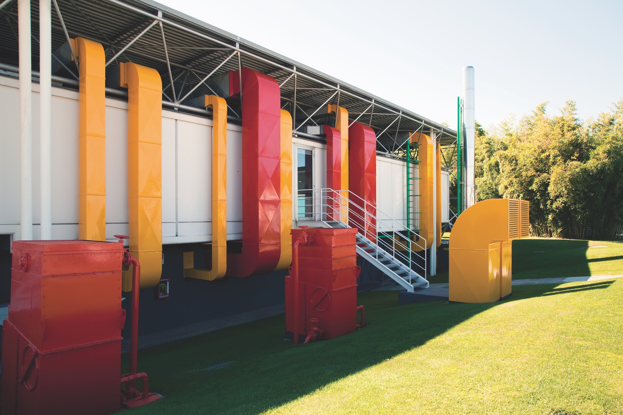
Situated close to the A9 highway that links Milan with Como, B&B Italia’s factory building and headquarters offer the first hints that this is a company with progressive design at its core. The factory, by architects Afra and Tobia Scarpa, was completed in 1968, while the headquarters – designed by Renzo Piano and Richard Rogers in 1971 and finished in 1973 – showcase the high-tech aesthetic the pair would later revisit for the Centre Georges Pompidou in Paris. The architecture of the campus serves as an important signifier of B&B Italia’s values, but it is inside the factory that the firm’s innovative credentials become truly apparent.
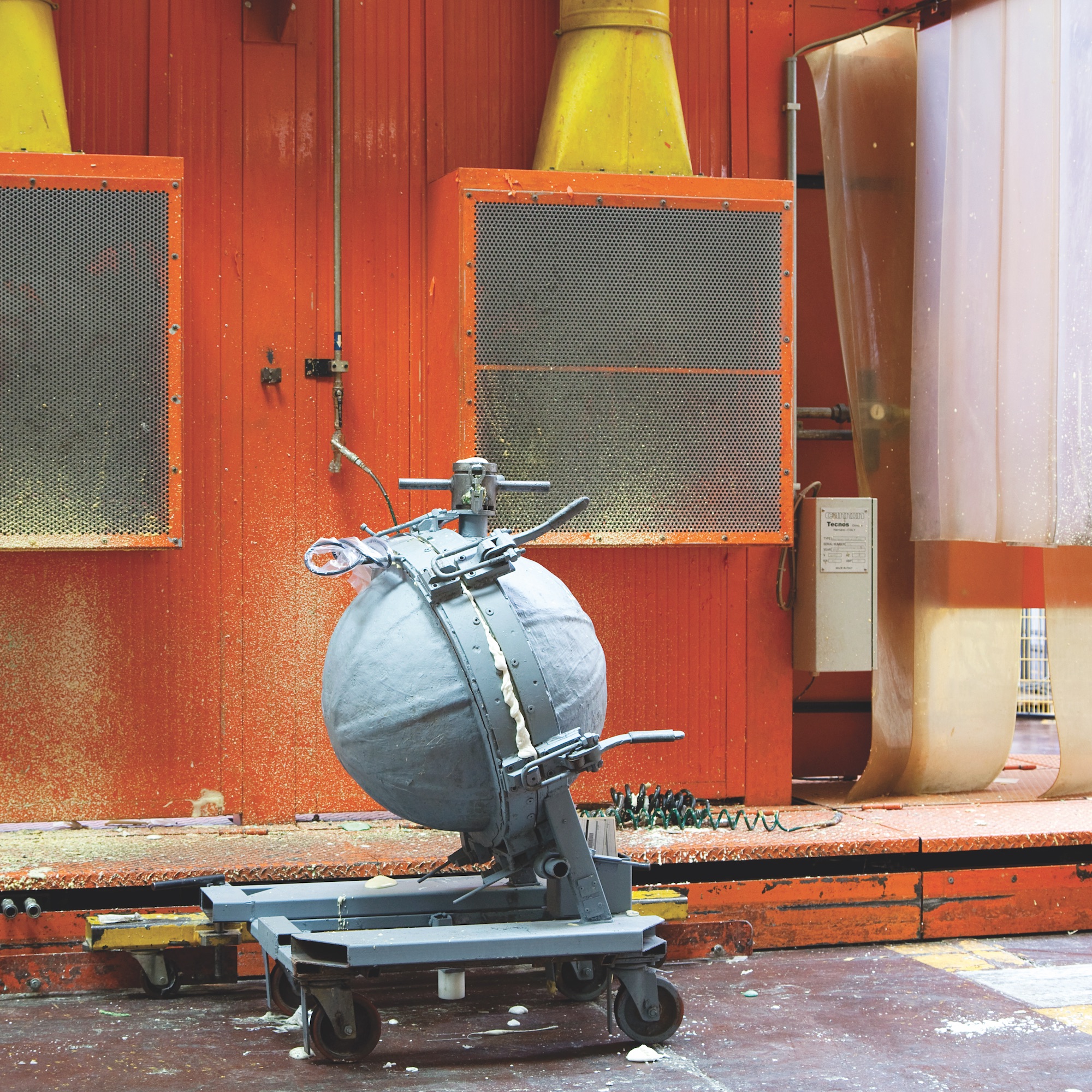
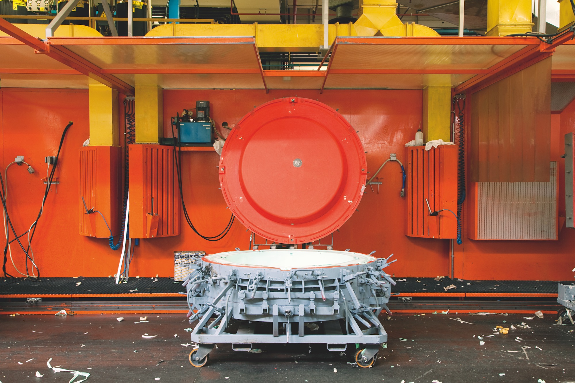
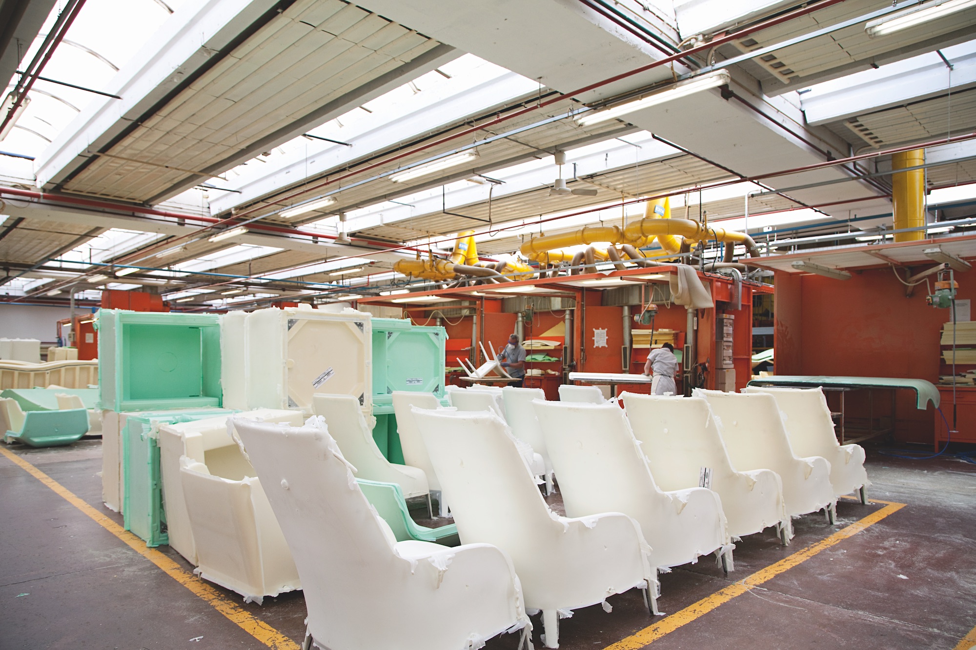
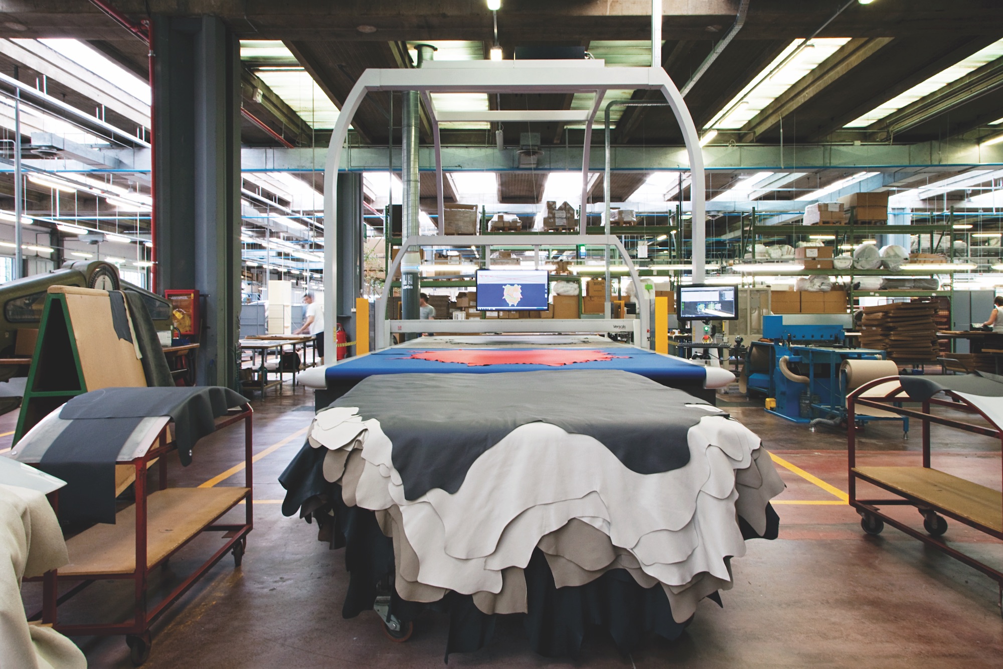
The facility’s 20,300-square-metre floor area is divided into zones dedicated to the various stages of the manufacturing process. Skeletal metal frames resembling wireframe drawings of the company’s iconic sofas and chairs stand in clusters along one side of the building. Welded by trusted Italian suppliers, the frames are delivered to the factory and placed into moulds, which are injected with a polyurethane foam that expands to take on the form of the product. Once the foam has cooled, the pieces are moved to the upholstery area to be covered in the customer’s choice of premium leather or fabric.
It’s an approach to furniture production that was groundbreaking when it was first developed in the 1960s by B&B Italia’s founder, Piero Ambrogio Busnelli. Having already established a successful business with his brother Franco in 1953, Piero dreamed of industrialising what at the time was still a predominantly artisanal process. During a research trip to London, Busnelli visited a trade fair where one exhibitor was showing rubber ducks produced using moulded polyurethane – a process he believed could be applied to furniture manufacturing. In 1966, he left Fratelli Busnelli and set up his own company to pursue this new direction, teaming up with industry leader Cesare Cassina to form C&B. The company would go on to collaborate with leading designers including Marco Zanuso, Vico Magistretti, Mario Bellini and the Scarpas, to develop products that would revolutionise the furniture industry.
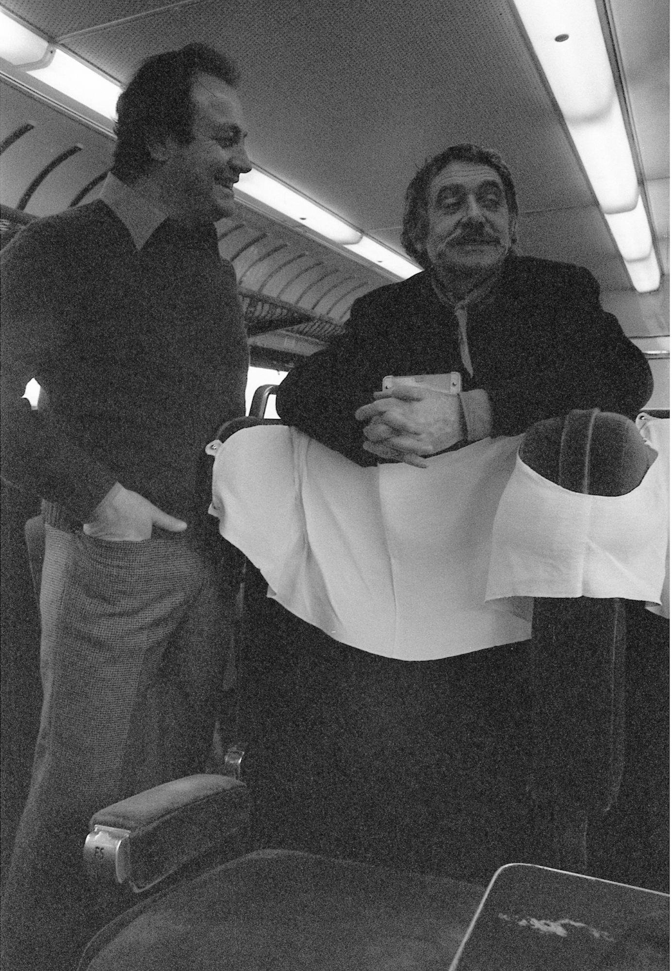
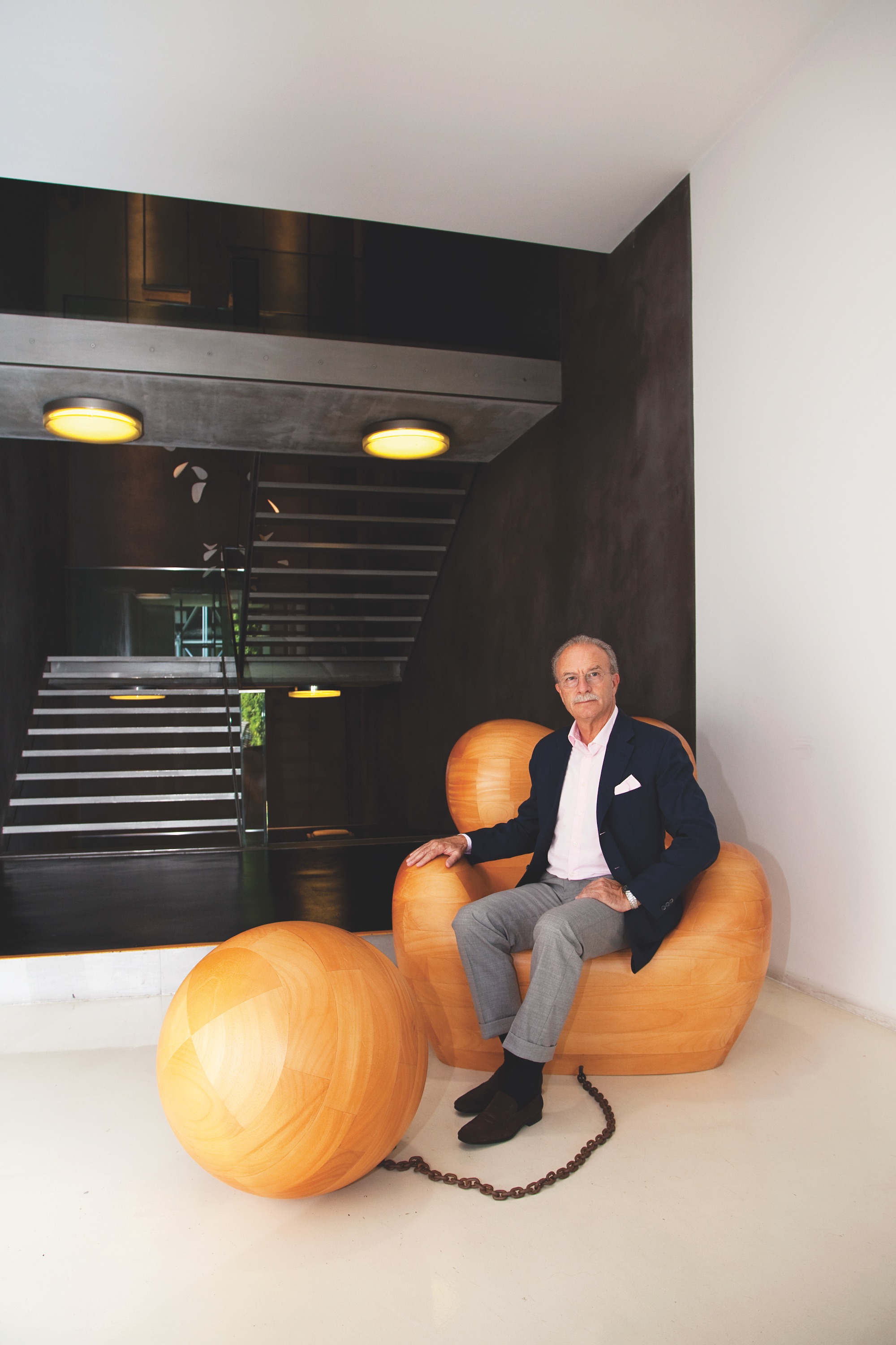
C&B grew rapidly, eventually reaching a point where it was operating on the same level as the core Cassina brand. In 1973, Busnelli bought out Cassina’s shares and renamed the company B&B Italia. As the firm continued to expand, responsibilities were passed on to the next generation, with Busnelli’s sons Giorgio, Giancarlo and Emanuele taking on leadership positions. Over breakfast at the Park Hotel, a short distance from the headquarters, the current CEO, Giorgio, explains how his father put in place systems to ensure the company would continue to innovate and remain one step ahead of the competition.
“One of the first things my father did when he teamed up with Cassina was create a centre of research and development,” he recalls, “because he started working with architects and designers and needed to develop prototypes away from the factory setting.” This facility, which moved into the third and final building to be completed on the campus, by Antonio Citterio and Patricia Viel in 2002, remains the place where new products, materials and technologies are explored, tested and refined.
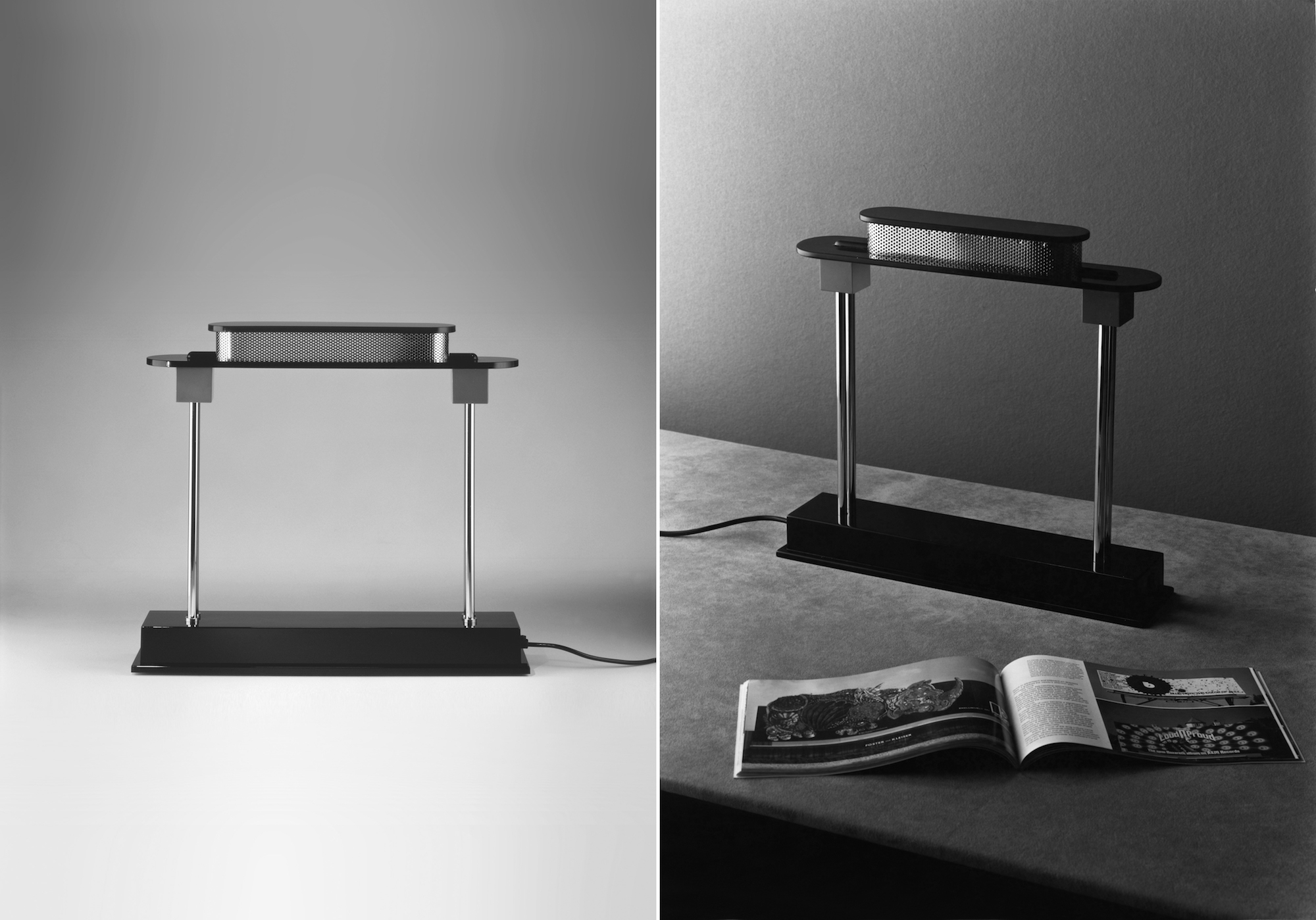
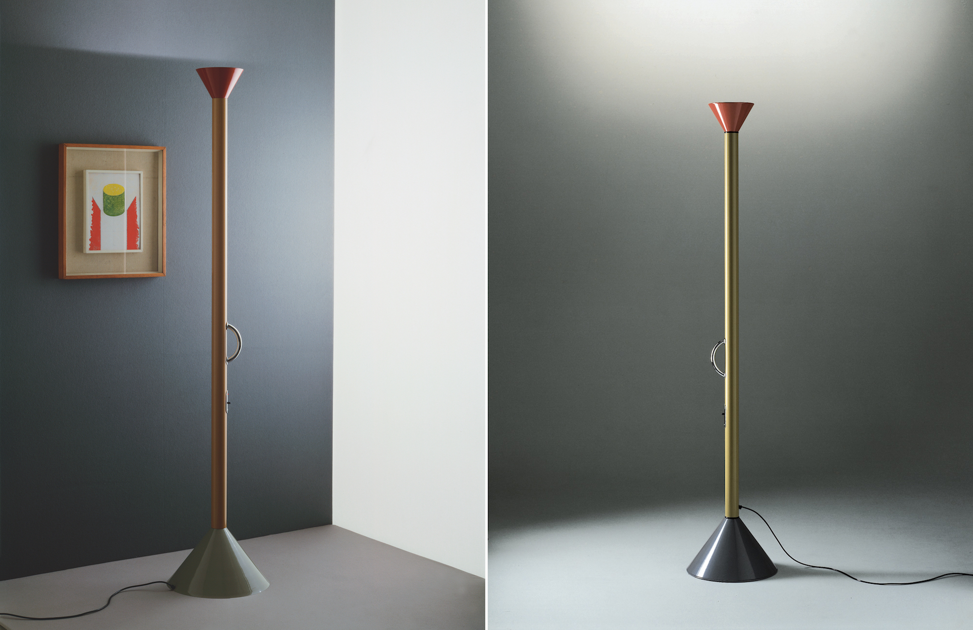
Today, many leading designers visit the Piero Ambrogio Busnelli Research and Development Centre to develop new products, hoping to emulate the success of the company’s most famous icons. These include the Coronado armchair and sofa by Afra and Tobia Scarpa – the first piece of upholstered furniture designed entirely for industrial mass production. It features four pieces (a seat, back, and two armrests) that can be assembled with just two screws, making it ideal for shipping internationally. In 1969, the Up series by Gaetano Pesce demonstrated the truly disruptive potential of polyurethane technology, offering an anthropomorphic form without any internal framework, which was delivered vacuum packed. Mario Bellini’s 1972 Le Bambole was the first sofa to be manufactured purely as a padded cushion without an internal frame, while Paolo Piva’s Alanda sofa bed from 1980 emphasised the importance of the R&D centre to the company, with its patented mechanisms for adjusting the headrests, armrests and bedside table.
Several other bestsellers followed in subsequent years, with one of the most significant breakthroughs occurring in 1995 with the launch of Antonio Citterio’s Harry sofa system, followed by the Charles sofa in 1997. By raising the sofa off the ground on cast-metal feet placed delicately at the corners, the designer created a new furniture archetype that has been endlessly copied due to its timeless simplicity. By that point, Citterio was already established as one of the brand’s key designers, and he has been responsible for developing and coordinating the collections of B&B’s luxury sister brand Maxalto since 1993.
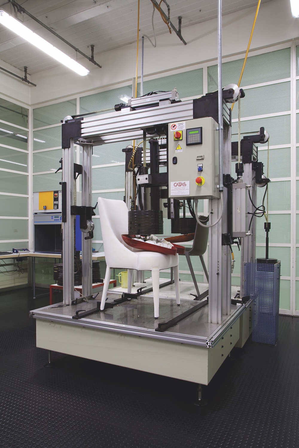
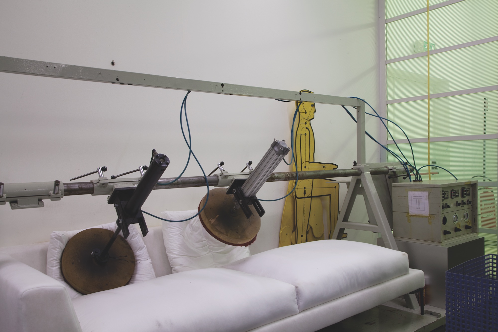
By offering designers the opportunity to work with nascent technologies and supporting them in their endeavours to explore entirely new directions for familiar furniture archetypes, B&B Italia has consistently been able to attract top talent, from Patricia Urquiola and Naoto Fukasawa, to Zaha Hadid and Vincent Van Duysen. The collaborations between these designers and a team of 25 experts at the R&D centre are crucial to the company’s continued creative and economic progress. Every product undergoes a thorough process of detailed design and refinement, based on prototypes built by specialists in woodwork, metalwork and foam technology. “When we receive a design idea, we don’t waste our time trying to understand its real potential on paper, we start the prototyping process straight away,” says Giorgio’s son, Massimiliano, who also works at the R&D centre.
Giorgio and the head of the R&D centre, Rolando Gorla, regularly travel to major global cities where they spend time in the latest hotels, museums and galleries to identify new architectural ideas or cultural directions that might inform future projects. Gorla, who has been at the company for over 40 years, explains that the quest for innovation has become more challenging in recent years. “We’re not in the ’60s when everything needed to be done – now almost everything exists,” he says. “It is becoming more difficult to invent something new, so more often designers look to the past for something that might be worth updating.” In this context, the focus of the R&D centre has switched towards sustainability and the evolution of existing technologies to improve performance and efficiency. B&B Italia is at the forefront of identifying ways to allow materials to be separated and reused or recycled, as well as trying to develop a more environmentally friendly alternative to polyurethane. It is also working on ways to make its furniture more lightweight, so it uses less material and is easier to ship.
Inside the factory, the injection-moulding manufacturing process is consistently challenged by ambitious and complex products such as Zaha Hadid’s Moon System sofa, and the SAKé sofa by Piero Lissoni, which requires 19 separate moulds. Alongside this technology, which has remained largely unchanged in 50 years, the company continues to add new machinery that helps to improve the efficiency of production. It recently invested 750,000 in an automated laser cutting machine and accompanying software that optimises the process of cutting high-quality leather hides into precise sections, ready for upholstering.
“It is a hugely complicated piece of equipment and the sort of investment that not many companies would make,” claims Busnelli, adding that it will take a few years before the machine’s efficiencies provide any return. This, however, is the spirit in which the firm has always operated, since the early days when its founder paid for a pneumatic press capable of producing 1,500 tonnes of force, instead of the 500 tonnes necessary to produce the items currently in the collection. “This was another thing inherent in Dad’s strong character,” Busnelli adds. “He actually completely changed the way to produce; we now had a company with industrial processes.”
In today’s hyper-competitive global market, innovation and risk-taking in business is as important as it is in design and manufacturing. In 2015, Busnelli made the decision to sell a majority stake in the company to a subsidiary operated by Andrea Bonomi’s Italian investment company, Investindustrial, which part-owns and supports a range of premium brands, including Aston Martin and lighting firm Flos. With a healthy turnover of over 180 million, Busnelli could have been satisfied to remain one of Europe’s largest furniture brands, but he recognises that continuing international expansion requires more risk and investment than a small family-run company could cope with. “For many years people were saying small is good – it’s nice; it’s craftsmanship. But in the end if you want to play globally you need to compromise a lot to be represented in the market,” he insists.
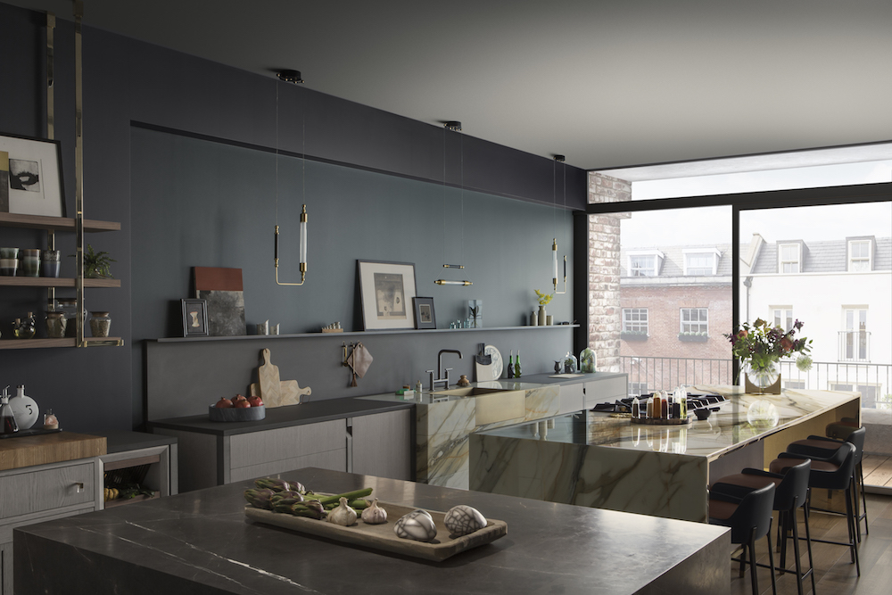
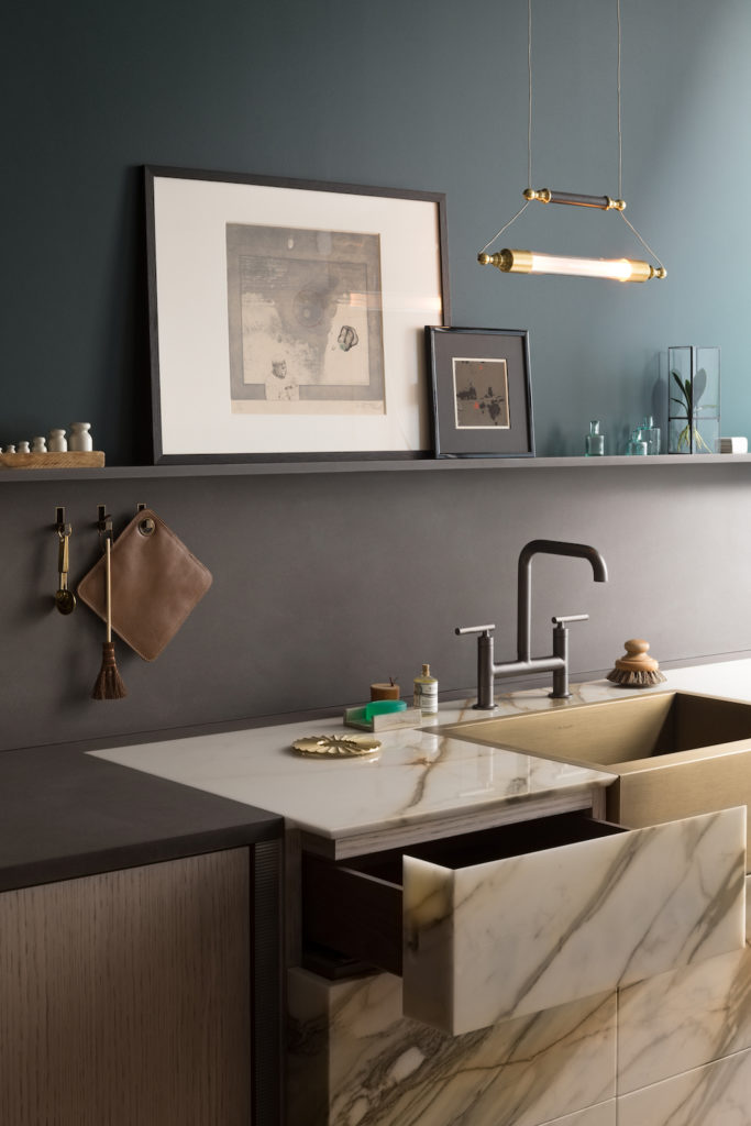
With backing from Investindustrial, B&B Italia purchased a majority stake in high-end kitchen producer Arclinea in 2016, with the aim of accelerating its international expansion. “I like the idea that it is possible to create a conglomerate like Louis Vuitton has done in fashion,” adds Busnelli. “So the idea is to create a group of the best companies of high-end design in the world.” This ambitious plan will see the Busnelli family adding to its portfolio of brands in the coming years, enabling it to expand into new markets and apply its knowledge of materials, processes and technologies to a broader range of products.
With around 500 staff working for the company across design, production, contract projects, sales, marketing and distribution, B&B Italia is now firmly established in the international furniture market and will continue to extend its influence through key strategic partnerships and investments. As Busnelli finishes breakfast and prepares to dash off to a meeting with the management of Arclinea, he offers a final insight into the mindset that has formed the basis of the company’s success. “One of the most important things my father taught me is to be curious,” he says, “because curiosity is really fundamental for everything you want to do in your life.”
Photography Allegra Martin
This is an excerpt from issue 21 of Port, out now. To buy or subscribe click here.