Just Dance: 7y98D

Ouro, the Vancouver-based dance collective, addresses the climate emergency in its hypnotic dance project with RubberLegz

Global warming on the cusp of becoming irreversible – or perhaps it’s already there. As I’m writing this, I’m gazing out the window at a divided sky; one half is clear blue, the other is expelling snow. Today marks the beginning April, and this icy, interchangeable weather is highly unusual for the dawning days of spring. This is just another noticable effect of climate change.

In response to the impeding doom of the heating planet, many artists and creatives are utilising their practices as a way of steering action. It’s far less about raising awareness, now, for we’ve gone far beyond conversational points or discussion. Now, it’s about actionable response. Ouro Collective is doing just that in its work, a Vancouver-based dance collective merging hiphop, waacking, breaking, popping and contemporary dance in its evocative works. Founded in 2014 by Cristina Bucci, Dean Placzek, Maiko Miyauchi, Mark Siller, and Rina Pellerin, the collective has since evolved from a group of artists “looking to share and learn from each other” into something much bigger, and more impactful. The group have collaborated with artists spanning all mediums over the years and, in its eighth season, this is its most exciting yet with its roster of Ash Cornette, Cristina Bucci, Eric Cheung, Maiko Miyauchi, Rina Pellerin, and Shana Wolfe. All of which hail from diverse cultural and dance backgrounds, wherein they forge a collaboration that demands a need for “dialogue, creative innovation and community building”, the collective explains. 

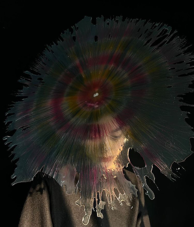
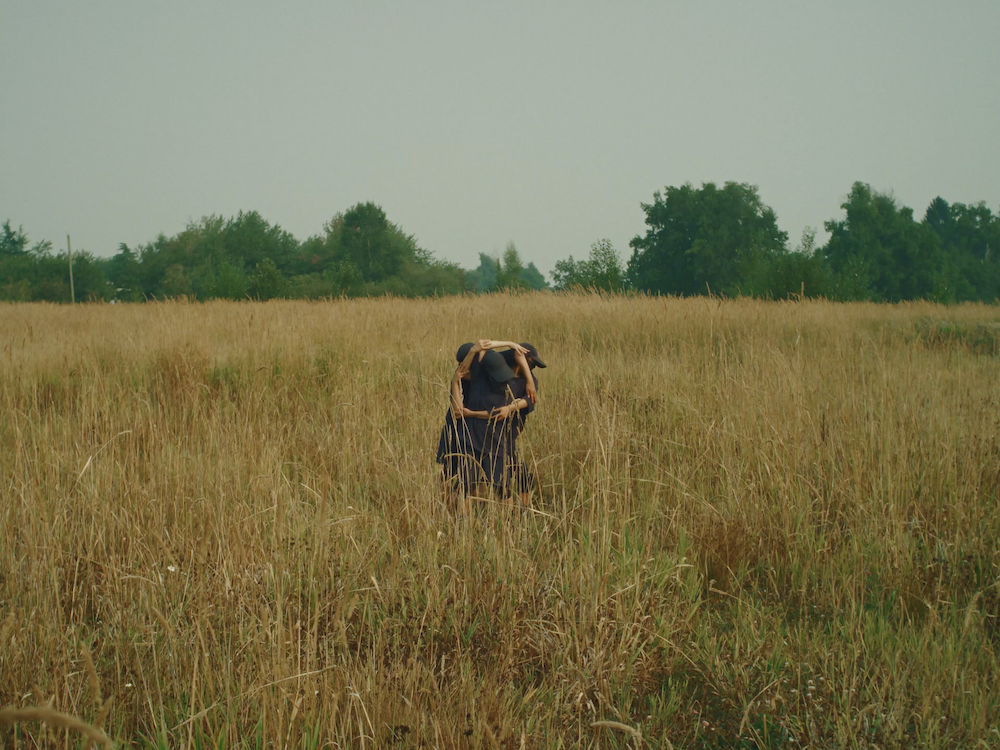
The result of which has been merged into project named Just Dance: 7y98D, a mesmerising piece composed in collaboration with Rauf “RubberLegz” Yasit. The work is inspired by The Climate Clock, a public installation created by an Golan and Andrew Boyd located that counts down the days until unrepairable climate catastrophe – where no longer can we reverse the burns, scars and wounds of humanity’s impact. Below, I chat to the collective about collaborating with RubberLegz, who’s “well known in the street dance community”, learning the hypnotic choreography over Zoom, and how dance can be a vital tool for addressing the climate emergency. 

It’s interesting to hear that you learnt the choreography through Zoom, how did this pan out?

In 2020, we received the Chrystal Dance Prize, an award from Dance Victoria, which supports projects with international collaborators. We began rehearsals through Zoom, in our own homes, as Vancouver was on lockdown during the COVID-19 pandemic and RubberLegz was in Los Angeles. As rehearsals progressed, the ban on international travel was not yet lifted, and we were forced to continue the project virtually. 

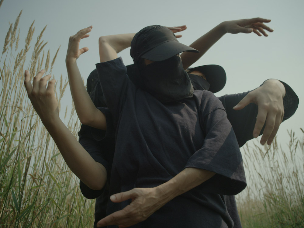
Learning movement online is challenging in a number of ways, but learning RubberLegz’s movement online is a game-changer. His movement vocabulary stems from breaking and threading concepts which results in various limbs folding and threading into one another, and with Zoom, everything is backwards. Though challenging, this opportunity created space and trust between the dancers and choreographer.

This trust also extended into the film’s direction as the storyboarding and filming preparations took place online. Co-director David Ehrenreich said: “It’s the first dance film I’ve made, and I enjoyed the unique collaborative process. I imagine it’s similar to adapting a play into a film; this live performance is being created, and we got to go watch it and design the film around what you see at the rehearsals. Rauf approaches movement and the human body in such an idiosyncratic way—we wanted to champion the exploration they were doing.”

The project raises awareness about climate change, a highly pertinent and relevant topic of today. How do you do this in the choreography and wider project?

The title of this project was inspired by The Climate Clock, a public art installation created by artists Gan Golan and Andrew Boyd set on Manhattan’s Union Square. The clock counts down the time left to avoid climate disaster. Ouro became aware of The Climate Clock in 2019 when seven years and 98 days remained. Faced with this stark knowledge, OURO was inspired to bring “the most important number in the world” – as described by the creators of the clock – to dance audiences. 

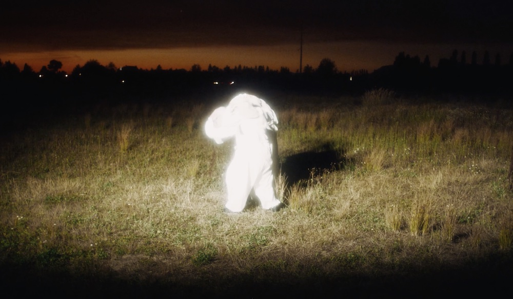
During the filming of 7y98D, we endured extreme weather conditions. On one of our filming days, Vancouver had the worst air quality in the world, and on another, temperatures reached over 40℃. The air was thick from the smoke of neighbouring forest fires. We had to alter quite a bit of movement to adapt to the environment, so in a way, the choreography underwent its own type of natural selection.

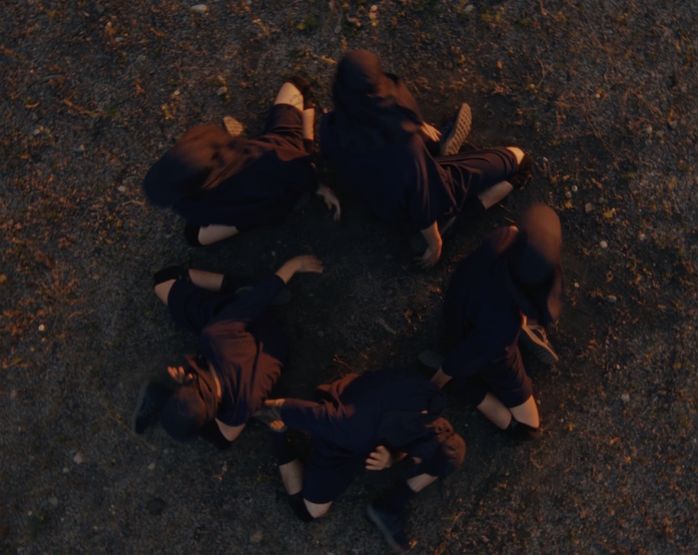
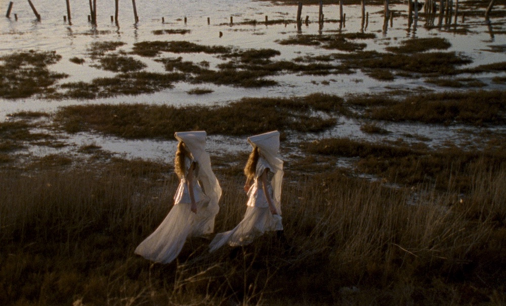
The choreography begins with dancers moving in a harmonious link, mirroring the cyclic nature of the earth. As the piece progresses, the dancers begin disconnecting and linking onto themselves. The tone shifts and movement becomes faster and more urgent as they adapt to new environments. We are currently in rehearsals for our full-length theatre piece and are adapting the choreography seen in the film for a live audience.

What reaction do you hope to receive from your audience?

We hope audiences reconnect as a community during this critical window for action to prevent the effects of global warming from becoming irreversible. Making small personal changes in our lives can pave the way for a better relationship with the earth. 

“It’s a challenge to make a film about how little time we have left to save our planet without it feeling depressing or preachy. Dave and I wanted to present this film in a way that allowed the audience to connect to the movement of the dancers on an emotional level first and wait till the end to provide some context.” Co-director, Jeff Hamada explains. “Hopefully it leaves people feeling just as inspired to go out and do something.”

In what ways can dance and art be an agent for change, especially in relation to the warming climate?

Art can be an agent for change, as it inflicts subconscious responses and emotional connections that impose lasting meaning for the viewer. With a topic like climate change, it is easy to feel disconnected and complacent, as its effects are often regarded as gradual and not fully visible. We wanted to find a way to encourage our audiences to recognise our current situation and empower them to make changes while we still have time. Jeff Hamada said, “The rotations that happen throughout the film are meant to be a reminder that the climate clock is always ticking, but also to convey that there is still time.”
What’s next for you?

We are currently adapting 7y98D into a full-length stage piece, which will premiere in summer of 2022 in Vancouver. Following that, we will be touring the work, and running our summer programming and workshops.

Dates for our community and ocean cleanups will be released in the next few months. They will be open to the public and followed by workshops led by our team and collaborators. We encourage everyone to come, learn and contribute to reversing the Climate Clock. 

Making Strange: The Chara Schreyer Collection

DelMonico Books’ new publication asks us to rethink the world through art. Its curator, Chara Schreyer, tells us more

Carrie Mae Weems

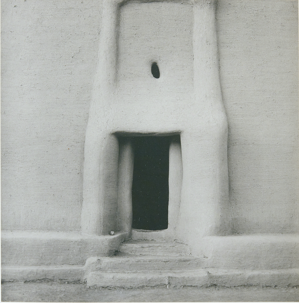
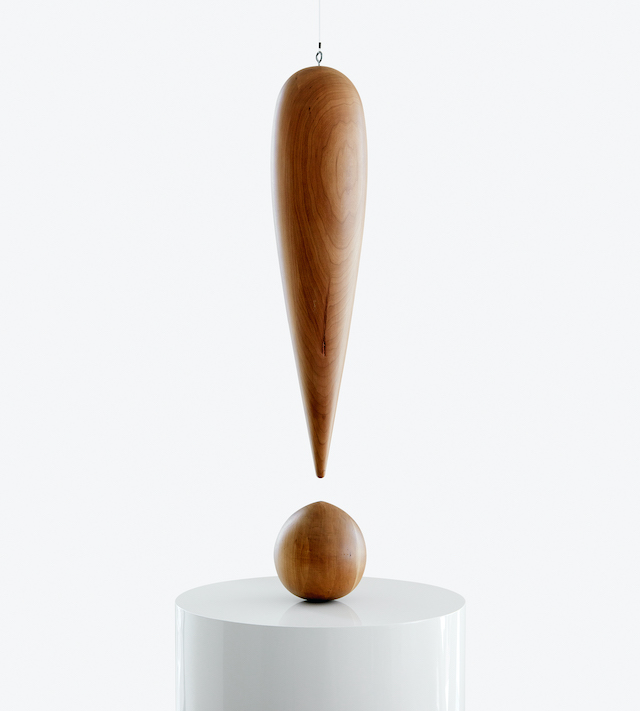
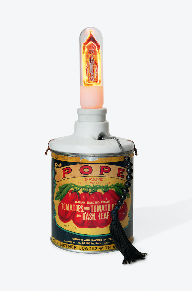
In a new publication from DelMonico Books, the viewer – moreover the whole of society – is tasked to see the world through a refreshed lens. Entitled Making Strange: The Chara Schreyer Collection, the magnanimous tome collates nearly 250 artworks that span over 100 years, formulating a deep and comprehensive study brought to us by Chara Schreyer, the curator of the project. Compiled over three decades, Chara examines the definition of perception, where we, the audience, are encouraged to rethink the everyday in accordance to the trailblazing and irreverent work of French painter Marcel Duchamp plus the Russian literary critic Viktor Shklovsky and his conception of ‘making strange’.

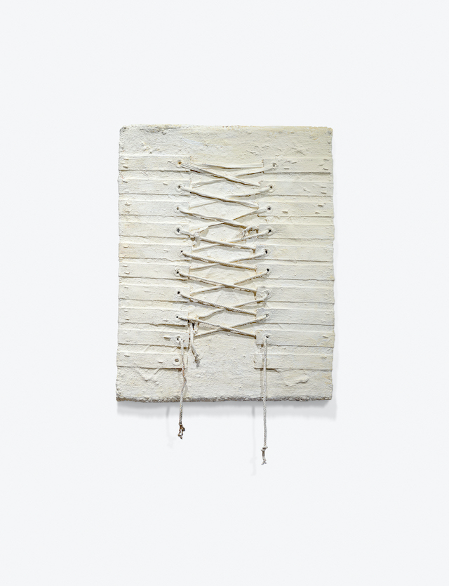
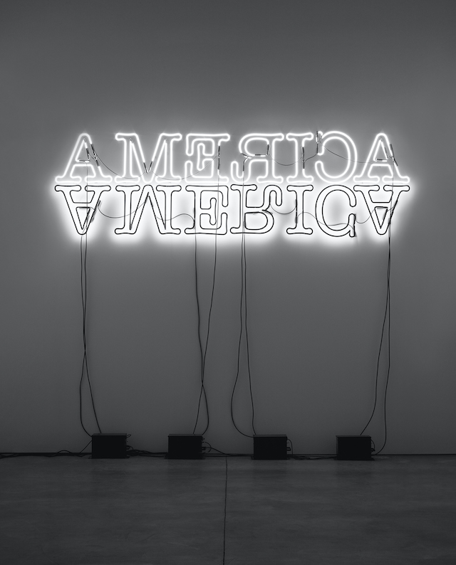
A multitude of works on this topic are brought to the fore, including Andy Warhol, Glenn Ligon, Lawrence Weiner, Jenny Holzer, Diane Arbus, Cindy Sherman among many others. The book is edited with text by Doulas Fogle, Hanneke Skerath and includes a foreword by Chara Schreyer with an introduction penned by Fogle. Additionally, the tome features newly commissioned essays by Geoff Dyer, Briony Fer, Russell Ferguson, Elena Filipovic, Bruce Hainley, Eungie Joo, Sarah Lehrer-Graiwer, Annie Ochmanek, Jenelle Porter, Joan Rothfuss, Lynne Tillman, and Mika Yoshitake. Below, I speak to Chara on the topic of the collection, how she curated such a vast project and the specific ways in which art can be used to change the course of history: “We all really need to be challenged today whether it’s by visual artists, poets, or musicians. The world needs artists to shake us up.”
Richard Artschwager

What inspired you to start working on this book and collection, was there a reason or moment that sparked it?

Regarding Making Strange, I was motivated to commission a book about the collection for two reasons: one, the works in the collection are spread out over five different locations, so I was curious about what the works that are not in the same house might say to each other when brought together in a book format; and two, I realised that, one day after I’m gone, these works will be dispersed with a number of them promised to museums, and so on. I wanted to have a record of their intimate relationship with each other together in this collection before they one day go on their own individual journeys to new homes.

Having worked with the collection for 30 years, what challenges or surprises did you encounter?

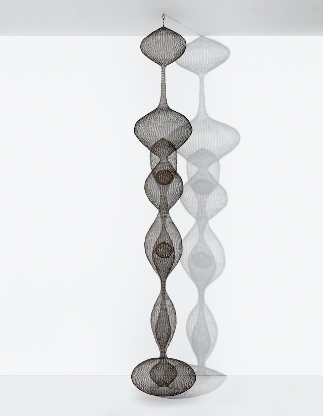
One of the most interesting things for me in seeing the works brought together in Making Strange were the serendipitous synergies and unexpected conversations that came about from bringing these works together virtually in a book format. I really loved seeing how the authors Douglas Fogle and Hanneke Skerath brought very different kinds of works together under provocative curatorial propositions. It was really thrilling, for example, to see Ruth Asawa’s hanging wire sculpture Untitled S.437 (Hanging, Seven-Lobed, Two-Part Continuous Form within a Form with Two Small Spheres) (1956) in a chapter called ‘Minimalism and Its Discontents’ with Donald Judd’s Untitled stack (1969), Catherine Opie’s landscape photograph Untitled #5 (Icehouses) (2001) and Felix Gonzalez Torres’s light string sculpture Untitled (Tim Hotel) (1992). And there are many more surprising moments in the book.

Renate Bertlmann

What was the curatorial process like over this period; where did you source your artworks? What did you seek to include and what didn’t you?

The motivating factor in all my collecting has always been one simple idea: I’ve always wanted to collect works by artists that changed the course of art history. Early on, I worked with an advisor with whom I had a fantastic curatorial relationship. We purchased a number of core works in the 1990s including an example of Marcel Duchamp’s Boîte-en-valise (1935-41) that was once owned by Andy Warhol (who is also in the collection), a classic stack by Donald Judd and Robert Gober’s iconic Deep Basin Sink (1984) which turns the Duchampian readymade on its head by recreating an unplumbed sink fixture completely by hand. In a sense, everything in the collection flows from, around, or into the work of Duchamp. Even Georgia O’Keefe and Arthur Dove, two American modernist painters we would never think of as ‘Duchampian’, were friendly with and often showed together alongside Duchamp at the time. But it’s not just Duchamp’s contemporaries. The lineage extends in all sorts of ways up through the likes of Andy Warhol to younger generation of artists from Kaari Upson, Glenn Ligon to Rirkrit Tiravanija.

Dan Flavin

What artworks can we expect to find inside, can you pick out a few favourites or key pieces?

As I always say, choosing your favourite works is like choosing between your children. It’s really impossible as you love them each in different ways. With that said, I do find myself continually enamoured with Eva Hesse’s Top Spot (1965) and Robert Gober’s Basin Sink (1984). Is Top Spot a painting or a sculpture? It pushes itself outside of the boundaries of the canvas into the space that you’re inhabiting. Hesse exploded the boundaries between sculpture and painting and did it as a woman in an art world still dominated by men in the 1960s. Gober’s sink also asked all the right (or maybe wrong?) questions. It is proudly hand-crafted as opposed to machine made. It was created as a non-working sink with all the melancholia that this suggests. It’s ghostly. As the artist created it in the middle of the AIDS crisis its lack of functionality also became a metaphor for the individuals whose bodies were no longer working correctly and who ended up losing their lives to the disease. This work has so many levels.

In many ways though, the spiritual guiding force of the collection (and of the book Making Strange) is Marcel Duchamp’s Boîte-en-valise (1935-41) as it is a collection/retrospective in its own right with its miniature reproductions of the artist’s major works including his ready mades. In some ways, this work, which is the inspiration for the title and first chapter of Making Strange, is the defining core of the collection. Many other artists in the collection can be seeing as operating in the conceptual wake of Duchamp.

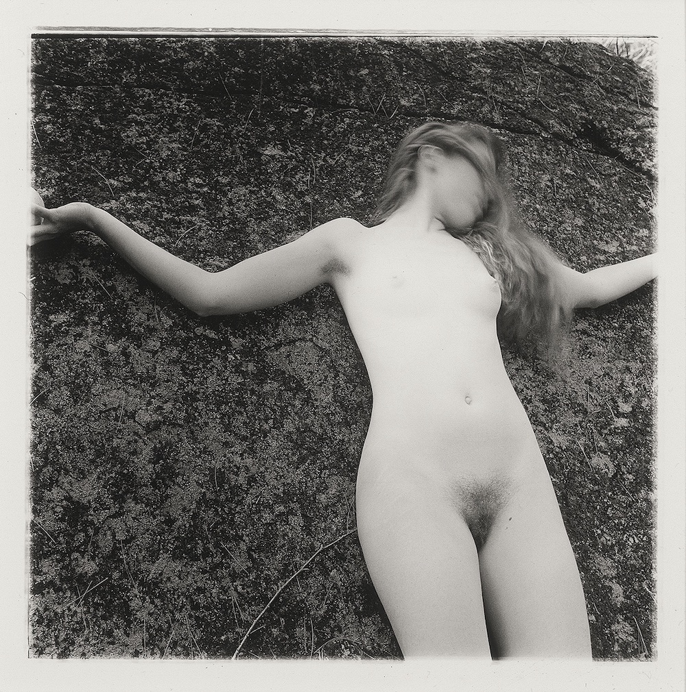
Francesca Woodman

The topic of defamiliarised art is an interesting one. In what ways can art help us rethink the world? How can this be applied to a modern context?

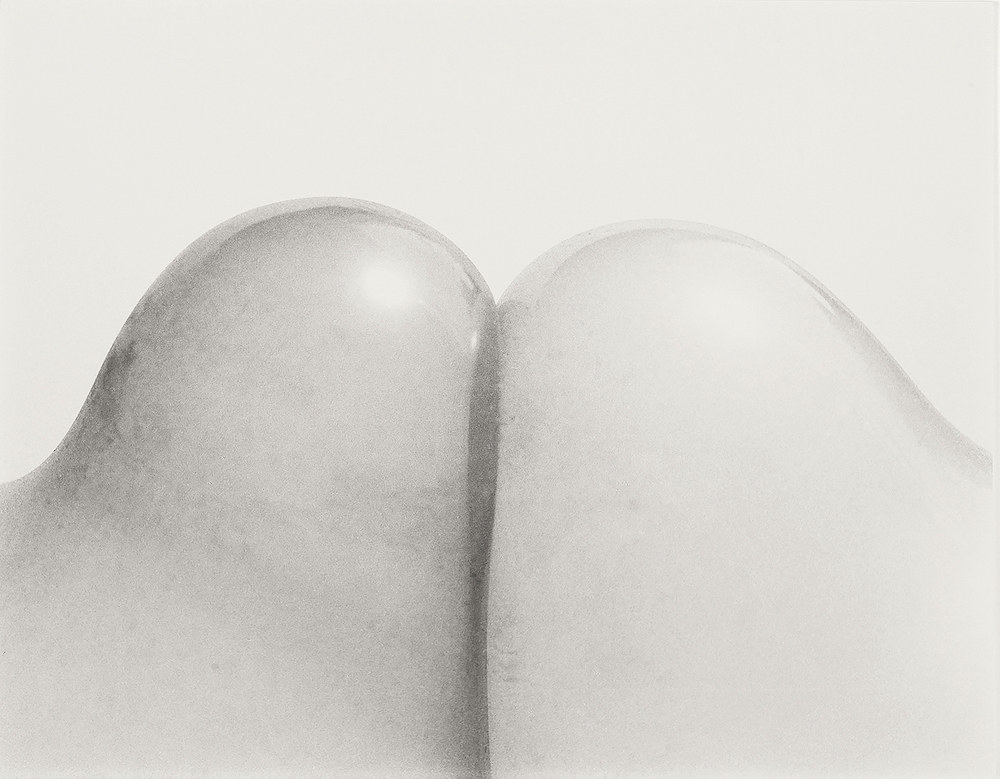
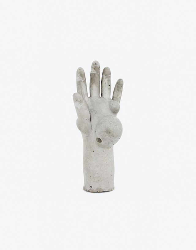
I think a lot about many of the women artists in the collection and the way in which they’ve made the body strange, from Hannah Wilke’s vulvic ceramic sculptures, Renate Bertlmann’s photograph of the tips of two condoms that seem to resemble a pair of knees to Alina Szaponikow’s lamp sculpture Lampe-bouche (Illuminated Lips) (1969) with its alien-like disembodied mouth or Louise Bourgeois’s abstracted marble female torso Harmless Woman (1969). Each of these artists was working in a way that we might call defamiliarised. They really questioned the role of the female body in culture and how we objectify it. They made the body strange in a way that challenged us to rethink our relationship to gender. It’s clearly an extremely relevant way of looking at the world still today. In the end, I love art that has that edge that makes you get out of your comfort zone. We all really need to be challenged today whether it’s by visual artists, poets, or musicians. The world needs artists to shake us up.

How do you hope your audience will respond to this book, what can they learn?

I really hope that the readers will enjoy seeing the art historical connections between the various works in the collection. I also love how Douglas Fogle and Hanneke Skerath edited the book as a series of visual essays. The works speak to each other and have conversations that run parallel to the wonderful commissioned texts on individual works in the collection by 14 art historians, curators and critics around the world. 

Ruth Asawa

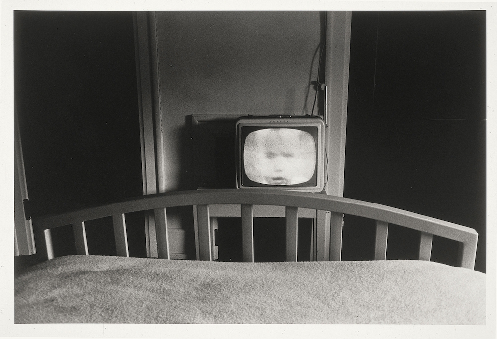
Lee Friedlander

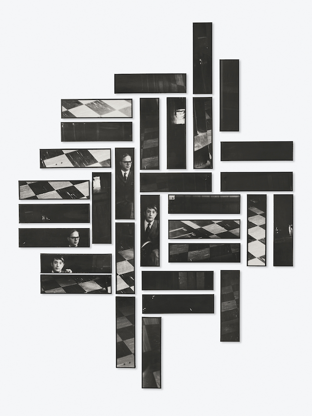
Gilbert & George

Harmony Hammond

Glenn Ligon

Christian Marclay

Jean-Luc Moulène

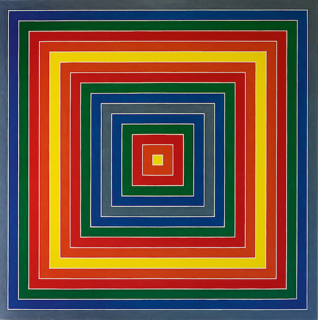
Frank Stella

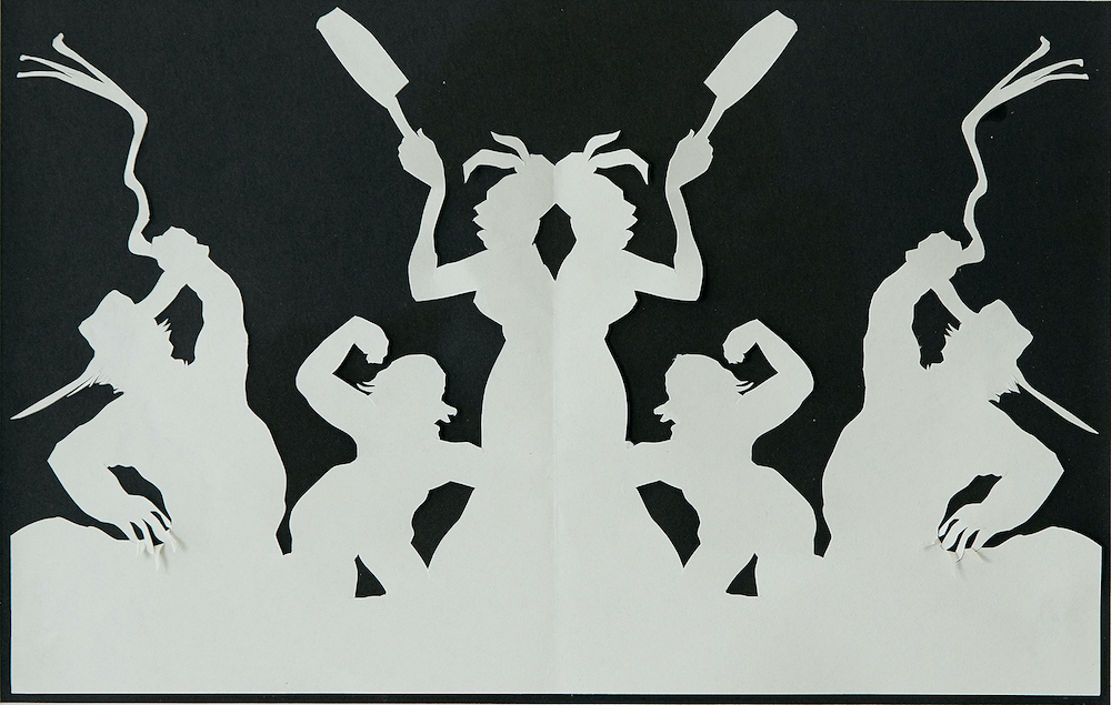
Kara Walker

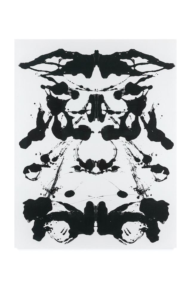
Andy Warhol

Making Strange: The Chara Schreyer Collection is available here.

Rhapsody In The Street

A Magazine Curated By onboards Grace Wales Bonner for its 22nd issue, featuring archival and newly commissioned works that respond to the tradition of Black poetry, literature and portrait photography of the 20th century

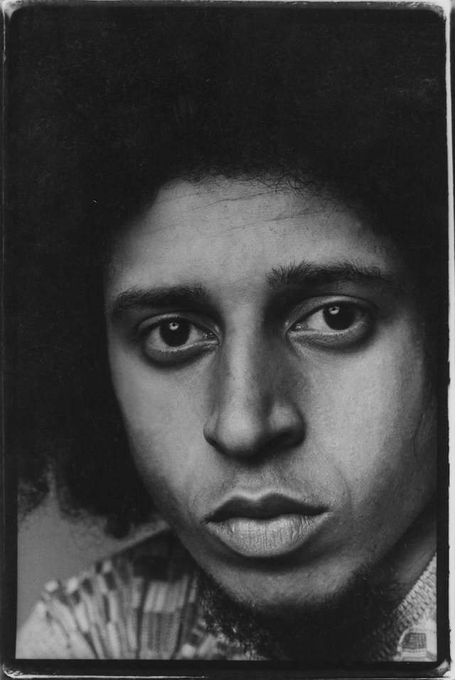
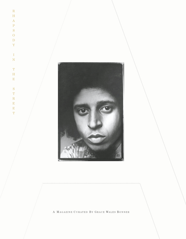
Anthony Barboza. (1972) Self Portrait Kamoinge

Grace Wales Bonner is a polymath of sorts. After launching the eponymous fashion label Wales Bonner in 2014, the British-Jamaican designer has been actively addressing topics of identity, politics, sexuality and race through a merging of luxury and critical design – that which is informed by research and a hybrid both of European and Afro-Atlantic culture. Her graduate collection Afrique, which debuted in 2014 with a cast of Black male models, received the L’Oréal Professional Talent Award; the AW15 collection Ebonics proceeded and, the same year, she was awarded Emerging Menswear Designer at the British Fashion Awards. It wasn’t long until she was awarded the LVMH Prize of $300,000 for Young Fashion Designers, which was given just after Grace’s SS17 show Ezekiel, featuring a collection of structural works draped in beading and history, drawing inspiration from Emperor Haile Selassie of Ethiopia. Her work often signifies mythology and cultural narratives, and has, since the dawning of her label, continuously challenged expressions of beauty and identity – her recent SS22 collection named Volta Jazz being the latest example.

And now, Grace is wearing a slightly different hat. She was asked to curate the 22nd issue of A Magazine Curated By, entitled Rhapsody In The Street and displaying an academic and visual survey of Grace’s research spanning 200 pages. The Paris-based magazine explores a different fashion designer with each issue, and with this one, Grace responds to the tradition of Black poetry, literature and portrait photography from the 20th century. Within, you’ll find archival work and historical ephemera coupled with newly commissioned essays, poems, paintings and photography from the likes of Ming Smith, Zoë Ghertner, Paul Mpagi Sepuya and Tyler Michell, the latter of whom has captured Wales Bonner’s AW17 collection Ezekiel. It’s a tome to cherish and hold, thought of as a reference point for conversations surrounding topics such as Jamaican dancehall and the Kamoinge photographic group in Harlem, with published archives from previously unseen Ghanaian film photography and poetry by Lynette Yiadom-Boakye to name a few. Grace tells me more about the issue below.

Harley Weir. (2015) Wales Bonner Spring Summer 2015 Ebonics

Curated as a “response to the tradition of Black poetry, literature and portrait photography of the 20th century,” what does this mean exactly? How are you responding to these art forms?
Rhapsody in the Street explores Black style as a lineage and quality of beauty recorded in history by portraiture. I see the issue as a chorus: a hybridity of different voices speaking as one, and an exploration of the archive as a process of recording collective memories.

Talk me through your research process – where did you source your content, who did you seek to include?

I wanted to create a rhythmic and intellectual space underlined with a magical spirit. Starting points for research were Amiri Baraka’s In Our Terribleness and Roy DeCarava & Langston Hughes, The Sweet Flypaper of Life. Both publications explored a mixture of photography and poetry which I wanted to respond to in this issue. 

Zoë Ghertner. (2021) Selena Forrest wears Wales Bonner, Black Sunlight (Autumn Winter 2021) . Adidas x Wales Bonner (Autumn Winter 2021)

Can you pick out a couple of favourite moments from the magazine to look out for? 

I feel honoured to be able to have included Greg Tate’s reflections on Kamoinge, the photographic group from Harlem, in the magazine. A self portrait by Anthony Barboza, a former member of Kamoinge, is featured on the cover of the magazine. 

How do you hope your audience will respond to the magazine? What stories are you hoping to share?

Rhapsody in the Street is an opportunity to experience, honour and revel in a lineage of beauty that unravels and reveals itself over time. With this, I open the door to new possibilities and the continuous unfolding of our story.

Paul Mpagi Sepuya. (2021) Mirror Study for Grace (0X5A4149)

Ming Smith. (2021) Self-Portrait in Wales Bonner, Black Sunlight (Autumn Winter 2021)

Ming Smith. (ca.1977) Acid Rain – White Socks (Mercy Mercy Me (The Ecology) by Marvin Gaye, Soul Purrfection Version)

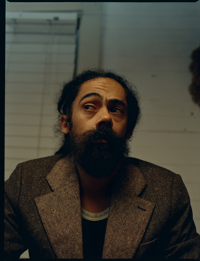
Steven Traylor. (2021) Damian Marley wears Wales Bonner (Autumn Winter 2020) Lovers Rock Judah Two-Toned Tailored Jacket

Cover, A Magazine Curated By Grace Wales Bonner

Acid Coral Template

Tuomas A. Laitinen addresses important questions of ecology and climate change through a series of glass-made structures and installations

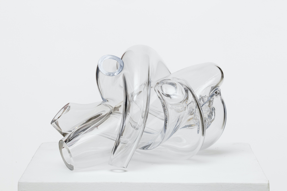
A Proposal for an Octopus, series, 2019. Photo: Jussi Tiainen

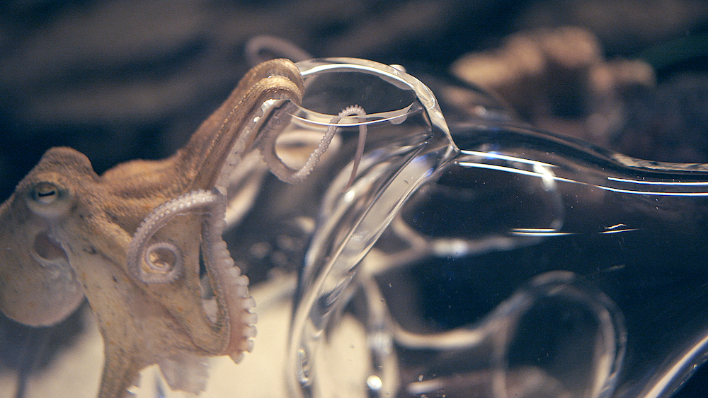
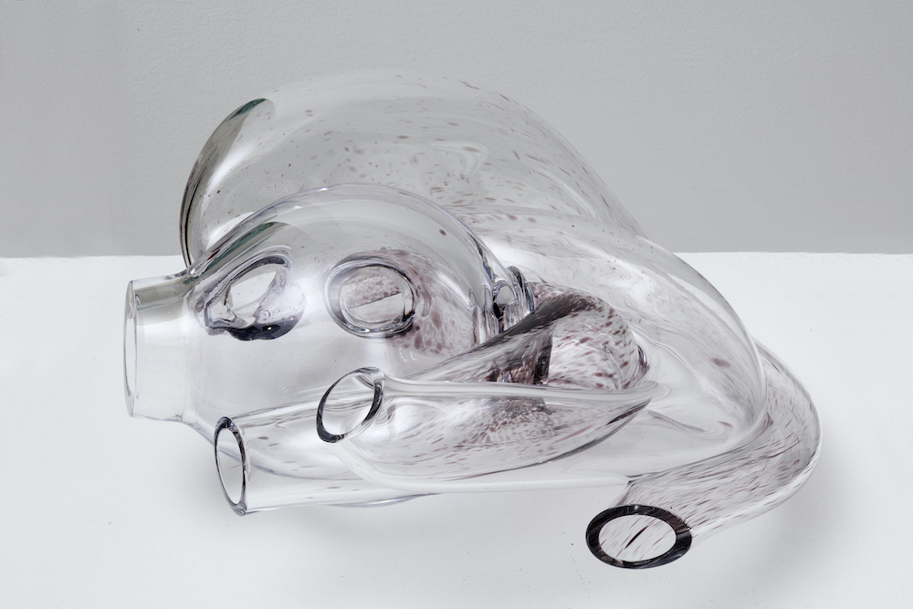
The octopus has earned a spot as perhaps one of the most visited subject matters in art. From 19th century Japanese erotica through to modern painting classics, the eight-armed sea creature has drawn many artistic practitioners in with its alluring symbology and anthropomorphic influences. Mysterious, intelligent, adaptable and fluid; the tentacled and unpredictable animal represents both wisdom and strategy. For instance, in the recent documentary My Octopus Teacher, we saw the ocean protagonist cover herself with shells to hide from impeding prey, outsmarting the sharks in an instant as she continued to poke her many legs into its gills. So it’s no wonder the octopus has caught the attention of artists and designers over the years, with Tuomas A. Laitinen being the most recent – an artist who works across video, sound, glass, algorithms, plus chemical and microbial processes.

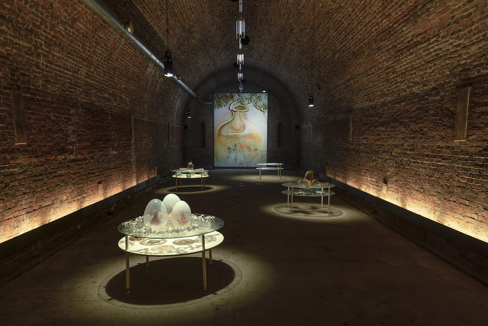
In his most recent body of work Tuomas merges the line between art and science, weaponising materiality and craft to take a crystallised view at the world of ecology – that which is done so through octopus-shaped glass structures and compositions. The work, named Acid coral template, has been presented at the inaugural Helsinki Biennial this year, and he’s also recently been commissioned by Daata to create an AR artwork for the launch of the platform’s AR app – a continuation of what was first commissioned by Daata in 2020. “I had been researching protein crystallography for a few years and started to think about how I could translate this data in my work,” he tells me. “In that video work, I used the protein models to create these very baroque body augmentations for the animated characters in the video.” Simultaneously, at the time of making, Tuomas was working on coral growth simulations and eventually these two worlds collided. “The protein model for this particular coral is based on the Yersinia Pestis (plague) bacterium. So there is a weird fictional metamorphosis woven into the fabric of the work. A bacterium becomes a speculative coral. It’s not really about representing the data as such but making an interpretation, a translation, or a transmutation of it and consequently placing it into new environments through AR.”

PsiZone, 2021. Installation view, Helsinki Biennial

Tuomas grew up in a small Finnish town, a place known the centre point for glass production in Finland and in the 20th century. He started working on his installations as a teenager using junkyard materials and scraps, “so that was my fist touch to art, even though there were no such categories in my mind then,” he says. After a stint in music, Tuomas decided to attend art school and pursued his studies at Finnish Academy of Fine Arts, which is where his love of sound, moving image, 3D animation, light and installation first bloomed; his debut glassworks were created around 10 years ago and “were basically custom lenses for a camera”, while his first augmented reality piece was borne in 2016. Now living in Helsinki, he often works with various artists and researchers to question the role of ecology and production, often employing a profound mix of translucent materials such as glass and chemicals, as well las microbial processes and algorithms. 

For the last five years, Tuomas has turned his focus onto the eight-legged creature and its home: the coral reef. “I’ve been making glass sculptures for octopuses as an attempt to find ways to think with these extraordinary lifeforms and, on a larger scale, ocean ecosystems. The octopus started to feel like a relevant conductor for opening up various ecological questions, providing a tentacular and modular model for organising ideas and artworks: ‘nine minds’ in one body. There is always a core brain there, but the structure allows a certain decentralisation to happen.” In a wider context, Tuomas strives to question ecology but also to touch upon the various mythologies that are attached to it, “and ideas coming from processes of knowledge production.” He adds: “And in some way, an element of cli-fi and sci-fi is present in the entanglements of my work – especially climate fiction, where the weather or the ecosystem is often seen as a protagonist. The current path in my work started in 2010 when I discovered some key texts from feminist new materialist theorists. That moment presented a major shift in perspective, and it is still affecting a lot of my work.”

Haemocyanin, 2019. Still from the video

And now, when thinking about the relationship between ecology and sustainability, it’s universally thought of as a delicate and necessary relationship. Conserving the earth’s waters, soil and ecosystem is vital in order to remain harmonious with the environment and the incoming – or better yet the present – affects of climate change. Tuomas’ work not only proves the impact of art when it comes to raising awareness of climate change, but that it’s a an aesthetic reminder of how fragile the natural world can be, where with just a shudder, slap or bash it can break it into tiny fragments. 

“For me, the idea of ecology is something that emerges from being sensitive to processes of mutual coexistence,” he explains. “When I think of ecology, I often come back to the notion of overlapping symbiotic processes and questions of biodiversity. At the level of making art, it means that individual works (like this coral reef) emerge out of an extensive world building or thought process rather than clearly defined project boundaries. A certain bundle of actions and reactions allows a specific outcome or a life form to appear, and I think that this is a sort of a parable of an ecological process. Feminist theorist Deboleena Roy talks about this notion of ‘feeling around for the organism’ in her book Molecular Feminism, and it’s been one of the important reminders on how to look for kinship with other-than-human lifeforms. And then, on another scale, as a citizen concerned with environmental issues, I am trying to find ways to support youth climate actions, but on an artistic level, it’s all about these subtle differences and tentative approaches.

It seems to me that understanding different scales and the resulting perspective shifts are quite crucial tools in relation to thinking about ecological transformations.”

A Proposal for an Octopus, series, 2019. Photo: Jussi Tiainen

Protean Sap, 2020. Stills from the video

The Same Sea

Port takes a trip to the Finnish island of Vallisaari for the Helsinki Biennial 2021

©Matti Pyykko, Helsinki Biennial

A group of 330 islands conjugate around the coastline of Helsinki, establishing an untrammelled and easy getaway from the humdrum of city life. It’s normal for locals to boat around here, whether that’s in lieu of the sauna, work or heading home from the mainland. Life in the Finnish capital feels serene, and the calm streets of the more urban environments – free from any queues – only solidifies this as a place where happiness, nature and the environment matter above anything else. 

While leaving the port of Helsinki on a refreshingly crisp day – the locals explained it was unusually cold for the time of year – that’s when I first caught sight of the many tiny islands, most of which are decorated with a wooden hut or left untamed and completely wild. Some are homes, others are summer houses or places to soak up the heat of the sauna. Then there’s the rocks, poking out of the water with abnormally smooth edges; they sink into the sea bed with little effort, windswept and altered by the tectonic shifts of the surface below. It took a mere 20 minutes to arrive at our destination of Vallisaari, an enchanting island and home of the Helsinki Biennial – an event presented by Helsinki Art Museum (HAM), directed by Maija Tanninen-Mattila, and curated by Pirkko Siitari and Taru Tappola.

Making its debut on the island with 41 artists from Finland and across the globe, the biennial’s new location is a land that’s diverse and rich in its formation. Few people could have entered Vallisaari a handful of years ago, due to it being used as a military base for the Russian Army – the remnants of which are still astonishingly present today. With a title of The Same Sea, the works involved in the biennial’s festivities reflect on the island’s history, as well as the interconnectedness and dependence that the world has on its oceans. With the climate at the fore, this is highlighted immediately as you board the island, where visitors are stunned by the confrontational work of Finnish artist Jaakko Niemelä’s Quay 6 (2021) a large, red structure that cups the shore line as it explicitly denotes the impending threat of rising sea levels. Below, I round up a few key highlights from the event, consisting of sculpture, sound and installation that each reflect on our climate emergency. 

Jaakko Niemelä: Quay 6, 2021 ©Maija Toivanen/HAM/Helsinki Biennial 2021

Jaakko Niemelä: Quay 6 (2021)

Designed as the island’s greeting, Jaakko’s installation has been construed of scaffolding, painted wood structures, water pipe and pumps. Commenting on the drastic effects of climate change and how the rising sea levels will greatly affect our lands and civilisation, the alarming piece directs its focus onto the melting of Greenland’s northern ice sheet; if it were to disappear in entirely, then sea levels will rise to six metres – the height of the structure.

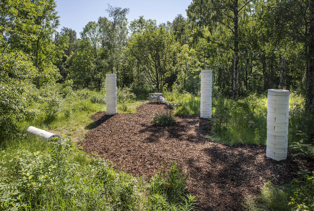
Teemu Lehmusruusu: House of Polypores, 2021 ©Maija Toivanen/HAM/Helsinki Biennial 2021

Teemu Lehmusruusu: House of Polypores (2021)

A hybrid of natural processes, research and sound, the Helsinki-based artist’s installation is given anthropomorphic qualities as it listens to decaying trees before converting the noise into music. The work is likened to an instrument made of soil, and visitors are invited to touch and place their ears onto the large tubular structures to listen to its deep and vibrating hum. There are four structures in total, each of which is crafted from mushrooms, electronics and decaying wood. 

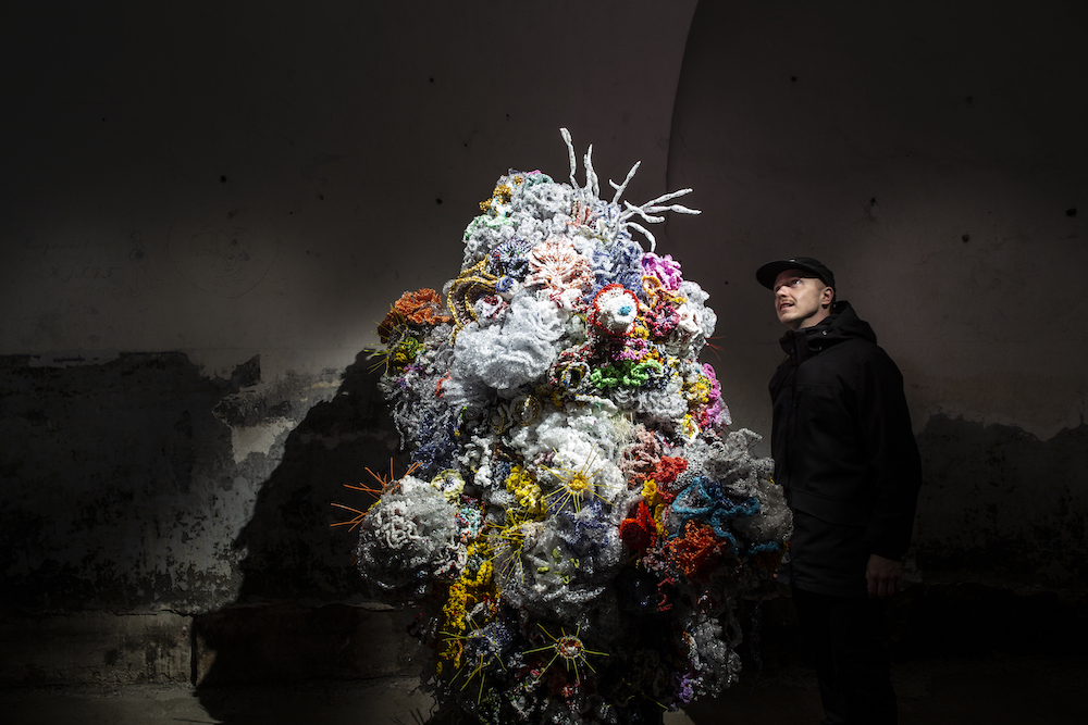
Margaret & Christine Wertheim and the Institute For Figuring: Helsinki Satellite Reef, 2021 ©Maija Toivanen/HAM/Helsinki Biennial 2021

Margaret & Christine Wetheim: Crochet Coral Reef, The Helsinki Satellite Reef (2021)

The world’s coral reefs are depleting, suffering greatly from pollution and heat exhaustion as a result of climate change. This handmade crochet piece, crafted by two LA-based sisters, is a passionate response to the matter; it reflects on the long process of building the sculptures as well as the lack of time that animals (and the reefs) have on our planet. The project has travelled to New York, London, Riga and Abu Dhabi in engaging with more than 10,000 participants; the sisters will also work with local Finnish communities to crochet a reef in Helsinki.

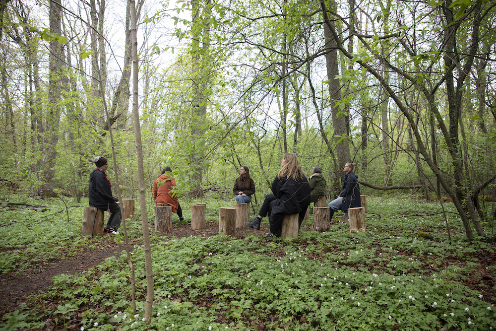
Janet Cardiff & George Bures Miller: FOREST (for a thousand years…), 2012 ©Maija Toivanen/HAM/Helsinki Biennial 2021

Janet Cardiff & George Bures Miller: Forest (for a thousand years…) (2021) 

In a calming corner of the island’s woodland, an immersive sound installation encourages its visitors to perch on tree stumps as they listen to various sounds: aircrafts flying above, birds, explosions and choir song. The Canadian artists’ work comments on the sounds that a forest will hear in a lifetime and, in this case, the different points in history for Vallisaar. Its listeners are exposed to yelling, screaming and gun fire, but equally they are connected to the trees around them, personifying nature as a delicate and fragile entity. 

Mabel, Betty & Bette

Yelena Yemchuk’s mixed-media project delves into the identities of three make-believe characters

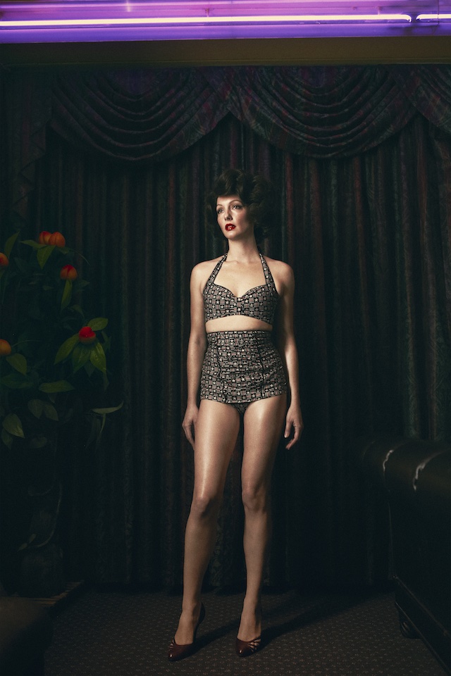
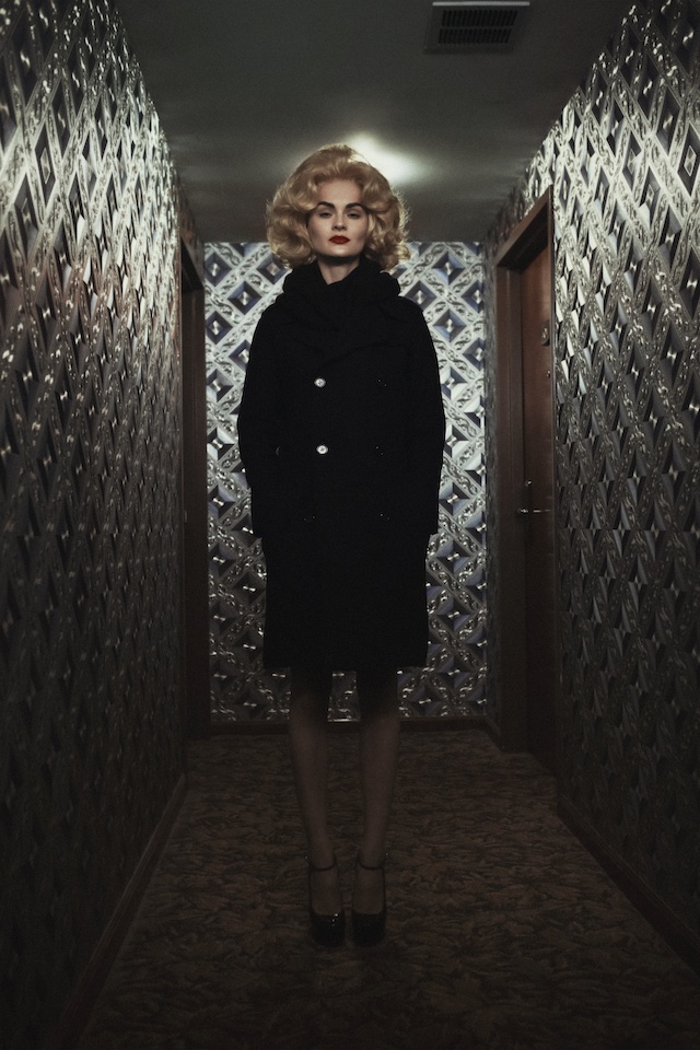
In a time not too long ago, Yelena Yemchuk had found herself at a flee market, marvelling at a collaged photograph she picked up of two girls sitting on a sofa. Their heads had been replaced by starlets from the 1950s, think Elizabeth Taylor, Grace Kelly and Marilyn Monroe; the famed and beautiful symbols of golden era Hollywood. It was in this very moment that Yelena, a visual artist from Ukraine who immigrated to the US at the age of 11, started to think deeply about the context of identity. “Who are we? And how much of it is based on the society that we live in, and how thin is the line between dream and reality?”

To answer these questions, Yelena began working on Mabel, Betty & Bette, a mixed media project that delves into the lives and identities of three make-believe characters. Played by a cast of models dubbed after popular names in America during the 1950s, the subjects – who are adorned in wigs and garb from this era – are composed from Yelena’s childhood memories of these “otherworldly women” she saw in postcards while living in the Soviet Union. It’s a marriage of fiction and hyperreality, and a commentary on what defines us beings in a certain time or place. Below, I chat to Yelena to hear more about the project.

What inspired you to start Mabel, Betty & Bette; why tell this story?

Mabel, Betty & Bette began quite by chance. I wanted to start a new project that was more fictional and had a narrative. I’ve always been fascinated by the mystery of time – the meeting of the dream world and reality – as well as disguise, a different appearance in order to conceal one’s identity or become someone else. I wanted to capture the psychology or the dream states of a person who is at loss with their identity. I wasn’t sure how to go about starting this adventure and, by chance, I found a photograph at a flee market; it was a collage where two girls were sitting on a couch and their heads had been replaced by 1950’s starlets.

It set off a bunch of ideas about identity, about the complexity of self and the projections of self and society. I wanted to explore this vulnerability and this confused state of identity: who are we and who do we try to imitate in our daily life? Who are idols and why have we chosen these particular stereotypes? I started to question the loss of self and what being vulnerable means. Thats how it began. 

Who are Mabel, Betty and Bette, what do they represent?

I created three fictional characters. I looked up popular names from the Americana era of the 50s. I wanted to create these characters from my memory as a child, of these otherworldly women that I saw in postcards as a kid in the Soviet Union – those Western ideals mixed in with the Italian and French actresses like Sophia Lauren, Brigit Bardot and Elizabeth Taylor. It was this mix of fantasy as well as a certain kind of sadness and strength that I remembered as a kid in their faces, so different than the images of the ideal Soviet women.

Also, my immigration to the United States at such a fragile age of 11 played a big part in the project. When one is changing so quickly as a pre-teen, and then to all of a sudden be in a completely different world in every way, I think that has triggered a lot of these questions at an early age. And once I started making art, those questions became part of my work. Who are we? And how much of it is based in the society that we live in, and how thin is the line between dream and reality?

You’ve cast over 50 women for this project, where did you find them and who did you want to photograph specifically?

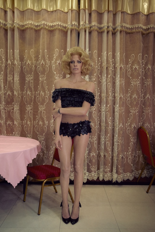
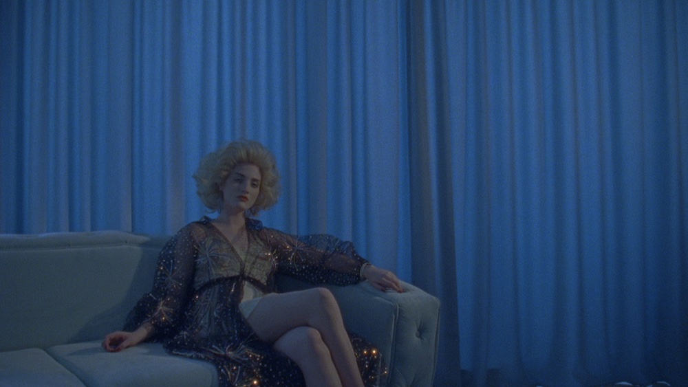
Each photograph portrays one of the three fictional women – Mabel, Betty, or Bette – as conveyed by a cast member in one of three corresponding wigs, playing out three different storylines written by me. I casted mostly recognisable fashion models (which was also the first time I worked with models for a personal project). Rarely seen as themselves, these women are a template upon which ideas are formed. Their inclusion in this project was a knowing gesture towards the continued malleable nature of female identity in the 21st century. 

I contacted a lot of models that I have worked with though various projects, but the process had to be changed when the shoot was taking place. Destabilising their own working process to intentionally disrupt them from their known actions and poses, I worked quickly (no more then 20 minutes per shoot, sometimes only five minutes) and in scenarios that were often unknown to the model. For the moving image part of the project, the short film that was shot in Odessa, Ukraine, and I worked with one women, an artist Anna Domashyna, who played all three characters  


Can you talk me through a couple of favourite images from the project?

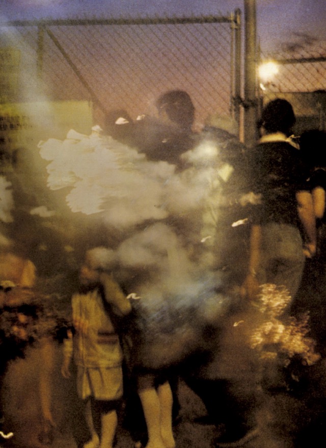
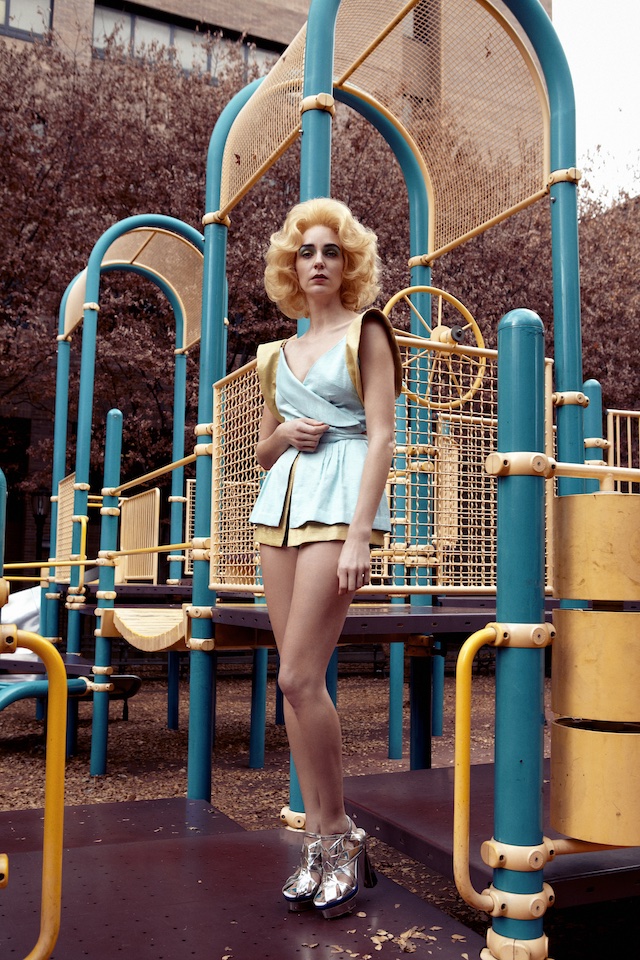
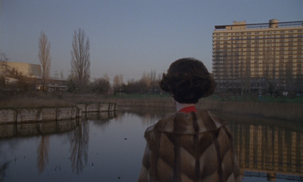
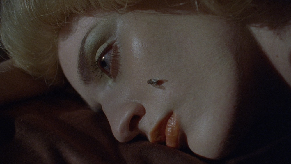
I am going to pick three different medias: a photograph, a collage and a film still, since all three makeup the project. This image of Hannelore was taken in a playground around the corner from my house, and Hannelore is someone I’ve worked with a lot and I’ve always admired her as a person, and as a model. She was one of the first women I asked to be in the project. I knew she would trust me to put her in this strange disguise and understand this feeling that I was trying to portray for each of the women: this moment of change, crisis or loss of self; this intersection between dreaming and waking, and the alarm and confusion that accompanies the void.

The film for the project was shot in Odessa, Ukraine. I met Anna while photographing her for a book that I am doing on Odessa, and I was immediately blown away by her. It was like she embodied all the three women in one – her being so otherworldly in every way. I asked her if I could take her picture for the project and showed her some images I already took. She looked at them and said ‘yes I get it, I am the girl’, and I said ‘yes you are!’ Six months later and I was back in Odessa to make the film with her. This is a still from the film I love, you can’t see her face but you can feel the story unfolding from her gaze in what she is seeing. There is a sense of mystery and nostalgia.

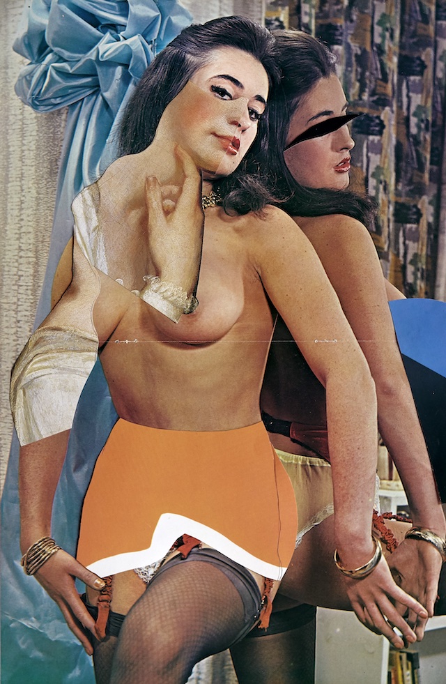
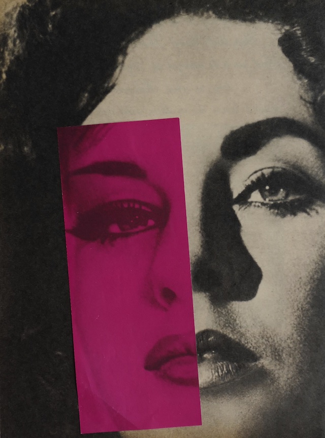
The collages came as the last part of the project. Bauhaus, surrealism and Dada deeply influenced me as an artist, and those were my original inspirations when I started making art. In my working process, chance encounters and subconscious influence are always present – while details from my dreams as well as a large cultural anthology of images come into my practice. Working from my archive of old media as well as new materials, I found Soviet Life as well as Hollywood Factory magazine. These collages came to life by splicing Brigit Bardot in half, and I placed her with an image of Elizabeth Taylor. The two women appear as one and as a collage from the cover of Mabel, Betty & Bette. Symbolically their shared features speak to a form of representation that I am interested in analysing.

Painting: Toshio Shibata

Chose Commune unearths 16 previously unpublished works from the contemporary Japanese photographer, best-known for his painterly depictions of rural landscapes

Photography and painting have an undeniably tender relationship. In a time before the camera, realistic imagery would be produced by artists, employing a brush to hand and putting to use a mastering eye of realism. Now, in a world over-saturated with imagery, it’s hard to imagine a time when the long and intricate process of painting was the only format of replication – witnessing the skill and patience it would take to craft each stroke, gesture and expression. But the influence of both mediums works twofold, and the earliest practitioners of photography turned towards painting to find their subjects, be it a still life, landscape, nude or portrait. 

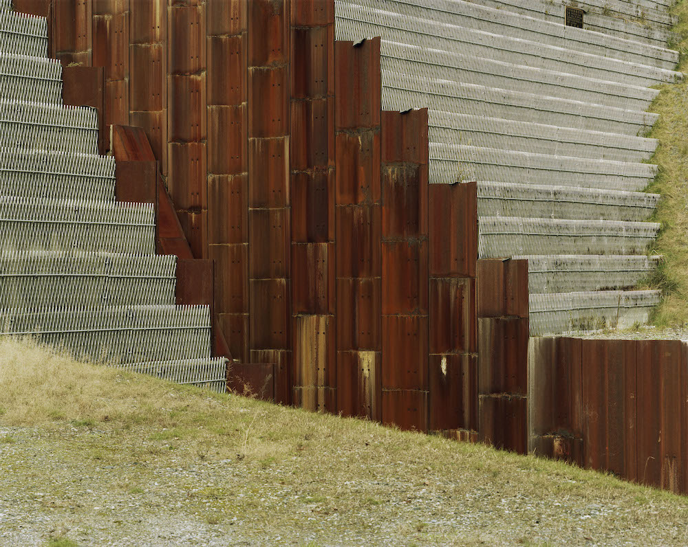
So when photography presents itself in a way that correlates highly with the process of painting, something wonderful happens. Your mind is instantaneously transported into otherworldly places; the locations which seem unfathomable, too scrumptious, too perfect, too colourful or vivid. Toshio Shibata is a photographer who’s mastered this canon, and he’s spent a healthy career perfecting the marriage of abstraction and realism through his camera. A contemporary Japanese photographer, he’s best-known for his large images of civil engineering in rural Japan, where manmade constructs are paired eloquently with notes from the natural world, causing ripples in light and sheds of water as they pass and flicker through the structural compositions of humankind. Dams, lakes and water ways are synced with the earthy notes of the environment; but rather than viewing these opposites as two juxtaposed elements in his work, Toshio depicts them in unmatched harmony.

You’d be unsurprised to learn that Toshio’s career first began in painting, having graduated with a BA and MFA in the subject from Tokyo National University of Fine Arts and Music. After leaving Japan in 1975 to pursue his studies at the Royal Academy in Ghent, Belgium, that’s when Toshio decided to test his hands at painting and printmaking, later discovering his interests in photography. Gas stations were his primary subject while making his debut into the medium, but it wasn’t long until he’d moved onto the landscapes of Japan, documenting the fine moments where the artificial and natural collide. To such success that Toshio received the Kimura Ihei Award in 1992, and he’s also had works exhibited internationally since 1971, including a solo show at Tokyo Metropolitan Museum of Photography; the Sprengel Museum in Hanover; the Centre National de Photogoraphie in Paris and many others.

In a new book published by Chose Commune, 16 previously unpublished colour works are brought to the surface in an artful curation of his finest and meticulous compositions. Aptly titled Painting, the publication turns an ultra-fine lens onto the more abstract and painterly of his pieces, and is designed in concertina format – to represent the kakemono, a Japanese unframed scroll painting. Below, I chat to Cécile Poimboeuf-Koizumi – director and co-founder of Chose Commune alongside Vasantha Yogananthan – to hear more about the publication. 

What inspired you to make this book?

I had been looking at Toshio Shibata’s work for a while but the idea of making a book came quite late. When I decide to reach out to an artist and propose a book, the intention has to be quite strong. When artists have never made a book before, it’s easier. The lack of an existing book on an important work is a good enough reason to make a book. In the case of Toshio Shibata, he had already made quite a few monographs. I asked myself: “why would it be relevant to release yet another book?” Including new and/or unpublished photographs can be a good reason. But I thought it would make even more sense if the concept was innovative and strong. I started selecting over 50 images and in the end, I kept only 16 and imagined this very tightly edited book that can also be turned into a kakemono (a Japanese unframed scroll painting made on paper or silk and displayed as a wall hanging).

What is it that you enjoy about Toshio Shibata’s work specifically; is it the subject matter, the aesthetic or process, for example?

I have always admired Toshio Shibata’s work for the quality of the composition in his photographs, as well as his prints. His colour work is fantastic. Also, although Toshio Shibata is best known for his landscape photographs, I was more drawn to the more abstract ones, when Toshio Shibata’s lens is closer to his subject matter and the photographs become a mysterious abstract composition. 

The book unearths 16 unpublished colour photographs, why bring these into light now?

Bringing those 16 unpublished colour photographs is a personal choice. It could have been any 16 other images, and my only guide was to choose the most abstract ones. This was also a reference to Toshio Shibata’s interest in painting, which he studied before he took on photography. This intention gave its title to the book as well: painting, as in the act of painting. For me, Toshio Shibata photographs the landscape as a painter would paint it: carefully choosing his colours from a palette, and bringing a lot of detail and texture to his compositions. 

Talk me through the design of the book, why make the comparison to a concertina and kakemono? What does this add to the presentation and interpretation of the artwork?

The book was designed as a concertina book, which means that one can unfold the book and discover the whole sequence. It’s a very different experience from actually turning the pages of a traditional book. The sequence is uninterrupted. 

But I thought it would also be interesting to give a vertical reading to the images, as a hint to Japanese scroll paintings. When hanging on a wall, the eight images on each side become something else. One doesn’t really read them as eight single images anymore but as one larger abstract image. The multiple readings of the images add an interesting layer to the interpretation of the work. 

What about the structure, was there much consideration to the order and placement of each image?

Yes, the order and placement were carefully thought through. My partner, the photographer Vasantha Yogananthan, pitched in for that. It was like a puzzle: we moved around the pieces, and found the harmony and connections between the shapes and colours. It was like composing another image from existing images.

Can you pick out a couple of personal favourites from the book and talk me through them?

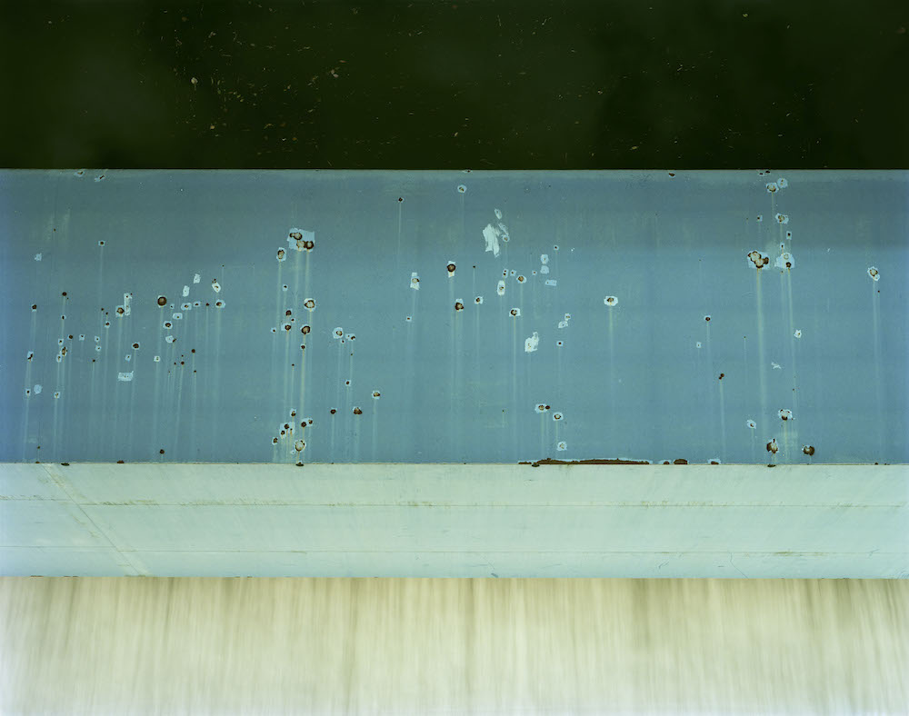
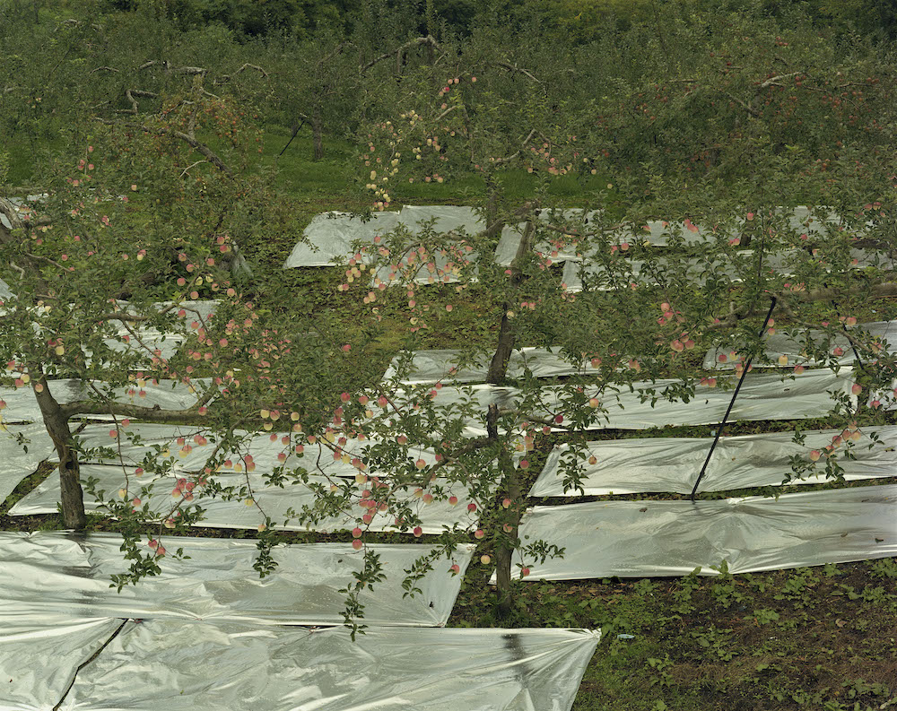
16 images isn’t much, so I guess they’re all favourites. But if I had to pick only two, I would say the apple tree and what I call the “blue canvas with holes”. I wouldn’t know how to explain it. I think I like how the apple tree is a figurative photograph, but the bright apples looking like distinct dots of colour in the branches make it look almost like “pointillism”, the painting technique branching from Impressionism. And the blue canvas is the photograph that looks the most like a painting, almost like a Mark Rothko who’s one of my favourite painters of all time. 

How do you hope the audience will respond to the work?

As a publisher, it’s always impossible to predict the response to a book and the work inside. It’s daunting and magical at the same time. 

Painting is available here.

Can you see me now?

Brunel Johnson’s four-part series provides a necessary platform for Black and minority ethnic groups

Many of Brunel Johnson’s ideas tend to formulate in the shower – it’s where he devises some of his best work. In the past, there’s been Dream, a project documenting the Pembury Estate in Hackney, photographing and videoing young women playing estate football. There’s also the countless sports, commercial, lifestyle and documentary photography projects, that each depict his notably candid style of image-making and, more importantly, his view of the world. It’s my Hair is another fine example, an ongoing project that aims to show the time, effort and skill that goes into maintaining Afro hair. 

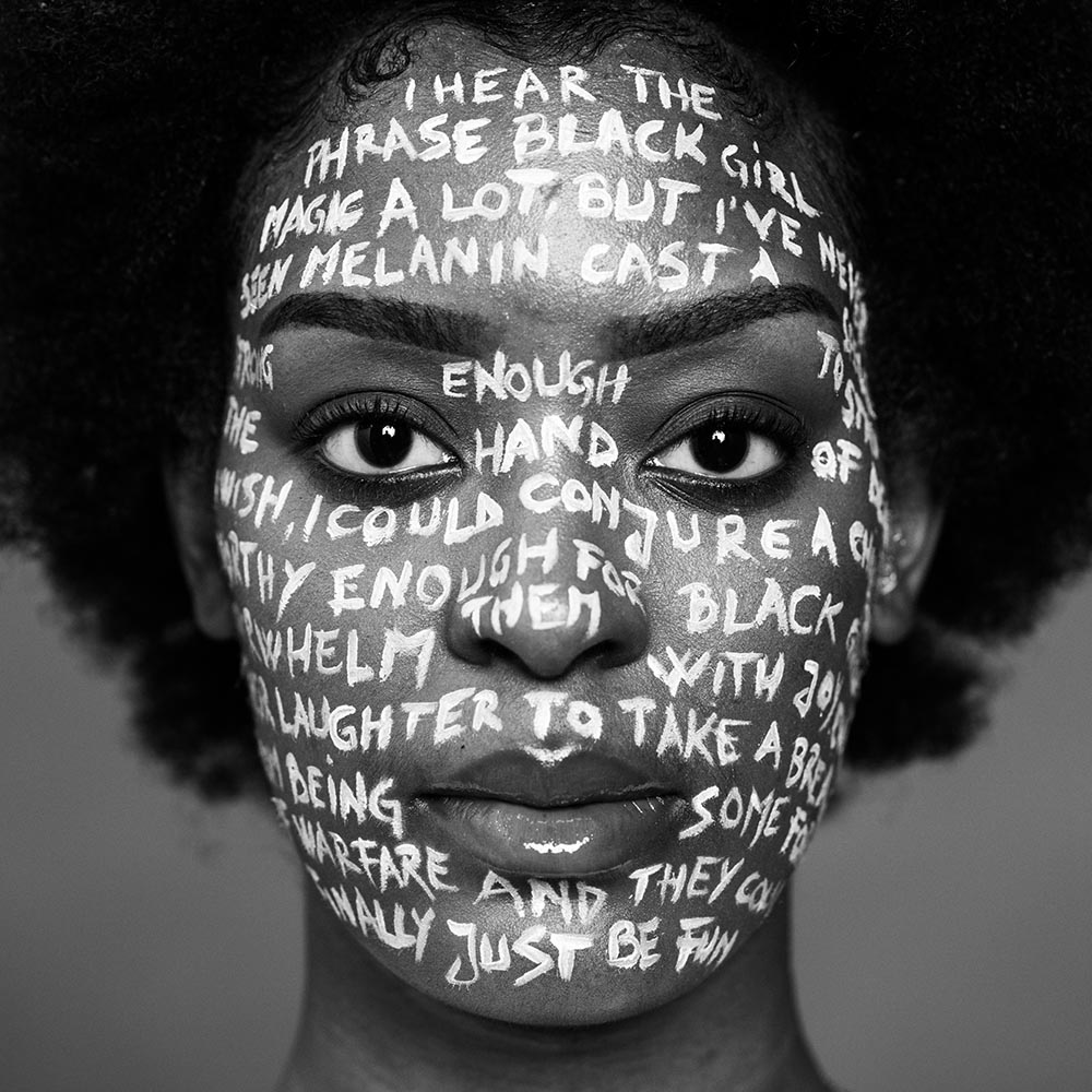
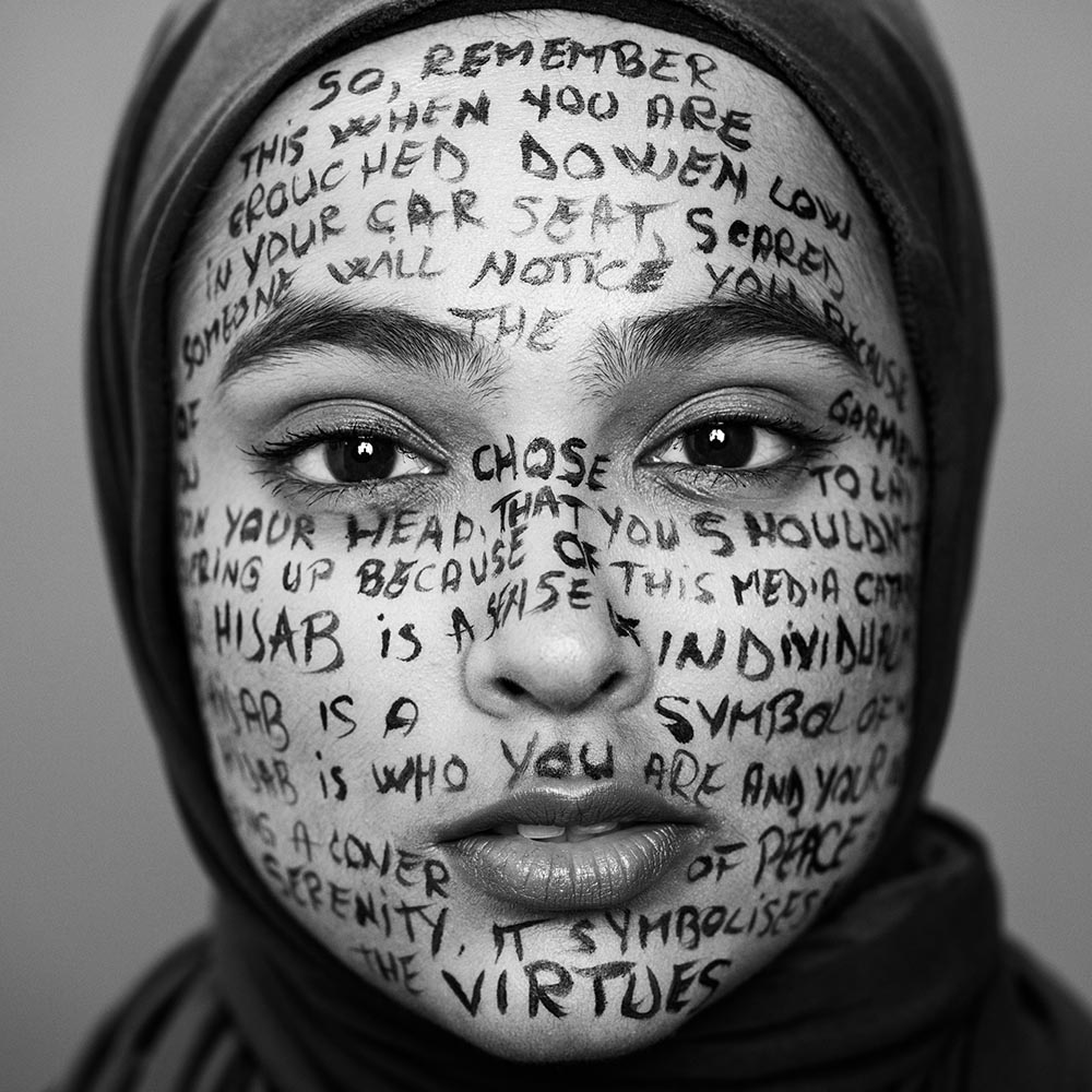
Whether it’s a still or moving image, Brunel’s shower-formed concoctions are deeply powerful just as much as they are empathetic. And Brunel’s most recent endeavour is a fine paragon of his goals as a self-taught, documentary photographer-turned-filmmaker. Titled Can you see me now?, the project is a four-part series produced and directed by Brunel himself, that aims to provide a space for Black and minority ethnic groups to tell their stories. For him, creativity is an apt tool for telling these narratives and to ultimately steer change. So by working with a solid team – including Milo Van Giap as the DOP, plus charities Rise.365 and Re:Sole and United Borders – Brunel has cast an array of real-life people with lived experiences to share, heightened by his artful use of mixed-media and 1:1 format. The result of which is a compilation of four films, Young Black Man, The Beauty Of The Hijab, Black Girl Magic and CHiNK. Below, I chat to Brunel to hear more about his impactful series.


First, tell me about your ethos as a photographer.

I strive to capture the mundane moments of daily life in an authentic and raw way. If I’m working on a project, I’ll always try to draw out the moments that tell the story I want the audience to see best. My goal as a photographer is to change the narrative that surrounds Black and minority ethic communities. I want to change how we’re shown in the media and how our stories are told. So I strive to bring out the stories that I believe the world needs to hear and see without tainting it from a biased gaze. 

When did the idea arise for Can you see me now? Why tell this story?

It actually came about while I was in the shower (a lot of my ideas happen there). Being a Black creative in this industry can be frustrating, as not only do you have to deal with basic day-to-day struggles of life, you also have to deal with the stereotypes, your work being deemed irrelevant, being labelled unprofessional for stating your mind and making a stand for what you believe in, being randomly stopped and searched because of a vague police description as you walk out your front door. 

All these things and many more make you realise that you’re in a constant upward struggle to achieve a basic human right – to just live. And this can really take a toll on you mentally. Simply screaming, complaining and protesting gets you easily labelled and tossed aside. So how do you tell your pain, struggles and experiences while making those who wouldn’t normally listen, listen? It has to be done creatively. In my opinion, anyway. I believe these stories are important and need to be told, especially with how the world is right now. The mic isn’t being given to those who are truly affected and that needs to change. How will people understand what is happening in these communities if it’s always the white gaze of the media telling us what they think we feel? 

What are your reasons for incorporating mixed-media, and what does this add to the narrative?

While planning this project, I wanted the message to be delivered in a way that hits the viewer from multiple angles. I’ve seen this format done many times before, but I wanted to do it differently. Sometimes the visuals are dope but the poem is a bit meh, other times it’s the visuals that are meh but the poem is dope; I wanted to create something that was both visually and audibly dope yet still digestible. 

As a documentary photographer, I know the face and eyes tell a story and are probably the most captivating part of the human body. I saw the face as a blank canvas that I could use to tell the story with words, and would visually have the viewer spending more time staring at the photo. I didn’t want the viewer to come up with their own interruptions. The monochrome palette and 1:1 format were important for me. I acknowledged that, for some reason, whenever we talk about race, despite its complexities, it always somehow boils down to Black and White, so why not have visuals like that too. The 1:1 format was to create a box, symbolising the stereotypical box many of us have had to live our lives in, but now we were taking control of this box and using it to our benefit, to tell our stories. I made the subjects stare directly into the lens to prevent the viewer from looking elsewhere. The subject is in front of them and there’s no escape; it’s time to listen, read and see what they have to say. 

How did you land on the subject matter, and what do these topics mean to you? 

I decided that I wanted each piece to be direct and unapologetic of how these communities really feel. For the young Black man part of the series, I drew upon my personal experiences and had a friend who is a poet write it out as a spoken word. With the other parts of the series, I spent time speaking to people from those communities to educate me on their experiences, their feelings and what they’d like to say if given the platform to. 

I really enjoyed this process because, for example, with Black Girl Magic I was going down the lines of Maya Angelou and the strong Black woman narrative. However, after speaking with Black women, many said that the era of the strong Black woman had passed and that they wanted the world to know that they experience other feelings too; that they cried, laughed, felt anxious, scared, fatigue and more. So making this a reality was incredible. It was the same situation with CHiNK and The Beauty of The Hijab. One thing I made sure of was that each poem was written by someone from their respective community. This is why I decided to call the series Can You See Me Now? I do what I do so I can learn more about humanity. Each topic for me is an opportunity to learn, to find common ground and build bridges. 

What’s the main message with this powerful series, what can the audience learn? 

Can you see me now? Am I visible now? Can you feel and understand my pain, struggles and experiences? It’s to be visible. I hope the audience can relate to the series and feel a sense of relief that maybe how they’ve felt is finally being put across, and those who haven’t experienced the things said in the series become more understanding and accepting to the fact that they do exist and are happening. 

Film credits:

Producer, Script Writer, Director: @bruneljohnson
DP: @milovangiap
Sound & photographer: @bruneljohnson
AC: @notsergioh
Lighting: @flapjacksss & @milovangiap
Makeup: @ioanasimon_mua @madalina_petreanu
Editor: @jfroudy
Sound Engineer: @flynnwallen
Retouch: @alberto__maro @isahakeemphotography
Runner: @soyd1416

Models: @lenaelghamry @sadiqa.e @_shazfit @alex_fergz @da_bf9 @mrbonsu @proscoviauk @doggsza @jaychelle.1 @youngshahid @belliebooze @_purnimaraicreates @w.cui Gladys & Sandro.

Poems by: Yumna Hussen, @ashleybelalchin @thejasminesims @belliebooze

Brunel Johnson is represented by Studio PI, an award-winning agency with a diverse roster of talent from the most under-represented sections of society


Mundane

Mariam Adesokan’s two-minute short reflects on the idleness and contentment of lockdown

It had been years since I last picked up my crochet hook, which tends to live untamed under the bed with its family of wildly knotted yarn. But as soon as the lockdown first hit, it was time to revisit this old friend, testing my hands with a few simple and tiny bags. It had also been years since I’d felt the smoothness of wet clay; I’d forgotten what it was like moulding something – a bowl, candle holder and dish – out of bare fingers and a splash of water, and how satisfying it was to build something useful. 

It had been years since I last felt comfortable with doing nothing, knowing that everyone else was doing the same. The dread and gut-wrenching perception that others are having more fun than I am, or that I’m missing out constantly – even if there’s nothing going on – had been stripped away. It was a good feeling, even if it was just momentarily. Dancing had been swapped for the kitchen, but it was a welcomed turn for a little while. 

These are a handful of familiar moments that are brought to the surface as I consume the slow and beautiful scenes of Irish-born and London-based Mariam Adesokan’s new short film, Mundane. Made in collaboration with two close friends – DOP Jojo Bossman and Uzi Okotcha who plays the protagonist – it was devised during lockdown in a similar time of idleness and strange bliss. Like Uzi in the film, I too felt myself fall into this unusual state of contentment, returning to old hobbies and searching for some form of creative entertainment; the things I hadn’t had the time to care about in the chaos of adulthood. But that’s not to say that my personal experience had been without sadness or grief. In fact, that’s not to undermine anyone’s sadness or grief; it’s been a struggle for all over the course of the pandemic. However, just like the key touching points in Mundane, it was a chance to change pace; to find some peace in the disconnect from what was previously a hectic routine.

I wasn’t one for making bread or going for daily runs (the latter had been tried, tested and failed), and instead I’d turn to music and crafts. In Mundane, there are scenes akin to my own experiences as the character sits solemnly at the bed, moving to the sound of nearby music. It’s relatable; no performance, no awareness of her surroundings; just the self, the sounds and movement. The film then flickers – brashly but artistically in a simple hue of monochrome – to other moments. Smoking in bed, cosying up for a nap, and more or less doing nothing. How often is it that we can do things like this, without regret or fear of being judged?

When I ask Mariam about her reasons for making this film, she responds stating that it came from a period of reflection and relatability. “I thought of making this film to embody what I and a lot of others were experiencing at the time; sitting at home or living a very stripped back life due to Covid-19 was something I thought would be nice to show on screen in snapshots. Alongside this, I created the film because I needed something to stimulate me.”

Mariam sees the period of lockdown as being a bit of a blur, which is something that myself and I’m sure many others can connect with. That want to fill the day with more than just wading around the house hopelessly, and responsively steering towards sleeping, cooking, breathing, being and, in Mariam’s case, “a lot of introspection”, “crying and of course eating”. She was also studying for a BA in Architecture at Central Saint Martins during the year’s events and, with classes moved on online and all social aspects removed, this would naturally spur on some bizarre emotions. “I got through it in the end,” she adds, “and 2020 was probably the most fact-paced year I’ve experienced weirdly enough.”

And now, after what’s been an anomalous and indeed fleeting year, she has two-minutes’ worth of contemplation to refer back to. Like a bookmark logging a moment in hers and our lives, Mundane reminds us all to find the positives in dark times like this. “The film is everything that I (or we) do day-to-day but just depicted on screen,” she explains. “I suppose I wanted to highlight the really small ritual things that we tend to do, the things that are so essential we almost forget how essential they are.”

“This film was a pandemic project depicting the pandemic; when I made this film with Jojo and Uzi, we had conversations about being content with not necessarily being as social as we used to, or even indulging in habits that were encouraged pre-Covid-19. We all thought solitude and being alone was really important, and I know a lot of us had a tase of that last year.”

Greco Disco

Port and Oliver Peoples meet with artist and designer Luke Edward Hall to discuss interior design, historical influences and the magic of Italy

The illustrated figures by Luke Edward Hall have the facial features of a classical portrait bust, although their luxuriantly coiffed hair, stark jawlines and Greek noses are all sparingly rendered with only a few strokes. They possess a composed sense of purpose, not unlike the artist’s own, but whether poised with martinis at a bar or gazing at a sea view, their eyes communicate a melancholic impassivity, evocative less of sadness than of listless longing. Steeped in an unnamed nostalgia, theirs is an idealistic beauty that appears to have been at first entirely enervated and then brought back to life through bright colours and delicate floral arrangements.

Shirt, tie and boilersuit Gucci

At the age of 30, Hall has created a brand out of this mix of the frivolous and sophisticated. He suffuses the style with references, most obviously to antiquity, and uses classical imagery as a shorthand for all things worldly and refined. The root is his interest in mythology but, as the name of his newly published book Greco Disco suggests, he is alluding to a more modern interpretation, in which Graeco-Roman tradition becomes a set of stylised motifs. Whether as a pattern or print, Hall applies them with playful, contemporary twists. “I think design can be very serious, very boring, and I’m trying to inject a bit of fun. It’s not about going crazy. I’m still quite careful with it.”

Shirt Drake’s, jacket Lanvin, trousers Basic Rights

The cartoonish simplicity of Hall’s drawings also recalls Jean Cocteau, and the occupants of some of his more isolated scenes are imbued with the same emotional ambiguities that appear in the work of Patrick Procktor or John Craxton. Others languish in a sensuality more closely connected to Duncan Grant. The man himself is regularly decked out in pastel pink trousers, busy seater vests and trademark optics, making the collaboration with Oliver Peoples a natural fit.   

Shirt, jacket and trousers E.Tautz

Though Hall is quite clearly informed by the past, his sketches have an unpretentious, off-the-cuff immediacy that he developed while producing designs for his Menswear degree at Central Saint Martins. It was there that a burgeoning aesthetic found its physical form in the medium of the sketch, which lies at the heart of the many high profile design collaborations he is best known for. Among these are slippers for Stubbs and Wootton, cushions for The Rug Company, stationery for the RA, tableware for Richard Ginori, ceramics for Liberty and a furniture line for Habitat. In a studio filled with magazines and mood boards, there is rarely a day where Hall can’t be found leant over paper with a pencil in hand. “Most things I do, whether it’s an interior or art or ceramics, will start with sketches. There’s always something to be sketched out.”

Shirt and trousers Basic Rights, shoes Luke’s own

Hall’s student days foreshadow the diverse nature of his practice now, and he originally moved to London from his hometown of Basingstoke with the hopes of studying Graphic Design. He had been a voraciously artistic child who drew in his spare time and, looking back now, he sees threads that have survived. “It was very cut and paste and collagey and a lot of my work now is like that still. It has a slightly DIY aesthetic.” In the end he opted for Fashion Communications after his Foundation year, a decision perhaps foretold by a fashion and art fanzine he set up at the age of 16. He would eventually switch to Menswear but spent his final few years tracking down antiques to resell online. The business, which he oversaw with a friend and his boyfriend, the interior designer Duncan Campbell, was more a way to stay occupied than a serious side hustle. “I’ve always loved doing a lot of stuff at once. It was never going to make us lots of money, but it was a fun little project.”

Interning at a clothing company immediately after graduating in 2012, Hall grew disenchanted with fashion at the same time as he was approached by an architect and interior designer who had found him through his website. What followed was a two-year apprenticeship, during which Hall learnt not only the practicalities of running a business, but a whole new set of historical references. He now cites David Hicks, Madeleine Castaing, John Fowler and Dorothy Drapers as inspirations for his interiors. At the same time he started making ceramics and continued selling artworks online, this time his own prints and illustrations. As soon as he began receiving a reliable stream of commissions, he struck out on his own as he’d always planned.

Much of what Hall attempts to evoke in his drawings is a time and place, one that relates to his experiences but takes on an otherworldly aura in memory. “I like the idea of being taken away to someplace magical. Italy has been a huge inspiration… the people, the food, the culture and history.” More than a mood, Hall is establishing a certain lifestyle. It harks back to many of Hall’s heroes, from Cocteau to the Bloomsbury Group and, above all, to the diarist and designer Cecil Beaton. The artistic London milieu that the latter inhabited during the interwar period included socialite Stephan Tennant and designer Oliver Messel. It provides a romantic vision of a life in which work and relaxation cease to be separated. “They were working in such different fields. Sometimes, when I get stressed about doing too many things, I look back at those people.”

In as much as we can imagine Beaton in the 21st century, Hall’s presence on Instagram may provide some clue. With 85k followers at the time of writing, his ability to embody and live out his aesthetic has been an easy hit on a platform that rewards aspirational content. Not merely a portfolio of Hall’s work, the page also offers followers a glimpse of his private interiors, holiday snaps and even Hall and Campbell sharing an intimate candlelit dinner. “I like Instagram’s that aren’t very curated, that are not perfect. Those are the ones that feel most real.” He is keen to stress, however, that it is an edited view: “I show our houses because my job is making interiors, but I don’t write a weekly blog about my feelings. You’re also not going to Instagram from a hungover Sunday in bed. I mainly just try not to take it too seriously. It’s a great tool and I like using it, but it’s not the biggest part of what I’m about.”

Shirt and tie Drake’s, jumper Gucci, jacket E.Tautz, trousers Basic Rights

Sighting the inside of Hall’s North London flat, where he lives with Campbell, attracts followers for its colourful schemes and surfaces liberally scattered with objects. It’s a curiosity that Hall understands. “What I find fascinating with interiors is how people express themselves through what they live with.” So what can his interiors tell us about him? “People ask what I would save from a fire, and I’m not really that attached to big pieces of furniture. I’m more attached to little things that have stories, like a figurine I picked up at 18 when I first went to Rome. It’s that connection to things I’ve done, people I’ve met, places I’ve been.” The objects that Hall collects have a modest charm, and there is something folksy about his preference for novelty ceramics shaped like vegetables and rare art books. What moves him most though, is colour. “I find it very transportative. Our hall at home is painted in egg yolk yellow and when I come home I’m instantly taken somewhere happy.”

His approach to colour is spiritedly experimental, and one past mistake he admits to is the choice of “really intense barbie pink” for the couple’s living room. “It turned out so headachey, it was like being in a highlighter pen.” Hall switched it for a softer version, noting, “Sometimes you mess up but you can always repaint. It’s not the end of the world.” Hall leaves no room ever truly finished, an approach that challenges conventional wisdom about the purpose of interior design. Each project remains open ended and Hall’s latest struggle has been getting a newly acquired country house, on the Gloucestershire-Oxfordshire border, ready to live in from scratch. “When you’re mixing together colours and furniture from different periods it is quite tricky to do in a short period because ideally you need time to reflect on it, bring different pieces in and try stuff out.” Plans for a dark brown guest bedroom have so far been stalled for fear of complaints.

Shirt Drake’s, jacket Lanvin

The challenge has parallels with Hall’s latest professional project, an entirely renovated hotel in Paris’s 10th arrondissement that is set to open in the spring. As well as doing the interiors, he is art directing the branding, uniforms and stationery. The project satisfies his lifelong urge to build a complete world from the ground up, but is testing his eye for detail. “It’s a lot of sitting down and looking at fabric samples and light fittings. The challenge is to create an atmosphere through furniture, wallpaper and objects.”

To focus on the project and promote his new book, Hall, who also writes a weekly column for the FT’s House & Home, is momentarily slowing his uptake of new commissions. Asked if he considers himself an entrepreneur, he admits to loving a spreadsheet but adds, “when I was younger I got a bit caught up worrying about what to be seen as and now I don’t mind. I just do what I do and I enjoy all the aspects of it.” As open to new opportunities as ever, he is keeping his plans for the future intentionally vague – “I’ve been on a winding path to get here and I think I’m just going to continue on that.”

Stylist Rose Forde
Assistant stylist Sophie Tann
Photographer Issac Marley Morgan 
Grooming Hiroshi Matsushita 
 
Film Production Company – Black Sheep Studios
Film Producer – Rory Reames
Film Director – Harry Bowley
DOP – Lorena Pagès 
Camera Asst – Carmen Pellón
Sound Recordist – Nick Olorenshaw 
 
Luke Edward Hall wears Oliver Peoples Coleridge opticals and sunglasses throughout