Elements: The Beret

Port’s fashion features editor, David Hellqvist, reflects on the long, colourful and not completely French history of the beret

‘Homme au béret basque’ by Picasso Pablo. Courtesy of RMN (musée Picasso de Paris) Photo (C) RMN-Grand Palais (musée Picasso de Paris)

Picture a beret wearer in your head and they’ll most likely be French. Perhaps they’ll be in a striped Breton top, if you believe in stereotypes. But if you were to trace the hat’s history, you’ll find that it’s got as much to do with Spanish fashion as with French mode.

The two often overlap, as was the case with French-Basque tennis player Jean Borotra, who famously wore a blue beret while playing at the Wimbledon championship throughout the 1920s. It was Borotra that helped popularise the beret internationally, bringing it to an audience outside of France and Spain, where it has been commonly worn since the 13th century.

But the beret has always had an artistic air too, which only makes its affiliation with elite special forces around the world even stranger. This mixture of the intellectual and the macho means it is an alluring piece of clothing to work with today, as proven by Isaac Larose and Marc Beaugé’s Larose Paris brand. Having mastered everything from the trilby to basketball caps, Larose Paris now also offers berets, with or without its signature zip pocket.

There is no one else, arguably, that personifies the beret and its creative ambitions quite like Pablo Picasso. Born in Malaga in south-east Spain, he spent most of his adult life living in France, where he died in 1973 from a heart attack.

Some viewed him as a sartorial role model as well as an artistic master, as suggested in the 2014 book Institute of Contemporary Arts: 1946-1968. According to its co-author Anne Massey, researching the book unveiled the true power of Picasso’s beret.

“Among the monthly internal bulletins we found one concerning lost property,” Massey says. “It revealed that berets were left behind around the time of the Picasso show – he wore one and everyone was trying to copy him.” Well, we know what they say about imitation…

Take a look at a brief history of the French chore jacket 

The Merchant of Moscow

Madeline Morley discovers how a member of Moscow’s mercantile class amassed one of the most extraordinary art collections of the twentieth century

“If a picture gives you a psychological shock, buy it. It’s a good one.” This was the advice that the great Russian art collector Sergei Shchukin gave his daughter at the turn of the 19th century.

Musée d’Art Moderne Occidentale, Moscow

During the first quarter of the 20th century in Russia, this small inconspicuous man with an uncontrollable stutter – a member of Moscow’s conservative and provincial merchant class – would open the doors of his Trubetskoy palace to the public to share his collection of paintings. Rooms adorned with the sunset palette of Matisse, the distorted perception of Picasso, the looming bodies of Degas and the earthy hues of Cezanne, all crowded under the ceiling’s ornate decor. It was here that a generation of young art students would draw from the canvases they observed and eventually find their way to abstraction.

Since Peter the Great, wealthy czars had supported the arts, but by the end of the 19th century, it was Moscow’s merchants – particularly Shchukin – who were buying the “shocking” work of new French painters, pieces like Matisse’s ‘La Danse’ and Picasso’s ‘Les Demoiselles d’Avignon’ that were scorned by the aristocrats of old Slavic-Russian values. It was well known that only Shchukin’s most sophisticated visitors could get a glimpse of one of his precious Gauguins, which he kept hidden behind a curtain.

He was a unique, open-minded collector, and regularly became close friends with the artists he supported. He would spend hours in front of a painting before he decided whether or not to purchase it, allowing its mood to wash over him.

In 1918, after immigrating to Paris with his family to escape the political upheaval of the revolution, Shchukin’s collection became the property of the state, and was hidden in museum storerooms. Almost 100 years later, the Foundation Louis Vuitton hosted an exhibition of 130 of his collected works.

“Nothing will ever replace the sensitive, invested, courageous and committed eye of the private art collector, enamoured often to the point of addiction and madness,” said the exhibition’s general curator, Anne Baldassari. Ultimately, Shchukin’s talent wasn’t business but instinct, curating and selecting the defining works of an art historical epoch. The show was a reminder of the power and eventual prestige that emerges from making the right choices at the right time.


This article was original published in Issue 19 of Port

Mario Testino on Newton and Nudity

The prolific photographer reveals an intimate side to his work in a bold exhibition of photographs at the Helmut Newton Foundation

The human body is an inexhaustible subject in photography. By blurring boundaries between fashion, eroticism and art, Mario Testino has unravelled the politics and symbolism of the body throughout his work. In an exhibition conceived for the Helmut Newton Foundation in Berlin and its catalogue by the same name, Undressed, the photographer explores nakedness through 50 images from his archive. 

Testino, much like Newton before him, offers an empowering perspective on the body, and where Newton established a confident image of femininity, Testino challenges masculine paradigms. The playful, unfettered atmosphere of his studio is captured through effervescent portraits of anonymous, androgynous men as well as supermodels such as Kate Moss and Amber Valletta, which even at their most daring, never slip into the vulgar. Including previously unseen photographs, Undressed reveals a more intimate side to the photographer’s work and in the process, he too lays himself bare.

What kind of impact did Helmut Newton have on you as a young photographer? 

He had pretty kinky ideas that could well have been seen as vulgar or too pornographic, but because they were presented so stylishly in Vogue it was considered elevated work. Seeing this taught me that, whatever you do, if you do it well and elegantly it can live on its own.

In Ways of Seeing, John Berger makes a clear distinction between nudity and nakedness. As a photographer, how do you negotiate that tension?

To me nudity is the way people are made and nakedness entails a certain provocation. I think both are valid in their own way. Why not provoke when you can?

Does nudity still have the power to shock? If so, where does that fit in with your photographs?

I think that it is definitely less shocking today, although it is still provocative. I find it interesting that male nudity seems to shock more than female nudity. Is it because we are more used to seeing women naked than men? Or perhaps it comes from men being more shy with their bodies? I don’t know.

What was the catalyst for Undressed and how did you approach the selection process?

The show marks a significant point in time for me. The majority of the works in Undressed come from the ’90s, which was a transformative moment in my career. It was a point where I was identifying the new people coming into the industry and photographing them naked. I think in some odd way the nudes I did then undressed me too, of my limits and preconceived ideas about image-making. They influenced and informed the way I did my fashion photographs.

Has hindsight changed the way you feel about any of these photographs? Did anything surprise you? 

It is great to come back to these images after a long period. I realise I have changed a lot since the ’90s, when most of these works were shot. I think back then I was very precise and today I am a lot more open. But I needed that precision to discover the Mario Testino of today.

Ultimately, what would you like people to take away from both the exhibition and the book?

I feel these photographs show a strength in these people, despite being naked. Not everyone feels like that and I would love to feel that people took away some of that essence in themselves. They should be proud of how they are made and gain strength from nakedness, instead of insecurity.

Mario Testino: Undressed is on show at the Helmut Newton Foundation in Berlin until 19 November. The accompanying catalogue, published by Taschen, is out now

Andy Warhol’s Sixty Last Suppers

As Warhol’s final painting goes on show in Milan, curator Jessica Beck speaks about the long-lasting appeal of the celebrity artist

Almost 500 years after Leonardo da Vinci’s masterwork The Last Supper was completed, Andy Warhol unveiled his homage to the Renaissance artist in the form of sixty black-and-white reproductions of the original painting, each stacked together in rows and columns like the outside of a block of 1930s flats. The work was the last Warhol finished before his death just one month after the exhibition opened, adding a degree of mystery to the paintings.

This year, in celebration of the painting’s 30-year anniversary, Sixty Last Suppers is once again being shown in Milan, this time at the Museo del Novecento (in collaboration with the Gagosian Gallery) – a stone’s throw away from Da Vinci’s original.

The original imagery associated with the painting is profoundly religious, yet Warhol’s re-working is viewed by many as a wry comment on cliché and the flippant culture of the modern art world.

Andy Warhol, Sixty Last Suppers, 1986 © The Andy Warhol Foundation for the Visual Arts Inc. by SIAE 2017. Photo by Rob McKeever

However, Jessica Beck, the curator of the exhibition, has another theory. “I don’t think that the work is satirical at all, on the contrary I find it to be a very serious painting, and a tribute to one of the masters of Renaissance painting. Warhol produced this painting in the mid-1980s, a period when he had fully embraced video, photography, television and even the Amiga computer. He captured the drama and power of Leonardo’s masterwork through the lens of the technology and politics of his time. He was making works from Leonardo’s image of salvation and loss in the midst of the AIDS epidemic, while the tight grid of repeated squares gives the static image a flicker and glow similar to a television screen.”

Along with Sixty Last Suppers, the exhibition will include source material for the paintings, including polaroids of a kitsch sculptural replica of the painting and a facsimile from Cyclopedia of Painters and Paintings, each offering visitors a chance to contextualise the canvas. 

“I hope that visitors will begin to see that Warhol was engaged with very serious ideas of painting,” explains Beck. “He tapped into ideas that remain relevant to contemporary audiences: celebrity culture, capitalism, death and public loss. It’s surprising even to me how with each year there is more and more enthusiasm and excitement around his work.”

Sixty Last Suppers is being shown at the Museo del Novecento in Milan until 18 May

Massimo Vitali: Disturbed Coastal Systems

The Italian photographer discusses scouting locations, the politics behind his work and the changing status of Europe’s beaches

Massimo Vitali is known for his large-format photographs of crowded beach scenes. A former photojournalist and cinematographer, Vitali has committed the second half of his adult life to travelling across the globe. “At the beginning of the season I look up places to shoot,” he says. “Sometimes people I know will talk to me about new locations, sometimes I will want to go back to places I’ve been before.” It’s this tradition of visiting and re-visiting beaches that has reinforced his idea of them as places of perpetual change. “If you really wanted, you could go to the same beach for twenty years and every year it would be different,” he explains. 

“When I first started taking pictures, beaches had no connotations. They were places where people could not think about anything, and be totally at ease.” Today, the same beaches are still holiday destinations, he says, but they are also the troubling backdrops of the European migrant crisis. For Vitali, an artist who has spent the last two decades documenting holidaymakers along the coastlines of the continent, as well as further afield, the beach has become a looking glass into the heart of the lives of Europeans. Of the current political climate, Vitali notes: “There is a vague sense of doom.”

New work in the Italian photographer’s current exhibition at the Benrubi Gallery in New York, Disturbed Coastal Systems, was primarily shot on the beaches of Portugal, where over a million Syrian, Afghan and Iraqi refugees first set foot on the shores of Europe. Vitali continues to look at the tension between the human habitat and the natural world with his latest photographs. Throughout the images, man-made saltwater pools and concrete piers break up natural scenery and hint at ways coastlines are occupied.

While at first glance Vitali’s photographs can seem almost saccharine, on closer inspection there is an unexpected depth beneath the bubblegum colour palette – something that feels both timeless and fleeting. “I try with my pictures to be in the middle, in the middle of something that is not long lasting, like walking on a thin line between what is already there and what is changing all of the time.”

Disturbed Coastal Systems is on show at the Benrubi Gallery in New York until 17 June


The World of José Parlá

Opening the doors to his studio, the Cuban-American artist discusses identity, underground culture and art as politics

José wears long sleeve tee and tack slim selvedge rigid denim Levi’s® Made & Crafted™

Artists’ studios are always personal spaces. Hidden in plain sight in warehouse lofts or behind pull-down steel grates, they don’t reflect their residents’ personalities and practices until you get inside and see what’s on the walls.

The studio of the Cuban-American artist José Parlá is no different. A single-storey industrial building in the southerly Gowanus neighbourhood of Brooklyn that’s surrounded by mechanics and manufacturers, the facade is completely nondescript. But once you’re in the door, everything changes.

Parlá, who bought the building in 2014, works in the centre of the space, a wide sky-lit arena hung with the artist’s vibrant, gestural paintings in progress, which recall urban walls as much as art historical reference points like Cy Twombly and Ed Ruscha. The paintings have been shown in galleries and museums from New York to Tokyo; a mural of Parlá’s can now be seen in the new One World Trade Center.

Above the studio arena off to one side of the space is what Parlá calls the ‘nest’: a lofted aerie that holds an office with a wide desk; a circle of sleek chairs; a couch for meetings; and a DJ setup currently spinning Marley Marl, an artefact of the energetic New York culture that first brought the artist to the city. Records spill on to the floor: Celia Cruz, the Last Poets, the Warning. ‘In terms of the quality of rhythm in my work, a lot of it is informed by music,’ Parlá tells me.

Below the ‘nest’ is a neat box composed of a library, bathroom, and full kitchen. Light is plentiful, even on a dull day, and the walls and fixtures are painted a warm industrial grey. Altogether, the studio forms a perfect machine for art, life and anything in between.

‘I don’t live here, but I pretty much feel like I do,’ the artist says (his apartment is in nearby Fort Greene). In his paint-spattered black jacket and jeans, Parlá looks as comfortable as he would holding court at home.

The studio’s design was the result of a collaboration with Snøhetta, the buzzed-about Norwegian architecture firm responsible for such structures as the San Francisco Museum of Modern Art’s recent iceberg-like expansion, and the Oslo Opera House, which won the 2009 Mies van der Rohe award.

Parlá met the firm’s co-founder, Craig Dykers, at a Pecha Kucha slide-presentation event in 2010. The two appreciated each other’s talks and Dykers invited the artist to his office to see if they might collaborate. The first result of the partnership was a piece installed at North Carolina State University’s Hunt Library. The intention is to team up for spaces like a public library in Queens and the Obama Presidential Center in Chicago. But Parlá’s studio is the biggest collaboration so far.

‘When I bought the property, I was having a beer with Craig and he started drawing right away,’ the artist says. The space’s openness, both in terms of scale and the presence of other cultural forms, is perfect for Parlá’s practice, which draws on influences as diverse as graffiti and the French situationists.  

Joaquin, Parlá’s studio assistant, brings two Cuban coffees, the kind that you can only get outside of Miami if you know someone who can make it for you. He serves them in espresso cups emblazoned with Cuban flags. ‘As a kid we weren’t allowed to go to Cuba,’ the artist says.  ‘I was born in Miami and grew up in Puerto Rico, so I understand the culture from the perspective of being a Latin American and of being from Cuban parents.’ The country itself was still off limits, however.

After President Obama opened Cuba to United States citizens in 2014, change came in earnest. The country’s cultural landscape is changing, too. Parlá is now becoming a public creative force in the homeland he didn’t know until later in life. He participated in the 2012 Havanna Biennial in a collaboration with his friend, the French photo-based street artist, JR. Parlá had just returned from Havana to work on new projects two weeks prior to our meeting.

During this gradual transformation, the Cuban identity has persisted. ‘Cuba’s still Cuba culturally,’ Parlá says. Not everything has changed, certainly not like the overhaul Brooklyn has seen since the artist moved here decades ago. ‘You see one or two hotels refurbished, some young people opening up their own restaurants. It’s not at the scale you see in the first world.’

However, Cuba is not the easiest political environment for artists. ‘There’s still a lot of tension. It depends on how far you take your message with the art, how much you can get away with,’ Parlá says. Making art there is an opportunity, however, ‘to go back and have a dialogue with my soul country.’

In 1980s Miami, Parlá was exposed to the nascent movement of street art and graffiti that was growing in New York and Philadelphia. Friends and family passing between the two cities would bring back photos and art books. He started painting walls when he was 10 years old, learning from older writers on the scene. ‘It was really important to be original,’ Parlá says. ‘We used to say, this guy “bit” somebody; somebody’s a “biter”. That was a big no-no, to copy somebody. If you didn’t have a respectful attitude, you might get beat up.’

José wears crewneck sweatshirt and chino pants Levi’s® Made & Crafted™

Parlá followed the trail of hip-hop and wall-painting to the Bronx in 1995, then moved to an empty loft in downtown Brooklyn in 1997, all the while writing under the name Ease. The energy had shifted downtown with DIY exhibitions. The scene, as Parlá describes it, became an international export. ‘I started out showing in galleries and doing bigger projects in Japan, Hong Kong and London,’ he says. ‘There was an appreciation for New York underground culture there. Here, the museums weren’t really trying to look at what we were all doing.’

Parlá doesn’t appreciate the label of “street art”. To him, the work is all part of an art historical continuum. The abstract expressionists were urban artists, after all, responding to the street. Parlá is as likely to reference artists like Joan Mitchell or Antoni Tàpies, as the graffiti legend Kase 2. As for the Banksy-style boom, ‘We got grouped in with artists who were painting a bunny rabbit hopping over a dragon. That was not the same,’ he says.

Today, the artist shows in estimable galleries like those of Mary Boone and Bryce Wolkowitz – the latter being the New York gallerist who walks into the studio during my visit to check on work for upcoming art fairs. Exhibitions are coming up in Italy and London, as well as a project at the University of Texas, Austin. Parlá is entrenched in the art world, reinforcing a now well-established path from graffiti to museums, just as Keith Haring, Jean-Michel Basquiat and KAWS have before him.

Yet Parlá is still focused on reaching a wider audience, particularly through his murals and other “public art”. ‘You’re having a connection with the public that’s different, than with someone who’s searching for art,’ he says. ‘They might discover that they really love art.’ One can easily imagine the next generation of painters arriving in New York inspired by Parlá’s work, just as the city once drew him in.

For its SS17 collection, Levi’s® Made & Crafted® has channelled the rich colour palette and flamboyance of Havana, with guaybera shirts, tropical prints and camouflage details all harking back to the nation’s enduring revolutionary spirit.

See more from Levi’s® Made & Crafted® here.

Photography by Mark Mahaney
Styling by Yety Akinola

Inside East London’s Creative Spaces

Hackney’s community of artists and designers intimately documented by photographer Jenny Lewis

Jenny Lewis has been photographing artists and designers in their east London studios for four years. Firstly, as a way to celebrate their creativity, but also to understand her own place as an artist within her community, and to pay tribute to the area’s fading studio culture. ‘I wanted to explore the creative world of Hackney and to discover who these people were,’ she says.

After an encounter with fashion designer Isobel Webster, the project took on a life of its own. Each subject nominated someone they thought was exceptional and, by word of mouth, the series flourished into a “family tree” of Hackney’s creatives. By viewing their studio set-up, their paints, materials, sketches or storyboards, Lewis has captured their inner workings.

When photographing her subjects, Lewis took a conversational approach so as to put everyone at ease. ‘The focus wasn’t solely on them,’ she explains. ‘We were talking about the person that recommended them and discussing who they might nominate.’ With 20 years of experience behind her, she believes the success of a portrait depends on a connection with her sitters. ‘It takes the ego out of the picture. They are much more relaxed, much more intimate and authentic.’

The series, which has been newly published as a book, does away with creative hierarchies, and painters, sculptors, musicians and film-makers sit side by side. ‘It’s not about established artists – even though some of them are very established – it’s about the integrity and passion for their work and admiration among their circle.’ Artists would nominate their assistants, tutors would nominate their students and vice versa.

Hackney Studios began as a celebration, but a year into the project came clear signs that things were changing. Over half of Lewis’ subjects have now been forced out of their studios due to redevelopment or rising rent prices. ‘It gives a different tone to the whole series. It’s such a fragile ecosystem and we all need each other to survive, but this support network is crumbling and disappearing.’ Many creatives have moved to other areas, including Margate and Tottenham. Others have had to give up their studios to work from home.

Despite challenges faced by the community, Hackney Studios is ultimately a salute to the spirit of creativity, and Lewis now calls many of those photographed close friends. ‘They deserve to feel celebrated,’ she says. ‘There’s a lot of pride and soul in this project.’

Hackney Studios is available from 6 April, published by Hoxton Mini Press

Donald Judd: The Art of Writing

Flavin Judd, the son of the celebrated minimalist Donald Judd, shares memories of his father’s writing

After the restoration of 101 Spring Street [Donald Judd’s former home and studio in New York] and shows at the David Zwirner Gallery, we finally had time to create one, complete-as-possible volume of Don’s written work: Donald Judd Writings.

Working with our archivist, Caitlin Murray, we exhaustively deciphered Don’s handwritten documents, which would reveal the breadth of his interests, and how the way he thought changed over the decades. Sometimes I’d only figure out one word per day…thank God we had such fabulous staff – they made it much easier.

There were a lot of notes and they were very important as they showcased his raw thinking process, in contrast to the articles and essays which are finished statements. As Don said: history is messy and nothing fits into neat categories, especially new or radical things.

[Producing the book] was like putting together a biography that we didn’t have to write – he’d already done it. This volume gives you an overall picture that you would never have gotten otherwise, and you realise that there is a thread through everything he writes.

Art Studio Marfa TX. Photo – Elizabeth Felicella Esto, Judd Foundation Archives. Image © Judd Foundation. Donald Judd Art © Judd Foundation
Art Studio Marfa TX. Photo – Elizabeth Felicella Esto, Judd Foundation Archives. Image © Judd Foundation, Donald Judd. Art © Judd Foundation.

We included all of his essays, plus three papers from his college days that, at first, seem completely unrelated to modern art, before you realise exactly where he’s going. I thought I had read everything, but there was still more to discover in the form of drafts of unpublished essays. They are fascinating. The only writings we left out were Don’s early reviews, notes that seemed inconsequential – like grocery lists, for instance.

[One in particular] is an essay on the economics of the Aztecs, which might seem completely unrelated to anything else in the world. Don uses it as an allegory for the modern military and government, and he’s basically says that the huge amount of effort, time and money that is wasted on the preservation of a facade is costing all of us. It’s just beautiful and very timely, I might say. 

The essays are eye-opening are those that mention Abstract Expressionism, because you can see Don explain the beginnings of his thinking. One in particular is a note from 1963, where he writes about the Abstract Expressionists at the same time he was figuring out his three-dimensional work. There’s also another note that takes the form of a complaint about historians who have made disparaging comments on Jackson Pollock. Don says that whilst it’s okay for them to speak this way about a dead artist, we seemingly cannot say anything about the fact they’re doing that. It’s a really nice read.

Our next goal is to get the book translated into different languages. We have some other bits of magic in the hopper, as they say in the Midwest, but we’re not quite ready to pick out which one is going to be next. For now, our job is to continue preserving everything as is.

– Flavin Judd

Text taken from an edited interview with Flavin Judd

juddfoundation.org

Richard Haines: Larger Than Life

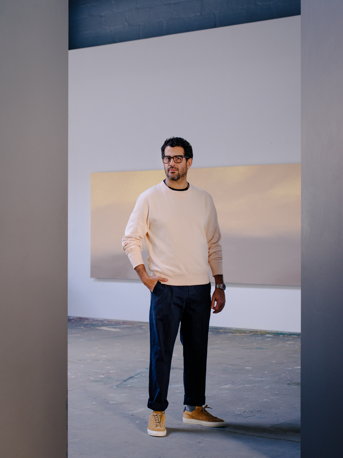
Artist and illustrator Richard Haines discusses art’s importance in Trump’s America, how Dries Van Noten has inspired him and why you should create for yourself

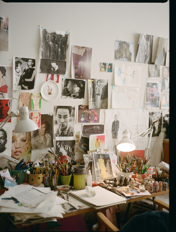
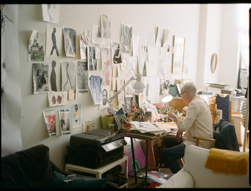
Richard Haines is living life his way. After the end of a career in fashion design, a divorce and a coming-out, Haines found himself starting anew as an illustrator living in Brooklyn’s then yet-to-be trendy Bushwick neighbourhood.

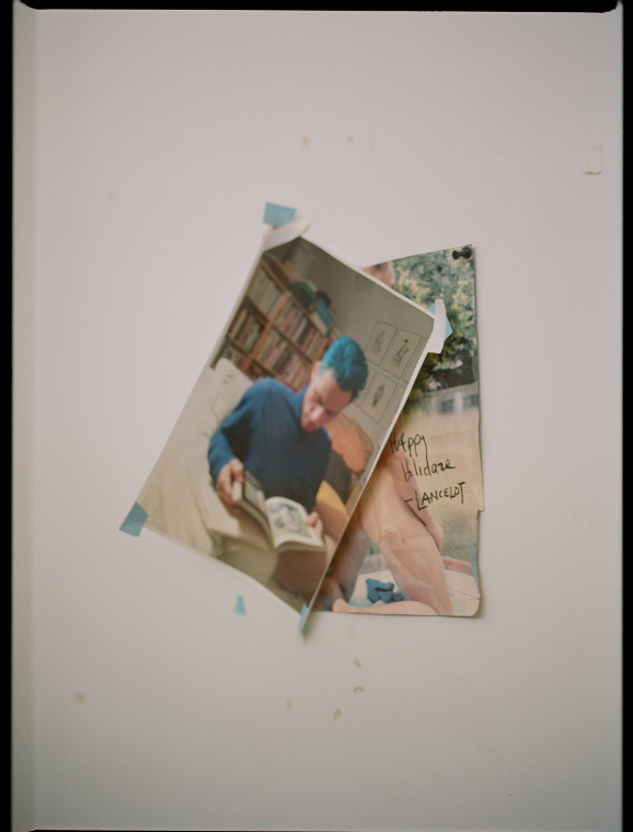
After posting sketches of the intriguing people he saw around him on his blog ‘What I Saw Today’, he caught the attention of some of fashion’s key players and the rest is history. But it doesn’t quite end there. As a man rediscovered, Haines has once again rewritten his story, by establishing himself as an artist in his own right. Here, we talk to him during his new exhibition in New York.

photo-sep-26-1-20-59-am-1

The rise of editorial photography in the ’70s meant that you instead pursued a career as a designer instead of as an illustrator, do you look back on this time as a detour of-sorts, or as an experience that has bolstered your artistic ability?

I’d say it was a detour and something that bolstered my knowledge. I think because I worked as a designer for so many years I have a complete understanding of clothing and the process that goes into making them. When I draw I know exactly where the pocket goes or where the lapel falls because I spent so many years working with pattern makers, being in fittings, and drawing ‘flats’—technical garment drawings.

I think that experience just informs the work I do. Because of that background, I’m super aware of the manufacturing process, which I think has also helped in my collaborations with companies such as Prada, Dries Van Noten, and Orlebar Brown.

Your new exhibition ‘Larger Than Life’ centres around the Bushwick drag scene. What is your connection to the area, and why has the process of documenting the area and its people been so captivating for you?

I moved to Bushwick about eight years ago (after 30 years in Manhattan) as a kind of refuge from the economic crisis and a divorce. It was also the start of my life as an artist, and I feel like I landed in the perfect place. There’s a rule of thumb in NYC that where there is space and cheap rent there will be artists… and ideas—and that’s Bushwick.

There are people here who are being brave — pushing boundaries of art, beauty, gender and sex. Bushwick is fearless, I love witnessing it!

What does this exhibit say about where you are in your life right now?

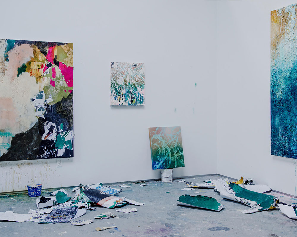
Exhibits are great ways to evaluate progress, and I ask myself ‘Where am I this time versus last?’ I’m just starting to get some distance and perspective. I was so happy with the first show, it consisted only of drawings on paper. This time round I felt like I needed to ‘push it’, so I began painting on canvas and also installed two large drawings. Painting is a real challenge. There were so many time when I said to myself, ‘Why the fuck did I take this on? Everyone likes the drawings, why fuck up the momentum?’, but I’m so happy I did.

There are surprises in the show and ultimately that’s what a show is for — to push, risk and then present. I feel like all art is a diary of sorts, at least it is for me. It’s a journal of my thoughts on gender, beauty, sexuality, fashion and more.

photo-sep-26-1-20-56-am-2

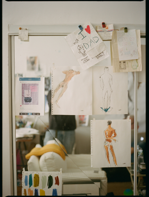
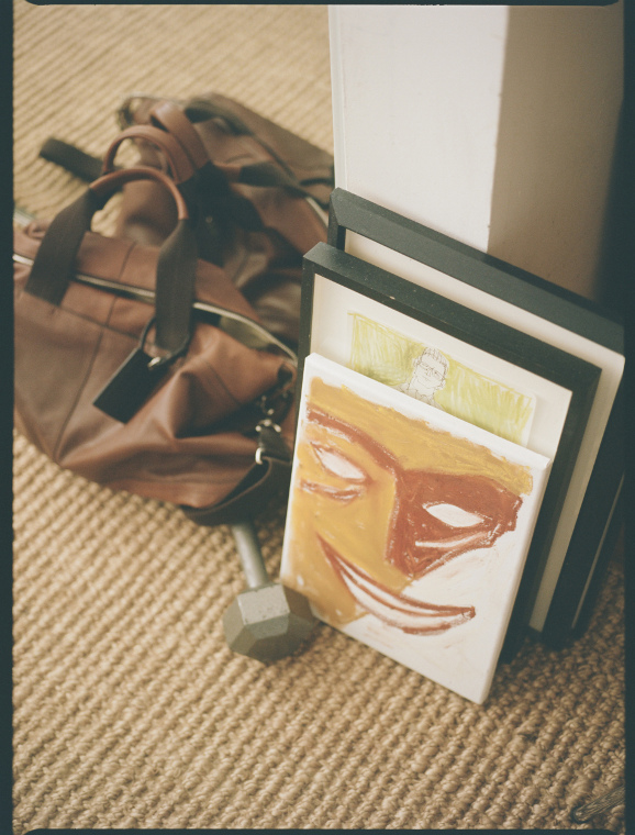
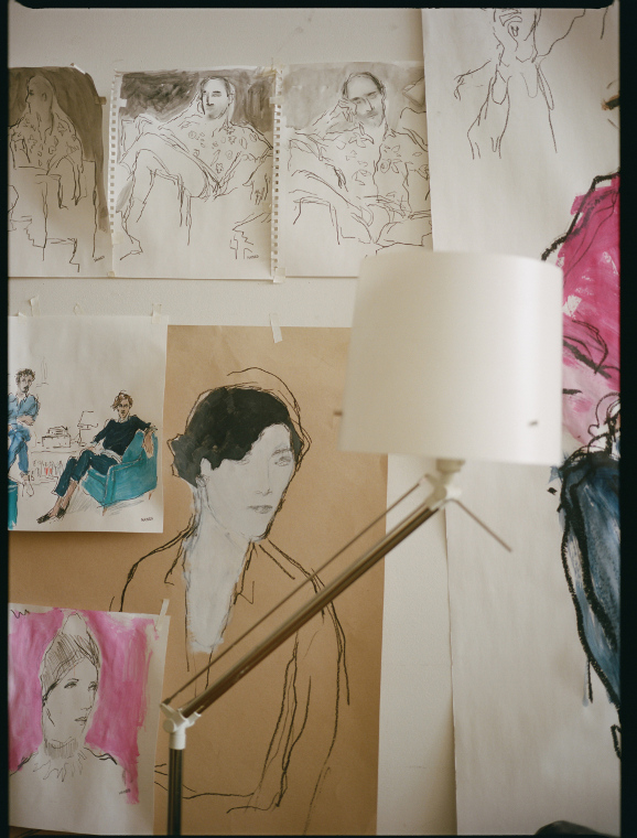
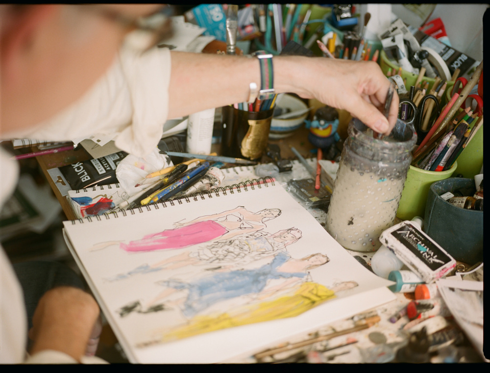
You are well known for the immediacy of your charcoal and watercolour responses, but your new work focusses on your use of acrylic. What has drawn you to the medium?

I haven’t used watercolours in a long time – they remind me of being a kid, when all I could get were the ones that come as little compressed cakes. The colour was never vibrant enough and dried so quickly. Watercolours are also hard to work with…once they’re on the paper, that’s it!

I’ve been using acrylic paints for most of this ‘new’ career as an artist. You can push them around the page, layer them and there’s still room to rework. The colours are also much more vibrant. So it’s a win-win for me!

What do you look for in a subject when you’re out exploring the streets of New York?

I’m reading about the Flaneur — the observer, the urban walker and how it relates to what I do. I’m much more interested in a person who carries himself a certain way, who puts themselves together in an interesting or unusual manner. People think I’m attracted to ‘fashion’ but that’s not the case. It’s more about attitude, swagger, grace and self-possession.

photo-sep-26-1-20-56-am-1

What’s the most unusual or memorable situation in which you’ve met an inspirational subject?

There are so many! I love to go to clubs, after-hour clubs, bars, etc, and kind of disappear and observe. I’ve met amazing people that way, but conversely I also see incredible people on Instagram, or meet friends through networks — there are people everywhere who are compelling and pushing the envelope.

How do you feel illustration affects the senses of viewers who are now so used to seeing photographic representations in the media?

I always think illustration is a ‘palate cleanser’ to photography. And I think that explains the recent resurgence of interest. There’s so much photography, so many images now; drawing lets the eye relax and engage in a different way. It brings the viewer into the piece differently.

I find people crave the human touch – the smudges and drops of paint that are human and say ‘I was here’. When I draw, I edit as I go along, removing and eliminating parts of the drawing. It’s a way of bringing the viewer into the piece and lets them interact in a different way. Photography has its own magic, but this to me is unique to drawing.

What role do you think art plays in our culture today?

In the context of what just happened in this country with the election of Trump, art has a new purpose and urgency. I’ve felt a shift in what I’m posting on Instagram — images and words that are healing and uniting. They’re healing not just for me but hopefully for the viewer too.

I think art is crucial in telling storytelling, uniting, provoking and expressing. I have a 19-year-old daughter who’s studying photography and I told her the best thing she can do now is make art — good thoughtful art to heal and unite. Art that says ‘Yes’ and art that says ‘NO!’

You started your blog ‘What I Saw Today’ back in 2008, and it has since caught the eye of some of fashion’s most influential personalities. How has social media been instrumental to your later success?

Social media basically changed my life. When I started my blog I was an unemployed fashion designer who couldn’t get a job – there were no jobs to be had. The idea of posting my own drawings in an unedited way — sharing my vision with like-minded people – was, and still is, incredibly powerful. I’m grateful for the technology that made this possible, and for the amazing people I’ve come in contact with because of it.

rhaines

How has your style evolved through your life, and how have you refined it?

When I first moved to NYC many years ago, my style wasn’t great. I have drawn my entire life but by the time I moved here it was just very tight and not interesting. Then, over time, it improved because I just didn’t care what people thought of it. I drew only for myself and it got much more emotional and free.

It was a great lesson in learning to not seek approval from others, and to be real and authentic. I think that’s what people respond to: realness.

Which designers are striking a chord with you right now?

I have always had an enormous amount of respect for Dries Van Noten. There is so much integrity and beauty in his clothes and of course it was thrilling collaborating with him. I feel the same way about Prada; Mrs. Prada designs to her own instinct, and takes an idea and executes it beautifully. I also think Comme des Garçons is wonderful for many reasons — I love CDG’s vision of execution and distribution as well as Rei Kawakubo’s ideas.

Because my focus is menswear those names come to mind first, but Raf Simons shows are great, as are those by AMI and Officine Generale. They all have different points of view but are all 100 per cent behind their design and know who they are designing for.

What does the near-future hold for you?

The older I get, the more I realise that we have very little control over much. That said, of course I plan on continuing to draw, explore painting and have more gallery shows that give more context to my work. I also want to see my daughter graduate from college, spend more time in Paris and get exciting commissioned work.

In early 2017, I am spending a week at the Courtauld Institute of Art in London, talking about art and drawing. I’m super excited about that, and look forward to the experience of interacting on that level in London. Oh, and I of course hope that I can get through the next four years of a Trump administration without losing my mind…

‘Larger than Life’ runs until 22 Dec at Daniel Cooney Fine Art, New York

Photography Jerry Buttles

The Grandmother of African Art: Esther Mahlangu

South African artist Esther Mahlangu discusses taking her art from the back walls of her house near Pretoria to the Centre Pompidou in Paris

Esther Mahlangu
Esther Mahlangu

Despite being 81 years old, Esther Mahlangu doesn’t show any signs of slowing down. For the past 70 years, the South African artist has been creating bold and beautiful murals and working them onto any surface she sees fit, be it the houses and walls of her native Ndebele community, or BMW cars and British airways planes.

Labelled the ‘grandmother’ of African art, Mahlangu has gained international recognition for her large and colourful geometric designs, which she was taught by her mother and grandmother. Her colourful – and (often large-scale) patterns are rooted in a Ndebele tradition that dates back to the 18th and 19th centuries, which saw women from the community paint vibrant symbols on their homes in order to communicate with their peers in a manner that couldn’t be understood by the local Boer.

Although she still lives in her homeland, Mahlangu is still prolific on the international stage and is using her popularity for benevolent causes. Her latest project has seen her distinctive motifs applied to Belvedere Vodka bottles, as part of an ongoing campaign in collaboration with AIDS charity (RED)

Here, we meet the indefatigable artist to discuss where her passion for art began, painting traditional Ndebele motifs on modern day technology, and teaming up with Belvedere Vodka.

One of Esther Mahlangu's painted homes in South Africa
One of Esther Mahlangu’s painted homes in South Africa

How would you describe yourself as an artist?

I always loved to paint, since I was a small girl I started off by painting on the back walls of our house, then as I got better I was allowed to paint the front. I knew this is what makes me happy and I just want to keep on painting.

Painting is in my heart and in my blood. When I was invited to paint for the first time in the Centre Pompidou in Paris in 1989, I saw how happy my work made the people and I knew I had to keep on doing that. Through my painting I can show people about my culture and the painting style of the Ndebele. Every time I travel to paint overseas I know that more people now know about Esther and the Ndebele. I paint every day.

Where did your interest in painting objects and walls begin?


Part of Ndebele culture is to paint and decorate walls of our houses to tell a story or send a message to the passers by. It was also a way to unite and identify the Ndebele as a nation during difficult times. The walls are painted for special occasions to announce happenings like a wedding or when a son goes to initiation school.

The girls are taught from a young age to help their mothers paint and this is seen as part of upholding the culture and becoming a woman. After 1989 when I did the first painting for the the Museum in Paris I started painting on other objects and surfaces as they were presented to me. I have painted cars, caravans, aeroplanes, shoes, bottles and even the body of the fashion model Iman once. When I am presented with a new object it is always a challenge, but before I start to paint I see the design in my head of what I am going to do…then I just start painting.

How did your mother and grandmother influence your work?

They were not artists in way you think of artists, and also never thought of themselves as artists, but they were natural-born artists who painted and decorated the houses in the traditional Ndebele design, like all women of the time and the women before them. They did this as part of their daily duties.

I watched them from a very early age and they got me started, albeit on the back of the houses like I said. Their work was never seen by people who appreciated art but only by the Ndebele who “read” the walls and the messages they contained.

What does your art say about where your home is in South Africa?

If you look at my paintings, my art is who I am. I am Esther, a Ndebele woman from Weltevrede South Africa. Over the years I kept on painting in the same way I was taught, although I incorporated new designs and colours. The designs I paint are often similar to those I paint on my house.

esther-2

How do you think public art, like painted houses and cars, can help change society?

Most artists want to do some public artwork for everybody from the street to see. Public art is a good way to make people aware of art. Many people never go to see exhibitions or museums, but when they see art on a wall or a public space they will look at it and then wondered ‘who made that?’. 

Twenty-five years ago, you collaborated with BMW to customise a BMW 525i Sedan. How different is your approach to partnerships today?

When I was approached by BMW 25 years ago I was very happy and from that came lots more collaborations and partnerships with other brands like Fiat, BA, Eytys, Melissa’s, etc. This all allowed me to spread my art all over the world as it would never be possible to make so many artworks by myself.

My latest projects include the second commission I just did with BMW to paint the inside of a individual 7 series BMW, which was exhibited and sold at FRIEZE in October (the proceed of which were donated to charity). I also just worked with Belvedere on its bottle label. The collaboration with all these companies also gives me the opportunity to travel even more and see the world and meet lots of people and tell them about my culture.

Can you talk us through the collaboration with Belvedere?

In 2016, John Legend joined the fight against AIDS as the ambassador for (BELVEDERE)RED, and developed the campaign’s core values: security, change, support, and unity. They asked me to paint an artwork to decorate the bottle in my typical Ndebele style.

My collaboration with Belvedere was a very special one as 50 per cent of all sales will be donated to fight against AIDS in Africa. I went to the USA for a month on their invitation and they showed the bottle all over – everybody was very happy to see it

For every bottle of the limited edition Belvedere (RED) vodka purchased, Belvedere will donate 50 per cent of the profits to the Global Fund, the leading financier of HIV/Aids prevention in Africa.

For more information see: esthermahlangu.co.za

Additional text Gonzalo Mases