Frank Bowling and Sculpture

In a new exhibition at The Stephen Lawrence Gallery, rare and previously unseen sculptural works from the iconic artist are brought to the fore

Frank Bowling, Angharad’s Gift Patagonia, 1991, Welded steel, 92 x 94 x 34 cm and Sasha’s Green Bag, 1988, Acrylic, acrylic gel, polyurethane foam and found objects on canvas with marouflage, 180.6 x 294.2 cm. © Frank Bowling, All Rights Reserved, DACS 2022. Courtesy the artist. Photographed by Anna Arca.

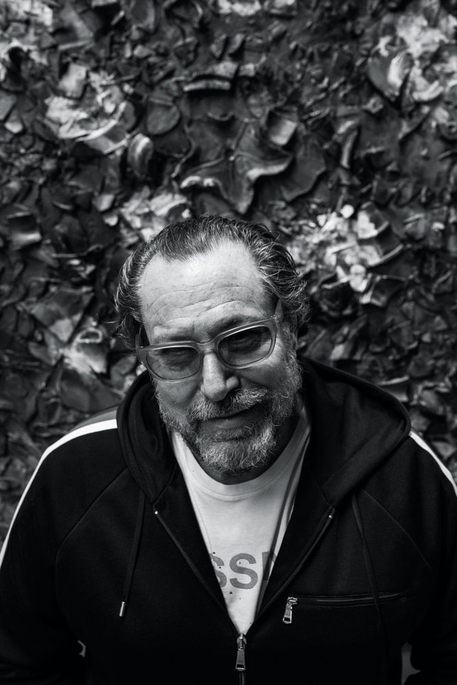
There is unlikely a more prominent or influential name in the world of art than Frank Bowling, a painter and sculptor born in Guyana and based in London. Renowned for his use of colour and experimentation, the former RCA grad – who studied alongside the likes of David Hockney and R. B. Kitaj – spent the next 60 years fine-tuning his medium, working his way to masterdom while developing a style that merges new materials and methodologies. From iconic Map Paintings to an artwork (named Tony’s Anvil (1975)) featuring pouring paint dripping down the canvas, perhaps his paintings are what Frank is best-known for. Little does the world know about his sculptural pieces, which is precisely what a new exhibition at The Stephen Lawrence Gallery opening on 15 July aims to address. In a conversation with curator Sam Cornish, we chat about Frank’s enduring influence, his pivotal works, and the reasons why his sculptures have remained in the shadow – until now. 

“Painting has to release certain sculptural aspects, but it also has to retain aspects of the sculptural to hold its own on the wall, in order for it to be a thing.” – Frank Bowling

Frank Bowling, Hrund, 1988, Welded steel, 84 x 122 x 40 cm. © Frank Bowling, All Rights Reserved, DACS 2022. Courtesy the artist. Photographed by Anna Arca

This is the first exhibition to focus on Frank’s sculptures. Why have these works been overlooked in the past?

Interest in Bowling’s art has risen vertiginously in the last decade or so. Inevitably there are lots of areas which haven’t been explored, especially given the peculiar complexities and contradictions of his art and attitudes. At the moment interest has been concentrated in his earlier work, his Expressionist pictures, his conflicted Pop paintings and, most significantly his Map Paintings; all areas open to sociological or political analysis. This is all well and good, and in line with the mood of the time, but I think there are lots of aspects of Bowling’s work that these approaches struggle with. Bowling’s making of sculpture has been fairly isolated, so naturally have taken a back seat. His paintings’ interactions with sculpture, or the idea of the sculptural, has been remarked upon before, but my project argues it has a much more central generative role within the trajectory of his work.

Frank Bowling, Lapwing Eye (Made in Japan), 2000, acrylic and mixed media on canvas, 64.5 x 46 cm. © Frank Bowling, All Rights Reserved, DACS 2022. Courtesy the artist. Photographed by Anna Arca

Can you give some details into Frank’s relationship with sculpture? What defines his style and processes, and how did you want to represent this in the show?

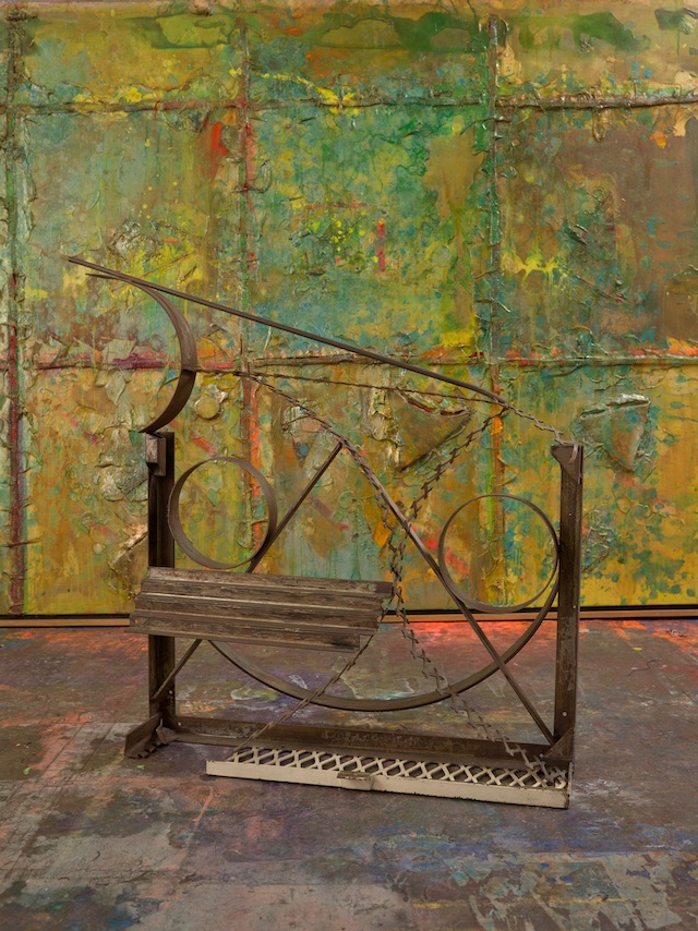
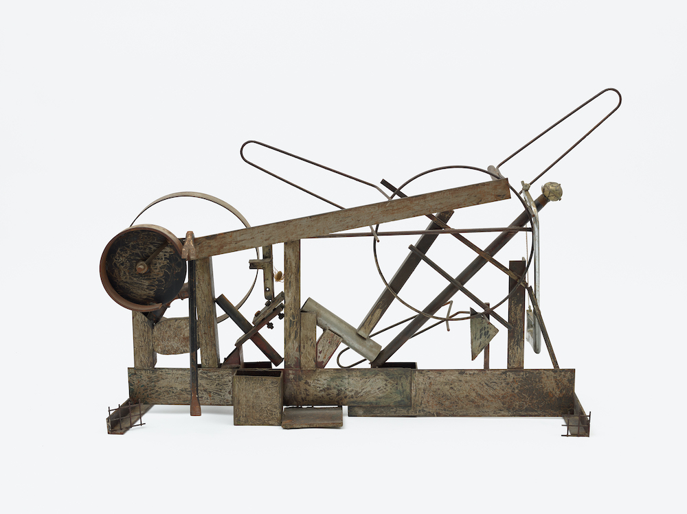
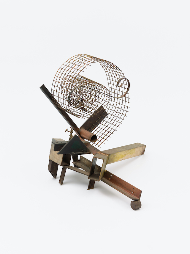
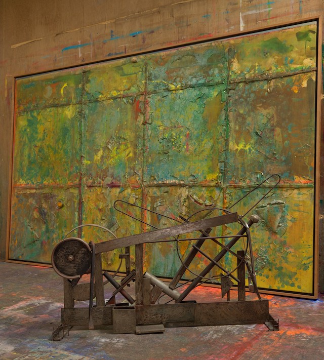
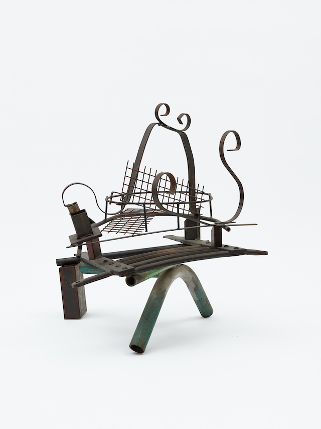
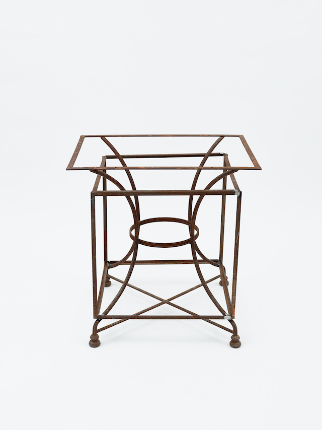
We are showing seven steel sculptures by Bowling, which is probably about half he has ever made, and almost all that survived. Six were made between 1988 and 1991 and the seventh completed this year, for the exhibition. I relate his work in steel to Anthony Caro, to Cubism, to classical African Art and the art of the abstract artists of the early twentieth century of Russia and Eastern Europe. This mix of influences are handled playfully. Bowling makes a virtue of being an amateur, or at least occasional, sculptor: they do not have any tricks, but they do have a direct and in a sense surprising physicality. 

Frank Bowling, Bulbul, 1988, Detail, Welded steel. © Frank Bowling, All Rights Reserved, DACS 2022. Courtesy the artist. Photographed by Anna Arca

What comparison can be made between his sculptures and paintings?

There are many connections and overlaps. One is persistent interest in geometry, one of Bowling’s key concerns from the very beginning of his career. Bowling has commented that he turned to sculpture because he thought Colour Field Painting ‘lacked structure’. Geometry, whether used to determine the overall proportions of his paintings, or more physically present as a kind of substructure, has been crucial for Bowling to help him give his paintings a sense of order. There are a number of instances in the exhibition where similar geometric structures can be seen in painting and sculpture. 

Frank Bowling, Mummybelli, 2019, Acrylic, acrylic gel and found objects on collaged canvas with marouflage, 171.3 x 206.8 cm. © Frank Bowling, All Rights Reserved, DACS 2022. Courtesy the artist. Photographed by Anna Arca

How did you curate the show, what works did you seek to include? Can you pick out some highlights?

The 1988-91 sculptures chose themselves, although I was very pleased that Bowling had What Else Can You Put In A Judd Box completed, so it could be included. And we were very grateful to include a sculpture from a private collection. I could have kept the selection limited to paintings contemporary with the 1988-1991 sculptures, but I decided to include works from across the career, from 1960 until 2019. This gives a broader sense of the different ways his paintings have interacted with sculpture, which also creates an inherently more interesting, and I hope, exciting, display. 

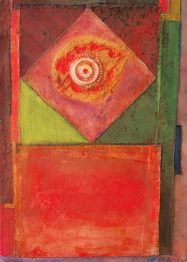
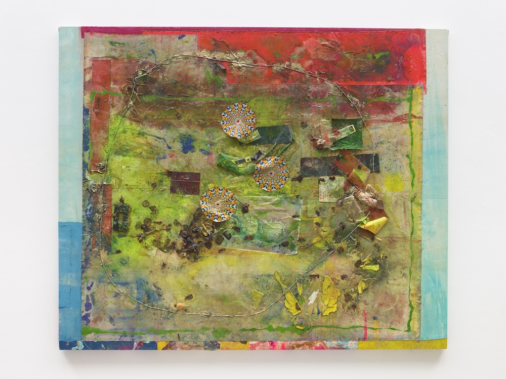
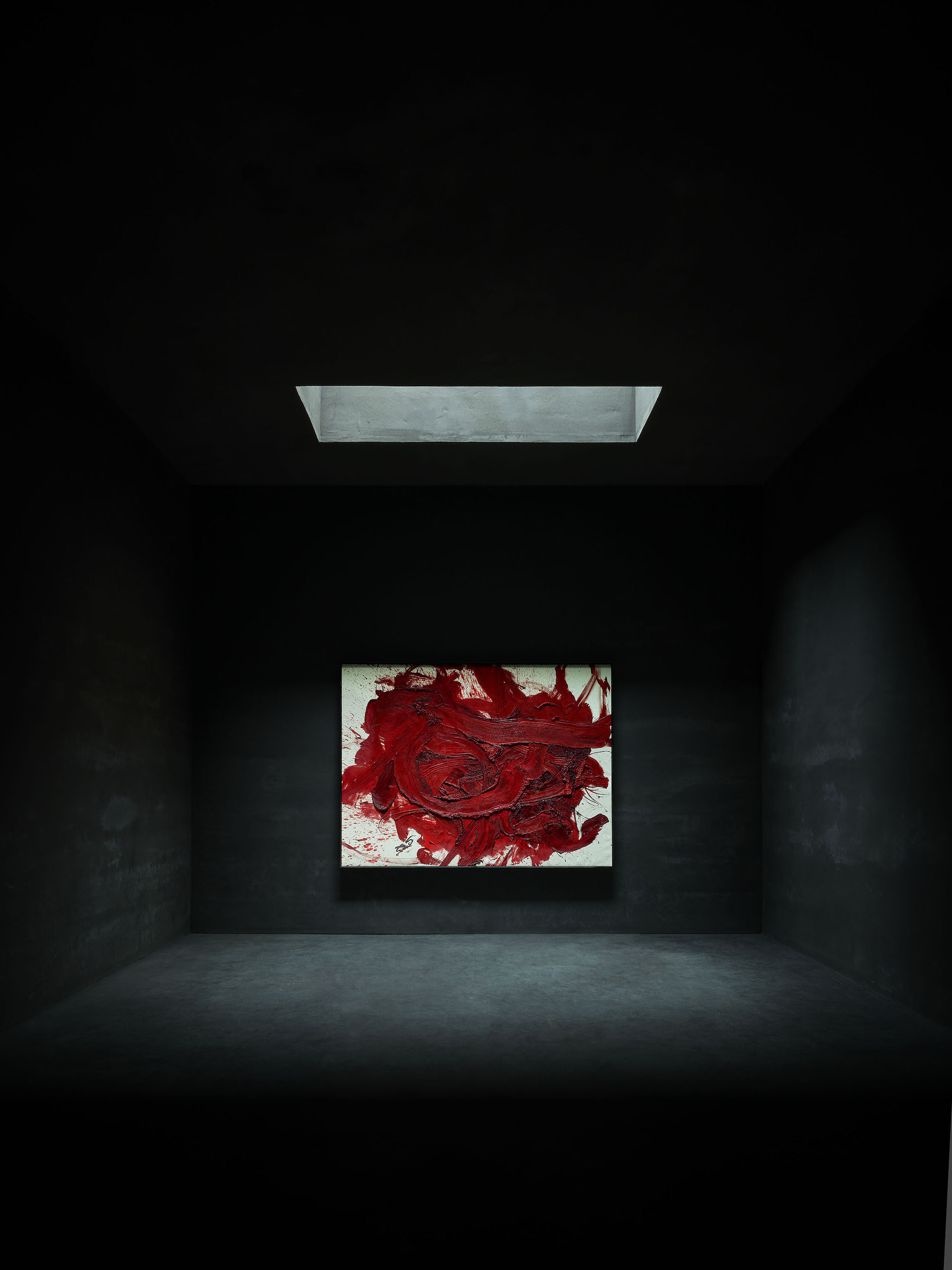
Sentinel, one of Bowling’s Poured Paintings of the mid-70s is a highlight for me. But I also love Brooklyn III, which at first seems monochrome. The way Brooklyn III sits next to the very busy, object strewn and colourful surface of Mummybelli is something I am especially pleased with. The similarities outweigh the differences, which would be difficult to anticipate from photographs. I think the harmony is to do with light and the way a sense of underlying movement is contained by the overall rectangle. Of the sculptures, Angharad’s Gift Patagonia and The Man Who Mistook His Wife for a Hat are my favourites: I’ve looked at both many times before, but they feel very different in this exhibition. The rigour of Angharad’s Gift Patagonia is clearer in the gallery space, while there are a few elements of The Man Who Mistook His Wife for a Hat I hadn’t noticed before. I could go on, because all the works bring something special to the display.

Frank Bowling, King Crabbé, 1988, Welded steel, 68 x 50 x 30 cm. © Frank Bowling, All Rights Reserved, DACS 2022. Courtesy the artist. Photographed by Anna Arca

Any notes about the structure and pace of the exhibition itself? How do you hope the audience will experience it?

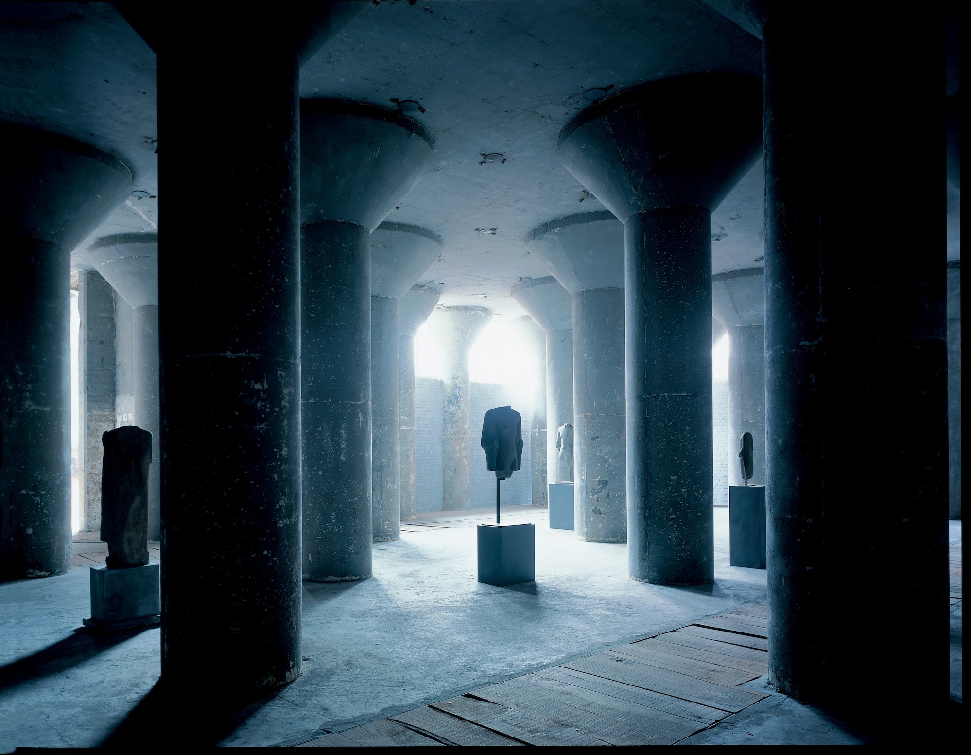
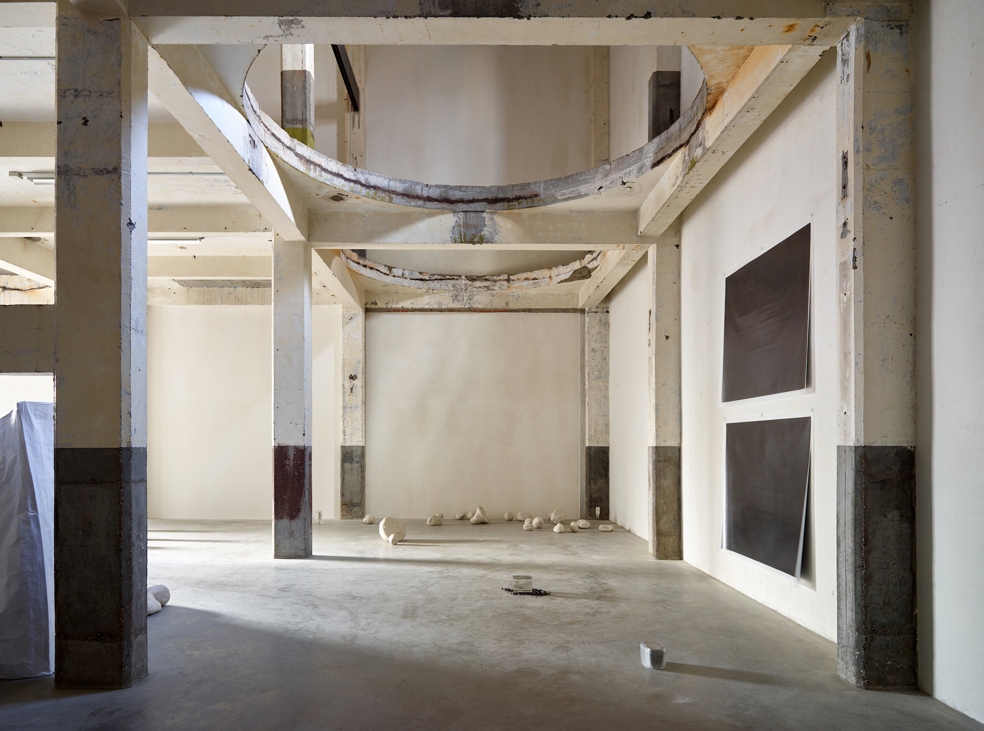
The exhibition space is divided roughly in half, with an upper and lower level, separated by a ramp and some partition walls, although with enough space left to easily look from one to the other. The paintings are hung visually, in dialogue with each other and the sculptures, rather than in chronological or thematic order. I wanted to mix large and small works, partly because of the spaces of the Stephen Lawrence Gallery, and partly because some recent displays of Bowling’s art have perhaps overemphasised literal monumentality. The movement from the very small incidents of colour and texture to very large panoramas is hugely important to Bowling’s paintings, so in a way it makes sense that his larger works can sit alongside his smaller. Obviously I had some hunches before I started about how the works would interact but I was pleasantly surprised at how many inter-connections there were, congruences of shape or structure, or materiality, even in a few instances, of colour. I would hope the viewers would pick-up on at least some of these and also notice things I haven’t.

Frank Bowling, Sasha’s Green Bag, 1988, Acrylic, acrylic gel, polyurethane foam and found objects on canvas with marouflage, 180.6 x 294.2 cm. © Frank Bowling, All Rights Reserved, DACS 2022. Courtesy the artist. Photographed by Anna Arca. Frank Bowling, King Crabbé, 1988, Welded steel, 68 x 50 x 30 cm. © Frank Bowling, All Rights Reserved, DACS 2022. Courtesy the artist. Photographed by Anna Arca. 

What’s the main goal with the show, what can the audience learn? 

I hope it’s more pleasurable than didactic. But I guess I want to impress upon people the complexity and range of Bowling’s interaction with sculpture. There has been a lot written about Bowling and landscape. I think that his more fundamental concern is with evoking human presence, and I would be pleased if that were communicated at some level.

Frank Bowling and Sculpture is at The Stephen Lawrence Gallery, University of Greenwich, London from 15 July – 3 Sept 2022. To coincide with the opening of the exhibition a new standalone monograph Frank Bowling: Sculpture has been published by Ridinghouse.

Frank Bowling, The Man Who Mistook His Wife for a Hat, 1988, Welded steel, 75 x 72 x 65 cm. © Frank Bowling, All Rights Reserved, DACS 2022. Courtesy the artist. Photographed by Anna Arca.

Frank Bowling, What else can you put in a Judd box, 2022, Welded steel, 72 x 69.8 x 57.9 cm. © Frank Bowling, All Rights Reserved, DACS 2022. Courtesy the artist. Photographed by Anna Arca.

Painting: Toshio Shibata

Chose Commune unearths 16 previously unpublished works from the contemporary Japanese photographer, best-known for his painterly depictions of rural landscapes

Photography and painting have an undeniably tender relationship. In a time before the camera, realistic imagery would be produced by artists, employing a brush to hand and putting to use a mastering eye of realism. Now, in a world over-saturated with imagery, it’s hard to imagine a time when the long and intricate process of painting was the only format of replication – witnessing the skill and patience it would take to craft each stroke, gesture and expression. But the influence of both mediums works twofold, and the earliest practitioners of photography turned towards painting to find their subjects, be it a still life, landscape, nude or portrait. 

So when photography presents itself in a way that correlates highly with the process of painting, something wonderful happens. Your mind is instantaneously transported into otherworldly places; the locations which seem unfathomable, too scrumptious, too perfect, too colourful or vivid. Toshio Shibata is a photographer who’s mastered this canon, and he’s spent a healthy career perfecting the marriage of abstraction and realism through his camera. A contemporary Japanese photographer, he’s best-known for his large images of civil engineering in rural Japan, where manmade constructs are paired eloquently with notes from the natural world, causing ripples in light and sheds of water as they pass and flicker through the structural compositions of humankind. Dams, lakes and water ways are synced with the earthy notes of the environment; but rather than viewing these opposites as two juxtaposed elements in his work, Toshio depicts them in unmatched harmony.

You’d be unsurprised to learn that Toshio’s career first began in painting, having graduated with a BA and MFA in the subject from Tokyo National University of Fine Arts and Music. After leaving Japan in 1975 to pursue his studies at the Royal Academy in Ghent, Belgium, that’s when Toshio decided to test his hands at painting and printmaking, later discovering his interests in photography. Gas stations were his primary subject while making his debut into the medium, but it wasn’t long until he’d moved onto the landscapes of Japan, documenting the fine moments where the artificial and natural collide. To such success that Toshio received the Kimura Ihei Award in 1992, and he’s also had works exhibited internationally since 1971, including a solo show at Tokyo Metropolitan Museum of Photography; the Sprengel Museum in Hanover; the Centre National de Photogoraphie in Paris and many others.

In a new book published by Chose Commune, 16 previously unpublished colour works are brought to the surface in an artful curation of his finest and meticulous compositions. Aptly titled Painting, the publication turns an ultra-fine lens onto the more abstract and painterly of his pieces, and is designed in concertina format – to represent the kakemono, a Japanese unframed scroll painting. Below, I chat to Cécile Poimboeuf-Koizumi – director and co-founder of Chose Commune alongside Vasantha Yogananthan – to hear more about the publication. 

What inspired you to make this book?

I had been looking at Toshio Shibata’s work for a while but the idea of making a book came quite late. When I decide to reach out to an artist and propose a book, the intention has to be quite strong. When artists have never made a book before, it’s easier. The lack of an existing book on an important work is a good enough reason to make a book. In the case of Toshio Shibata, he had already made quite a few monographs. I asked myself: “why would it be relevant to release yet another book?” Including new and/or unpublished photographs can be a good reason. But I thought it would make even more sense if the concept was innovative and strong. I started selecting over 50 images and in the end, I kept only 16 and imagined this very tightly edited book that can also be turned into a kakemono (a Japanese unframed scroll painting made on paper or silk and displayed as a wall hanging).

What is it that you enjoy about Toshio Shibata’s work specifically; is it the subject matter, the aesthetic or process, for example?

I have always admired Toshio Shibata’s work for the quality of the composition in his photographs, as well as his prints. His colour work is fantastic. Also, although Toshio Shibata is best known for his landscape photographs, I was more drawn to the more abstract ones, when Toshio Shibata’s lens is closer to his subject matter and the photographs become a mysterious abstract composition. 

The book unearths 16 unpublished colour photographs, why bring these into light now?

Bringing those 16 unpublished colour photographs is a personal choice. It could have been any 16 other images, and my only guide was to choose the most abstract ones. This was also a reference to Toshio Shibata’s interest in painting, which he studied before he took on photography. This intention gave its title to the book as well: painting, as in the act of painting. For me, Toshio Shibata photographs the landscape as a painter would paint it: carefully choosing his colours from a palette, and bringing a lot of detail and texture to his compositions. 

Talk me through the design of the book, why make the comparison to a concertina and kakemono? What does this add to the presentation and interpretation of the artwork?

The book was designed as a concertina book, which means that one can unfold the book and discover the whole sequence. It’s a very different experience from actually turning the pages of a traditional book. The sequence is uninterrupted. 

But I thought it would also be interesting to give a vertical reading to the images, as a hint to Japanese scroll paintings. When hanging on a wall, the eight images on each side become something else. One doesn’t really read them as eight single images anymore but as one larger abstract image. The multiple readings of the images add an interesting layer to the interpretation of the work. 

What about the structure, was there much consideration to the order and placement of each image?

Yes, the order and placement were carefully thought through. My partner, the photographer Vasantha Yogananthan, pitched in for that. It was like a puzzle: we moved around the pieces, and found the harmony and connections between the shapes and colours. It was like composing another image from existing images.

Can you pick out a couple of personal favourites from the book and talk me through them?

16 images isn’t much, so I guess they’re all favourites. But if I had to pick only two, I would say the apple tree and what I call the “blue canvas with holes”. I wouldn’t know how to explain it. I think I like how the apple tree is a figurative photograph, but the bright apples looking like distinct dots of colour in the branches make it look almost like “pointillism”, the painting technique branching from Impressionism. And the blue canvas is the photograph that looks the most like a painting, almost like a Mark Rothko who’s one of my favourite painters of all time. 

How do you hope the audience will respond to the work?

As a publisher, it’s always impossible to predict the response to a book and the work inside. It’s daunting and magical at the same time. 

Painting is available here.

Dimitris Anastasiou: A=-A

The Greek painter and artist on his new graphic novel, an illusory and hypnogogic tale of a protagonist named Alpha

For one day, a man’s entire reality is about to be toppled. It all begins as he glares into the bathroom mirror, brow lines creased with exhaustion as he looks back at himself. He runs his hands through his hair and pieces start to fall into the sink. He reaches for a hat at the back of the door, and the scene ends. The following page starts in double vision, where the letter “A” is penned on a piece of marked paper. A man – who looks similar to before – appears to be dragged off into a surgical operation; injections, cameras, masks, a room full of doctors. The scene ends. The next eight-panelled page details a patient, slowly falling asleep on the left, while the doctors wait in anticipation on the right. The scene ends in darkness. 

There are many more encounters of this kind, as the man wanders the streets of his hometown, journeying into unfathomable places. And these are all but a few of the vague and pensive moments found within Dimitris Anastasiou’s graphic novel, A=-A. A Greek painter and artist based in “sunny (but gloomy nonetheless)” Athens, it was around nine years ago in 2021 when he sparked a sudden urge to draw something – but not just anything, it was a picture of a man flying over the city of Athens. “That drawing felt like a part of a bigger narration and it made me wonder: ‘Who is this man? Why is he flying?’ It was obviously a dream scene – flying was a frequent dream of mine,” he says, before deciding to build on the narrative bit by bit and “weaving the oneiric word of A=-A.”

Dimitris’ A=-A can be likened to a state of consciousness, for it depicts the events that can only be conjured up in the nonsensical landscape of a dream. Hair falling out, flying, losing teeth or undergoing surgery; these are familiar themes in the extraordinary abyss of dreams, and themes that many can relate to. Since he was young, Dimitris has kept a dream journal, and he’s always enjoyed listening to others’ tell their nightly stories. “I could say that A=-A is based on real dreams, at least at its best part,” he continues. “I have always been fascinated by the dream world, this realm of uncertainty, of unwilling symbolism and of spontaneous visual poetry.”

In choosing the graphic novel as his preferred media to tell his hypnotic tales, Dimitris effortlessly combs his detailed drawings in with the disjointed structuring of his dreams. It’s an idyllic pairing no less, considering the ways in which dreams run in sequences. But it was never his intention to form an entire short story like this. Rather, he set out to create a few pages only, avoiding any script or series of events. Consequently this spawned a uniquely hand-made and evolutionary tale of a protagonist named Alpha – “someone who could be anyone”, or someone who’s perhaps devised from a dream. The character’s presence and intentions aren’t quite clear from the beginning, and you’re instantly hit with wondering whether or not this is the same person appearing over and over again in the pages. Who is Alpha, and what is his story?

There are a few things that do become known, however, and that is how Alpha is the first letter of the alphabet and also of Dimitris’ surname. He also started drawing Alpha six years ago with a pencil and paper, while “following the steps of my main character,” he says. “But was I trying to follow alpha as he was diving deeper and deeper into his oneiric world, I had to use different drawing styles and techniques.” That’s why, in the second chapter, you’re greeted with a comparatively different aesthetic: he’s using ink on paper, acrylics and coloured panicles. Then in a flippantly stark contrast to the monochromatic wanderings that came before, the next section details the more comic-like errands of his character, the “more grotesque, more expressionistic”. 

Things change once again in the third chapter, the final chapter, which is composed entirely of colour. In this part, Dimitris has painted each frame separately with oil on canvas, before photographing the images and arranging the sequences on the computer. It’s the more realistic part of the mind-bending narrative and one that tilts the axis of the novel into a more regular world (or so it seems). “Alpha believes that he has awoken and that everything is back to normal. But very soon, he realises that his world is as normal as a goat standing on a bed.”

Many questions will hatch when observing Dimitris’ beautiful, although highly speculative graphic novel. There’s a character, like you and I, who’s striving to find some certainty in life, “even a tiny piece of solid ground on which to firmly stand,” adds Dimitris. “He needs some kind of an existential axiom to use as a basis of his life. Instead of that, he finds himself being constantly out of balance, doubting even the most elementary constants. To me, this is the core of western thinking. Skepticism is what makes the western philosophy both strong and weak. It is a sign of health but at the same time a sign of sickness. I think this is what makes our situation fascinating.”

Dimitris has drawn up an engrossing network of thought and doubt, where beautiful markings probe into the role of humankind and the free-running mind of its people. But if you’re looking for answers in A=-A, then you’re not getting any. Dimitris wants you – and Alpha – to continue being curious. “‘But is doubt helpful?’ one might ask. ‘Do people not need certainties in order to live?’ I suppose so, nobody likes a doctor who doubts his own diagnosis. But maybe philosophical questions are not made to be answered, at least not once and for all. And maybe works of art are not supposed to give answers, but to pose meaningful questions.”

 A=-A by Dimitris Anastasiou, published 29 July by Jonathan Cape, a part of Vintage Books

Werner Büttner: Humour in Darkness

Port speaks to artist Werner Büttner about growing up in East Germany, the experience of moving to West Berlin just before the wall fell, and his new show at the Marlborough Gallery

Viel Raum für allerlei Glück , 2017 © Werner Büttner, Courtesy Marlborough Fine Art

Provocative art tends to take a post-modern form, whether that be film, installation or performance art. In transgressing the boundaries of traditional media, it signals its subversive tendencies. But for Werner Büttner, once a member of Germany’s Junge Wilde or ‘wild youth’, figurative painting holds far greater expressive potential in all its narrative lucidity and metaphorical inference.

Büttner relishes each brushstroke, applying the paint in layers until he has built a thick crust. Every inch feels powerful and deliberate, yet Büttner insists he has no emotional relationship to paint, “I try to enslave it [only] to end up in splendid arbitrariness.” The images themselves are astutely observational with a dark, comic edge. “Humour is the only appropriate reaction I have found facing what’s now 64 years of the ‘condition humaine’.”

At his latest London show, Plenty of Room for all Sorts of Happiness at the Marlborough Gallery, works from Büttner’s early years fill the downstairs gallery, with more recent painting hung on the upper level. “I liked the possibility of walking around one floor and seeing works by an author in his thirties and then seeing the same author in his sixties on a different floor,” Büttner says of the strict division. Creepy and caustic, surreal but incisive, the early works are tonally dark in every sense. In the Vineyard, a painting from 1981, readily evokes a desolate graveyard with a monstrous, ghostly, almost illegible figure emerging from a wild gale that ravages the landscape.

Ein geschundener Gaul [A Flogged Horse], 2016 © Werner Büttner, Courtesy Marlborough Fine Art

His contemporary paintings are lively and less perverse – a bright pastel pink brings ambiguous meaning to A Flogged Horse (2016), while the streaks of orange in Holding Loop in the Void (2015) are positively kaleidoscopic. In Büttner’s recent work, his social commentary of the 1980s is as present as ever but he more freely dabbles in the ridiculous and the mundane. He admits that “the guy who did the paintings on the ground floor seems a bit more mournful and upset than the guy upstairs… I like my most recent work best.”

Born in 1954 in Jena, East Germany, Büttner spent the first seven years of his life living under the Soviet-controlled German Democratic Republic until his mother took him to Munich, just before the construction of the Berlin Wall. Büttner’s childhood is addressed in On Thrones and Entanglement, an unusually solemn self-portrait in which Jena is foregrounded by a young boy on a pony. The painting’s title refers to Martin Heidegger’s theory of ‘throwness’, the idea that we are thrown into existence without our consent and must attempt to exercise autonomy over our lives.

Danke Frankreich (für Monsieur Monet und Hhle Lascaux) , 2017, © Werner Büttner, Courtesy Marlborough Fine Art

Once thrown into the world, as Büttner says, “you are immediately entangled in many calamities… in a landscape and a language, in a climate and social order, in a political and economical system… all this limits somewhat your freedom to design your own fate”. Appearing to ride away from the town that is neatly bordered off into the background, the painting depicts an alternate existence that was left behind, at the last moment, but whose legacy endures. For Büttner, living under the regime was formative but his escape was liberating in more senses than one – “the delight of having two opposing systems made me flee all systems, made me distrustful, sceptical and melancholic.”

By the late 1970s, Büttner was employed as a social worker at the Berlin-Tegel Prison, despite having studied Law at university. He broke onto the art scene in 1979 when he took part in Elend, a group exhibition in the Büro, a loft space set up by Martin Kippenberger and inspired by Warhol’s Factory. He went on to appear in a string of fringe shows with other members of the Junge Wilde. Belonging to the avant-garde community was extremely seductive – Büttner joined after a chance meeting with Albert Oehlen, the flatmate of a one night stand.

Diet – Geißel der Postmoderne , 2017 © Werner Büttner, Courtesy Marlborough Fine Art

In romanticised recollections he describes the shared “hunger to be heard, the same heavenly pubs, the urge for attractive and digestible company”. Ultimately however, he saw the group’s activity as “foolish dalliance” rather than a guiding force in his art: “I was more influenced by dead colleagues like Magritte, de Chico, Ensor or Goya.” As Büttner became increasingly recognised, the inevitable forces of establishment took over and within a decade he was appointed Professor of Painting at the University of Fine Arts in Hamburg. It marked the start of a new phase for Büttner, with the groups he belonged to disbanding.

When pressed on his motivations he offers only a cryptic hint: “My laughter is self-sufficient; in other words, extremely clever. By this you avoid the silly longing for applause.” Plenty of Room for All Sorts of Happiness reveals that, three decades later, the irony of his youth endures.

Plenty of Room for all Sorts of Happiness runs at Marlborough Gallery, 6 Albemarle Street, London until 23 June 2018.

Jules de Balincourt: Precision and Abstraction

Franco-American painter Jules de Balincourt ruminates on abstraction, utopia and the accessibility of art, at the opening of his latest exhibition

Another Divided Island, 2017 © Jules de Balincourt. Courtesy the artist and Victoria Miro, London / Venice

If contemporary art is frequently found to be conceptually obscure, exasperatingly self-referential or weighed down with lofty ideals, then the vibrant works of Brooklyn-based artist Jules de Balincourt may be just the antidote. With nothing more new-age than oil on panel, he has produced paintings that project a powerful radiance from within an abstracted haze. Imposing landscapes inhabited by roaming communities, each work is arrestingly aestheticised in a way another artist might find beneath them, but De Balincourt owns it. “Art for me, it always was about beauty and seduction at a certain level, the first thing that draws you to art is to be pulled into it, seduced by it.” He hurriedly adds, “but it can’t just be sugar-coated sweetness, I need an edge or tension or… I like the idea of these paintings standing at a crossroad where it could go either way. I like to leave that suspense.”

If Queens Ruled 2017 © Jules de Balincourt. Courtesy the artist and Victoria Miro, London / Venice

De Balincourt was born in Paris, although from the age of nine he was raised in Malibou Lake, California. He has stated in interviews that he doesn’t identify as either entirely French or American, although with France recently voting in Macron over the far-right, populist Le Pen, it is clear that his mind is very much focused on the troubled and divided times facing the United States. It is almost a year since Trump’s inauguration when I meet him at the installation of his new show, They Cast Long Shadows, at Victoria Miro in Mayfair. Perched on stools in the main gallery, we are surrounded by these new works, and he gesticulates energetically whenever he seeks a point of reference.

Troubled Eden 2017 © Jules de Balincourt. Courtesy the artist and Victoria Miro, London / Venice

The show is an accumulation of activity from only the past few months, although this is in fact an arbitrary marker. “It’s just a continuation of what I’ve always done in some ways. There’s never a big drastic shift… I consider each show like another page in the same book.” De Balincourt is very precise about his process, if only to articulate its imprecision. Each painting is begun in abstract until, floating in the brushstrokes, “I find something to grasp onto and it eventually becomes figures.” These little populations in turn create a landscape from the floating impressionistic forms by transforming their surroundings into a coherent space. It is unplanned and instinctive, and de Balincourt eschews the use of photography or preliminary sketches. “I’m always working intuitively and unconsciously, I’m interested in my own self-discovery through making this work.”

This approach has informed the show’s installation process too, “I’m interested in the free-associative elements that come up when two completely different images are juxtaposed but I know they still somehow relate.” For all their chance origins, De Balincourt’s landscapes are highly expressive and their metaphorical power leaves them steeped in narrative potential.

Big Little Monsters 2017 © Jules de Balincourt. Courtesy the artist and Victoria Miro, London / Venice

The island, a recurrent motif for the artist, who is also a keen surfer, has unfixed and shifting applications. In Island People the pastel pink island is an ‘Edenic comfort zone’ or a sanctuary where people freely congregate. In Divided Island, however, a gathering perches on one island and stares across a channel to another larger land mass that recedes into the distance. It speaks of islands that are insular and isolating with a resonance that is at once timeless and timely, as de Balincourt confirms – “it’s a subtle jab at Brexit”.

His work has long toyed with a tension between the utopian and dystopian, although he admits, “I think my work, when I was younger, was a little bit more direct. Now I push myself to delve more into the unconscious, the abstract, the intuitive and see what comes up.” This is inevitably influenced by real world events, which have recently loomed in the minds of many. “The real challenge under the Trump administration is how to confront the current situation at all… I don’t really know how to address it directly but I know that subconsciously I am concerned about what’s happening in America.”

Repeated Histories 2017 © Jules de Balincourt. Courtesy the artist and Victoria Miro, London / Venice

In his recent move towards greater abstraction, de Balincourt has found avenues to address those issues. Even the most obvious work, Repeated Histories, in which a robust orange-faced man directs a small accusatory finger towards a row of black men, makes use of abstracting techniques such as repetition and distorted scale to reflect real power structures. Other works in the collection take a softer approach, and one that is distinctly undogmatic. The art is deliberately accessible, with de Balincourt entirely unconvinced by the social or political impact of art that he considers “convoluted and hyper-conceptual… completely wrapped up in a hermetically sealed corner of the art world. My work is in a weird way a resistance to that pretentiousness and elitism,” he stares intently at a canvas across the room before turning to me with a grin, “but then again, you know, I’m starting to sound like a Trump supporter.”

Cave Country, 2017 © Jules de Balincourt. Courtesy the artist and Victoria Miro, London / Venice

De Balincourt’s work seems simple, yet strikes to the core of a complex conversation. In these dreamy worlds, at least, the utopian defeats the dystopian and de Balincourt announces, “I wanted to be optimistic. I wanted to still give hope.” At one point he gestures towards Cave Country, a large canvas in which a deep crevasse of hot oranges and warm pink cuts into a turquoise rock to house a crowd seeking refuge. He pauses carefully before declaring, “I like to think of it as a place away from the chaos of the rest of the world.”

They Cast Long Shadows is at the Victoria Miro Gallery until 24 March 2018.

An Hour with Jean-Michel

Photographer Richard Corman reflects on his brief acquaintance with Jean-Michel Basquiat, culminating in a set of unpublished photographs shot in a New York studio during the summer of 1984

Although still somewhat of a cult figure at that time, I was definitely aware of the unique canvas of Jean-Michel Basquiat, as his poetry, painting and culturally poignant vision moved so many of us at the time. When I stepped into his studio on 57 Great Jones St., the room was a swirl of people, creative energy and smoke, and Basquiat was submerged and almost invisible in a corner, taking it all in.

I think by nature, Basquiat was extremely vulnerable, and he wore that sensibility on his sleeve. Yet I remember feeling his curiosity, his intensity, his anger and his honesty in his eyes as his body language shifted from frame to frame. I placed him in front of grey paper in order to remove him from the surrounding confusion and to create a simple setting where I would hopefully see a piece of his humanity. I think I was more of a voyeur on that day than a director – I did not want to interrupt the process.

As with most photography, and mine in particular, I leave it up to those viewers who look into the eyes of these portraits to determine their own truth about the man, the artist, the genius. I have tried to create a portfolio that was indicative of that moment in time with an individual who, in many ways, is more relevant today than ever. With the world in such confusion, we need the honest voice of a dreamer like Basquiat.

www.njgstudio.com 

Miró on Miró

In an excerpt from a new book of reflections by the iconic Spanish surrealist, Joan Miró, the artist considers his work, his career and his influences

Joan Miró, shot by Carl Van Vechten in Barcelona, June 1935

A voice. For days and days my inner ear was attuned to this voice, which I’ve tried to recreate using the notes I took. These words, which started slowly, but grew bit by bit in speed and in number, ending on the afternoon of November 25, 1958 — how to capture them without freezing them? Miró himself was clear and precise. But speech, by its very nature, seems so different to me from writing that I wondered whether the conversion from one to the other would even be possible, until a phenomenon, which I hoped for intensely but surprised me all the same, occurred. 

To describe it, we luckily have Miró’s own words: it is, in fact, a seedling, a new growth. Something in my memory sets down roots, throws up a trunk, branches, leaves. In short, it’s as if some part of me became the garden workshop he talked about where his work grows. A tree of written words, whose image I set in motion and recorded in its spoken version, is born.

Having arrived at this point, I realise that what grows, in me and on paper, traces itself too: there is a kind of drawing, of a figure, of a face. In other words, I also fulfil the requirements of a portrait artist. “Now,” I said to myself, “portraitists don’t usually add their own portrait to that of their subject.” As a result, I’ve tried to suppress any questions that represent myself and which I put to Miró, to leave nothing more than the face, the tree, or the monologue of one of the greatest painters of our times – Yvon Taillandier. Paris, 1963.

The spectacle of the sky overwhelms me.
          I’m overwhelmed when I see, in an immense sky, the crescent of the moon, or the sun. There are, in my pictures, tiny forms in huge empty spaces. Empty spaces, empty horizons, empty plains — everything bare has always greatly impressed me.
          In the contemporary visual climate, I like factories, nighttime lights, the world seen from a plane. I owe one of the greatest emotions of my life to a night flight over Washington. Seen from a plane at night, a city is a marvellous thing. From a plane, you can see everything. A little person, even a very little dog, can be seen. And this takes on enormous importance, like one or two lights from peasants in the absolute darkness, during a night flight over the countryside.

The simplest things give me ideas. A bowl from which a peasant eats his soup; I prefer this to the ridiculously sumptuous plates of the rich.
           Folk art always moves me. In this art there is neither cheating nor faking. It goes straight to the point. It surprises, and is rich in possibilities.

Figure à la bougie, 1925

When I began, the painters who made a strong impression on me were Van Gogh, Cézanne, and Le Douanier Rousseau. In loving Rousseau, I already loved folk art. The older I grow, the greater importance this art has for me. A hayfork well carved by a peasant is very important to me.

For me an object is alive; this cigarette, this matchbox, contain a secret life much more intense than that of most humans. I see a tree, I get a shock, as if it were something breathing, talking. A tree, too, is something human.

I work in a state of passion and frenzy. When I begin a canvas, I obey a physical impulse, a need to act; it’s like a physical discharge.
          Of course, a painting can’t satisfy me right away. At the beginning, I feel the distress I described. But as I’m a great fighter in these sorts of things, I throw myself into the struggle.
          It’s a battle between me and what I’m doing, between me and the canvas, between me and my distress. This struggle is passionately exciting to me. I work until the distress leaves me.

I work for a long time, sometimes years, on the same canvas. But all this time, there are periods, sometimes quite long, when I’m not doing anything with it.
          The important thing for me is that its point of departure — the shock that determined it — must be felt.
          It doesn’t worry me if a canvas remains in progress for years in my studio. On the contrary, when I’m rich in canvases that have a point of departure vital enough to set off a series of rhythms, a new life, new living things, I’m happy.
          I think of my studio as a kitchen garden. Here, there are artichokes. There, potatoes. Leaves must be cut so the fruit can grow. At the right moment, I must prune.

I work like a gardener or a winemaker. Things come slowly. My vocabulary of forms, for example — I didn’t discover it all at once. It formed itself almost in spite of me.
          Things follow their natural course. They grow, they ripen. I must graft. I must water, as with lettuce. Ripening goes on in my mind. So I’m always working at a great many things at the same time. And even in different fields: painting, engraving, lithography, sculpture, ceramics.

Circus Horse, 1927

In an artwork, you should be able to discover new things every time you see it. But you can look at a picture for a week and never think of it again. You can also look at a picture for a second and think of it for the rest of your life. For me, a picture should be like sparks. It must dazzle like the beauty of a woman or a poem. It must have radiance; it must be like those stones that Pyrenean shepherds use to light their pipes.

An artwork must be fertile. It must give birth to a world. Whether you see it in the flowers, people, or horses matters little as long as it reveals a world, something alive.
          Two and two don’t make four. They only make four to an accountant. But we mustn’t stop there; the picture must make everything clear; it must fertilise the imagination.
          I don’t rule out the possibility that a businessman, looking at one of my pictures, might discover the means of doing a deal, or a scholar, the means of solving a problem.
          The solution offered by a picture is a solution of a general order applicable to all sorts of other fields.

More than the picture itself, what counts is what it throws into the air, what it exhales. It doesn’t matter if the image is destroyed. Art can die; what matters is that it scatters seeds on the ground. I liked surrealism because the surrealists didn’t consider painting as an end. With a painting, in fact, we shouldn’t care whether it remains as it is, but rather whether it sets the germs of growth, whether it sows seeds from which other things will spring.

Joan Miró: I Work Like a Gardener by Joan Miró, preface by Robert Lubar (Princeton Architectural Press, £14.99) is available now

Translated by Joyce Reeves, with additional translation by Kevin Lippert

We select an evening wear edit inspired by the Surrealist movement

Kanaal: Living in Art

Kanaal, the brainchild of Belgian art and interiors behemoth Axel Vervoordt, provides cutting-edge new exhibition and residential spaces at the forefront of design 

Kanaal. Photo © Jan Liégeois

The Kanaal complex, originally an old malting distillery and grain storehouse, lies just on the outskirts of Antwerp. It’s here, over the last two decades, that Axel Vervoordt – the interior designer and art collector who designed the Manhattan penthouses of Robert de Niro and Kanye West – has been gradually acquiring land and derelict agricultural buildings. Today, the recently opened, 55,000sq m site offers custom designed and sympathetically restored exhibition space, featuring permanent installations from luminaries including Anish Kapoor and Marina Abramović, as well as rotating showcase exhibitions for emerging artists. 

The complex also includes luxury apartments available for commercial sale, conceived by long-term Vervoordt collaborator, the architect Tatsuro Miki, and with interiors designed by Vervoordt himself. He envisages a close community here, brought together by a love of art and design – the site already hosts award-winning French bakery Poilâne and a restaurant, with daycare facilities in the pipeline. It’s a project that is truly a family affair, with Axel’s two sons, Boris and Dick, taking responsibility for new art acquisitions and real estate, respectively.  

Anish Kapoor’s At the Edge of the World, installed at Kanaal in 2000 and created before the artist achieved global fame, represents the “red beating heart” of the project, as Vervoordt explains to me at the event’s opening. “I wanted the space, which used to be a building where grains were sorted, to be like a Rothko chapel, a room for universal peace and harmony.” Recently, an opera was performed in the space.  

Axel Vervoordt standing underneath Anish Kapoor’s ‘At the Edge of the World’. Photo © Zoemin

Nearby, the Henro gallery houses Axel Vervoordt’s permanent collection, moved from its previous exhibition space in the heart of Antwerp. In Karnak, an ascetic space with the original solid concrete columns intact, works by Gutai artists are installed alongside Japanese sculptures dating from the Endo period. Literally meaning ‘concrete’, Gutai was a radical artistic movement that emerged in postwar Japan, its proponents aspiring to transcend the abstract painting of the time in favour of pure materiality.

The strength and legacy in the room is palpable: the columns once supported 60 litre silos. “When I first saw it, the columns reminded me of an Egyptian temple,” says Vervoordt. “The power is still amazing – almost religious. Industrial architecture is not made to be beautiful, it is made to serve.”

Karnak © Laziz Hamani courtesy of Axel & May Vervoordt Foundation

The room next door is dedicated to three paintings by Gutai artist Kazuo Shiraga, who descended from a prominent samurai family. The three ‘warrior’ paintings convey a primal violence reminiscent of Shakespearean tragedy, the scarlet spattered canvases hovering, eerily suspended in the slate-grey gloom. When Vervoordt visited the artist at his home in Kobe in 2003, he witnessed an equally elemental mode of preparation.

“He would contemplate the empty canvas, until he became one with the emptiness. His wife would then pour the paint, and he would create the painting in a few gestures, without hesitation. This for me is the origin of life, that which comes out of emptiness. This is the big bang.”

Suiju, Kazuo Shiraga. Photo © Laziz Hamani courtesy of Axel & May Vervoordt Foundation

“Now we go into the light”, Vervoordt jokes, as we exchange the shadowy gallery for comparatively blinding Flemish daylight. Though lighthearted, this is an apposite remark: at Kanaal, the levels of luminescence in each gallery are carefully weighted for optimum atmosphere.

Installation El Anatsui, ‘Proximately’. Photo © Jan Liégeois

The Patio Gallery, a space for temporary exhibitions, is currently showing Ghanaian artist El Anatsui’s ‘Proximately’, and is drenched in natural light. Anatsui’s tactile sculptures, vast quilts of scrap metal that have been washed, hammered flat and sewn together using copper thread, hang on the walls like glittering patchwork quilts. Vervoordt first discovered Anatsui’s work in Toyko, and presented the artist at the Venice Biennale in 2007, draping one of his sculptures over the facade of Palazzo Fortuny like a chainmail tapestry designed with the palette of Gustav Klimt.

Lucia Bru exhibition, Escher Gallery. Photo © Jan Liégeois

The industrial legacy of the Escher Gallery, a former brick warehouse and now another temporary exhibition space, remains clear. Though the machinery and grain silos have been removed, vast cylindrical concavities remain carved in the space. The sculptures of Belgian artist Lucia Bru that inhabit the gallery were not made in accordance with the space, but feel like a part of its industrial heritage. Fragments of crystal and milky porcelain with rounded edges, as though smoothed by waves, lie in glimmering piles. When I note the sculpture’s resemblance to sea glass, Bru emphasises the integrality of water to her work. “The elements of water and earth are part of the same family, they have a relationship, they fight, they reconcile,” she explains. Bru’s larger sculptures, which resemble pale rocky islands, are ceramic, a famously un-pliable, difficult material with which to work. “It has a mind of its own”, she notes. “I don’t like it when I control the material too much. I like it to surprise me.”

Detail of movidas, Lucia Bru. Photo © Jan Liégeois

Not all the structures at Kanaal are original, though it is often difficult to tell what has been newly built. Tatsuro Miki’s design celebrates this assimilation. “It’s important to preserve the existing quality of a place,” Miki says. “The first concept for the additional buildings at Kanaal was to create something as if it was already there. Once things have aged, we want them to be part of the same landscape. We prefer harmony to noise.”

Kanaal represents a continuation of Vervoordt’s design vision that has endured since his earliest restoration projects in the 1960s, to create an environment in which everyday life and art coexist harmoniously: a philosophy of living in art.


Julian Schnabel: New York’s Renaissance Man

Port meets the Brooklyn-born artist, Academy Award-nominated filmmaker, father and man about town during an afternoon at his home and studio 
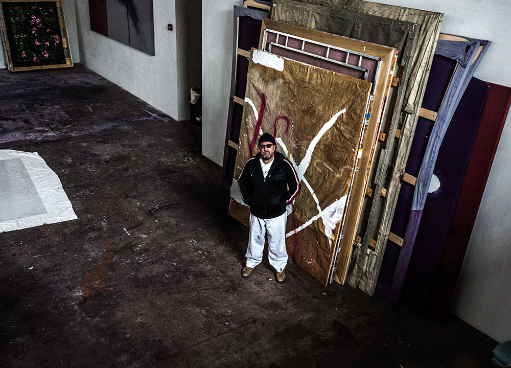
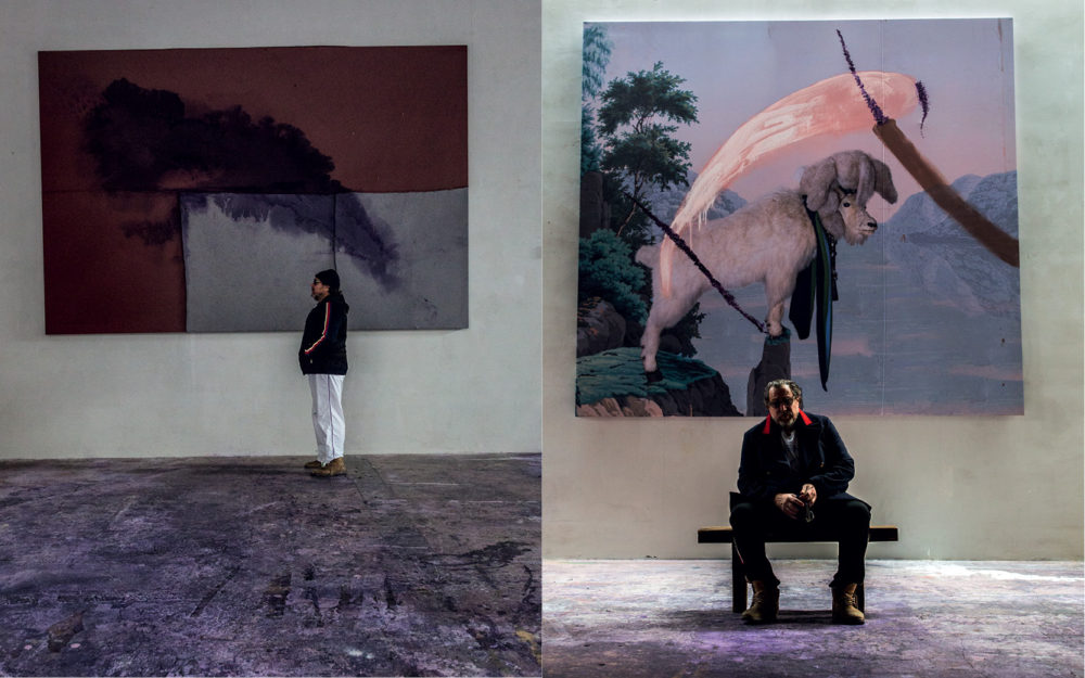
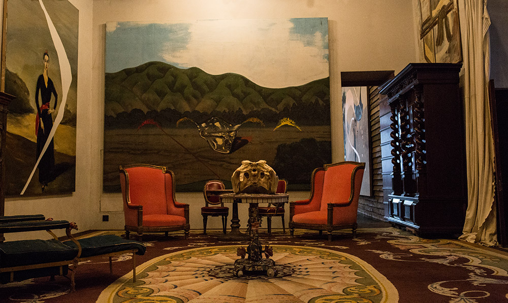
Even if you don’t know who lives there, the home and studio of the painter Julian Schnabel is a familiar sight for denizens of downtown Manhattan. As the West Village stretches out toward the water, a pale pink tower rises out of blocks of low apartment buildings and townhouses. This is Palazzo Chupi, a residence that Schnabel designed and built in 2009, so called after the nickname of his second wife, Olatz López Garmendia. The structure, with its stepped-back floors, curved windows and arabesque arcades, resembles a cross between a modern condo and a medieval castle in Convivencia Spain. 

To visit Schnabel, one must first make a procession through Palazzo Chupi’s imposing wooden doors on the ground floor and into a tall, dark elevator that features a wall-size mirror, pointed ceiling and a woven bench, in high Gothic style. The doors open on to a sudden mirage, or so it seems: a room of billowing red velvet curtains, stone tiles and enormous paintings covering every available patch of wall – the domain of a deposed monarch in exile perhaps, or one of the best-known and yet least-understood living artists in the world.

Two summers ago, Schnabel was visiting the cemetery where Van Gogh is buried, in Auvers-sur-Oise, to the north of Paris. ‘There were these rose bushes with these pink roses, and there’s this black wall around the cemetery that had little white stones in it,’ he says. The scene provided the impetus for some dozen paintings, which hang, stately, at Pace, like a room of Monets at the Museum of Modern Art, pre-historicised. ‘There’s a work ethic in these paintings, a paintedness that is a very old-fashioned way of being a painter.’

The grandeur of Schnabel’s current surroundings and the Pace exhibition is all part of the artist’s carefully cultivated mystique. As a representative icon of 1980s New York City painting, in all its excesses, and the mascot of the neo-expressionist wave that preoccupied painters at the time, these days the artist is famous for being famous. The New York Times called him “the carnival man of contemporary art” as far back as 1982. Schnabel and his several ex-wives and art-world model girlfriends, and his now-adult children – son Vito and daughter Stella – have been mainstays of the society pages ever since. 

Another factor has increased Schnabel’s public notoriety. He leveraged his fame into Hollywood as well, tapping friendly actors and funding films with his own fortune. The results, movies like Basquiat (in which Bowie plays Warhol) and The Diving Bell and the Butterfly, display a unique visual sensibility. A new film project will explore the life of his most recent inspiration, Van Gogh, succeeding his paintings.

Yet Schnabel’s new rose period presents a mystery. These are quiet, contemplative paintings, more introverted than anything Schnabel has done in decades. What happened to the bad boy of the 80s, the builder of pink towers, the unrepentant enfant terrible of the art world?

Schnabel’s salon, the room where I meet him, is hung with paintings from the various phases of his long career: an autobiographical solo exhibition that continues throughout his home, hung between eclectic artefacts like a toreador costume and a Chinese idol. In the kitchen is an inchoate work from the 70s, a dark canvas fixed with shelf protrusions and painted with wandering lines, somewhere between neo-expressionism and Arte Povera. Two of the more recent series much in evidence are the ‘Navigation Drawings’, maps with sweeps of thin, translucent paint; and the ‘Goat’ paintings, in which a photograph of a stuffed version of the titular animal is set against a swatch of 19th-century wallpaper and daubed once more.

The rose pieces represent another turn. Schnabel reclines on one side of a long couch and I sit in a throne-like chair beside it, positioned like a therapist to his patient, but the painter gestures for me to sit with him. He eases back further. ‘I want things to be able to be different and address other things, rather than make the same thing over and over,’ he says, gesturing at the work around him.

When talking to artists, there are certain patterns that emerge, no matter what kind of work the artist makes, no matter how famous or obscure they are. One is that they don’t like to be tied to their influences, even if they are undeniable art historical reference points. Hence Schnabel’s dismissal of my initial suggestion of Cy Twombly as a comparison for his rose paintings. Schnabel is a fan of the late painter, whose play between figuration and abstraction his own work echoes, but Twombly’s flowers aren’t his favourite, he says. 

Another reality of conversations with artists is that any attempt to describe their work to them will inevitably fail. This constant falling-short brings to mind the paradox of trying to interpret art in the first place: the experience of viewing it is never the same, nor often remotely similar, to the process of making it, of having your nose up to the canvas and your brush in the paint. The piece often doesn’t mean to its viewer what it means to its creator. ‘You’re doing something and people are all around you, but they don’t see what you see and they don’t know what you’re doing,’ Schnabel says. 

It’s this gap that the artist hopes to represent in his film about Van Gogh, now that he has put an end to the rose series, he says. He can let the audience in on the process of art-making from the painter’s perspective, even as the characters in the movie remain distant from it. Showing the reality of Van Gogh’s life and work seems to be a way for Schnabel to reconcile his own fame with the fact of his ongoing artistic practice, though his own career couldn’t be more different than the post-Impressionist’s – Schnabel has sold far more than one canvas in his lifetime. 

‘The movie’s about painting. Van Gogh as a human being has been highly mythologised; his death and his ear have been mythologised. It would be nice to make a movie about a guy everybody thinks they know about, but maybe they might be surprised,’ Schnabel says. Over the course of our conversation he pauses for longer and longer moments, either fighting sleep or diving into an inner landscape, imagining the work to come.

By this point, the long afternoon has overtaken the city, the sunlight is starting to dim, and Vito’s living room is hushed and enclosed, an unreal space filled with the living detritus of culture. The roses, to offer up my own paltry interpretation, are an effort to seek solace in the rush of time, a way to begin to find a place in history, if there is one to be found. That the blooms the paintings depict will fade is inevitable, but Schnabel has captured them, to set against every image of every flower that will ever be made by an artist. Here is his enduring offering. 

‘Painting seems to last a long time. It’s a wonderful refuge. The painted world is a place where you can reside outside of the world of everything else,’ Schnabel says, and pauses for the longest time, reclining flat on the couch, eyes closed, searching for something internal and then coming back up with it, a vulnerable twinge in his voice communicating a universal ache. ‘In there, there’s a great freedom. Obviously, there’s this crazy relationship with eternity. It’s a denial of death.’

This article is taken from Port issue 20. To subscribe, click here.

Photography by Michael Avedon
Styling by Dan May


Albam AW15: Picture Perfect Layering

David Hellqvist talks to photographer John Spinks about his latest work for British menswear brand, Albam

AUT.HORIZ.01.150dpi

Fashion is only as good as its image. This business – more than most – is all about perception. That’s the reason why brands still spend lots of money on print campaigns, even though we live in the fast food lane of the Internet, where images are consumed quickly and in large quantities. Creating a visual interpretation of what a brand stands for, and what the current collection looks like, is crucial when it comes to communicating with consumers. They will need to be able to identify with the images while also seeing them as aspirational. It’s a fine line.

Laid back British menswear brand Albam has – thanks to its longstanding relationship with photographer and PORT contributor John Spinks – managed to strike that balance. Spinks’ gentle take on Albam’s iconic wardrobe staples – some of them seen on PORT
before – signify a working relationship at ease. The photographer’s earthy colours and honest positioning makes for a compelling Albam portrait; believable yet ambitious, wearable yet directional. Here, Spinks explains the images and the process behind them.

Landscape Composites2

Who are your collaborators?
The final visual pieces are the result of conversations between myself, Albam co-founder Alastair Rae and Mark Tappin, the art director. We work very closely together.

Who created the artwork that goes with the pictures?
They both came through my wife, Nora. The flower painting was owned by her grandfather, and the landscape she found in a charity shop in Norway.

Landscape Composites3

How does the artwork fit in with the pictures?
First, the colours in both paintings seemed perfectly in tune with the colour palette Nick and Alastair are using this time around. Second, a particular notion of nature and the landscape informs the thinking behind the AW15 collection, so both pictures were perfect in that regard.

What would you say is the atmosphere of this Albam season?
The figure in the landscape. The idea that there is a very real connection between who we are and where we find ourselves.

Landscape Composites (lo res)4

Are you a Spring or Autumn wardrobe person?
Definitely Autumn. I really like a good coat.

Who’s the model?
Duncan Pyke. I had worked with Duncan before and really enjoyed it. He has a presence that is quite particular, a lack of ‘blankness’.

Landscape Composites (lo res)

What do you like most about Albam?
They work very hard and are an extremely pleasant group of people to be around, from those working behind the scenes to the guys in the shops.

I really enjoy the things they make. The clothes have always been interesting, but the last year or so has marked a significant change. A lucidity has emerged, a clarity of thought…

How would you describe the brand to someone who hasn’t encountered it before?
An excellent gentleman’s outfitters… but not quite as expensive as that sounds.

AUT.HORIZ.02.150dpi

What’s your favourite piece from Albam’s AW15 season?
The hunting cagoule. It’s quite a simple waxed coat: very practical, with a good colour and shape.

What is the connection between you and Albam and where is the ‘aesthetic overlap’?
We’ve been working together for a number of years now, and I think over that time we have developed a sort of common language, a shared sensibility.

Albam