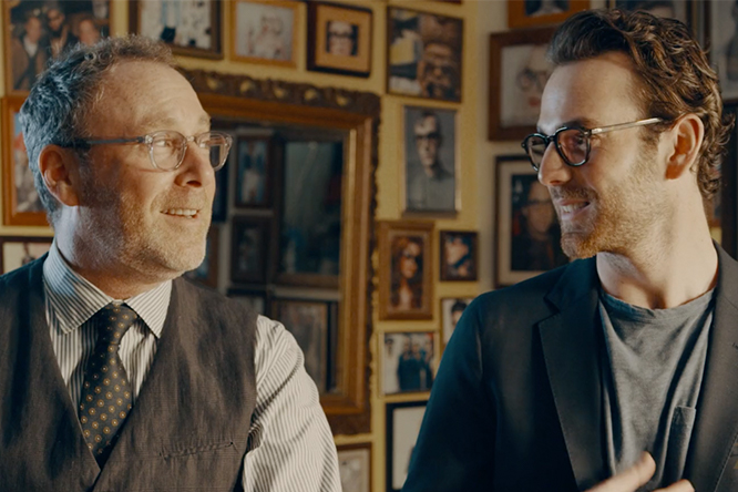
Fishing in New York

New York may not seem the obvious place to indulge the pastoral pastime of fishing, but then it isn’t a city known for following the rules. Taken from Issue 20, our special issue on the city

Illustration by Eric Chow

The New York angler may be the most misunderstood outdoorsman of them all, because what could be more vile than someone who fishes in the dark polluted waters of New York?

Live here long enough and you’ll see us, perched along the East River, or in Sheepshead Bay, using shrimp or clam as bait, waiting for our hooks to set, and avoiding irritation from the city dwellers who inevitably stop to ask:

“You really go fishing in this water?”

“Do you eat what you catch?”

“Ever caught a body part?”

“Can I take your picture?”

My answer to #3 is No: although I have caught mattress chunks and human hair. But the questions are eye-roll inducing because we’re well aware that fishing in New York is not the same as casting for trout in the crystalline streams of a freshwater river. But like many aspects of New York, from sunbathing on its sooty beaches to playing catch in wilting parks, fishing is an exercise in compromise, and one with an idiosyncratic culture all of its own.

I started fishing around the city last summer when I moved to Chinatown and noticed a local angling community. Men pedalled around the neighbourhood on bikes equipped with fishing rods and tackle boxes, and they pedalled back home with plastic bags containing thrashing fish. The fish were caught from the East River – possibly the filthiest New York waterway of them all – where the men would post up with cigarettes and reel in striped bass, blackfish, bluefish, sea robins and writhing eels. I’d enjoyed fishing in the past, so I decided that with an open mind, I could give it a shot.

I bought my first rod from an aquarium supply store on Delancey Street that maintains a small bait and tackle operation behind its counter front. I got lucky with my first cast into the river. After reeling in the hard bite, the striped bass hit the concrete, instantly collecting street dirt. An old man rushed to my aid. A paper bag was produced and the fish slipped inside. I let him keep it. A local jab at Chinatown’s fish markets is that certain specimens probably come from the brackish waters just a few blocks away.

Some New Yorkers eat fish that comes from city waters. Bottom feeders like eel, sea robin and flounder are found all around New York Bay, and it probably isn’t wise to eat them, but it happens. On the other hand, one of the most prized eating fish in North America, the striped bass, is found in the same waters.

Stripers are prized for their fight and their taste, and they engage in an annual spring run up the Hudson River, considered one of the great migrations of the East Coast. It starts in Lower New York Bay, near the financial district, and makes its way up the Hudson, where it eventually concludes in the northern reaches of the state. At peak, the rush of fish is so intense that one can cast a hook just about anywhere and land a striper. From spring until late summer, a striper caught near the World Trade Center could be the same striper caught off flashy East Hampton, where it would be served for $50 with a squeeze of lemon. Try explaining this to a fellow New Yorker, however, and you’ll get concerned stares. (I don’t eat city fish, and practice catch-and-release.)

For all the indignities that city anglers endure, like crowds watching them reel in what ends up being a car tyre, there are moments that transcend the concrete.

The best-known fisherman in my neighbourhood may be a man I call Prescription Bottle Tony. He’s in his 80s, his name is Tony, and he uses a prescription bottle wrapped in monofilament line as a rod. A metal washer on the line serves as a weight, and clam is his bait of preference. On summer afternoons, I fished with him, and, as he jigged on the prescription bottle’s line, he told me what it was like fighting in the Korean War.

Another afternoon, seagulls started feasting on the waters just off Catherine Street. This is a good sign because it means a school of fish has arrived, which means large apex predators – like big striped bass – are lying nearby in wait. Practically everyone caught something that day, including an old Greek man who spoke no English and watched from afar with envy. Eventually, I invited him to join me and we traded casts for over an hour without exchanging a word. Later, we reeled in a plump striped bass as the sun started to set.

Battery Park, at the foot of Manhattan, has one of the most popular fishing sites in the city, because its waters are closest to the Atlantic. This boulevard of park benches is crowded with boom boxes playing Cuban jazz and men chomping cigars. One afternoon, I sat on the moorings and dangled my legs over the water. I held my rod loosely, lost in the vast expanse of ocean ahead of me. After a while, it was easy to forget a metropolis was behind me at all. I caught nothing that afternoon, but it didn’t bother me.

Inevitably, you become an advocate for the maligned hobby, and you find that the stereotypes of fishing still ring true in New York. Even below skyscrapers, fishermen stretch yarns about the size of their fish, they swear by lucky lures, and they guard locations of fishing holes closely. I didn’t think I’d adopt any of these clichés, but I picked up all of them, including an urban fishing hole of my own.
As the season started to wind down, my friend Sam and I went to Staten Island. We took the ferry from Manhattan, armed with our rods, and visited Liedy’s on arriving, which is the oldest bar on the island. I asked the owner if he had any suggestions on where to fish. He divulged we should try the waters behind a lonely gas station two miles down the road.

It was a scene of dilapidation. Old warped train tracks ran behind the gas station, and past them, a pebble beach littered with trash. The Manhattan skyline loomed quiet and small in the distance. We followed the warped track until we encountered a rocky chasm. A concrete structure stood in the waters and a creaky plank led to it.

We crossed carefully and then made ourselves at home, setting up sandwiches and beers. A group of striped bass fed right below us. We spent an hour trying to game them with our bait. Large oil tankers rolled past and a full moon started to glow. After a while, it became bright and huge. I stopped caring about the fish, and started casting out over and over again as far as I could, just for the joy of it.


Spotlight One

Little Wing Lee reflects on the inaugural exhibition from Black Folks in Design at the Ace Hotel Brooklyn

All photography Kelly Marshall

A hand turned vessel is finished in hardy wenge wood; the bruised-lilac of the okra plant is woven into wool; an ideally proportioned chair nods to early 20th century Viennese architecture. These collected items are a glimpse of the works currently showing within the Spotlight One show at Ace Hotel Brooklyn, New York. The inaugural exhibition from Black Folks in Design – a collective of Black designers from an array of disciplines – showcases deftly created furniture, sculpture and textiles from the likes of Garth Roberts, Kyle Scott Lee, Lisa Hunt, Luam Maleke, Studio ANANSI and Studio & Projects. Interior, architectural and environmental designer Little Wing Lee founded the art and design network in 2017 to create economic opportunities for Black creatives and help forge a world that “recognises their cultural contributions, excellence and importance”. With a keen eye, she has curated a show that does exactly that, celebrating the nuances of material, craft and form.

Here, she reflects on the exhibition, discussing how to create welcoming spaces, the Black designers who inspire her, and the strength of a collective. 

Little Wing Lee

How does your practice – as an interior, architectural and environmental designer – inform your worldview? 

Actually, I would say that my worldview informs my practice. 

Spaces that are designed and considered should be for everyone. Design can be in service to all people and I believe that beautiful and functional spaces impact people’s lives. A space can make you feel at ease, energised or focused. A well designed space amplifies its function, whether it’s feeling welcomed and relaxed in a hotel, or a school that inspires you or a museum to educate you.

And a follow up, how does it shape your approach to creating spaces, whether that’s physical exhibitions or digital networks? 

My work takes a narrative approach to design. I always think about the story and connection behind the design decisions I make.

As an interior designer, I am not only concerned with the interior space of a project. The experience as you approach a space can be an important part of your experience of an interior. It can work to set the tone and mood. Similarly, a view within the space will affect how you experience a room – think of a view into a garden or cityscape in the background and/or foreground of the interior. 

It’s important to me for people to feel comfortable in a space – to feel that all of the components were considered for them.

OKRA rug by Studio & Projects in collaboration with Odabashian

Why did you establish Black Folks in Design, and what are the strengths of a collective such as this?

I was an exhibition designer for the National Museum of African American History and Culture in Washington DC. The exhibition and design team was primarily made up of Black designers. Having worked in other design offices, I was often the only Black designer. The experience of being in a room with other Black architects, interior, graphic and interactive designers working together on the concept of this museum was incredible. After the NMAAHC was completed, I thought, “When will I have the opportunity to work alongside so many talented Black designers?” I looked for an organisation where Black designers could meet one another, share opportunities or ways to collaborate. Since that space didn’t exist, I decided to create it myself. In 2017 I launched Black Folks in Design (BFiD) as a network that connects Black designers within and across disciplines to support each other and share professional opportunities. We help people understand the excellence, contributions and importance of Black designers and we create economic and portfolio-building opportunities for Black designers.

What was the curation process for Spotlight One? Why were you drawn to these particular designers? 

For the inaugural exhibition for BFiD I wanted to exhibit a variety of aesthetics and mediums, to show the range of approaches and visions of Black designers. The exhibit space itself was modestly sized, so I wanted to be sure each piece carried its own weight. In pulling together the show and meeting the exhibitors it was wonderful to discover the connections between so many of us – past and current collaborations, mutual friends, and colleagues.

Framework chair by Luam Melake

There are nods to Europe (Luam Melake’s chair) and plenty to Africa (Wenge Wood used in Studio ANANSI’s Ode vessel, the okra plant represented on Studio & Projects x Odabashian’s rug), how does Spotlight One interpret and play with these geographies through material and aesthetics, what is their relationship to them? 

We are all influenced by the context in which we live and work and by our own personal histories. But of course, we’re all global citizens and our lens extends globally. I can say in the case of the rug Studio & Projects created for the show, the construction of the rug is rooted in Asian traditions, while the pattern is grounded in African American culture with connections to West Africa. 

I know you’re not meant to have favourites, but what work would you take home and keep?   

Oh, that’s a really tough question! I really couldn’t pick just one. Each piece would work in my home and I would be honoured to own it. If I were to place them, I would hang Lisa Hunt’s wall piece in the dining room, Studio ANANSI and Kyle Lee’s objects on my mantle or nestled on my book cases and use Garth Roberts’ stool and Luam Melake’s chair in my living room to compliment the Studio & Projects rug. I love the true aesthetic variety they represent. 

Research for the OKRA rug by Studio & Projects in collaboration with Odabashian

Who are some of the Black designers (past or present) that inspire you?

As a part of Spotlight One we have a digital slideshow of Black designers from the past and present. It was important for me to try and give the context of the long legacy of designers and current designers working today. I’ve always been inspired by the work of Philip Simmons from Charleston, SC. I recently bought a book about his life and work and love seeing his process of hand sketches for the design of his ironwork. Another would be the work of Walter Hood. I started my path to design through my love of landscape architecture. I appreciate his sculptural and historic approach to landscape design. There is meaning and beauty in all of his projects.

Given that Spotlight One is Black Folks in Design’s inaugural exhibition (congratulations), what have been some of your learnings? And, are you excitedly thinking about the next one?

Spotlight One is the first exhibition for BFiD and my first time curating a show. I’ve learned so much in the process and am excited by the possibility of doing another one. The reception to the first show was more than I could have hoped for and we’ve been approached from galleries in the US and abroad for future exhibits. I’m also excited by the idea of having other designers in the network curate shows and to have the excellence of Black designers shown around the world.

Spotlight One exhibits at Ace Hotel Brooklyn until June 29th, 2022

Photography Kelly Marshall

acehotel.com/brooklyn

blackfolksindesign.com


Common Place

In his ongoing series, Scott Rossi highlights the importance of public space for building community

Lily, Reef, Kane, and Luci, Central Park, New York, USA 2022

Capturing the world around you is one thing, yet doing so in a way that’s not only mesmerising and memorable but also rich in context and history is another. Scott Rossi, a Canadian photographer based in New York, does this utterly well in his photography work. With an ability to lens the moments of daily life around him, Scott draws from the quieter parts – those that are smaller and often missed to the untrained eye – to build stories about the people of the world. In this regard, subcultures and public spaces are the two key pillars to his practice, which have naturally informed his latest series, Common Place. A project that commenced during the pandemic while out and about on his daily walks, Scott set out to photograph the local community in Central Park and their relationship to the natural world. Below, Scott tells me more about the series and the importance of public space – a relationship that will continue in the future.

Untitled, Central Park, New York, USA, 2021

What’s your journey into photography like?

I grew up in the suburbs of Vancouver, B.C. When I was five years old, my father arrived home one evening with a go-kart. I spent the next 13 years racing go-karts around the world, from British Columbia to the streets of Monte Carlo. 

Photography was not always on the cards for me. After my dreams of becoming a professional race-car driver were over, I studied Psychology at university. I only began taking photographs in my final year by chance. In that elective photography course, my professor introduced me to the work of Garry Winogrand and Joel Meyerowitz, which derailed my plans. I couldn’t shake photography away. It gave me a new purpose. I spent the next two years primarily photographing my surroundings without much intent or reasoning behind my actions. I simply wanted to capture beautiful, fleeting moments. 

In 2018, I started making long-form projects. In them, I discovered the power of visual storytelling. I began to value not just the results, but the process of engaging with my subjects, establishing an intent to the work that previously lacked. In the first two projects I worked on, Burned Out (2018-19) and Jazz House (2018-20), I documented coming-of-age stories. Whereas Common Place (2021), which I began shortly after moving to New York City, explores the history of Central Park and the relationship between New Yorkers and the public space in the context of a global pandemic. 

Quinceañera, Central Park, New York, 2021.

What inspired you to start working on Common Place, what stories are you hoping to share?

In Vancouver I was surrounded by nature. After I arrived in New York City, in the height of the pandemic in 2020, I began to miss nature and felt lost and uninspired, so I started going on long walks through Central Park. I began photographing during those walks with a point-and-shoot camera. I was studying at ICP at the time, and I thought this point-and-shoot idea would be a good side project to my thesis, which was still undecided. Eventually, I realised the side project was worthy of the main thesis idea. I bought a new pair of shoes, switched to a medium format camera, and began photographing Central Park every day. I hoped to share the stories of the people I met there through photographs. 

The work highlights the importance of public spaces, especially in a city like New York, for the overall wellbeing of its people. This city and Central Park, have a complicated but also rich history. Today, despite its history, I think the Park is seen as a sanctuary and a place to be yourself and I hope that comes through in my photos.  

South of Sheep Meadow, Central Park, New York, 2021.

Who are your subjects? Did you spend much time getting to know them?

I meet all my subjects while wandering around the park and typically photograph them as they were. It is that level of comfort and intimacy that piques my interest in the first place. Most of my subjects happened to be New Yorkers, with a few exceptions. 

How long I spent with them really depended on the person. With some people we would spend hours talking, while others gave me only five minutes. Regardless of how long, I was always transparent about what I was doing.

Aaron and Eralissa, Central Park, New York, 2021.

Can you share any personal favourites from the series?

Aaron holding his baby daughter Eralissa has always been a favorite. There is subtext in this image, but for me, the cutest part is thim holding his daughter on his dog tag necklace. Once I noticed that, my heart melted. 

Then of course, Dave. He is a Latin professor and track and field coach at an Upper East Side high school. I think it’s his oversized tie and baggy suit that made it all come together so well, along with the fact that he is marking student’s papers while they run laps around the reservoir. 

A third favourite of mine is the trees with afternoon light passing through. This is exactly how I feel about Central Park. It has been my home away from home. I feel a warmth when I am there and am constantly “invited” down new pathways. This picture, with the pathway leading us into it, invites the viewer. 

Spring Bloom, Central Park, New York, 2021.

How do you hope your audience will respond to this project?

I hope people feel something when they look at the images. Whether they feel love, hope, or sadness, it doesn’t really matter. I just hope people feel something. As with all photography, for me, an emotional response is the most important.

Untitled, Central Park, New York, USA, 2021

Dave, Central Park, New York, USA, 2021

Geese, Central Park, New York, 2021.

Untitled, Central Park, New York, USA, 2021

Dirk Braeckman: LUSTER./

The first NYC solo show in 15 years at GRIMM, the photographer challenges our perspectives of reality with nine years’ worth of boundary pushing imagery

Dirk Braeckman: S.N.-U.N.-21, 2021. Ultrachrome inkjet print mounted on aluminium in stainless steel frame Framed: 90 x 60 x 3 cm | 35 3/8 x 23 5/8 x 1 1/8 in Edition of 5 plus 1 artist’s proof (#1/5) (c) Dirk Braeckman. Courtesy Zeno X Gallery, Antwerp, Galerie Thomas Fischer, Berlin and GRIMM, Amsterdam and New York

The opening image of Dirk Braeckman’s first solo show of 15 years is quintessentially Dirk Braeckman. This photo greets you with a stark uneasiness; a body-like composition appears to be cradling itself amongst some crispy sheets and materials, the colours printed in a signature tone of ashy monochrome. Sombre, dark and melancholy, the name – S.N-U.N.-12, 2021 – is just as allusive as its subject matter, where you’re not quite sure of its offering, let alone its narrative and context. But one thing we do know is that the piece is an ultra chrome inkjet print, mounted on aluminium and hung in a stainless steel frame; a technique widely employed throughout the photographer’s boundary pushing practice. 

Minutes later and you’ll float quietly past the image titled U.M.-V.P.-16, an almost opaque depiction of a subject laying on a a bed – their face obscured from the camera’s gaze and the lines of the body only just visible to the audience. Similar to when a bright flash goes directly into your eye and your pupil rapidly adjusts to its surroundings, this gelatine silver print is hauntingly mysterious. What follows next is a series of landscape explorations, the sea crashing against the sepia-tinted cliffs and the dynamic ripples of the ocean reflecting the small amount of light available to the lens. You might not have come across anything so considered and technical before, where layers of life and perspective have been thoughtfully composed into a dystopian depiction of the world. 

Dirk Braeckman: U.M.-V.P.-16, 2016. Gelatin silver print mounted on aluminium, aluminium support & frame Framed: 180 x 120 x 3 cm | 70 7/8 x 47 1/4 x 1 1/8 in Unique in a series of 3 (#1/3) (c) Dirk Braeckman. Courtesy Zeno X Gallery, Antwerp, Galerie Thomas Fischer, Berlin and GRIMM, Amsterdam and New York

Based in Belgium, Dirk has spent the last 40 years as a photographer. Over this time, he’s continued to build on his impressive portfolio replete with recognisable and undeniably expressionistic artworks, that of which have garnered him a credible name in the field. Instead of offering up his stories and motives on a platter for the hungry viewer to quickly ingest, Dirk contrastingly leaves a sense of mystery throughout all that he creates. He’s a suckler for the darkroom, too; he works like a painter as he experiments with the creative process, altering negatives through various tools and double exposure techniques. The result of which is almost unrecognisable, from altered seascapes, darkened bedrooms, wallpapers and nudes awash in a tone of grey. What is reality, when conceived through the eye of this knowingly stirring photographer?

Toying with the unknown, Dirk’s photography is very much the case of ‘show don’t tell’. It’s an illusion ready to be found out – like the moment of uncovering a magician’s trick. Whether we find this book of secrets, though, is something we can only hope for. But for now, revelling in the beauty of the imagery at hand is more than enough. 

Dirk Braeckman: U.C.-T.C.I #2 -21, 2021 Ultrachrome inkjet print mounted on aluminium in stainless (series of five works) 180 x 120 x 3 cm | 70 7/8 x 47 1/4 x 1 1/8 in (each) Edition of 3 (#1/3) (c) Dirk Braeckman. Courtesy Zeno X Gallery, Antwerp, Galerie Thomas Fischer, Berlin and GRIMM, Amsterdam and New York

The exhibition features a wide-spanning collection of his works from 2012 to 2021 that not only give the audience a firm understanding of the breadth of his practice, but also his commitment to his artistic language. There’s a synchronicity between each piece, where fluid movements of nature meet with the candid postures of his subjects. What I find particularly interesting, too, is the omnipresent feeling of light. In many of his photos, there’s a glimmer of light presented in the frame. This is either portrayed as a more obvious ray of the moon or the more allusive, like the moment someone tries to photograph an artwork in front of them, only to have been met with the light bouncing off the frame. Other times, the light is more finely sprinkled than it is all-encompassing, but it’s always there – keeping you in check with the reality.

Towards the final moments of the exhibition, you’re then met with a piece named T.S.-O.S.-18. There’s a familiarity about this one – the darker palettes, handing drapes and wallpaper. Yet what’s different this time around is that there’s no subject to be seen, no-one cradling their own body in the dimly it room. The absence of a person leaves you wondering whether what you’ve just been looking at was ever there at all; that art and photography a subjective, illusive thing. 

LUSTER./ is currently on show at GRIMM New York until 26 February 2022. 

Dirk Braeckman: B.J.-D.U.-12, 2012. Gelatin silver print mounted on aluminium, aluminium support & frame Framed: 180 x 120 x 3 cm | 70 7/8 x 47 1/4 x 1 1/8 in Edition of 3 plus 1 artist’s proof (#2/3) (c) Dirk Braeckman. Courtesy Zeno X Gallery, Antwerp, Galerie Thomas Fischer, Berlin and GRIMM, Amsterdam and New York

Dirk Braeckman: B.S.-S.B.-18 #3, 2018. Gelatin silver print reversibly mounted on aluminium 180 x 120 x 3 cm | 70 7/8 x 47 1/4 x 1 1/8 in (c) Dirk Braeckman. Courtesy Zeno X Gallery, Antwerp, Galerie Thomas Fischer, Berlin and GRIMM, Amsterdam and New York

Dirk Braeckman: R.N.-W.S.-21, 2021. Ultrachrome inkjet print on matte paper 180 x 120 cm | 70 7/8 x 47 1/4 in Edition of 3 plus 1 artist’s proof (c) Dirk Braeckman. Courtesy Zeno X Gallery, Antwerp, Galerie Thomas Fischer, Berlin and GRIMM, Amsterdam and New York

Dirk Braeckman: F.W.-S.V.-21, 2021. Ultrachrome inkjet print mounted on aluminium in stainless steel frame Framed: 180 x 120 x 3 cm | 70 7/8 x 47 1/4 x 1 1/8 in Edition of 3 plus 1 artist’s proof (#1/3) (c) Dirk Braeckman. Courtesy Zeno X Gallery, Antwerp, Galerie Thomas Fischer, Berlin and GRIMM, Amsterdam and New York

Dirk Braeckman: L.U.-A.L.-21, 2021. Ultrachrome inkjet print mounted on aluminium in stainless steel frame Framed: 180 x 120 x 3 cm | 70 7/8 x 47 1/4 x 1 1/8 in Edition of 3 plus 1 artist’s proof (#1/3) (c) Dirk Braeckman. Courtesy Zeno X Gallery, Antwerp, Galerie Thomas Fischer, Berlin and GRIMM, Amsterdam and New York

Dirk Braeckman. 27.1 / 21.7 / 045 / 2014, 2014 Ultrachrome inkjet print mounted on aluminium support & frame Framed: 120 x 180 x 3 cm | 47 1/4 x 70 7/8 x 1 1/8 in Edition of 3 plus 1 artist’s proof (#2/3) c) Dirk Braeckman. Courtesy Zeno X Gallery, Antwerp, Galerie Thomas Fischer, Berlin and GRIMM, Amsterdam and New York

Dirk Braeckman: R.N.-W.S. #2-21, 2021. Ultrachrome inkjet print mounted on aluminium in stainless steel frame Framed: 180 x 120 x 3 cm | 70 7/8 x 47 1/4 x 1 1/8 in Edition of 3 (#1/3) (c) Dirk Braeckman. Courtesy Zeno X Gallery, Antwerp, Galerie Thomas Fischer, Berlin and GRIMM, Amsterdam and New York

Dirk Braeckman: S.G.-B.S.-21, 2021. Ultrachrome inkjet print mounted on aluminium in stainless steel frame Framed: 180 x 120 x 3 cm | 70 7/8 x 47 1/4 x 1 1/8 in Edition of 3 plus 1 artist’s proof (#1/3) (c) Dirk Braeckman. Courtesy Zeno X Gallery, Antwerp, Galerie Thomas Fischer, Berlin and GRIMM, Amsterdam and New York

Dirk Braeckman: T.S.-O.S.-18 (1_1), 2018 Gelatin silver print reversibly mounted on aluminum 180 x 120 cm | 70 7/8 x 47 1/4 in Unique in a series of 3 (#1/3) (c) Dirk Braeckman. Courtesy Zeno X Gallery, Antwerp, Galerie Thomas Fischer, Berlin and GRIMM, Amsterdam and New York


Cindy Sherman – Contact

A new book by Jeannette Montgomery Barron presents a different, less fictionalised side of the American photographer 

© Jeannette Montgomery Barron

In some ways, we’re all familiar with the face of Cindy Sherman, an American photographer known for her self-portraiture adorned with wigs, prosthetics and elaborate makeup. For the last four decades, Sherman has turned an inquisitive eye onto the concept of identity, deconstructing its codes into varying pastiche of art, gender and self. 

In a conversation with John Waters for MoMa in 2012, she said, “I wish I could treat every day as Halloween, and get dressed up and go out into the world as some eccentric character.” So it’s somewhat fitting, then, that Jeannette Montgomery Barron would end up photographing Sherman on Halloween in 1985, an annual event that sees America congregate in partying mass and embellished in fancy dress. Jeannette was invited to Sherman’s studio in the city, and it was in this very moment that she sat herself in front of the camera as her own subject – revealing a face without all the typical costumes and fictional characterisations.

This was nearly 30 years ago, and the pictures have now been brought into light with a new book, Contact, published by NJG Studio. A compilation of 40 images and four contact sheets, the visual tome presents a different side of Sherman, as seen through the eye of Barron who’s known for capturing portraits of many notable names from New York City during the 80s. Below, I chat to Barron to learn more about this meeting.

© Jeannette Montgomery Barron

Having lensed many renowned personalities over the years, what was it that captivated you to photograph Cindy Sherman?

When these portraits were taken in 1985, I had already photographed many people in the art world. Cindy was an artist whose work fascinated me. I just really wanted to photograph her. 

How did the shoot come about; was she happy to be photographed?

I called her up on the phone and asked if I could photograph her – that’s the way it worked back then. If someone wasn’t home, I’d leave a message on their answering machine and they would hopefully call me back. 

She seemed happy to be photographed. I really hope she was. 

© Jeannette Montgomery Barron

Was there a specific reason for photographing on Halloween in 1985? Does this date have much significance?

I’m pretty certain the date, 31 October, was chosen randomly. And I never really thought about the significance of the date until recently. 

What was the art landscape like in New York at this time?

Well, you know, we all tend to romanticise the past. But I remember Soho still being a bit rough and wonderful back then. One vivid memory was walking around a corner onto West Broadway and always smelling fresh pepper; there were warehouses still down there.  

I’d always stop by and say hello to Mary Boone when I was downtown, and also pop across the street to Leo Castelli’s gallery. I had two good friends who moved to a loft in Tribeca in the early 1980’s. If you can imagine, there was not one grocery store down there back then; it was kind of like the wild west. 

© Jeannette Montgomery Barron

What can you tell me about Sherman’s real-life character and persona? And how did this compare with your expectations?

Cindy was very quiet and reserved as I recall. I’m not sure I expected her to be any other way, even though her work may have led one to expect differently.              

What was the process like; was it much of a collaboration between the two of you – between a photographer and subject? How exactly did you want to portray her in the photographs?

My process was always much the same: I would arrive exactly on time with my Hasselblad 500 C/M and usually Tri-x 400 film (although for these portraits I used Ilford film, which was unusual). I had two Lowel Tota Lights with stands I always brought along. And I always used a tripod for my Hasselblad. 

I would usually find a spot where I want to photograph the subject and move around a bit, getting closer, going further away. Then sometimes I would change location and go somewhere else in the studio or apartment. 

I wanted to portray Cindy as Cindy without all of the costumes on. I imagine that’s what she wanted too, since she answered the door in her normal clothes.  

© Jeannette Montgomery Barron

What’s it like looking back on this moment in time; how does it feel to revisit these pictures again?

I have to say it feels just like yesterday. It’s been great to rediscover some of the images I never printed before.  

And how do you hope your audience will respond to the work?

I hope it will be a fun ride for those who were not around in the 1980’s, and a blast from the past for those who were. 

© Jeannette Montgomery Barron


David La Spina

An exclusive portfolio by photographer David La Spina explores the hidden patterns and intimate moments of New York street life

All you need to know about David La Spina is in the first picture of this portfolio. He is motivated when the light is hot and strong and the contrast is high. He frames chaos within chaos. He picks up on signifiers of how we live. Two women grip cell phones with ferocity. Are they hostage takers or hostages? One of the women listens intently to one phone while holding another. What does it mean to have two phones?

La Spina’s photos are full of everyday mysteries and nuances. The uncanny waits for him. With quick reflexes he snags the splatter of light and shade on their faces. The smudgy shadows tumbling down the side of the woman’s face as she steps into sunlight could not be more perfect if he drew them in with a charcoal stick.

As the women come towards us, La Spina also registers the back of a man walking towards them. And then he re-raises the ante by lassoing the leafy shadows on the gentleman’s shoulders, and then the shadow of yet another person falling across the man’s back. Is it La Spina’s shadow? Can this be the portraitist inserting a self-portrait among the pedestrians on an ordinary day of extraordinary Manhattan light? The man’s bent fingers at the edge of the frame add to the choreography of hands. A ‘Parking’ sign descends in the background, testament to La Spina’s love of vernacular typography. La Spina is the equivalent of a studio musician laying down all of the tracks in a song, all at once.

La Spina’s images savour the urban elegance of stairs, wrought iron railings and fire escapes. The angles, edges, reflective surfaces and intersecting shapes of urban buildings inspire and delight him. His eye owes its rigour and discipline to his love of architecture. Later on in the story, laundry hanging behind two buildings stands out. The clothes hang from a grid of bars that echoes the grid of windows in the background. One can imagine the windows and bars aligned and matching perfectly. Does every walk La Spina takes down a city street on a sunny day result in a moment of visual ecstasy?

After years of working with sophisticated cameras, La Spina started shooting with his smartphone, liberating him to make pictures quickly – usually when he is in transition: on his way to the subway, heading to work or pushing his daughter in a stroller. At first he was “very insecure about these pictures and thought they were second fiddle”. Then he realised “they were getting better than the pictures I thought were my serious pictures.” These vividly beautiful, impatiently captured and elegantly rendered photographs are proof of the irrepressible power and pleasure of great street photography.

Kathy Ryan is director of photography at The New York Times Magazine

MOSCOT: Keeping It in the Family

The father and son team behind the New York eyewear institution reflect on family, tradition and working together

Harvey and Zack Moscot

When, at the turn of the century, Hyman Moscot started selling ready-made eyeglasses from a pushcart on New York’s Lower East Side, he had little idea that he was founding a family business that would continue to this day, five generations later. Having crossed from Eastern Europe to disembark on Elis Island in 1899, Hyman would establish his eponymous brand on Rivington Street in 1915, before, in 1936, moving across the block to Orchard Street where MOSCOT would stay, the company being handed down through the generations: from Hyman to Sol to Joel to the current CEO and doctor of optometry, Harvey, and his son, chief design officer, Zack.

With the eyewear industry today dominated by the Luxottica Group, MOSCOT offers an enduringly intimate experience based around the quality of the products, an expert understanding of the science of eyewear and a tactile, physical encounter with the brand. Though they do sell online, their shops have become destinations in their own right – a central part of the family’s offering is in their ability to test your eyesight, proscribe and manufacture bespoke lenses on site. It’s an approach that has made the brand an institution in the market – patronised by the likes of Leonardo DiCaprio and Jake Gyllenhaal –  as well as, with their yellow-fronted corner store, an institution in their neighbourhood.

As MOSCOT launches their new collection for AW18, Port asked Harvey and Zack to reflect on the heritage of their brand, the evolution of New York, and working together as father and son.

Zack: What’s the secret to success when running a family business with over 100 years of heritage?

Harvey: The secret is to stay true to what our predecessors have always preached: provide a memorable experience to our loyal customers. It’s always important that we do things for the right reasons, and that we are a place that our customers want to come back to and enjoying being a part of. 

Zack: I remember Grandpa Joel always told me how we’ve been known for some of the most classic designs since the Grandpa Sol days. People from around town always came to MOSCOT for round shapes and I really feel that I have captured some of our most timeless round silhouettes in our new models, giving them some MOSCOT character with subtle accents using detailed filigree, unique bridge designs, or intricate temple features. 

What’s the legacy that you want MOSCOT to be known for in years to come?

Harvey: I want to ensure that our brand message and our ethos is properly conveyed as we continue to tell our story to the world. We must never forget where we came from and if we can do that we will always know where we are headed! It’s also very important to me that our level of customer service is maintained and held to the highest standard. My father, and your grandfather, Joel, and my grandpa Sol, always strived to make all customers’ visit to MOSCOT memorable and special. I would expect the same legacy to be carried out by you.

Zack: I really see an opportunity to tell our story through new channels. We’ve always been known for our expertise in the optical field and our timeless designs and through direct to consumer strategies I want to inform existing, new and future fans about our heritage and expertise.

How do you think New York has changed in the last 30 years and how has MOSCOT evolved in this time too?

Harvey: With our roots deeply planted on Orchard Street in Manhattan’s Lower East Side in the early 20th century from a pushcart we certainly have seen lots of changes to the neighbourhood… and not just in the past 30 years! Orchard Street’s gentrification, like in other parts of Manhattan, is evident. Once a hotbed of artists, musicians, poets, we now see many new developments – hotels, restaurants, and upscale condos. Despite this the Lower East Side still retains a lot of its authenticity and we like to think we help contribute. MOSCOT has had to adapt to these changes by looking at digital initiatives but we are so thankful we still attract customers to our shop for eyewear, music, and a fun experience for whatever you visit us for.

How do you feel about working close to your father in a family business with a legacy like ours?

Zack: Honestly, it’s a true honour. I’ve wanted to be in the business my entire life, the trouble was just finding my way in. All my predecessors were opticians and you are an optometrist, but I was never intrigued by eyeballs or optics. My passion has always been design and relationships between humans and objects. Eyewear represents something truly special because its fashion but also a needed, functioning medical device that helps one see. To be able to build on this emotional connection through design and my namesake, with you by my side, is one heck of a ride to be on! Here’s to the next five generations….

moscot.com

Reflections

As Bottega Veneta launch the fifth and sixth instalment in their series of films for Spring/Summer 2018, Port speaks to the man behind them – one of the most experienced art directors in the business, Fabien Baron – about the ever changing nature of media

Reflections, a six part film anthology for Bottega Veneta’s Spring/Summer 2018 campaign, is the latest chapter of the ‘Art of Collaboration’, a project set-up by the fashion house’s creative director Tomas Maier in 2001. Designed to promote partnerships between Bottega Veneta and great artistic talents, their latest collaborator – following in the wake of Jurgen Teller, Ryan McGinley and Nan Goldin – is the celebrated French art director and editor, Fabien Baron.

Baron began his media career in 1982 as art director for Barneys in New York and has gone on to direct celebrated campaigns for Calvin Klein, Giorgio Armani and Burberry, as well as working at Italian Vogue, French Vogue, Interview Magazine and Harper’s Bazaar, during the vital time when publications began to make the painful shift towards digital media. Now CCO of Baron & Baron, a boutique advertising agency, Baron spoke to Port from his office in New York about the collaboration with Bottega Veneta, how media has evolved during his time in the industry, and what images mean in the age of Instagram.

Fabien Baron. Photography Mert Alas and Marcus Piggott

How did the collaboration with Bottega Veneta come about?

We wanted to see how we could communicate a fashion brand in the technological age. We decided the best approach would be film. Fashion is always communicated through print, which is still effective, but I think it’s important for fashion to be accessible in other media. Bottega Veneta is about storytelling and film is the best medium to develop narrative.

Digital media has emerged during your career. How have you seen things change?

I think with social media the quality has gone down. Everything has to be accessible, everyone is posting selfies. It feels like all the brands are posting really low quality content. Now some are turning around and starting to realise they need to put in the same effort as with print. When communication was about print, luxury brands used it to make a big statement for the season and it was the way they built their DNA. Image was really important and everything was so carefully presented. On social media, people want ‘real things’ so now the brands are showing a side of themselves that is different and not always the best. But they feel that that’s what they have to do. If it continues that way they will lose their own DNA.

Aurora

Have you had to adapt and change, or are you essentially doing the same as you did before?

I’ve always been someone who works with different mediums anyway. I was doing film twenty five years ago, while others have only just begun to use it because they realised that’s what people want now. I know what I’m talking about with film. I know what’s possible and what doesn’t work.

I’ve also adapted to digital because I’m very curious. Early on I looked at it as a thing of the future and predicted that print would lose power to digital. I’m not surprised that’s where we are now. We can tweak a concept slightly to fit different platforms, so with Bottega we wanted to make a narrative through film but when you look at the prints it still feels like film because of the way it’s presented in strips.

Vertigo

How do you see the relationship between print and digital going in the future? 

I think digital is only an addition and I don’t believe that print is dead. I think it will stay pretty much the way we are now. Maybe print will get a bit smaller and more specific, more classic. Print will always have a certain quality because it’s a still image, but we need to be careful that these still images retain an iconic presence because nowadays we are bombarded with imagery.

The images should be consistent and recognisable – brands are too quick to try different things for a new trend on Instagram but is that the smart thing to do? Everybody and their mothers can do the back and forth Boomerang effect, it’s not really very smart. What is the brand’s message? And how can they communicate it in the best way possible that’s adapted to multiple channels of expression? I’ve been thinking about that a lot.

bottegaveneta.com

An Hour with Jean-Michel

Photographer Richard Corman reflects on his brief acquaintance with Jean-Michel Basquiat, culminating in a set of unpublished photographs shot in a New York studio during the summer of 1984

Although still somewhat of a cult figure at that time, I was definitely aware of the unique canvas of Jean-Michel Basquiat, as his poetry, painting and culturally poignant vision moved so many of us at the time. When I stepped into his studio on 57 Great Jones St., the room was a swirl of people, creative energy and smoke, and Basquiat was submerged and almost invisible in a corner, taking it all in.

I think by nature, Basquiat was extremely vulnerable, and he wore that sensibility on his sleeve. Yet I remember feeling his curiosity, his intensity, his anger and his honesty in his eyes as his body language shifted from frame to frame. I placed him in front of grey paper in order to remove him from the surrounding confusion and to create a simple setting where I would hopefully see a piece of his humanity. I think I was more of a voyeur on that day than a director – I did not want to interrupt the process.

As with most photography, and mine in particular, I leave it up to those viewers who look into the eyes of these portraits to determine their own truth about the man, the artist, the genius. I have tried to create a portfolio that was indicative of that moment in time with an individual who, in many ways, is more relevant today than ever. With the world in such confusion, we need the honest voice of a dreamer like Basquiat.

www.njgstudio.com 

Julian Schnabel: New York’s Renaissance Man

Port meets the Brooklyn-born artist, Academy Award-nominated filmmaker, father and man about town during an afternoon at his home and studio Even if you don’t know who lives there, the home and studio of the painter Julian Schnabel is a familiar sight for denizens of downtown Manhattan. As the West Village stretches out toward the water, a pale pink tower rises out of blocks of low apartment buildings and townhouses. This is Palazzo Chupi, a residence that Schnabel designed and built in 2009, so called after the nickname of his second wife, Olatz López Garmendia. The structure, with its stepped-back floors, curved windows and arabesque arcades, resembles a cross between a modern condo and a medieval castle in Convivencia Spain. 

To visit Schnabel, one must first make a procession through Palazzo Chupi’s imposing wooden doors on the ground floor and into a tall, dark elevator that features a wall-size mirror, pointed ceiling and a woven bench, in high Gothic style. The doors open on to a sudden mirage, or so it seems: a room of billowing red velvet curtains, stone tiles and enormous paintings covering every available patch of wall – the domain of a deposed monarch in exile perhaps, or one of the best-known and yet least-understood living artists in the world.

Two summers ago, Schnabel was visiting the cemetery where Van Gogh is buried, in Auvers-sur-Oise, to the north of Paris. ‘There were these rose bushes with these pink roses, and there’s this black wall around the cemetery that had little white stones in it,’ he says. The scene provided the impetus for some dozen paintings, which hang, stately, at Pace, like a room of Monets at the Museum of Modern Art, pre-historicised. ‘There’s a work ethic in these paintings, a paintedness that is a very old-fashioned way of being a painter.’

The grandeur of Schnabel’s current surroundings and the Pace exhibition is all part of the artist’s carefully cultivated mystique. As a representative icon of 1980s New York City painting, in all its excesses, and the mascot of the neo-expressionist wave that preoccupied painters at the time, these days the artist is famous for being famous. The New York Times called him “the carnival man of contemporary art” as far back as 1982. Schnabel and his several ex-wives and art-world model girlfriends, and his now-adult children – son Vito and daughter Stella – have been mainstays of the society pages ever since. 

Another factor has increased Schnabel’s public notoriety. He leveraged his fame into Hollywood as well, tapping friendly actors and funding films with his own fortune. The results, movies like Basquiat (in which Bowie plays Warhol) and The Diving Bell and the Butterfly, display a unique visual sensibility. A new film project will explore the life of his most recent inspiration, Van Gogh, succeeding his paintings.

Yet Schnabel’s new rose period presents a mystery. These are quiet, contemplative paintings, more introverted than anything Schnabel has done in decades. What happened to the bad boy of the 80s, the builder of pink towers, the unrepentant enfant terrible of the art world?

Schnabel’s salon, the room where I meet him, is hung with paintings from the various phases of his long career: an autobiographical solo exhibition that continues throughout his home, hung between eclectic artefacts like a toreador costume and a Chinese idol. In the kitchen is an inchoate work from the 70s, a dark canvas fixed with shelf protrusions and painted with wandering lines, somewhere between neo-expressionism and Arte Povera. Two of the more recent series much in evidence are the ‘Navigation Drawings’, maps with sweeps of thin, translucent paint; and the ‘Goat’ paintings, in which a photograph of a stuffed version of the titular animal is set against a swatch of 19th-century wallpaper and daubed once more.

The rose pieces represent another turn. Schnabel reclines on one side of a long couch and I sit in a throne-like chair beside it, positioned like a therapist to his patient, but the painter gestures for me to sit with him. He eases back further. ‘I want things to be able to be different and address other things, rather than make the same thing over and over,’ he says, gesturing at the work around him.

When talking to artists, there are certain patterns that emerge, no matter what kind of work the artist makes, no matter how famous or obscure they are. One is that they don’t like to be tied to their influences, even if they are undeniable art historical reference points. Hence Schnabel’s dismissal of my initial suggestion of Cy Twombly as a comparison for his rose paintings. Schnabel is a fan of the late painter, whose play between figuration and abstraction his own work echoes, but Twombly’s flowers aren’t his favourite, he says. 

Another reality of conversations with artists is that any attempt to describe their work to them will inevitably fail. This constant falling-short brings to mind the paradox of trying to interpret art in the first place: the experience of viewing it is never the same, nor often remotely similar, to the process of making it, of having your nose up to the canvas and your brush in the paint. The piece often doesn’t mean to its viewer what it means to its creator. ‘You’re doing something and people are all around you, but they don’t see what you see and they don’t know what you’re doing,’ Schnabel says. 

It’s this gap that the artist hopes to represent in his film about Van Gogh, now that he has put an end to the rose series, he says. He can let the audience in on the process of art-making from the painter’s perspective, even as the characters in the movie remain distant from it. Showing the reality of Van Gogh’s life and work seems to be a way for Schnabel to reconcile his own fame with the fact of his ongoing artistic practice, though his own career couldn’t be more different than the post-Impressionist’s – Schnabel has sold far more than one canvas in his lifetime. 

‘The movie’s about painting. Van Gogh as a human being has been highly mythologised; his death and his ear have been mythologised. It would be nice to make a movie about a guy everybody thinks they know about, but maybe they might be surprised,’ Schnabel says. Over the course of our conversation he pauses for longer and longer moments, either fighting sleep or diving into an inner landscape, imagining the work to come.

By this point, the long afternoon has overtaken the city, the sunlight is starting to dim, and Vito’s living room is hushed and enclosed, an unreal space filled with the living detritus of culture. The roses, to offer up my own paltry interpretation, are an effort to seek solace in the rush of time, a way to begin to find a place in history, if there is one to be found. That the blooms the paintings depict will fade is inevitable, but Schnabel has captured them, to set against every image of every flower that will ever be made by an artist. Here is his enduring offering. 

‘Painting seems to last a long time. It’s a wonderful refuge. The painted world is a place where you can reside outside of the world of everything else,’ Schnabel says, and pauses for the longest time, reclining flat on the couch, eyes closed, searching for something internal and then coming back up with it, a vulnerable twinge in his voice communicating a universal ache. ‘In there, there’s a great freedom. Obviously, there’s this crazy relationship with eternity. It’s a denial of death.’

This article is taken from Port issue 20. To subscribe, click here.

Photography by Michael Avedon
Styling by Dan May