People Having Good Design

Jeremy Lee visits David Mellor’s Hathersage factory, seeing their process up close

Photography ADAM BARCLAY

“We never used to sell to restaurants 20 years ago. Just the odd bit, like the Blueprint Café,” says Corin Mellor, David’s son, who took over from his father in 2006. The Blueprint Café, upstairs at the Design Museum’s original Shad Thames site, was an early home to our guest editor Jeremy Lee’s cooking – he spent 18 years there as head chef. During that time, they used David Mellor’s Odeon tableware. On the way to the David Mellor factory in Hathersage, our cab driver was pleased to hear there’s still a local cutlery industry. A plaque at the station marks Sheffield as the home of stainless steel, but local production has dwindled. After a drive through the Peak District, we’re dropped off right next to the bespoke Round Building that makes the site famous.

Early on in our time there, Corin Mellor tells us it wasn’t initially planned as a public attraction. “What would happen was architects would come along and they would come to look at the Round Building, so we had a little table in the factory. So they could go into the factory, and we had a few knives and forks, occasionally, once a week someone would buy something. So that’s how it all started.”

Now, the site includes the original Round Building as well as two more traditionally shaped ones, redesigned from their old purpose as part of a gasworks. They’re joined by a bespoke central structure. Corin and his wife Helen live above the offices, overlooking the factory. After Corin walks us through historic Mellor designs, he says we should “do the factory… I think that’s the key”.

As we walk into the Round Building – shaped as described, with a central skylight, Jeremy says: “Oh, wow, golly, this is a long-cherished dream.”

There’s a strong smell of something. I ask Corin if it’s steel: “Yeah. Cutting, grinding.” Corin shows us a rotating display, walking visitors through the cutlery production process. “So this, this actually I made for the David Mellor Design Museum exhibition, and then it’s all glued on with our Araldite. And it’s been on ever since!”

Sheets of steel arrive in the factory, and then they’re blanked – cutlery outlines are punched out of them. Factory manager Andrew walks us through it. He started as an apprentice at 16, and now runs the factory. They tend to do a batch every couple of months, but we’ve caught them at a good time. The sheet goes through once and then back again, and once nothing else can be punched out of it, it’s melted back down into new sheets. The blanks fall out of the machine, warm to the touch. The machines have been going since the 70s.

Next is the forming tools – they look like moulds, and they’re used to shape cutlery later in the process. Corin tells us they’re hand-filed by a man called Terry. Those go into a coining press – “actually the most powerful of the three presses we’ve got”, at 180 tonnes per square inch.

Next stop is the rolling pin – Andrew passes fruit spoon blanks between rollers, you hear a hammering noise, and the proto-spoon comes out flatter. Each flattening drags slightly, so as he passes the spoon through, he’s twirling it constantly between his fingers – “If you didn’t, you’d end up with half a spoon.” It’s hard on the steel, so between stages, the steel leaves the factory to be annealed. In a break from the noise of the roller, Jeremy asks, “Each one is individually done? I mean, it’s jaw-dropping.”

They’re changing how they make Odeon’s non-metal parts, with a new injection moulding tool. James Lawless (who manages trade sales and communications) points us towards a pair of knife grinding machines. “They’re twins basically, one side is done with that machine, the other in that machine.” Corin shows us a commission in progress, noting the filing between fork tines hasn’t yet been done. We see rivets going in, and catch up to Andrew, now polishing a silver teaspoon. Once the cutlery has been through the degreasing tank, the last stage is the application of the David Mellor name, currently being rolled onto a knife blade. David designed the machine that does it, and it was made in Sheffield. A little like an old label-maker, it uses physical pressure, from a foot, to press; Corin tells us, “If you get the pressure wrong, you end up with no D or no R. It’s a bit like when something’s burned in the oven.”

The second time Jeremy encountered Mellor cutlery was more recent. He tells us:

“Leila McAlister, who’s got Leila’s Shop in Calvert Avenue, at Arnold Circus – possibly the most beautiful grocery shop in London, and one of my favourites – she’s got a very good eye for good things, and so there’s a whole lovely collection of old bowls and pots and troughs and all sorts of things. I said, ‘That’s a very lovely spoon,’ and she said, ‘Oh, yeah, I thought you might notice that. No, it’s not for sale. It’s Thrift, made for Her Majesty’s Prisoners.’”

Thrift was one of a series of commissions Mellor did for the government – his most famous being the UK’s traffic light system and pedestrian crossing boxes. Corin tells us a bit more: “it was post-war, and these young designers were taken quite seriously by the government, amazingly.” Jeremy notes: “That’s the great thing with your legacy, is it’s all part of the infrastructure of daily life.” Thrift is all swooping curves; the knife is especially distinctive, with no ridge in the middle and a curve that goes out at both the handle and the end. It was used in all sorts of public institutions: prisons, hospitals and also on British Rail. Corin explains – “It didn’t need to be any more expensive, from a production point of view, than a bad design. It doesn’t cost any more.”

There are a few different stories wrapped up into David Mellor – there’s the story of a Britain that made things, one that valued well-trained craftspeople. There’s one of a government that made an effort to foster those things. There’s also the family itself. A lot of businesses start out family owned and artisanal, but eventually bow to milking a name for its brand value and cheapening the way they do things. I put this thought to Corin, and he tells me he’s “not really that interested in profit. We’re a little firm, and we’re a family firm, and we have lots of super-loyal employees, like James. The main thing we’re bothered about is doing good design, and people having good design.”

He goes on: “You can sort of blow something. If you keep quite small, you keep control, and you’ve got control of your market and your customers, and you look after them and do a nice job, you can keep going. Whereas if you expand something, as often happens, you lose the way. The specialness has gone, and then the whole thing’s gone.”

After the factory visit, before we need to leave for the train, we sit down. Jeremy says, “The thing that strikes me, that’s so fascinating, is that at each… the level of detail, I’m now appreciating at long last. Which, of course, I knew, but seeing it…” Corin explains, “Obviously, with some people, all the little bits of work does sort of add up to a whole when you look at something. Obviously, they’re not going, ‘Oh, look at that bit. It’s been perfectly polished.’ But I think as a whole, you know, people do get it, luckily.”

Helen, Corin’s wife, points out one motivation that hasn’t come up yet – Corin’s still doing all of this because he’s “enjoying doing it”. Corin agrees – “I like designing things!”

Hand-forged silver commissions still go to a local firm; they’re done with a hammer rather than dies, so need quite close attention. There are four people who can do the work, and when we’re visiting, one is unwell. Doing things this way is more complicated, and often riskier. It’s not as if you can ramp up production, though Corin doesn’t seem to want to. “I suppose I’m not really interested in having 40 David Mellors around the world. I like to be on the shop floor, and to meet the customers. It’s too personal for that.”

Jeremy says, as we’re getting ready to leave, that with “all these things, they need the heart”. There’s a lot of parallels between cooking and this sort of design, he points out – a lot of work to make something effortless that might go unnoticed at the other end.

David Mellor’s most engaged-with work is almost definitely the UK’s traffic lights, and the legacy Corin’s continuing in cutlery seems focused on detail rather than scale – most things are still made the same way, the slow way. Wherever he can, he’ll design by hand in the factory itself, working from sketches and filing down prototypes.


This article is taken from Port issue 34. To continue reading, buy the issue or subscribe here

Unearthing Time

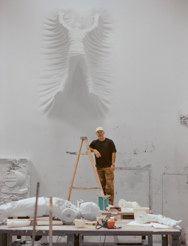
Exploring the artistic alchemy of Daniel Arsham

All Photography ANDINA MARIE OSORIO

In the realm of contemporary art, where innovation and bravery collide, one name emerges with an irrefutable resonance – Daniel Arsham. An enchanter of temporal dimensions, Arsham has spent the past 20 years transforming cultural objects into eroding artefacts, producing works that could both be plucked from ancient history or from an unfathomable day far, far ahead in a dystopian future.

Much like an alchemist of antiquity, Arsham’s creations sit in what he coins an “archaeological universe” – a civilisation that banishes the clock and is populated by ageless fictional artefacts. Spanning multiple disciplines from sculpture to painting, Arsham’s practice can therefore be likened to an orchestrated symphony that dances on the delicate thread of time. To celebrate Arsham’s momentous career and a two-decade collaboration with gallerist Emmanuel Perrotin, the artist is opening two solo exhibitions taking place simultaneously in Perrotin’s spaces in Paris and New York this September. Debuting multiple series of works inspired by his archive – a project with Star Wars, sketches etched into hotel stationery and updated versions of his antiquity sculptures, for example – all those who set foot into the galleries will be given the chance to observe his evolution over the years. Right now, there’s a deep sense of reflection permeating the air. “A lot of the work that I make today,” he admits, “I don’t think I would have been able to create 20 years ago.”

Born in Cleveland, Ohio, and raised in the sun-stroked streets of Miami, there are a couple of catalytic moments that inspired the practice of the now New York-based artist. In 1992, Hurricane Andrew blitzed its way through Florida and destroyed Arsham’s family home in its path. It’s not an event that he thinks about every day, but certainly one that went on to inform the character and ethos of his work. “A lot of my works have this sense where they appear as if they’re in a state of decay or erosion, or they’re falling apart,” he says. “The idea around destruction and reconstruction is buried in the deep recesses of my subconscious.”

Arsham attended Design and Architecture Senior High School in Miami and was later awarded a scholarship to study a Bachelor of Fine Arts degree at The Cooper Union in New York. Here, he was able to dabble in different mediums including painting, sculpture and photography, and ultimately sow the seeds of his distinctive vision. “The school was really an education about concepts and ways of making rather than the medium in which it sits,” he explains. After this, Arsham travelled back and forth between Miami and New York, which led to the meeting with gallerist Emmanuel Perrotin. “I began my career with him,” he says. Since Arsham joined 20 years ago, the gallery itself has expanded from a single space in Paris to multiple branches in Miami, New York, Shanghai, Hong Kong and Tokyo. “As my work has evolved, the gallery has as well,” he reflects. “I think it’s quite rare today for artists to have relationships with galleries like this. I was 23 when I began with the gallery, and it feels like a part of me, my history and my family.”

Just like time itself, Arsham’s interests in varying mediums have ebbed and flowed. In fact, his journey is not too dissimilar to the way a river ceaselessly carves its course, with the first bend marking his journey as a painter, before the gentle stream ships him off to other disciplines. As Arsham is colour blind, however, he’s always found painting to be a little challenging, “especially in the use of colour”, he says. As such, he turned his focus on the tonalities of colour instead, and all his artworks pre-2010 are swashed in monochrome gradients with hints of blue and green.

For the next 10 years, Arsham became interested in sculpture and began manipulating architecture – ‘Falling Clock’, a sculpture that gives the illusion of time melting off the wall, is one of his best-known pieces from this era. When Covid-19 hit and studios were closed, however, a lack of space and available tools meant that Arsham wasn’t able to work on larger-scale pieces. It was a perfect opportunity to return to painting, which he practised “pretty heavily” in the time proceeding. So much so that the exhibitions launched after 2020 saw an influx of new paintings and revamped ideas from the past that he “hadn’t quite concluded 10 years ago” – such as a series of landscapes “that look like they could have been made thousands of years ago, in the present or some potential future”.

Alongside his personal endeavours, Arsham co-founded design studio Snarkitecture in 2008 with Alex Mustonen and has continued to place collaboration as a fundamental part of his practice. To date, he’s conceived projects with multiple brands including Tiffany & Co., Adidas, Dior and Porsche, and has worked with music producer Pharrell Williams, choreographer Merce Cunningham and designer Hedi Slimane. Throughout his far-reaching work, though, there’s a consistent theme of decay and rebirth. His work is not merely a sanctuary for artistic creation; it’s a sanctum where subjects like ancient Greek busts, cars, film characters or emojis go through a metamorphosis. His Future Relics series sums this up best, which sees time-bending objects excavated from the present. “It’s as if you’re looking at an archaeological object that is from your own life,” he says. “There’s a bit of a confusion or dislocation that you feel; you don’t quite know where the objects are from.”

One of Arsham’s latest displays of timeless decay is a new collaboration with Star Wars, a project he’s dreamt of since childhood. Three years in the making and on view at Perrotin, Arsham was granted licence to turn Star Wars characters like R2-D2 and Darth Vader into archaeological relics, effectively creating a Star Wars universe that’s undergone a time-melting makeover in true Arsham style. This project, as with all of his work, is inherently there to confuse you, to make you question when, why and how it was made. But once you peel away the layer of magic, you’ll see that his
pieces are all created with traditional casting techniques, but constructed from a medley of unexpected materials, like crystal, volcanic ash, patina bronze and stainless steel.

To achieve this eroding effect, Arsham mixes wax with sand and applies it to the affected areas – this causes the material to lose its bond and fall away. “It’s a bit of trial and error because the moulds are sealed, so I cannot see inside them when they’re being cast,” he explains. “Some of the works have to be cast multiple times in order to get them to work properly. But over the years, I’ve gotten better at that process.”

When walking into any gallery space in which he’s exhibiting, there’s an odd sense of dislocation that will arise from the experience. On one side, you have decaying faces, almost rotting structures that have disintegrated over time, and familiar objects that appear to be blowing in a constant state of dizzying movement. On the other side, you have soft, textural paintings and architectural sculptures that melt into the walls. This perplexing state, according to Arsham, can open up new ways of thinking.

“It’s like an invitation to rethink your everyday life and how you interpret time,” he says. “So much of our everyday experience is governed by how many hours we have in the day and what we’re doing next week. The work invites you to escape that paradigm. When things are acting in a way that they’re not supposed to, it’s confusing. And that confusion can lead to productive thinking in other areas.”


This article is taken from Port issue 33. To continue reading, buy the issue or subscribe here

Crafting Identity

In an increasingly interconnected world, design has become a meaningful tool for self-expression

Subin Seol. All Photography Sebastian Bruno

Throughout history, design has unfurled as a vehicle for self-expression. Consider the ground-breaking designs of Eileen Gray, a pioneer of modernism in the early 20th century. Her E-1027 seaside villa – replete with shape-shifting furniture – was not merely a marvel of architecture but a defiance against gender norms, and a means of carving out space in a male-dominated industry. Or Emory Douglas, a graphic artist and Minister of Culture for the Black Panther Party, whose revolutionary designs represented Black American oppression and helped define protest art at the height of the Civil Rights era. Otl Aicher – a designer most revered for his identity for the 1972 Summer Olympics in Germany – opposed the politics of Nazi-era Germany and believed that designers were responsible for building a better order. This led to the co-founding of education centre Ulmer Volkshochschule in 1946, accompanied by a graphic poster with the title ‘Wiederaufbau’, which translates to ‘the rebuilding’. Aicher played a pivotal role in reconstructing post-war Germany.

In the present day, where ideas dance freely amidst a mosaic of cultures, the importance of preserving and expressing one’s individuality cannot be overstated. Design has proven to be an instrument for making sense of oneself and communicating it to the masses. It’s more than aesthetics; it’s a canvas where individuals can paint their innermost narratives through materials, processes and technology. This concept pulses vigorously through the veins of many contemporary practitioners today, like Subin Seol, a London and Seoul-based designer who skilfully weaves her Korean heritage into her oeuvre. “Design is an intrinsic reflection of one’s identity and self,” she says. “I’m not just crafting objects; I’m translating my personal journey, challenges and joys into a tangible form.”

Subin’s formative years were bathed in Korean history, stories and craftsmanship, forging the bedrock upon which she built her creative perspective – a juxtaposition between Korean tradition and a modern feel. Her Korean Art Deco collection, shown at Seoul Design Festival in 2020, stands as a magnum opus for its fusion of bold, geometric Art Deco style with traditional Korean art, the latter designed after natural forms. Meanwhile, her Remembrance project, unveiled this year, comprises a dining chair and coffee table derived from reclaimed timber handrails sourced from a brutalist landmark, the now-demolished Fawley Power Station, located in Hampshire. An “ode to architectural heritage”, the project invites viewers to honour its memory through the physical elements.

Even with the prevalence of British architectural features, her Korean heritage still reverberates within the Remembrance project – attained through the use of natural, repurposed materials and delicate composition. “Whether it’s the patterns, shapes or even the subtle gestures in my designs, my Korean heritage invariably shines through,” she says. “Every design choice, from material selection to the crafting technique, tells a story of where I’ve been, what I’ve learned and how I perceive the world. The transformation of ideas into three-dimensional objects serves as a testament to my evolving identity.”

Bisila Noha

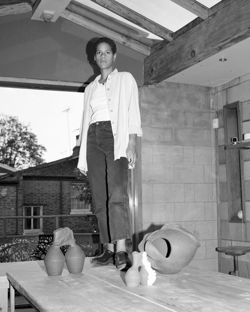
This exploration of self resonates within the ethos of Bisila Noha, a London-based ceramic artist, researcher and writer of Spanish-Equatoguinean heritage. With clay as her muse, Noha was drawn to pottery for its affinity with tactility. “I love the fact that it is a direct conversation with the material,” she says. “The way my fingers are dealing with the clay and shaping it is very relaxing and meditative.” As time went on, a deeper fascination for the material’s history grew – specifically the way in which clay has been part of civilisation for thousands of years, and used to make bricks or vessels for storing food and water. “It is such an integral part of our survival.”

At the start of her creative journey, Noha felt inclined to use her practice as a way of proving her Spanish-ness, employing traditional Spanish objects – like Mediterranean water containers crafted in hues of warmth and vitality – as an influence. Around three years ago, her parents brought back clay from Baney, a small town in Equatorial Guinea where her father is from. “Through the process of making with this clay, I’ve connected to my African side,” she explains. “It’s been an interesting but also very deep and transformational process.” When she returned to Baney in April,  from the moment she arrived there was an irrefutable sense of homecoming – “for so many years I had been dealing with and touching the land.” So in a sense, Baney clay acted as a catalyst for her to open up about her heritage, resulting in her most personal project to date, Baney Clay: An Unearthed Identity, a collection made with mixtures of stoneware or porcelain and Baney clay. It also sparked her creative ethos to reclaim the history of women of colour in pottery, and to challenge Western views on art and craft.

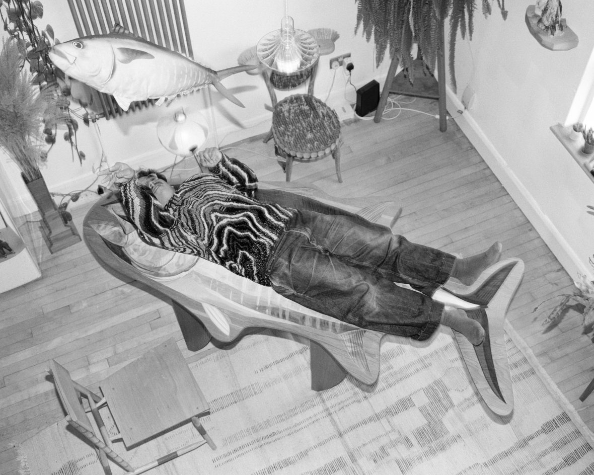
Rio Kobayashi, a London-based designer of Japanese-Austrian heritage, also finds solace in the practice of his craft. Raised in Japan by an artisan family, he imbibed the spirit of craftsmanship almost inherently. His parents are hippies – his dad a potter and mum a conservationist with pink hair – and they lived in an eccentric house with a large workshop and a mass of land. “Many people treated me as a special person,” says Kobayashi of his experiences growing up mixed-race in the countryside. Not only does he have a German accent in English, sometimes it’s Italian or Austrian Tyrolean; he’s also fluent in Japanese and German. “My existence was already confusing for many people.” This melting pot of cultures went on to inform his outlook on design – that is, an aim to create anthropomorphic furniture pieces lavished in patterns, maximalist silhouettes and a reverence for creating unexpected outcomes. “I like the idea of mixing everything up, making it all ambiguous and confusing to people.”

Rio Kobayashi

This is evident across Kobayashi’s entire portfolio, from a reconstructed three-legged table assembled in a “bat-like” hanging manner, to Shima Uma, a mixed-material dresser designed for Dolce & Gabbana that’s inspired by the ambiguity of a zebra’s black-and-white stripes. More recently, Kobayashi released a collaborative project Manus Manum Lavat, which translates to “One hand washes the other”. Made in conjunction with a group of friends who each work across textiles, graphics and art, he set out to recreate a living room of his life, filled with a medley of playful furniture pieces that you wouldn’t find anywhere else. A table with a tuna fish painted on the top; or hand-shaped soaps appearing like they’re reaching out to wash the palm of the other; the collection pivots away from a lone journey of self-discovery and instead shows us what happens when a group of like-minded individuals (and friends) come to ride on the same path. Three posters were commissioned for the exhibition, which provoked a welcomed response for Kobayashi; “My grandma didn’t understand the posters,” he says. “I was trying to get people to feel even more confused.”

Kobayashi is an apt example of how craft can allow designers to press their own imprint onto a tangible object. In a similar vein, UK-based wood artist, curator and public speaker Darren Appiagyei uses locally sourced wood from Shooters Hill, London, to create sculptures seeped in Ghanaian tradition. “As I grew older, I developed my identity and understood what it is to be from Ghana,” he says. From pottery and weaving to beadwork, masks and wood carving, Ghanaian art is strikingly textured and raw. Appiagyei applies these attributes to his own work, but instead of striving for a flawless finish, he seeks out imperfections from the wood, slowly carving out cracks and texture between the posts of a lathe. “I try to keep the authenticity of the wood and its origin key to my design.”

Darren Appiagyei

With each curve and contour, Appiagyei maps out the formation of wood and essentially opens up a dialogue between the history of the natural world as well as his own. A series of Pyrographic Vessels put this process to use through pyrography, a mark burning technique which, when applied, subtly exposes the grains and enhances the tones of the wood. “I never want to disturb the natural aspects or features that make the wood interesting,” he says. For him, it’s important to appreciate the material, be explorative and enjoy the journey. “It’s a very therapeutic process for me. I call it a labour of love.”

From remedial hand-play to the crossing of cultures, the stories of these designers underscore the profound role that design can play in understanding identity and heritage. As we continue to navigate the complexities of an interconnected world, their work demonstrates the enduring power of craftsmanship and the ability for design to transcend borders and time. It’s clear that design is a homage to the diverse cultures that make up our global community.


This article is taken from Port issue 33. To continue reading, buy the issue or subscribe here

Our Divine Comedy

Purgatory and Paradise: Acclaimed artist Tacita Dean reflects on her debut design work for Wayne McGregor’s balletic interpretation of Dante’s The Divine Comedy. From Issue 29

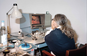
Watching trims from One Hundred and Fifty Years of Painting, 2021, on her 16mm Steenbeck. Photography Muhammad Salah


Tacita Dean is gently cutting strips of paper in her Berlin studio. As we talk, looking into our respective screens, scissors snip, and she sticks schedules into an already-bulging notebook ready for her upcoming trip: New York then London. “Everything that I was supposed to do in the last two years has been put into the last two months, so it’s been a nightmare.” Like many of us, she’s weary, but she’s been anything but idle in lockdown. I’m speaking to the award-winning artist in the run-up to her highly anticipated debut as set and costume designer for Wayne McGregor’s interpretation of The Divine Comedy, which opens at the Royal Opera House this October. The Dante Project, originally planned for May 2020, has been long in the making. “I had perhaps historically thought of working, one day in my life, on a stage, for a stage,” she muses. “It wasn’t an active ambition; it was more of a passive one, so when he did approach me, well, I was up for trying anything once!”

McGregor first asked Dean to work on Woolf Works, inspired by the life and writings of Virginia Woolf, but scheduling made the collaboration impossible. When he approached her the second time, she accepted gladly: “I think in a weird way The Dante Project suited me more.” She’d never read The Divine Comedy, but “there’s an amount of osmosis”, she theorises, smiling. As she worked, she listened over and over again to the audiobook, read by the poet Heathcote Williams. The subject fascinated her: “It has all the ingredients of things that interest me, and purgatory is a state that informs my work. I was a Roman Catholic, so there’s that element to it too.”

Much of Dean’s art deals with exploring the mysteries of life, the unseen world, the limits of things (‘Disappearance at Sea’, 1996), an eclipse (‘Antigone’, 2018), the elusive green ray (‘The Green Ray’, 2001). “I work a lot with travelling in a way, the voyage, the crossing or passage; that aspect was also very interesting to me, and in terms of mediums that was very important.” She describes how she approached the whole ballet as a travelling through the three states of the text, using three different mediums to explore and differentiate between them: “through negative to positive, from black-and-white to colour, from representation to abstraction. I went through the whole gambit.” These spectrums map out a fascinating voyage of their own in Dean’s visual language, tracking the development of her own career, from smudged lines of chalk to rolls of flickering 35mm film. Divided into the three acts of Inferno, Purgatorio, and Paradiso, as resident choreographer McGregor worked with the Royal Ballet on movement and Thomas Adès on the specially commissioned composition, Dean’s set designs came before anything else. “I was really out there alone. So I struggled initially, and I was very self-conscious about it. Then at a certain point I thought, well I just have to do what I do rather than worrying, and as soon as I got to that phase it got much easier for me.” For Inferno she took her cue from Dante. “Hell is cold, which is not how we perceive it; we always think about it as hot – Dante made me think of ice.” Dean returned to her earliest work with chalk, painting large wooden boards with blackboard paint. These became her canvas for a huge landscape with jagged edges, yet rather than simply draw ice in white chalk she chose to draw it in negative. “I could have flipped it digitally; I just knew that psychologically I needed to put myself through the difficulty of drawing. I did an upside-down mountain range.” Dean drew the work back in 2019, listening to discussions of Brexit post-referendum and the proroguing of parliament, with similar political traumas occurring in America. As she worked she found herself writing names into the piece, though most were smudged away: “The only name I kept visible was Mitch McConnell.” For the dancers, sin became a white stain. “I sprayed on chalk in relation to their various sins, so thieves had chalked hands, and Paolo and Francesca have genitals in chalk.” As the dancers move they will transfer this chalk to each other and a dark circle on the floor will fill with the echo of their movements, sin spreading and hell growing at each touch.

Photography Muhammad Salah

For Purgatorio Dean printed a negative image as positive. “You can’t escape hell,” she observes. “You can escape purgatory, through labour, through people praying for you on Earth; there are ways of petitioning. You can rise further up purgatory, but I just saw it as a very static image on the stage that was also a transitional state.” Dean chose the image of a jacaranda tree, a common sight in southern California, near her studio in Los Angeles, famed for its purple flowers, and transformed it into an “otherworldly green”, with the 10 x 8 negative thrown into positive. “[It] means it’s got some strangeness to it, with the whole of LA in negative in the background but whited out with crayon.” Sitting on a bare stage it acts as a freeze-frame, the trunk’s bark like skin, wrinkled yet somehow ageless – an eerie presence, a stasis in which the dancers must roam. When she first heard the music by Adès she was stunned: “It was magical. I thought, oh my god this is like attending The Rite of Spring… It’s so emotional; I don’t think there’ll be a dry eye in the house.”

Inferno premiered in July 2019 at the Dorothy Chandler Pavilion in Los Angeles, and seeing her first set come to life left an impression. “I can see why people get hooked on working live, because there are things that happen… You encounter the reception in a very visceral way; you have to meet your audience.” As an artist she’s aware of the distance she’s usually afforded: “How people think or how they behave at an opening is not remotely what is really going on, but when it’s an audience you feel the response is spontaneous, people clap… You can hear a visible intake of breath, and that is real.” She pauses, almost melancholic, “You never really get that in the art world, that’s not what we trade in, that reaction, that reality. That physical moment is new for me, and that’s both exhilarating and terrifying.” She checks herself, “I want to go back to my world where I don’t have to encounter anybody.” Did she enjoy lockdown then? “We’ve had our own purgatory I think, but it’s now the 700th anniversary of Dante, which it wasn’t when we were initially supposed to do it, so that’s useful as a sort of hook, and a bit of time has been helpful. What the delay has given is a context larger than Dante… all these generic words that we have in our language: This period has been ‘hell’, and we’ve all definitely been in ‘purgatory’ waiting. These terminologies have taken on a whole new meaning because of the pandemic.”

I ask her what the stages of Dante’s afterlife mean to her. “I think we know what hell is really,” her face freezes for a moment. “Hell is physical pain.” She’s put the scissors down, hands clasped in front of her mouth. “Purgatory is more emotional pain, emotional regret, and paradise… Well, paradise is to be without a body.” It’s a sentence that stings; Dean has suffered from rheumatoid arthritis for years.

The elusiveness of Paradiso made it a difficult stage to set, “We all much prefer watching iniquity,” she notes dryly. “Paradise is formless, isn’t it? Whereas the other two are very much a trajectory.” Echoing this amorphousness for the LA premiere, she created an abstract film in a photo studio in Burbank: “There’s no safety in film; there’s no safety in dance, either; people slip, so it’s just bringing another live element to the whole thing.” Despite her worries she makes light of it: “It’s just shape and form and colour, so I’m briefly turning the opera house into a cinema.” Inspired by William Blake’s iconic illustrations of Dante, she made light filters with several different layers of colour: “I really wanted that muddy richness, which is what Blake had, not pure colour at all.” She cut the film listening to Adès’s composition, “It’s really weird: Every time I have to remember how to do it, I can never remember. I think it’s obviously self-imposed, but I get a sort of amnesia. I have to reinvent my process; so I’m not overawed by my past – I don’t remember it.” Where does one even start on a project like this, I ask? “You start in the wrong place; that’s what happens,” she muses. “That’s always the way, and you know it’s the wrong place in your heart of hearts, and that eventually trips you out of it; you realise, that’s not me.”

Limbo Accra

The spatial design studio infuses architecture with art to transform unfinished structures in West Africa

WET exhibition in collaboration with artist with Araba Ankuma. Photography by Komla S. Darku

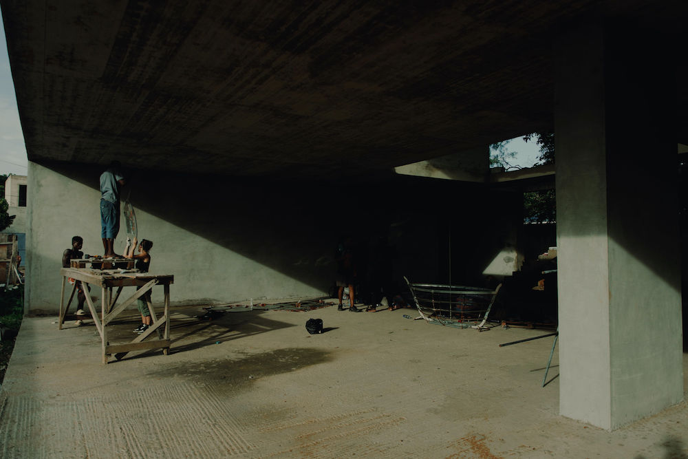
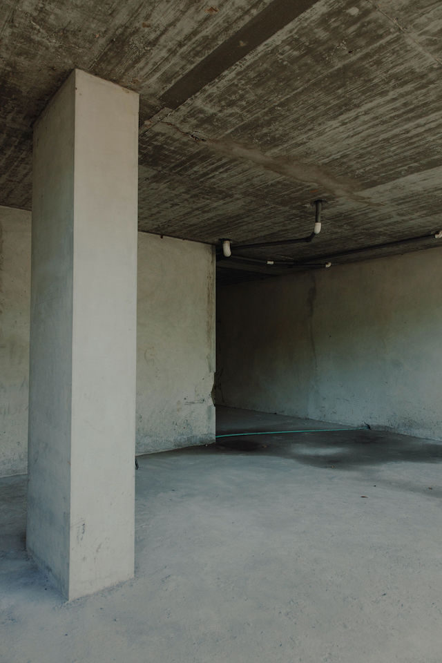
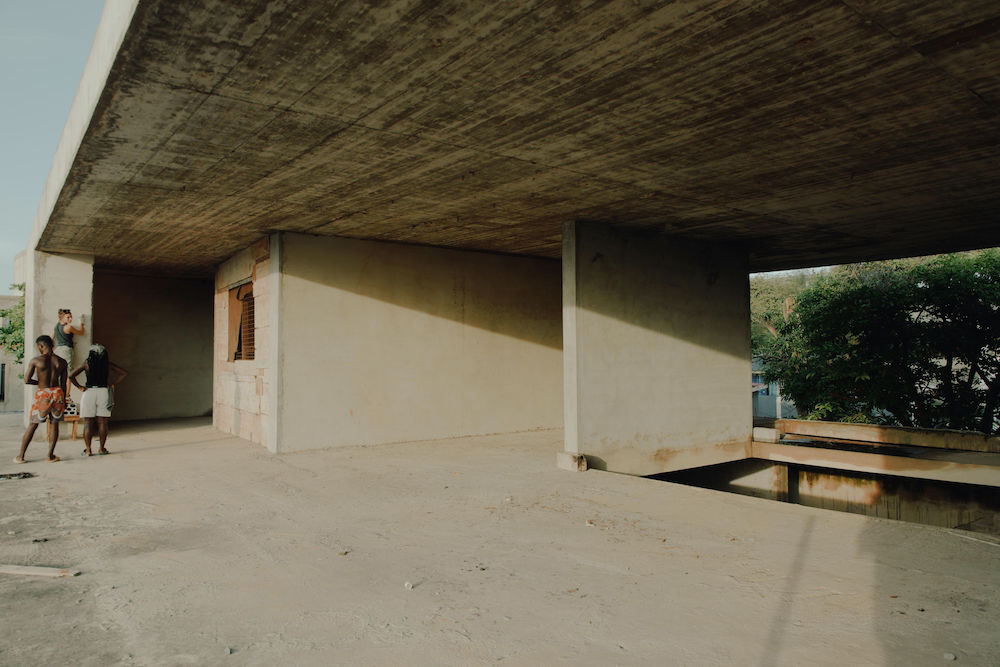
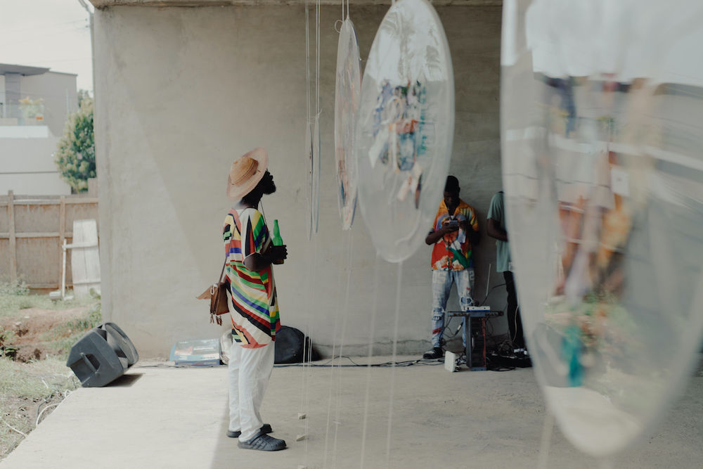
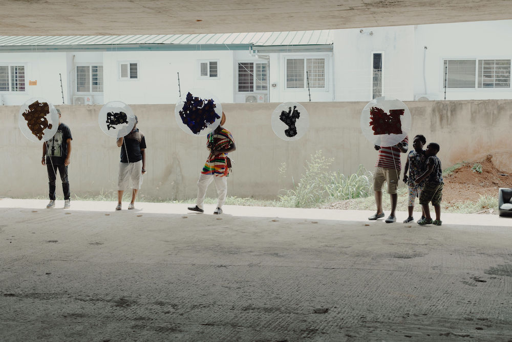
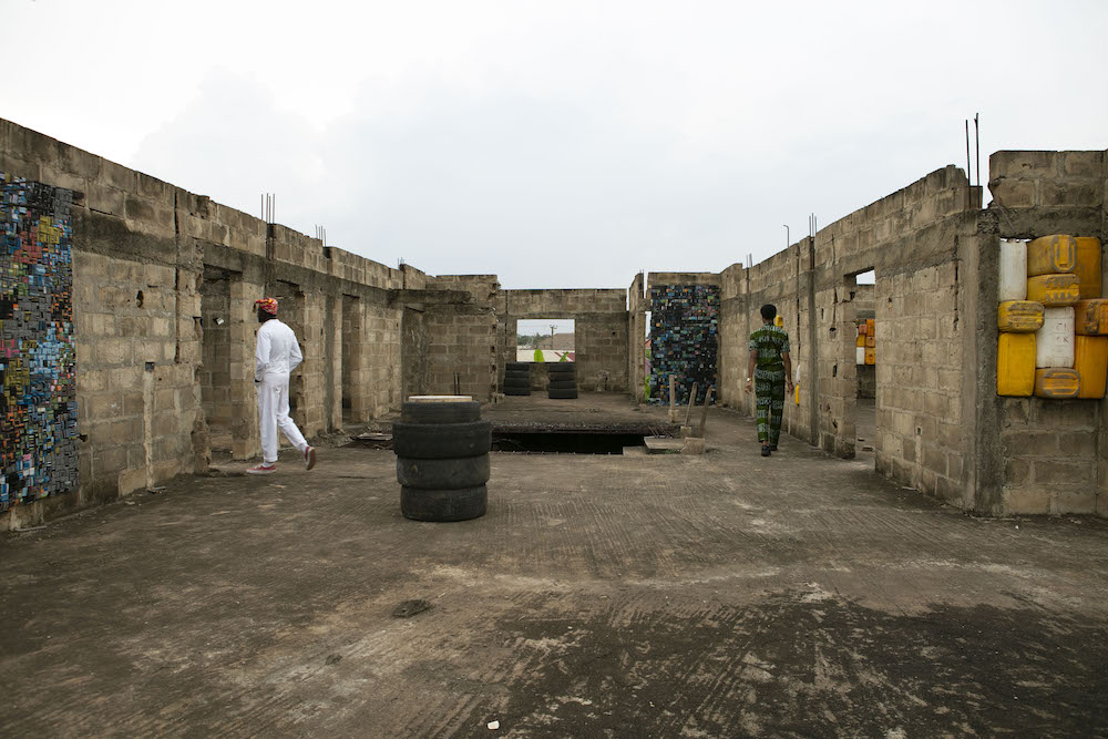
“We all need each other” is a phrase that suitably defines both the output and ethos of spatial design studio Limbo Accra. Founded by Dominique Petit-Frère and Emil Grip in 2018, the work of Limbo Accra is cyclical and non-wasteful as it operates amongst unfinished structures in West African cities; it puts the planet and its people first. By doing so, decaying buildings are given new narratives, while public spaces are provided for the local communities. Below, I chat to Dominique and Emil to find out more about their impactful work.

Can you begin by telling me a little about your backgrounds?

Our backgrounds are within urban development and education – so our approach to design and architecture has always been from an intuitive and autodidact perspective. The whole process for us has always been informed by the multicultural essence in our relation to each other, since we are constantly moving between Accra, Copenhagen and New York. We met in Ghana in 2014, but we didn’t form Limbo until 2018. In that sense Limbo is a culmination of all the experiences and ideas we had over those four year. 

WET exhibition in collaboration with artist with Araba Ankuma. Photography by Komla S. Darku

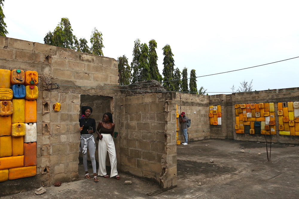
When we started Limbo Accra it was out of pure curiosity to transform and investigate the architectural and built conditions of modernising West African cities as we were keen on exploring the intersection between art, architecture and sustainability within this new-age context. The studio’s name is a nod to the many incomplete and since-abandoned buildings in Accra and other West African cities. 2018 was a truly transformative period in Accra and we both felt compelled to take action in that transformation. For us it was very evident that this large scale of uncompleted property developments littered around the city of Accra held a vast amount of opportunities for activations and conversation among the growing creative community and city at large. 

WET exhibition in collaboration with artist with Araba Ankuma. Photography by Komla S. Darku

WET exhibition in collaboration with artist with Araba Ankuma. Photography by Komla S. Darku

What’s your ethos as a studio, what types of projects do you usually like to work on? 

It’s not like we have a stiff value set at the studio, but more a set of current observations from society in general and the spaces we navigate in, that we choose to act and react to. Our practice exists in this fluid space between juxtapositions, because we never allow ourselves to be stagnant; Limbo is constantly evolving, morphing and growing. Essentially, we are simply here to question and investigate the reality of the world we see, and how we can be more intentional about our role within in it as spatial practitioners. 
We are quite selective about the projects we engage in. At the core of any of our projects is a story. We honestly see Limbo as a way of communicating stories through architecture. The fascinating thing about telling stories using architecture is the opportunity to materialise an idea in a simultaneously expressive and material way. That impact on society is immaculate. 

WET exhibition in collaboration with artist with Araba Ankuma. Photography by Komla S. Darku

You operate within unfinished buildings in Ghana and beyond, which is super interesting. Can you tell me more about this? 

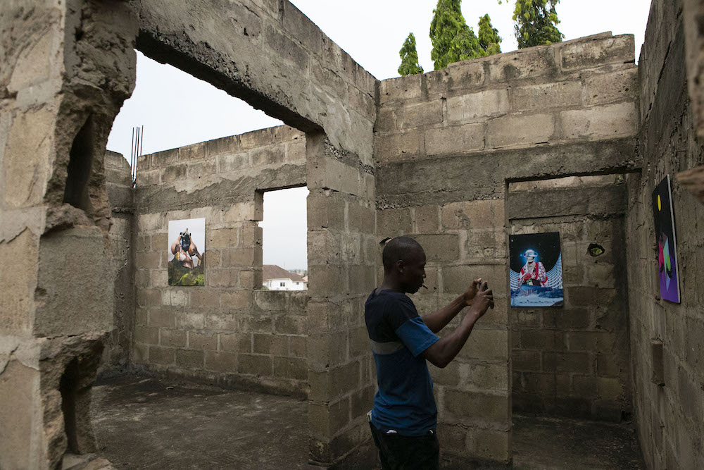
So the Limbo sites are interesting for us in an African context because it poses the opportunity to bridge two societal issues within the urban landscape: extensive voided structures and lack of public space. Essentially we are experimenting with the idea of using these sites as soft activations for people to question the neighbourhoods and cities, asking “how are we being intentional in the way we design and create spaces for people?” 

How important is sustainability to your practice, and what does this mean in terms of how you approach a brief and the design process? 

Sustainability is important. We try to think of our approach to a project as regenerative. Our logic from the very beginning has always been to work with what already exists – to maximise the re-usage of what we already have, simply re-adapting what already is into a new meaning. 

WET exhibition in collaboration with artist with Araba Ankuma. Photography by Komla S. Darku 

Can you talk me through a recent project of yours?

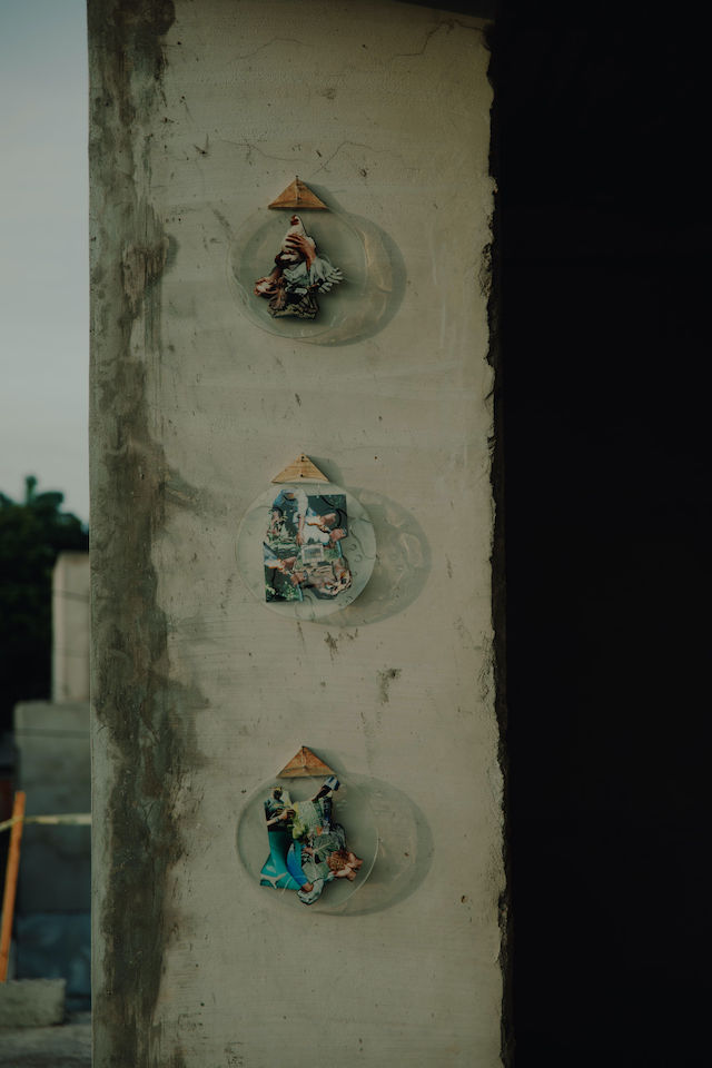
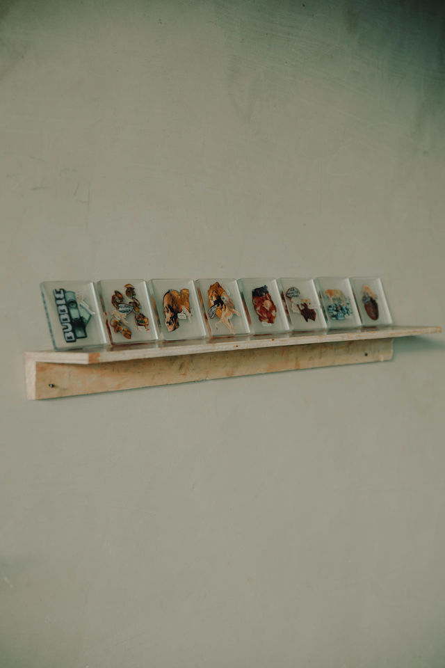
We just wrapped up an amazing exhibition titled WET by Ghanaian-American artist Araba Ankuma. As an artist working internationally, Ankuma’s stories focus on the importance of perception and the need to shift it in order to illuminate the invisible narratives that bind us as human beings. Composing narrative through photography and collage, Ankuma acts as a tour guide, transporting viewers from existing perspectives to new perceptual ground. Our studio is always about collaborations and working together. The whole logic is that we all need each other, and that we all need a space. This is what we offer as Limbo. Everyone has something to gain by working together. 

WET exhibition in collaboration with artist with Araba Ankuma. Photography by Komla S. Darku

WET exhibition in collaboration with artist with Araba Ankuma. Photography by Komla S. Darku

Do you think the design industry is currently doing enough in terms of sustainability and the environment? Are you hopeful about the future? 

I mean, how can we define that? The world is such a big place with so many different spaces each within their own context. It’s obviously a part of the current discourse within the industry, which is positive, but the question of how intentional the movement is remains. The interesting thing about the environment and sustainability within architecture and design is the fact that it’s hard to see how anyone can ignore addressing those issues. People are starting to feel some of the consequences of the world changing, so the simple need for change will only increase. In that sense I’m hopeful. 

What’s next for you, any upcoming plans or projects that you can share?

Right now we are doing a few things with the Brooklyn Museum that will come out this summer. So stay tuned! 

Photography by Anthony Combder Badu

Photography by Anthony Combder Badu

Photography by Anthony Combder Badu


Oriente Italiano

Ginori 1735 fuses Italian craftsmanship with floral embellishments in its latest porcelain collection 

For over 280 years, Ginori 1735 has been at the forefront of Italian design and craftsmanship. A company rich in heritage, its design legacy is a lengthy and pronounced one; its name, for example, refers to the 18th century origins of the company when Marquis Carlo Andrea Ginori launched the Manifattura de Doccia in Doccia, which is located in the family estate nearby Florence. He opened a porcelain factory fuelled by his interests in white gold, which soon became an icon in its own right and the Ginori 1735 brand we know it as today.

A few years down the line and Ginori 1735 evolved with a modernised direction, still remaining true to its core values and essence as a brand. In the 20th century, Giò Ponti was named creative director and the manufacturing expanded through Europe, causing an artistic revolution and the development of new innovations. The Ginori 1735 tableware sets, for instance, made their debut in the 1950s and were celebrated for their elegant, minimalist aesthetic. Collaborations, too, played high importance in the 80s, with Italian designers such as Franco Albini, Franca Held, Antonio Piva, Sergio Asti and Achille Catiglioni breathing new life into the manufacturing. In 2013, Manifattura Ginori was acquired by Gucci and placed under the direction of Alessandro Michele, before being untrusted under the Kering Group and a team of designers formed by Alessandro. 

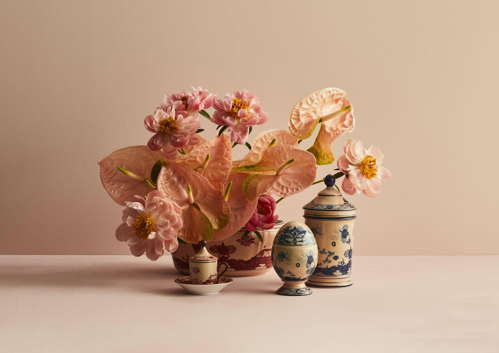
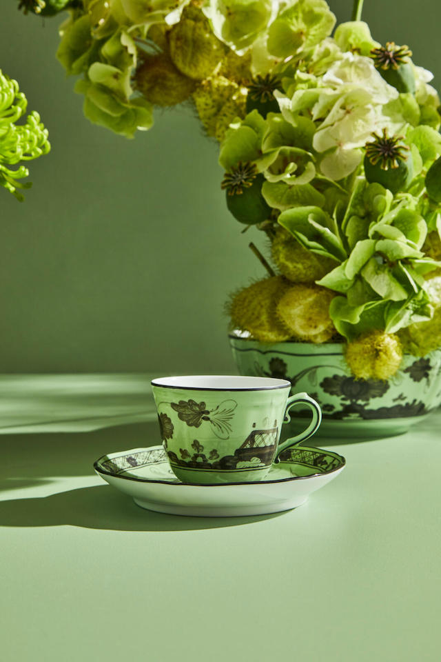
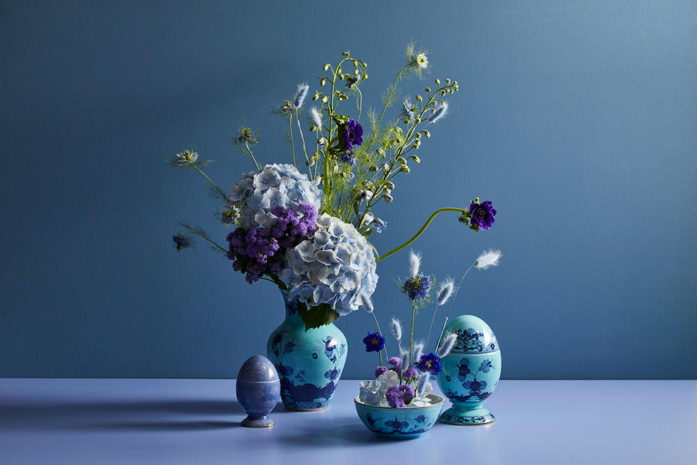
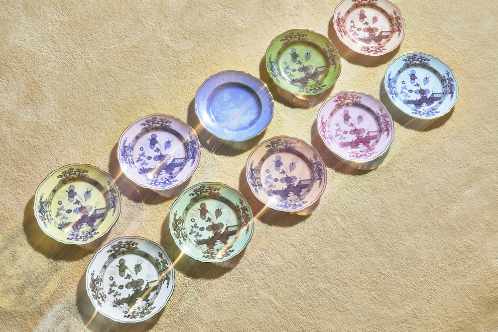
And now, with a plethora of table wear, decor and fragrances housed in its collections, Ginori 1735 has launched a new line, the Oriente Italiano. Blending floral embellishments with Italian craft, the pieces are distinctive in their own right – from tea sets to table objects. Annalisa Tani, brand and product designer at Ginori 1735, tells me more about the collection. 

This collection is a fusion of Italian and Far Eastern charm. What does this mean exactly, and how is this represented in the design?

The combination between exotic beauty and Italian style of the Oriente Italiano collection is represented by decoration, which is the result of a successful dialogue between different techniques and the traditional craftsmanship that distinguishes Ginori 1735.

Florals are a key feature running throughout the collection. Did you reference any existing materials – such as real life plants or photographs – when designing the patterns? Or are they drawn from your own imagination? 

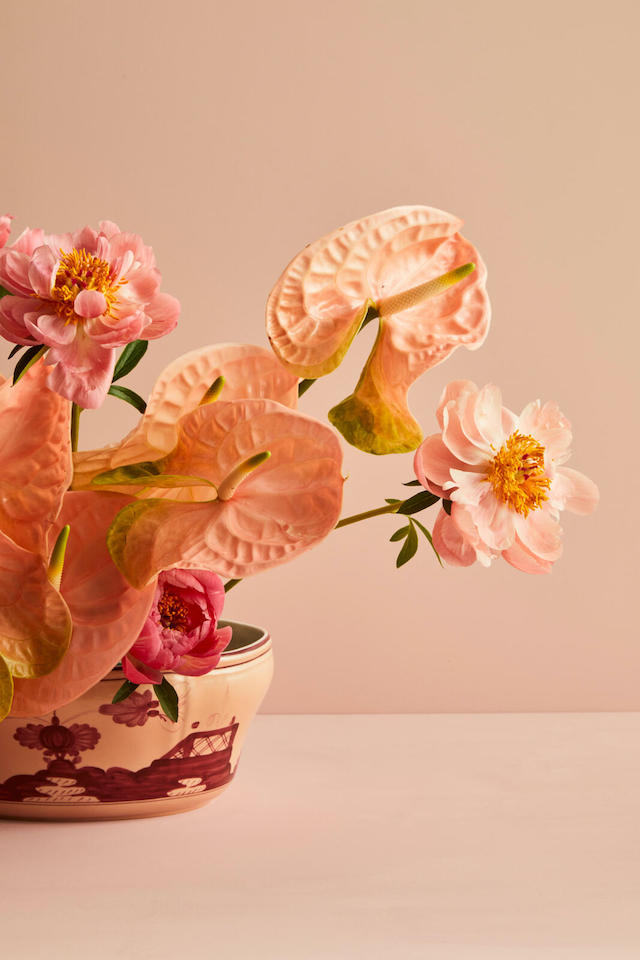
The flower that characterises the decoration of Oriente Italiano is a stylised carnation, an iconic decoration of the Florentine majolica since the mid-1700s. The flower, reinterpreted by Gio Ponti, takes shape in a rapid stroke that reminds water colours in which the gradient dissolves in the background colour.

The colour palette is calmingly earthy, with mossy greens, blues and pinks. How did you decide on these specific tones, what do they evoke? 

The Oriente Italiano palette, composed by ten shades – azalea, iris, purple, periwinkle, cipria, vermilion, citrine, barium, malachite, albus – creates surprising and unexpected combinations. These soft and sensual colours express the charm of a journey in distant lands with a perfect chromatic balance.

Can you tell me a bit more about how the collection was made?

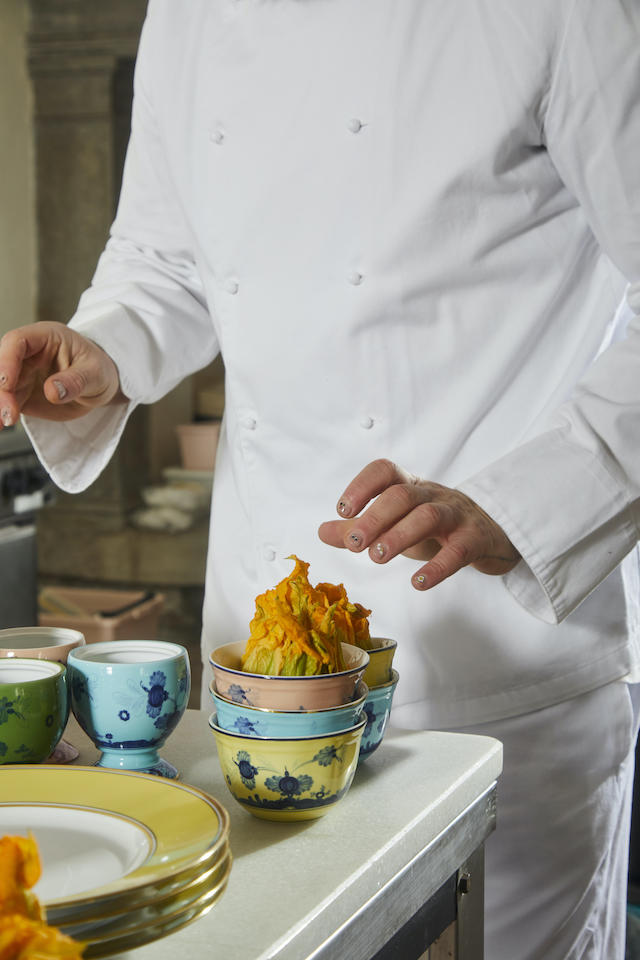
The Oriente Italiano collection is very complicated to produce and has many several steps. First of all, the colour is nebulised on the whole surface of the piece through the airbrush technique. This technique also enhances the shapes because the colour becomes more intense on the embossments, creating chiaroscuro effects. It’s a very elaborate technique because it’s very difficult to maintain the same and the homogeneous tone of colour on all pieces and in every production. 

Then, the colour is hand-applied with a precise direction to respect the plate’s supporting beams and make each piece perfectly the same to the other. Finally, the piece is hand-treated with “ritrovature”, tiny embellishments created by small brushstrokes, realised, for example, on the mug handles. Moreover, there are many firing processes with different temperatures depending on the colours created. 
Where do you see the collection being used? 
Oriente Italiano is a collection that suits perfectly in domestic environments as well as in hotel spaces thanks to its wide range of pieces that includes tableware and interior decor objects. The tableware proposal, thanks to its vast array of colours, creates a perfect mix and match allowing everyone to express their own creativity. 
How does this collection fit in with the brand’s rich history and design legacy – have you incorporated any characteristics or elements that nod to the past? 

All of our collections tell a story of excellence, savoir-faire, tradition and craftsmanship. Elements that have distinguished Ginori 1735 brand for over 280 years. The stylist signature of Oriente Italiano brings together craftsmanship, tradition as well as the artistic and the cultural values of the Manifattura. As one our best selling collections, Oriente Italiano allows us to export and make our heritage known all over the world.

How important is craftsmanship and traditional techniques to the making of this Ginori collection?

Craftsmanship and traditional techniques are very important for us. Tradition stands for the respect of a sense of continuity; it means transmitting. Through its tradition, Ginori 1735 creates products that express beauty, artisanship, design and style, typically made in Italy.

What’s next for Ginori?

In June, during the Milano Design Week, we will present a new home fragrance collection and two other exclusive collaborations with two well-known brands in fashion and design sectors. Furthermore, we will present the new fragrances of La Compagnia Di Caterina, the LCDC collection, created in collaboration with the designer Luca Nichetto. 


Triple Stitch Sneaker

Zegna reimagines the iconic shoe for SS22, placing versatility and flexibility at the core of its refreshed design

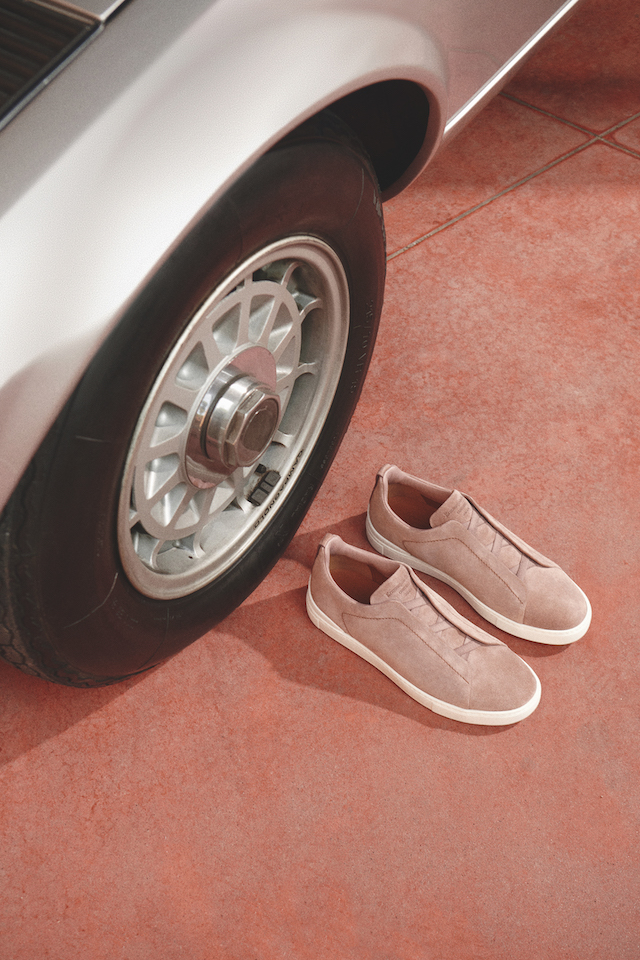
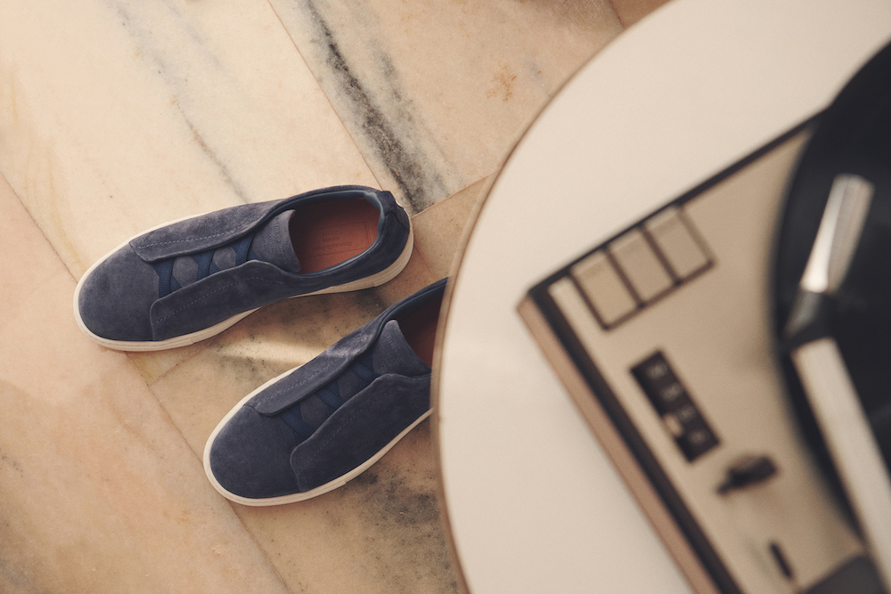
So long are the days where sneakers are reserved only for athletes. Thanks to modernised updates to the typically sports-centred footwear, comfort, ease and style now go hand-in-hand to its practical counterparts. In the latest announcement from global luxury menswear brand ZegnaZegna, the Triple Stitch Sneaker is proving just that with its versatile approach to aesthetic and design.

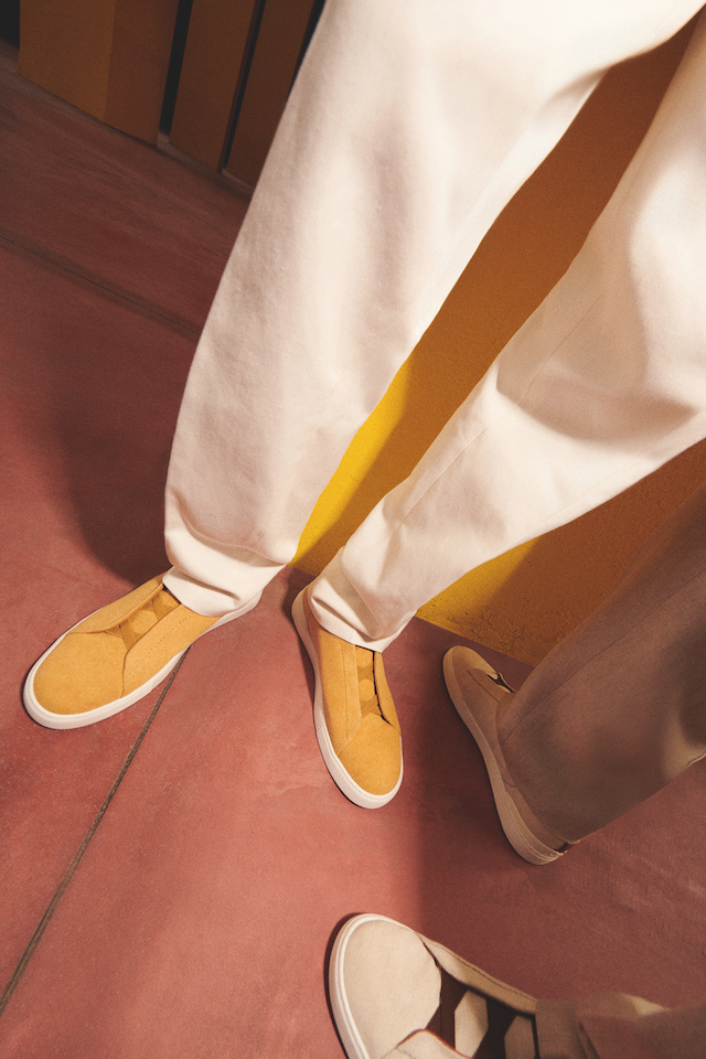
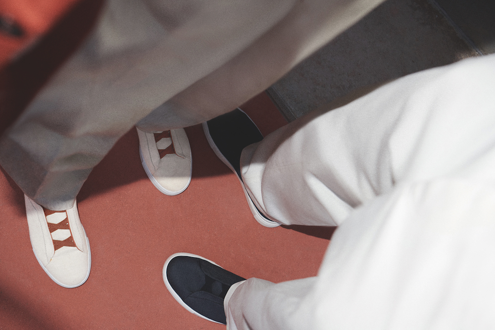
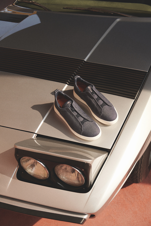
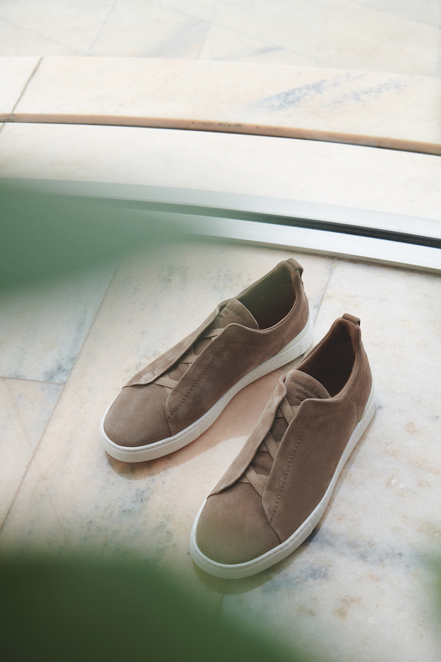
Reimagined by artistic director Alessandro Sartori, the Triple Stitch Sneaker returns each season and has consequently solidified itself as an iconic staple within the contemporary menswear capsule wardrobe – especially in the cupboard of Zegna, an enduring influence in the luxury leisurewear industry for 112 years. This new iteration, then, features a revamped silhouette that sees elegance merge with high design and a multitude of wearable colours. A smooth and classic structure means the sneaker can be worn in an array of different settings, from the humdrum of daily life to work, travel and the more leisurely. Coupled with a refreshed take on its materiality, the sneaker sees a rich grained leather paired with canvas and suede, topped off with elastic straps for the wearer to conveniently slip on and off with ease and mobility. 

Comfort is indeed of high importance to the design of the Triple Stitch, which is further elevated by its lightweight rubber sole and flexible construction. By emphasising the need for accessibility and comfort, this shows just how much the needs of the modern wearer has changed. The shoe can quite literally be worn with anything, whether it’s the more formal attire to the more casual – a suited trouser to a sporty jogger, for instance. 

Formerly making its name in the early 1830s, the sports shoe was first created by The Liverpool Rubber Company, founded by John Boyd Dunlop. At the time, the sneaker made headway for its innovative method of bonding canvas to rubber roles, making it the perfect shoe for trips to the beach. Further down the line, the sneaker steered more in the way of athletics and was therefore dominated by sporting pursuits, moulded by a more athletic function and design. And now, the Zegna Tripe Stitch Sneaker comes at a time of universality; it’s a melting pot of style and form, past and present; it’s to be worn with flexibility at the hand (or foot) of the wearer.

Zegna was founded by Ermenegildo Zegna over 110 years ago in the Piedmont mountains of Northern Italy. Now part of the Ermenegildo Zegna Group, the company has long been committed to preserving and leveraging its heritage – and the Triple Stitch Sneaker update is pinnacle of that.

Hair of the Future

Zhou Xue Ming explores otherworldly structures and techniques in his crafty hair designs

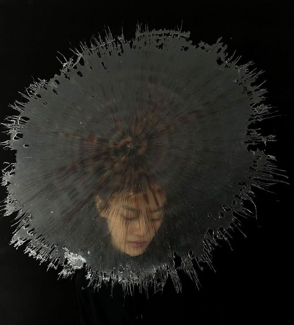
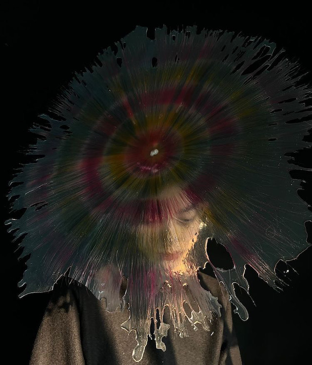
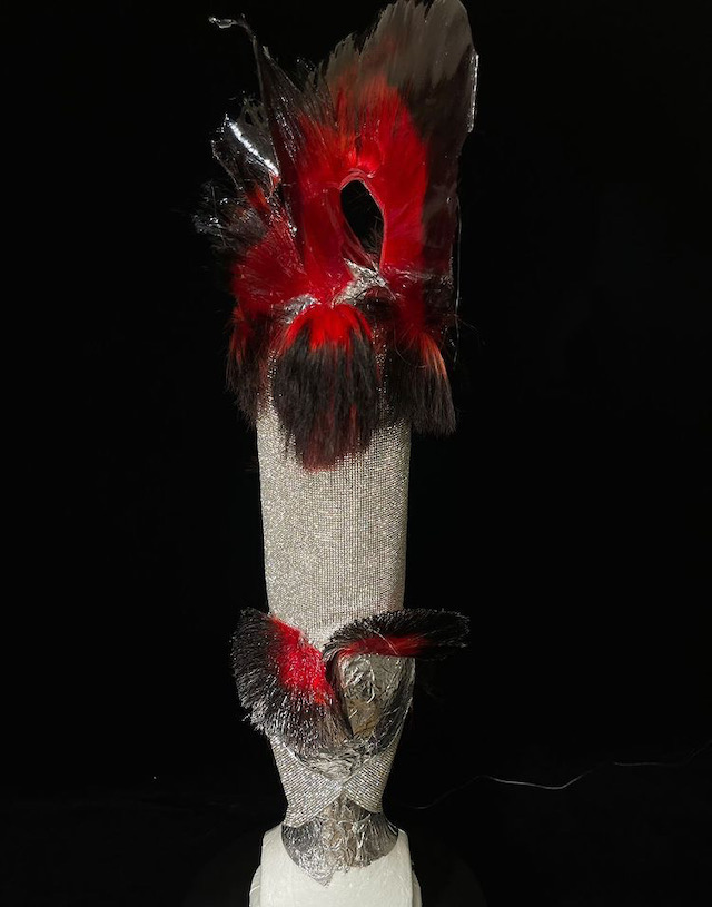
Land on the Instagram account of Zhou Xue Ming and you’ll be instantaneously enamoured, scrolling and pausing – with curious hesitation – as you start to question the process behind each of his creations. A hair designer by title, Shanghai-based Xue Ming is more of an artist-stroke-wizard as he expels his craft on the artful placement of a do, from the decoratively lavished to the perfectly coiffed. Proving that there’s more to hair than hair itself, Xue Ming has been working in the industry for almost 10 years now. And ever since his first hairdo, he’s since been published on the covers of Nylon China and Modern Weekly Style, and has collaborated with an abundance of makeup artists, from Shuo Yang at Jonathan Makeuplab to Yooyo Keong Ming. 

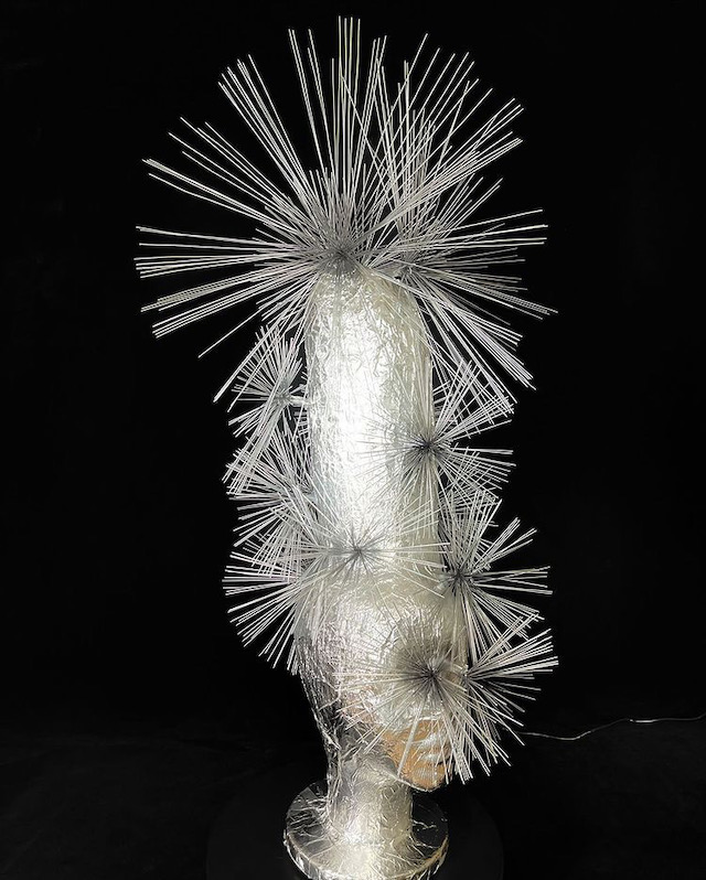
Xue Ming’s impact is mammoth, not least in the creative application of colour but also in the use of materials. It’s not just hair that’s incorporated into these designs, for there’s also the unexpected addition of metallics, wires, peacock-like feathers, spikes or a material that appears like the cracks in a frosted lake. With a vast “enthusiasm for artificial hair”, he tells me, it’s no surprise that his portfolio succeeds in pushing the boundaries as to what can be worn on the top of a head. Sadly, we’re not going to be getting any answers as to how he makes his pieces – “this is my little secret” – so instead, we invite you to marvel and leave the methodology to the imagination.

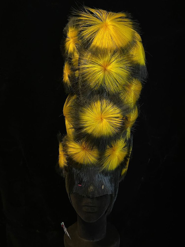
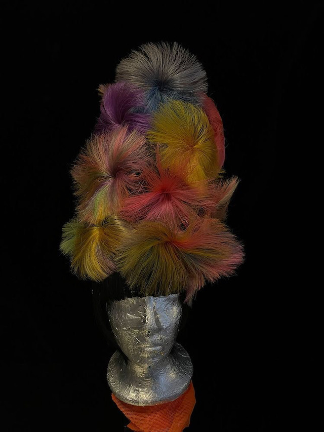
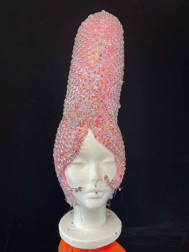
One of the most recurring motifs of Xue Ming’s is the periwig, known as a highly styled wig worn on formal occasions, often sported by judges or barristers as part of their professional attire. Explicitly artificial, these wigs usually tend to have unmissable height and weight to them, placed atop a head in a composed and careful manner. The periwig was most popular from the 17th to the early 19th century, typically composed from long hair with curls on the sides. The colours are usually dyed in more realistic hues, whereas Xue Ming’s are quite the opposite. 

In fact, Xue Ming’s take on the periwig is widely juxtaposed with the more traditional concept of the wig. In one design, the hair appears like an explosion of fireworks with its vibrant yellow tones and splaying textures – the type that makes you want to reach out and touch, even though it looks like it could burn you. Others are more multi-toned and soft, displaying a palette of blush pink, sky blue, purple and sunshine yellow; while some – with pointy edges similar to a sea urchin – look completely unwearable. Or so you’d think. Not too long ago, the designer worked with a “young lady called ‘Princess’”, wherein he was “pasting posters with ‘princess’ cartoon images to prepare the periwig”. He ended up covering the entire periwig with these posters; “I was really interested to see the result”.

The work is a wonderful merging of old and new, where traditional headgear has been transformed, warped and lavished in the modern style and technique of Xue Ming. You can easily see some of the silhouettes being worn in the past, most likely the Regency era, while others are drawn from a far-reaching trend found in the future. Perhaps he’s ahead of his time, and world of hair might become little more creative in the years to come.

Mario Tsai Studio

The Hangzhou-based research studio on conscious craft, manual processes and why most sustainable design is “pseudo and gimmicky”

Origin Collection by Xu Xiaodong

2019 was an especially prominent year for Mario Tsai, a furniture designer born in Hubei and currently based in the western suburbs of Hangzhou, China. It was the year that he and his design team of four held their first solo exhibition in Milan Design Week, presenting his “masterpiece” Mazha Lighting System that caught the eye of international media and brands. This led to two solo exhibitions the following year called Poetic Light, and in 2021, he set up his brand Mario Tsai. Under guise of this new title, Mario Tsai now sells lighting and installations designed and developed by the design team of Mario Tsai Studio. 

But it’s not just the tight-knit team and eye for structure, composition and materiality that paved the way for such large success in his business. Mario Tsai is a keen advocate for sustainability – and not the green-washing kind that’s only surface deep. “I believe that sustainability should no longer be just a concept or a gimmick in our work life,” he tells me, “I personally want it to be in my works as a guideline and a responsibility that binds me.” For Mario, sustainable design must be timeless, and designers – himself included – have a responsibility in thinking about the life cycle of a product. “But also if it can be easily recycled or repaired at the end of its life cycle,” he continues. “Whether the production process, packaging and exhibition presentation related to the work can be sustainable should be our concern as designers.”

Origin Collection by Mario Tsai

Sustainability therefore guides all that Mario Tsai Studio puts its mind towards, whether it’s a product, installation, strategy or exhibition. To achieve as such, the studio is driven by research, innovative thinking and, of course, eco-design processes, which resultantly forms a poetic depiction of what a  product should ultimately be, do and look like. “Personally,” adds Mario, “I prefer projects that can fully present the ins and outs and clear logic, and can deeply explore the essence. I hope the projects we are pushing can bring new thinking, design methods or social responsibility guidance to the public. Often such projects require a lot of effort, but the income will be relatively small.” On the business side of things, the studio prefers companies that share the same ethos, goals and ideals, “whether they are well-known, big or small”.

When beginning any given project, the team will first begin by using the “brain”.  Second of all, they will decipher the best techniques and technologies needed for the project – those that are more “advanced and difficult”. This means it will modernise the product they’re designing, and equally it will “build up technical and production barriers,” explains Mario. Before diving in with the pieces, though, the team will set up production, a mass production method and cost consideration. “We only use computers and simple models to test the new designs in the studio,” he says. “After many years of development, and also thanks to a strong supply chain in China, our studio was able to find suppliers for the production of any material and technology.”

Mazha Lighting System by Xu Xiaodong

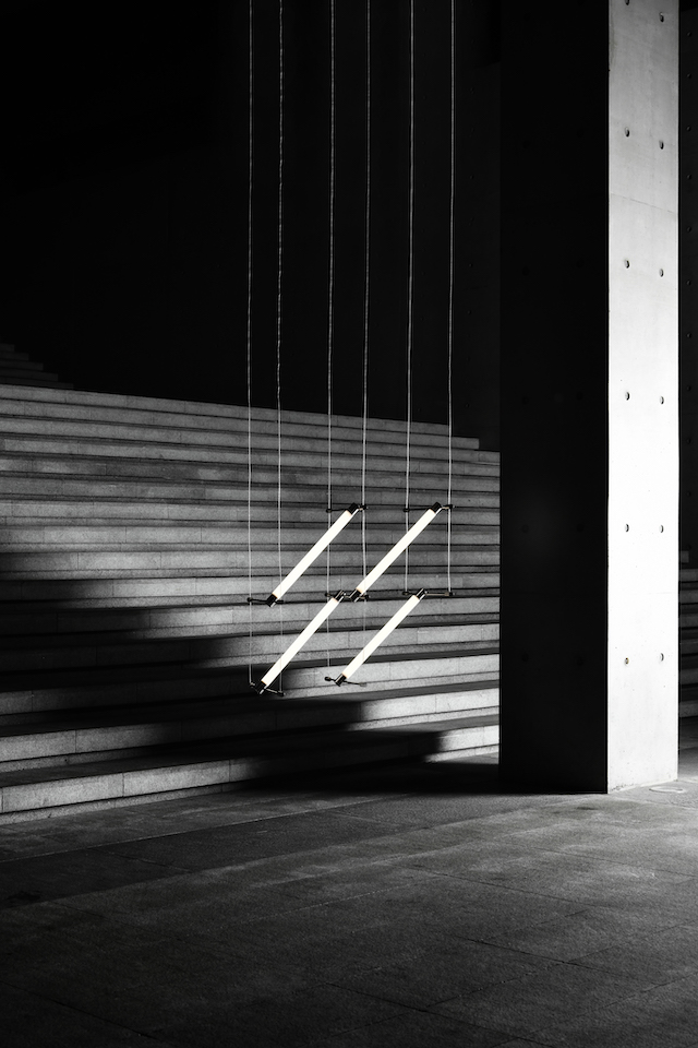
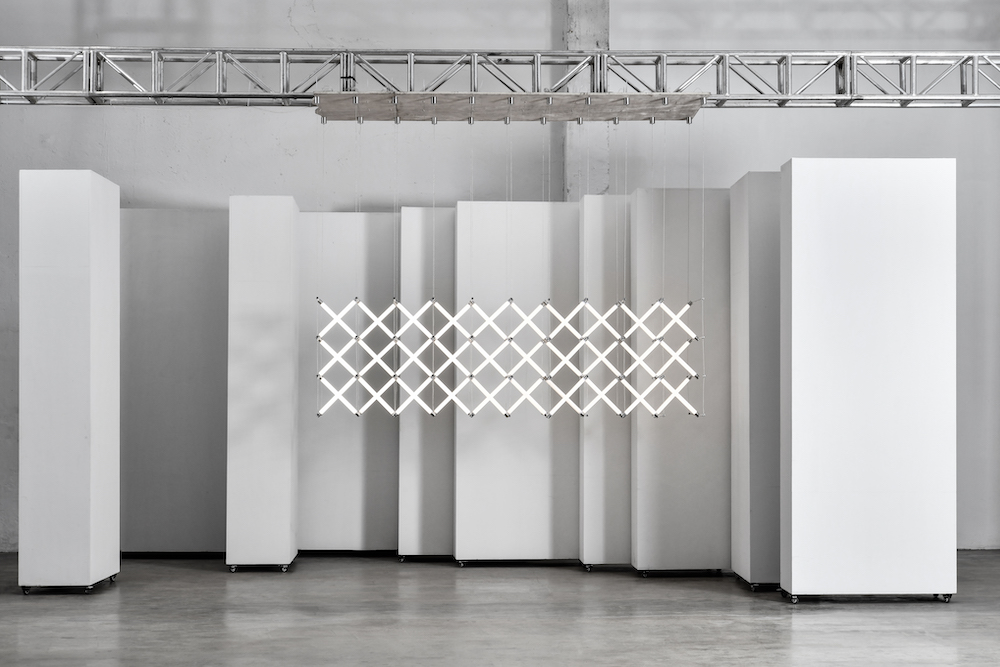
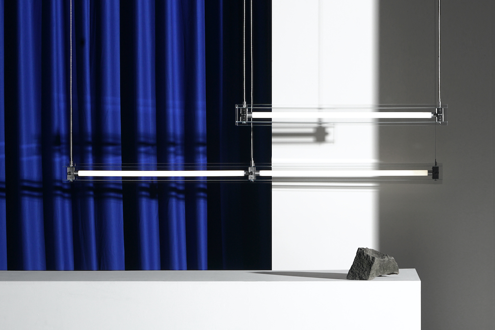
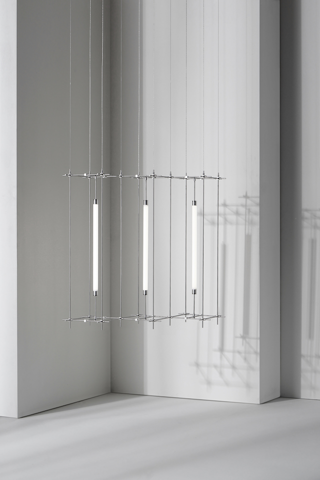
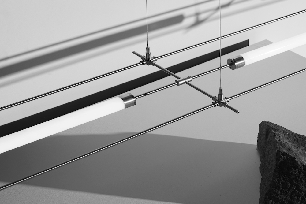
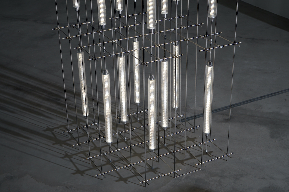
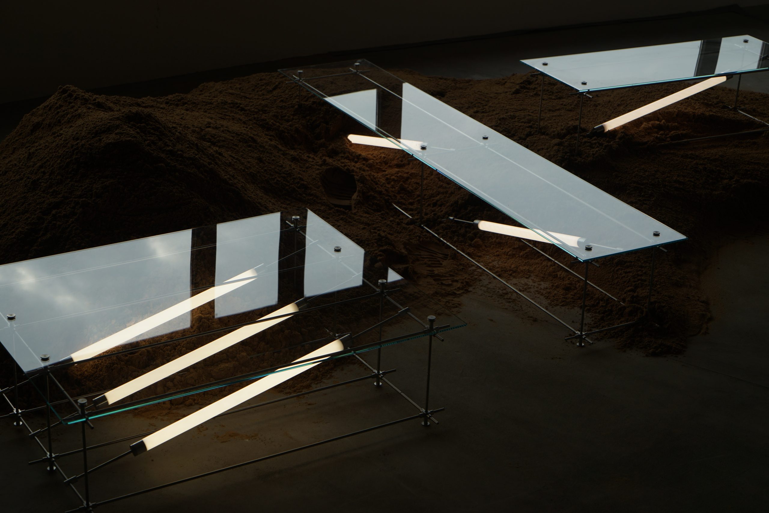
Because of the studio’s detailed and research-guided approach, this means the team are able to test their hands at a plethora of different pieces; the portfolio is diverse as anything. One example can be seen in its Mazha Lighting System, in what Mario deems as the “most representative work” of the studio’s. Designing for eternity, the system has been made to last. “Low voltages can be transmitted electrically through the structure of the lamp, allowing the lamp to be free of wires and to build diverse and endlessly changing systems as a free unit,” explains Mario. The first iteration of the modular lighting system was inspired by traditional Chinese seating apparatus, composed to give a “more diverse expression” and renew its circularity; it’s how the Mazha Lighting System was borne. 

Each generation thereon consists of tube lights, a metal pole or metal connector, plus the wire ends. “Without the slightest intention to hide the structure, each component is extremely delicate and independent,” says Mario. “When a part of the product is faulty and needs to be replaced, only the point of filature news to be replaced, not the whole lighting.”

Mazha Lighting System by Xu Xiaodong

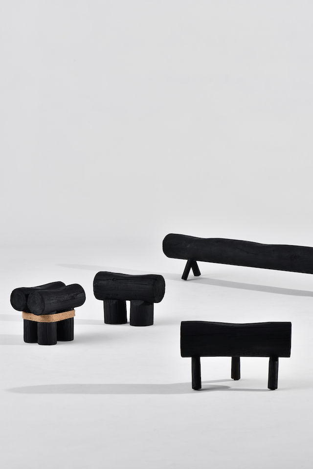
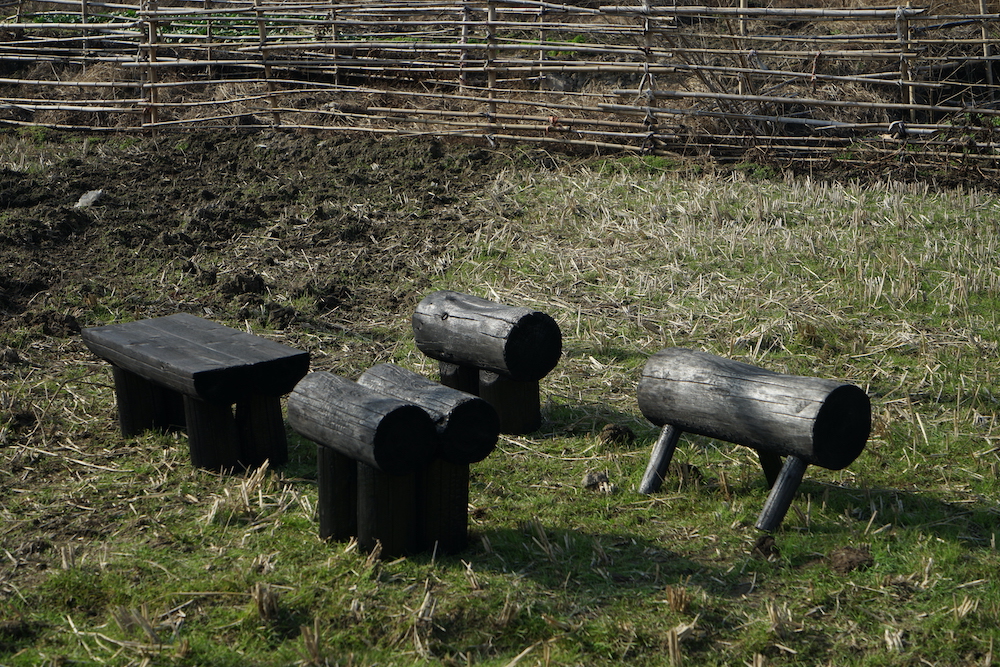
Origin Collection is a comparatively different project yet one that succinctly aligns with the Mario Tsai ethos entirely. A design performance piece, Origin Collection reflects on the idea of using modern technology and tools to make life and work more convenient. But on the other side, according to Mario, “they also gradually hinder our human instincts and sensitivities”. In response,  Mario hired a carpenter from the Hangzhou countryside to structure the furniture through manually processes like log-cutting and fire burning – the antitheses to digital methodologies and one that equated to a refreshing design experiment to inspire people to rethink their footsteps. “All the processes used to complete The Origin are based on instinctive human wisdom. The process of creating tools to carry out the project, using native materials and existing conditions, was also the best way of expressing the idea of locality in contemporary design.”

Clearly, Mario Tsai and the team go beyond the expected when diving into a project, be it a more critical or conceptual piece or one that’s more functional. Shying away from the wishy washy displays of ‘sustainable’ design, Mario Tsai Studio strives to be honest, functional and long-lasting. Speaking of whether the design industry is currently doing enough in terms of combatting climate change, Mario says: “I think it’s far from enough. A lot of sustainable design is pseudo and gimmicky, and many people use the concept of sustainable design with the ultimate goal of business and personal fame. I hope that sustainability can be incorporated as a norm in the way people live and work.”

Mazha Lighting System by Mario Tsai

Mazha Lighting System by Mario Tsai

Mazha Lighting System by Mario Tsai

Mazha Lighting System by Mario Tsai

Mazha Lighting System by Mario Tsai

Origin Collection by Mario Tsai

Acid Coral Template

Tuomas A. Laitinen addresses important questions of ecology and climate change through a series of glass-made structures and installations

A Proposal for an Octopus, series, 2019. Photo: Jussi Tiainen

The octopus has earned a spot as perhaps one of the most visited subject matters in art. From 19th century Japanese erotica through to modern painting classics, the eight-armed sea creature has drawn many artistic practitioners in with its alluring symbology and anthropomorphic influences. Mysterious, intelligent, adaptable and fluid; the tentacled and unpredictable animal represents both wisdom and strategy. For instance, in the recent documentary My Octopus Teacher, we saw the ocean protagonist cover herself with shells to hide from impeding prey, outsmarting the sharks in an instant as she continued to poke her many legs into its gills. So it’s no wonder the octopus has caught the attention of artists and designers over the years, with Tuomas A. Laitinen being the most recent – an artist who works across video, sound, glass, algorithms, plus chemical and microbial processes.

In his most recent body of work Tuomas merges the line between art and science, weaponising materiality and craft to take a crystallised view at the world of ecology – that which is done so through octopus-shaped glass structures and compositions. The work, named Acid coral template, has been presented at the inaugural Helsinki Biennial this year, and he’s also recently been commissioned by Daata to create an AR artwork for the launch of the platform’s AR app – a continuation of what was first commissioned by Daata in 2020. “I had been researching protein crystallography for a few years and started to think about how I could translate this data in my work,” he tells me. “In that video work, I used the protein models to create these very baroque body augmentations for the animated characters in the video.” Simultaneously, at the time of making, Tuomas was working on coral growth simulations and eventually these two worlds collided. “The protein model for this particular coral is based on the Yersinia Pestis (plague) bacterium. So there is a weird fictional metamorphosis woven into the fabric of the work. A bacterium becomes a speculative coral. It’s not really about representing the data as such but making an interpretation, a translation, or a transmutation of it and consequently placing it into new environments through AR.”

PsiZone, 2021. Installation view, Helsinki Biennial

Tuomas grew up in a small Finnish town, a place known the centre point for glass production in Finland and in the 20th century. He started working on his installations as a teenager using junkyard materials and scraps, “so that was my fist touch to art, even though there were no such categories in my mind then,” he says. After a stint in music, Tuomas decided to attend art school and pursued his studies at Finnish Academy of Fine Arts, which is where his love of sound, moving image, 3D animation, light and installation first bloomed; his debut glassworks were created around 10 years ago and “were basically custom lenses for a camera”, while his first augmented reality piece was borne in 2016. Now living in Helsinki, he often works with various artists and researchers to question the role of ecology and production, often employing a profound mix of translucent materials such as glass and chemicals, as well las microbial processes and algorithms. 

For the last five years, Tuomas has turned his focus onto the eight-legged creature and its home: the coral reef. “I’ve been making glass sculptures for octopuses as an attempt to find ways to think with these extraordinary lifeforms and, on a larger scale, ocean ecosystems. The octopus started to feel like a relevant conductor for opening up various ecological questions, providing a tentacular and modular model for organising ideas and artworks: ‘nine minds’ in one body. There is always a core brain there, but the structure allows a certain decentralisation to happen.” In a wider context, Tuomas strives to question ecology but also to touch upon the various mythologies that are attached to it, “and ideas coming from processes of knowledge production.” He adds: “And in some way, an element of cli-fi and sci-fi is present in the entanglements of my work – especially climate fiction, where the weather or the ecosystem is often seen as a protagonist. The current path in my work started in 2010 when I discovered some key texts from feminist new materialist theorists. That moment presented a major shift in perspective, and it is still affecting a lot of my work.”

Haemocyanin, 2019. Still from the video

And now, when thinking about the relationship between ecology and sustainability, it’s universally thought of as a delicate and necessary relationship. Conserving the earth’s waters, soil and ecosystem is vital in order to remain harmonious with the environment and the incoming – or better yet the present – affects of climate change. Tuomas’ work not only proves the impact of art when it comes to raising awareness of climate change, but that it’s a an aesthetic reminder of how fragile the natural world can be, where with just a shudder, slap or bash it can break it into tiny fragments. 

“For me, the idea of ecology is something that emerges from being sensitive to processes of mutual coexistence,” he explains. “When I think of ecology, I often come back to the notion of overlapping symbiotic processes and questions of biodiversity. At the level of making art, it means that individual works (like this coral reef) emerge out of an extensive world building or thought process rather than clearly defined project boundaries. A certain bundle of actions and reactions allows a specific outcome or a life form to appear, and I think that this is a sort of a parable of an ecological process. Feminist theorist Deboleena Roy talks about this notion of ‘feeling around for the organism’ in her book Molecular Feminism, and it’s been one of the important reminders on how to look for kinship with other-than-human lifeforms. And then, on another scale, as a citizen concerned with environmental issues, I am trying to find ways to support youth climate actions, but on an artistic level, it’s all about these subtle differences and tentative approaches.

It seems to me that understanding different scales and the resulting perspective shifts are quite crucial tools in relation to thinking about ecological transformations.”

A Proposal for an Octopus, series, 2019. Photo: Jussi Tiainen

Protean Sap, 2020. Stills from the video