Arassociati co-founder Giovanni Da Pozzo discusses the redesign of Hotel Duca di Milano, last transformed by his former mentor and architect, Aldo Rossi
Being tasked to breathe new life into your late mentor’s work must be both flattering and terrifying in equal measure. But that’s what the founders of Italian architects Arassociati were faced with when commissioned to revive the old Hotel Duca di Milano. This was the central Milan hotel that last underwent a redesign between 1988 – 1991 under the master hand of esteemed architect Aldo Rossi, who was the first Italian to win the coveted he Pritzker Architecture Prize.
Rossi, who passed away in September 1997, was known for his philosophical take on architecture; he believed strongly in the relationship between architecture and the city, and his designs reflected an acute awareness of place and time.
In the year of Rossi’s death, Arassociati was set up by a quartet of architects, Marco Brandolisio, Giovanni Da Pozzo, Massimo Scheurer and Michele Tadini, all of whom began their careers working in Rossi’s studio, learning their trade and the coveted designer’s interpretation of modernity.
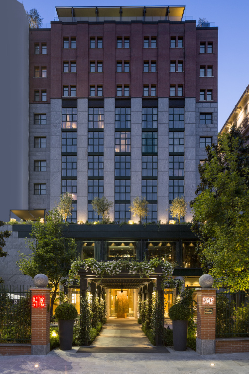
So it seems fitting that in 2015, the studio paid homage to Rossi once more by completing the restoration – including a redesign of both exterior and interior – of the 5-star hotel, now called the ME Milan Il Duca.
Here, we speak to Arassociati co-founder, Giovanni Da Pozzo, about channelling Rossi’s aesthetic in order to create a hotel that reflects both a modern and historical sense of Milan.
What are the key principles you and the founders of Arassociati learned from Aldo Rossi and how have they influenced your practice as architects?
We learned principles that we constantly try to honour in our professional research and practice. First of all, true modernity is based on history and every project needs to live alongside the spirit that characterises the location.
The main rule that Aldo Rossi passed down to us is to promote our own concepts of architecture while also retaining a continuity of ideas and researching new shapes.
Rossi was once described as ‘a poet who happens to be an architect’. From your experience of working with him, what do you make of this?
When excellence is reached, in every single activity, we used to say that you overcome rhetoric to reach poetry. In this sense Rossi was a poet of architecture, thanks to his introspective vision. He was a master that always looked beyond the trends of the moment.
What set Rossi’s original Hotel Duca di Milano apart when it was first revamped?
Rossi introduced the concept of a new hotel, composed of basic volumes and bound to a very rational and functional morphology and typology. He introduced a very recognisable architecture, the opposite to the stylistic repetition of the 19th century’s hotels; it was a new kind of building, imagined as an urban block of great importance thanks to its façade.
How did Rossi’s work on the original hotel influence your studio’s vision for the updated version?
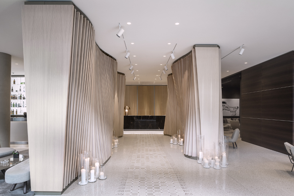
Rossi’s job wasn’t completed by the interior design that was developed in the 90s by others – its commercial standards misrepresented Rossi’s modernist spirit, with no relationship to the external architecture. We started from this, giving continuity and a new décor to the building’s interior.
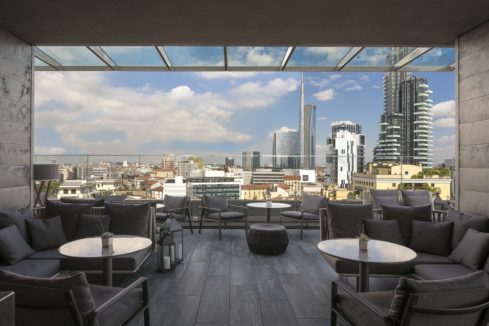
Concerning new volumes on the roof, we opted for a rational architecture characterised by linearity and transparency, in order to not misrepresent the original one. The external intervention is very measured without being too mimetic, while the inner spaces are a succession of reception and hospitality.
Could you expand on this idea of rational construction?
The method was to propose new spaces and changes that respected the original morphology and typology, searching for new shapes through the clarity of design, the materiality of finishes and through light.
Another principle was to rationalise the functional aspects of the hotel, following priorities and specifics given by ME Melià (i.e. the STK restaurant, Radio Rooftop Bar and its accessibility to the terrace with panoramic views of Milan), and to advance the original ideas in a coherent way. Without conception, principles – even if rational – are like an empty score.
Can you tell us more about the furniture you chose for the interior?
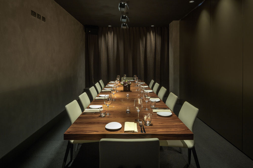
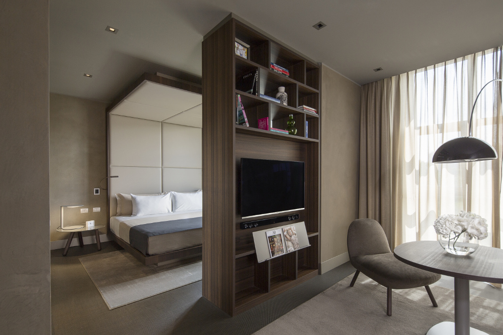
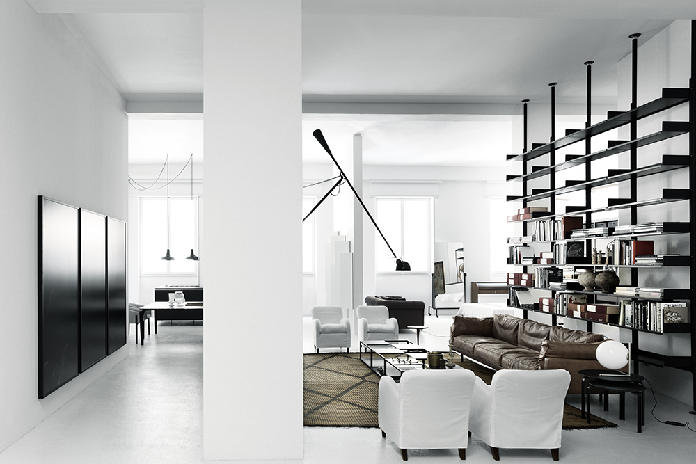
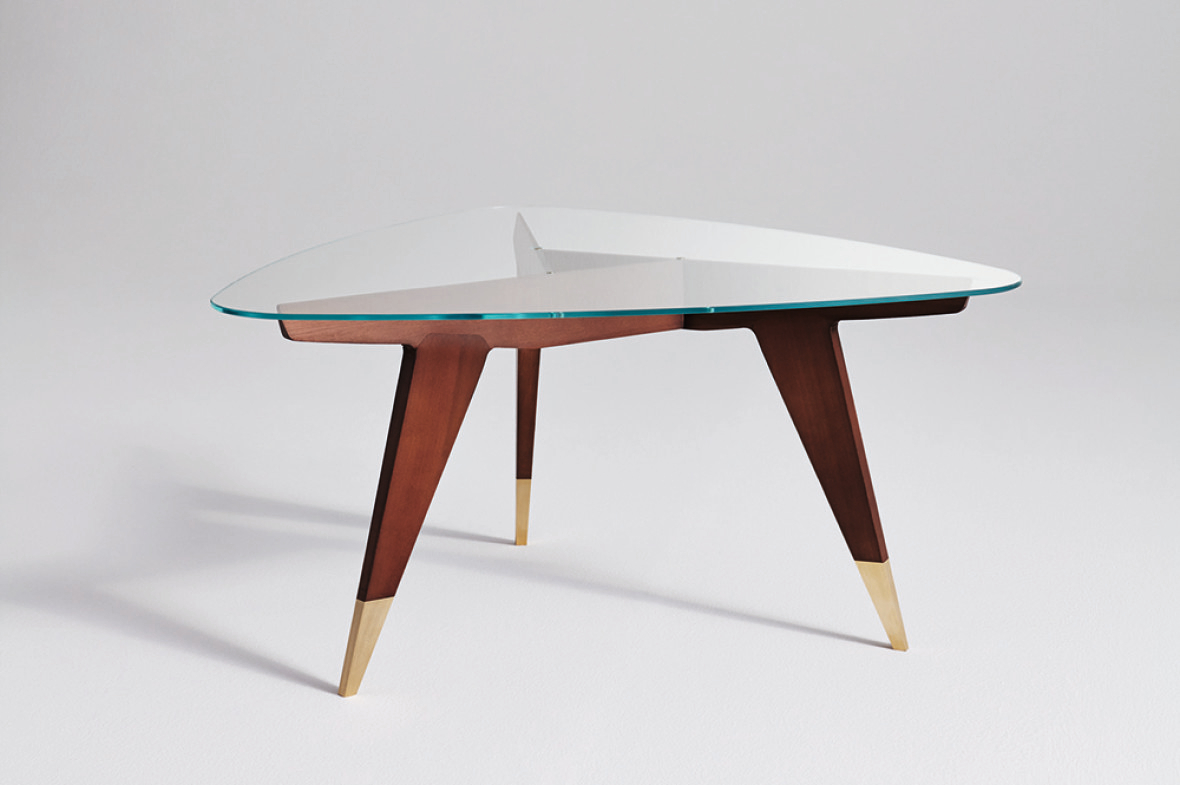
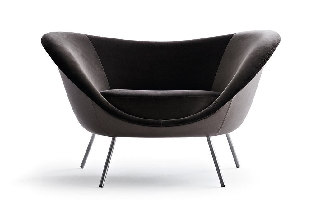
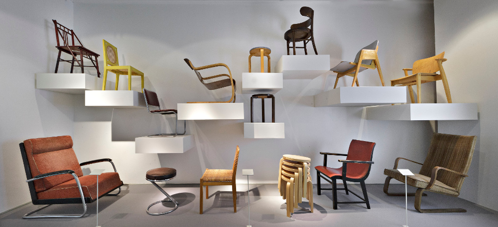
The furniture in the guestrooms and in most of the hotel’s public spaces was made by Molteni & C. Every floor in the hotel is identified by the chairs and furniture products designed by great Milanese masters of design: ground floor and mezzanine floor by B.B.P.R. (Elettra – Arflex) and Gio Ponti (D.153.1 e D.270.2 – Molteni & C.). Then from the first floor to the ninth floor, respectively: Aldo Rossi (Parigi – UNIFOR), Caccia Dominioni (Catilina – Azucena), Achille Castiglioni (San Luca – Frau), Franco Albini (Tre Pezzi – Cassina), Ignazio Gardella (Digamma – Santa & Cole), Vico Magistretti (Tondo – De Padova), Joe Colombo, Marco Zanuso (Maggiolina – Zanotta) and Guglielmo Ulrich (Willy – Frau).
What was the key ethos behind this project?
The main aim was to renew the hotel with a sense of international glamour that had to be strongly bound to the city’s spirit; it had to have a unique aesthetic and be able to let its guests live a particular experience, which merged with the city’s reputation as a fashion and design capital.
Me Milan Il Duca Hotel Piazza della Republica, 13, 20124 Milan, Italy


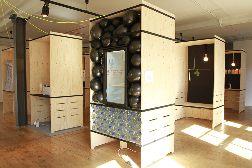


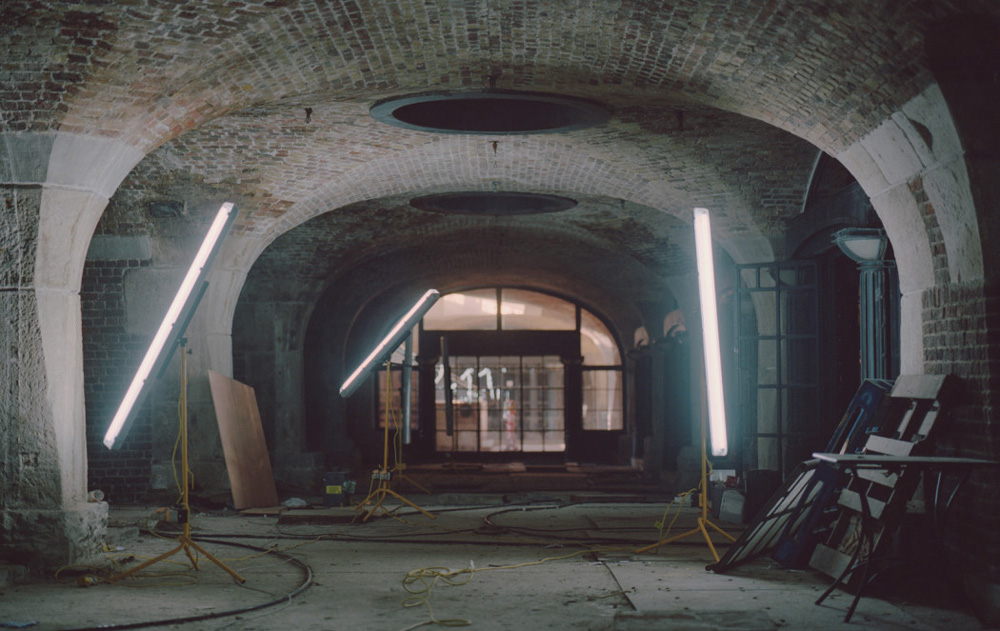 The Spaces about co-working environments” width=”1000″ height=”631″ class=”size-full wp-image-59943″ /> Tobacco Dock Vaults, which appear in a feature on The Spaces about co-working environments