A home for creativity

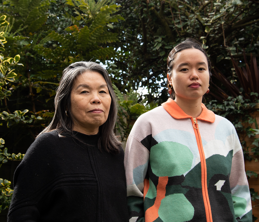
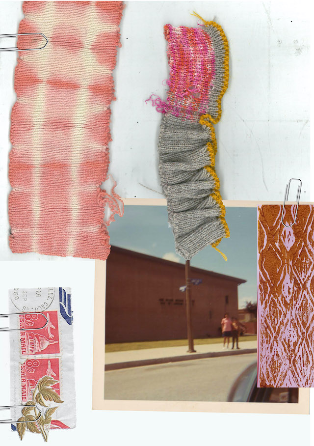
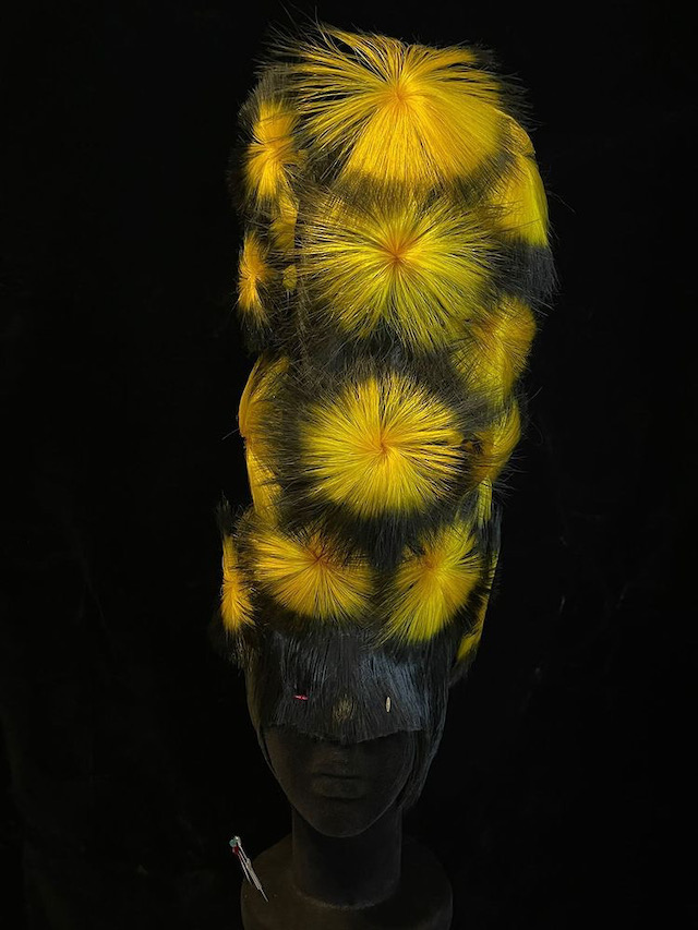
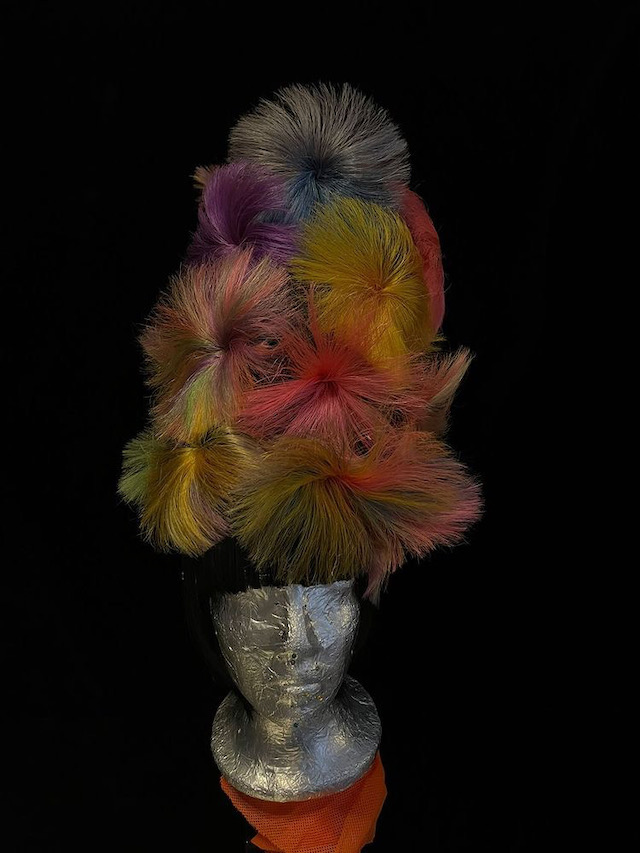
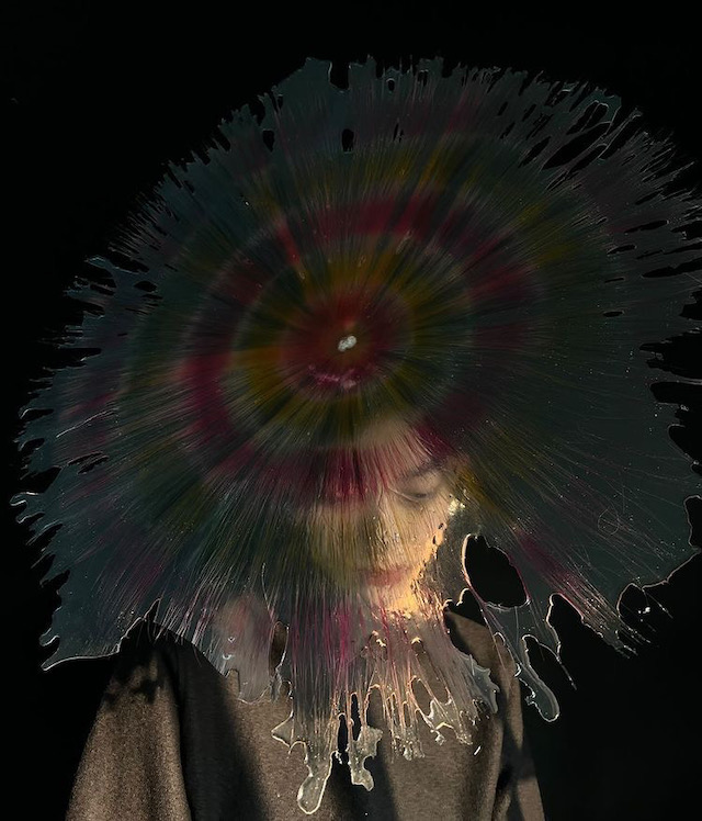
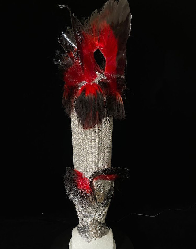
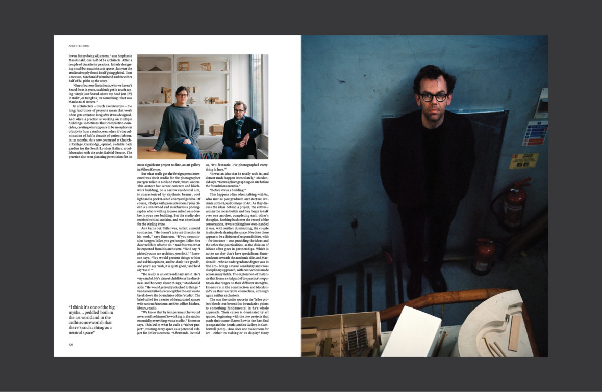
Since launching in 2022, Young Space has cultivated an environment where artists collaborate and thrive. Below, we ask some of its residents to highlight their favourite objects in the space, and the role these items play in their everyday lives

Photography Dan Tobin Smith

Young’s founding principle – that a good space can facilitate great, surprising creative work – isn’t necessarily new. Its approach, though, might be. Launching in July 2022, the UK indie label Young (formerly known as Young Turks and founded by Caius Pawson) built Young Space as an incubator for creatives, sitting in a former millinery works in east London’s De Beauvoir Town, hemmed in by housing on either side.

When stepping into the late 19th-century structure, which was redesigned by British architect John Pawson, visitors will likely see singer Sampha recording in one of its five studios, or Grace Wales Bonner designing her latest collection in a workspace. But for the most part, it’s “for artists and people who support artists”, as stated on its website, spanning freelance and company-based residents across fashion, music, visual art, furniture, food and publishing.

Practically, freelancers occupy a core and yet precarious position in the creative world, acting as iconoclastic sources for new creative thinking some of the time, or at other times as the glue or the oil in a creative engine. The problem with that duality is that they’re scattered, often isolated, but inextricable from exciting creative work – a freelancer commissioned this story, another freelancer photographed it. Yet another freelancer will have combed through these words before you read them.

It’s not in Young’s mission to set out a goal for itself or its residents – one gets the sense that’s exactly what they’re trying to avoid. If we were to apply one to what’s been built so far, though, it might be to bring freelancers together under one roof with as few prescriptions as to what they do there as possible. On the day I visit, there’s an A&R meeting for the label, a visiting dog, a delicious communal lunch and a reading in the evening. You can do pretty much anything here, Beth Davies, Young Space’s strategist and development consultant, tells me, “as long as you put the tables back”. To dig into some of what happens there, we asked residents to contribute objects as well as explanations around them.

Kwes Darko, producer – Palo santo

Young is a space built on the energy of creative fluidity, as well as a safe space for all to freely connect and grow creatively; a space for all to feel comfortable from the moment they step in the building. That ethos runs through all parts of the space, including the studios – mine is a sacred room of free flow and spirituality. The palo santo stick is an important part of my studio, as it provides calm and a cleanse of any bad energy that may try to interfere with the core foundation and comfort of being. The scent complements the aura of Young and emits positive vibrations and peace.

Sienna Murdoch, artist, (gelines, 2024)

Prompts for fantasy, amplifying elements of things we consume every day. They feel familiar but they are something else now. They could transform you if only you could touch them, which is happily encouraged.

Clem Macleod, founder – WORMS, Bookworm candle

We believe that a sense of calm is imperative for the creative process. At Young Space, we begin each of our writing workshops with a meditation. Light a candle, get comfortable and ignite the flow state.

John Glacier, musician – Microphone

In relation to this space, the microphone is one of the most crucial objects. It’s as important to me as it is to others. It’s where sounds are transmitted to give life to a space called Young.

Luc Wilkinson, musician – Dungeons and Dragons Dice Sets, various

I love all things fantasy. As adults, we don’t often get to truly remove ourselves from reality and indulge in the freedom of make believe. Dungeons and Dragons allows you to do just that: play. It’s fun to bring this game to the space and play with people you’d normally interact with in a professional context. You see different sides of people.

Rhys Coren, artist – Sample of ‘Filter Sweep’, a table by Rhys Coren and Peter Noyce created for the Young Space Garden

‘Filter Sweep’ references feedback loops and resonance, mirroring the cross-pollination at Young Space. This piece is the first of a new series of works, and is created using Italian marble and granites from India and Brazil.

Luke Pryde, manager and A&R – Chess Board

Chess is an unfiltered conversation between two people’s minds, it can tell you a lot about a person and about how they think. It’s a fun way for two minds to come together and challenge each other, not unlike that of Young Space. Every day, we meet new people and are challenged by others’ thoughts and ideas. This brings out the best in people – food for thought nourishes the mind.

Charlie Hedin, co-founder and creative director – Tekla Tekla red mohair blanket, by John Pawson

At its core, the blanket draws from the specific visual memory of a graphic interaction between architectural space and light. Through its function, it transfers feelings of home to Young Space.

Mafruha ‘Maf’ Ahmed, chef, and Nancy Andersen, chef and musician – Rings, St Christopher, Best Friend Charm and Taja Guirey Chain

Wearing jewellery in the kitchen is somewhat forbidden but holds so much identity for myself and Nancy. Whilst cooking at Young Space, we wear our jewellery as a statement of our individualism. The dining room at Young Space is a minimal communal area and, though we take our jewellery off to cook and mix with our hands, we show it off whilst serving lunch, as an extension of our personalities.

Milo Cordell, head of A&R Young and founder Open by Appointment – Jack Lamp by Tom Dixon

The space is a minimalist haven, a place where conversation, community and calm take precedence over anything else. Sometimes I just want to spray paint over all the walls and let the chaos in. I see the lamps as pieces of physical graffiti.

Foundation FM, music label – Butterfly T-shirt designed by Dolly

Dolly’s name kept appearing at Young Space, literally in large type on the leg of her signature baggy shorts. You’d see it worn by radio show guests, by our friends at WORMS publishing and in the kitchen. When we were talking about designers who we should collaborate with, she was first on the list.

Caius Pawson, co-founder and board of trustees chair, Murmur – ClientEarth book
This book was co-written by James Thornton, a poet, Zen Buddhist and tough-as-nails climate lawyer. James founded ClientEarth, and both the organisation and the book have been a point of reference and an inspiration for Murmur.

Photography Dan Tobin Smith

This article is taken from Port Issue 35. To continue reading, buy the issue or subscribe here

Living Room Reverie

Photography Luca Ward, styling Julie Velut

Top Christian Dior Trousers stylist’s own Boots Alaïa
Shoes Tod’s Tights stylist’s own
Top Alaïa Belt Margaret Howell Hat Christian Dior Tights, Shoes & Bracelet stylist’s own
Shoes Ferragamo
Top Emporio Armani Trousers Stefan Cooke Shoes Louis Vuitton
Pearls Celine
Top Margaret Howell Jeans Margaret Howell Gloves Emporio Armani Earrings & Cuffs stylist’s own
Keyring stylist’s own

Photography Luca Ward

Styling Julie Velut

Hair Kachi Katsuya

Casting Lauren van Meeuwen

Model Ruby P @ Milk

This article is taken from Port Issue 35. To continue reading, buy the issue or subscribe here

Port launches Issue 35 with Chiwetel Ejiofor and Manolo Blahnik

Chiwetel Ejiofor attends the Port x Manolo Blahnik – Issue 35 Launch hosted by Chiwetel Ejiofor at GAIA Mayfair on November 27, 2024 in London, England. Photo Credit: Dave Benett.

Port’s editor-in-chief, Dan Crowe, our AW25 cover star, Chiwetel Ejiofor, and Kristina Blahnik celebrate the launch of Issue 35 with an intimate dinner at GAIA Mayfair. Special guests included Yinka Ilori, Charlie Casely-Hayford, Afua Hirsch, Angel Coulby, Peter Saville, Haley Bennett, Joe Wright, Nicholas Cullinan, Max Hurd, Robert Montgomery, Vinette Robinson and William Bracewell. A special thanks to Manolo Blahnik and to everyone who has shown their support.

Photography Dave Benett

Afua Hirsch attends the Port x Manolo Blahnik – Issue 35 Launch hosted by Chiwetel Ejiofor at GAIA Mayfair on November 27, 2024 in London, England. Photo Credit: Dave Benett.
Charlie Casely-Hayford and Yinka Ilori attend the Port x Manolo Blahnik – Issue 35 Launch hosted by Chiwetel Ejiofor at GAIA Mayfair on November 27, 2024 in London, England. Photo Credit: Dave Benett.
Angel Coulby attends the Port x Manolo Blahnik – Issue 35 Launch hosted by Chiwetel Ejiofor at GAIA Mayfair on November 27, 2024 in London, England. Photo Credit: Dave Benett.


Dan Crowe, Chiwetel Ejiofor and Kristina Blahnik attend the Port x Manolo Blahnik – Issue 35 Launch hosted by Chiwetel Ejiofor at GAIA Mayfair on November 27, 2024 in London, England. Photo Credit: Dave Benett.
Charlie Casely-Hayford attends the Port x Manolo Blahnik – Issue 35 Launch hosted by Chiwetel Ejiofor at GAIA Mayfair on November 27, 2024 in London, England. Photo Credit: Dave Benett.
Dan Crowe, Dr Nicholas Cullinan and Peter Saville attend the Port x Manolo Blahnik – Issue 35 Launch hosted by Chiwetel Ejiofor at GAIA Mayfair on November 27, 2024 in London, England. Photo Credit: Dave Benett.
Haley Bennett attends the Port x Manolo Blahnik – Issue 35 Launch hosted by Chiwetel Ejiofor at GAIA Mayfair on November 27, 2024 in London, England. Photo Credit: Dave Benett.
Chiwetel Ejiofor attends the Port x Manolo Blahnik – Issue 35 Launch hosted by Chiwetel Ejiofor at GAIA Mayfair on November 27, 2024 in London, England. Photo Credit: Dave Benett.
Joe Wright attends the Port x Manolo Blahnik – Issue 35 Launch hosted by Chiwetel Ejiofor at GAIA Mayfair on November 27, 2024 in London, England. Photo Credit: Dave Benett.
Dan Crowe attends the Port x Manolo Blahnik – Issue 35 Launch hosted by Chiwetel Ejiofor at GAIA Mayfair on November 27, 2024 in London, England. Photo Credit: Dave Benett.
Joe Wright attends the Port x Manolo Blahnik – Issue 35 Launch hosted by Chiwetel Ejiofor at GAIA Mayfair on November 27, 2024 in London, England. Photo Credit: Dave Benett.
Kristina Blahnik and Haley Bennett attend the Port x Manolo Blahnik – Issue 35 Launch hosted by Chiwetel Ejiofor at GAIA Mayfair on November 27, 2024 in London, England. Photo Credit: Dave Benett.
Max Hurd attends the Port x Manolo Blahnik – Issue 35 Launch hosted by Chiwetel Ejiofor at GAIA Mayfair on November 27, 2024 in London, England. Photo Credit: Dave Benett.
Yinka Ilori and Charlie Casely-Hayford attend the Port x Manolo Blahnik – Issue 35 Launch hosted by Chiwetel Ejiofor at GAIA Mayfair on November 27, 2024 in London, England. Photo Credit: Dave Benett.
Dr Nicholas Cullinan attends the Port x Manolo Blahnik – Issue 35 Launch hosted by Chiwetel Ejiofor at GAIA Mayfair on November 27, 2024 in London, England. Photo Credit: Dave Benett.
Kristina Blahnik attends the Port x Manolo Blahnik – Issue 35 Launch hosted by Chiwetel Ejiofor at GAIA Mayfair on November 27, 2024 in London, England. Photo Credit: Dave Benett.
Yinka Ilori and Afua Hirsch attend the Port x Manolo Blahnik – Issue 35 Launch hosted by Chiwetel Ejiofor at GAIA Mayfair on November 27, 2024 in London, England. Photo Credit: Dave Benett.
Peter Saville attends the Port x Manolo Blahnik – Issue 35 Launch hosted by Chiwetel Ejiofor at GAIA Mayfair on November 27, 2024 in London, England. Photo Credit: Dave Benett.
Dan Crowe and Kristina Blahnik attend the Port x Manolo Blahnik – Issue 35 Launch hosted by Chiwetel Ejiofor at GAIA Mayfair on November 27, 2024 in London, England. Photo Credit: Dave Benett.
Robert Montgomery attends the Port x Manolo Blahnik – Issue 35 Launch hosted by Chiwetel Ejiofor at GAIA Mayfair on November 27, 2024 in London, England. Photo Credit: Dave Benett.
Vinette Robinson attends the Port x Manolo Blahnik – Issue 35 Launch hosted by Chiwetel Ejiofor at GAIA Mayfair on November 27, 2024 in London, England. Photo Credit: Dave Benett.
William Bracewell attends the Port x Manolo Blahnik – Issue 35 Launch hosted by Chiwetel Ejiofor at GAIA Mayfair on November 27, 2024 in London, England. Photo Credit: Dave Benett.
Yinka Ilori attends the Port x Manolo Blahnik – Issue 35 Launch hosted by Chiwetel Ejiofor at GAIA Mayfair on November 27, 2024 in London, England. Photo Credit: Dave Benett.
Joe Wright and Haley Bennett attend the Port x Manolo Blahnik – Issue 35 Launch hosted by Chiwetel Ejiofor at GAIA Mayfair on November 27, 2024 in London, England. Photo Credit: Dave Benett.


The Road to Nowhere

Dalia Al-Dujaili on identity, storytelling and the importance of providing a platform for second-generation immigrants

Hark1karan, Zimmers of Southall (Copyright © Hark1karan, 2020-2021)

Identity is complex a complex thing. In The Road to Nowhere, a magazine from Dalia Al-Dujaili, a British-Iraqi editor and journalist, the concept of identity is torn apart, scrumpled and analysed as she addresses her frustration with a lack of accurate representation of second-generation immigrants – where so often are diaspora communities spoken for in the media and therefore turned into a “political issue only”, she says. Where in fact, migration is a vital part of global culture, and The Road To Nowhere – now in its second issue – seeks to highlight this through a celebratory merging of art and writing, told first-hand from “third-culture kids”. She says, “Humans are mosaics of their experiences, their upbringings, the people around them and their personal history. So none of us fit neatly into a box, we’re all so messy and complicated!” Below, Dalia reveals her reasons for making the magazine, what we can expect to find inside the latest issue and her personal thoughts on identity.

Courtesy of Angela Hui

What are your reasons for starting The Road to Nowhere, what provoked it?

Oof, so many reasons… I started it during lockdown of 2020 as a way to pass the time as I was still a uni student then and didn’t have much to do. It was partly a way to raise aid money for the famine in Yemen which remains one of the largest humanitarian crises in history yet receives almost no media coverage. 

However, mostly, I was frustrated at how little agency diaspora communities have over telling their own stories. Representation is few and far between; when we are represented, we are spoken for and don’t get to choose how we’re shown. I was annoyed at how migration was almost always made into a political issue only. Whilst obviously it’s inherently political, it’s so much more than that. Migration creates culture and art, feeds creativity, inspires us, connects communities and reminds us to be human, so I found the constant politicising aspects a bit objectifying, belittling and limiting. 

On the other hand, migration is one of the most important aspects of humankind’s growth and its richness and is the oldest and most natural phenomenon, yet under current policies in the UK and the EU, migration has never been under more scrutiny; immigrants, refugees and asylum seekers are fighting some of the most aggressive and oppressive policies. As children of immigrants, we owe our livelihoods to freedom of movement, so I’m desperate to fight totalitarian control of movement and borders through creativity and joy.

Edmund Arevalo

What can we expect to find inside issue two? How does it compare to the debut edition?

Firstly, it’s so much bigger than the last issue! Almost double the number of pages. And you can expect to find an extremely diverse range of stories; for this issue, we have contributors with backgrounds from Aotearoa, Ghana, Egypt, Turkey, Pakistan, India, Malaysia, Indonesia, Poland, and many more. The contributors use a range of poetry, fiction, personal essays, photography, illustration, digital art and film, and we have several interviews with trailblazers like Rohan Rakhit and Angela Hui. So I really sought out stories which greatly differed from one another but, at the same, were all connected by the same thread of their very human and sometimes even mundane nature. 

Family meal before service

Can you pick out a couple of favourite stories featured in the magazine and talk me through them? 

Oh my goodness, very difficult to pick out just a couple. But if I have to… Zain’s story is one that I keep returning to. Not only is his personal story absolutely fascinating – the move from Lahore, Pakistan to East London, then Morecambe – but the way he talks about objects, and clothes especially, as archives of our families’ migration is so relatable and poetic. Again, it’s just a deeply human story that almost any diaspora kid can relate to, no matter their background. Also, Zain’s work is just absolutely stunning. 

My interview with Angela Hui is another that I really treasure and feel very honoured to have in the magazine. Angela is about to publish her own book, Growing Up in a Chinese Takeaway, and we discussed her upbringing in rural Wales working for her family’s business. What I love about her story is how deeply Welsh and Chinese she feels. It was fascinating hearing her speak so passionately about Welsh culture and a love of Wales. I think people often forget how we do in fact love the countries we grew up in, as well as loving the cultures our parents imported for us from their homelands; Angela’s story is a reminder that we don’t have to ‘pick a side’.

Natasha Zubar

What does identity mean to you? And how have you represented (or scrutinised) the concept of identity in the magazine?

Identity is both everything and nothing. It’s a made-up concept and whist I deeply resonate with my identity as an Arab Brit, I also try to reject rigid notions of ‘identity’ because they can be so limiting. Many diaspora feel the same way because we fit in “everywhere and nowhere at the same time”, to echo Theo Gould in his TRTN piece, Mixed. I also think some aspects of identity politics can be more harmful and divisive than uniting. Identity to me is just being able to express the different parts of yourself without feeling the need to cater to a certain audience or change yourself to fit into other people’s boxes. Humans are mosaics of their experiences, their upbringings, the people around them and their personal history. So none of us fit neatly into a box, we’re all so messy and complicated! 

I think a good example of this in the magazine is Hark1karan’s Zimmers of Southall series (the cover image). Other than being obviously stunning, this series is so refreshing because it’s almost got nothing to do with Sikh culture – it’s about a community which is devoted to classic BMWs and which happens to be Sikh. The subjects of the images are evidently Sikh because of their clothing and appearance, but the series isn’t making their Sikh identity the sole focus, which just really humanises this community and de-exoticises them. Hark, perhaps unintentionally, re-writes this stereotype of South Asians being associated with Bollywood, curry and turbans, but he also shows how this community haven’t rejected their culture either; they manage to fuse their saris and Bhangra with their love of German Whips. I mean, to me, it’s just quietly genius. 

I hope in this magazine I have shown how identity is both a beautiful thing and ultimately a futile exercise – you will never be able to fully embody one identity and the magazine is part of a mission to learn how to accept this as a beneficial and powerful existence instead of it being simply frustrating. 

Rachna, Mom, 2021

What are the key takeaways, what can the audience learn?

Joy! I just want people to feel joy, and feel more open to listening to stories that challenge their views.

What’s next for you?

We have a couple exciting events lined up this year with the magazine, including a sold out screening of shorts at the Barbican, Finding Home, Forging Identity, and we’ll be selling the magazine at Bow Arts with Baesianz Makers Market. 

Currently, I’m just pushing and promoting issue two as best I can. We already have ideas and collaborators for issue three – I’d like to keep growing our online platform to showcase more audio-visual content, and I’d love to keep collaborating with arts collectives, organisations and institutions on in-person events like workshops, exhibitions and screenings/readings. But to be transparent, we need funding to make the next one even better, and the bigger our audience, the easier it is to convince someone to give us money… And as you know, funding is competitive and extremely difficult to attain. So the work starts now in anticipation for next year. 

The Road to Nowhere can be purchased here.

Jyni and Chuey, by Jai Toor, 2022

Marco Russo

Mirror Mother, Lorena Levi, 2021

Mixed, Theo Gould, 2021

Senja, by Maddie Sellers

Yousef Sabry, for The Road to Nowhere, 2022

Zain Ali, by Nancy Haslam-Chance, courtesy of Zain Ali

Hark1karan, Zimmers of Southall, (Copyright © Hark1karan, 2020-2021)

Hark1karan, Zimmers of Southall, (Copyright © Hark1karan, 2020-2021)

Hair of the Future

Zhou Xue Ming explores otherworldly structures and techniques in his crafty hair designs

Land on the Instagram account of Zhou Xue Ming and you’ll be instantaneously enamoured, scrolling and pausing – with curious hesitation – as you start to question the process behind each of his creations. A hair designer by title, Shanghai-based Xue Ming is more of an artist-stroke-wizard as he expels his craft on the artful placement of a do, from the decoratively lavished to the perfectly coiffed. Proving that there’s more to hair than hair itself, Xue Ming has been working in the industry for almost 10 years now. And ever since his first hairdo, he’s since been published on the covers of Nylon China and Modern Weekly Style, and has collaborated with an abundance of makeup artists, from Shuo Yang at Jonathan Makeuplab to Yooyo Keong Ming. 

Xue Ming’s impact is mammoth, not least in the creative application of colour but also in the use of materials. It’s not just hair that’s incorporated into these designs, for there’s also the unexpected addition of metallics, wires, peacock-like feathers, spikes or a material that appears like the cracks in a frosted lake. With a vast “enthusiasm for artificial hair”, he tells me, it’s no surprise that his portfolio succeeds in pushing the boundaries as to what can be worn on the top of a head. Sadly, we’re not going to be getting any answers as to how he makes his pieces – “this is my little secret” – so instead, we invite you to marvel and leave the methodology to the imagination.

One of the most recurring motifs of Xue Ming’s is the periwig, known as a highly styled wig worn on formal occasions, often sported by judges or barristers as part of their professional attire. Explicitly artificial, these wigs usually tend to have unmissable height and weight to them, placed atop a head in a composed and careful manner. The periwig was most popular from the 17th to the early 19th century, typically composed from long hair with curls on the sides. The colours are usually dyed in more realistic hues, whereas Xue Ming’s are quite the opposite. 

In fact, Xue Ming’s take on the periwig is widely juxtaposed with the more traditional concept of the wig. In one design, the hair appears like an explosion of fireworks with its vibrant yellow tones and splaying textures – the type that makes you want to reach out and touch, even though it looks like it could burn you. Others are more multi-toned and soft, displaying a palette of blush pink, sky blue, purple and sunshine yellow; while some – with pointy edges similar to a sea urchin – look completely unwearable. Or so you’d think. Not too long ago, the designer worked with a “young lady called ‘Princess’”, wherein he was “pasting posters with ‘princess’ cartoon images to prepare the periwig”. He ended up covering the entire periwig with these posters; “I was really interested to see the result”.

The work is a wonderful merging of old and new, where traditional headgear has been transformed, warped and lavished in the modern style and technique of Xue Ming. You can easily see some of the silhouettes being worn in the past, most likely the Regency era, while others are drawn from a far-reaching trend found in the future. Perhaps he’s ahead of his time, and world of hair might become little more creative in the years to come.

Bad Form: Caribbean Literature

In an excerpt from the literary magazine’s seventh issue, guest editor Mireille Cassandra Harper celebrates the Caribbean through stories, essays, reviews and poetry

Illustration by Tomekah George

I am a second-generation Jamaican. Despite my grandmother moving here in the 1960s, my mother remained in Jamaica, a ‘barrel child’ and spent her childhood in the parishes of Clarendon and St. Catherine, raised by her grandparents and later her aunt. She has often entertained me with stories of her childhood, visiting then-untouched beaches, fond memories of picking fresh mangoes, oranges and cashew fruit (often surreptitiously), the goats, chickens and other animals that her grandparents reared on their farm, and the joys of a rural and idyllic childhood. 

I grew up with an intense love and appreciation of my Jamaican heritage, that was always supported and nourished. Our home was filled with the sounds of Morgan Heritage, Richie Spice, Tarrus Riley and other music icons. From Lover’s Rock Sunday sessions and Vibes FM car journeys (those who are familiar will recall the hilarity of the incessant interruptions declaring that the station was ‘the wickedest in the whole world’) to late nights on holiday in southern Italy, where my parents would drive out to arid, empty locations in the middle of nowhere so we could enjoy open-air reggae concerts with the likes of Jah Mason, my mother and I belting out “My Princess Gone” without a care in the world. Storytelling and literature played a big part too. I was regaled by tales of Jamaican folklore, my favourite being the story of River Mumma, a mythical sea siren. A literary lover from a young age, my mother sought out books that put Caribbean literature front and centre. She travelled far and wide to buy me countless titles about the Caribbean, many of which I still own. My personal favourites, Kwame and Netta’s Story, came from Black River Books, an independent publisher that sought to revive the fullness of Caribbean heritage by telling beautiful stories of the lives of Caribbean children, putting them front and centre of stories, rather than on the sidelines. I was taken to meet my heroes, John Agard and Grace Nichols, and cherish the beloved signed copies I went away with to this day.

As I’ve grown older, more complexities around my heritage have come to light. In recent years, I have grappled with difficult conversations with my grandma – if you have ever tried to persuade your grandma, especially a 92-year-old Jamaican grandma, to consider a different way of thinking, you’ll know how challenging that can be. I’ve also attempted to reckon with the fact that my family is split across towns, states and countries – disjointed in more ways than one, and tried to reckon with intricate and at times, painful family histories and hidden secrets that inevitably have come to light as I grow older. At the same time, I have built deeper connections with family members, expanded my knowledge on my family history and heritage, and both listened and taken in the wisdom of my elders. Outside of my familial relationships, I am seeing what it means to be of the Caribbean diaspora, redefined through music, art and of course, literature.

When I came across Bad Form last year, I felt like I had finally found a literary space that encompassed the richness, vibrancy and sheer brilliance of Black, Asian and marginalised writers. Headed up by the phenomenal Amy Baxter (who will likely own her own publishing house one day, mark my words!) and the stellar team – Morgan, Sophie and Emma who are all immensely impressive in their own right – I found Bad Form’s active and dynamic approach to platforming Black, Asian and marginalised writers a breath of fresh air in what can often be a stagnant, elitist and if I am to speak frankly, institutionally racist industry. I knew instantly that I would love nothing more than to work on an issue celebrating Caribbean writers and so the idea for Issue 7 (my lucky number, what are the chances?) was born.

We picked June by chance, but writing now, this publication marks an important time for the Caribbean diaspora. As this issue lands in your hands, Caribbean American citizens are honouring their heritage during Caribbean American Heritage Month and the UK celebrates the 73rd anniversary of the Windrush generation coming to Britain. This feels, in this moment, like a literary ode to what is a month of both remembrance and celebration. A celebration of the Caribbean and all its greatness, this issue boasts 17 stellar writers who each share their stories, essays, reviews and poetry for your literary pleasure. From opinion pieces on Jamaican patois and revelations on queer and non-binary defiance in contemporary Caribbean poetry to literary essays on West Indian revolutionaries and narrative poetry that bring folktales and legends to life, each piece is a gem in its own right.

Like Amy, I’m not one for favourites – each of these contributions is equally brilliant – but some left me reeling after reading. Ashley Roach McFarlane’s spectacular piece on the historical development and exportation of homophobia to Jamaica and Desta Haile’s breathtaking poem, Blue Blood – an ode to her late sister and her childhood years spent in Barbados are two I would recommend you devour instantly.

This issue’s mesmerising cover comes from illustrator, Tomekah George, who creates colourful artworks which sit between collages and paintings. Her abstract design pays homage to the diversity of the Caribbean – across its peoples, cultures and landscapes – coupled with the connectedness of its persons. A huge thanks goes to Tomekah, who approached this with such care and love. 

Thanks also to Duppy Share who have kindly partially sponsored this issue. Many brands co-opt Caribbean culture without consideration for its people. It has been a pleasure to work with an organisation that appreciates the labour, effort and time that the team at Bad Form undertakes for each issue, respects how we choose to present our respective cultures and heritages and recognises the value in this work.

And, of course, thank you, Bad Form readers. Without your support, this issue wouldn’t exist. I hope reading this nourishes your spirit. It has been an honour to work on this, to encounter incredible writers, poets and essayists, and to work with such a brilliant team of brilliant women. May you cherish it as much as I have.

Mireille x

Bad Form is available to purchase here

Port Issue 22

The Spring/Summer 2018 issue of Port – featuring writer Chimamanda Ngozi Adichie, Dutch garden designer Piet Oudolf and David Hallberg, the greatest male dancer of his generation – is out now

Photography Mamadi Doumbouya

Writer Chimamanda Ngozi Adichie is one of the foremost intellectual voices in the United States today. The author of Half of a Yellow SunPurple Hibiscus and Americanah – as well as of one of the most-viewed Ted talks ever, sampled by Beyoncé, no less – Adichie transcends the barriers between literature, art and music. For the cover story of Port issue 22, she met Catherine Lacey in Washington DC to discuss her extraordinary books, the complexity of recent gender movements and to give a hint at a next big project.

Photography Suzie Howell

Elsewhere in the magazine, we speak to 6a – the most exciting architecture practice in London; discuss Netflix and race with the director of Mudbound, Dee Rees; and travel to rural Netherlands to meet the pioneering Dutch garden designer Piet Oudolf. Also featured: The photographer Christopher Payne visits one of the largest flag factories in the US, and we uncover the secrets and beauty of space with astronaut Nicole Stott.

Photography Tereza Cervenova

In the fashion section, celebrated photographer Kalpesh Lathigra and Port‘s fashion director Dan May travel to Mumbai to shoot a 40-page story around the sprawling, seaside city; Scott Stephenson styles this season’s collections and Pari Dukovic shoots the greatest male dancer in the world, David Hallberg, wearing Saint Laurent.

Photography Kalpesh Lathigra

Commentary pieces come courtesy of Will Self, Lisa Halliday and Jesse Ball, as well as Samuel Beckett‘s seminal Three Dialogues with Georges Duthuit. Highlights from the Porter include Tilda Swinton remembering her friend John Berger; an interview with the British artist Gavin Turk; foraging with chef Nicholas Balfe; and ex-director of the Tate Modern, Vicente Todolí, on his passion for citrus fruits.

To buy Port issue 22, click here.

Photo Essay: Fish

Port and still life photographer Giles Revell go under to reveal the beauty beneath the waves

John Dory fish on blotting paper, shot by Giles Revell

John Dory

This extraordinary looking fish, with its quiff-like spiny dorsal fin and miserable face, has the rather grand Latin name Zeus Faber, as it was sacred to the god Zeus. It also carries the Christian name St Peter’s fish, the gold ringed dark spots on either side of its body are supposedly the fingerprints of St Peter, the apostle who pulled the fish out of the Sea of Galilee and plucked a gold coin from his mouth to pay his overdue taxes.

The John Dory is a sophisticated predator, creeping up behind its prey then using its extending mouth to hoover up cuttlefish, small-fin fish and squid. To eat, John Dory could be described as elegant and is considered by many to be the best tasting fish in the sea.

Haddock on blotting paper

Haddock

Haddock is a close relative of cod, they have a bluish-brown back, silvery flanks, a black curved lateral line and a sensitive chin barbell used for feeling around for food in the dark ocean depths.

They enjoy the cool waters of the North Oceans only coming inshore in summer to feed before going back offshore to breed. To eat, haddock has an ozone-like aroma that encapsulates the salt water from which it is fished; the texture is very lean, spearmint white and soft and it is best cooked with its skin on to enjoy its delicate flavour.

Freshly caught mackerel on blotting paper

Mackerel

A ritzy looking fish with its metallic green-blue sheen scattered with a mass of black scribbles or bars on its back, pale green and purple flanks that sparkle with a myriad of hues. It’s designed for speed, is a highly effective hunter and can live for up to 20 years if it avoids nets and lines.

It’s a fish that repays being eaten very fresh before its rich oil content starts to spoil. The aroma of the fish is reminiscent of fine green seaweed and its predominately pink flesh is succulent with discreet flakes that are almost chicken-like in texture.

Herring on blotting paper

Herring

The “silver darling” herring has a rich history in the world of fishing. So important are they that from Britain to Scandinavia, there have been an enormous number of cures created to preserve them. From their head to the deeply forked tail they are predominately silver with a blue-green back, allowing them to melt away into the watery environment when viewed from above.

Herrings are rich in oil content and are perfect for smoking after a spring and summer of feeding, which makes them lusciously plump. These wonderful oils add to the saltiness of their flavour and the skin adds a light seawater character and the flesh, a slight white peppery spiciness.

Salmon Heads on blotting paper

Salmon

Atlantic salmon is one of the most popular eating species, probably because it farms so well. These fish are extraordinary as they are able to return to the river where they were born with pinpoint accuracy years after they went to sea, and it’s believed that a number of navigation aids, including the stars, differences in the Earths magnetic fields and ocean currents, guide them.

Once they get close off the coast, salmon literally smell their way home, guided by a chemical memory of what their river smelled and tasted like. There is no mistaking its rich savoury flavour with its high and satisfying oil content.

Photography Giles Revell
Photography assistant Tristan Thomson

Julian Schnabel: New York’s Renaissance Man

Port meets the Brooklyn-born artist, Academy Award-nominated filmmaker, father and man about town during an afternoon at his home and studio 
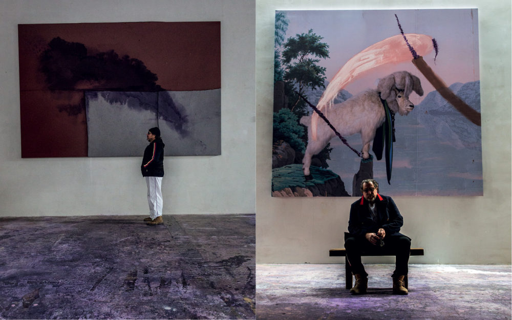
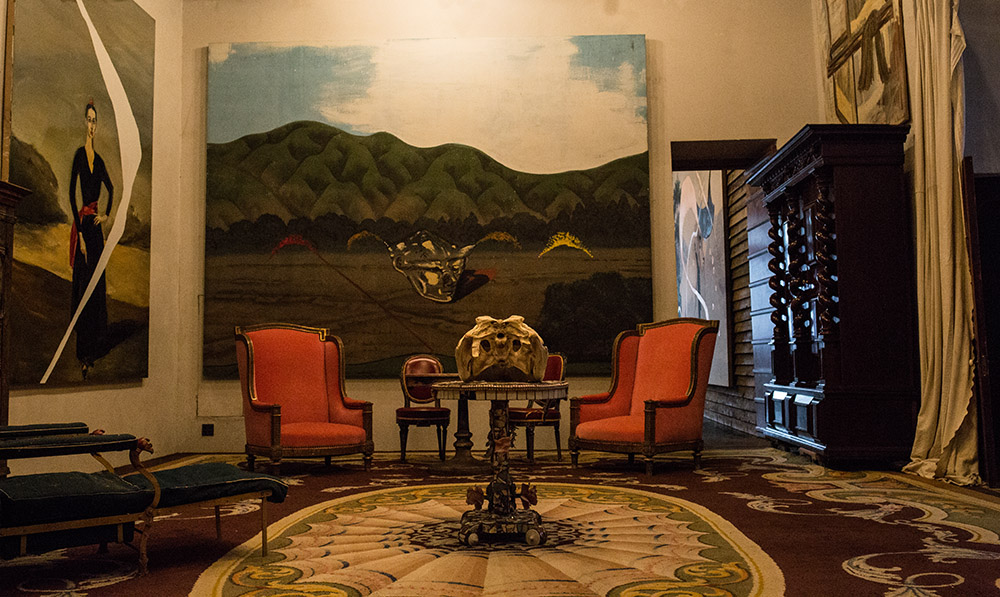
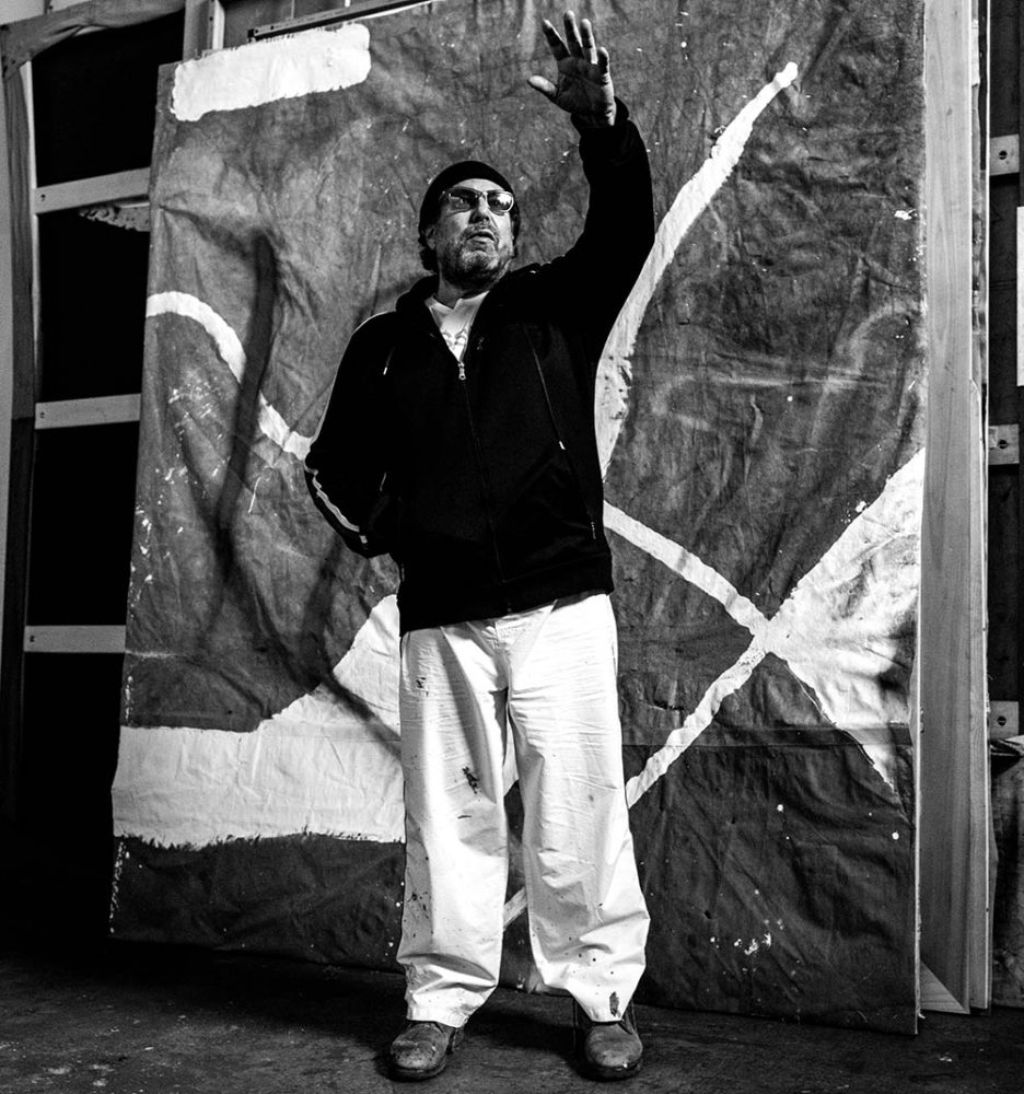
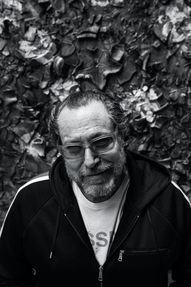
Even if you don’t know who lives there, the home and studio of the painter Julian Schnabel is a familiar sight for denizens of downtown Manhattan. As the West Village stretches out toward the water, a pale pink tower rises out of blocks of low apartment buildings and townhouses. This is Palazzo Chupi, a residence that Schnabel designed and built in 2009, so called after the nickname of his second wife, Olatz López Garmendia. The structure, with its stepped-back floors, curved windows and arabesque arcades, resembles a cross between a modern condo and a medieval castle in Convivencia Spain. 
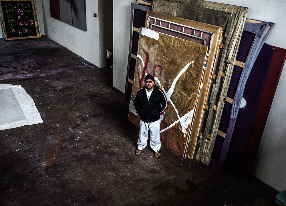
To visit Schnabel, one must first make a procession through Palazzo Chupi’s imposing wooden doors on the ground floor and into a tall, dark elevator that features a wall-size mirror, pointed ceiling and a woven bench, in high Gothic style. The doors open on to a sudden mirage, or so it seems: a room of billowing red velvet curtains, stone tiles and enormous paintings covering every available patch of wall – the domain of a deposed monarch in exile perhaps, or one of the best-known and yet least-understood living artists in the world.

Two summers ago, Schnabel was visiting the cemetery where Van Gogh is buried, in Auvers-sur-Oise, to the north of Paris. ‘There were these rose bushes with these pink roses, and there’s this black wall around the cemetery that had little white stones in it,’ he says. The scene provided the impetus for some dozen paintings, which hang, stately, at Pace, like a room of Monets at the Museum of Modern Art, pre-historicised. ‘There’s a work ethic in these paintings, a paintedness that is a very old-fashioned way of being a painter.’

The grandeur of Schnabel’s current surroundings and the Pace exhibition is all part of the artist’s carefully cultivated mystique. As a representative icon of 1980s New York City painting, in all its excesses, and the mascot of the neo-expressionist wave that preoccupied painters at the time, these days the artist is famous for being famous. The New York Times called him “the carnival man of contemporary art” as far back as 1982. Schnabel and his several ex-wives and art-world model girlfriends, and his now-adult children – son Vito and daughter Stella – have been mainstays of the society pages ever since. 

Another factor has increased Schnabel’s public notoriety. He leveraged his fame into Hollywood as well, tapping friendly actors and funding films with his own fortune. The results, movies like Basquiat (in which Bowie plays Warhol) and The Diving Bell and the Butterfly, display a unique visual sensibility. A new film project will explore the life of his most recent inspiration, Van Gogh, succeeding his paintings.

Yet Schnabel’s new rose period presents a mystery. These are quiet, contemplative paintings, more introverted than anything Schnabel has done in decades. What happened to the bad boy of the 80s, the builder of pink towers, the unrepentant enfant terrible of the art world?

Schnabel’s salon, the room where I meet him, is hung with paintings from the various phases of his long career: an autobiographical solo exhibition that continues throughout his home, hung between eclectic artefacts like a toreador costume and a Chinese idol. In the kitchen is an inchoate work from the 70s, a dark canvas fixed with shelf protrusions and painted with wandering lines, somewhere between neo-expressionism and Arte Povera. Two of the more recent series much in evidence are the ‘Navigation Drawings’, maps with sweeps of thin, translucent paint; and the ‘Goat’ paintings, in which a photograph of a stuffed version of the titular animal is set against a swatch of 19th-century wallpaper and daubed once more.

The rose pieces represent another turn. Schnabel reclines on one side of a long couch and I sit in a throne-like chair beside it, positioned like a therapist to his patient, but the painter gestures for me to sit with him. He eases back further. ‘I want things to be able to be different and address other things, rather than make the same thing over and over,’ he says, gesturing at the work around him.

When talking to artists, there are certain patterns that emerge, no matter what kind of work the artist makes, no matter how famous or obscure they are. One is that they don’t like to be tied to their influences, even if they are undeniable art historical reference points. Hence Schnabel’s dismissal of my initial suggestion of Cy Twombly as a comparison for his rose paintings. Schnabel is a fan of the late painter, whose play between figuration and abstraction his own work echoes, but Twombly’s flowers aren’t his favourite, he says. 

Another reality of conversations with artists is that any attempt to describe their work to them will inevitably fail. This constant falling-short brings to mind the paradox of trying to interpret art in the first place: the experience of viewing it is never the same, nor often remotely similar, to the process of making it, of having your nose up to the canvas and your brush in the paint. The piece often doesn’t mean to its viewer what it means to its creator. ‘You’re doing something and people are all around you, but they don’t see what you see and they don’t know what you’re doing,’ Schnabel says. 

It’s this gap that the artist hopes to represent in his film about Van Gogh, now that he has put an end to the rose series, he says. He can let the audience in on the process of art-making from the painter’s perspective, even as the characters in the movie remain distant from it. Showing the reality of Van Gogh’s life and work seems to be a way for Schnabel to reconcile his own fame with the fact of his ongoing artistic practice, though his own career couldn’t be more different than the post-Impressionist’s – Schnabel has sold far more than one canvas in his lifetime. 

‘The movie’s about painting. Van Gogh as a human being has been highly mythologised; his death and his ear have been mythologised. It would be nice to make a movie about a guy everybody thinks they know about, but maybe they might be surprised,’ Schnabel says. Over the course of our conversation he pauses for longer and longer moments, either fighting sleep or diving into an inner landscape, imagining the work to come.

By this point, the long afternoon has overtaken the city, the sunlight is starting to dim, and Vito’s living room is hushed and enclosed, an unreal space filled with the living detritus of culture. The roses, to offer up my own paltry interpretation, are an effort to seek solace in the rush of time, a way to begin to find a place in history, if there is one to be found. That the blooms the paintings depict will fade is inevitable, but Schnabel has captured them, to set against every image of every flower that will ever be made by an artist. Here is his enduring offering. 

‘Painting seems to last a long time. It’s a wonderful refuge. The painted world is a place where you can reside outside of the world of everything else,’ Schnabel says, and pauses for the longest time, reclining flat on the couch, eyes closed, searching for something internal and then coming back up with it, a vulnerable twinge in his voice communicating a universal ache. ‘In there, there’s a great freedom. Obviously, there’s this crazy relationship with eternity. It’s a denial of death.’

This article is taken from Port issue 20. To subscribe, click here.

Photography by Michael Avedon
Styling by Dan May


Dana Lixenberg: Imperial Courts

The Dutch photographer explains how portraits became stories in her Deutsche Börse Prize-nominated series

In 1992, Dana Lixenberg travelled to Los Angeles for a magazine story on the race riots that broke out after the Rodney King trial. Outrage had spread through the local community after King, an African American taxi driver, was filmed being savagely beaten by several policemen who were later acquitted. 

After witnessing the one-dimensional reporting that seemed to reduce the complex and cultural situation to simplified gangland stereotypes, Lixenberg returned the following year to photograph residents of the Imperial Courts housing estate in Watts. The people there went on to become the focus of her 22-year project, Imperial Courts. Taken between 1993 and 2015, the series of portraits and its publication has earned the Dutch photographer a nomination in this year’s Deutsche Börse Photography Foundation Prize.

The project began with her introduction to OG Tony Bogard, leader of the Imperial Courts Crips faction and unofficial “godfather” of the community. ‘When I was introduced to him, he was very reluctant to trust me, or even work with me,’ Lixenberg recalls. ‘I kept showing up at his house and, eventually, he relented. Tony introduced me to his friend Andre who had just gotten out of jail, needed work and was interested in photography. I would meet him everyday at the playground with my camera, and we would hang out and he would make the introductions,which was very important. Tony had given his approval.’

‘Freeway – 1993’ © Dana Lixenberg

Despite Bogard’s approval, Lixenberg was still met with wariness. ‘A lot of people didn’t want to have their picture taken,’ she continues. ‘I was seen as a negative. There was a lot of media attention due to a fear of new riots following the retrial of the four officers.’ In the end, Lixenberg’s slow, patient approach set her apart from the media frenzy. ‘When I showed them the polaroids, they started to come around.’

The direct style of Lixenberg’s portraits is a defining quality throughout her work. ‘I like it when people don’t perform too much, when you try and create a space where someone just is,’ she says. ‘For me it’s all about the person, looking at each individual and tuning into the mood and the moment. Whether the beauty is shown through a tilt of the head, the body language, or the texture and light, there’s a genuine exchange between me and the subject when I’m photographing them.’

‘Tish’s Baby Shower – 2008’ © Dana Lixenberg

The 1993 photographs were exhibited in the Netherlands, and published in Vibe magazine, after which the work was shelved for fifteen years. ‘I didn’t feel compelled to do a follow-up,’ says Lixenberg. ‘That was never my intention when I did the first series but I’d given people prints and had stayed in touch over the years, and then, as more time passed, the responses became more powerful, and the residents would ask when I was coming back.’

‘Dee Dee with her son Emir – 2013’ © Dana Lixenberg

Lixenberg returned to Imperial Courts in 2008, but quickly found that it wouldn’t be enough to simply produce new versions of the portraits she took in the 90s. She wanted to take the project further, and portray the community in all of its complexity. ‘I wanted to photograph new people and new generations, and make group shots and landscapes. I used sound recordings to document the residents’ reactions to the portraits so they could tell their stories in their own words, and video to show the movement and soundtrack of the area.’

Despite a few cosmetic changes, the social conditions of Imperial Courts had not improved. She found that the project, however, had become less political and more personal. It had become about memory and family, and the bonds that make up a community. ‘People had passed away or were spending time in prison. New generations were born, and the pictures started to carry more weight. The more time passed, the more stories the pictures held. The pictures became stories.’

Dana Lixenberg’s Imperial Courts 1993-2015 is on show at the Photographers’ Gallery in London until 11 June