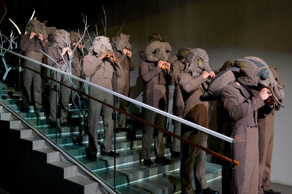
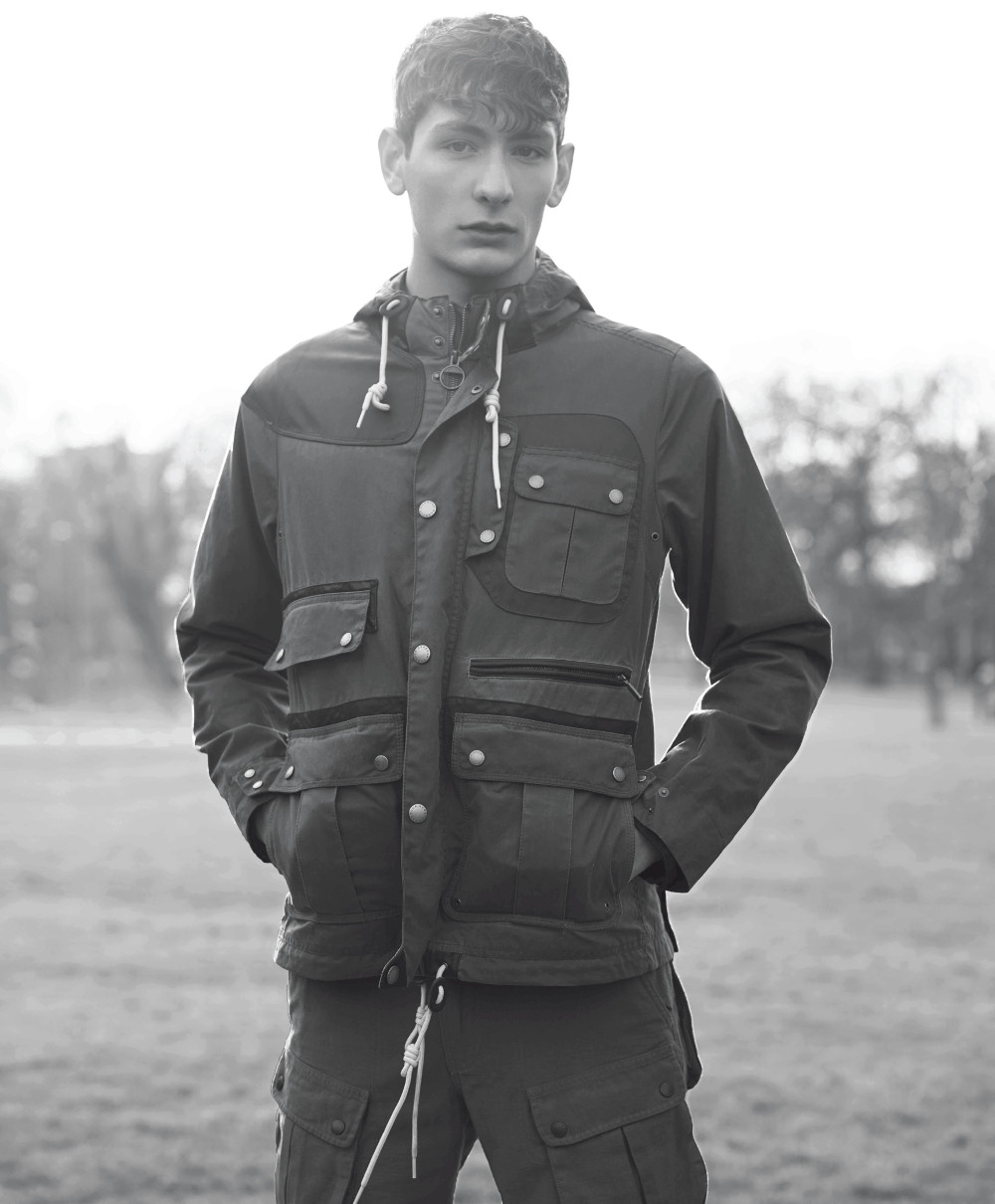
José Cuevas shot these exclusive backstage images from the avant-garde designer’s latest menswear show
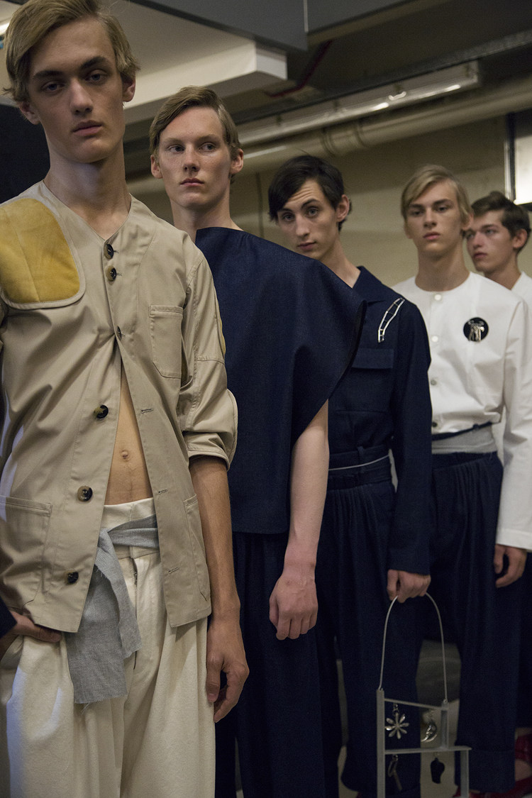


Photography José Cuevas
Subscribe to Port Magazine annually and receive each issue to your door.
Get PORT in printSubscribe to Port Magazine annually and receive each issue to your door.
Get PORT in printJosé Cuevas shot these exclusive backstage images from the avant-garde designer’s latest menswear show
Photography José Cuevas
Silas Adler discusses his visual collaboration with American artist Charlie Roberts
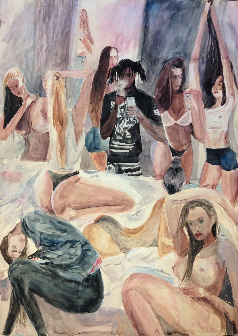
I was first introduced to Charlie Roberts at an art fair in Copenhagen, two years ago. The first pieces of his I saw were big drawings of American football players, slightly naive in their style. But he can also paint photographically – he’s good enough to do both. He probably started as a photographic painter and then developed the style he’s now using, and the kind of pieces we have collaborated on. At the time I couldn’t afford to buy them, so that was that, for the time being.
About six months later, he came back to Copenhagen to put on a show of wooden sculptures. At the same time he produced a handful of A4 drawings, a lot of them in relation to sex, drugs and hip-hop, and sold them for £50 a pop… I bought four of them. We got chatting and he just seemed really keen on doing something together; he really likes when his art leaves the gallery space and actually gets ‘used for something’, as he put it.
I wanted to create a fabric with him because, to me, it was interesting to see how his art would look like as clothing material. For that, you need a really good mill, someone who can take on a challenge as it’s very complicated to replicate the colours, and the mix of colours from a painting, and then you can make it into a fabric.
There are a few different pieces made out of that fabric we’ve constructed ourselves, but we also have 10 exclusive suede jackets that Charlie hand painted. They’re art pieces in a way, more us collaborating with him than the other way around. The print you see here is the rapper Chief Keef. Charlie painted him in a room full of naked girls and here he is taking a photo of them on his iPhone. I absolutely love the hoodie that we made out of that print.
Words Silas Adler
Artwork Charlie Roberts
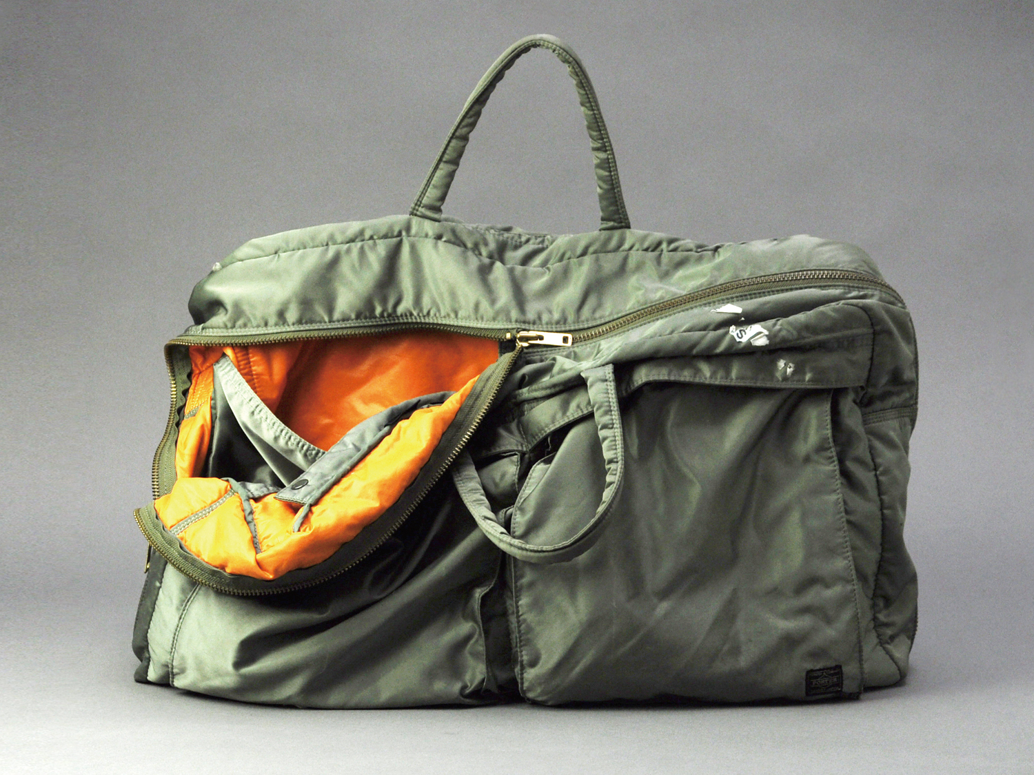
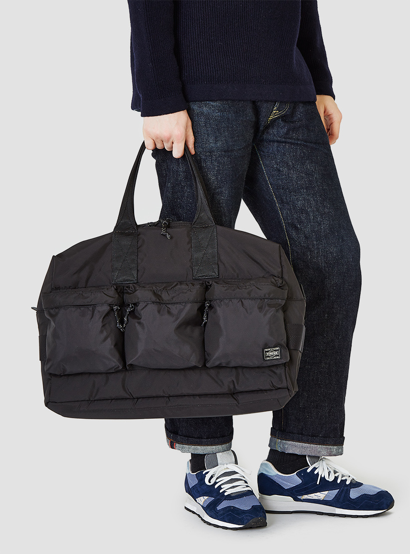
David Hellqvist and Porter-Yoshida’s managing director Ken Matsubara trace the Japanese bag brand’s history and sartorial importance
JAPAN WEEK: There are instances when the clothes you wear become accessories to the actual accessory. Sometimes this sartorial appendix can be so powerful in colour, shape or all-around design that it overtakes the best suit or coat in your wardrobe. Accessories, be it shoes, jewellery or bags, are the underdogs – they have to work harder to be seen, due to size issues (jewellery) or because of their position on the body (shoes). But, when they’re good, they can make or break an outfit.
In the last few years, there’s been an influx of statement accessories. Some women buy ‘it-bags’ and spend both time and money finding the ultimate heels, while some men join queues that stretch around corners for limited edition trainers. Bags, though, have always been a tricky accessory for men. Bar the odd rucksack, we’ve struggled to master ‘man bags’. Briefcases are for businessmen and document holders are, well, they’re just rarefied pouches, aren’t they? There is a small handful of brands that have mastered the craft of making bag for the male market, and Porter-Yoshida is certainly one of them.
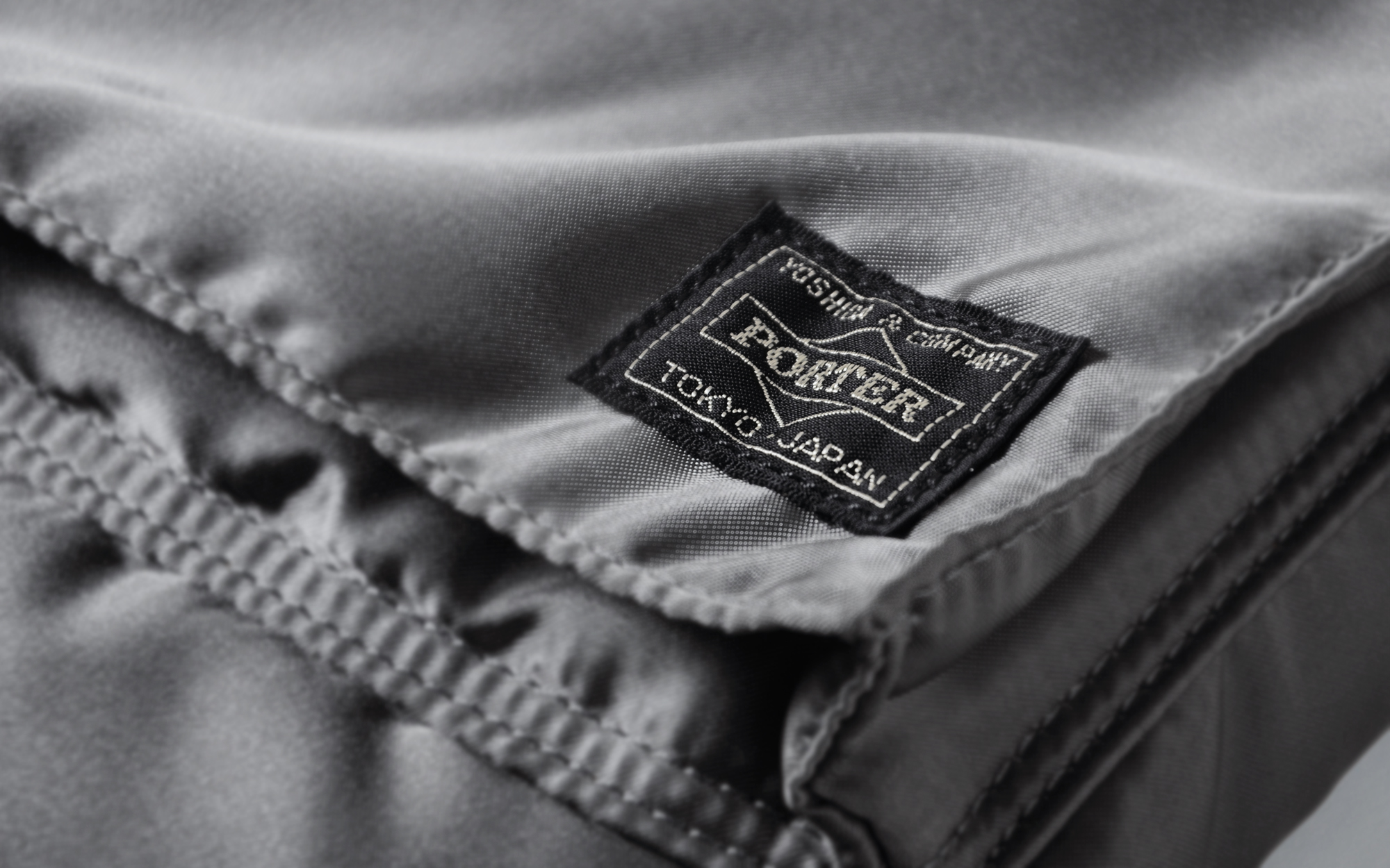
In 1935, in Tokyo’s Kanda-Sudachō district, Kichizo Yoshida started what would lovingly become known as Porter-Yoshida. The Japanese bag-maker has since manufactured satchels, backpacks, wallets and briefcases (in its characteristic green nylon), and beyond. Starting life as Yoshida Kaban Seisakujyo, the brand was close to never taking off, due to the timing of its inception.
“During the 10 years from the company’s establishment until the end of the Second World War, Kichizo had to do military service twice,” explains Ken Matsubara, Porter-Yoshida’s managing director. “However, thanks to his wife, Chika, his sewing machine, fabric, and tools were kept in a warehouse under a girder bridge. As a result, they weren’t lost during the war and therefore he was able to come back to work at the end of 1945.”
It’s not unusual for big fashion houses to have started as luggage brands – Louis Vuitton, Gucci and Prada are all examples of bag specialists that branched out into the wider fashion world. But Porter-Yoshida has refused the temptations of any such adventures. Instead of expanding horizontally, the Japanese label has grown vertically by adding new lines and products. Currently, the company boasts 1,500 bag styles over 130 different sub-lines. This has made it the go-to for any multi-brand store in search of a characteristic, well-made bag with a standalone identity.
“We would never see design as a priority over functionality. We want to be able to continue making new and interesting products so our company can continue for eternity”

The label’s famous nylon bags launched in 1962, taking inspiration from porters carrying the luggage of hotel guests. It’s arguably this line that has made Porter-Yoshida a household name among fashionable bag carriers around the world. That and a long list of illustrious fashion collaborators, two of which include Italian brands Marni, for SS15, and Stone Island, for AW15.
Arguably, the best collaborations are always based on the expertise of a niche company and a brand with a strong aesthetic. As it’s Porter-Yoshida’s anniversary year in 2015, the collaboration tempo has been increased. “As the first stage of the celebrations, we’re releasing items in collaboration with Michael Lau, Ryota Aoki, Adidas, and Maehara Kouei Shoten,” Matsubara says.
Kichizo was born at Samukawa-cho in the Kanagawa prefecture, as the second of eight children – all boys. As early as aged 12, Kichizo knew it was bags he wanted to work with and at 29 he managed to fulfil his dream when setting up Yoshida Kaban Seisakujyo. His first bag to gain mainstream appeal was the ‘Elegant’, developed in 1953, which came with a zipper around its base that allowed the owner to extend the bag’s depth.
“This design was a big hit, since there were many apartments built at that time and people’s homes were not very spacious,” Matsubara explains. “However, it was very difficult to supply leather material right after the war, so the products he made were mainly rucksacks and shoulder bags made by canvas material that Chika had kept.”
Though Porter-Yoshida has a loyal fan base and continues to develop future classics, it’s a tough market. The fact that the company only makes bags can be seen as both an advantage and a problem. But, for Matsubara, there’s no question what school of thought he subscribes to.
“We think that our strongest point is that we are purely a bag manufacturer. Our products are made with the idea of the bag being a tool. Of course, the design is very important, but we think that durability and functionality are the most important features of a bag.” he explains. “We would never see design as a priority over functionality. We want to be able to continue making new and interesting products so our company can continue for eternity.”
Japanese designer Kazuki Kuraishi talks to David Hellqvist about hearing The Stone Roses’ eponymous album, and the impact Ian Brown has had on his life
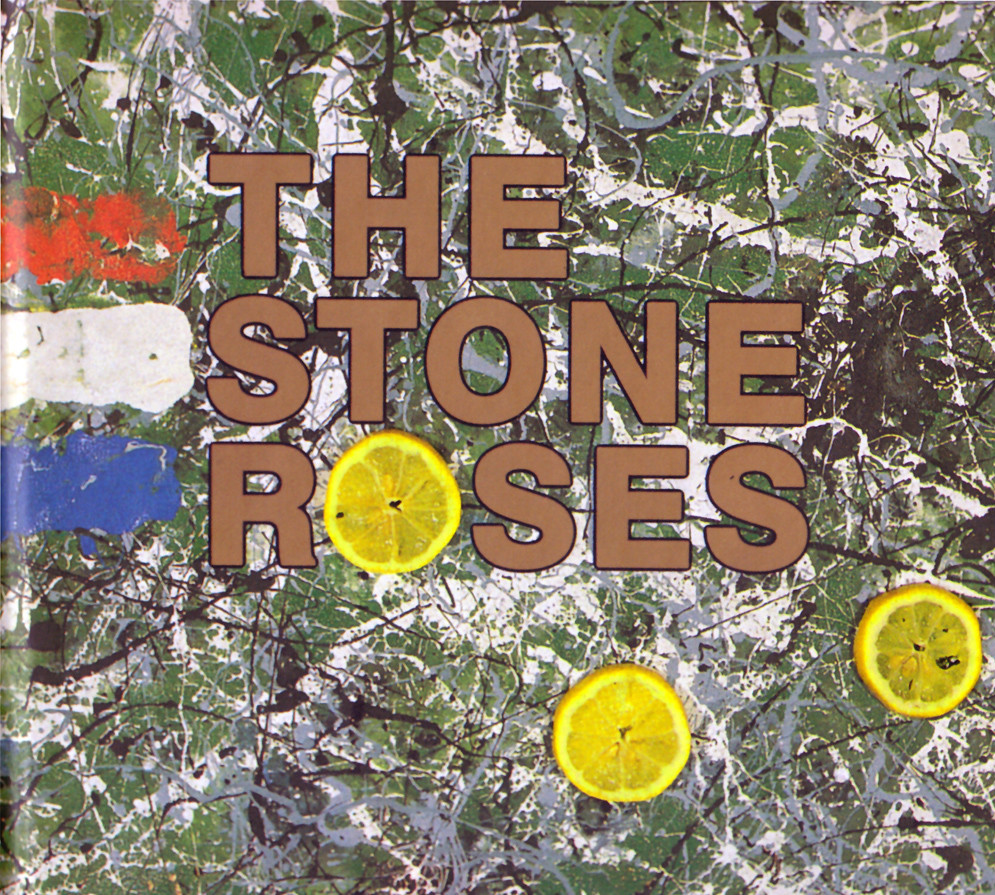
JAPAN WEEK: If I could only choose one record, this would be definitely be the one. Perhaps both now and forever.
I first encountered the album when I was in high school. My favourite Japanese band was using some samples from a band called The Stone Roses and thought I’d check out the original version, so I listened to Elephant Stone. Afterwards, I bought The Stone Roses album and immediately fell in love. The more I listened the more I liked and go into it; I still play the album regularly to this day, which is rare.
From The Stone Roses, I started to get into Hacienda music and discovered many more UK bands. At that time, it was very difficult to get hold of UK indie bands in Japan. As I remember, it was even difficult to buy Oasis anywhere in Tokyo – it took me quite a few visits to shops in order to find them.
There was a TV programme called Beat UK where they showed British band’s music videos – I recorded and edited so many of them. I would also watch the music videos and wonder what the musicians were wearing. I wanted their t-shirts and would start searching for the clothes that they wore… Music and fashion are tied into one, and that’s how I become interested in fashion.
Time passed and I started working for A Bathing Ape where a miracle happened. When James Lavelle from Mo’ Wax visited Japan, for whatever reason, Ian Brown tagged along. One day, A Bathing Ape creator Nigo asked me to come to his office and there I met James and Ian. I was beyond shock, I remember I lost all my senses. Nigo knew that I loved The Stone Roses so he introduced me to James and there and then and I started to get to know Ian. I still have the letters that Ian and I exchanged; I used to send him what I’d made, and he’d send me CDs…
Some time later, when Ian came to Japan for the Fuji Rock Festival, he introduced me to Gary Aspden from adidas (read Gary Aspden’s Soundtrack for Port) and that’s how I started to work for adidas. Come to think of it, there is a pathway from the point where I began to like The Stone Roses, and got to know Ian Brown, which led me to where I am today.
When The Stone Roses reunited, Ian, John Squire, Mani, Reni and I all had dinner, which was one of the most epic moments of my life. Ian had come to Japan earlier than the others and we hung out with him for few days. When Mani arrived at the hotel, the atmosphere changed all of a sudden. It was mystic and everything surrounding them had a bright spirit. What I felt about the band was that, although Ian alone has a strong impact, when Ian, John, Mani and Reni are together the power multiplies and exhilarates. Their live performance felt as though there was magic in the air; I experienced something new, these things can still happen.
I think The Stone Roses is an album with a message about trying to change the world. Their sound changed me during this period of time. It affected my life positively, because when I discovered this album I felt I wanted to make changes – it led to where I am and what I do right now.
Kazuki Kuraishi’s new clothing label The Fourness launched in early 2015
Anna Zegna, granddaughter of Italian tailor Ermenegildo Zegna, explains the brand’s artistic and culinary collaboration with Lucy + Jorge Orta
Art has always been a major source of inspiration for fashion. As with music, it’s a creative hot pot for designers to stir and find new ideas. Whereas music adds more of a feeling and energy, art contributes strong visuals and stunning graphics. There’s also an idea of a rarefied technique that the two artforms share.
Clever fashion brands realised ages ago that in order to stimulate their own designs they need to get involved with the art community to support and enable artists to create. A few years back Ermenegildo Zegna, the Italian sartorial powerhouse, founded ZegnArt. Through commissions and special projects, ZegnArt has been able to further artists on a global scale, while also subtly promoting its own brand of luxury suits and elevated lifestyle products.
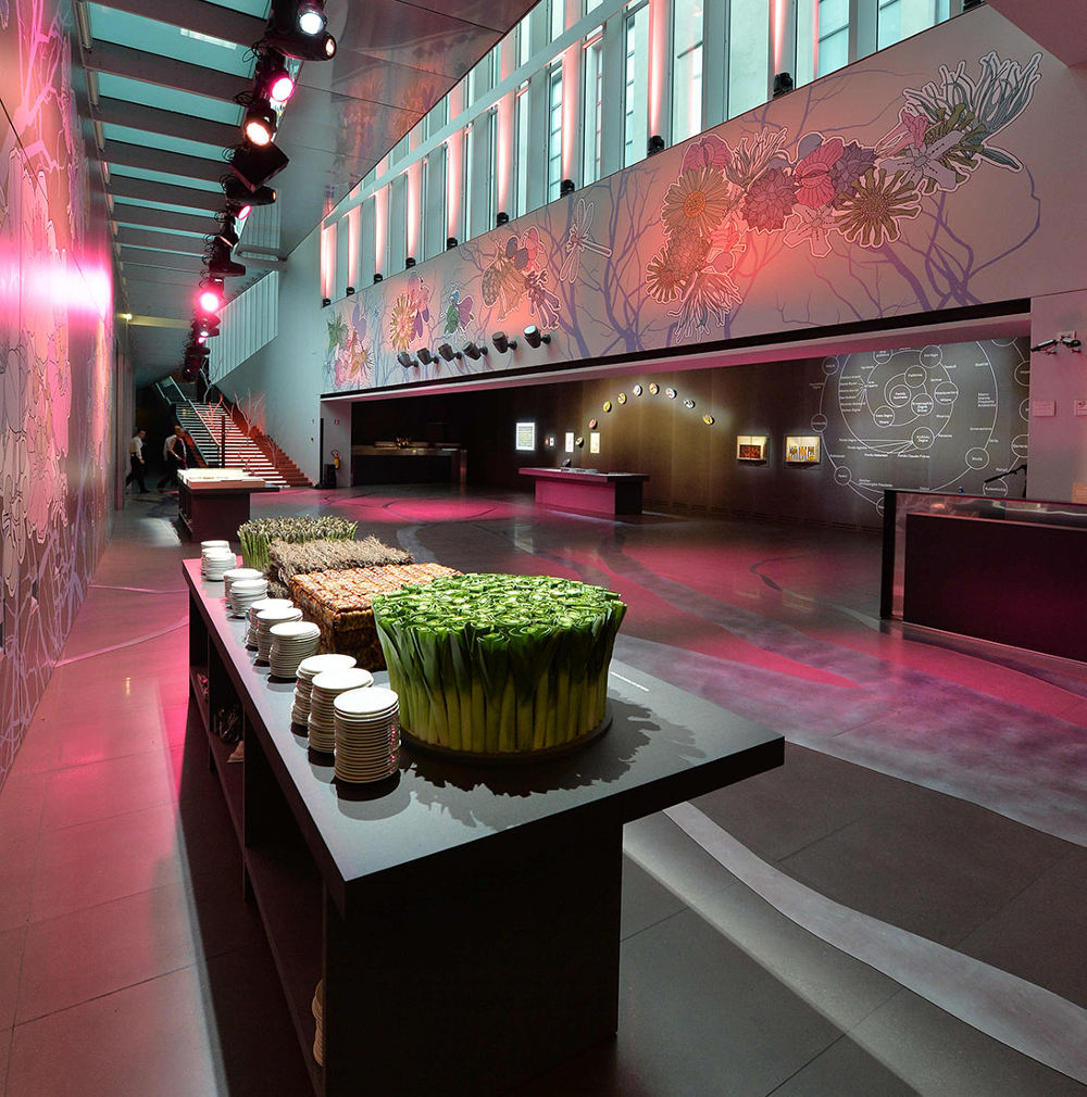
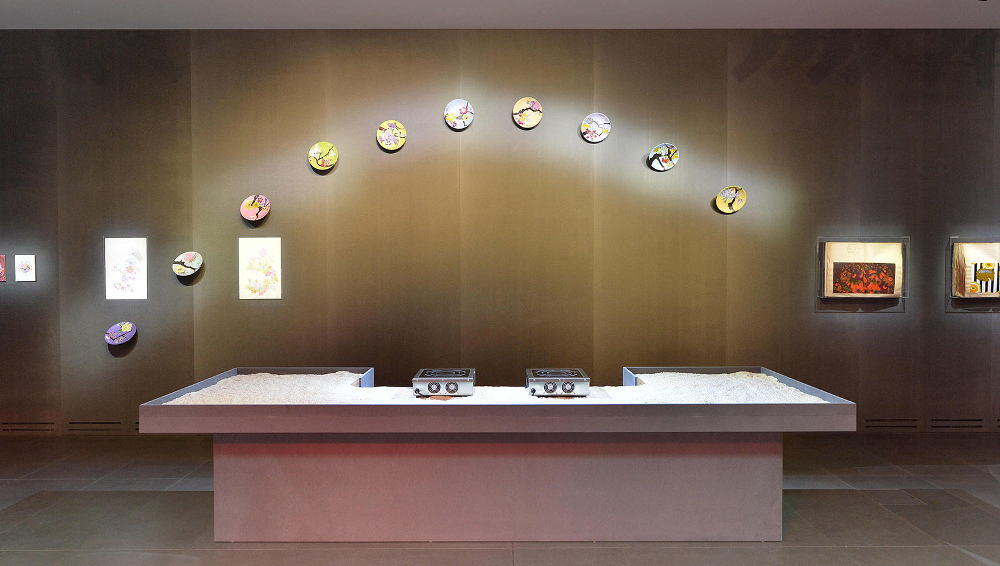
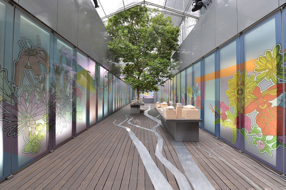
In the spirit of Expo Milano 2015, and its food theme, ZegnArt has connected ‘art and nutrition with environmental and ethical ideas’ to create a unique concept. Artist duo Lucy + Jorge Orta were commissioned by Anna Zegna and her team to continue their ongoing 70×7 The Meal project in Milan during the Expo. The result, Fabulae Naturae – 70×7 The Meal, Act XXXVII, consists of an artistic act directed by Lucy + Jorge Orta and a food performance by Davide Oldani. Curated by Maria Luisa Frisa, the happening was not only a highlight at this year’s Expo Milano but a creative triumph for ZegnArt.

What’s the relationship between fashion and art in general and for Zegna?
Fashion and art are deeply connected: both stem from creative concepts and minds able to reinterpret and mold the reality surrounding them. These two worlds seemingly move at different paces, but can become entangled along the way. Fashion can be perceived as a work of art when it seeks to create timeless pieces that go beyond the trends and seasons.
Fashion houses were the first to grasp how powerful and strong the connection between fashion and art is. For instance, speaking about Zegna, our family relationship with the world of art dates back to my grandfather, Ermenegildo Zegna, who first understood the essence of aesthetic and the role beauty could play in the betterment of a community. With such spirit, he commissioned artists like Otto Maraini – an architect, painter and glass etcher – who designed the Wool Mill and his house in Trivero, or like Ettore Pistoletto, father of Michelangelo Pistoletto. The next generations continued to strengthen the bond with the world of visual arts, which led to the launch of ZegnArt in 2012.
What is the overriding purpose of ZegnArt?
ZegnArt has been defined as a platform for action in contemporary arts and it illustrates our way of doing business. We envision ZegnArt to be a bridge between enterprise and culture, a valuable occasion for exchange and awareness and a unique opportunity to create a new way of thinking.
How did you find and commission Lucy + Jorge Orta? What is it about their work you like and think is relevant to Zegna?
What intrigued us the most was their ability to address social and culture issues through their installations and performances. We therefore commissioned them to create a special installation to launch ZegnArt that was unveiled in March 2012, in Rome. Fabulae Romanae (Tales of Rome) was designed by the artists specifically for MAXXI, National Museum of XXI Century Arts, and assumed the meaning of ‘homage’ to Rome.
Can you explain the work they’ve created for you?
They have created art and food performances, named 70×7 The Meal, in various cities since 1997, each time with a new ‘act’. The different acts of 70×7 The Meal celebrate the ritual of dining with both public and private dinners and are designed as a medium to connect art, nutrition and ethical themes. Their latest performance, Fabulae Naturae – 70×7 The Meal, Act XXXVII, consists of an artistic performance directed by Lucy + Jorge Orta and a food performance by Oldani, all curated by Luisa Frisa.

What was the idea behind adding food to the mix?
Food is obviously an important element, as it represents the central theme of Expo Milano 2015: ‘Feeding the Planet, Energy for Life’. Everything started with the creative mediation concerning food and arts. Lucy + Jorge Orta were entrusted to stage a new act of this series of performances, but this time we asked them to specifically create something for Ermenegildo Zegna.
Certainly, the curation of Luisa Frisa contributed to the strong synergies forged between the artistic performance and the food performance by Italian chef Davide Oldani. Even the setting itself has been conceived to underscore the themes of art, food and the environment. The centrepiece of the exhibit is the outline of a tree that extends through the entire location: the trunk is a path that leads to Oldani’s food stations, while its branches metaphorically bridge arts and food.
Is there a connection to the set design and use of plants from the AW15 Zegna show back in January?
When Stefano Pilati joined the company over two years ago, he embraced the legacy and values of Zegna, making them his own, and was able to blend them perfectly in the last fashion show. The decision to present his new eco-leader against the backdrop of a forest, in which the trees have been replanted in Oasi Zegna, was a gesture of homage to environmental protection – one of the core values so dear to my family since the very beginning.
In a similar way, what Lucy + Jorge Orta have created for Fabulae Naturae is also inspired by our legacy as they have transformed our Milan headquarters into a forest, reminiscent of Oasi Zegna. Pilati and the Orta duo were both inspired by our DNA; what they did was to look at our past and make it our future thanks to their creativity.
Head to zegnart.com for more info
David Hellqvist and Oi Polloi co-founder Steve Sanderson discuss what brands define the legendary Manchester store and its new branch in Soho

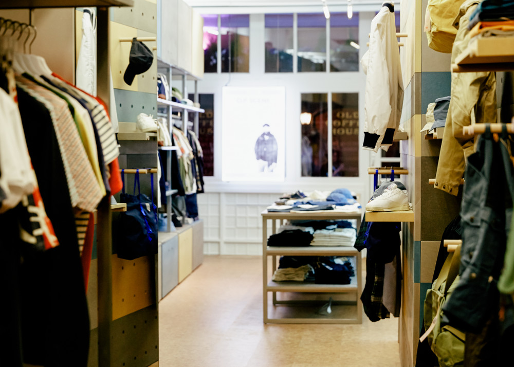
Fourteen years after opening independent menswear boutique Oi Polloi in Manchester, co-founders Nigel Lawson and Steve Sanderson have finally made the move to the capital. There are plenty of multi-brand stores in London, but none with the same unique mix of brands. Add to that the soft-spoken characters of their founders and the laid back attitude of Soho and you have a surefire retail success lined up.
Manchester is famous for its football clubs and musicians – Oasis, Morrissey, The Smiths, New Order, Joy Division, etc. – and these two scenes have heavily influenced the fashion that comes out of the city. However, it’s unfair to say Oi Polloi is just for music fans and football heads. Their curated staples (Oi Polloi is defined by basics as opposed to ‘statement pieces’) can form the foundation for a healthy wardrobe that’s one part quality and one part style with a dash of attitude from the likes of Patagonia, OrSlow, Our Legacy, Engineered Garments and Filson. We spoke to Sanderson about his favourite brands, the store’s ethos and making their mark on Soho.

What defines Oi Polloi?
Steve Sanderson: It’s not what we do sell, it’s what we don’t sell that defines Oi Polloi – the way we edit collections, dig for buried treasures and sometimes find things that are hidden in plain site… That’s what I think makes us different.
What are the brands that truly sum up the store?
It’s a bit like asking someone about their favourite book or album, these things change over time and you tend to come back to the same ones time and time again. Right now, what sums up Oi Polloi for me are the following brands: Engineered Garments, OrSlow, Levi’s Vintage Clothing, Tender, Anonymous Ism, Novesta, Birkenstock, Sassafras, Anatomic, Arpenteur, Beams Plus, Converse, Spring Court, Golden Bear, Garrett Light, Nanamica, Sanders… tell me when to stop!
“We bring some of our past into everything we do, it’s what you do with it that counts”
In what way is Oi Polloi still ‘Mancunian’?
I’m going to quote Rakim from back in the day: “It’s not where you’re from, it’s where you’re at.” More than that, it’s about where you’re going. We bring some of our past into everything we do, it’s what you do with it that counts.

Does music inspire the fashion or vice versa?
Music inspires fashion… Musicians, artists and other creative people are often the instigators of what fashion is. Fashion, to me, is more about following – not leading. I always err on the side of sub and counter-culture movements, that’s my bag, and it’s Oi Polloi’s bag. Always has been, always will be.
Why is now a good moment to open up in London?
It felt like the right time. London has been the aim for a while, we’ve been looking at Soho for about three years. We’re pretty patient, so when the unit at 1 Marshall Street came up, we had a look and knew straight away that it was perfect for us. It’s discreet and tucked away up a side road, not too dissimilar to our first store on Tib Street in Manchester. We’re now a little older and hopefully a little wiser, and this is the next chapter of our journey. There’s no point in going on about what you’ve done and where you’ve been, it’s all about moving forward and seeing where it leads.

A lot of the brands you sell have their own Soho stores – how do you hope to fit in?
Part of the reason for us being there is that we’ll be among friends. Stores like Our Legacy, YMC, Universal Works, etc., we know them well, so why wouldn’t we want to be in this mix? There’s no multi-brand independent men’s clothing store in Soho, it’s time to shake it up. We’re a good fit and have plenty great stuff to offer all the discerning gents in the area…
David Hellqvist speaks to Graeme Fidler, the founder and creative director behind new British menswear brand Several
British subcultures have long been globally notorious for their style influence, so new brand Several is aware the expectations are high. Not only are there lots of well-dressed youth movements to draw inspiration from, but also with a CV like creative director Graeme Fidler’s, people are already predicting big things.
As a former designer at Aquascutum and Bally, Fidler knows clothes need to possess more than just attitude and energy. “In my opinion, quality and craftsmanship prevail. Hopefully men will discover that the short, utilitarian silhouette we offer is a clean, modern yet long-lasting look,” Fidler says. “The fabrics are honest, robust and quietly luxurious. If a detail doesn’t have a function it shouldn’t be there.”
The brand, based in East London, prefers a simple and basic approach, at least for now. “I want Several to grow organically and develop an identity that will fit naturally within the fashion system,” Fidler adds. “People have became bored of fast fashion and branded luxury. The cornerstones of Several are modernity, details and soul.”
Taken from Port issue 16 – out now
David Hellqvist on the new collaboration between a classic British outdoor brand and its modern Japanese counterpart
Mixing aesthetics from polar opposite cultures doesn’t always work, but it makes the odd fruitful collaboration stand out even more. Japanese designer Yosuke Aizawa and his ultramodern White Mountaineering brand have teamed up with British heritage staple Barbour, to successfully bring together their two sartorial ideas. Aizawa merged Barbour’s classic oil-coated fabrics and traditional shapes with his own hi-tech approach to intricate details, to ensure the collection really is the best of both worlds.
“I wanted to introduce a new point of view on Barbour,” Aizawa explains. “In Tokyo, you’ll see the people wearing Barbour with raw denim Levi’s jeans and Alden shoes, and I wanted to update that combination. Actually, you can keep the Levi’s and Aldens, but wear them with a Barbour x White Mountaineering jacket – and all of a sudden it’s a completely new look.”
This article appears in Port issue 16, out now
Edward Lumley inspects Audemars Piguet’s newest addition to its celebrated Millenary watch range

From start to finish, a staggering 600 hundred craftspeople are involved in the development of Audemars Piguet’s Millenary Quadriennium, which is due for commercial launch during Paris’ Haute Couture week in July of this year.
Designed by AP’s former art director, Octavio Garcia, the Quadriennium follows the layout of previous Millenary watches, which feature oval cases and specially made movements. Measuring 47mm wide and 42mm high, it features sculpted lugs and a raised bezel; its unusual shape cuts an imposing figure in the cabinet, but once worn on the wrist it becomes an extremely well balanced timepiece.
The Quadriennium derives its name from its calendar that needs to be adjusted just once every four years, as opposed to every month on the 30th or 31st. Built from more than 250 parts, the watch benefits from advanced precision due to the AP escapement and double balance spring, which helps to mitigate any loss of time caused by shocks encountered through wear.
Its sleek, 18-carat pink gold case is flanked by a hand-stitched brown alligator strap and matching 18-carat pink gold AP folding clasp, all converging to beautifully complement the gold white enamel dial, black Roman numerals and blackened gold hands. Time precision, elegance and its unique construction make the Millenary Quadriennium a sound choice for those wanting something aesthetically different whilst maintaining exceptional standards of technical sophistication.
See www.audemarspiguet.com for more information.
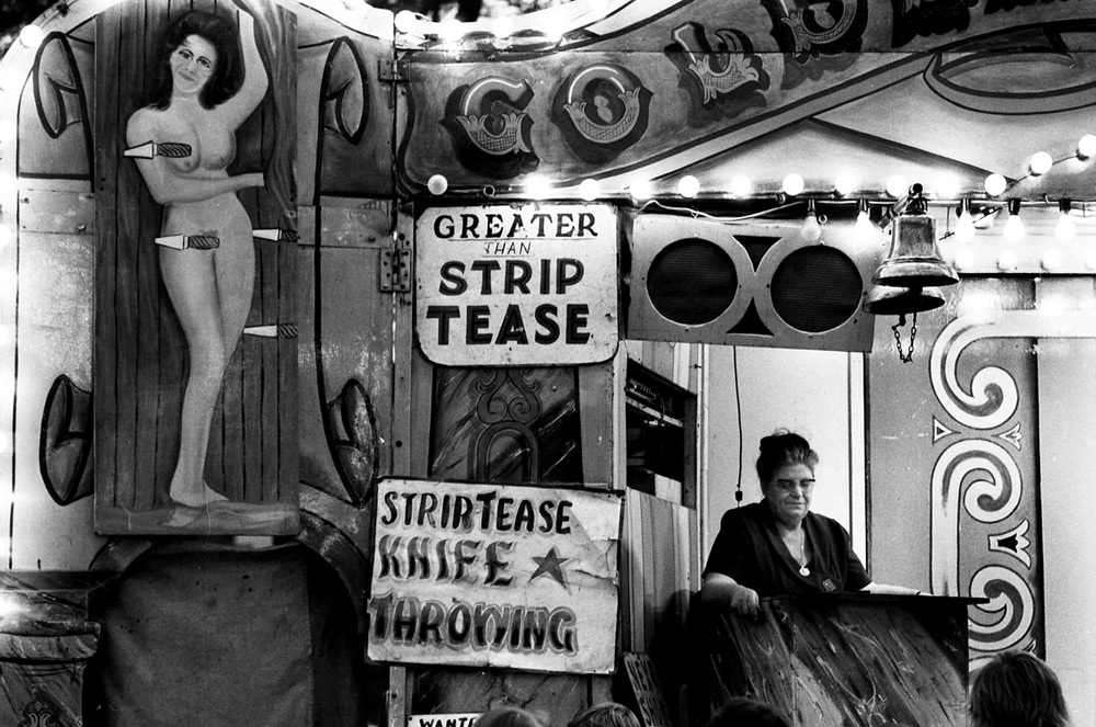
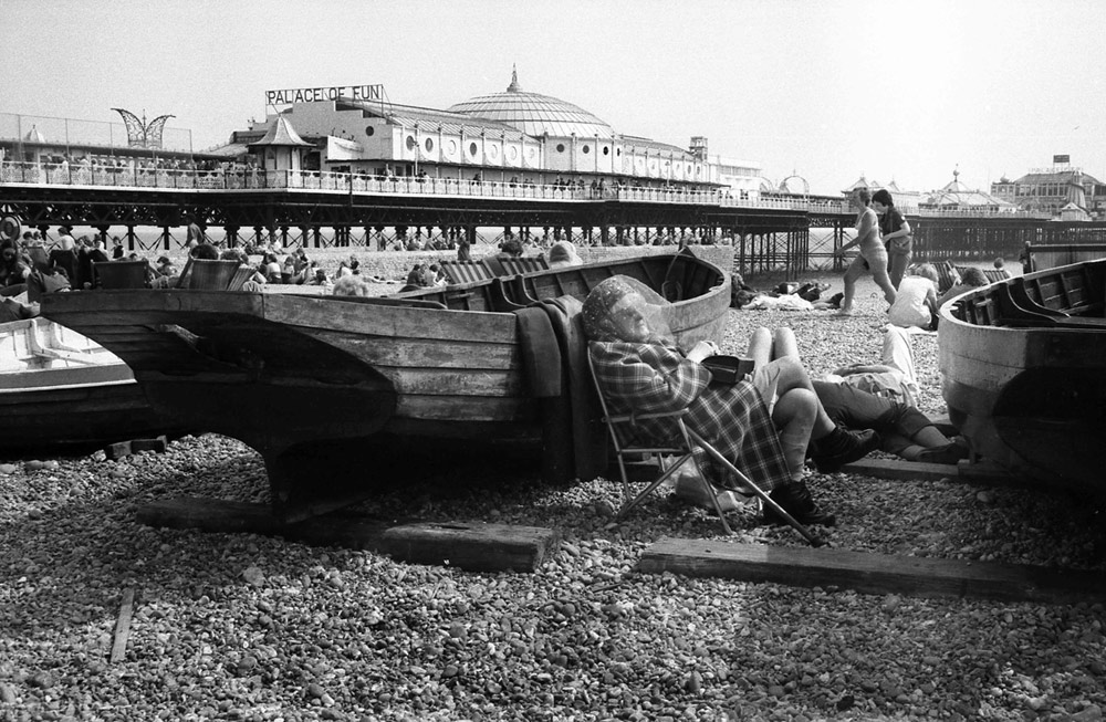
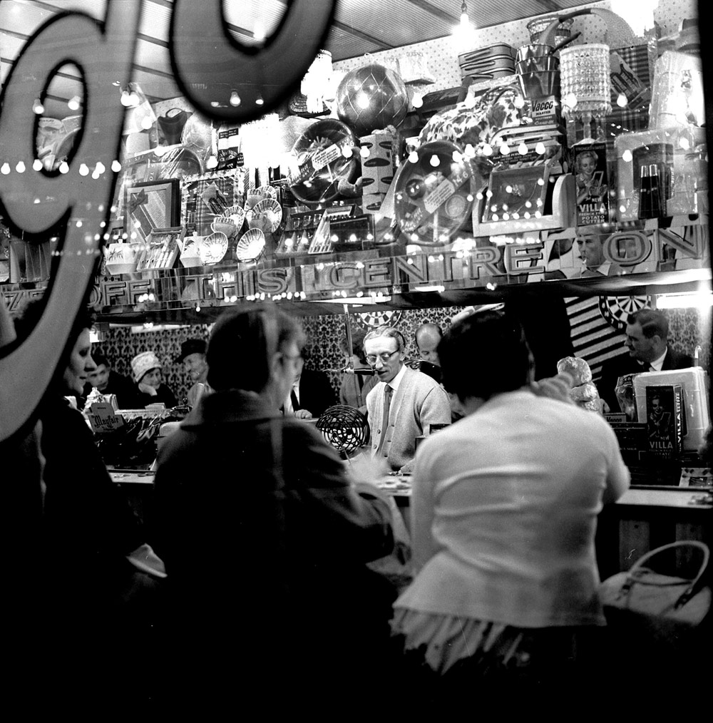
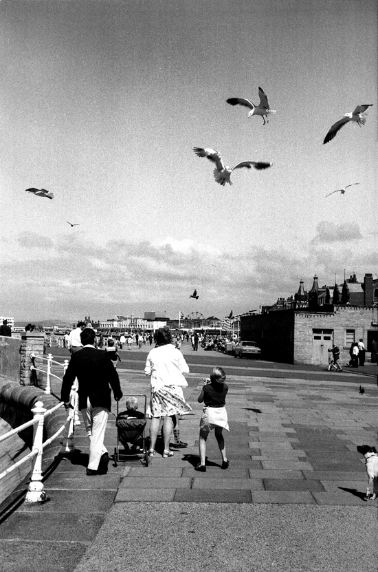
British designer Patrick Grant talks to David Hellqvist about his fascination with Peter Lane’s photographs of English seaside resorts in the 1970s
Patrick Grant is something of a Savile Row stalwart, both in terms of his Mayfair-based bespoke tailoring house, Norton & Sons, and his own personal style, which is a very ‘dandy’ take on the traditional English gentleman. To ensure that his eclectic style is available to more than just businessmen, Grant cleverly acquired E Tautz: a ready-to-wear brand catering for casual and formal needs.
While Grant and his brands have a contemporary, 21st-century feel, there’s something a bit ‘vintage’ about his lifestyle. His influences can often be traced back to a bygone era, to a time and place where people acted differently but also dressed accordingly.
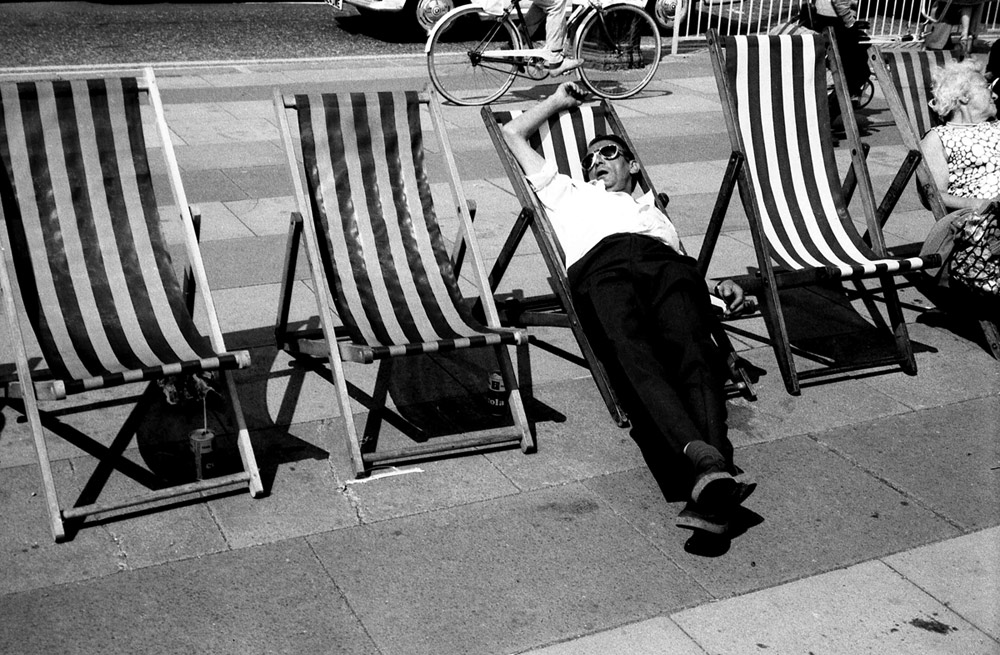
After last year’sOriginal Man book, his latest foray into publishing makes complete sense. Having discovered Peter Lane’s images of English seaside towns by chance, taken between 1960 and 1980, Grant decided to use them as loose inspiration for the current SS15 collection and published them too.
Palace of Fun is a beautiful collection of previously unpublished images from a time when seaside towns like Brighton, Morecambe and Blackpool were full of joyous holidaying families. This book is a good reminder of these halcyon days and the people that made them.
How and where did you come across Peter Lane’s photography?
I came across Peter’s photographs buried deep within a website devoted to the Morecambe Grammar School while researching the SS15 collection. A note beneath gave a short biography and an email address, which I contacted. I went to Peter’s home and he showed me his stash of albums over a nice cup of tea.
What was your initial reaction to the images?
Peter has a wonderful eye for the surreal, the funny and the melancholic. Working in fashion we’re always looking for a story and Peter’s photos tell great stories of their own. These are the tales of Brits living a different, more carefree life, if only just a for a few days of the year.
Did you grow up on the seaside?
I could see the sea from the hills above my house in Edinburgh, but that was the coastline and not seaside. Seaside to me requires a promenade and probably some flashing lights and a waltzer.
What do you think is the attraction of living on the coast?
There is nothing quite like the seaside, that’s what makes it so alluring. People feel free to be a different version of themselves; they physically and mentally unbutton themselves. Maybe it’s the feeling of being at the very edge of the island, maybe it’s just the music and the flashing lights. It’s hypnotic.
Did you take any inspiration from the images that later influenced a collection?
The feeling of freeness and abandon. The clothes they wore back then had a louche looseness to them, an attitude that was more carefree and away from the usual strictness of English tailoring. There were also quite literal references – the stripes on the side of an ice-cream shed, or a deckchair, or the paint on a theatre.
What does the British seaside represent to you?
There’s something wonderfully freeing about being close to the sea. It draws you in, it liberates the mind and seaside towns are all about abandoning your normal mores. The seaside is a great release. We go there to feel different about ourselves.
What’s the attraction from a fashion design perspective ?
It’s an incredibly rich vein of inspiration, both the physical – the light, the colours, the rolled up trousers legs – and the metaphysical – the sense of abandon, the lightness of being.