Julian Rosefeldt: An Artist’s Manifesto

Port speaks to director and artist Julian Rosefeldt about his film Manifesto, a meditation on modern artistic manifestos in which Cate Blanchett plays 13 different characters

FLUXUS / MERZ / PERFORMANCE, Manifesto © Julian Rosefeldt

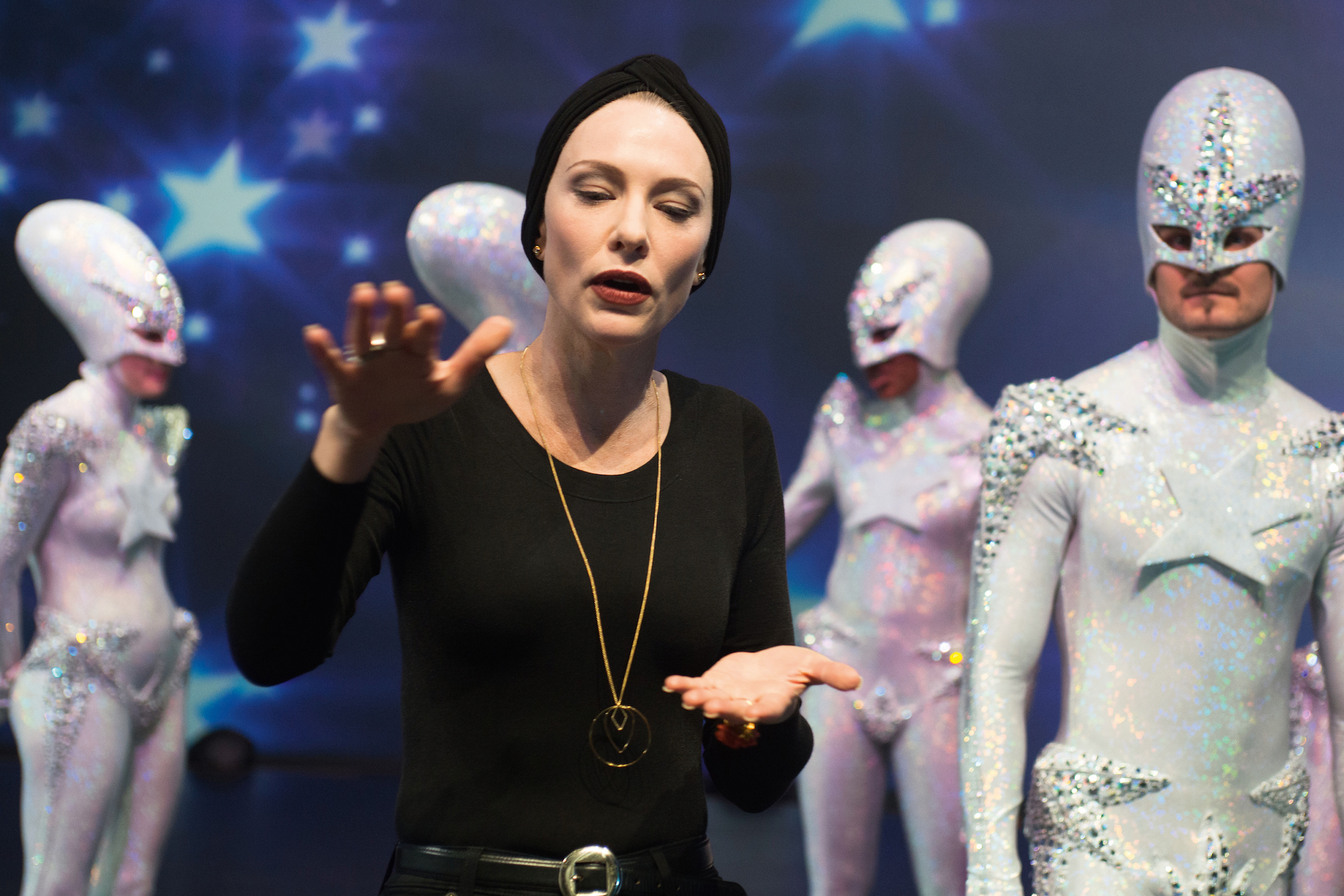
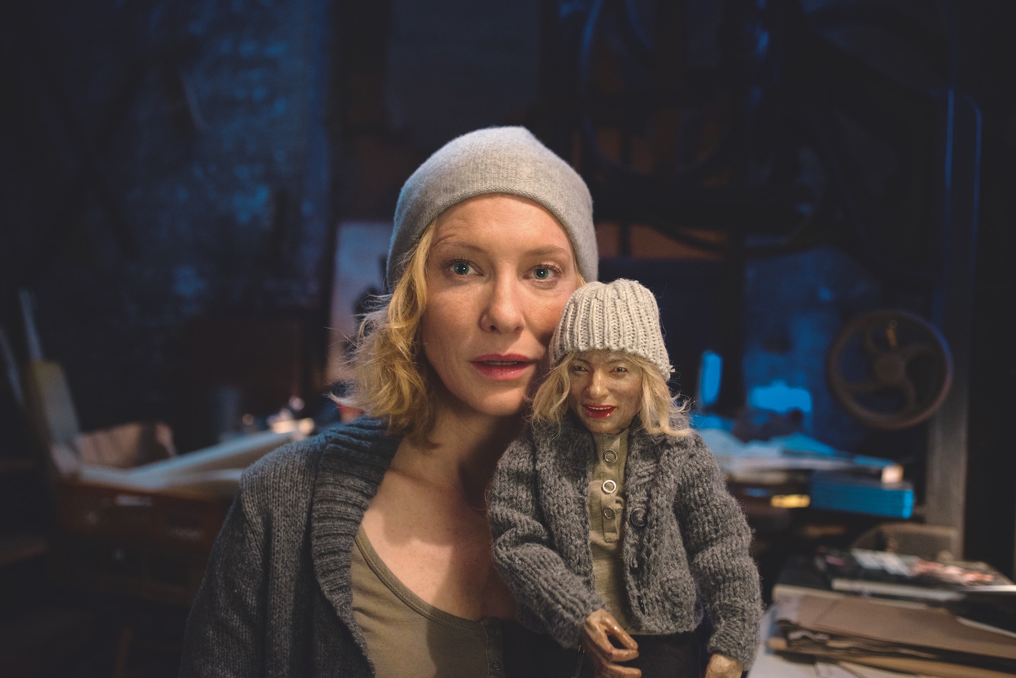
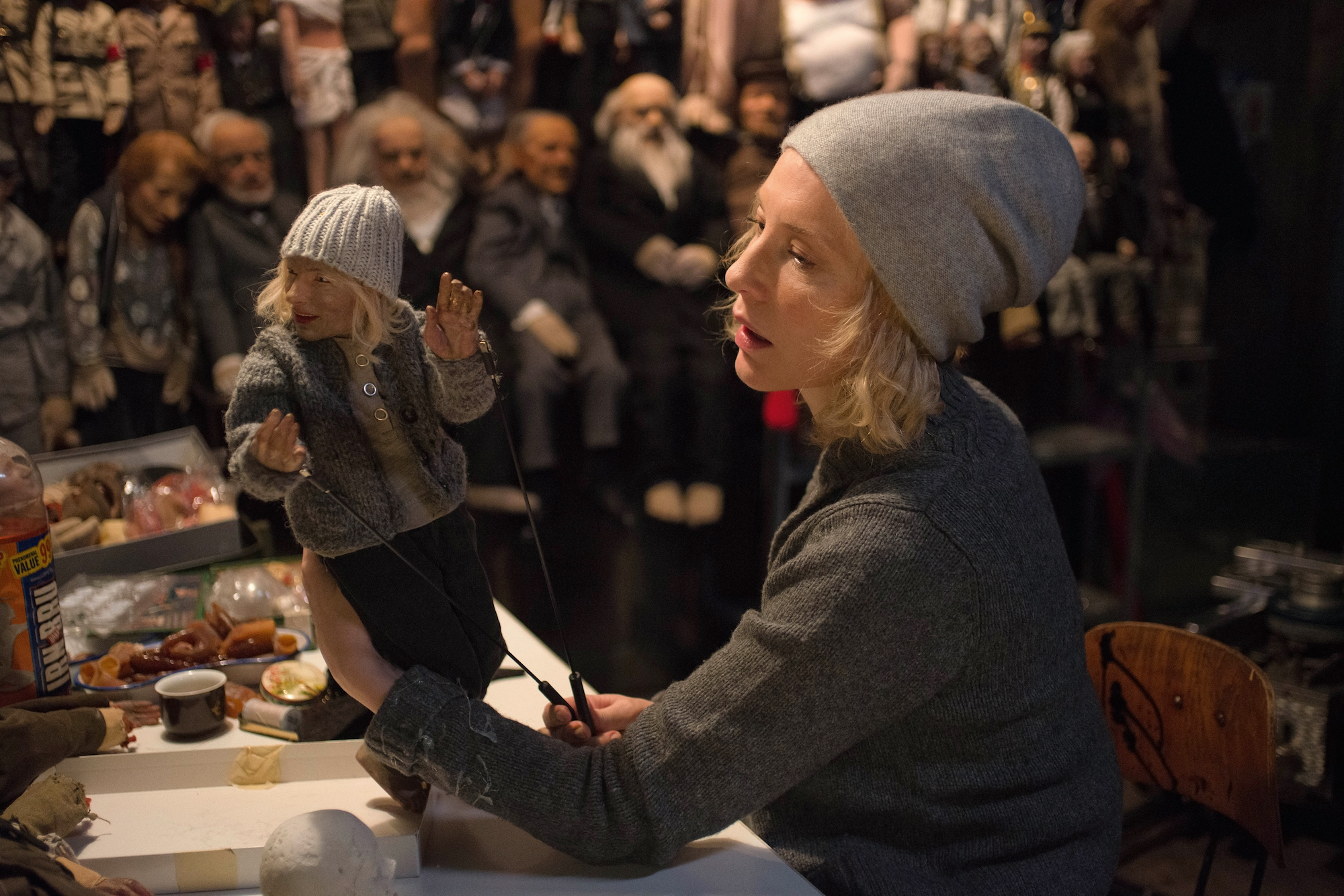
Julian Rosefeldt’s Manifesto, a feature length film derived from an art installation of the same same name, is a tough sell on paper. The film is divided into thirteen sections, each with a different main character played by Cate Blanchett (a la I’m Not There, in which Bob Dylan is embodied by six actors, including Blanchett) who recite excerpts from over fifty individual manifestos of art, from Dada to Dogma 95. Alongside a touring exhibition of the sections simultaneously projected onto separate screens in an overwhelming sensory soundscape, the more conventionally structured film of Manifesto, in which the sections are stitched together into a 90 minute feature, premiered at Sundance Festival in January, and has its general UK release later this month.

SURREALISM / SPATIALISM, Manifesto © Julian Rosefeldt

What relevance do these artistic credos, some of which are approaching their centenary, have for people not in the art world? “The art world is a bit of a closed circle,” explains writer, director and producer Julian Rosefeldt from his home in Berlin. “We’re imprisoned in a white cube where we always speak with people who don’t necessarily have to be convinced, because they agree with everything we have to say already. We consider these important issues, but we don’t talk to the right people about them.”

STRIDENTISM / CREATIONISM, Manifesto © Julian Rosefeldt

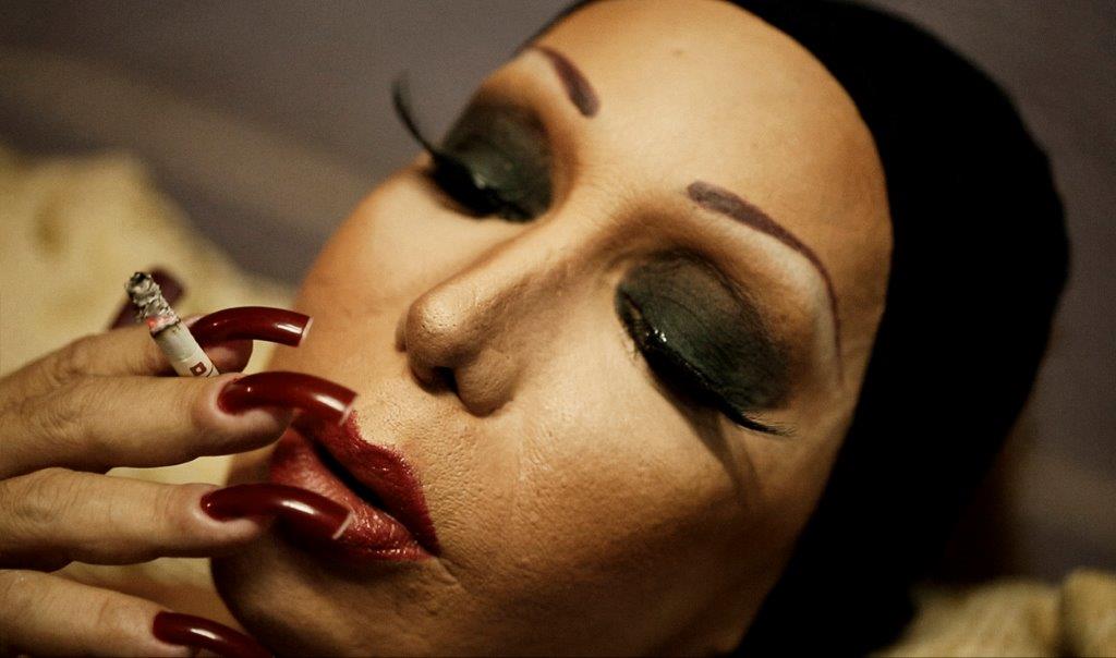
In different hands, this cerebral mixture could easily have produced quite a dry film: one to be cautiously admired, rather than enjoyed. Yet, Rosefeldt and Blanchett pull off the impressive feat of making these scholarly manifestos digestible, comprehensible and almost conversational.  In Blanchett’s portrayal of a dizzying range of characters – including a homeless man, a single mother and a ballet choreographer – century old texts written almost exclusively by dead, white men, go through a certain democratisation. “I wanted to depict a kaleidoscope of society,” Rosefeldt says.

SITUATIONISM, Manifesto © Julian Rosefeldt

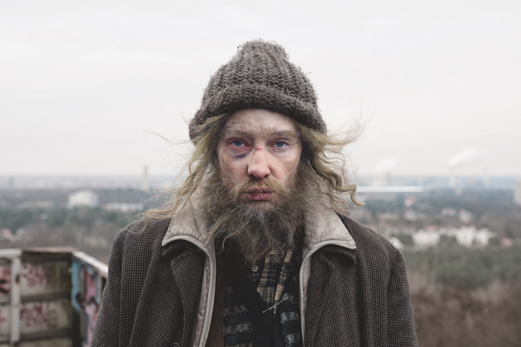
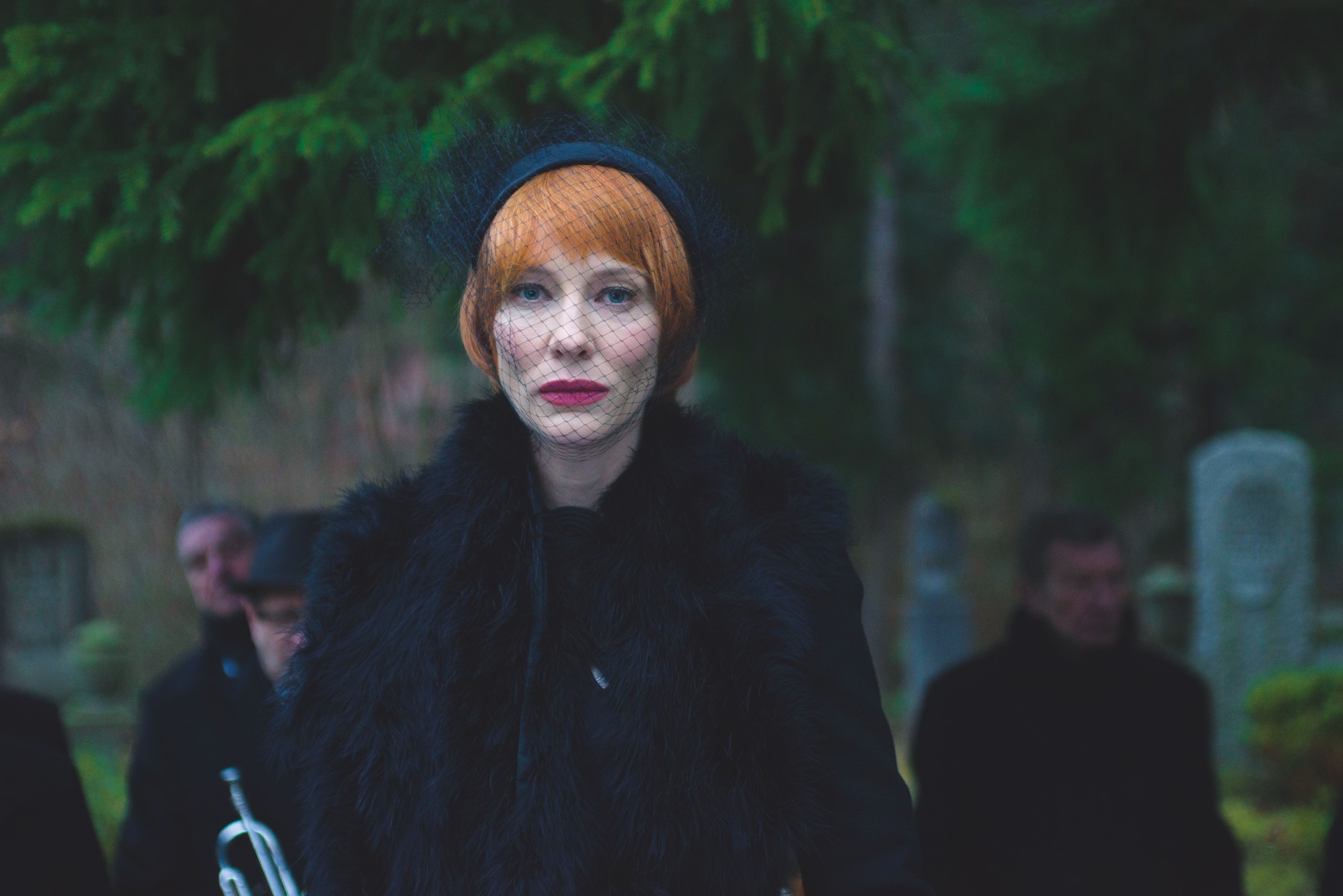
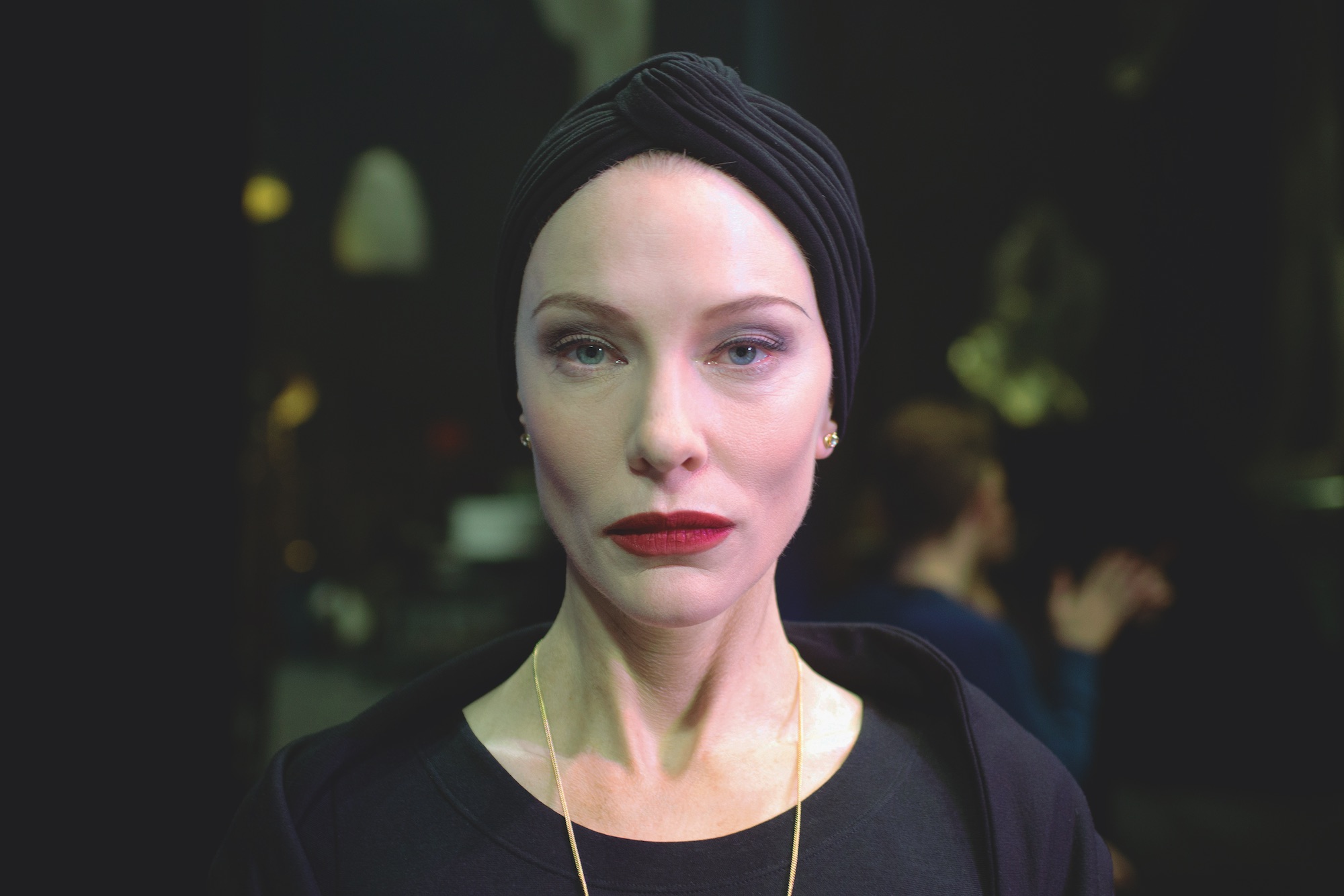
The film is also tonally diverse. The second section features a wild-eyed homeless man, screaming through a microphone with only a post-apocalyptic wasteland to act as witness. This is immediately followed by a stockbroker extolling the virtues of speed and technology that complicated the Futurist movement with overtly Fascist overtones. In Manifesto’s most arresting sequence, Blanchett presides over a Dadaesque funeral mourning (and simultaneously celebrating) the death of art. This scene was filmed in the dying light of a brief winter afternoon in Berlin, Blanchett nailing the eviscerating speech in just one or two takes.

DADAISM, Manifesto © Julian Rosefeldt

This palpable sense of unease and impending catastrophe is punctured by scenes of surprising comedy, such as sculptor Claes Oldenburg’s ‘I Am For An Art’ recited with reverence by a Southern mother saying grace. “I am for an art that is political-erotical-mystical, that does something other than sit on its ass in a museum,” she intones solemnly, her three children and husband (played by Blanchett’s actual family) propped up on steepled fingers around a rapidly cooling Sunday roast.

SURREALISM / SPATIALISM, Manifesto © Julian Rosefeldt

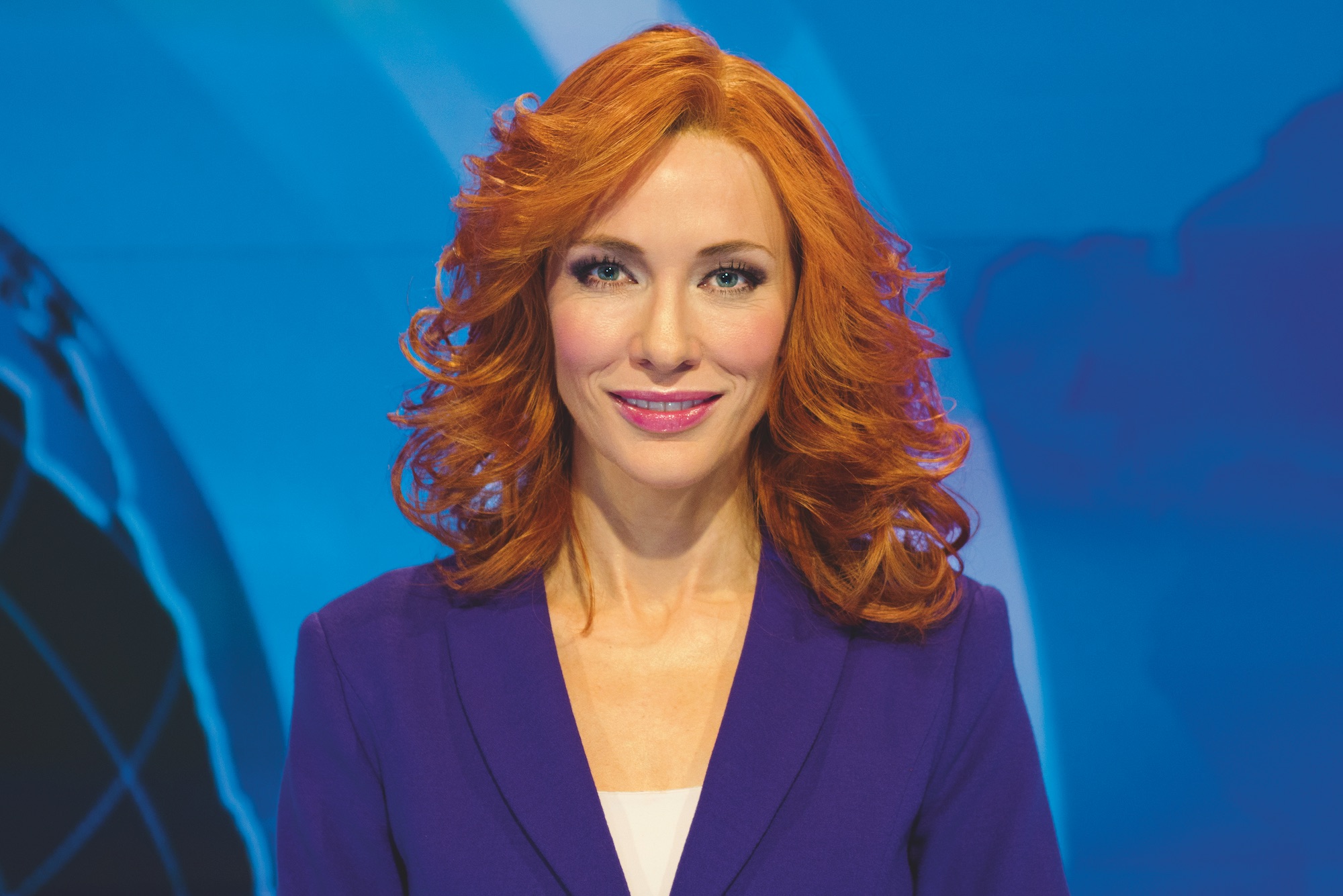
The dashes of humour in the film often arise from such ironic distance between text and situation. A manifesto of conceptual art, parroted by an aggressively made-up, Elnett-haired parody of a Fox News reporter, cannily raises the spectre of fake news: “Good evening, ladies and gentlemen. All of current art is fake.”

CONCEPTUAL ART / MINIMALISM, Manifesto © Julian Rosefeldt

Bar the opening lines from the Communist Manifesto, the texts are artistically apolitical – though between the lines such declarations are always political. “In Q&As after the screenings, people again and again refer to the political circumstances of today”, Rosefeldt explains. “When the first Futurist manifesto was published on the front page of Le Figaro in 1909, it acted as a kind of an ignition, a spark, that infected a lot of artistic manifestos at the time. We are living in a moment that is, in a way, comparable to the tension felt between the wars. The world is upside down and people read in those manifestos a kind of call for action, or an anti-populist call.”

FLUXUS / MERZ / PERFORMANCE, Manifesto © Julian Rosefeldt

Audaciously, Rosefeldt combines manifestos from decades apart in the same section, bringing Wassily Kandinsky (1912) and Barnett Newman (1948) into conversation. “Of course, it’s quite disrespectful towards the original writing,” Rosefeldt says bluntly. “Within these circles there is as much contradiction as agreement. But in art, as in history and fashion, everything repeats itself. Ideas come up, disappear for a while, and then forty years later have their rebirth.”

FILM, Manifesto © Julian Rosefeldt

In the last section, in which the manifestos of cinema’s auteurs including the Dogma 95 duo Lars von Trier and Thomas Vinterberg are coalesced into a lesson, the lively contradiction between different authors is more explicit. Through Blanchett’s earnest teacher, the director Jim Jarmusch writes “Nothing is original” on the blackboard and instructs a class of ten year olds to “Steal from anywhere”; a sentiment that the firmly tongue-in-cheek Dogma manifesto contradicts in the next sentence. “That’s a bit how I remember school,” Rosefeldt chuckles. “From the same person, you get both complete bullshit, and things that actually make sense.”

Manifesto: Live From Tate Modern takes place across the UK on Wed 15 November. Manifesto goes on general release on 24 November. See manifestothefilm.com for full details.

Paris Photo 2017

Port visits the 2017 edition of Paris Photo to discover stories of the African diaspora, the nude reinterpreted and disaffected youth on the streets of Los Angeles 

Nanny et Quao, Jamaïque, 1720 2017, © Omar Victor Diop. Exhibited by MAGNIN-A

With over 180 galleries and publishers represented, Paris Photo is the largest international art fair dedicated to photography. As such, when I visit the Grand Palais in Paris, just off the Champs-Élysées, is full to its ornate Rococo rafters with photographers, curators and art-lovers from around the world. It was even possible to catch a glimpse of the elusive Patti Smith, one of this year’s guest curators. Here, we take a look at the highlights of the fair.

An artist who immediately catches the eye is Omar Victor Diop, a Senegalese photographer who takes elaborately staged photographs of people (including himself) presented in various historical guises. These allegorical portraits focus on stories from the African diaspora over time, and his subjects, formally composed and framed against a background, have the air of oil paintings. When I mention this to him, Diop laughs. “Good. If I had the skill to paint, I would never touch a camera.”

Untitled, from the series ‘Halo’, 2017, © Rinko Kawauchi/ Courtesy Christophe Guye

Over at the Christophe Guye gallery, Rinko Kawauchi’s serene images of cherry blossom, migrating birds and candy-coloured fireworks are peaceful and dreamlike. The recipient of the Annual Infinity Award in 2009 from New York’s Centre of Photography, Kawauchi makes everyday scenes and objects extraordinary.

‘Oh man’, from the book Oh Man, 2013. © Lise Sarfati. Exhibited by Steidl

Algerian-born French artist Lise Sarfati’s large-scale panoramas of disaffected youth are set against the streets decaying inner-Los Angeles. Her images of aloof, solitary young men have echoes of William Eggleston in their faded pastel palette and emphasis on the minutiae of American life. 

Yellow Passage by James Casebere, © Galerie Templon

James Casebere’s sundrenched, angular photographs offer a vision of modern architecture devoid of all human life. Casebere’s deserted, hectically coloured rooms combine a striking visual sensibility with an uncanny sense of foreboding.

Cherry Tree from The Appearance of Things, 2016, © Jocelyn Lee and Pace/MacGill

At Pace/MacGill, two of the artists exhibited focus on reinterpreting the female nude. Jocelyn Lee’s flame-haired women among the cherry blossoms feels inspired both by the cinematography of Sofia Coppola, and the verdant imagery of the Pre-Raphaelites, though the washed-out tones and slightly blurred focus seem to promise something more unwholesome. Richard Learoyd’s Freya offers an entirely stripped-back depiction of femininity, the shaven-headed model reclining on a moth-eaten sofa, her pose communicating uneasy rest.

Freya, Nude horizontal, © Richard Learoyd and Pace/MacGill

Heading upstairs to ‘Prismes’, the sector of the fair dedicated to exhibiting large format photography, video installation, or otherwise exceptional work, the Sator gallery is the only area of the Grand Palais completely shrouded in darkness. Greek visual artist Evangelia Kranioti’s startling video installation stills gleam in the dim light, the saturated, oozing colours and fantastical imagery evoking both fairytale and nightmare.

L’extase doit être oubliée (Still), by Evangelia Kranioti. © Galerie Sator

Elsewhere, in a more illuminated area of ‘Prismes’, Nadav Kander’s sombre, gray scale images of rough seas and deserted beaches – including an exquisite triptych of raging water taken from his Thames Estuary series – quietly demand the viewer’s complete attention. 

Water I, Shoeburyness towards the Isle of Grain, by Nadav Kander, 2015. © FLOWERS

Cover image courtesy of Paris Photo

Paris Photo 2017 runs at the Grand Palais until 12th November 2017

Into the Woods with Noma Bar

Taken from the latest issue of Printed Pages, It’s Nice That catches up with graphic artist Noma Bar to discuss artistic responsibility and his idiosyncratic office

If you go down to Highgate Woods in London today, you might be in for a bit of a surprise. Among the dog walkers, the frazzled parents searching for their kids and the forestry workers making sure that the ancient woodland is being preserved, you might, if you look carefully, find one of the most prolific artists and illustrators working in the UK. Highgate Woods, all 28 hectares of it, is Noma Bar’s ‘office’. Everyday, come rain or shine, the graphic artist is there, somewhere, armed with his notebooks and pens, working through ideas that will appear in their final forms in newspapers, magazines, as part of a campaign or a gallery.

“You won’t find me drawing the flowers or the trees,” says Noma with a chuckle. “I’m not here to react to the seasonal changes or the landscape. I need the energy and the contrast to what is happening in the city.” We are sat by his current ‘desk’ that is hidden away from a footpath. It is here that he works, pen in hand, only leaving for meetings in the city or to go home and turn his ideas into the thought-provoking, inventive and sometimes controversial work he is famed for. It’s Nice That has joined for an afternoon to see the sights and learn more about Noma, his background and art. Our interview occurs soon after he has released Bittersweet, a “mid-career retrospective” with Thames and Hudson – a mammoth five volume box set that splits his portfolio thematically between: Life DeathPretty UglyLess MoreIn Out and Rough Smooth.

Noma’s work has been exhibited and published extensively responding to subjects ranging from war crimes to online porn. Over the course of his career his images that playfully tackle these far ranging topics have become known for the juxtaposition within the imagery and his mastery of negative space and block colour. “When you see my work, you wouldn’t think it was created in the woods,” says Noma thoughtfully. “I like this contrast.”

His work is adept at condensing complex subjects into simple images that belie the depth of thought and endeavour that goes into making them. His work for the GuardianNew York Times and other bastions of the old media establishment has seen him deal with the topics that informed the names of each section of his new book with apparent ease. “There isn’t one way to do it. There’s something in me that wants to strip things down. No one knows the pain and sweat that goes into making each work,” he explains. “It’s like being a musician or a dancer. You might see the sweat on the stage, but you don’t see everything that has gone into it. I’m not crazy about showing that process, I want to keep things for myself. Theres a lot of deleting and starting again.”

Whatever the brief, be it a commercial client, a publication or a commission for a charity or campaign, Noma’s belief in his responsibilities is resolute. “As designers we have power. If I can use my pen to say things, to affect and change realities, I will,” he says firmly. “It’s like a singer writing a song. If I work for someone like Cancer Research and can attract someone to donate to the cause through a poster, that is my contribution. It’s another voice. It can be a powerful thing.”

It’s not only the more overtly emotive works that embody this thinking. Noma has been called to produce portraits of countless faces over the years. It’s something that endlessly fascinates him and his sketchbooks are full of faces he has seen on his travels in the woods, around the capital and further afield. “Taking iconic faces and working into them is fun,” he says. “It’s deconstructing them to the extreme. The power lies in taking on something that is already iconic. I am taking the icon and breaking the icon. An average, normal, beautiful face is more tricky to draw.” Among the film stars, politicians and royalty he has to depict, one face returns more than others. “I get a lot of Hitlers. People don’t like that I draw Hitler. For me, drawing Hitler is provocation whatever the message is. It’s something that I am dealing with and it is a bitter pill. Hitler is fun. Challenging is fun.”

The challenges come thick and fast, and as Noma gathers his thoughts and records them in his sketchbook, sat among the foliage in the woods, he can never truly anticipate the response an image will generate. Controversy has followed his overtly political works – be it a Time Out cover that merged the image of Big Ben’s clocktower with an representation of anal sex, or a piece about George Bush and the Iraq war that saw “countless emails and letters questioning why I did it”. It’s Noma’s storytelling abilities that get him to his final ideas. “I didn’t choose this. It’s just something I can do,” he says. Noma can reduce the graphic nature of a topic without losing how profound the message it is, or place something in the mainstream media that might be too difficult to convey in another way. “I have a name now, people come to me to solve problems. I wouldn’t do what a photographer would do. I can say things about, say, sexuality and bring fun to sex. Or I have done really serious briefs covering topics like rape, war or paedophiles. There is no harm in what I am doing visually. I enjoy doing this work.”

The dualities within Noma’s work mirror his life. This fascination with the essence of the story and a translation of this into a beautiful and profound image is a struggle on which he thrives. In the spirit of Bittersweet I ask him to try and sum himself up in two words. He pauses, furrows his brow beneath his ever present hat, then smiles: “Always More!”

Photography Jack Johnstone

This is an excerpt from an article published by It’s Nice That in August 2017, and features in the latest issue of Printed Pages

Elements: The Beret

Port’s fashion features editor, David Hellqvist, reflects on the long, colourful and not completely French history of the beret

‘Homme au béret basque’ by Picasso Pablo. Courtesy of RMN (musée Picasso de Paris) Photo (C) RMN-Grand Palais (musée Picasso de Paris)

Picture a beret wearer in your head and they’ll most likely be French. Perhaps they’ll be in a striped Breton top, if you believe in stereotypes. But if you were to trace the hat’s history, you’ll find that it’s got as much to do with Spanish fashion as with French mode.

The two often overlap, as was the case with French-Basque tennis player Jean Borotra, who famously wore a blue beret while playing at the Wimbledon championship throughout the 1920s. It was Borotra that helped popularise the beret internationally, bringing it to an audience outside of France and Spain, where it has been commonly worn since the 13th century.

But the beret has always had an artistic air too, which only makes its affiliation with elite special forces around the world even stranger. This mixture of the intellectual and the macho means it is an alluring piece of clothing to work with today, as proven by Isaac Larose and Marc Beaugé’s Larose Paris brand. Having mastered everything from the trilby to basketball caps, Larose Paris now also offers berets, with or without its signature zip pocket.

There is no one else, arguably, that personifies the beret and its creative ambitions quite like Pablo Picasso. Born in Malaga in south-east Spain, he spent most of his adult life living in France, where he died in 1973 from a heart attack.

Some viewed him as a sartorial role model as well as an artistic master, as suggested in the 2014 book Institute of Contemporary Arts: 1946-1968. According to its co-author Anne Massey, researching the book unveiled the true power of Picasso’s beret.

“Among the monthly internal bulletins we found one concerning lost property,” Massey says. “It revealed that berets were left behind around the time of the Picasso show – he wore one and everyone was trying to copy him.” Well, we know what they say about imitation…

Take a look at a brief history of the French chore jacket 

The Merchant of Moscow

Madeline Morley discovers how a member of Moscow’s mercantile class amassed one of the most extraordinary art collections of the twentieth century

“If a picture gives you a psychological shock, buy it. It’s a good one.” This was the advice that the great Russian art collector Sergei Shchukin gave his daughter at the turn of the 19th century.

Musée d’Art Moderne Occidentale, Moscow

During the first quarter of the 20th century in Russia, this small inconspicuous man with an uncontrollable stutter – a member of Moscow’s conservative and provincial merchant class – would open the doors of his Trubetskoy palace to the public to share his collection of paintings. Rooms adorned with the sunset palette of Matisse, the distorted perception of Picasso, the looming bodies of Degas and the earthy hues of Cezanne, all crowded under the ceiling’s ornate decor. It was here that a generation of young art students would draw from the canvases they observed and eventually find their way to abstraction.

Since Peter the Great, wealthy czars had supported the arts, but by the end of the 19th century, it was Moscow’s merchants – particularly Shchukin – who were buying the “shocking” work of new French painters, pieces like Matisse’s ‘La Danse’ and Picasso’s ‘Les Demoiselles d’Avignon’ that were scorned by the aristocrats of old Slavic-Russian values. It was well known that only Shchukin’s most sophisticated visitors could get a glimpse of one of his precious Gauguins, which he kept hidden behind a curtain.

He was a unique, open-minded collector, and regularly became close friends with the artists he supported. He would spend hours in front of a painting before he decided whether or not to purchase it, allowing its mood to wash over him.

In 1918, after immigrating to Paris with his family to escape the political upheaval of the revolution, Shchukin’s collection became the property of the state, and was hidden in museum storerooms. Almost 100 years later, the Foundation Louis Vuitton hosted an exhibition of 130 of his collected works.

“Nothing will ever replace the sensitive, invested, courageous and committed eye of the private art collector, enamoured often to the point of addiction and madness,” said the exhibition’s general curator, Anne Baldassari. Ultimately, Shchukin’s talent wasn’t business but instinct, curating and selecting the defining works of an art historical epoch. The show was a reminder of the power and eventual prestige that emerges from making the right choices at the right time.


This article was original published in Issue 19 of Port

Mario Testino on Newton and Nudity

The prolific photographer reveals an intimate side to his work in a bold exhibition of photographs at the Helmut Newton Foundation

The human body is an inexhaustible subject in photography. By blurring boundaries between fashion, eroticism and art, Mario Testino has unravelled the politics and symbolism of the body throughout his work. In an exhibition conceived for the Helmut Newton Foundation in Berlin and its catalogue by the same name, Undressed, the photographer explores nakedness through 50 images from his archive. 

Testino, much like Newton before him, offers an empowering perspective on the body, and where Newton established a confident image of femininity, Testino challenges masculine paradigms. The playful, unfettered atmosphere of his studio is captured through effervescent portraits of anonymous, androgynous men as well as supermodels such as Kate Moss and Amber Valletta, which even at their most daring, never slip into the vulgar. Including previously unseen photographs, Undressed reveals a more intimate side to the photographer’s work and in the process, he too lays himself bare.

What kind of impact did Helmut Newton have on you as a young photographer? 

He had pretty kinky ideas that could well have been seen as vulgar or too pornographic, but because they were presented so stylishly in Vogue it was considered elevated work. Seeing this taught me that, whatever you do, if you do it well and elegantly it can live on its own.

In Ways of Seeing, John Berger makes a clear distinction between nudity and nakedness. As a photographer, how do you negotiate that tension?

To me nudity is the way people are made and nakedness entails a certain provocation. I think both are valid in their own way. Why not provoke when you can?

Does nudity still have the power to shock? If so, where does that fit in with your photographs?

I think that it is definitely less shocking today, although it is still provocative. I find it interesting that male nudity seems to shock more than female nudity. Is it because we are more used to seeing women naked than men? Or perhaps it comes from men being more shy with their bodies? I don’t know.

What was the catalyst for Undressed and how did you approach the selection process?

The show marks a significant point in time for me. The majority of the works in Undressed come from the ’90s, which was a transformative moment in my career. It was a point where I was identifying the new people coming into the industry and photographing them naked. I think in some odd way the nudes I did then undressed me too, of my limits and preconceived ideas about image-making. They influenced and informed the way I did my fashion photographs.

Has hindsight changed the way you feel about any of these photographs? Did anything surprise you? 

It is great to come back to these images after a long period. I realise I have changed a lot since the ’90s, when most of these works were shot. I think back then I was very precise and today I am a lot more open. But I needed that precision to discover the Mario Testino of today.

Ultimately, what would you like people to take away from both the exhibition and the book?

I feel these photographs show a strength in these people, despite being naked. Not everyone feels like that and I would love to feel that people took away some of that essence in themselves. They should be proud of how they are made and gain strength from nakedness, instead of insecurity.

Mario Testino: Undressed is on show at the Helmut Newton Foundation in Berlin until 19 November. The accompanying catalogue, published by Taschen, is out now

Andy Warhol’s Sixty Last Suppers

As Warhol’s final painting goes on show in Milan, curator Jessica Beck speaks about the long-lasting appeal of the celebrity artist

Almost 500 years after Leonardo da Vinci’s masterwork The Last Supper was completed, Andy Warhol unveiled his homage to the Renaissance artist in the form of sixty black-and-white reproductions of the original painting, each stacked together in rows and columns like the outside of a block of 1930s flats. The work was the last Warhol finished before his death just one month after the exhibition opened, adding a degree of mystery to the paintings.

This year, in celebration of the painting’s 30-year anniversary, Sixty Last Suppers is once again being shown in Milan, this time at the Museo del Novecento (in collaboration with the Gagosian Gallery) – a stone’s throw away from Da Vinci’s original.

The original imagery associated with the painting is profoundly religious, yet Warhol’s re-working is viewed by many as a wry comment on cliché and the flippant culture of the modern art world.

Andy Warhol, Sixty Last Suppers, 1986 © The Andy Warhol Foundation for the Visual Arts Inc. by SIAE 2017. Photo by Rob McKeever

However, Jessica Beck, the curator of the exhibition, has another theory. “I don’t think that the work is satirical at all, on the contrary I find it to be a very serious painting, and a tribute to one of the masters of Renaissance painting. Warhol produced this painting in the mid-1980s, a period when he had fully embraced video, photography, television and even the Amiga computer. He captured the drama and power of Leonardo’s masterwork through the lens of the technology and politics of his time. He was making works from Leonardo’s image of salvation and loss in the midst of the AIDS epidemic, while the tight grid of repeated squares gives the static image a flicker and glow similar to a television screen.”

Along with Sixty Last Suppers, the exhibition will include source material for the paintings, including polaroids of a kitsch sculptural replica of the painting and a facsimile from Cyclopedia of Painters and Paintings, each offering visitors a chance to contextualise the canvas. 

“I hope that visitors will begin to see that Warhol was engaged with very serious ideas of painting,” explains Beck. “He tapped into ideas that remain relevant to contemporary audiences: celebrity culture, capitalism, death and public loss. It’s surprising even to me how with each year there is more and more enthusiasm and excitement around his work.”

Sixty Last Suppers is being shown at the Museo del Novecento in Milan until 18 May

Massimo Vitali: Disturbed Coastal Systems

The Italian photographer discusses scouting locations, the politics behind his work and the changing status of Europe’s beaches

Massimo Vitali is known for his large-format photographs of crowded beach scenes. A former photojournalist and cinematographer, Vitali has committed the second half of his adult life to travelling across the globe. “At the beginning of the season I look up places to shoot,” he says. “Sometimes people I know will talk to me about new locations, sometimes I will want to go back to places I’ve been before.” It’s this tradition of visiting and re-visiting beaches that has reinforced his idea of them as places of perpetual change. “If you really wanted, you could go to the same beach for twenty years and every year it would be different,” he explains. 

“When I first started taking pictures, beaches had no connotations. They were places where people could not think about anything, and be totally at ease.” Today, the same beaches are still holiday destinations, he says, but they are also the troubling backdrops of the European migrant crisis. For Vitali, an artist who has spent the last two decades documenting holidaymakers along the coastlines of the continent, as well as further afield, the beach has become a looking glass into the heart of the lives of Europeans. Of the current political climate, Vitali notes: “There is a vague sense of doom.”

New work in the Italian photographer’s current exhibition at the Benrubi Gallery in New York, Disturbed Coastal Systems, was primarily shot on the beaches of Portugal, where over a million Syrian, Afghan and Iraqi refugees first set foot on the shores of Europe. Vitali continues to look at the tension between the human habitat and the natural world with his latest photographs. Throughout the images, man-made saltwater pools and concrete piers break up natural scenery and hint at ways coastlines are occupied.

While at first glance Vitali’s photographs can seem almost saccharine, on closer inspection there is an unexpected depth beneath the bubblegum colour palette – something that feels both timeless and fleeting. “I try with my pictures to be in the middle, in the middle of something that is not long lasting, like walking on a thin line between what is already there and what is changing all of the time.”

Disturbed Coastal Systems is on show at the Benrubi Gallery in New York until 17 June


The World of José Parlá

Opening the doors to his studio, the Cuban-American artist discusses identity, underground culture and art as politics

José wears long sleeve tee and tack slim selvedge rigid denim Levi’s® Made & Crafted™

Artists’ studios are always personal spaces. Hidden in plain sight in warehouse lofts or behind pull-down steel grates, they don’t reflect their residents’ personalities and practices until you get inside and see what’s on the walls.

The studio of the Cuban-American artist José Parlá is no different. A single-storey industrial building in the southerly Gowanus neighbourhood of Brooklyn that’s surrounded by mechanics and manufacturers, the facade is completely nondescript. But once you’re in the door, everything changes.

Parlá, who bought the building in 2014, works in the centre of the space, a wide sky-lit arena hung with the artist’s vibrant, gestural paintings in progress, which recall urban walls as much as art historical reference points like Cy Twombly and Ed Ruscha. The paintings have been shown in galleries and museums from New York to Tokyo; a mural of Parlá’s can now be seen in the new One World Trade Center.

Above the studio arena off to one side of the space is what Parlá calls the ‘nest’: a lofted aerie that holds an office with a wide desk; a circle of sleek chairs; a couch for meetings; and a DJ setup currently spinning Marley Marl, an artefact of the energetic New York culture that first brought the artist to the city. Records spill on to the floor: Celia Cruz, the Last Poets, the Warning. ‘In terms of the quality of rhythm in my work, a lot of it is informed by music,’ Parlá tells me.

Below the ‘nest’ is a neat box composed of a library, bathroom, and full kitchen. Light is plentiful, even on a dull day, and the walls and fixtures are painted a warm industrial grey. Altogether, the studio forms a perfect machine for art, life and anything in between.

‘I don’t live here, but I pretty much feel like I do,’ the artist says (his apartment is in nearby Fort Greene). In his paint-spattered black jacket and jeans, Parlá looks as comfortable as he would holding court at home.

The studio’s design was the result of a collaboration with Snøhetta, the buzzed-about Norwegian architecture firm responsible for such structures as the San Francisco Museum of Modern Art’s recent iceberg-like expansion, and the Oslo Opera House, which won the 2009 Mies van der Rohe award.

Parlá met the firm’s co-founder, Craig Dykers, at a Pecha Kucha slide-presentation event in 2010. The two appreciated each other’s talks and Dykers invited the artist to his office to see if they might collaborate. The first result of the partnership was a piece installed at North Carolina State University’s Hunt Library. The intention is to team up for spaces like a public library in Queens and the Obama Presidential Center in Chicago. But Parlá’s studio is the biggest collaboration so far.

‘When I bought the property, I was having a beer with Craig and he started drawing right away,’ the artist says. The space’s openness, both in terms of scale and the presence of other cultural forms, is perfect for Parlá’s practice, which draws on influences as diverse as graffiti and the French situationists.  

Joaquin, Parlá’s studio assistant, brings two Cuban coffees, the kind that you can only get outside of Miami if you know someone who can make it for you. He serves them in espresso cups emblazoned with Cuban flags. ‘As a kid we weren’t allowed to go to Cuba,’ the artist says.  ‘I was born in Miami and grew up in Puerto Rico, so I understand the culture from the perspective of being a Latin American and of being from Cuban parents.’ The country itself was still off limits, however.

After President Obama opened Cuba to United States citizens in 2014, change came in earnest. The country’s cultural landscape is changing, too. Parlá is now becoming a public creative force in the homeland he didn’t know until later in life. He participated in the 2012 Havanna Biennial in a collaboration with his friend, the French photo-based street artist, JR. Parlá had just returned from Havana to work on new projects two weeks prior to our meeting.

During this gradual transformation, the Cuban identity has persisted. ‘Cuba’s still Cuba culturally,’ Parlá says. Not everything has changed, certainly not like the overhaul Brooklyn has seen since the artist moved here decades ago. ‘You see one or two hotels refurbished, some young people opening up their own restaurants. It’s not at the scale you see in the first world.’

However, Cuba is not the easiest political environment for artists. ‘There’s still a lot of tension. It depends on how far you take your message with the art, how much you can get away with,’ Parlá says. Making art there is an opportunity, however, ‘to go back and have a dialogue with my soul country.’

In 1980s Miami, Parlá was exposed to the nascent movement of street art and graffiti that was growing in New York and Philadelphia. Friends and family passing between the two cities would bring back photos and art books. He started painting walls when he was 10 years old, learning from older writers on the scene. ‘It was really important to be original,’ Parlá says. ‘We used to say, this guy “bit” somebody; somebody’s a “biter”. That was a big no-no, to copy somebody. If you didn’t have a respectful attitude, you might get beat up.’

José wears crewneck sweatshirt and chino pants Levi’s® Made & Crafted™

Parlá followed the trail of hip-hop and wall-painting to the Bronx in 1995, then moved to an empty loft in downtown Brooklyn in 1997, all the while writing under the name Ease. The energy had shifted downtown with DIY exhibitions. The scene, as Parlá describes it, became an international export. ‘I started out showing in galleries and doing bigger projects in Japan, Hong Kong and London,’ he says. ‘There was an appreciation for New York underground culture there. Here, the museums weren’t really trying to look at what we were all doing.’

Parlá doesn’t appreciate the label of “street art”. To him, the work is all part of an art historical continuum. The abstract expressionists were urban artists, after all, responding to the street. Parlá is as likely to reference artists like Joan Mitchell or Antoni Tàpies, as the graffiti legend Kase 2. As for the Banksy-style boom, ‘We got grouped in with artists who were painting a bunny rabbit hopping over a dragon. That was not the same,’ he says.

Today, the artist shows in estimable galleries like those of Mary Boone and Bryce Wolkowitz – the latter being the New York gallerist who walks into the studio during my visit to check on work for upcoming art fairs. Exhibitions are coming up in Italy and London, as well as a project at the University of Texas, Austin. Parlá is entrenched in the art world, reinforcing a now well-established path from graffiti to museums, just as Keith Haring, Jean-Michel Basquiat and KAWS have before him.

Yet Parlá is still focused on reaching a wider audience, particularly through his murals and other “public art”. ‘You’re having a connection with the public that’s different, than with someone who’s searching for art,’ he says. ‘They might discover that they really love art.’ One can easily imagine the next generation of painters arriving in New York inspired by Parlá’s work, just as the city once drew him in.

For its SS17 collection, Levi’s® Made & Crafted® has channelled the rich colour palette and flamboyance of Havana, with guaybera shirts, tropical prints and camouflage details all harking back to the nation’s enduring revolutionary spirit.

See more from Levi’s® Made & Crafted® here.

Photography by Mark Mahaney
Styling by Yety Akinola

Inside East London’s Creative Spaces

Hackney’s community of artists and designers intimately documented by photographer Jenny Lewis

Jenny Lewis has been photographing artists and designers in their east London studios for four years. Firstly, as a way to celebrate their creativity, but also to understand her own place as an artist within her community, and to pay tribute to the area’s fading studio culture. ‘I wanted to explore the creative world of Hackney and to discover who these people were,’ she says.

After an encounter with fashion designer Isobel Webster, the project took on a life of its own. Each subject nominated someone they thought was exceptional and, by word of mouth, the series flourished into a “family tree” of Hackney’s creatives. By viewing their studio set-up, their paints, materials, sketches or storyboards, Lewis has captured their inner workings.

When photographing her subjects, Lewis took a conversational approach so as to put everyone at ease. ‘The focus wasn’t solely on them,’ she explains. ‘We were talking about the person that recommended them and discussing who they might nominate.’ With 20 years of experience behind her, she believes the success of a portrait depends on a connection with her sitters. ‘It takes the ego out of the picture. They are much more relaxed, much more intimate and authentic.’

The series, which has been newly published as a book, does away with creative hierarchies, and painters, sculptors, musicians and film-makers sit side by side. ‘It’s not about established artists – even though some of them are very established – it’s about the integrity and passion for their work and admiration among their circle.’ Artists would nominate their assistants, tutors would nominate their students and vice versa.

Hackney Studios began as a celebration, but a year into the project came clear signs that things were changing. Over half of Lewis’ subjects have now been forced out of their studios due to redevelopment or rising rent prices. ‘It gives a different tone to the whole series. It’s such a fragile ecosystem and we all need each other to survive, but this support network is crumbling and disappearing.’ Many creatives have moved to other areas, including Margate and Tottenham. Others have had to give up their studios to work from home.

Despite challenges faced by the community, Hackney Studios is ultimately a salute to the spirit of creativity, and Lewis now calls many of those photographed close friends. ‘They deserve to feel celebrated,’ she says. ‘There’s a lot of pride and soul in this project.’

Hackney Studios is available from 6 April, published by Hoxton Mini Press