Areas for Change

Katie Chung, creative director of MCM, discusses her creative approach and culinary preference

Photography DONGKYUN VAK

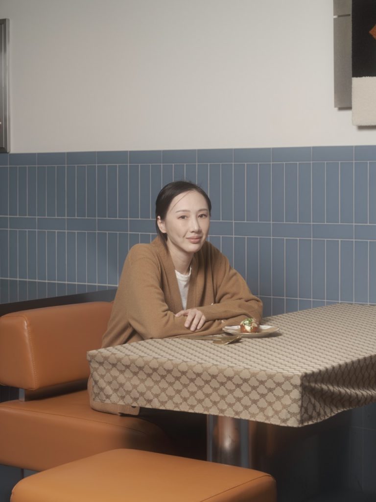
In Katie Chung’s favourite restaurant, the walls are lined with vinyl LPs. The health-conscious creative director of MCM doesn’t indulge in much, but at Buto – a European-Korean fusion restaurant and Hansik bar in Seoul’s Yongsan District – she’ll treat herself to a fried delight: a hot, fragrant order of Eggplant Menbosha. “Unlike other restaurants, they wrap shrimp into eggplant instead of bread, and colour it with squid ink,” she tells me. “There’s this vintage, classic ambiance where, regardless of where I sit, I feel a real sense of comfort during the meal.”

A Central Saint Martins graduate, Chung started designing for her mother’s label Wooyoungmi: “I naturally assumed I had to pursue this path from a young age.” She doesn’t see this as a “particularly glamorous starting point” (though it arguably is) but rather “one that felt natural and familiar”. Now at MCM, she likens her career to that of a musician. “I always think of brand directing as akin to conducting an orchestra. Just as each orchestra varies in size, instruments, and the people performing, directing a fashion brand entails a great deal of understanding and adapting to unique circumstances and requirements.” Her approach is “not about rigidly adhering to my own methods or style, but rather comprehending the working methods involved in conceptualising each brand’s core products, and suggesting areas for change.”

Having lived in both London and Paris before settling in Seoul, Chung feels that certain localities have had their time in the sun as cultural and artistic hubs. “What I’ve come to realise is that there are cities capable of exerting significant cultural influence on the world, during their own eras.” In years past, she says, “cities like London, Tokyo, Antwerp and New York had periods of prominence for creatives”. But times change. “Personally, I feel that Seoul is experiencing such a period now.”

The city’s vibrant food culture is just one indicator of sound cultural health, and Seoul’s is particularly compelling. While she aims to prioritise low-sugar, high-protein foods overall, Chung’s policy is to – at a minimum – sample everything. “When something new is launched, I’m inclined to give it a try out of curiosity, at least once. Myself included, Koreans often enjoy dining at casual eateries like chimaek,” she says, referring to the heavenly pairing of fried chicken and beer served in the evening by many South Korean restaurants, as well as a few specialty chains, some of which have made their way across the world. But the company is often the best part: “I love to get together with friends or family to indulge in those experiences. It’s important to have unique spaces for people to socialise over food,” she adds, “and shared moments”.


This article is taken from Port issue 34. To continue reading, buy the issue or subscribe here

Millefeuille

Stylist Georgia Thompson and photographer Dovilè Babraviciutè unravel this season’s layering

JIL SANDER

Jacket CELINE
Skirt TOD’S Trousers MM6 MAISON MARGIELA
Multiple jumpers BABAÀ
Jacket and trousers FERRAGAMO Additional shorts JIL SANDER
Dress DIOR

LEMAIRE
Dress and bag EMPORIO ARMANI
JIL SANDER
Dress DIOR
GIVENCHY
GIVENCHY


Photography DOVILÈ BABRAVICIUTÈ 

Styling GEORGIA THOMPSON 

Model LOUISE GALAN at PREMIUM MODELS 

Casting Director AYMERIC at AYMCASTING

Hair Styling QUENTIN GUYEN at WALTER SCHUPFER 

Make up ELLEN WALGE 

Out of Office

From Issue 33; reinterprenting workwear staples 

PRADA
Coat LOEWE Shirt FERRAGAMO Tie FERRAGAMO Shoes TOD’S Socks STYLIST’S OWN
TOD’S
Hood (as part of Coat) FERRAGAMO
BOTTEGA VENETA Socks STYLIST’S OWN
SAINT LAURENT BY ANTHONY VACCARELLO
GIORGIO ARMANI
Burgundy Glove LOUIS VUITTON Black Glove EMPORIO ARMANI
VALENTINO
ZEGNA
Shirt DOLCE & GABBANA Tie DOLCE & GABBANA Corset DOLCE & GABBANA Trousers PAUL SMITH Shoes TOD’S Socks STYLIST’S OWN
Suit HERMÈS Shirt CANALI Sweater CANALI Jacket worn around shoulders CANALI
Loafers JOHN LOBB Lace-Up Shoes GIORGIO ARMANI
Jacket GIVENCHY Trousers GIVENCHY Shoes GIVENCHY Tie FERRAGAMO Shirt MARGARET HOWELL
CANALI
FENDI
ALEXANDER MCQUEEN
DUNHILL
FENDI
Coat EMPORIO ARMANI Shirt LORO PIANA Trousers LORO PIANA Tank Top POLO RALPH LAUREN Tie POLO RALPH LAUREN Shoes DUNHILL


Styling Mitchell Belk

Photography Rodrigo Carmuega

Model Saul Symon at Wilhelmina

Casting Nico Carmandaye

Hairstyling Yoko Setoyama At Dawes

Make Up Lydia Ward-Smith Using Chanel

Set Design Lucy Blofeld

Production Lock Studios


This article is taken from Port issue 33. To continue reading, buy the issue or subscribe here

The Sea, The Sea

Taken from Issue 32, styling and set design Lune Kuipers, photography Gaëtan Bernède.

HERMÈS
BERLUTI
Left FENDI; Right BRIONI
PRADA
JOHN LOBB
DIOR
LOEWE
SAINT LAURENT BY ANTHONY VACCARELLO
CELINE
VALENTINO GARAVANI
LOUIS VUITTON
JIL SANDER BY LUCIE AND LUKE MEIER
FERRAGAMO


Photography Gaëtan Bernède

Styling and set design Lune Kuipers


This article is taken from Port issue 32. To continue reading, buy the issue or subscribe here

Les Obsessions

Fashion from Issue 32. Styling Julie Velut and Photography Maxime Frogé.

Jumper CRAIG GREEN Trousers CRAIG GREEN Jacket CRAIG GREEN Shoes JOHN LOBB
Dress TOD’S Earrings FREYA DOUGLAS FERGUSON Ring FREYA DOUGLAS FERGUSON
Top HERMÈS Trousers ACNE Belt from RELLIK Shoes PRADA Jewellery CHRISTIAN DIOR
Shirt CANALI Knit jumper HERMÈS
Trousers KIKO KOSTADINOV Top ATELIER SOVEN Beaded Vest GIORGIO ARMANI Bracelet from RELLIK


Shirt ATELIER SOVEN Shorts HERMÈS Socks Stylist’s own Shoes KIKO KOSTADINOV
Dress KNWLS Knit top Stylist’s own Tights Stylist’s own Shoes KIKO KOSTADINOV Socks CHRISTIAN DIOR Brooch jewellery FREYA DOUGLAS FERGUSON Earring LAYAN HELL Ring LAYAN HELL
Shirt BOSS Belt Stylist’s own Shorts CHRISTIAN DIOR Earrings LAYAN HELL Necklace LAYAN HELL
Top KIKO KOSTADINOV Jeans MM6 Shoes MM6 Necklace Stylist’s own
Blazer VALENTINO Shorts VALENTINO Socks Stylist’s own Shoes KNWLS Earrings LAYAN HELL
Jacket PAUL SMITH Waistcoat PAUL SMITH Shirt BOSS Brooch jewellery FREYA DOUGLAS FERGUSON

Shirt GIORGIO ARMANI Cardigan GIORGIO ARMANI Trousers GIORGIO ARMANI Shoes JOHN LOBB Jewellery on shoe FREYA DOUGLAS FERGUSON


Styling Julie Velut

Photography Maxime Frogé

Set design Anna Grabowska

Hairstyling Kei Takano

Make up Taketake

Casting editor Clémence Orozco Bello at The Line Casting

Models Keke at Models 1, Maya at Chapter Management

Production The Production Factory

Styling assistant Rowena

Lighting assistant Joshua Heavens

Studio manager Kolla at Studio Monde

An Up-Hill Cycle

The next generation of sustainable fashion designers

All clothing MARIE LUEDER

Sillage: it’s a word used in perfumery to describe what is left behind when you walk by. The impact — it’s what keeps people talking when you leave the room. In fashion, making an impression is everything. A good outfit should “change the way you walk; change the way you see yourself in car windows,” Central Saint Martins graduate Alec Bizby tells me. The main task of a fashion designer is to provide the wearer with impact — glamour, sexiness, absurdity — but this is rarely conducive to having a lack of impact on the planet. Fashion is silly, whilst sustainability is serious (rightly so, on both accounts). The pairing is often uncomfortable, like sitting on a bar stool while wearing a very short skirt. But designers Marie Lueder, Rina Hayashi and Alec Bizby manage to resolve this conflict.

Jacket MARIE LUEDER Trousers MARIE LUEDER Top RINA HAYASHI Ear cuff KKRREEIISS x MARIE LUEDER Bag RINA HAYASHI Shoes DR MARTENS

With a desire for the “highest amount of creativity with the lowest amount of environmental impact”, Bizby’s entire MA collection cost no more than £100, made entirely from “thrifted curtains, curtain linings and bed sheets.” The used fabric came with its own personality – “stains, rips, wear and tear all add to the beauty of the final garments” – and what emerged was a process that instead of hindering Bizby’s creativity, enhanced it. “Thrifting material means you have to make changes to your plans… It keeps the designs fluid until the final stitch.” Bizby draws inspiration from historical peasant clothing and farmers’ workwear, folk dancing costumes and Welsh ladies’ hats. All pieces are one-of-a-kind, with Bizby having no intention of creating duplicates. “My final goal is to have a tiny brand that makes one-off pieces for people, which can then be turned into something else afterwards.” He believes this approach is the way to a sustainable future for fashion, but nothing will change unless large corporations begin to make proper steps towards sustainable practices. “They have to be dedicated to sustainability root and branch, small changes within these huge companies are not enough to make a difference. Capitalism and profit will turn this planet to ashes.”

Top RINA HAYASHI Trousers RINA HAYASHI Skirt Stylist’s own
All clothing MARIE LUEDER

Also abandoning mass production and focusing on traditional Japanese craftsmanship, Rina Hayashi’s Central Saint Martins’ BA collection inhabits a space between clothing and the unexpected sculptural forms that appear in everyday objects. During a road trip across her native Japan, Hayashi became “fascinated by traditional crafts rooted in each area.” The resulting garments feature dead-stock and second-hand materials from both Japan and the UK (rice paper, sasawashi paper and bamboo for garment construction, alongside British hand-spun merino wool and viscose) and a focus on techniques that are rapidly being forgotten. “For my sakabukuro chaps, I up-cycled 50-60 year old Japanese seamless bags which are used for making sake”, she tells me. Hayashi sourced the bags from her grandfather’s family, and dyed them using kakishibu, a traditional persimmon tannin varnish which continues to which continues to darken over time when exposed to sunlight, highlighting the beauty within the ageing process, and Hayashi’s love for the old and used. Garments are already ‘fixed’ before being broken or aged — “I use the ikkan-bari technique on my sculptural pieces which is a traditional way to fix bamboo baskets, like darning on the basket with rice paper.” For Hayashi, sustainable practice is linked with taking care of what is already existing and the ability to repair and remake from already used materials — she loves knitwear for its inherent flexibility (it can be deconstructed, re-knitted, and “reborn as new”). Hayashi’s grandmother was a freelance knitter, encouraging and pushing Hayashi with her BA collection when the designer wanted to give up, but it was their talks that Hayashi valued the most — ultimately, they were “just girls who love knitting.”

Top ALEC BIZBY Trousers ALEC BIZBY Ear cuff KKRREEIISS x MARIE LUEDER

“As I grew up in the countryside,” notes Marie Lueder, “I feel very connected to nature and mother earth in a spiritual way and think about the loss of the connection between Gaia and us humans.” Lueder considers the environment throughout every level of her design process – using CLO 3D instead of paper or calico in order to prototype, up-cycling and using dead-stock – while also balancing the emotional and physical desires of her customers. The outcome of a practice that centres “passion rather than survival, asking rather than knowing”, Lueder’s clothes are intended as physical creations that provide the wearer with the “mental armour for their survival — for every day and our future.”

Top ALEC BIZBY Trousers ALEC BIZBY Belt Stylist’s own Shoes Stylist’s own

Lueder began up-cycling during the first lockdown of 2020, taking model’s unwanted garments and creating fresh, one-off pieces. Lueder describes the restriction of up-cycling as a thrill: ‘You had just one chance to make the garments rather than working from scratch and making multiple toiles.” Lueder trained as a tailor at Hamburg State Opera, before studying at the RCA and going on to an accelerator programme for sustainable leadership at Cambridge University in 2021. Lueder believes up-cycling can be the way forward for the industry — “using what is already there but still feeding into that desire to buy something new.” I mention sillage, already knowing that Lueder created a perfume with Paul Guerlain and IFF; what impact does she want her garments to have? “I want the people to gather, to be able to rethink and regenerate (gender, bodies…) if they feel scared and depressed about the future. A super positive and exited outlook into their future… that’s what I want them to feel.”

All clothing RINA HAYASHI Earrings Stylist’s own Shoes Stylist’s own

Photography Pablo Escudero

Styling Julie Velut

Casting Ethan Price

Hairstyling Tommy Taylor

Make up Iga Wasylczuk

Models Harry at Head Office MGMT, KC at Head Office MGMT, Medea at TIDE Agency

This article is taken from Port issue 31. To continue reading, buy the issue or subscribe here

Nigel Shafran: The Well

In a new book published by Loose Joints, the British photographer turns a critical and humanistic lens onto the fashion industry 

© Nigel Shafran 2022 courtesy Loose Joints

“This isn’t a book of best pictures, it’s more of a tight edit than that. It’s a book about the ideas that always end up somewhere in my work, I guess… Windows, shopping, making decisions and consuming…” So goes the opening phrase of Nigel Shafran’s new book The Well, penned by the British photographer himself. 

Recently published by Loose Joints, Nigel’s latest endeavour is a 376-page critique into the fashion industry. A steer away from the usual glitz and glamour, the pages are filled with impromptu photographs from a plethora of past commissions – the type that avoids studios or the cold poses and laser stares. Instead, his imagery offers up a well-rounded insight into his subjects, who are often caught mid-grin, having fun with their mates or dressed in an astronaut suit. Think lavished granny carrying her shopping trolly, a model trying not to be a model as she goofily places a globe on her head, and a black and white shot of some kids posing in baggy clothes, similar to garms we see on TikTok today.

© Nigel Shafran 2022 courtesy Loose Joints

Nigel’s career started in his younger years, where he’d trudge around his local village taking pictures of all sorts of people and places. His first gig was as a photographer’s assistant in London, before he moved to New York City in 1984 to assist in studios and on the streets, namely for commercial fashion photographers. After being deported in 1986 for working illegally, he returned to London and started photographing for magazines like The Face and i-D, utilising a set of 10 Pola Pan black and white 35mm slides, plus a viewer. “I was such a pain in the arse,” says Nigel in the book, often spending ages finding the right light for people to view his slides. 

With a background predominantly in commercial fashion photography, The Well is a juxtaposing albeit welcomed foray into the more idiosyncratic parts of his image-making – the weird, simple and spontaneous. The title – The Well – refers to publishing jargon meaning the central spread of work of the issue, the place in which photographers and writers alike strive to have their work featured. It’s the creme de la creme of the magazine and usually where the most topical and high quality features can be found. So where does Nigel’s work sit amongst it all? 

“These weren’t usual fashion shoots that are often done in a day. You’d go out, come back to show me a picture, and then go back out to take another one. Then you’d take another two or three, and we’d get rid of the first two, over and over again,” writes Phil in the book, in reference to Lost in Space, published in The Face, Seven Sisters Road (1989).

© Nigel Shafran 2022 courtesy Loose Joints

Nigel’s photography is undeniably anti-fashion, which is interesting coming from a photographer who’s carved a career working predominantly in this corner of the industry. Yet his gentle and humanistic eye is what makes his work so captivating. His subjects pose sometimes humorously in carefully curated garments; they smile, jolt and jive in front of the lens without a care in the world. Let’s not forget the fashions either; the more every-day clothing that you’d see on a passer by during your stroll to the off-license. His work signals much about his subjects’ personality, as it does his own. He’s not pretentious, nor is he one to fit into the norm. He wants you to know this. 

“I grew up around the world of fashion, it’s a bit like family,” says Nigel in reference to Fashion Circus, shot for a Jean Paul Gautier show in Paris, and published in i-D, 1990. “Still I always considered myself an outsider, but I’m probably more of an insider, really.”

The Well by Nigel Shafran is published by Loose Joints.

© Nigel Shafran 2022 courtesy Loose Joints

© Nigel Shafran 2022 courtesy Loose Joints

© Nigel Shafran 2022 courtesy Loose Joints

© Nigel Shafran 2022 courtesy Loose Joints

© Nigel Shafran 2022 courtesy Loose Joints

© Nigel Shafran 2022 courtesy Loose Joints

© Nigel Shafran 2022 courtesy Loose Joints

© Nigel Shafran 2022 courtesy Loose Joints


Triple Stitch Sneaker

Zegna reimagines the iconic shoe for SS22, placing versatility and flexibility at the core of its refreshed design

So long are the days where sneakers are reserved only for athletes. Thanks to modernised updates to the typically sports-centred footwear, comfort, ease and style now go hand-in-hand to its practical counterparts. In the latest announcement from global luxury menswear brand ZegnaZegna, the Triple Stitch Sneaker is proving just that with its versatile approach to aesthetic and design.

Reimagined by artistic director Alessandro Sartori, the Triple Stitch Sneaker returns each season and has consequently solidified itself as an iconic staple within the contemporary menswear capsule wardrobe – especially in the cupboard of Zegna, an enduring influence in the luxury leisurewear industry for 112 years. This new iteration, then, features a revamped silhouette that sees elegance merge with high design and a multitude of wearable colours. A smooth and classic structure means the sneaker can be worn in an array of different settings, from the humdrum of daily life to work, travel and the more leisurely. Coupled with a refreshed take on its materiality, the sneaker sees a rich grained leather paired with canvas and suede, topped off with elastic straps for the wearer to conveniently slip on and off with ease and mobility. 

Comfort is indeed of high importance to the design of the Triple Stitch, which is further elevated by its lightweight rubber sole and flexible construction. By emphasising the need for accessibility and comfort, this shows just how much the needs of the modern wearer has changed. The shoe can quite literally be worn with anything, whether it’s the more formal attire to the more casual – a suited trouser to a sporty jogger, for instance. 

Formerly making its name in the early 1830s, the sports shoe was first created by The Liverpool Rubber Company, founded by John Boyd Dunlop. At the time, the sneaker made headway for its innovative method of bonding canvas to rubber roles, making it the perfect shoe for trips to the beach. Further down the line, the sneaker steered more in the way of athletics and was therefore dominated by sporting pursuits, moulded by a more athletic function and design. And now, the Zegna Tripe Stitch Sneaker comes at a time of universality; it’s a melting pot of style and form, past and present; it’s to be worn with flexibility at the hand (or foot) of the wearer.

Zegna was founded by Ermenegildo Zegna over 110 years ago in the Piedmont mountains of Northern Italy. Now part of the Ermenegildo Zegna Group, the company has long been committed to preserving and leveraging its heritage – and the Triple Stitch Sneaker update is pinnacle of that.

Hair of the Future

Zhou Xue Ming explores otherworldly structures and techniques in his crafty hair designs

Land on the Instagram account of Zhou Xue Ming and you’ll be instantaneously enamoured, scrolling and pausing – with curious hesitation – as you start to question the process behind each of his creations. A hair designer by title, Shanghai-based Xue Ming is more of an artist-stroke-wizard as he expels his craft on the artful placement of a do, from the decoratively lavished to the perfectly coiffed. Proving that there’s more to hair than hair itself, Xue Ming has been working in the industry for almost 10 years now. And ever since his first hairdo, he’s since been published on the covers of Nylon China and Modern Weekly Style, and has collaborated with an abundance of makeup artists, from Shuo Yang at Jonathan Makeuplab to Yooyo Keong Ming. 

Xue Ming’s impact is mammoth, not least in the creative application of colour but also in the use of materials. It’s not just hair that’s incorporated into these designs, for there’s also the unexpected addition of metallics, wires, peacock-like feathers, spikes or a material that appears like the cracks in a frosted lake. With a vast “enthusiasm for artificial hair”, he tells me, it’s no surprise that his portfolio succeeds in pushing the boundaries as to what can be worn on the top of a head. Sadly, we’re not going to be getting any answers as to how he makes his pieces – “this is my little secret” – so instead, we invite you to marvel and leave the methodology to the imagination.

One of the most recurring motifs of Xue Ming’s is the periwig, known as a highly styled wig worn on formal occasions, often sported by judges or barristers as part of their professional attire. Explicitly artificial, these wigs usually tend to have unmissable height and weight to them, placed atop a head in a composed and careful manner. The periwig was most popular from the 17th to the early 19th century, typically composed from long hair with curls on the sides. The colours are usually dyed in more realistic hues, whereas Xue Ming’s are quite the opposite. 

In fact, Xue Ming’s take on the periwig is widely juxtaposed with the more traditional concept of the wig. In one design, the hair appears like an explosion of fireworks with its vibrant yellow tones and splaying textures – the type that makes you want to reach out and touch, even though it looks like it could burn you. Others are more multi-toned and soft, displaying a palette of blush pink, sky blue, purple and sunshine yellow; while some – with pointy edges similar to a sea urchin – look completely unwearable. Or so you’d think. Not too long ago, the designer worked with a “young lady called ‘Princess’”, wherein he was “pasting posters with ‘princess’ cartoon images to prepare the periwig”. He ended up covering the entire periwig with these posters; “I was really interested to see the result”.

The work is a wonderful merging of old and new, where traditional headgear has been transformed, warped and lavished in the modern style and technique of Xue Ming. You can easily see some of the silhouettes being worn in the past, most likely the Regency era, while others are drawn from a far-reaching trend found in the future. Perhaps he’s ahead of his time, and world of hair might become little more creative in the years to come.

The Fendi Set

In a celebration of history and heritage, this new book serves as a love letter from Kim Jones to Bloomsbury and Fendi

Chapter 2: Paris

“Memory is the seamstress, and a capricious one at that,” writes Virginia Woolf in Orlando. A love letter penned by the acclaimed author in October 1928, the satirical novel was inspired by the family history of Vita Sackville-West, who’s both a friend and lover of the author. A feminist accord and one that rose to great acclaim, the book details Vita’s transition from man to woman as she goes on to live through centuries, thus meeting many names in English literary history. 

This love letter has inspired the debut Fendi Couture Spring / Summer 2021 collection designed by Kim Jones, the newly appointed artistic director of womenswear and couture. Derived from his adoration for the Bloomsbury, a term used to describe the English artist and literary movement, the pieces within pull references to both the time-travelling words found in Orlando as well as cues from the Bloomsbury Group – a cohort of English writers, intellectuals, philosophers and artists from the first half of the 20th century, which both Virginia and painter/interior designer Vanessa Bell were part of. The collection therefore pays homage to the warping concept of time and gender found in Orlando, which has now been composed into a new publication titled The Fendi Set.

Chapter 1: UK

The book, published by Rizzoli, is an ode to the rich heritage of both Bloomsbury and Fendi, as well as the locations shared between them and the two lovers of Orlando. Consequently, the work involved gives a firm nod to the characteristics of both England and Rome – two significant locations visited in the collection and publication. Documentary and portrait photographer Nikolai von Bismarck has collaborated for the release and, concurrently, has created a series of textural collage-esque imagery that alludes to the archaic style of a Victorian-era photograph album. Paired with diary entries and letters written by members of the Bloomsbury Group – such as the love letter correspondence between Woolf and Sackville-West – it’s a significant pairing that allows its viewers to traverse back in time joyfully and momentarily. 

Working with Polaroid, film and Super-8, Nikolai says of his process: “Whether shooting landscapes, interiors or models, I wanted to maintain an ethereal sense of dreaminess, with figures that are occasionally ghostlike and who seem to drift on the page. Sometimes with muted colours to mirror the palette of Duncan Grant and Clive Bell. Sometimes images were dark and moody, textured, layered, soft blurred and sometimes not like photographs at all – images that were above all romantic and true to the characters of the Bloomsbury Group, dark graceful and free.”

Chapter 2: Paris

Structurally, the book journeys through the hilltops of Southern England and traverses to ancient Rome, before landing finally at the aqueducts of Italy. Two family histories are expelled in unison: the artists of Bloomsbury and the dynasty of Fendi. To reveal this synergy, the book is split intro three sections. The first takes its audience to Sussex and Kent, which are two locations associated with the Bloomsbury Group; they’re also referencing Sackville-West’s ancestral home and the fictional family seat of Orlando. Additionally, Sackville-West later lived with her husband Harold Nicolson in Sissinghurst Castle. The second chapter takes place in Paris as it marks the couture presentation abound with Italian Renaissance references; the third travels to Rome to follow in the steps of Bloomsbury artists who spent time there, including Woolf. 

“I wanted a ghostly atmosphere, a dreamlike quality,” states Kim, discussing the book’s unmissable aura. “Orlando is about time travelling and I wanted the work to transience time, to drift between the present, past and future. Nikolai’s photographic language and his exploration of both analogue and other experimental techniques and textures evokes these shifting narratives.”

Other contributors include Tilda Swinton who’s written the preface, as well as Bloomsbury scholar Dr Mark Hussey who’s penned the introduction; Hussey also worked with the archive of Berg Library in New York to curate Woolf’s diaries and letters.


The Fendi Set with photography by Nikolai von Bismarck and text by Kim Jones, Jerry Stafford and Dr. Mark Hussey is published by Rizzoli priced £97.50

Chapter 2: Paris

Chapter 2: Paris

Chapter 2: Paris

Chapter 3: Italy

Chapter 1: UK

Chapter 1: UK

Chapter 2: Paris