The 170-year-old Spanish fashion house installs an 18th-century granary and an exhibition of British art at its US flagship store, to coincide with Art Basel Miami
Loewe’s creative director Jonathan Anderson has had a busy 2015. Not content with running his own brand, JW Anderson, for which he won both the womenswear and the menswear designer of the year at the British Fashion Awards, the English designer has now branched into curation, putting together a show that will run during Art Basel Miami.
The exhibition, entitled Chance Encounters, which opens on Wed 2 Dec 2015 at Loewe’s flagship store in Miami’s design district, is based around an 18th-century granary (or hórreo) imported from a small town on the Spanish-Portuguese border. The degraded, unadorned form of this monolithic structure centres an exhibition of four British artists. Contemporary works, by the painter Rose Wylie and installation artist Anthea Hamilton, are contrasted against an extensive collection of works by celebrated potter Lucie Rie and photographs by Paul Nash, one of the icons of early British 20th century art.
When curating Chance Encounters, Anderson wanted to create an environment that “brought history and craft into a modern context”. The show reflects the earthy tones and simple forms of Loewe’s latest collection, functioning as a “snapshot of a single moment, bringing together things that have recently lodged in my mind and shaped my thinking”, as Anderson says in the press release.
Chance Encounters runs until 17 January at Loewe, Miami Design District 110 NE 39th Street, Suite #102 Miami Florida 33137
Kenneth Mackenzie is a bit of a ‘designer’s designer’. His 6876 brand, although a modernist cult institution, is more of an industry secret than a high street staple. But when it started in 1995, 6876 fitted in perfectly with the ‘look of the day’ and Mackenzie, a former Duffer of St George designer, was part of the zeitgeist.
As often is the case when a brand – or any artist for that matter – grows too big too quickly, the initial reason and purpose for the set up can become blurry. That’s how Mackenzie saw it, so he decided to radically scale back his label. Today, 6876 runs outside of the traditional fashion trajectory: no wholesaling, small trans-seasonal runs, collaborations with obscure Japanese designers and the occasional flash sale for loyal customers.
Mackenzie enjoys hardcore support from a (relatively) small group of fans and these days there’s a strict ‘quality over quantity’ methodology to all his work. His latest project, a two-part collaboration with Clarks Originals, is testament to that.
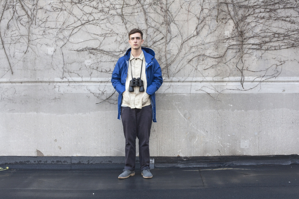
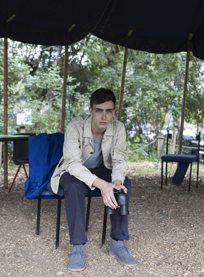
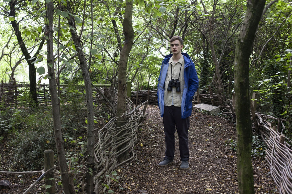
Teaming up with the classic British footwear brand, Mackenzie has focused his attention on two styles – the iconic Desert Boot and the slightly more obscure Trek style – and re-appropriated them in 6876-relevant materials. To coincide with the launch of the suede styles, and ahead of the leather versions due for release in February 2016, Mackenzie worked on a short film, from which these stills were taken.
Here, he explains his fascination with Clarks, what constitutes a healthy collaboration and defines his take on modernism.
“A good collab has to be believable and have a plausible link between the brands. In fact, at 6876, we have worked on collaborations since the year 2000 and I think we have kept to that promise. This time around it was Christian Hilton, who’s an avid follower of both Clarks and 6876, that suggested the link up, so it was a very organic start to the project. Clarks are a British menswear staple, but its products are very simple and accessible as well. I wore them growing up as a way to subvert my boring school uniform with Desert Boots and cords. Recently I was lucky to get a pair of the UK-made 65th year anniversary Desert Boots made, which is a very nice version of the original.
“Clarks Originals, in their purest form, have a very low-tech feel that I think fits with 6876 aesthetically. The Desert Boot was an obvious choice as it’s just turned 65; I chose the Trek because when I started 6876 that shoe was released with a very small production run and, worn with early 6876 products, became a bit of a uniform for me. The whole concept was to subtly upgrade materials and finishes to create a more luxurious version. We introduced a premium veg-tanned runner board, leather laces and made the crepe sole a much lighter un-dyed colour. The suede we used was a premium quality from Steads of England, who provided the original suede 65 years ago.
“Modernism is an aesthetic approach rather than a style – it’s the quest to keep moving forward and investigate the development of products. It’s function and evolution, as opposed to mere styling. Clarks, at its inception, was actually quite a modern and progressive brand, as the ideas behind the Originals were garnered through travel and utility. The Clarks family travelled extensively, as you can see from the museum, and I think the resulting footwear was a product of that. Nowadays I see them more as a classic, British institution.”
Stills taken from ‘Derive’, a Clarks Originals x 6876 film directed by Brian Sweeney
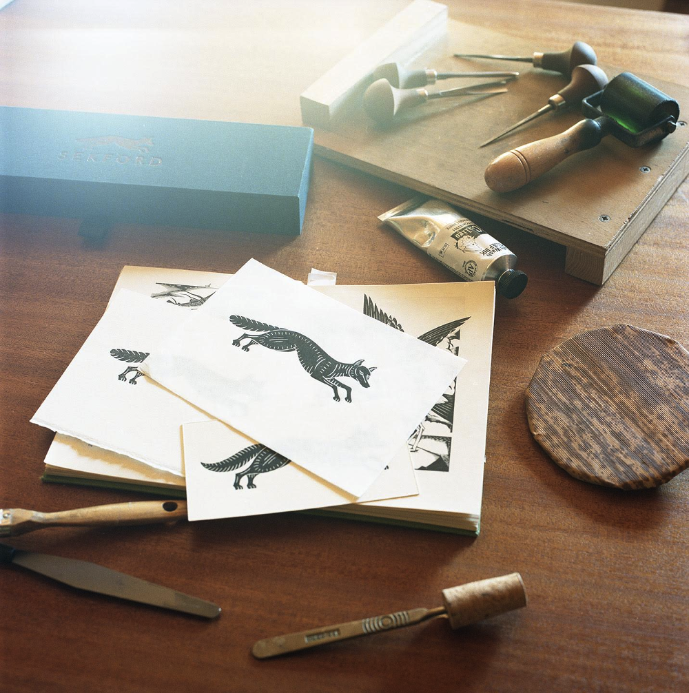
PORT travels to Lincolnshire to meet printmaker Mark Wilkinson to discuss the timeless appeal of wood engraving and how he created a Gothic-inspired logo for new watch brand Sekford
Mark Wilkinson’s work is limited edition by necessity. As a Lincolnshire-based printmaker specialising in linocuts, his entire creation process – from wood-carving to ink-print – is done by hand. Once the print run is complete, he scores his lino block, ensuring no further images can be produced.
Wilkinson’s work has roots in many places – from Japanese woodblock prints to the art scene of 1930s Europe. After a career with the RAF, Wilkinson discovered printmaking when he unearthed an old book and went on to find his own company, Inkshed Press. As part of a recent collaboration with new English watch brand, Sekford, Wilkinson created a Gothic-inspired fox, which has since become the brand’s logo and is engraved on the back of its debut watch series, the Type 1A.
We caught up with Wilkinson to chat about his craft, the printmakers he values, and the inspiration he draws from the skies of northern England.
What brought you to printmaking?
I was looking for a new direction to take in life having just left the Royal Air Force and a ‘thoughtful’ present for my wife’s birthday. I was on the verge of applying for a job collecting trolleys in a supermarket car park (and buying a bunch of petrol station flowers), when I rediscovered an old book I had of Eric Gill’s engravings. The pure, clean and deceptively simple lines inspired me to go out right away and buy a woodblock, a cutting tool, an ink roller and a tube of ink. The result was a dreadful woodcut of a letter L and a enduring love of printmaking.
Why do you think wood engraving endures in popularity?
For the same reasons that first drew me to it; its timelessness and the deceptive simplicity of line and form it allows. To my eye, it’s clean, pure, deeply satisfying and, when done right, completely beautiful.
What inspires your work?
The British and Irish wood engravers of the 1930s are at the core of everything that inspires me. Printmakers such as Eric Ravilious, Eric Gill and Edward Bawden are justifiably well known today, but others, such as Robert Gibbings, Leonard Beaumont, John Farleigh and Reynolds Stone, are, I think, deserving of much more recognition.
For the rest, my influences are eclectic and range from medieval woodcuts and 18th-century engravings to Japanese woodblock prints.
What brought you to Lincolnshire?
It was fortunate circumstances that brought me to Lincolnshire. I originally bought my house here as a result of being stationed whilst in the RAF, but I’ve kept it because of the big skies, wide open spaces, relaxed pace of life and beautiful mellow limestone villages.
How did designing the Sekford fox differ from your other recent projects?
The Sekford logo was the first truly collaborative project I’ve undertaken. With the Sekford fox, what I was trying to create was central to the company’s identity, and I felt the responsibility keenly. Thankfully the brand’s founder, Kuchar Swara (also a co-founder of PORT), had a very clear idea of what he wanted and, even more thankfully, we saw eye to eye on most things.
His input helped lead the project in directions it might not necessarily have gone otherwise, but with rewards that I hope are self-evident in the finished logo.
What’s next for Inkshed Press?
I’ve just completed a commission for a range of Christmas cards that will be shortly be hitting the streets and I’ve been invited to exhibit at the prestigious annual Fry Art Gallery Exhibition and Sale in Saffron Walden, which I’m hugely excited about.
Beyond that, Christmas is always a very busy time of year, with commissions already backing up, but in the New Year I hope, for what seems like the first time in an age, to be able to get on with some new original work of my own…
Photography Tobias Harvey
Sekford watches launched in autumn 2015. Prices start at £695
PORT travels to Stone Island’s headquarters in Ravarino, Italy, to explore the brand’s 33-year-old archive and shoot an exclusive editorial celebrating a history of design and innovation
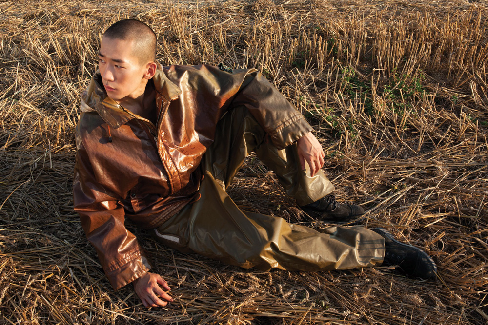
Translucent trilobate nylon hooded jacket with PVC glazed effect coating and glazed silk light visor, overalls SPRING SUMMER 1987
How to define luxury is a topic constantly discussed by premium fashion houses, and their customers; it isn’t enough to just hike up prices in order to be considered luxurious. In the case of Stone Island, the emphasis has always been on functionality.
“I think luxury is about feeling spoilt, wearing something special, beautiful, comfortable and functional – it’s a kind of fulfilment. That’s real luxury to me,” says Carlo Rivetti, creative director of Italian high-tech innovators Stone Island. “Research, experimentation and treatments on materials applied to innovative and functional designs define Stone Island,” he adds. “We’ve achieved an incredible ability to master garment dyeing through the continuous tests carried out in our colour laboratory for over 30 years.”
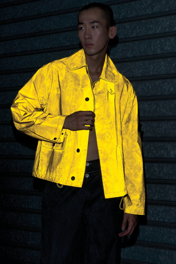
Reflective coated jacket with glass microspheres on a polyester base SPRING SUMMER 1993
In 2012, the Bologna-based brand celebrated three decades in business. The company was founded in the early 1980s by Massimo Osti, the man behind other technical staple brands like CP Company and Boneville. Osti’s presence is still felt in the building. “Yes, the imprinting he defined is still very strong in the brand’s DNA. Walking in the archive, I easily see this,” explains Rivetti.
PORT was given access to the archives for this shoot, digging deep into the brand’s history to highlight its relevance today. “My perception is that men wearing Stone Island feel like they’re part of a club. The removable badge on the left arm makes pieces recognisable and iconic,” says Rivetti. “I also think that our fans understand the functionality and research in fabric and treatments. Stone Island does the job; it protects; it keeps you warm, but it also looks good!”
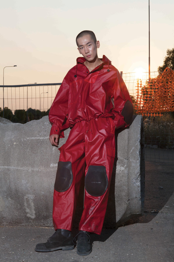
PVC cotton rubber effect jacket and trousers with moulded rubber patches SPRING SUMMER 1988
Stone Island is definitely ‘luxury’, but is it ‘fashion’? “Our approach is closer to industrial design than fashion, starting from the way our garments are conceived as design items, in which functionality and research are fundamental. We do not belong to technical outerwear, or activewear, or fashion. We design and use our technical knowhow to make everyday clothing that looks good and performs if needed.”
It’s this loose definition of the brand that sets it free; it’s not pigeonholed, and stays away from traditional high-end fashion platforms, such as the infamous industry ‘fashion weeks’, and yet can still be found in the same shops as Milanese luxury brands.
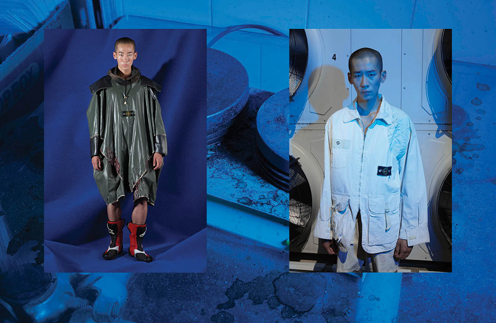
Left: Impregnated cotton canvas jacket with special pigmented resin in contrasting colours and cotton canvas shorts SPRING SUMMER 1983 – Right: Cotton canvas hooded cape with thick matte PVC coating and metal eyelets AUTUMN WINTER 1983
Its achievements are down to Rivetti’s level-headed approach to brand-building: “Success to me is to achieve something special every season and to carry on the integrity of the brand.” Looking forward, in order to ensure another 30 years of quality menswear, the family business needs to be replenished. “Yes, that’s why my sons and my daughter entered the company!”
But in the end it’s just an honest love of the creative process that drives the company forward. “I’m excited by the material research, the dye and treatment tests, the design and construction aspects, choosing the colour palette,” Rivetti sums it up. “This is magic to me.”
Model Wonjung Jo at Fashion Model Management Styling assistant Nathan Henry Special thanks Francesca Picciocchi
This article was taken from PORT issue 17. To buy a copy of PORT or to subscribe, click here
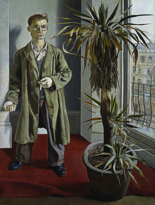
David Hellqvist examines the subtle wardrobe of Harry Diamond – the enigmatic street photographer who captured London’s art scene in the 60s and 70s
Harry Diamond by Lucian Freud, 1951 – Courtesy of Bridgeman Images
Today, ‘street style’ photographers follow celebrities around and post their images on blogs immediately. It’s a hollow business, often devoid of any genuine interest in the person. But back in the 1960s and 70s, it was photographers like Harry Diamond who documented London’s creative elite. Diamond wasn’t skulking outside the houses of painters Francis Bacon and Lucian Freud – he was part of the scene. He shot the artists who, in turn, asked the photographer to sit for them.
During two portrait sittings – one in 1951 and the other in 1970 – in Paddington, northwest London, Freud captured Diamond’s slender and nervous-looking figure. But, looking back, what stands out is Diamond’s subtle wardrobe. Even though they’re almost 20 years apart, both of his portraits speak of a sparse glamour; plain staples in beige, brown and white shades dominate his outfits. Around Soho, London, Diamond was dubbed ‘the man in the mac’ due to his choice of coat. His stylishness probably wasn’t conscious, but well-made quality basics were hard to come by, and the subtle colour choices helped the otherwise anonymous clothes stand out. Diamond and his contemporaries sported an art school style, characterised by unbuttoned formalwear. They lived and worked at a time when the term ‘casualwear’ was established and defined. This was before the introduction of sportswear as everyday clothing, and long after the formal Victorian dress code – a suit, tie, shirt and hat – had died out.
Today, Bacon and Freud are not only recognised masters of art but also widely acknowledged style icons. This AW15 season, brands such as Dunhill, Lou Dalton, Fendi and Paul Smith all look to their bohemian and boozy Soho lifestyles for inspiration. But, whereas Bacon and Freud have been religiously examined, men like Harry Diamond were able to dress and live outside the limelight, making for a more interesting style study. It’s no wonder luxurious high-end brands have come back to this time and place to find inspiration. But sometimes, as Harry Diamond proves, it pays to look beyond the most obvious figureheads.
This article was taken from PORT issue 17. To buy a copy of PORT or to subscribe, click here
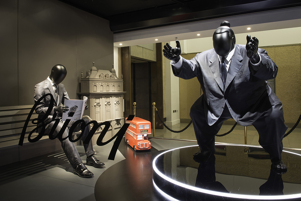
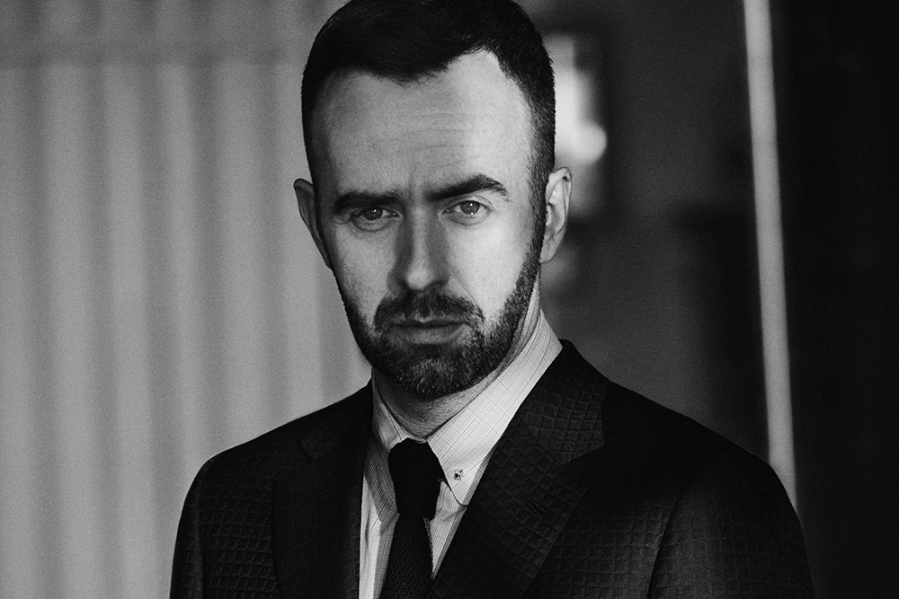
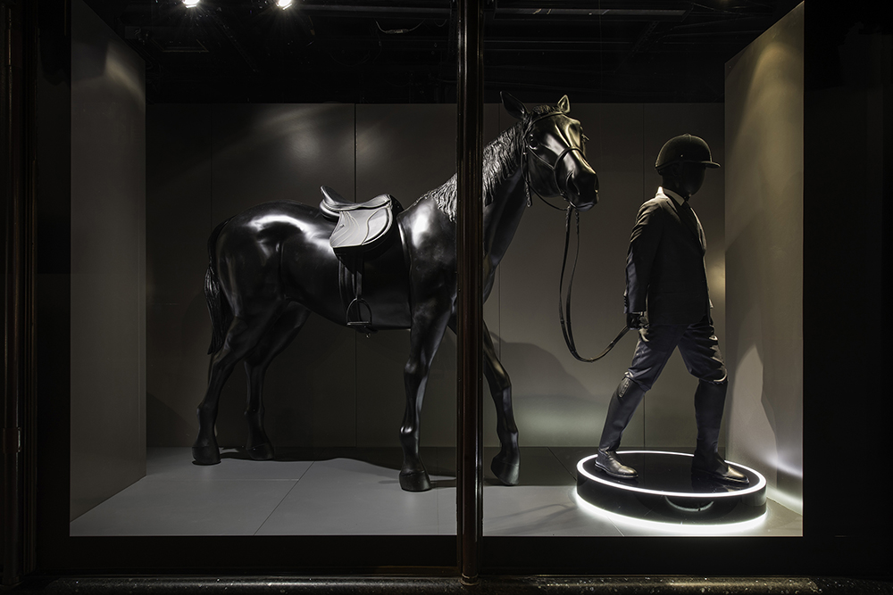
As Brioni celebrates its 70th anniversary and 40 years at Harrods, PORT chats to creative director, Brendan Mullane, about the brand’s sartorial heritage, the Su Misura service and the role the suit plays in the 21st century
Brioni window display at Harrods, London
Established in Rome in 1945, the history of the menswear brand, Brioni, stands as a symbol of Italy’s post-war rebirth. Extricating itself from the shadow of conflict and two decades of fascism, the country surged into the second half of the 20th century. Brioni successfully channelled the optimism of a fresh start after Mussolini and the luxury of the pre-war jet-set who frequented the Adriatic islands that gave the brand its name.
Within a few years, the sharp Italian tailoring and innovative approach – it held the first ever male catwalk in 1952 – established Brioni as a favourite of European aristocracy, Hollywood stars and world leaders alike. Now celebrating 70 years of business, Brioni continues to appeal to the famous and influential; Morgan Freeman, Barack Obama and, between 1995 and 2006, James Bond, have all been seen sporting Brioni suits.
Brendan Mullane, creative director of Brioni
“It’s the special way a Brioni suit feels that makes it so different,” says Brioni’s creative director, Brendan Mullane, when I ask why the brand has earned so many high profile clients. “It’s the fabrics we use and our ability to manipulate them to create something that is constructed but not constrictive, and then it’s the organic way the suit is built which means it gets better and better as it molds to your body,” he tells me.
“But the greatest thing is the experience of going to a tailor, laying your defects bare and having them completely transformed and hidden under a second skin that acts almost as a second layer,” Mullane adds. “This is what sets a Brioni suit apart and makes it very desirable to a real connoisseur.”
The personalised, Su Misura (meaning ‘made-to-order’ in Italian) service is really what defines Brioni. This autumn, Harrods in London is celebrating 40 years hosting Brioni tailors with a series of window displays that demonstrate how the brand’s tailoring service can accommodate people of all sizes – from sumo wrestlers to jockeys. It shows how in a commercialised, mass-produced market, there is still the potential to offer a bespoke product with traditional craftsmanship.
“The handcrafted way of working and the handmade element, within this tailoring language, is the foundation of everything we do inside Brioni,” Mullane explains.
One of the crucial innovations of the Su Misura service, and what tries to set Brioni apart from other tailors, is that, rather than being fabricated on site, the suits are produced at a factory in Penne, mid-southern Italy. Built in 1959 in the birthtown of the brand’s founding tailor, Nazareno Fonticoli, the factory now employs 400 master tailors in a well-trained and well-oiled production line. In a form of luxury Fordism, each worker is dedicated to a single process, with 80 workers responsible for the pressing alone, ensuring that these artisanal processes can be produced on a large scale.
Despite the scale of this tailoring process, Brioni insists there is no loss in quality or attention to detail. Each suit takes between 18 and 22 hours to put together, involves 220 individual steps and contains between 7000 and 9000 stitches. The bespoke element is also important when considering where the suit is destined, as each sewing phase is followed by an ironing and resting phase dictated by the fabrics used and the garment’s geographic and climatic destination.
Brioni’s intimate understanding of how to treat fabric is central to its approach to tailoring. Seventy per cent of the materials used in Brioni suits are exclusive to the brand, and selected from Italian, Japanese and English mills by a dedicated fabric design team. “The need for exclusiveness is of the upmost important to Brioni,” Mullane tells me. “It is the best way to strengthen our identity and drives our creative process. The fact we work in an artisanal way allows us to understand artisans and work well with them.”
It’s no secret that the role the suit plays in society has changed since 1945. I asked Mullane how a tailoring brand that helped define the dolce vita in mid-century Italy could remain relevant now and in the future. “A suit is always going to be relevant – it’s powerful, it doesn’t only give you confidence but it changes the way people see you,” he replies.
“The mix of the brand’s tradition, the constant innovation and research into sartorial mastery, means Brioni can meet the demands of the 21st century.”
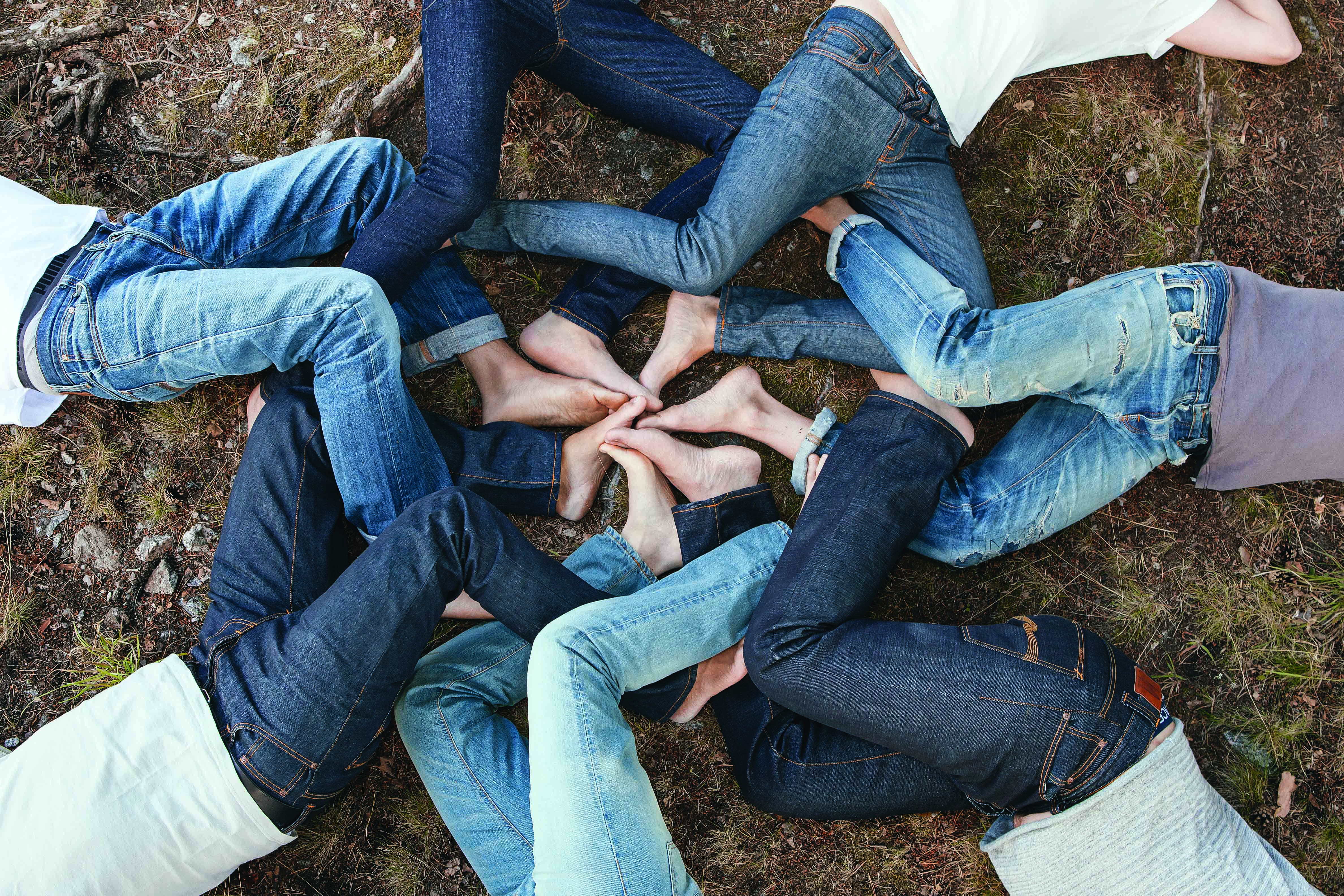
PORT’s fashion features editor, David Hellqvist, delves into the sustainable culture and the musical DNA that lies at the heart of Gothenburg-based denim brand Nudie Jeans
Denim is a universal fabric, worn regardless of nationality, gender, age and class. Its early pioneers were American brands like Levi’s, Lee and Wrangler, who used the fabric for workwear because of its functional and durable qualities. These days, due to their obsessive quest to improve denim, Japanese brands are leading the high-tech charge when it comes to fabric innovation. But, at least from a stylistic perspective, a recent Swedish surge has played a crucial role in shaping what jeans of the future look like.
Acne Studios, for example, was a pure denim brand before it chose to focus on the high-end fashion aspect of its business. Today, there are plenty of established and well-known brands, as well as niche startups, selling the Scandi look. In line with the Nordic notion of ‘sartorial democracy’, there are also affordable jean brands catering for the young and trend-led masses: Cheap Monday, for example, which is owned by Swedish high street chain H&M.
An unusual Gothenburg-based jean specialist sits somewhere between these brands, quietly spreading its denim gospel across the world. Since it was launched in 2001 by creative director Maria Erixon, Joakim Levin and Palle Stenberg, Nudie Jeans has managed to craft a unique brand with a different point of view. Not easy to pigeonhole and with an individual approach to product development, the brand has its own definition of success.
“Nudie Jeans was born out of a dream not to compromise,” Erixon explains from Gothenburg, Sweden’s second-largest city. “We committed to being independent, and staying independent, right from the start. Doing what we do, the way we want to, is at the heart of our DNA and ultimately what I believe has led to our success today.”
PORT’s guide to Nudie Jeans proudction in 2015 – Infographic by Ling Ko
That DNA was, and still is, hugely influenced by music. “Joakim’s background was music, while mine and Palle’s was denim,” Erixon adds. “These influences and experiences were complementary and caused us to be pragmatic.” Today the focus is perhaps less on dressing rock musicians (although their jeans are a common sight at festivals, both on and off stage) and more on making Nudie Jeans the best company it can possibly be. Since 2011, it has taken a new approach to the life span of a pair of jeans, which has meant more than just looking at the selvedge and measuring turn-ups.
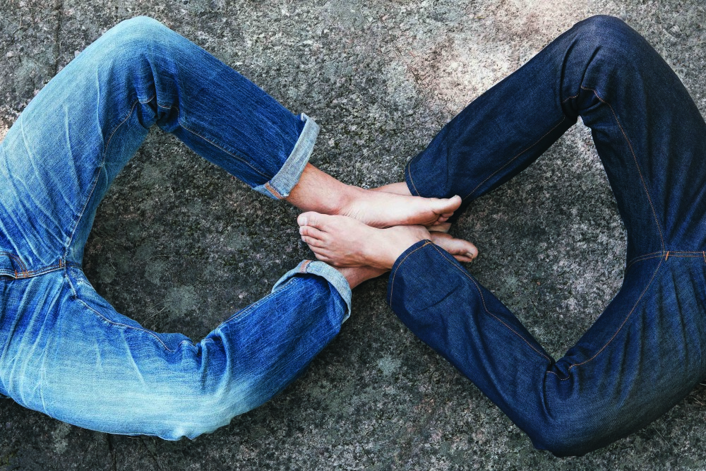
“There is no fabric like denim that has the ability to reinvent itself within its own domain, whilst also staying true to its original identity,” Erixon says. “Denim is an institution and has, as such, a unique ability to form a relationship and alliance with its wearer. No other fabric gets better the more you wear it. And tear it. And repair it!” The ‘repair’ part is key. Instead of throwing away used and torn denim, Nudie Jeans encourages customers to bring in the damaged pieces to a Nudie Jeans Repair Shop, where they’re mended. Either the customer goes away with fixed jeans or they leave them behind and buy a new pair, with a 20 per cent discount. The leftovers are either broken up and used separately or mended and sold as vintage jeans.
“Prolonging and extending the life of your denim is at the centre of the Nudie Jeans Eco-Cycle philosophy, and the Repair Shop concept really is a response to this,” says Palle Stenberg, cofounder and CEO. Last year, they repaired over 30,000 pairs of jeans in-store globally. Since the beginning of June 2015, the figure was at just over 20,000, meaning over 40,000 pairs of jeans are expected to have been handed in at the end of the year. The dedication pays off; in the past, Nudie Jeans has received domestic Swedish awards for the programme, and, earlier this year, won the ‘Sustainable Style’ category at the Observer Ethical Awards.
But Nudie Jeans also looks at what can be done to improve the denim’s ethical DNA before it gets to the repair stage. “Conventionally produced denim takes a lot of cotton to be harvested in order to meet consumer demand, and the environmental impact is huge, leaving the earth ravaged and taking years to repair itself,” Erixon says. “To combat this we now only use organic cotton in our jeans. The purpose is to ensure Nudie Jeans’ customers have the best possible garments, made the best possible way.”
“We want to ensure we do not expose workers involved in the cotton and garment production to the dangerous pesticides, fertilisers and defoliants associated with conventionally grown cotton. We care and are conscious of the environment, and do not want to contribute to the damage on the land where conventional cotton is grown,” says Sandya Lang, corporate social responsibility manager at Nudie Jeans. “Finally we want our consumers to see the benefit of using organic cotton instead of conventional grown cotton, and realise it benefits all persons in contact with the organic denim product along the supply chain.”
In 2012, the Repair Shop concept was officially launched and Nudie Jeans took its commitment to ethical manufacturing to a new level. The brand started to audit its suppliers and subcontractors globally. Later, all this information was uploaded onto the Nudie Jeans website as a ‘Production Guide’, where everyone can read up on the audits carried out on mills and factories. Initially, not everyone was convinced.
“Admittedly, at first, the reaction was a bit mixed, depending on where our suppliers were located. For example, it was easier to make the audit in India than Italy at first, as Indian suppliers are used to European companies conducting audits at their factory. Whereas this was a rather unusual request for Italian suppliers,” Lang says. “But after we explained our purpose and intent with the audits, it’s not been difficult to have them engaged in the process.”
Making jeans that are worn by rock stars is one thing, but to do that while upholding integrity and social responsibility – towards customers, staff and nature – is entirely another, especially in a highly competitive environment. But Nudie Jeans has a clear goal, and knows what the ultimate purpose of the brand is: “We want to produce great quality clothing as responsibly as possible to the environment, and to our people. In our brand literature we state there should never be a trade-off between manufacture and environment, or profit and people, and we live by that,” Stenberg sums up. “We want to inspire other brands in this industry to follow suit and produce responsibly and sustainably. This is a global effort.”
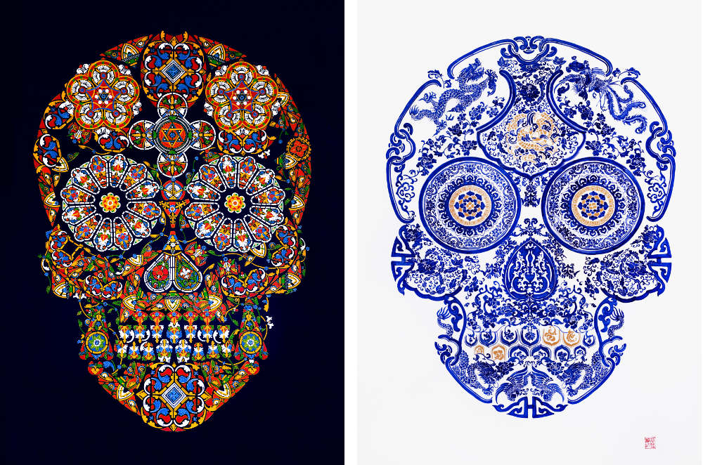
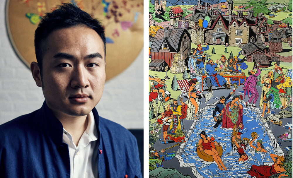
PORT visits the London studio of Chinese artist Jacky Tsai, creator of Alexander McQueen’s iconic skull motif, to talk pop art, superheroes and life after working with the legendary fashion designer
Jack Tsai in his east London studio
Jacky Tsai is a master of cultural crossover. Born in Shanghai and now based in London, Tsai draws directly from his own experience of cultural integration to create artworks that bring Eastern and Western cultures face-to-face. Having arrived in London in 2004, Tsai quickly fell in love with the city. After studying illustration at Central Saint Martins, he began an internship at Alexander McQueen that would change his trajectory as an artist forever.
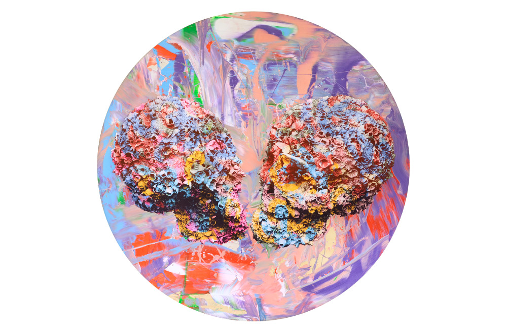
Stained Glass Skulls by Jacky Tsai. Image courtesy of the artist and The Fine Art Society
While at McQueen, Tsai was given a design task that resulted in the creation of the now iconic flower skull. “I think I was in the right place at the right time. They gave me a chance to prove myself and I didn’t just want to make the tea and coffee every day, so I tried my best,” he says. “It all happened in a very accidental way.”
Today, Tsai is conflicted in his relationship with a design so internationally celebrated that it has often overshadowed his achievements as an artist in his own right. “I created this beautiful piece when I was very young and, for a while, I grew fed up of answering questions to do with McQueen,” he tells me. “When Alexander McQueen passed away, all the interviews I gave were about him and not Jacky Tsai the individual.”
This summer, Tsai opened his first UK solo exhibition, which ran at London’s Fine Arts Society. For the show, Tsai combined the intricate grace of traditional Chinese techniques – lacquer carving, enamel cloisonné, and blue and white porcelain printing – with the vibrant immediacy of Western pop art, all revolving around an unexpected yet ubiquitous reference point for both cultures: superheroes.
Culture Clash, Jacky Tsai. Image courtesy of the artist and The Fine Art Society
“I think each superhero symbolises a superpower from different cultures,” Tsai explains. “In the past, when China was a superpower in the world, we had a lot of Chinese novels that featured superheroes.”
Drawing from the superhero narratives of both cultures, Tsai created a series of intricate tableaux depicting the interactions and altercations of these mythical figures; Wonder Woman is wooed by the Monkey King, while Empress Wu is saved by Tarzan.
Left: Jacky Tsai – Right: The Romance at The Hamptons by Jacky Tsai. Image courtesy of the artist and The Fine Art Society
Besides traditional Chinese techniques, Tsai is influenced by Western cartoons and artists including Andy Warhol and Roy Lichtenstein, whom he admired as a young man. However, keen to avoid imitation, Tsai borrows elements of his heroes’ work and adapts them to his own experience to create a new pop art. “Pop art is something of the past, so we have to bring something new,” he tells me. “I’m trying to make pop art in a Chinese way with more detail and more craftsmanship.”
Tsai takes his role as a contemporary Chinese artist in a Western city very seriously, acknowledging a certain obligation to continue aspects of his cultural heritage. “I feel responsible to do that as a London-based Chinese artist,” he says. “I think I can bridge the East and the Western cultures in a Chinese form… a traditional form.”
Kissers by Jacky Tsai. Image courtesy of the artist and The Fine Art Society
While he owes much of his early success and artistic development to McQueen, Tsai’s debut London exhibition went some way to redress the balance of attention towards his other work, and was an important step towards establishing him as an artist in his own right.
“I don’t want to completely turn away from McQueen, because that experience made me realise I could do something special,” he says. “Before that I didn’t have any confidence, and my time there helped me to develop my aesthetic and to learn the way to make my art. I got so much from the McQueen skull, but I hope people can concentrate more on the new Jacky Tsai, or the future Jacky Tsai.”
Photography (Images of Jacky Tsai in his studio)Aldo Filiberto
PORT meets the enigmatic German filmmaker to discuss the movies that influenced his career, his penchant for 3D film and a recent collaboration with Italian eyewear brand Persol
Wim Wenders on the set of Vai Paparazzo!
Wim Wenders isn’t so much a director, as a polymath. The 70-year-old German filmmaker, best known for his BAFTA-winning Paris, Texas, is also an author, playwright, painter, producer, actor, photographer, cinematographer and editor. He has a wicked sense of humour too.
It’s early evening in Milan and Wenders is getting ready to unveil his latest project: Vai Paparazzo, a film for the Italian eyewear brand Persol. In the brief time we have been chatting, there are brilliant flashes of Wenders’ classic wit and the first arrives at an unlikely juncture.
“My most challenging film was Until the End of the World,” Wenders says, perched on the edge of his armchair. He’s wearing a beige suit, white button-up shirt, and his signature eyewear, horn-rimmed glasses. He looks formal, that is until you spot the red Converse trainers.
“Until the End of the World was the most ambitious film I’ve ever done, and the most expensive,” he tells me. It’s no secret that Wenders’ passion project was a big undertaking. The film took over 15 years (and $23 million) to produce. And, to make matters worse, it was heavily edited by the film’s distributors. “We had to release the film in a ‘Reader’s Digest’ version”, he says. “That sucked,” he says, trying his best to suppress a smirk.
It wasn’t until the 1960s, when he was in his late 20s and working as an engraver in Montparnasse, that Ernst Wilhelm ‘Wim’ Wenders truly discovered film. And one film, in particular. “I found a movie that was so close to my own childhood,” he says. “So close to all the ruins and debris of war that I had grown up in, and that was Vittorio De Sica’s The Miracle in Milan.” This was to inspire one of Wenders’ most popular productions, Wings of Desire – both films feature ravaged postwar cities, their impoverished denizens clinging on to hope and angels intervening with the natural order. But make no mistake, Wings of Desire is still very much a Wim Wenders film: poetic, bleak and with a beautiful black and white aesthetic that was created by using a filter made from the stocking belonging to the grandmother of French cinematographer Henri Alekan.
Cellor by Persol
Wings of Desire was preceded by the critically acclaimed Paris, Texas in 1984, but four years later, Wenders’ career took a turn for the worse with Until the End of the World. Wenders sci-fi flick grossed a paltry $752, 856 at the US box office. However, the director assures me that there’s still hope for his dystopian epic. “It’s still a project that I’m extremely attached to,” he says with a sigh. “I’m very proud of it. And now, a quarter of a century later, I can show and release the real film, which is my cut, the original length.” And how long is the original? Just short of five hours.
Two years after Until the End of the World, Wenders hit back, this time with his Wings of Desire sequel, entitled Faraway, So Close! which was awarded the Grand Prix de Jury at Cannes Film Festival. In 1999, Wenders’ career soared to even greater heights with the release of Buena Vista Social Club. The Academy Award-nominated film documented Wenders’ long-time friend and collaborator, Ry Cooder, reuniting the legendary the Cuban musicians to perform for the first time since Fidel Castro’s reign. The film made an impressive $23 million at the box office, but Wenders wasn’t going to rest on his laurels.
In 2011, Wenders returned to cinema yet again, but this time, making his first foray into 3D filmmaking was the Oscar-nominated documentary Pina about the contemporary dance choreographer Pina Bausch. The film was met with universal acclaim and altered Wenders’ entire approach to filmmaking. “I’m so into 3D now that it’s almost an effort to think in two dimensions, let alone in black and white,” he says, laughing.
His latest film, Every Thing Will Be Fine, starring James Franco and due for release in December, is Wenders’ fifth film in 3D. It’s also his first full-length dramatic feature in seven years. In the interim he’s directed various shorts and documentaries, including the Oscar-nominated The Salt of the Earth, about the Brazilian photographer Sebastião Salgado. And then there’s his most recent triumph Vai Paparazzo!, which Wenders shot for Persol’s re-launch of the Cellor, a series of collapsible frames first released in the 1950s.
The short is a sumptuous homage to the golden age of Italian cinema and evokes the work of Italian directors such as Roberto Rossellini, Federico Fellini, and De Sica, whose grandson, Brando, was even on hand to direct the behind-the-scenes video. “He’s a very talented young man with a very heavy burden,” Wenders says. “It’s not easy to carry that name, but he carries it elegantly.” He smiles, gently pushing up his horn-rimmed glasses.
Vai Paparazzo! is also Wenders first time acting in four years. “I still feel much more comfortable behind the camera,” he explains with a self-deprecating laugh. “You’re so self-conscious when you’re in front of the camera. You can’t even watch yourself at the same time.” He rolls his eyes, feigning vanity. Then, all of a sudden, there’s a sly grin. “But it was fun!” It seems that even after 70 years and 59 films, the director hasn’t lost his touch. Or his wicked sense of humour.
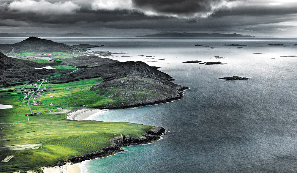
As Wool Week UK launches, photographer Ian Lawson describes his fascination with the Outer Hebrides and its hard-working shepherd community
Isle of Harris, Outer Hebrides, Scotland
I first travelled to the Outer Hebrides in search of the light. The long summer days of the far north, the twilight hour of changing colours on Brae and Ben, and the open sky where the wind blows salt freely. It was to be a rendezvous with beaut; I went with an open mind and an open heart. This unique environment of unchanging beauty is the home of Harris Tweed and my book, From the Land Comes the Cloth, attempts to show the intimate connection between land, thread and weaver.
Everywhere I went, I found intrigue in this wild, illuminating land of tweed. I visited at different times of the year and watched the slow procession of the seasons. But four years ago, something very peculiar happened. One spring day, on a still morning of clearing skies over West Harris, the hills lay quiet and green. A shepherd was calling clear Gaelic commands from the dunes that overlook the ocean. As I watched his flock of white wool scampering towards him up the grassy slopes, the landscape unexpectedly came to life. It caught my eye, excited my mind and a vital connection was made. Land, shepherds and sheep, all cooperating with an impassioned sense of timing and order… Each fitted into an old routine. I realised that people are the essence of what this landscape is about for me – their lives, the very fabric of existence here.
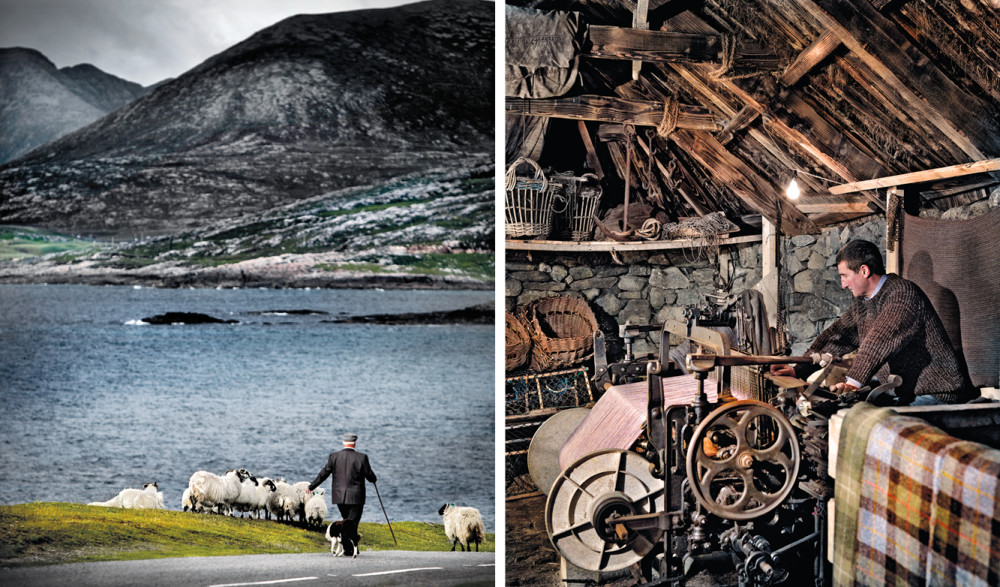
Left: Angus Macsween, Horgabost, Isle of Harris – Right:Loom shed, Gearranan, Isle of Lewis
I soon found myself alight with inspiration and set about documenting the land at work. The story of wool to weaver provided me with a way into a culture of which I had little previous knowledge or experience. I came to think of Harris Tweed, not as a product but as a process, encompassing and illustrating an entire way of life. During the day of the sheep gathering, an ambition was born. I would commit myself to a heartfelt study focused on the Isles of Harris and Lewis, a project over which I could exercise complete artistic control. It was an opportunity to give something back to the place that had inspired my creative adventures and ambitions.
The Outer Hebrides are remote. In fact, it’s their very remoteness that attracts me. Every time I hear the phrase Outer Hebrides it conjures up an ancient land, a place on the edge. But when the sea was the main highway for travellers, these islands weren’t so very far away at all. The perpetual rhythm of the North Atlantic has shaped some of the oldest rocks in the world into fifty or so islands, around fifteen of them inhabited. Together, they make up the most extraordinary archipelago, home to close-knit communities, rare wildlife habitats and teeming seabird colonies. A photographer’s paradise.
Today’s inhabitants have inherited a rich cultural legacy reaching back to the Iron Age Celts, the Norsemen and other settlers and invaders. Everywhere I go, I find place names derived from Old Norse: Luskentyre, Horgabost, Scalpay, Shawbost, Ness, Callanish – a legacy from the Vikings who settled in these islands from the eighth century. Here among the rocks and peat, along the arteries of loch, road and sea, I’m glimpsing patterns of existence that have survived through generations. But most of all, my eye is drawn to the daily rituals of crofters in small townships and on isolated crofts, people in tune with their environment. Something about their world touches me. And I want to know more. Here’s the story about how I met with one of the people living here, taken from From The Land Comes The Cloth.
Pastures New, Valtos, Isle of Lewis
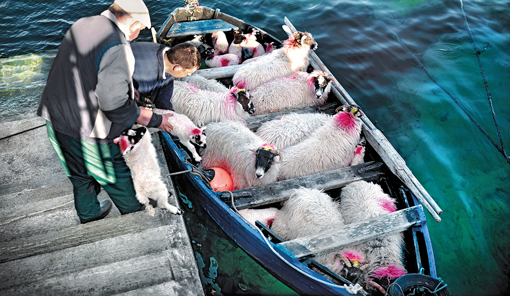
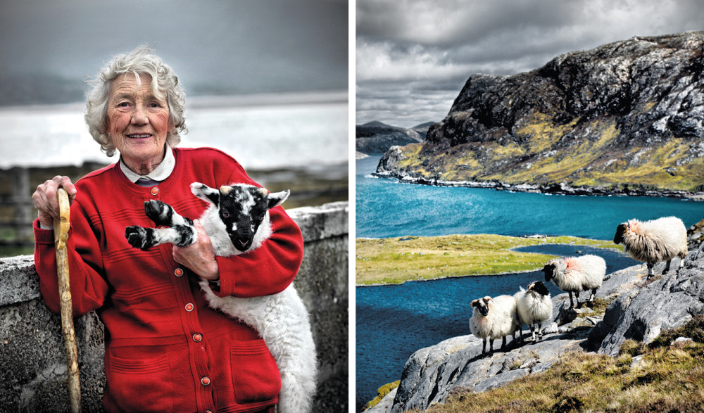
I meet Morag Mackinnon at the Luskentyre fank (sheep pen) in mid-summer. She is helping shepherds and fellow crofters clip and sort ewes and lambs, happy amongst the wool and hard graft. Morag’s job today is to buist each sheep with a red, blue or green marking once the fleece is clipped. She rolls and bags each fleece, her hands shiny with lanolin. The red cardigan she wears is flecked white with shorn wool. She works confidently and efficiently while entertaining us all with her playful wit.
A cool breeze from the shore eases the heat of the day. With heads down and backs bent, the shepherds work tirelessly, humour flowing as freely as fleece falling from the shears. Beyond the fank wall, flocks of oystercatchers are wading and calling. The wall itself is topped with sea pinks and scattered with shells, driftwood and bird feathers. Overhead, a noisy pair of Arctic terns defend their territory. Morag leans against the fank wall with a late lamb under her arm and a shepherd’s crook in her hand. She smiles mischievously at me and says: “Ian, you can take my picture now. The Beauty of Harris is ready for your camera!”
She jokes and teases me, making me feel so at home on the headland. I’m inspired by her zest for life and her humour, a Hebridean woman with spirit, passion and grit. She’s grasped life with both hands and lived it. Morag’s home is a stone’s throw from the fank and must have one of the best views in the world. Her garden is a sea meadow of wild flowers. Her front door looks out onto the white sands of Luskentyre. Morag has lived here for most of her life, working a croft of just under 80 acres.
She tells me she’s done her best with her croft and wouldn’t change a thing – even if she had to do it all over again. Morag’s family were crofter-weavers. Her mother gathered crottal, a flowerless plant that grows abundantly on the island’s rocks, to hand-dye wool outside the back door in a huge cast-iron pot. The crottal was placed in the pot along with the fleece and brought to the boil. After an hour or so, it produced a rich earth tone and was widely used for colouring tweed. The pot still stands by Morag’s back door, a reminder of days gone by.


 The 170-year-old Spanish fashion house installs an 18th-century granary and an exhibition of British art at its US flagship store, to coincide with Art Basel Miami