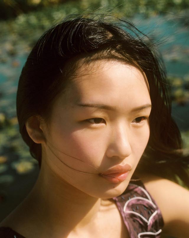
Twenty-five years on, Sofia Coppola’s debut film continues to shape how we see girlhood
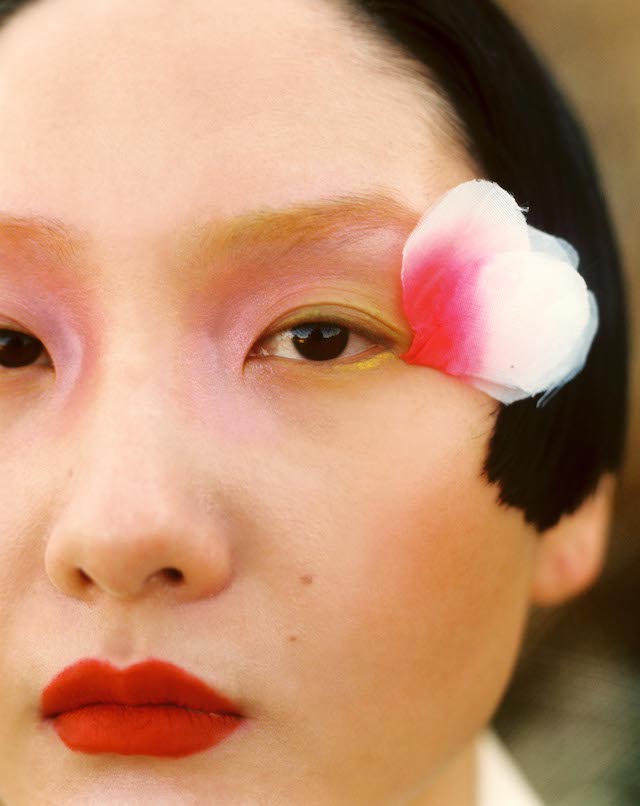
In depicting Cecilia Lisbon’s first attempt to end her life, Sofia Coppola created a timeless image. Her seminal adaptation of The Virgin Suicides is filled with these, but this frame of a 14-year-old Hanna R. Hall always stayed with me: lying in the still pink water of a bathtub with her tawny hair splayed out, expression serene. Bathed in the dim blue of summer twilight, the scene is a conscious echo of John Everett Millais’s Ophelia, whose fictional subject is also clothed in a pale gown, part-submerged and in the throes of madness. Evoking enduring images like Pre-Raphaelite portraits and religious motifs, Coppola situates her depictions within a long tradition of art history, staging contemporary scenes that feel both familiar and eternal.
Like many others who first encountered the film as a teenager, the Lisbons’ sticker-lined bathroom ledge was instantly recognisable to me as an altar to girlhood by way of consumption – powder brushes, perfume bottles, nail polish, lipstick, bangles and candles – and through the strategic draping of a crystal bead and crucifix necklace, implicit of a life constrained by Catholic upbringing. Kitschy compelling details like these are a hallmark of Coppola’s cinematic work, which critics today recognise as having a profound influence on the iconography of female melancholy.
When the filmmaker, then 27 years old, began shooting the suburban malaise of her debut feature, she had already dipped a toe in several industries – having appeared in multiple music videos, produced four episodes of an ill-fated Comedy Central series and interned at Chanel as a high schooler. In this respect, Coppola is arguably as much a part of the pop culture infrastructure as a formative influence upon it, and her multidisciplinary approach has become second nature for style-adjacent brands anxious to keep evolving their offering.
In aestheticising the Lisbon girls’ suffering, she made a non-physical illness legible to audiences who might struggle to grasp its invisibility. By doing this, Coppola also iconised the ‘sad girl’, positioning her as a disruptor rather than a victim and turning her into a vaguely aspirational figure. She’s effortlessly beautiful, stoic in her abjection, and with a sympathetic rage in her heart; she is given agency, and therefore dignity, in the deaths she dies.
In a recent retrospective for The New York Times, Emily Yoshida writes that Coppola’s films comprise a “stylistic manual for how to be sad, or at least disaffected” in today’s world. But Coppola’s filmography isn’t instructive as much as it is unabashedly expressive and unfailingly allied to the visual, experiential and imaginative – a Magic Eye book more than a manual. However, this hasn’t stopped players in fashion, film and music from taking extensive notes, or adopting concepts wholesale.
The most high-profile designer in this regard is Marc Jacobs, with whom Coppola has an artist-muse relationship described as one of fashion’s “great platonic love stories”: she’s modelled in his campaigns, sat front-row at his fashion shows and worn his clothes to her premieres. In 2014, Coppola directed a short for Daisy Dream, the then-latest instalment in Jacobs’ cult-favourite perfume line. The video uses the dissolve transitions employed in the dream sequences of The Virgin Suicides, which also feature fading palimpsests of blue sky and grassy fields. Campaign face Antonia Wesseloh is styled in accordance with the naturalistic Lisbon girl look, wearing a flowy prairie-style dress and imperceptible makeup, her long hair lank and loose around her shoulders.
While Coppola didn’t install lithe young white girls as the aesthetic ideal, her films further glorified and romanticised their appearance, reinforcing a narrow scope of desirable femininity and unfortunately contributing to an ever-expanding repository of imagery weaponised online to inspire anorexia. Thus, Coppola’s heroines live a second life on social media as “nostalgia effigies”, a term used by cultural critic Safy-Hallan Farah, who also invokes Tavi Gevinson’s Rookie magazine, the photography of Petra Collins, and “Lana Del Rey’s fully-realised visual and sonic identity” as associated totems.
What each of these touchstones present is a highly-stylised facsimile of unattainable girlhood, burned on a stake but remembered forever. A quarter century after the premiere of a film set another quarter century before that, The Virgin Suicides endures in its portrayal of adolescent desire and terror. An art object whose central critique is of the implicit violence wrought on the female body, its visuals were perhaps always going to exist apart from their far pricklier context. As it continues to age, find new audiences and accrue acclaim, the film only appreciates as a time capsule full of anachronism: a wholly uncondescending coming-of-age tale that asks us to believe what we see rather than what we’ve been told.
This article is taken from Port issue 36. To continue reading, buy the issue or subscribe head here
Before Star Trek fan fiction, Flame Con and AO3, there was an underground network of fanzines, occult circles and speculative visions that tied sci-fi to queer identity. Kyle Turner traces the coded language, hidden gatherings and radical ideas that shaped a subculture
Hubert Rogers, Revolt in 2100, 1953. Oil on canvas, 21 x 17 in (53.34 x 43.18 cm).
Courtesy of the Korshak Collection
Grand Prospect Hall – which sat in Park Slope, west of Prospect Park, as a reminder of the Gilded Age, when Brooklyn had to entice New York’s wealthy away from middle and lower Manhattan – was, until its demolition in 2022, old enough for its turn-of-the-century design to feel like another world. Gilt edges, sparkling chandeliers, balconies encrusted in gold paint – all sensibilities of a still very young America. The Industrial Age could give birth to extravagances like this beautiful banquet hall, first built by entrepreneur John Kolle and designed by Ulrich J Huberty in 1892, while draping other parts of the city, the country, in poverty. A character in Edith Wharton’s The Old Maid reflects, “All that I thought American in a true sense is gone, and I see nothing but vain-glory, crassness and a total ignorance.”
The American Federation of Labor had emerged in the late-1880s as a redirection of the priorities of the Knights of Labor, and Karl Marx’s third volume of Das Kapital, which was published in 1894, heavily influenced those Knights members who jumped to the AFL. New worlds, hopeful visions of justice for workers and all people, were being sketched out even as New York, across its boroughs, looked towards greatness and majesty. Grand Prospect Hall could be seen as a totem of Brooklyn’s seriousness as a social space – just as appealing as Carnegie Hall (founded the year before) – and a locale where history and tradition provided a foundation for what was to come. At least in the sense that in June 2015, what had been used for myriad events – weddings, performances, rallies by the likes of media tycoon William Randolph Hearst and politicians like William Jennings Bryan – could also become the new and first home of Flame Con, the first LGBTQ+ science-fiction/fantasy convention.
Cameron, Holy Guardian Angel According to Aleister Crowley, 1966. Caesin and gold
lacquer on board, 29.5 x 19.25 in (74.93 x 48.895 cm). Courtesy of the Cameron
Parsons Foundation, Santa Monica
A modest event effort on the part of Geeks OUT, a non-profit organisation for self-identified “queer geeks”, Flame Con began as a Kickstarter campaign seeking to raise $15,000 for event costs. Geeks OUT handily raised $20,000, and booked Grand Prospect Hall, welcoming over 2,000 attendees in all manners of cosplay and adoration. The line connecting emergent labour movements in the late-19th century and gay nerds in Sailor Moon attire is less circuitous than one might assume.
LGBTQ+ sci-fi fandom is arguably the powerful undertow beneath the dominant, straight forces of genre fan communities. For every message board or group chat that either doesn’t directly appeal to LGBTQ+ people or actively disregards them, there are dozens of splinter groups with queers in tow. Queer people’s relationship with science fiction, occultism and magic(k), stretches even further back than the advent of Star Trek fan fiction in the 1960s.
Around the same time Wharton was documenting a changing upper-class New York in the mid-1920s, magazine publisher Hugo Gernsback launched what is considered the first science fiction magazine, Amazing Stories, in 1926. Gernsback, who is the namesake of the prestigious Hugo Award for speculative fiction writing, had gone bankrupt in 1929, but when body builder-cum-eugenicist Bernarr McFadden acquired Gernsback’s Experimenter Publishing Co, it allowed science fiction and sexuality to begin to, shall we say, cross-breed.
Jim Kepner, cover of Toward Tomorrow no. 2, June 1944. 11 x 8.5 in (27.94 x 21.59 cm). Courtesy of ONE Archives at the USC Libraries, Los Angeles
While McFadden was already a purveyor of, if not outrightly gay, then at least homoerotic content, vis-à-vis his magazine Physical Culture, the consolidation of all of McFadden and Gernsback’s titles together would mean that the latter’s title Sexology would be under the same umbrella, and therefore, produced by the same workforce.
Gernsback’s daughter Tina and Frank R Paul handled art direction for all the titles that comprised Gernsback’s Experimenter Publishing Co, meaning that the same eyes and creative minds that imagined the covers of Amazing Stories would also do so for Sexology. Robert Silverberg, the author of such speculative fiction works as Nightwings (1969) and Downward to the Earth (1970), wrote for both Gernsback’s sci-fi magazine and his sex one, under the pen name LT Woodward. And as successful as Amazing Stories was, sometimes reaching a circulation as high as 110,000, Sexology edged out its fantastical sibling by nearly double that at 200,000.
Renate Druks, Self-portrait (state of mind), 1967. Oil on board, 40 x 36 in (101.6 x 91.44 cm). Courtesy of The Ranch, Montauk
These connected dots are crucial, particularly in sketching out sci-fi fandoms and queer communities as effectively subcultural. It is easy to take for granted the prominence of sci-fi titles, spaces, properties and ancillary products today, or at least the ones that capitalise on existing intellectual property which are then thrown into a meat grinder of perpetuity. But the combination of the lack of mass telecommunication and much stricter social mores around sexuality and identity invited these clandestine communes, initially disparate though they were, to intersect and inform one another. And that was done the old-fashioned way: in print.
It was in the pages and between the lines of magazines in the first half of the 20th century that queer people and sci-fi fans found ways to interact, creating a compelling meta-commentary. If speculative fiction is built on imagining new worlds and new kinds of people – or perhaps new kinds of relationships – then readers of Amazing Stories or ONE Magazine (published by members of the Mattachine Society) had to navigate the limits of print to connect. They sent letters to the editor or to classified sections, hoping to find like-minded individuals, but the gaps between publication cycles meant that much of this interaction took place in the space between the printed word and the reader’s imagination. Without direct, immediate contact, they had no choice but to conjure the people they were reaching out to in their minds.
Morris Scott Dollens, The Forest and the Far Land, undated. Photomontage, 10 x 8 in (25.4 x 20.32 cm). Courtesy of ONE Archives at the USC Libraries, Los Angeles
It was maybe this curious lack of immediacy, and the time and intentionality needed to craft these real and imagined communities, these made-up yet possible worlds, that appealed to early queer, gay and homophile activists. Chuck Rowland and Harry Hay, co-founding members of the Mattachine Society and both magazine and fanzine publishers, as well as gay rights historian Jim Kepner and sci-fi illustrator Edith Eyde (aka Tigrina), all had abiding love for sci-fi and occultism. Hay dabbled in Aleister Crowley’s Magick, Rowland was an avid reader of Amazing Stories, Kepner published fanzines with socialist and Marxist attitudes like Toward Tomorrow, and Tigrina published the first American lesbian-focused zine Vice Versa. Kepner and Tigrina met at the Los Angeles Science Fiction Society (LASFS), while Rowland and Hay, both communist leaning, would help to found the Mattachine Society, and then, as the gay rights group took a turn towards the liberal assimilationist in 1953, be purged from the community they both helped codify.
The steps from fanzines and magazines to in-person meetings were an important part of the process for queer people and sci-fi fans. Forrest J Ackerman, co-founder of LASFS with Gernsback, wrote for Tigrina’s lesbian zine Vice Versa as well as The Ladder after meeting Tigrina and Kepner at LASFS meetings. He was also given the title of ‘honorary lesbian’ by the lesbian homophile group Daughters of Bilitis, for his support of LGBTQ+ people.
Grace Talbert, cover of Voice of the Imagi-Nation no. 19, November 1941. 14 x 8.5 in. (35.6 x 21.6 cm). Courtesy of ONE Archives at the USC Libraries
It was at these parties and gatherings that those who felt ostracised by society and yearned to imagine something more free and just, even as they transformed real-world systematic issues and anxieties into the work, could under plausible deniability meet one another off the pages of the editor’s letters. Arthur C Clarke, the author of 2001: A Space Odyssey and a homosexual, would attend parties with sci-fi fan Peter Reaney, who would appear as his female alter ego Rita Peaney. And while rocket scientist Jack Parsons was less of a sci-fi person, his interest in the genre – via Jules Verne – intersected with his Thelemite beliefs, a philosophy founded by Aleister Crowley that emphasised individual will and spiritual transcendence.
This connection was further deepened by his participation in the Ordo Templi Orientis, a secretive occult society that incorporated elements of Thelema into its rituals and teachings, which provided space for sexual exploration with his wife, the mononymic Cameron, and L Ron Hubbard. Hubbard was a sci-fi writer who had written Final Blackout in 1940, To the Stars in 1954, would publish Battlefield Earth in 1982, and who also founded Scientology in the 1950s. According to Kelly Filreis in an essay called Supernatural Sex: The Visionary Life and Art of Cameron included in the book Sci-Fi, Magick, Queer LA, Parsons and Hubbard “performed a sex magick ritual called ‘The Babalon Working’ to summon the goddess Babalon, who, according to Crowley, was ‘a messianic figure who would end religious and sexual tyranny and manifest a new age of love and liberty’.”
The triangulation between fandoms, sci-fi and queerness comes into focus when one considers not merely the queer content that exists in much science fiction, implicitly or explicitly, but rather the shared goals between these three elements. Desire is unrestricted or at least not necessarily beneath the boot of authoritarian constraint; mutual benefit and communal success are foregrounded objectives; and the chaos of the transforming world is counterbalanced by a vision of others as fluid and free – ready to take society in their hands and break the shackles that prevent justice or peace from coming to fruition.
There are hundreds of thousands of users on AO3, the primary platform for fan fiction on the internet, with contributions written by and/or for queer people. Flame Con, which will celebrate its 10th anniversary this year, might be held back by the way that current media ecosystems function in late capitalism and fall short of the fully realised utopias imagined in speculative fiction. But, with all the games, booths, writers, illustrators, panels, artists and, of course, cosplayers, it will have to settle for being an amazing story.
Sci-fi, Magick, Queer L.A. Sexual Science and the Imagination can be purchased here.
All images courtesy Inventory Press.
This article is taken from Port issue 36. To continue reading, buy the issue or subscribe head here
Patrick O’Dell’s blog Epicly Later’d was a chaotic archive of skateboarding, New York nightlife and everything in between. Now, almost 20 years later, it’s back in book form, published by Anthology Editions
Before social media algorithms dictated what we saw or liked, blogs were where individuality thrived – spaces for unfiltered content, often paired with 300-image photo dumps and your favourite song on autoplay. The early 2000s internet felt like the Wild West: chaotic, lawless and open to anyone with a camera, a few lines of code and a vision.
Platforms like Myspace, Blogger and LiveJournal were fertile ground for niche communities to grow, and Patrick O’Dell’s blog, Epicly Later’d, thrived in this arable landscape. Launched in 2004, Epicly Later’d quickly became the go-to for skaters, artists and downtown New Yorkers alike, documenting the mayhem of youth culture, city nightlife and behind-the-scenes stories of pro skaters with his raw and gritty lens. His camera froze moments from parties, skate sessions and whatever else caught his eye, with familiar faces like Chloë Sevigny, Benjamin Cho and Tino Razo appearing in the frames. O-Dell was inspired by Amy Kellner’s blog Teenage Unicorn, and wanted to approach his own work with the same spontaneous and personal ethos, while avoiding anything too polished. Skate magazines like Thrasher were also dominating the mainstream at the time (to which O-Dell was the photo editor), and Epicly Later’d provided the counter-narrative: the messy, the in-between, the real.
Now, nearly two decades later, Epicly Later’d has taken on a new form – a photography book published by Anthology Editions. Edited by Jesse Pearson and featuring an introduction by Amy Kellner – the Teenage Unicorn, who’s also a writer, editor and photo editor – the book compiles some of the best images from the original source. In this Q&A, Port chats to Patrick O’Dell about the origins of Epicly Later’d and why, after all these years, the time felt right to bring this project back to life.
How did you become interested in skateboarding and photography – what sparked it and the relationship between the two?
I took a few photography classes in school, but my interest really took off when I started skateboarding and reading skate magazines. At that time pro skaters were measured by their photos just as much or even more than contest placing. Spike Jonze shot the best skate photos in my opinion at the time, so all the skaters he shot with were who I liked the best. And mimicking him was what I was trying to do when I went out skateboarding.
How did you come to develop this snapshot, ‘unfiltered’ aesthetic?
I think at some point I got into Nan Goldin, Jim Goldberg, or Richard Billingham’s book Ray’s a Laugh. I had some photography teachers that were complaining about some of them saying “they use the cheapest film and the worst cameras” and I identified with trying to shoot like that.
You debuted Epicly Later’d at a time when the internet was in its infancy, how did you come up with the idea?
I was copying Amy Kellner’s blog Teenage Unicorn. I was obsessed with looking at it every day and I basically asked her how to do it. Which camera to buy, which programs to use, how to get a domain name.
The book is being released almost 20 years after the blog’s debut. Why was now the right time to compile these moments into a publication?
I was kinda between jobs and had some free time. Originally I was going to self publish a set of books, one at a time, maybe a few hundred copies. But Jesse Pollock from Anthology saw what I was doing and offered to publish. I liked Anthology because they did a book with Tino Razo and one with Jerry Hsu and I wanted to be next to them.
Can you talk about the process of selecting the images for this book?
I went through every photo I ever took from that era and dragged them into a folder, I eliminated film photos as well as anything for work. I stopped when I got to iPhone photos. Jesse Pearson edited the book and helped me narrow it down further and Su Barber laid it out.
What did you seek to capture in your photos?
I guess I wanted the book to be fun, and also kinda wholesome. No one is doing drugs on camera and no one is doing anything embarrassing other than dated fashion. I guess I wanted to make life seem fun and adventurous. I also wanted to tell a daily story.
The blog and book both capture a sense of raw, unfiltered emotion. What approach do you take in your photography to maintain that authenticity, especially when photographing friends and peers?
I’ve found that it usually comes out naturally with the pictures of friends, or if you admire the person or want to communicate what it is you love about the person. I’ve had jobs or projects that I wasn’t as connected to and the pictures sometimes came out stiff.
The blog predated social media’s explosion. How do you think Epicly Later’d would have been received if it were launched today in the age of Instagram and TikTok?
I’m not sure it would have been so big. I had an advantage of being an early adopter. There were very few other ways of looking into NY nightlife everyday like that, or looking at what pro skaters were doing in between skate sessions.
What’s next for you?
I’m currently working on new episodes of the unrelated Vice show called Epicly Later’d, it’s a show about Skateboard History. It’s on Vice’s Youtube channel. Our next episode is about Atiba Jefferson, who is an amazing photographer that needs to come out with a 500-page oversized book asap.
The Imaginary Institution of India: Art 1975-1998, an exhibition organised by the Barbican in collaboration with the Kiran Nadar Museum of Art, explores pivotal moments in India’s socio-political history through nearly 150 artworks. Below, assistant curator Amber Li highlights five standout pieces from the show, each revealing powerful narratives of identity, resistance and change during late-20th century India
This epic painting captures a crowd moving through a busy alley, located off an important road in Mumbai where Gieve Patel worked as a doctor.
Across the painting, men and women stand or squat in small groups to talk. On the right, musicians accompany young people dancing, some dressed in colourful clothes. Celebration is side-by-side with destitution: two bandaged, leprous children beg for alms, and a woman lies naked and bleeding in the foreground. Patel’s work often depicts people on the fringes of society. The painterliness with which these figures are portrayed verges on abstraction, conveying the transience of the crowd.
Madhvi Parekh’s oil paintings provide, for her, a way back to the idyll of village life. They depict remembered landscapes from both her childhood village of Sanjaya, Gujarat, and her subsequent travels. She painted Village Opera-2 after attending an artist’s camp organised by artist G. R. Santosh in Kashmir in 1975. The copper pots she saw there inspired the black anthropomorphic figures at the centre of this work. Working first with oil paint, Parekh then used oil pastels to add small, vibrant creatures which resemble birds, fish, snakes and amphibians. The scene floats in a colourful net of dots and lines, patterns drawn from the folk crafts of Rangoli and embroidery that she had practised as a child.
Arpita Singh’s monumental painting, My Mother, records the chaos of communal violence exploding across India in the early 1990s. The artist’s mother looms dignified and stoic in the foreground, while militiamen in bottle-green uniforms enact scenes of devastation behind. Shrouded bodies line the streets and victims lie stripped on the ground.
Singh had started work on a portrait of her mother when riots erupted in Bombay (Mumbai). Unable to keep these two elements from spilling into one another, the painting represents collapsing boundaries between home and nation, private and public, and the real and the imagined.
Vivan Sundaram, House, 1994, from the series Shelter, 1994-99 Photo by Gireesh G.V. Photo courtesy The Estate of Vivan Sundaram
Vivan Sundaram – House, 1994
Vivan Sundaram was concerned throughout his career with the urgency of using art to confront political realities. After the demolition of the Babri Masjid, a 16th century mosque, by right-wing Hindu militants in 1992 and the ensuing Hindu-Muslim communal violence in the early 1990s, Sundaram, like some other artists at this time, turned towards making installations. The walls are made from handmade paper, derived from a handmade fibre called Khadi which Mahatma Gandhi promoted as an indigenous fabric which symbolised anti-colonialism. Although the walls are thin and fragile, they are also a call to resistance against violence and a commitment to peace.
Nalini Malani made this work in response to nuclear tests carried out by the Indian government in Pokhran, in the Rajasthan desert in 1998. In this installation, a woman from Pakistan and a woman from India fail to fold a sari together while footage plays of the aftermath of the nuclear bombings of Hiroshima and Nagasaki. The video installation builds on Toba Tek Singh, a short story by Pakistani author and playwright Saadat Hasan Manto about forced displacement during Partition, which you hear Malani reading from in the film.
The work conveys the artist’s searing anger at India’s nuclear tests, and at the absurdity and senselessness of ‘one set of people killing the other only because there is some land that you want, or there is some religion that is considered to be more superior than the other’.
Leafy Yeh on how photography can be used to understand identity, culture and place
American Home
Photography has many purposes. For Leafy Yeh, they make use of the camera as a means of exploring their identity. Born in China and currently based in LA, Leafy studied Media at The State University of New York and pursued roles as a designer and freelance photographer while working on their own art practice (not to mention the fact that they’ve recently joined Activision as a game capture artist). At the very beginning, Leafy centred their image-making on the more conceptual. Further down the line, however, and as they started to “grow”, Leafy began to steer more towards documentary, transfixed by its ability to “slow down and observe life more closely”.
Applying this to practice, Leafy’s ongoing series Stay In Between encompasses their ethos as a photographer – and ultimately the reasons why they take pictures. It’s a long-term project that explores their traditional Chinese and Chinese American identity, having spent a decade in the US and constantly feeling adrift between these two cultures. Toeing the line between familiarity and disconnect, Leafy responds to feelings of unsettlement by taking pictures, using their lens to produce almost surrealist photography that channels their interests in heritage, place and the environment. Below, I chat to the photographer to find out more about the series.
Chinese Takeout
What inspired you to start working on this project, what stories are you hoping to share?
This project comes from my experience as an immigrant. I live and work in the United States but China will always be my home. When I first came to America for college, I allowed myself to be very westernised so I could blend in. I started to loose a big part of myself and this has brought me a lot of pain. As I grow, I am embracing a unique space – where I am in between traditional Chinese culture and Chinese-American culture. My photos reflect the complexity of this journey through abstract forms in natural and urban settings.
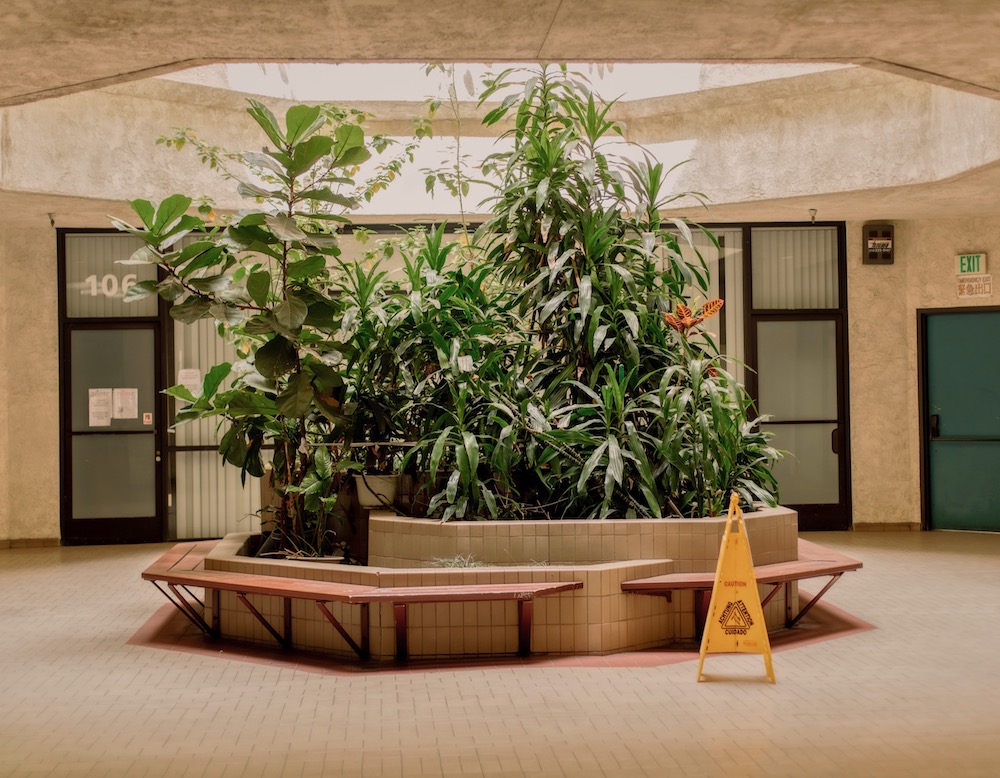
Having not been back to China for three years due to Covid-19, I’ve spent a lot of time at San Gabriel Valley and Chinatown to feel the familiarity again. Documenting these places evokes a lot of memories of my childhood, from ordinary objects to the architecture and language; they are reminiscent of China in the 80s. Based on my memories, I photograph this liminal space to imply concepts of continuity, isolation, transition and the overlapping of two cultures. This project is a way for me to navigate through them in search of a reconciliation of my inner juxtaposition: a home and a trip into normality.
Courtyard
Can you share a few key moments from the series and explain their significance?
My favourite combinations are the bright red tree in the forest and the centre planter inside an office building in Chinatown, occupied by Chinese businesses. They’re the opposite of each other. One is so alive and outside, while one is trying to breath through the open air from inside. I love the connection and contrast between the two.
Another two photos I really like are the long exposure of an airplane flying through electrical lines and the fan on fire. They share a sense of surreal-ness in reality. I photographed the fan when it was just lit so the original form is still showing. As the fan is burning away, the fire is opening up a gap. It’s reminiscent of the light beam slicing through the electrical lines and the sky over time. Both of the photos have a feeling of division – the power to break through space.
Fan on Fire
How important is the environment and sustainability to your practice, is it something that you consider while making imagery?
I try to keep a minimal impact on the environment when I am going into the nature. If I create something, I make sure it’s not harmful and very easy to remove. As I photograph more landscapes, the smaller I feel and the clearer I see the space inside. Environment and sustainability are more metaphorical elements in my practice – about finding balance in internal and external worlds.
I think a good balance is finding a flow that overlaps the two worlds; I keep these themes in mind when I work on projects. But this could be a roadblock if I am overthinking. For a while, I didn’t know how to move forward, and I learned to let go and photograph with instinct. The action of photographing brings me inspiration later on when I see the connection to other photos in the series. I think if you are overthinking about the meanings, the photos lack flow. Overtime, as I go deeper into the project, some meanings change or I encounter other perspectives to talk about it differently. This is what I am still learning from this project.
Cultural Publicity
What message do you hope to evoke from the work?
Most of my projects focus on looking inwards and finding a sense of home from within. The narrative of this project is a process of accepting and finding beauty where I am. I hope this project can speak to others that are like me – feeling in between things. When you can find a place inside, you can reflect that onto the outer world. There will be people telling you that you can only be one thing, but that’s very limiting. I hope you can find that space for you.
What’s in the pipeline for you?
I am working on a story about a Shanghai hair salon located in a strip mall in San Gabriel. Strip malls are quite unique to American urban planning in my opinion, so it’s interesting to see how the Chinese community adapts the look of the architecture and turn that into a mixed style. I want to use this hair salon as a centre to document the people and surroundings as they look like they are stuck in time from when they immigrated.
“This isn’t a book of best pictures, it’s more of a tight edit than that. It’s a book about the ideas that always end up somewhere in my work, I guess… Windows, shopping, making decisions and consuming…” So goes the opening phrase of Nigel Shafran’s new book The Well, penned by the British photographer himself.
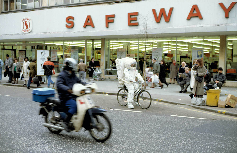
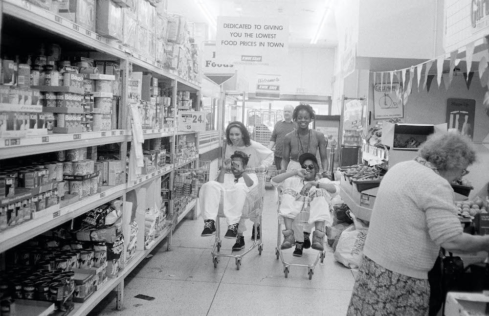
Recently published by Loose Joints, Nigel’s latest endeavour is a 376-page critique into the fashion industry. A steer away from the usual glitz and glamour, the pages are filled with impromptu photographs from a plethora of past commissions – the type that avoids studios or the cold poses and laser stares. Instead, his imagery offers up a well-rounded insight into his subjects, who are often caught mid-grin, having fun with their mates or dressed in an astronaut suit. Think lavished granny carrying her shopping trolly, a model trying not to be a model as she goofily places a globe on her head, and a black and white shot of some kids posing in baggy clothes, similar to garms we see on TikTok today.
Nigel’s career started in his younger years, where he’d trudge around his local village taking pictures of all sorts of people and places. His first gig was as a photographer’s assistant in London, before he moved to New York City in 1984 to assist in studios and on the streets, namely for commercial fashion photographers. After being deported in 1986 for working illegally, he returned to London and started photographing for magazines like The Face and i-D, utilising a set of 10 Pola Pan black and white 35mm slides, plus a viewer. “I was such a pain in the arse,” says Nigel in the book, often spending ages finding the right light for people to view his slides.
With a background predominantly in commercial fashion photography, The Well is a juxtaposing albeit welcomed foray into the more idiosyncratic parts of his image-making – the weird, simple and spontaneous. The title – The Well – refers to publishing jargon meaning the central spread of work of the issue, the place in which photographers and writers alike strive to have their work featured. It’s the creme de la creme of the magazine and usually where the most topical and high quality features can be found. So where does Nigel’s work sit amongst it all?
“These weren’t usual fashion shoots that are often done in a day. You’d go out, come back to show me a picture, and then go back out to take another one. Then you’d take another two or three, and we’d get rid of the first two, over and over again,” writes Phil in the book, in reference to Lost in Space, published in The Face, Seven Sisters Road (1989).
Nigel’s photography is undeniably anti-fashion, which is interesting coming from a photographer who’s carved a career working predominantly in this corner of the industry. Yet his gentle and humanistic eye is what makes his work so captivating. His subjects pose sometimes humorously in carefully curated garments; they smile, jolt and jive in front of the lens without a care in the world. Let’s not forget the fashions either; the more every-day clothing that you’d see on a passer by during your stroll to the off-license. His work signals much about his subjects’ personality, as it does his own. He’s not pretentious, nor is he one to fit into the norm. He wants you to know this.
“I grew up around the world of fashion, it’s a bit like family,” says Nigel in reference to Fashion Circus, shot for a Jean Paul Gautier show in Paris, and published in i-D, 1990. “Still I always considered myself an outsider, but I’m probably more of an insider, really.”
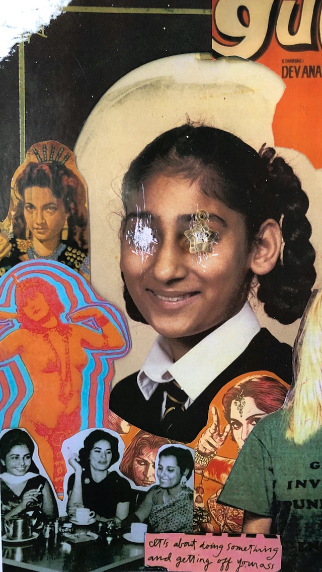
Identity is complex a complex thing. In The Road to Nowhere, a magazine from Dalia Al-Dujaili, a British-Iraqi editor and journalist, the concept of identity is torn apart, scrumpled and analysed as she addresses her frustration with a lack of accurate representation of second-generation immigrants – where so often are diaspora communities spoken for in the media and therefore turned into a “political issue only”, she says. Where in fact, migration is a vital part of global culture, and The Road To Nowhere – now in its second issue – seeks to highlight this through a celebratory merging of art and writing, told first-hand from “third-culture kids”. She says, “Humans are mosaics of their experiences, their upbringings, the people around them and their personal history. So none of us fit neatly into a box, we’re all so messy and complicated!” Below, Dalia reveals her reasons for making the magazine, what we can expect to find inside the latest issue and her personal thoughts on identity.
Courtesy of Angela Hui
What are your reasons for starting The Road to Nowhere, what provoked it?
Oof, so many reasons… I started it during lockdown of 2020 as a way to pass the time as I was still a uni student then and didn’t have much to do. It was partly a way to raise aid money for the famine in Yemen which remains one of the largest humanitarian crises in history yet receives almost no media coverage.
However, mostly, I was frustrated at how little agency diaspora communities have over telling their own stories. Representation is few and far between; when we are represented, we are spoken for and don’t get to choose how we’re shown. I was annoyed at how migration was almost always made into a political issue only. Whilst obviously it’s inherently political, it’s so much more than that. Migration creates culture and art, feeds creativity, inspires us, connects communities and reminds us to be human, so I found the constant politicising aspects a bit objectifying, belittling and limiting.
On the other hand, migration is one of the most important aspects of humankind’s growth and its richness and is the oldest and most natural phenomenon, yet under current policies in the UK and the EU, migration has never been under more scrutiny; immigrants, refugees and asylum seekers are fighting some of the most aggressive and oppressive policies. As children of immigrants, we owe our livelihoods to freedom of movement, so I’m desperate to fight totalitarian control of movement and borders through creativity and joy.
Edmund Arevalo
What can we expect to find inside issue two? How does it compare to the debut edition?
Firstly, it’s so much bigger than the last issue! Almost double the number of pages. And you can expect to find an extremely diverse range of stories; for this issue, we have contributors with backgrounds from Aotearoa, Ghana, Egypt, Turkey, Pakistan, India, Malaysia, Indonesia, Poland, and many more. The contributors use a range of poetry, fiction, personal essays, photography, illustration, digital art and film, and we have several interviews with trailblazers like Rohan Rakhit and Angela Hui. So I really sought out stories which greatly differed from one another but, at the same, were all connected by the same thread of their very human and sometimes even mundane nature.
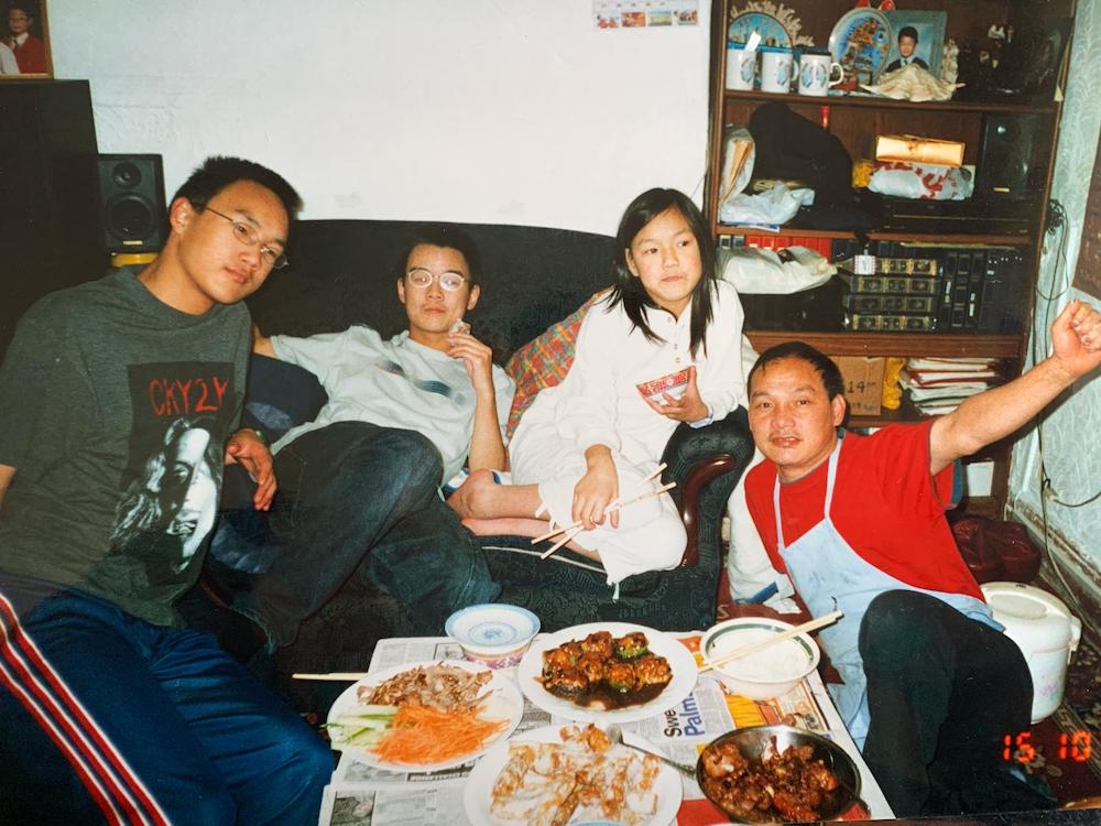
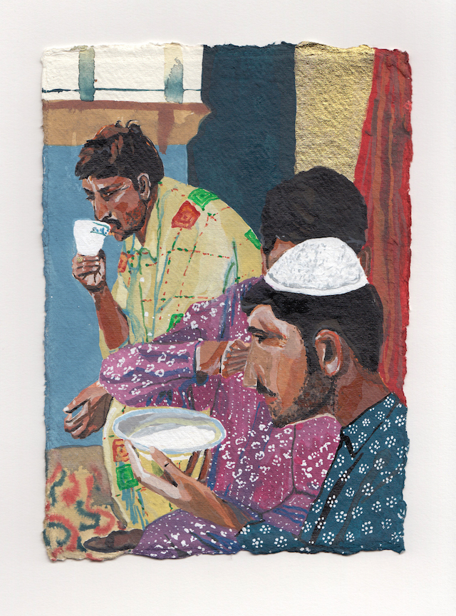
Family meal before service
Can you pick out a couple of favourite stories featured in the magazine and talk me through them?
Oh my goodness, very difficult to pick out just a couple. But if I have to… Zain’s story is one that I keep returning to. Not only is his personal story absolutely fascinating – the move from Lahore, Pakistan to East London, then Morecambe – but the way he talks about objects, and clothes especially, as archives of our families’ migration is so relatable and poetic. Again, it’s just a deeply human story that almost any diaspora kid can relate to, no matter their background. Also, Zain’s work is just absolutely stunning.
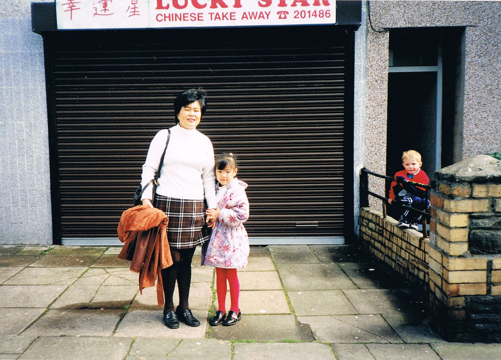
My interview with Angela Hui is another that I really treasure and feel very honoured to have in the magazine. Angela is about to publish her own book, Growing Up in a Chinese Takeaway, and we discussed her upbringing in rural Wales working for her family’s business. What I love about her story is how deeply Welsh and Chinese she feels. It was fascinating hearing her speak so passionately about Welsh culture and a love of Wales. I think people often forget how we do in fact love the countries we grew up in, as well as loving the cultures our parents imported for us from their homelands; Angela’s story is a reminder that we don’t have to ‘pick a side’.
Natasha Zubar
What does identity mean to you? And how have you represented (or scrutinised) the concept of identity in the magazine?
Identity is both everything and nothing. It’s a made-up concept and whist I deeply resonate with my identity as an Arab Brit, I also try to reject rigid notions of ‘identity’ because they can be so limiting. Many diaspora feel the same way because we fit in “everywhere and nowhere at the same time”, to echo Theo Gould in his TRTN piece, Mixed. I also think some aspects of identity politics can be more harmful and divisive than uniting. Identity to me is just being able to express the different parts of yourself without feeling the need to cater to a certain audience or change yourself to fit into other people’s boxes. Humans are mosaics of their experiences, their upbringings, the people around them and their personal history. So none of us fit neatly into a box, we’re all so messy and complicated!
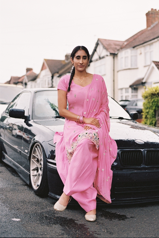
I think a good example of this in the magazine is Hark1karan’s Zimmers of Southall series (the cover image). Other than being obviously stunning, this series is so refreshing because it’s almost got nothing to do with Sikh culture – it’s about a community which is devoted to classic BMWs and which happens to be Sikh. The subjects of the images are evidently Sikh because of their clothing and appearance, but the series isn’t making their Sikh identity the sole focus, which just really humanises this community and de-exoticises them. Hark, perhaps unintentionally, re-writes this stereotype of South Asians being associated with Bollywood, curry and turbans, but he also shows how this community haven’t rejected their culture either; they manage to fuse their saris and Bhangra with their love of German Whips. I mean, to me, it’s just quietly genius.
I hope in this magazine I have shown how identity is both a beautiful thing and ultimately a futile exercise – you will never be able to fully embody one identity and the magazine is part of a mission to learn how to accept this as a beneficial and powerful existence instead of it being simply frustrating.
Rachna, Mom, 2021
What are the key takeaways, what can the audience learn?
Joy! I just want people to feel joy, and feel more open to listening to stories that challenge their views.
What’s next for you?
We have a couple exciting events lined up this year with the magazine, including a sold out screening of shorts at the Barbican, Finding Home, Forging Identity, and we’ll be selling the magazine at Bow Arts with Baesianz Makers Market.
Currently, I’m just pushing and promoting issue two as best I can. We already have ideas and collaborators for issue three – I’d like to keep growing our online platform to showcase more audio-visual content, and I’d love to keep collaborating with arts collectives, organisations and institutions on in-person events like workshops, exhibitions and screenings/readings. But to be transparent, we need funding to make the next one even better, and the bigger our audience, the easier it is to convince someone to give us money… And as you know, funding is competitive and extremely difficult to attain. So the work starts now in anticipation for next year.
Hélène Tchen utilises the power of photography to become “closer” to her identity
Jeanne and Valentine
“I realised that the people I shot had a huge impact on how it would make me feel,” explains Hélène Tchen, a photographer based in Paris. Born and raised in the French capital city to a Colombian mother and American-Chinese father, her identity as a woman of colour, she says, was therefore “quite complicated”. Having lacked in visibility and representation, this is where the arts come into play – a remedial outlet that allows creatives and subjects to form alliances and, in this case, to share personal experiences and perspectives on the world.
First off, Hélène decided to study cinema with the intentions of becoming a director of photography. Experimenting with analogue image-making on the side, a fascination with the medium grew. It wasn’t long until Hélène had taken up the practice professionally and started carving out her own personal projects, portraits and fashion stories – all of which expel a soft and tonal quality that signifies an intimate connection forged between two people. It allows her to address topics of identity and coming of age, protruded through a dynamism and relatability that not all can achieve through the snap of a shutter. It’s unsurprising to hear that she pulls influences from Wong Kar Wai, Leslie Zheng, Petra Collins and Nadine Ijewere, but equally, she’s identified her own language. “Shooting and creating with people that were like me – not having any visibility and presentation and either being a BIPOC or LQBTQIA+ person – is what inspired me and gave me a sense of my own aesthetic and how I wanted it,” she explains.
Ruiye
One of Hélène’s recent and most prominent projects is entitled Nearer To Me, a series that she launched as a way of becoming closer to her heritage. “I grew up with an ‘identity complex’,” she adds, “where I never felt French, Colombian or Chinese enough as I knew nothing about this culture and don’t speak the language. I looked Chinese most of all. The racism towards Asian minorities impacted me negatively during my young years and this project is a way for me to reappropriate my Chinese identity how I needed to.” She began the work in Toronto as she visited her sister, a place in which has one of the largest settlements of Chinese immigrants. A call out was made via Instagram and through her sister’s friends, in which Hélène would ask if they could make “simple” portraits together. “It was the first time in my life I would walk in the streets and feel at peace.”
Nearer To Me evolved as she travelled back to Paris and began photographing Chinese women – those who are immigrants or are the child of an immigrant. “This was a way for me to be closer to my lost culture and learn more about it by myself.” Even the name, Nearer To Me, evokes a sense of yearning for understanding; to know oneself and be close to one’s roots. And the pictures resemble just that, as they show how a person’s identity isn’t always linear nor seeped in one definition, place or history. “Belonging to the country you were born or your own origins is something very personal that can be made in many ways,” says Hélène.
Jeanne
The photographer has captured many women over time, from the people she’d met online to those she knows more closely. This includes a woman named Christine, based in Toronto, whose portrait depicts her quietly leaning on a balcony, hair as fiery as the sun. Then there’s Xiaoyi, a young Chinese women she’d photographed previously for a fashion series, who later featured again in the project. Her portrait is drenched in a saturated shade of red, perceived in a tonal and cinematic style that’s influenced by the Chinese poem Magnolias Ballad, the same reference that inspired by the Disney film Mulan. She also regularly lenses her twin sister, Laure-Anne, the closest person to her and subject she perceives as being the “most special” throughout.
“I hope my audience will receive this project with kindness and a different eye on the questions of race and social status in our societies,” shares Hélène. “The most important thing I wanted to convey in this artwork is the importance of identity, that it’s never too late to explore who you are of question yourself. And to not forget to be more kind towards ourselves and other people, nobody has the exact same experience in life and there is nothing we cannot do to grow in a better way.”
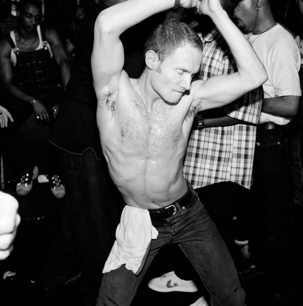
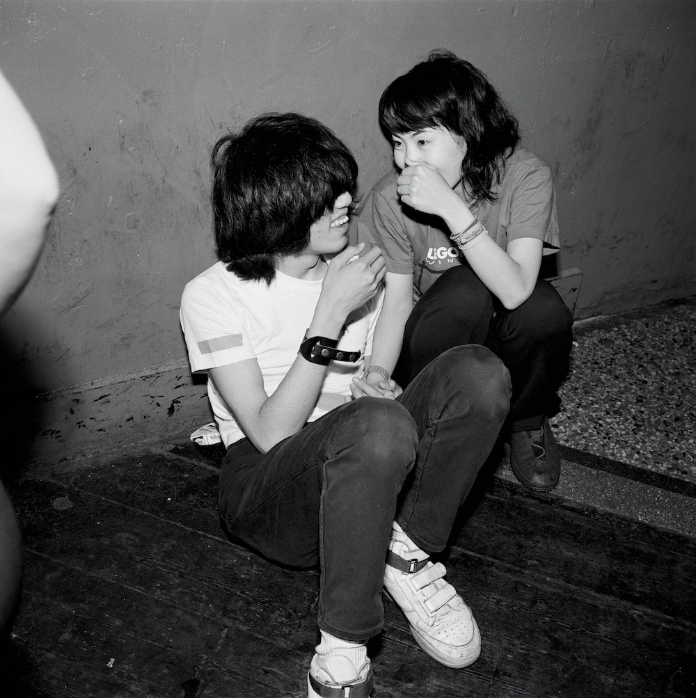
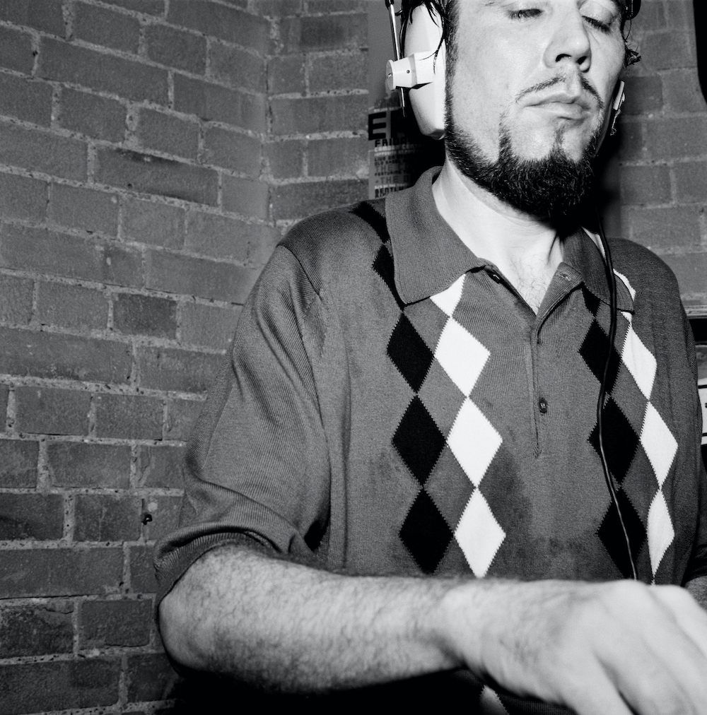
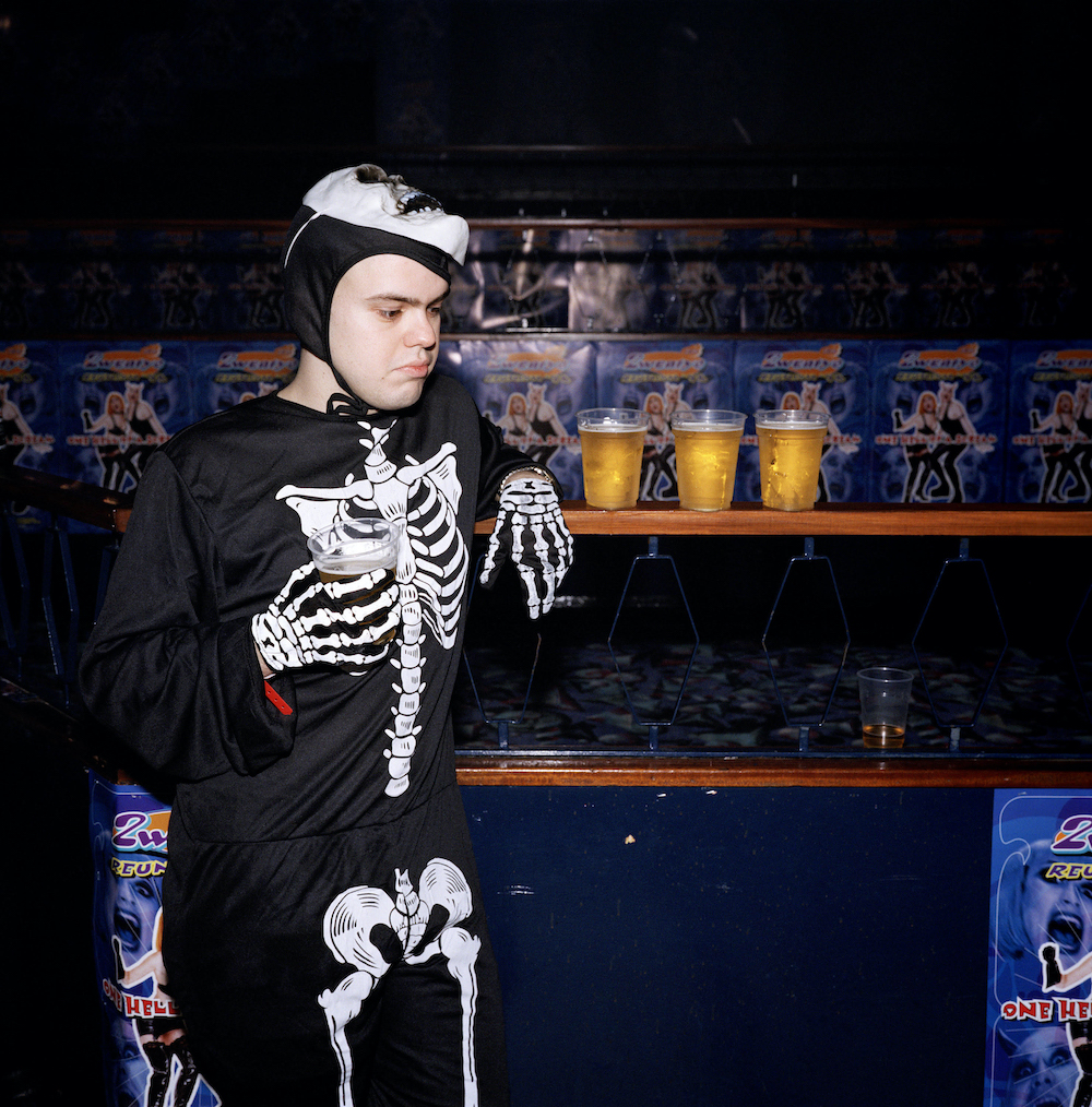
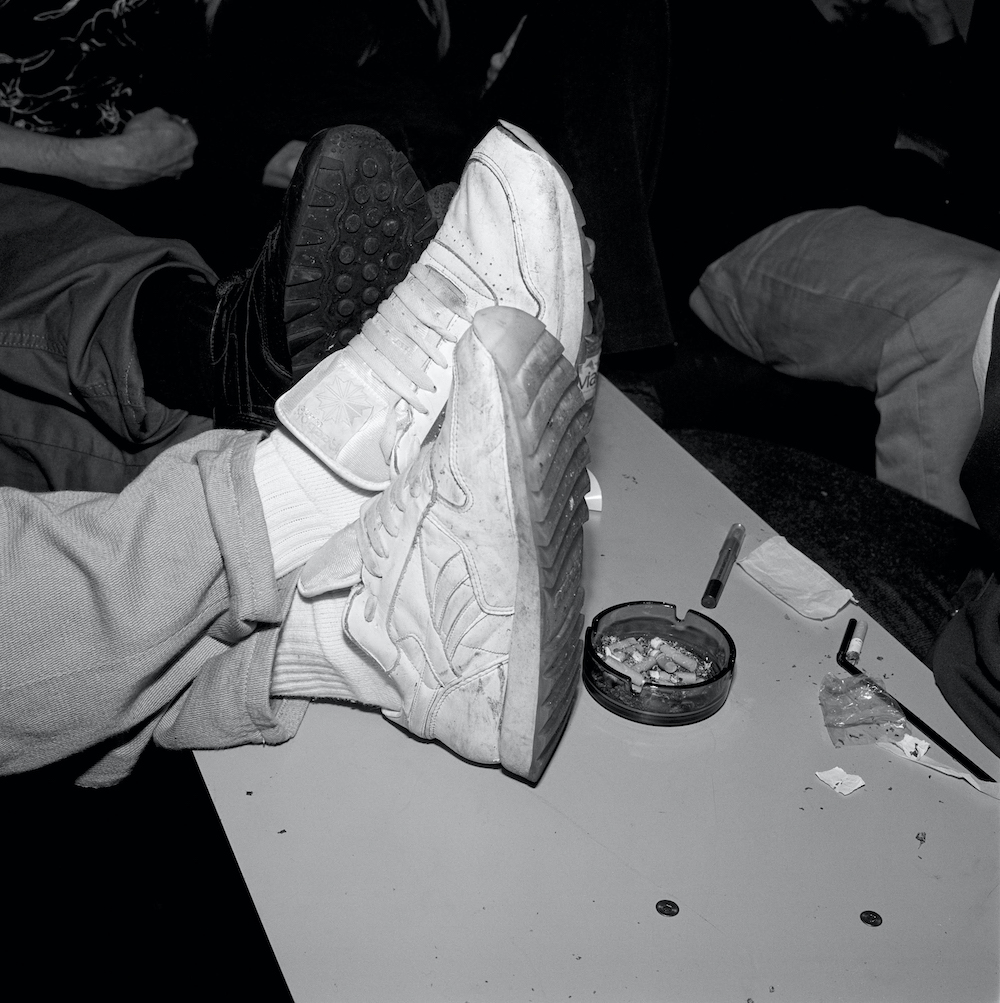
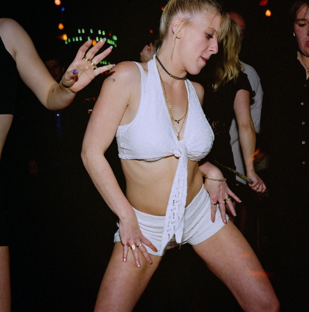
The eponymous British photographer’s new book provides a nostalgic snapshot of 90s club culture
Ewen Spencer: While You Were Sleeping
Conjure up an image of a club goer – the type who sways, dances, gropes, kisses and sleeps without a care in the world – and it will most likely be one of Ewen Spencer’s. Synonymous with exposing the antics of British nightlife, the photographer and filmmaker has carved a reputable name for his work documenting (and revealing) youth, fashion, music and subculture, particularly that which depicts a time when smoking in clubs was allowed and people were a lot less tied to their phones. In fact, phones weren’t really a thing back then. Could anything be more nostalgic?
While studying at Brighton School of Art in the 90s, Ewen began photographing topics in tune with society – snapping people having a 20-minute break at a service station on the M4, for example. This is where his interest in subcultures arose and, having attended Northern Soul all-nighters at the time, he decided to start bringing his camera in tow. It was the perfect subject matter. Then, upon graduating in 1997, Ewen took his imagery to Shoreditch-based Sleazenation magazine and launched his career capturing nightclub moments for the publication. He proceeded to document the UK’s garage and grime scenes and worked with NME, The Face, Dazed, Nike, Apple among others – he also took the inner liner photographs forThe Streets’ album Original Pirate Material, and has released a handful of books including Open Mic, UKG, Open Mic Vol.2 and Young Love.
A flourishing career so far, it seems only right for the photographer to look back at his archive. Doing just that in his new publication titled While You Were Sleeping, these very pictures – featuring those previously unseen – are an enjoyable reminder of a bygone era, a time when clubbing and clubbers were oblivious to the photographer’s lens. Will nightlife and club photography ever be the same again? Below, Ewen tells me about these prolific pictures.
Ewen Spencer: While You Were Sleeping
What inspired you to start photographing nightlife, and why make this book now?
I began making pictures around youth scenes out of my own interests. I was involved in the northern soul scene and the many off-shoots from that: modern soul, rare groove, house and garage throughout the late 80s and 90s. I just began to apply what I’d been researching and testing out while studying photography in those places that I loved. It blossomed into a visual language that made sense to me and discussed a myriad of social and perhaps political concerns and considerations at a time, when that was still conceivable in a club or around a dance floor.
Who caught your eye back then?
If you have an interest in people I think you probably gravitate towards interesting characters. In the late 90s, I was going into spaces that would hold no more than 200 people in some instances – in a basement in Brixton, let’s say. I’d look for characters interacting together, begin working around them and at times integrate myself with them to the extent where we’d have a drink and become friendly. I might stay with these people for a while and then work around the room; I might stay a couple of hours and shoot 10 rolls of film, and then move onto the next place. Unless it was a bigger club, or somewhere I was particularly interested in hearing a DJ or a particular sound, I’d stay and work all night and maybe know a few people in there. Sonic Mook Experiment was a place where I knew folks who were working in fashion, music and art. I photographed Jerry Dammers, DJ-ing here for Sleazenation in 1998.
Ewen Spencer: While You Were Sleeping
The photos are an incredible record of the past, where smoking in clubs was legal, people wouldn’t be glued to their phones; everyone seems less aware of themselves. How does it feel looking back on a time like this through your imagery? And has your process changed now that people are more self-conscious?
I think it all depends on where you go. I was at Guttering last weekend in Bermondsey and the folks were really up for the evening, dancing hard, mixing it up with one another. I love to see it; there were some real faces in there.
I’m always surprised by kids approaching me who know my pictures and are maybe more sussed to the dynamic, and that is in someway making the act of shooting around scenes a little more performative, in that the consent seems quite immediate. I had a few acknowledgments of satisfaction from people I’d photographed and a few kids came up and shared their pictures they’d been working on… Photography is obviously far more accessible and democratic now. However I’m not encouraging people to come and show me your pictures at parties, thanks x
Ewen Spencer’s While You Were Sleeping is published by Damiani at £40
Ewen Spencer: While You Were Sleeping Ewen Spencer: While You Were Sleeping Ewen Spencer: While You Were Sleeping
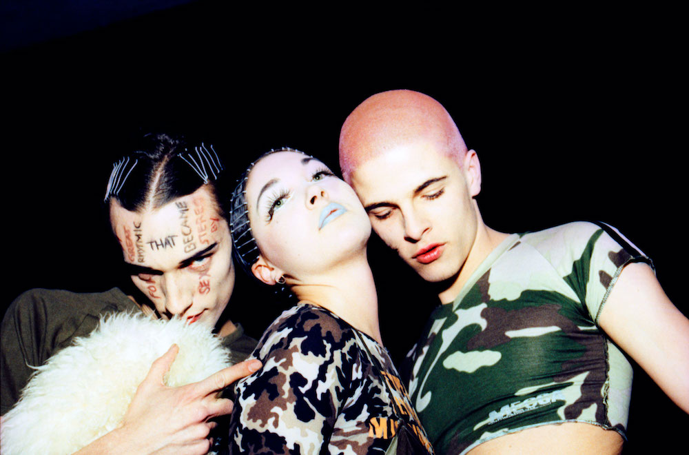
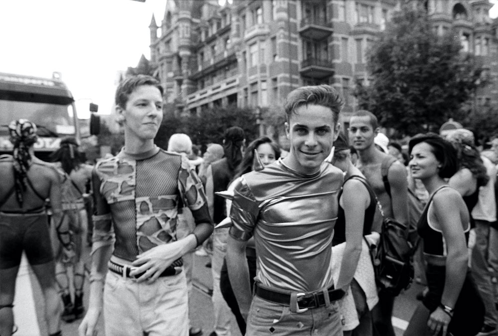
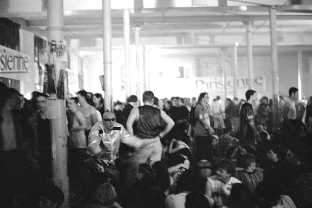
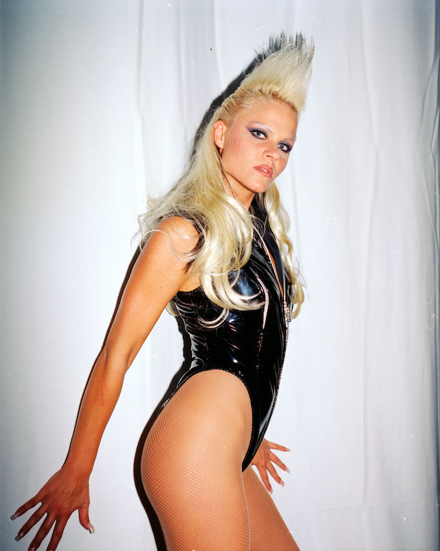
Relive the Swiss techno scene of the 90s in a new book published by Edition Patrick Frey
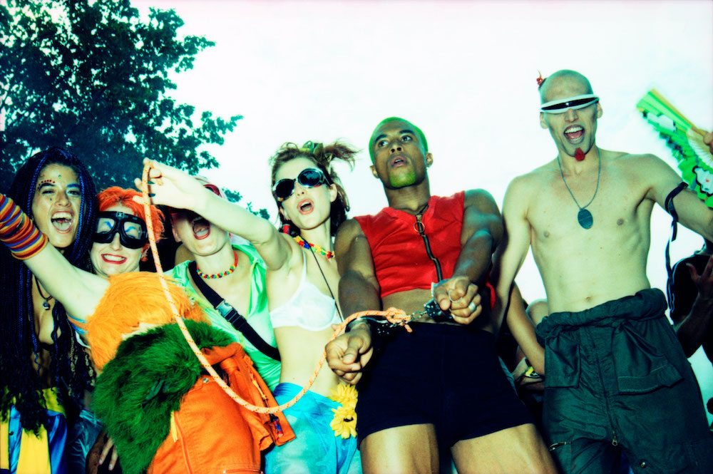
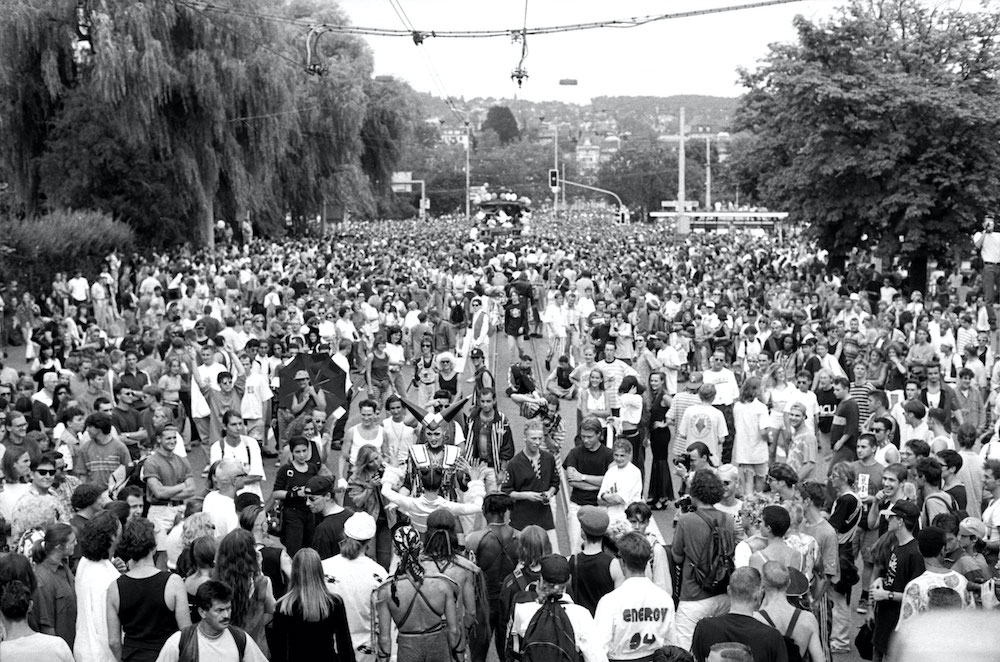
As the world continues to grapple with the pandemic, more so do we yearn for moments from the past, nightlife being one of them. Here in the UK, we had a blissful and somewhat wary few months reliving the sweaty, body-to-body movements only found in the dark and bassy depths of a club. But the potential for these nights to be put on hold, yet again, still looms. So for now, the easier days of dancing can be experienced in a more 2D (yet still utterly dynamic) form through the pages of Philipp Mueller’s latest book, 120 bpm – a comprehensive documentation of the rise of the Swiss techno scene in the 90s.
Published by Edition Patrick Frey, the Swiss photographer looks at the magnanimous impact that Switzerland’s techno scene has had on clubs, dance music and nightlife over the years. Rebellious and free, we see the dawn of Zürich’s street parades and the synonymous underground raves and parties, housed amongst warehouses or private venues. The flash-lit shots of party-goers are paired with archival clippings from rave magazines and fanzines, giving the book an almost allegorical feel and one that can stand the test of time. The book’s name, too, is given a musical stamp of approval as it denotes the average number of beats per minute on a club track, luring you in to the succinct and heart-racing photo sequences found within. Below, I chat to Philipp to find out more.
What inspired you to start working on a project about the Swiss techno scene?
I wasn’t part of a rave scene to begin with, and it didn’t start as a project. What you can discover in the photographs, which grow through the years, is that I was involved in the nightlife scene in Zürich, and that I got hired by independent magazines to cover parties, fashion shows and of course rave and techno events.
First, I have to tell you that all the material for this book was in my archive for a very long time. I almost forgot about it until I rediscovered it, picture by picture. This means I looked at them as if was seeing them for the first time.
I pulled a presentation in a PDF together and started to show it to my friends in London, Paris and Zürich. I was testing if those photographs were of any interest for people outside of Switzerland. My friends were surprised of the vibrant scene in Zürich, they thought I took the pictures in London or Paris. They were even more surprised when I told them that the photographs are over 20 years’ old. My agent encouraged my to send it to Editions Patrick Frey, and I was pleased the publisher wanted to work together on this book.
Talk me through your photography featured in the book, what did you seek to include?
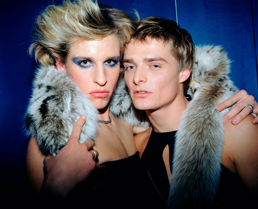
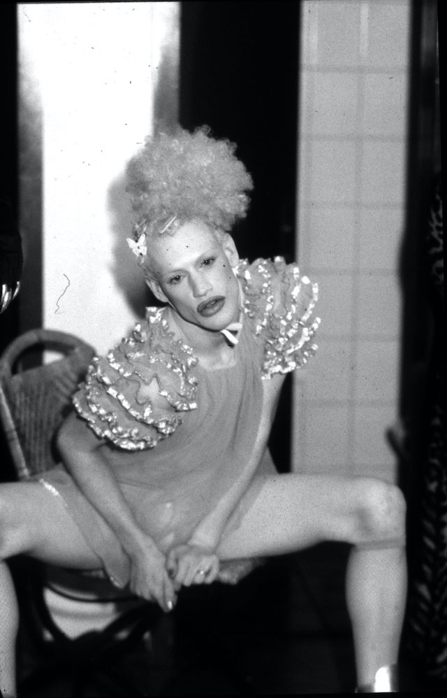
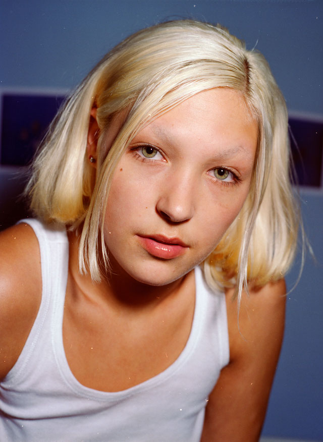
My photography always reflects on the zeitgeist of society. Therefore, the book shows my perspective of the 90s; it was a free time where everyone could express themselves. It includes photographs of my friends, models, drag queens, musicians, rave kids and other creatures of the night.
You’ve also incorporated a mix of clippings from magazines and fanzines, what does this add to the narrative and structure of the work?
Those magazines were my first clients. They didn’t pay me, but the freedom in creativity was priceless. They are like a time capsule, representing what was going on in society and culture at this time. They formed the very foundation of my work until today.
Can you pick out a couple of favourite images and talk me through them?
The cover with the girl sticking her tongue out is my first choice. It has an iconic and rebellious touch. Then, a little further back in the book, there’s the gay couple shot (the guy with short hair and the guy/drag queen with long black hair). Love is love – that is it what it means. And there are so many more.
Any particular message you’re trying to convey in the work?
It was never meant to be a memory lane book. I hope I will inspire people to live free, be creative and tolerant.
What’s next for you?
I have 30 years’ worth of photography work from new wave and punk, shot in Paris and London, as well as parties, fashion and celebrities. Some stuff has never seen the light of day, such as Hugh Hefner’s birthday party in Paris and John Galliano’s legendary cardboard fashion for Dior, shot backstage to be precise. Maybe there will be another book….