Antony Cairns: CTY_TYO3 TYO4

The British artist talks us through his first UK solo show in four years, held at London’s Webber Gallery

TYO4_014, 2021. Inkjet on 108 cream with coloured stripes computer punch cards Negative date 2019 99.6 x 168.3 cm

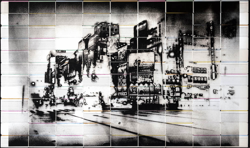
After months of UK closures, what better way to laud the reopening of art and culture than with a new exhibition of Antony Cairns, the British artist known for his long-term exploration into global metropolises. The first UK solo show in four years opening today at London’s Webber Gallery, the works at hand shed light on his signature stark and dystopian style of photography; the type that depicts a futuristic landscape of a city seen through the murky night. Is this what a post-pandemic world looks like?

Antony’s infatuation with his medium began early during his teenage years in the 90s. He’d started to experiment exclusively with analogue photography, to which he’d draw on the technique of black and white practices as his trademark. Spending time in the darkroom, he recalls: “I loved the red light darkroom experience and I have been obsessed with the idea of photography ever since.”

In these earlier days of his practice, he’d also become engrossed in the subject of the city; a muse that would later ensue across all of his endeavours in photography, installation and sculpture. “The idea of photographing a city became an obsession for me,” he adds. “I became interested in how photography can be used to show the character of a place, and for me it was London. So I started off by taking pictures that defined what London meant to me.” In doing so, the artist began constructing imagery that presented a city in constant change – the fluctuation of the landscape, the deterioration of buildings, and even the sudden rise of new ones. 

TYO4_028, 2021. Inkjet on 30 green and green computer punch cards with blue stripes Negative date 2019 49.8 x 93.5cm

Antony addresses this notion of evolution throughout his artworks, which has seen him expand further afield from the UK into cities such as Los Angeles, Tokyo and Osaka. He’s also been awarded the notable Hariban Award, with works shown internationally in exhibitions such as LDN at the Recontres d’Arles, as part of Arles festival in 2013, plus shows at the George Eastman Museum and the Tate Modern.

A key trait of Antony’s is that he tends to shoot mostly in the night. Not only are the cities quieter during this time, but he also feels like he gains more access to space and time to take his pictures. “You could also say that my work sometimes has a science fiction feel to the photographs,” he notes, citing a welcomed by-product of shooting with all but a street light and flash of a camera. The sci-fi genre typically presents a city “shrouded in darkness”, and Antony’s cities manage to mimic this viewpoint succinctly. It wouldn’t be surprising if themes of space exploration, time travel, parallel universes and extraterrestrial life were to pop up in one of his images. 

TYO4_031, 2021. Inkjet on 30 blue computer punch cards Negative date 2019 49.8 x 93.5cm

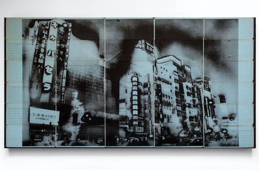
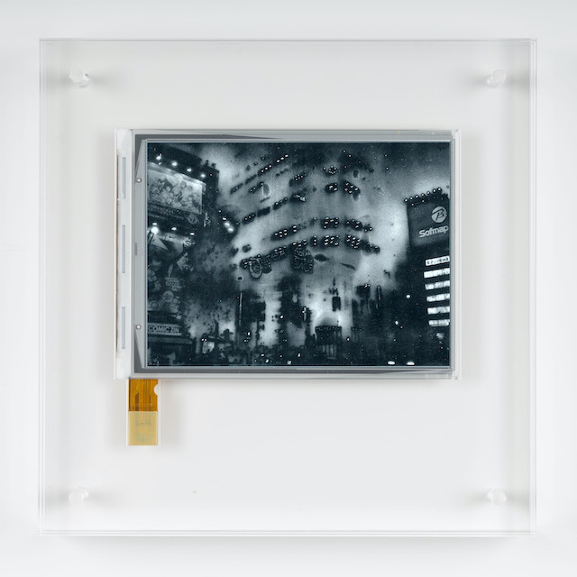
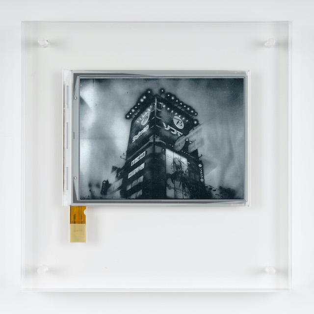
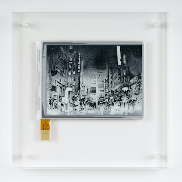
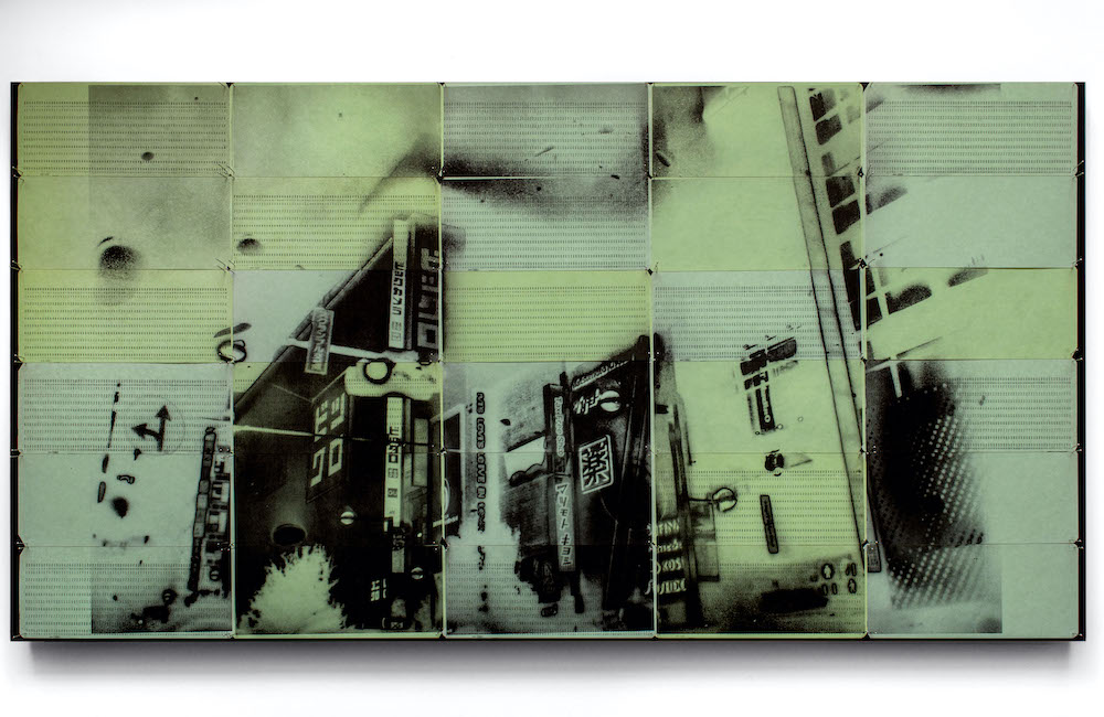
Antony’s current exhibition, allusively titled CTY_TYO3 TYO4, sees the expansion of his works under the title CTY (which is an abbreviation of ‘city’). Prior to this show, he published a selection of artist books named LDN (2010), LPT (2012), OCS (2016), as well as work created using translucent silver gelatine films applied to sheets of aluminium in LDN2 (2013), LDN3 (2014), plus experimental pieces crafted from electronic ink in LDN EI (2015). The city is his mediation, and a subject that will continuously take centre stage in all that he puts his mind towards. “My work is all about building an archive of imagery that defines what a city is, not just an individual city like Paris, London or Tokyo, but the idea of what a city means in a more philosophical sense. My images are pieces in a constantly changing jigsaw puzzle of the city.”

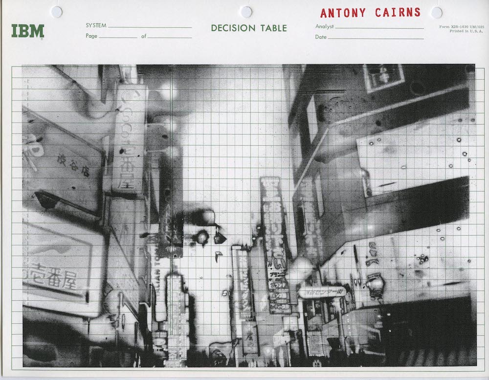
Although not exclusively, the works presented at Webber Gallery are mainly of Tokyo and Osaka – two bustling metropolis located in the country of Japan. While shooting there, Antony was on a three-month residency in South Korea as part of the HyundaiCard Air artist residency program. Stationed on Gapado, a small island located between Jeju Island and the southernmost isle of Marado, it was here that he decided to travel through Asia and commence the collation of his imagery. 

TYO4_004, IBM cobol form

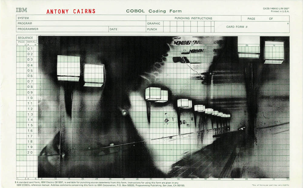
As for the process itself, he weaponises a host of “unorthodox” practices – a steer away from the traditional forms of photography and one that places emphasis on the use of a 35mm black and white film camera. From there, he develops the negatives but in reverse, “so it becomes a black and white positive, not a negative,” he explains. Then he’ll scan and utilises any supporting materials that he believes will suit the image’s aesthetic. And sometimes, he’ll use computer punch cards – a piece of stiff paper where holes can be punched into – or he’ll upload the jpeg onto Electronic Ink Silicon screens; two approaches he’s used in the exhibition. Other times, he’ll use a vintage paper stock such as Cobol IMB computer forms. “I use these varying techniques because the process and the reproduction of a photograph is what I want my works to explore.”

TYO3_47, 2019. Inkjet on Original IBM Decision Table Worksheet, 28cm x 21.5cm printed 2020

In some ways, Antony’s techniques have garnered the cityscape to be unrecognisable. The streets we may have come to know in our regular lives have been splintered with a dose of the supernatural – devoid of humans and garnished with an overcast shadow. But really, Antony wants you to look at these pictures as if you were the real thing, as seen through his own artistic interpretation. “It doesn’t matter which city, where or when, I want the viewer to feel that they are looking at a representation of the city.”

Antony’s show CTY_TYO3 TYO4 is on view at London’s Webber Gallery from 22 April – 6 June 2021. The exhibition is accompanied by his latest book, Selected Computer Punch card artworks: Computer listing paper edition, published by Morel Books.

E.I. TYO4_011, 2019. E-ink screen encapsulated in Perspex box. Negative Date 2019 10.1cm x 12.9cm; 20 x 20 x 3.2cm with frame
E.I. TYO4_012, 2019. E-ink screen encapsulated in Perspex box. Negative Date 2019, 10.1cm x 12.9cm; 20 x 20 x 3.2cm with frame
E.I. TYO4_086, 2019. E-ink screen encapsulated in Perspex box. Negative Date 2019, 10.1cm x 12.9cm; 20 x 20 x 3.2cm with frame

The Dream of Californian Design

From political posters to portable devices, discover how the egalitarian spirit of design in California has changed the way we live, learn, work and communicate 

An ongoing exhibition at London’s Design Museum explores how Californian design has given us the tools for unprecedented personal freedom by transforming the way we see, speak, make, travel and share. California: Designing Freedom traces the roots of modern technology and the legacy of Silicon Valley – including its cultish corporatism –  back to counterculture movements and the hippie modernisms of the 1960s.

In this sweeping celebration of California as a nucleus of pioneering design and technology, curators Justin McQuirk and Brendan McGetrick make connections between the free speech movement and social media, LSD and virtual reality, self-reliant communes and online communities, as well as many other equivalents, in order to argue that design drives the egalitarian spirit of California’s techno-utopia. 

The exhibition is ultimately about understanding the age of the individual. The freedom to say, to see, make, go where, and join what you want are its five organising themes. Taking the 1960s as its starting point, some 300 items, from political posters to portable devices, come together in the first show to position the Golden State as a self-made design capital of the 21st century, highlighting how Californian products now shape our daily lives.

It is an ambitious and at times overwhelming survey, with early Apple prototypes sharing the space with a replica of the Captain America chopper from the 1969 film Easy Rider. Highlights include artist and activist Gilbert Baker’s original 1978 design for the Rainbow Flag, Ridley Scott’s first commercial for Apple in 1984, and back issues of The Whole Earth Catalog (a pre-internet publication providing access to tools, information and ideas). There is even a vitrine of LSD blotting paper. “It’s the only drug where you’re consuming a piece of graphic design,” co-curator Justin McQuirk joked. 

A question left unanswered by California: Designing Freedom is whether the spirit within which something is made is more important than its application. When drawing parallels between California’s history of counterculture and the shared values of Silicon Valley, the downsides of technology, the internet and individualism at large are not addressed head-on. New phenomenons like self-surveillance are mentioned, but their potential for abuse is never fully implicated. In other words, the cost at which some of our newfound freedom comes is left unaccounted for. But perhaps that’s a story for another exhibition.

California: Designing Freedom is on show at the Design Museum in London until 17 October

The Phone Made for Minimalists

Joe Hollier, co-creator of the first phone designed to be used as little as possible, speaks about resisting digital distractions and the benefits of ‘going light’

As far as advertising slogans go, ‘designed to be used as little as possible’ is a far cry from ‘Just Do It’ or ‘I Want My MTV’, and is maybe one of the most unlikely examples in marketing history. Coined by Joe Hollier and Kaiwai Tang, co-creators of the Light Phone, its strength lies in the fact that the majority of us spend a worrying amount of time on our smartphones, and we’re all too aware of it. 

Some even call it an addiction. In fact, recent research claims that US consumers spend an average of five hours per day on their phones. The Light Phone’s USP then, is that it was made to be as simple and rudimentary as possible. Small, sleek and no bigger than a credit card, it is designed to be used as a second phone; a way to log off from the internet while still being contactable. 

Hollier and Tang came together on an app design programme run by Google. For Hollier, a graphic designer, artist and skateboarder, the programme ended up highlighting the greed and cynicism of the tech industry.  

“I realised quite quickly that, on one hand, apps all claim to make our lives better,” he explains. “But on the other hand, what all the founders and investors were talking about was retention: how many hours a day do your users actually use the app. Because the more addicted they become, the more ads you can sell them, the more data you can collect, and the more money you can make. So I saw this disconnect. How can you be claiming to make my life better when you’re really just taking up all of my time?” 

By the time the Light Phone was being tested, they found that first-time users often experience something that they now call ‘going light.’ “When someone ‘goes light’ there’s an initial anxiety, maybe tapping their pockets, maybe feeling like they’re missing something, maybe they’re at a café and can’t resort to looking down at their phones and they start making awkward eye contact with people,” Hollier continues. It sounds like satire, though it’s undoubtedly close to the truth. “But there’s always this moment when you stop caring, you forget about Instagram and you’re able to relax and experience the present.”

Given the Light Phone’s minimal design and limited features, the question remains: why buy a Light Phone when a simple Nokia could do the same job?  

“The design and the form are very important,” Hollier says. “The object of the Light Phone, image-wise, is designed to make the experience as special as possible. It’s hopefully something that you’ll be proud to pull out of your pocket. And then there’s the fact that you can keep the same number.”

Admittedly, there’s no getting away from the irony of using technology to combat technology addiction, but this isn’t the first time disruptors have subverted it in this way. With mindfulness apps and smart jewellery start-ups, the Light Phone seems to be part of a growing independent tech sector that promotes personal well-being. 

“One big thing about the Light Phone is the conversations it allows you to have about technology,” explains Hollier. “Even if someone doesn’t buy the phone, maybe it’s inspired them to question their personal phone use. Our goal was only ever to show how most technology is sponsored by big companies who don’t care about us, who just want our time and money. So the real question that the Light Phone poses is: why? And where do we go from here?”

Find out more about the Light Phone here

Crystal Clear: Bowers & Wilkins

PORT discovers how the latest offering from British audio brand Bowers & Wilkins, the 800 Series Diamond, continues a culture of research and development instilled by its founder, John Bowers

804 Series in Rosenut

In 1974, Bowers & Wilkins (B&W) revolutionised hi-fi equipment by taking inspiration from technology designed to stop bullets. The brand’s distinctive kevlar speaker cones offered greater rigidity and less distortion than conventional aluminium and visibly marked B&W systems as higher quality products. Four decades on, B&W is moving away from its iconic yellow speakers and even reconfiguring its manufacturing plant in West Sussex for the sake of continued innovation and the latest iteration in its flagship 800 series.

Apart from the 800 series’ synthetic diamond tweeter (the small speaker that produces the highest frequencies), B&W engineers have set about redesigning the loudspeaker from scratch. In addition to replacing the kevlar mid-range cones – the culmination of eight years of research – the bass unit and the speaker’s housing have been completely rethought. The new 800 Series is a testament to the spirit of constant research and development that stems from the founder, John Bowers, who produced the company’s first speakers by hand in 1966 at the back of an electrical shop in Worthing, a coastal town in south England.

Here, we to chat to B&W’s product manager, Andy Kerr, to hear how the company has evolved since then and learn more about John Bowers’ philosophy of ‘True Sound’.

Bowers & Wilkins 802 Series Diamond in White

It’s been five years since you last updated the 800 Series Diamond. Why is now a good time to renew it?

With every new model or series we introduce there’s always an element of ‘life-cycle management’ in our thinking, but the primary reason driving us in this instance has been our success in breaking new ground in drive unit and loudspeaker technology.

The engineers at our Steyning research and development facility have made some significant breakthroughs in the course of the past few years and of course, we wanted an opportunity to incorporate them into a new product as soon as was practical. As our flagship range, the 800 Series Diamond is the perfect vehicle for that.

What makes the 800 Series B&W’s flagship reference speaker? 

Our aim is always to make a better loudspeaker. Of course, the more demanding your aspirations for that loudspeaker, the harder you have to work to make it better. And with the 800 Series, we have some pretty stringent demands. It’s always been our technology statement – the best that we are able to deliver at any given point in time.

With each new iteration, we’ve always tried to raise the performance bar as high as we possibly can… We hold nothing back. To put it another way: if you wanted to define Bowers & Wilkins, listen to an 800 Series loudspeaker.

Can you talk us through the basic steps of the redesign process? How long did it take?

The project itself took three years, but some of the research work behind several core technologies took much longer; we began work on the Continuum cone back in 2008.

Our benchmark for performance is always ourselves. Over time, we have developed or adopted more advanced measurement and simulation equipment that gives us greater insight into the behaviour of our loudspeakers. So, we began the process of developing the new products by accurately measuring and modelling our existing loudspeakers and identifying areas where we could improve.

803 Series in Rosenut

Why do you use synthetic diamond for the tweeters?

We want our high frequency drive units to preserve the correct ‘pistonic’ shape without distortion. Diamond is an exceptional material to help us deliver that. It’s phenomenally stiff and light, so it stays in the optimum shape for far longer than any normal drive unit. As a result, we get clearer, more accurate treble.

Can you tell us more about John Bowers’ ‘True Sound’ philosophy and how it applies to this new 800 Series release?

John was a passionate music lover and regularly attended concerts. He started designing and building speakers because he couldn’t buy an off-the-shelf design that could replicate the same sound experience in the home.

True Sound is simple to explain. Our loudspeakers should not change, colour or in any way obstruct the intent of the original artist or performance. We want you to hear what was recorded, pure and simple. Another way of expressing the same sentiment is John’s adage, “the best loudspeaker isn’t one that adds more – it’s the one that loses the least.”

What are the main challenges with designing a speaker system that works for the home, but also in a professional studios like Abbey Road?

There’s actually no specific challenge to it at all. We just make the best loudspeaker we know how to make, one that fits with the principles of True Sound. That’s why our loudspeakers are often used by professionals as well as home enthusiasts.

bowers-wilkins.co.uk