A Quiet Revolution: dunhill AW17

Shot for dunhill by Port Creative, we reflect on the reimagined classics and relaxed shapes of the iconic brand’s Autumn Winter 2017 collection

The history of the men’s luxury retail brand dunhill has been one of constant reinvention. Founded after Alfred Dunhill inherited his father’s saddlery business in 1893 at the age of 21, the company began by offering a range of accessories deigned to capitalise on the burgeoning automobile industry, including leather overcoats, goggles and car horns. From there Dunhill moved into tobacco, patenting the ‘Windsheild Pipe’ in 1904, allowing drivers to smoke in their open top cars, and opening a tobacconists in Mayfair that became popular with the Gentlemen’s clubs in the area.

Since then, dunhill has gradually diversified and expanded to become one of the most recognisable British luxury brands operating today, and their latest reinvention this season comes courtesy of Mark Weston. Having joined dunhill as creative director earlier in the year from Burberry, where he worked as senior vice president of menswear, Weston promised “a new vision” for the brand. And it’s a vision borne out in a collection, where outerwear has been reimagined for contempoary living – overcoats having been relaxed and tailored to be suited more casual settings, and down-filled outerwear and multi-functional parkas have been teamed with suede tennis shoes to meet the demands of an active, modern lifestyle.

Evening wear, too, has been rethought, with dark chocolate velvets revitalising classic styles, while knitted merino blousons have been topped with fur-trimmed collars and paired with the ever-essential English Chelsea boot.

Together with the relaxed, casual approach to Spring Summer, dunhill is entering a new era – breaking new ground while staying true to their history by refusing to stagnate. Self-assured and confident, understated and elevated, it’s a move that is perfectly encapsulated in their collection, and bodes well for the future of Weston’s time at the brand’s helm.

https://www.dunhill.com/gb

Amsterdamøya: Where the Streets Have No Name

Port’s fashion features editor, David Hellqvist, reflects on an unusual journey to the remote Arctic archipelago of Svalbard to shoot Scotch & Soda’s A/W 17 collection

There are at least 12 places in the world called Amsterdam – but ask around and most people will only know one: the Dutch capital. Other Amsterdams include a town in eastern South Africa, a remote village in Ohio, USA, and a French island smack in the middle of the Indian Ocean. But the most outlandish one, the trickiest to reach and, ultimately, to survive on, is Amsterdamøya, a small island close to the North Pole.

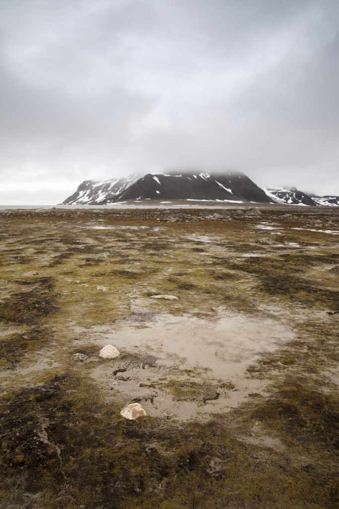
Part of the Svalbard archipelago, Amsterdamøya is today Norwegian territory, but the island was discovered by Dutch explorer Willem Barentsz in 1596. Svalbard covers a relatively small area: it’s roughly the same size as Ireland, but its hostile weather condition and remote location a mere 650 miles from the absolute top of the world, means only 2,500 people reside here.

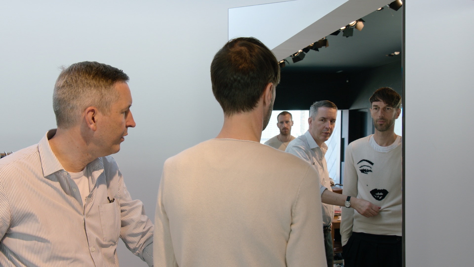
I’m writing this from the canteen on M/S Gamle Mårøy, a 199-ton boat anchored just off the Amsterdamøya coastline. No one lives on the island, except for polar bears and walruses. We’re here because Dutch brand Scotch & Soda have dispatched a film crew to the northern hemisphere’s rooftop to shoot its Autumn Winter 2017 campaign. I’m tagging along to observe and document the expedition. It’s a long journey, in more ways than one. Not only have people travelled far to come here but it’s a diverse group of individuals to start with: I count French, Turkish, Swedish, Lithuanian, Romanian, Brazilian, Portuguese, Norwegian and, of course, Dutch nationalities among the directors, photographers, technicians, stylists, assistants, guides and models.

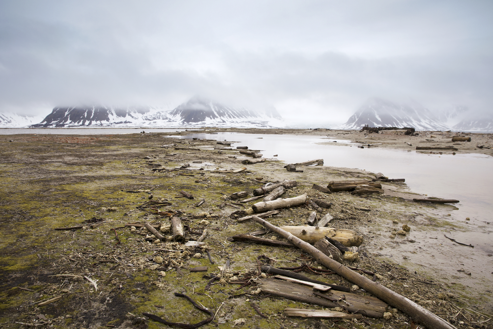
Built in 1959 to ferry people around the local villages of northern Norway, Gamle Mårøy dutifully carries us between fierce icebergs and desolate beaches decorated with stranded logs that have floated all the way from Siberia. We eat and sleep on the boat; altogether there’s 26 of us onboard, plus the six-man crew. The sailors, all serious and experienced seamen, have had to get used to living with make-up, hair straighteners and drones scattered all over the boat. It is, to say the least, a trip defined by organised chaos.

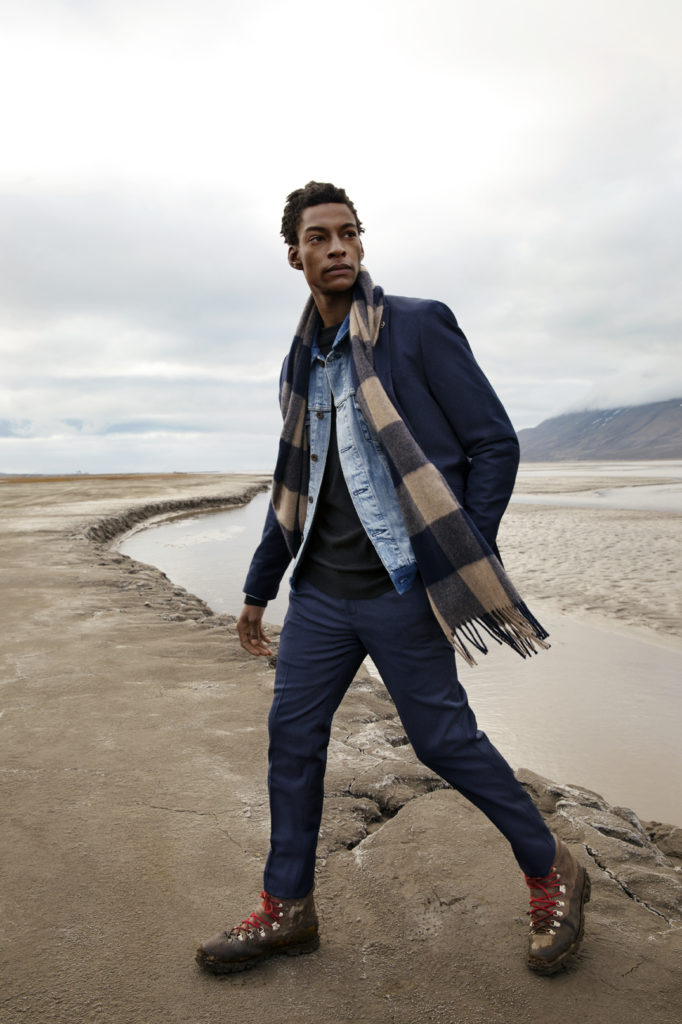
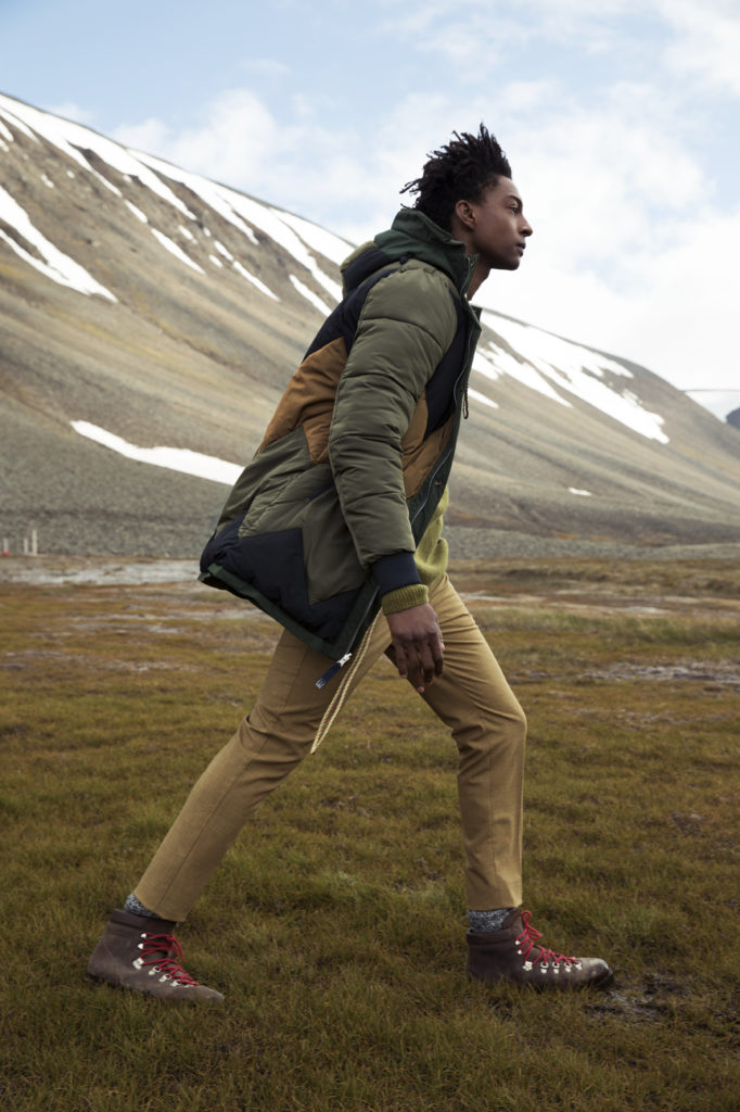
But in a way, the whole set-up is ‘on brand’ for Scotch & Soda. The Amsterdam-based label (the Dutch Amsterdam, that is) favours an eclectic mishmash attitude to fashion: different eras, places and cultures are merged into collections that speak of a sartorial freedom, as well as a ‘free mind’. If that sounds a bit ‘happy hippy’ it’s because Scotch & Soda is a spontaneous brand, not afraid to see where the wind them. It’s a brand of the world, and for the world. And in this case, it’s taken us to Amsterdamøya because Scotch & Soda firmly believes that Amsterdam can be everywhere; it’s about more than just canals, bikes and clogs. Travelling is about the journey not the destination, as the old saying goes.

Though when you’re at Latitude 79˚ 45.403’ N and Longitude 11˚ 00.819’ E, a metaphorical stone’s throw from the actual North Pole, the destination does have some impact – especially for the four armed guards that are here to protect us from attacking polar bears. We never see a bear but we get close to a group of walruses resting on the beach, and on our way out we spot whales in the distance. Here you see animals you only read about in books.

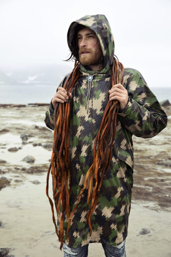
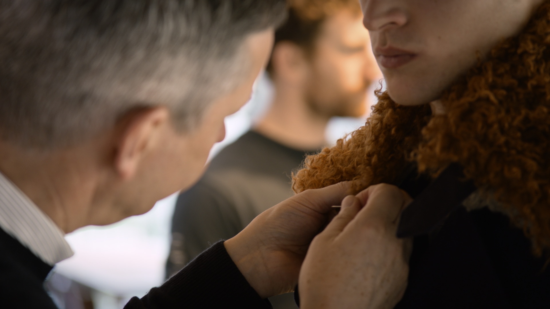
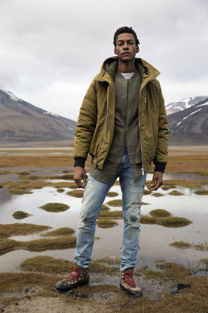
The models are not necessarily dressed for this sub-zero climate (there’s no Gore-Tex or fleece, instead the Scotch & Soda garments are layered up to keep them warm and dry) but it doesn’t matter: “You’re living on this island, but only in your dreams,” the photographer says to one model when explaining the character he’s playing. Loosely, the models take on the roles of explorers and adventurers, all characters in Scotch & Soda’s AW17 universe. It’s not for real – but the place, the climate and the island of Amsterdamøya are very much real. Here, there’s tension between fiction and reality; the role-play is acted out but there are potential real life consequences. The Arctic can be merciless; it doesn’t take prisoners.

Scotch & Soda could have filmed this elsewhere and just called it Amsterdamøya. Iceland, for example, is a lot closer to home and it looks similar in certain places. They could even have used a green screen in a studio to add the effect of Svalbard’s brutally monochrome landscape. We’ve made the journey because there are certain things you can’t fake; one morning, while filming on Gamle Mårøy’s upper deck, it starts snowing. Heavy flakes bounce off the rolling waves and soon cover the boat. Sure, it’s July but this is the Arctic – normal rules do not apply here. But even in the toughest of circumstances the film crew pushes on: Paolo Martins, Scotch & Soda’s art director, calls it “a sensible nonsense”. It’s a state of mind, the ability to make something out of nothing. 

To reach Amsterdamøya you first fly into Longyearbyen, the biggest town on Svalbard. It’s the world’s northernmost airport for commercial airlines. From Oslo, it’s a three-hour flight, but it’s worth it just to fly in over the mountaintops, fjords and glacier. The town sits on the east coast of Isfjorden, and when I land, at 1am, it’s as light as lunchtime. It takes some time getting used to, but we’re all happy we’re here in the summertime, rather then in deepest winter when you never see daylight and you need a headlamp to go to the supermarket. Longyearbyen is beautiful place, in an eerie way. A lot of the area is classed as a cultural landmark and there’s lots of abandoned equipment scattered around from when the island was a vital centre for coal mining.

But Svalbard’s mining days are long gone. Today, tourism is a big part of the financial eco-system up here and Ny-Ålesund, another Svalbard village, houses a research lab for 150 international scientists, which keeps the economy going. It’s here on Svalbard that the Global Seed Vault store a million seeds from all over the world in case a global emergency wipes out the existing ones. Its closeness to the Pole is also of interest to the Russians, who all live in a separate settlement on the island called Barentsburg.

The remoteness here is intense, and once we‘re on Amsterdamøya the silence is deafening. The only thing that brings back reality, except for the hushed chitchat among the crew, is the roaring diesel engine onboard Gamle Mårøy as she slices through the waves on the 17-hour trip back to Longyearbyen.

At the breakfast table on Gamle Mårøy there are ongoing production meetings and creative meetings; the film crew plot their storyboard while the print photographer works out who can have what model and when. At the back, the kitchen crew is still laying out breakfast while simultaneously preparing snacks for the film crew stepping ashore, and planning tonight’s dinner. The food cooked by the chef is local, fresh and tasty; we eat red snapper fish, deer and elk – we even try seal meat. It’s like a small-scale society on the boat, governed by Captain Odd Oliver Torkildsen. Everyone has a specific job that’s carried out with precision – there’s no room for mistakes.

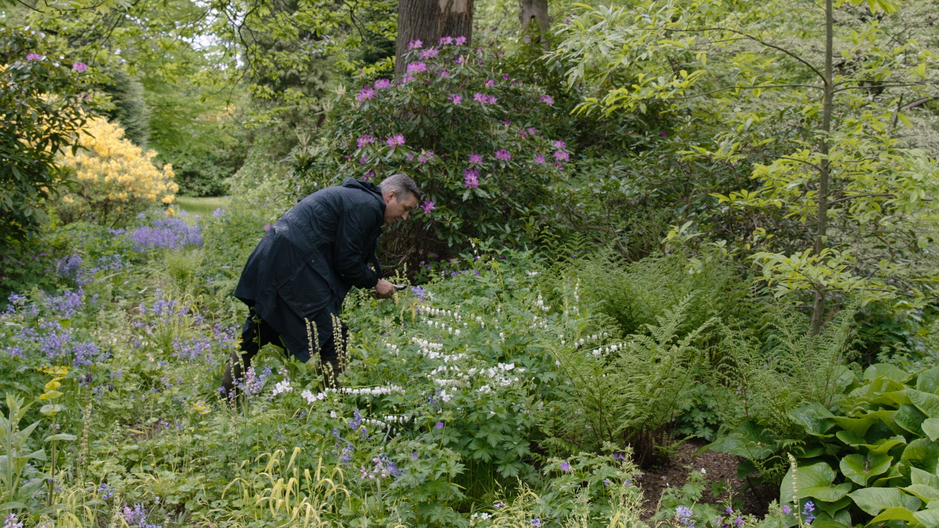
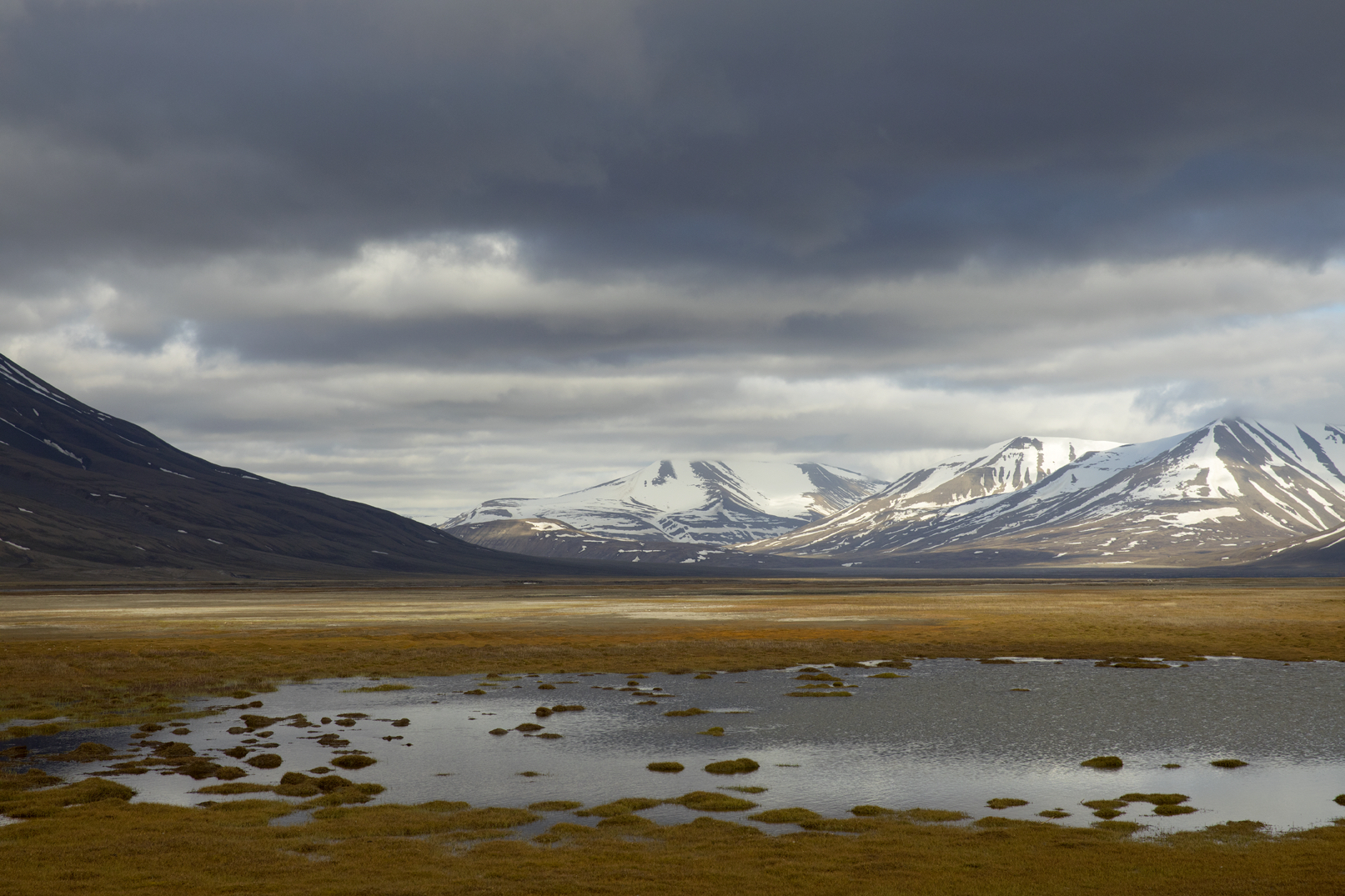
Inside the canteen it’s warm and cosy, but on Amsterdamøya there’s mostly wet moss and endless mountain peaks covered in snow and ice. Looking around, you sometime see another boat on the horizon, perhaps a fishing trawler, but there are no other fashion brands out here, that’s for sure. As the film crew covers yet another scene, the rest of us wander off to admire a group of beached walruses. In the water they are surprisingly agile but on land they can only crawl a few metres before having to lie down for a long break.

The Scotch & Soda brand, although over 30 years old, is like a curious and creative kid. Their want for adventure and discovery is a beautiful and child-like quality, which makes for playful clothes with a relaxed aesthetic. You can tell endless trips and adventures inspire and shape the collection. And when you’re shooting your campaign in the majestic shadow of a glacier you can’t help feel proud of Amsterdam, whatever Amsterdam you happen to find yourself in.

Photography Elizabeth Toll

Elements: The Beret

Port’s fashion features editor, David Hellqvist, reflects on the long, colourful and not completely French history of the beret

‘Homme au béret basque’ by Picasso Pablo. Courtesy of RMN (musée Picasso de Paris) Photo (C) RMN-Grand Palais (musée Picasso de Paris)

Picture a beret wearer in your head and they’ll most likely be French. Perhaps they’ll be in a striped Breton top, if you believe in stereotypes. But if you were to trace the hat’s history, you’ll find that it’s got as much to do with Spanish fashion as with French mode.

The two often overlap, as was the case with French-Basque tennis player Jean Borotra, who famously wore a blue beret while playing at the Wimbledon championship throughout the 1920s. It was Borotra that helped popularise the beret internationally, bringing it to an audience outside of France and Spain, where it has been commonly worn since the 13th century.

But the beret has always had an artistic air too, which only makes its affiliation with elite special forces around the world even stranger. This mixture of the intellectual and the macho means it is an alluring piece of clothing to work with today, as proven by Isaac Larose and Marc Beaugé’s Larose Paris brand. Having mastered everything from the trilby to basketball caps, Larose Paris now also offers berets, with or without its signature zip pocket.

There is no one else, arguably, that personifies the beret and its creative ambitions quite like Pablo Picasso. Born in Malaga in south-east Spain, he spent most of his adult life living in France, where he died in 1973 from a heart attack.

Some viewed him as a sartorial role model as well as an artistic master, as suggested in the 2014 book Institute of Contemporary Arts: 1946-1968. According to its co-author Anne Massey, researching the book unveiled the true power of Picasso’s beret.

“Among the monthly internal bulletins we found one concerning lost property,” Massey says. “It revealed that berets were left behind around the time of the Picasso show – he wore one and everyone was trying to copy him.” Well, we know what they say about imitation…

Take a look at a brief history of the French chore jacket 

Homage to a Classic: Adidas x Hender Scheme

PORT sits down with Adidas Originals and the iconic Japanese leather atelier, Hender Scheme, to discuss their latest collaboration

The adidas x Hender Scheme Micropacer

Fashion has long tried to redefine the concept of ‘luxury’, and to figure out what it means to consumers in 2017: just because something is expensive doesn’t necessarily mean it’s luxurious. Over the years the focus has moved on to the design process and, even more so, the craftsmanship needed to manufacture a product. How long did it take to make it, and how long will it last? Arguably, luxury is a combination of all aforementioned factors, and a high price tag the inevitable outcome from that.

Adidas, the German sportswear giant, is not a stranger to expensive fashion. Over the years it’s worked with various designers – everyone from Yohji Yamamoto and Raf Simons to Rick Owens and Alexander Wang – on short and long-term projects. At the same time, the bulk of its trainers and apparel are affordable and accessible, the definition of democratic fashion, as opposed to luxury. As such its latest collaborative partner, Japanese leather experts Hender Scheme, perfectly illustrates Adidas’ ability to scale ‘luxury’ in order to offer different types of products to different customers, without losing its DNA and brand personality.

The adidas x Hender Scheme Superstar

Founded by Ryo Kashiwazaki in 2010, Hender Scheme makes a wide array of leather goods, though is best known for its ‘Homage’ footwear line. In it, Kashiwazaki recreates various iconic trainers, from the likes of Adidas, Vans and Nike, using his signature ‘nude’ leather. The rawness of the material makes the craftsmanship that goes into the handmade trainers evident for the wearer as well as distant observers. Because of this, Hender Scheme might seem like an obvious collaboration match for the cherry picked brands, but in today’s design climate, with corporate trademarks and the red tape of intellectual property, it could also have lead to an expensive lawsuit.

It’s this that makes the Adidas x Hender Scheme project even more relevant. Based on a mutual respect, it is the ultimate collaboration in that it combines three mainstream Adidas silhouettes with Ryo’s intricate and limited interpretations. The styles – the NMD, Superstar and Micropacer – have all been stripped of its technology and remoulded in Ryo’s fine leather. They are no longer digital sportswear icons, but wearable and analogue pieces of art. PORT sat down with Kashiwazaki and Erman Aykurt, Senior Design Director for Adidas Originals Statement, to discuss the design process, the role of psychology in footwear and how Kashiwazaki retains ownership of his trainers.

The adidas x Hender Scheme Micropacer

Ryo Kashiwakazi, you studied psychology before going into footwear. Have you ever had any use of this experience in your current job, in an abstract or concrete way?

When you manufacture something, you always involve a group of people who actually make the product. I can apply my knowledge of psychology when communicating with them. The process of shoemaking involves a lot of divided labour, or divided roles. To make a shoe like this you probably have about fifty people involved one way or another, from the leather supplier to someone stitching them together, so it’s always important to create a shared goal among all of them, and to make everyone feel valued and involved. So, yes, psychology comes in handy!

You started out as a cobbler. Do you think that formal shoes are the foundation of footwear? Is that why you wanted to start at that end of the industry as opposed working with trainers straight away?

From my experience of repairing shoes I gained a lot of knowledge about how shoes are worn, and what happens to the shoes once they’ve been worn for a while. That helped me build my shoes and trainers, trying to foresee what will happen to them once they’ve been used for a while.

The adidas x Hender Scheme NMD

More than shoes you also produce other products, but what runs through the company is the use of leather and colour. What qualities does leather have that makes it so great for you?

For me, the thickness and tension are very important. For example, leather can be shaped into softness. If you don’t shape it, you can keep it hard. And the reason I use this natural colour is that you can see aging very clearly.

There’s a sense of purity to this colour, which makes it a great starting point, no?

Usually we dye from this colour, so this is starting point. It’s very delicate and sensitive; it can easily get stained as it’s basically untreated.

Another thing that strikes me is that you’ve borrowed existing silhouettes, and you’re using a colour that lends itself to the wearer putting his own stamp on it. So how do you retain ownership? Are you even interested in that?

Not sure it explains the ownership question, but the point of re-creating existing styles is to show off the work of the craftsmen, to introduce the work they do. So I suppose the product making is more important than the ownership.

You’ve reworked quite a few different brands. Is this the first time one of them has actually come to you and said, ‘let’s do something together’?

Yes, and because I was ultimately doing this out of respect for Adidas, it made me very happy that they respected me in the same way.

On that note, over to you Erman…  What was the initial Adidas reaction when you saw these products?

I can only say that, within the Originals department, we were really honoured. From a company perspective, there’s always two different ways how to look and deal with someone paying homage. But as we’re a global organisation with an office in Tokyo, there was already a personal relationship in place with Ryo-san. And it was very clear to us from the beginning that Ryo was working out of respect for our brand. And the mantra for everything we do in Consortium is based on mutual respect, so we wanted to meet him halfway and start a dialogue based on that.

The adidas x Hender Scheme NMD

What was it that impressed you? Was it the craftwork, or the craftsmanship?

Obviously the craftsmanship is something we admire and that we look up to. Even people who have been with the company longer than I have wouldn’t be able to do that even themselves. I know out of experience that what Ryo-san is doing is impressive. When Ryo-san came to Herzo , we gathered lots of people from across different Adidas branches and everyone was putting their latest innovations on the table, and he was known to everyone.

How did you end up with these three styles?

All of these shoes have been technological advancements of their own time. The NMD consists of Primeknit and our boost technology, the Superstar Shell Toe was high-tech at the time and, obviously, the Micropacer stands like nothing else for this sort of future-retro expression of the past.

From left: the adidas x Hender Scheme NMD, Micropacer and Superstar

Would you say that this is the ultimate in trainer luxury?

Well, what defines trainer luxury? It’s about combining a globally known silhouette with any form of limitation. In this case you have three of the most iconic sneaker silhouettes in the world, and you have, through the manual labour, one of the most authentic but at the same the most extreme limitation when it comes to creating quantities. It’s not limiting for the sake of limiting; it’s limiting because it’s not actually possible to create more!

The Vision of Dries Van Noten

An intimate documentary directed by Reiner Holzemer follows a year in the life of the Belgian designer as he reveals the creative process behind four collections

Dries Van Noten selecting fabrics in his studio in Antwerp

Dries Van Noten is one of the most unassuming figures in fashion. In an industry which otherwise moves at an impossible pace, he is a thinking, feeling designer, and for more than 25 years, he has remained independent in the face of fashion’s runaway globalisation. 

Despite his relatively low profile, Van Noten is a veteran designer and celebrated his 100th show in March this year. A master of print, pattern and texture, he emerged from Antwerp’s Royal Academy of Fine Arts in the early ‘80s as part of a group of designers including Walter van Beirendonck and Ann Demeulemeester, often referred to collectively as the Antwerp Six. Since launching his namesake label in 1986, he has become widely respected as a designer who has forged his own path.

In a new documentary directed by Reiner Holzemer – whose past films include portraits of artists and photographers such as David Lynch and Juergen Teller – the Belgian designer gives rare access to his home and work life. Over the course of a year, Dries documents the makings of four collections, from his studio in Antwerp to backstage at his fashion shows in Paris. In doing so, it offers a glimpse into the world of “one of fashion’s most cerebral designers”, as The New York Times has described him.

Dries Van Noten with Jürgen Sailer, head of men’s design in his studio in Antwerp

Holzemer, himself a relative newcomer to the inner workings of the fashion industry, met Van Noten while filming his 2011 documentary on Juergen Teller. Immediately taken with the designer’s intuitive approach, it took the German filmmaker three years to convince a camera-shy Van Noten to be the subject of his next film. While the designer had outright turned down the proposals of other directors, Holzemer was spurred on by the fact that he never said no. Twice a year, they would meet at Van Noten’s shows and each time, Holzemer would ask again.

“I think what encouraged him, or interested him in my work, was that I was not coming from the fashion world,” Holzemer explains. “I wasn’t a fashion filmmaker and he saw some of my films as portraits of artists, and I think he liked that approach.” After this prolonged game of cat and mouse, Van Noten agreed to open up his work and home to Holzemer and a small crew.

Dries Van Noten with Jürgen Sailer, head of men’s design in his studio in Antwerp

Holzemer’s genuine affection for Van Noten comes across in conversation and his respect for designer is more than apparent in his portrayal. Fashion documentaries often capitalise on moments of drama and the frenzy of the eleventh hour, but Holzemer cites examples such as The September Issue and Dior and I as precisely the type of fashion film he wasn’t looking to make. With Dries, he insists he wasn’t interested in playing up to the same stereotypes; the appeal was the person, not the industry. 

An important aspect of the film is its depiction of Van Noten’s life in Antwerp, where he continues to live with his long-term partner, Patrick Vangeluwe, and his dog, Harry. The choice not to live in Paris, where his collections are shown, is a considered one. “There’s less distraction and he can really concentrate on his work,” says Holzemer. “It’s important for him to live his own rhythm, to live in his own world. And that’s why he’s always creating something new and unexpected.”

Dries Van Noten in his garden in Lier, picking flowers for the house

In Dries, Van Noten touches on what he calls the “rat race” of fashion. Speaking of the immense pressure placed on designers today, many of whom are tasked with producing a growing number of mid-season collections, Holzemer says, “In a way he’s an exception and in the same way he’s typical, I think.” Yet, while contemporaries might produce in excess of eight collections a year, Van Noten has refused to compromise the quality of his ideas.

“When he designs something, when it’s too beautiful, he adds something distracting or something ugly to make it more interesting, and that’s an ongoing process all the time,” Holzemer explains of his process. “I found that Dries doesn’t draw. He works like a sculptor, working with the fabrics on a live model, more a less. That was very hard for him to show – how he works – because he was always a little bit afraid of showing something that was not perfect, and might even look a little banal in the eye of the audience.”

As seen through the eyes of Holzemer, the designer’s high-profile admirers, and Van Noten himself, what comes together is a portrait of a man who strives to bring the same artfulness to all areas of his life. “Do you think people like Dries are disappearing in the world today?” Holzemer asks Iris Apfel as the documentary draws to a close. “Not disappearing, darling – they’ve disappeared,” she says. “He’s a treasure and has to be treated as such.”

Dries Van Noten working on a collar for the Men’s Winter 2016 collection

Dries, directed by Reiner Holzemer, is out now on DVD 

The Wardrobes of Legendary Writers

Style and substance sit shoulder to shoulder in Terry Newman’s new book, which examines the personal styles of 50 literary icons from Joan Didion to James Joyce    

“Style is character,” Joan Didion famously wrote. The American writer, whose output is peppered with references to the cultural significance clothes, was talking about the tendency to view someone’s work as a reflection of their person. Specifically, she was writing about her young daughter’s desire to meet Georgia O’Keeffe after seeing her paintings. “She was assuming that the glory she saw in the work reflected a glory in its maker, that the painting was the painter as the poem is the poet…,” Didion tells us.

This is a common, almost instinctive, assumption about artists, wherein the politics of personality and style reign supreme, but is to a lesser extent applied to the literary world. It is telling then that Didion, the well-dressed woman, has become inseparable from her sharp, stylish prose. 

London-based fashion journalist and writer Terry Newman takes this idea one step further in her new book, Legendary Authors and the Clothes They Wore, which details the relationship between the writing and wardrobes of 50 iconic authors. Ahead of its release, Newman sheds light on the book below. 

On the inspiration behind the book…

“I have only ever been interested in two things: books and clothes. When I started thinking about writing a book, it seemed to me that writing about what authors wear would be interesting. When I was growing up, I was a voracious reader and authors themselves were just as interesting as the books they wrote. I was always fascinated by the characters behind the books.”

On style versus substance…

“People sometimes feel that the clothes can be superficial and I have to say, when I sat down to write this book, I thought, perhaps this is a mad thing to do, to talk about such amazing writers and analyse them as per their clothes. Then I realised that is just not how I feel about clothes. 

Clothes reveal intense amounts about people; about their character, about their purpose, about their emotions. It seemed to me, to find a little bit more about these authors that I love, that looking at their clothes was a really obvious choice. It can be as revealing as talking to somebody. I can’t talk to Samuel Beckett because he is dead, but looking at his clothes gave me a glimpse of his personality. When people refer to clothes as being superficial, I think they are missing the point.”

On what she learned…

“What I found was that my premise was correct. As I started researching, what was most interesting was all of these authors had a style, they all had this uniqueness. But also the way they wrote about and used clothes in their literature was similar as well. They are all magnificent writers, all of them to a greater or lesser extent use clothes as a way of illuminating character. From James Joyce right through to Tom Wolfe, not one of these authors have dismissed clothes as being superficial in their work. What I feel about clothes, almost all these authors feel. They are important and interesting.”

Legendary Authors and The Clothes They Wore by Terry Newman, published by Harper Design, an imprint of HarperCollins, is out on July 27

Interview conducted by Hikmat Mohammed

Mario Testino on Newton and Nudity

The prolific photographer reveals an intimate side to his work in a bold exhibition of photographs at the Helmut Newton Foundation

The human body is an inexhaustible subject in photography. By blurring boundaries between fashion, eroticism and art, Mario Testino has unravelled the politics and symbolism of the body throughout his work. In an exhibition conceived for the Helmut Newton Foundation in Berlin and its catalogue by the same name, Undressed, the photographer explores nakedness through 50 images from his archive. 

Testino, much like Newton before him, offers an empowering perspective on the body, and where Newton established a confident image of femininity, Testino challenges masculine paradigms. The playful, unfettered atmosphere of his studio is captured through effervescent portraits of anonymous, androgynous men as well as supermodels such as Kate Moss and Amber Valletta, which even at their most daring, never slip into the vulgar. Including previously unseen photographs, Undressed reveals a more intimate side to the photographer’s work and in the process, he too lays himself bare.

What kind of impact did Helmut Newton have on you as a young photographer? 

He had pretty kinky ideas that could well have been seen as vulgar or too pornographic, but because they were presented so stylishly in Vogue it was considered elevated work. Seeing this taught me that, whatever you do, if you do it well and elegantly it can live on its own.

In Ways of Seeing, John Berger makes a clear distinction between nudity and nakedness. As a photographer, how do you negotiate that tension?

To me nudity is the way people are made and nakedness entails a certain provocation. I think both are valid in their own way. Why not provoke when you can?

Does nudity still have the power to shock? If so, where does that fit in with your photographs?

I think that it is definitely less shocking today, although it is still provocative. I find it interesting that male nudity seems to shock more than female nudity. Is it because we are more used to seeing women naked than men? Or perhaps it comes from men being more shy with their bodies? I don’t know.

What was the catalyst for Undressed and how did you approach the selection process?

The show marks a significant point in time for me. The majority of the works in Undressed come from the ’90s, which was a transformative moment in my career. It was a point where I was identifying the new people coming into the industry and photographing them naked. I think in some odd way the nudes I did then undressed me too, of my limits and preconceived ideas about image-making. They influenced and informed the way I did my fashion photographs.

Has hindsight changed the way you feel about any of these photographs? Did anything surprise you? 

It is great to come back to these images after a long period. I realise I have changed a lot since the ’90s, when most of these works were shot. I think back then I was very precise and today I am a lot more open. But I needed that precision to discover the Mario Testino of today.

Ultimately, what would you like people to take away from both the exhibition and the book?

I feel these photographs show a strength in these people, despite being naked. Not everyone feels like that and I would love to feel that people took away some of that essence in themselves. They should be proud of how they are made and gain strength from nakedness, instead of insecurity.

Mario Testino: Undressed is on show at the Helmut Newton Foundation in Berlin until 19 November. The accompanying catalogue, published by Taschen, is out now

dunhill: Our London

Celebrate the capital through the eyes and minds of an architect, a chef, an entrepreneur and an adventurer, each with a unique story to tell about their city 

This month, dunhill has partnered with Port to present a series of four films exploring London through the eyes and minds of an architect, a chef, an entrepreneur and an adventurer. Chung Qing Li, Michel Roux Jr., Robert Scott-Lawson and Matthew Robertson are men of style and substance, each with a unique story to tell about their city.

Watch the full films from the Our London series here.

Michel Roux Jr. – Chef

Michel Roux Jr. is a Michelin-star chef and patron, and a man of classic taste and style. His restaurant La Gavroche, in London’s Mayfair, is one of the finest in the country. The name Roux is synonymous with French haute cuisine in Britain.

Matthew Robertson – Adventurer

Adventurer and filmmaker Matthew Robertson is a Londoner that finds peace in the wilderness. As the founder of Momentum Adventure, he scours the earth seeking out unique experiences and environments.

Chun Qing Li – Architect

Architect and entrepreneur Chun Qing Li is the founder of China Design Week and KREOD, an award-winning interior design and architecture practice in London. Standout designs include the China International Trade Pavilion built for the Rio Olympic Games 2016.

Robin Scott-Lawson – Entrepreneur

Robin Scott-Lawson is an established entrepreneur and has called London home since he was 18 years old. His London-based agency My Beautiful City specialises in high-end art direction, experiential marketing and event production. 

Watch the full films from dunhill’s Our London series here

A Port Creative production 

Photography: Christophe Meimoon at Quadriga Management
Styling:  Dan May
Grooming: Grooming by Tyler Johnston @ One Represents using Moroccanoil and Givenchy La Make Up
Production: Emma Viner
Interviewer:  George Upton
Editorial Director: Dan Crowe
 
Film Production Studio: Black Sheep Studios
Producer:  Michelle Hagen
Director:  Simon Lane 
DOP:  Tom Sweetland 
Exec Producer:  Dan Keefe

Stories of Craftsmanship

In a series of six short films, Canali explores the craft and construction of some of its key designs

‘Where do stories come from?’ asks Italian writer and director Ivan Cottroneo. ‘Everything starts with a blank page – metaphorical or physical – or a blank screen in a cinema before a movie begins. This is a very significant image and despite everything that is said about writer’s block or director’s block, this image is inspirational to me. I get the urge to fill that blank screen, I want to fill that blank page.’

In a recent collaboration with Canali, Cottroneo – who co-wrote the script for Luca Guadagnino’s I Am Love – came together with Luca Bigazzi, director of photography for Paolo Sorrentino’s The Great Beauty, and Oscar-winning composer Dario Marianelli to create an exclusive short film. The result – Rewind – pays homage to the attention to detail involved in the making of a Canali blazer, from pattern-making to the final stitches. 

Now, this narrative continues with Stories of Craftsmanship, which explores the craft and construction of some of the other garments the brand is best known for. Six short films released over the several weeks each focus on an item from the Canali catalogue: The Shirt; The Tie; The Shoe; The Belt; The Sweater; The Trouser. The latest episode, released today, focuses on the construction of a Canali sweater. Watch it here


Alasdair McLellan X Margaret Howell

Fashion designer Margaret Howell and photographer Alisdair McLellan reveal a new exhibition, which will show off the fruits of a 13-year long collaboration

For five seasons, Margaret Howell’s love for the varied landscapes of Britain and the clean simplicity of modernism have been encapsulated through the lens of British photographer Alisdair McLellan. Now, or the first time, the pair will exhibit 40 images from the 13-year long collaboration in a specially curated show.

The partnership, which began in 2004, has been shaped by Howell’s “very distinct vision of the British Isles” suggests McLellan. “She loves it when the weather is typically British and isn’t bothered when we’re shooting if it’s raining in summer, or sunny in winter,” he says. “She understands that this is the way the country happens to be and goes with it. Margaret prefers to shoot in black and white too, which is brilliant.”

“I know what I want our photo campaigns to achieve and Alasdair knows how to achieve it,” Howell adds. “His judgment, vision and tenacity make for a valuable partnership.”

Since they first began working together, McLellan has produced over 40 photographs for Howell, all of which capture the brand’s hallmark aesthetic of quiet, contemplative beauty. Celebrating the diversity of Britain’s geography, the images were shot at a plethora of unassuming locations, including Wensleydale in North Yorkshire, Devils Dyke in East Sussex and, for SS17, the historic seaside town of Hastings.

McLellan’s images will be exhibited at Margaret Howell, 34 Wigmore Street, London, from 17 February – 19 March. The exhibition will coincide with Howell’s first combined AW17 menswear and womenswear runway presentation at London Fashion Week.