Saint James: A Stripe for All Seasons

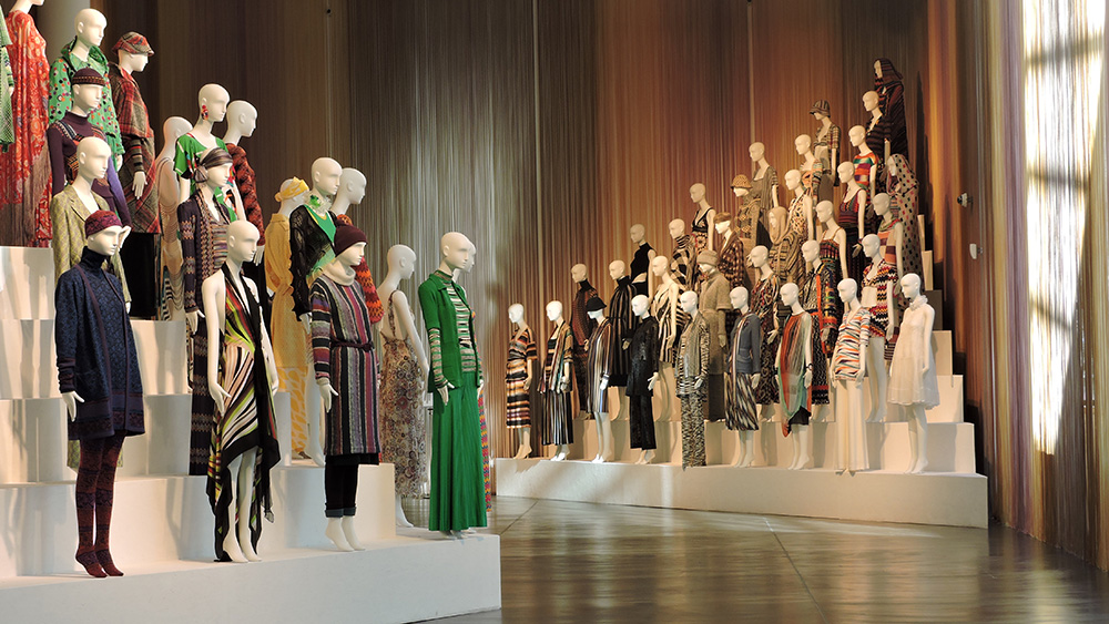
PORT discovers the slow fashion and local ethos of Saint James – the small, Normandy-based fashion brand that has become an icon of French style

Pascale, Véronique and Nathalie – the children of Bernard Bonte, President of Saint James, 1976

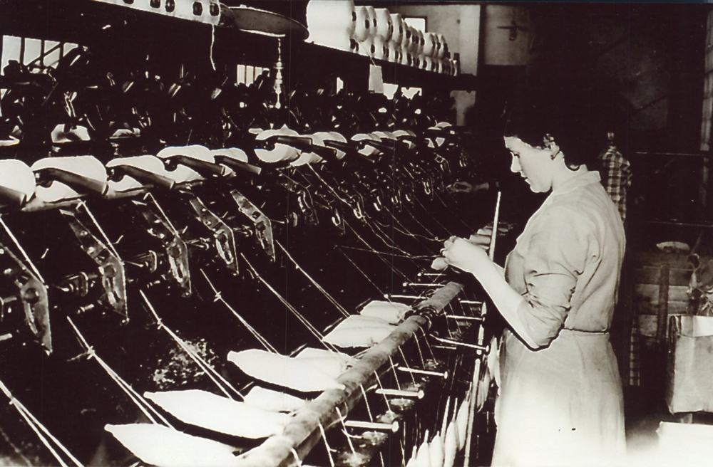
Founded by William the Conqueror in 1067 – the year after his victory at the Battle of Hastings where he secured the English crown – Saint-James is a small town located a few miles inland from France’s northern coast. With a population of less than 3,000, it would be a quiet, unassuming place were it not for the town’s eponymous clothing brand, which was founded by the then mayor in 1889 and is still headquartered there today.

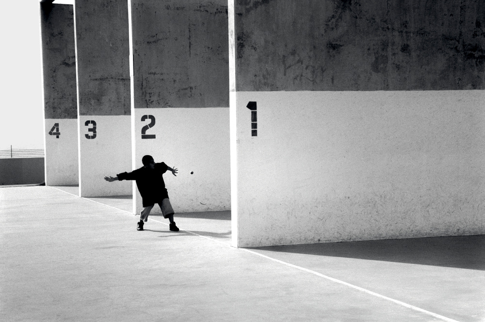
The Saint James Company (aka Saint James) is perhaps best known for producing a version of the iconic marinière, the striped shirt designed initially for fishermen in Brittany and later adopted by the French Navy in 1858. According to Breton folklore, the top’s 21 stripes represent Napoleon’s victories over the British at sea, while also making it easier to see any men wearing it who have fallen overboard. Yet, despite this long, illustrious and militaristic tradition (which includes commissions by both the French Army and Navy), Saint James maintains an unusually relaxed commercial attitude.

Production of the Breton striped tee in Saint James’ atelier in France

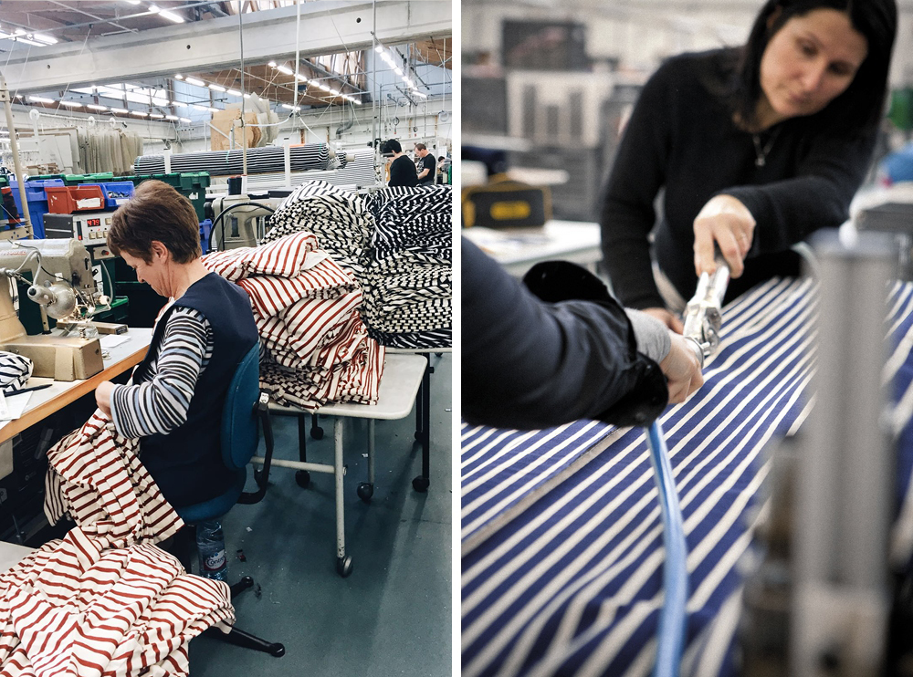
“The sirens of fast fashion – the cheap and disposable clothing made for the sake of renewal – do not appeal to us at all,” says Luc Lesénécal, President of The Saint James Company, when asked why, with such a prestigious history, his brand’s output remains small.

Lesénécal joined the company in 2012 and is proud of the brand that he invested in financially as well as professionally. “The region and local culture are in my blood,” he says. “I sought to get personally involved with a beautiful company and that represented a strong legacy and a unique know-how. I found this with Saint James.”

Saint James Binic II, Succès Magazine, 2005

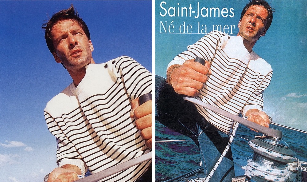
In popular culture, the Saint James marinière has become synonymous with Gallic chic – from the beret-sporting French stereotype, to the discerning eye of designer Coco Chanel and the gamine charm of Jean Seberg in the iconic New Wave film Breathless. Donned by Pablo Picasso and Jackson Pollock, as if channelling the freedom of the shirt’s seafaring origins, it has come to be associated with avant-garde and bohemian life.

Wool spinning at the original Saint James factory

“The Breton top, as it’s called in English, – though I prefer to call it a sailor shirt – is one of the essential three pillars to the brand, in addition to the connection with Mont Saint-Michel and knitting with wool,” Lesénécal explains. “The shirt’s 21 stripes are a nod to Bonaparte and his victories, but they represent so much more. They embody everything positive that French culture has to offer. They are timeless and simple in their beauty.”

Saint James archival imagery

Given Saint James’ pedigree both as a lifestyle brand and as a military outfitters, I wondered how Lesénécal viewed the company and if the philosophy has changed over the years.

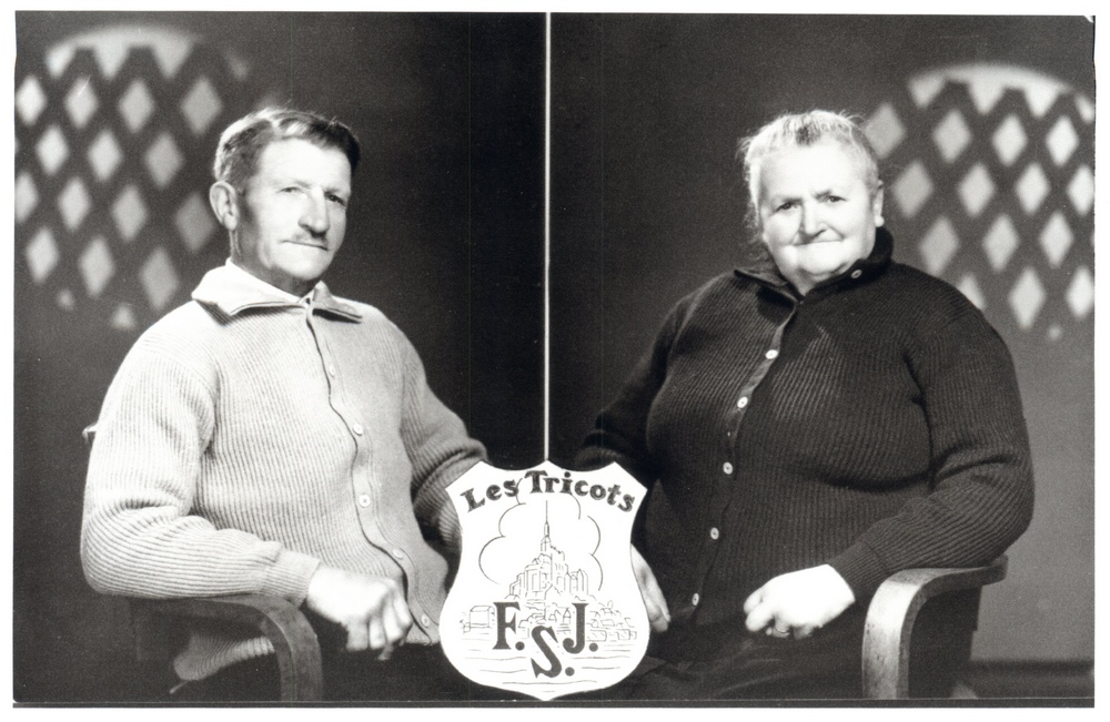
“We respect all people, from our designers to our manufacturers and quality controllers,” Lesénécal says before explaining that Saint James’ history and legacy is defined by the brand’s core values: independence, exemplified by the fact that it’s owned by its employees; open-mindedness; a tradition of quality materials; and a crew spirit.

“Our contract with the French Navy and Airforce just got renewed for the next four years and we’re really proud of that,” he tells me. “I’d say that Saint James represents the defence of some values that are dear to France. It applies to a country, but also to fashion and to simply making a strong statement through our clothes by making our customers feel good in them.”

So Far, So Goude: A Body of Work

In a rare interview, Jean-Paul Goude, the multi-talented graphic artist and photographer who ‘broke the internet’, discusses his new collaborative exhibition with Tod’s in Milan

It’s almost the norm for an artist to stick to a single medium after they’ve mastered it. One reason for doing so could be to avoid spreading themselves too thin, and diluting their talent across various artistic formats. But, for 75-year-old French artist Jean-Paul Goude, this was never the case. The multifaceted Parisian began his career at Esquire magazine in the 1960s, where he became art director. Since then, the Frenchman has worked as a photographer, filmmaker, graphic designer and illustrator across television, fashion, publishing, fine art and performance. In 1989, Goude was given the honour to art direct France’s bicentennial parade, which marked 200 years since the end of the French Revolution.

Goude’s body of work stretches back over four decades and, to celebrate that achievement, Padiglione d’Arte Contemporanea in Milan is hosting a retrospective exhibition of the artist’s oeuvre, in collaboration with Italian shoe and leather brand Tod’s. The show includes a number of Goude’s sketches, which he draws out before embarking on every single project, as well as other images and photographs produced during his 40-year career, including his powerful and sexually charged images Grace Jones – his muse – and the notorious image of Kim Kardashian that supposedly ‘broke the internet’. Here, we catch up with Goude to discuss his upcoming retrospective.

Naomi Campbell, Knysna, 2009. Image courtesy of Jean-Paul Goude

You have been described as an artist, illustrator, photographer and a filmmaker. How do you prefer to define yourself?

I am a graphic artist. That’s what I am and that’s why I use film, photography and drawings.

Your work is renowned for the careful handmade process it requires. How would you describe the creative journey that brings your images to life?

I try to find an idea first, then I transform that idea into a drawing because I am obsessed by proportions. The drawing can be developed into a script or into a film. Generally, this is what I do also with photography: the pictures are the result of my graphic mentality. You start with a white page and you imagine what you want to put on the page and then develop the idea. A real photographer, instead, is there to capture an extraordinary moment and that is different – that is not my mentality at all. I start from the style and this is why I do all my drawings first. What is interesting is that all of these images go together quite well; my childhood fantasies are still the same at the end of my life as they were at the beginning.

Can you tell us a little bit more about this collaboration with Tod’s on So Far So Goude?

This is my first time in Milan and it is wonderful. I was delighted to be invited, it is a great compliment. The exhibition collects a range of my sketches, drawings, photographs and films done between Paris and New York. We looked back in time and tried to determine the roots of my work.

How did the women you met in your life influence you and is there a special meaning in the title of this exhibition?

I didn’t meet many women. I really fell in love maybe three or four times in my life and obviously these women became the subjects of my pictures and films. The title refers to the expression, and this is what happens with me. It means the story is not finished yet: I am still alive and I am still producing. So far, everything is really good.

So Far, So Goude runs at the Padiglione d’Arte Contemporanea in Milan until 19 June

The Art of Fashion: Missoni Art Colour

PORT speaks to Luca Missoni about his new exhibition at the Fashion and Textiles Museum that charts how, for the past 60 years, the luxury Italian brand has found inspiration in early 20th century European art

The Forms of Fashion installation of Missoni garments dating from 1953 to 2014 at MISSONI, L’ARTE, IL COLORE, 2015

For the past 60 years, the luxury Italian clothing brand, Missoni, has been finding inspiration in the company’s extensive archive of Futurist, Abstract Expressionist and Orphist artwork – driving innovative new patterns and approaches to weaving.

Founded by Ottavio and Rosita Missoni in 1953 after the two met at the 1948 London Olympics, where Ottavio competed as a sprinter, the brand has since become a standard-bearer for luxury textiles and colourful knitwear. With such a long, rich history, Missoni’s archive needs constant attention – a responsibility that falls on Ottavio and Rosita’s son, Luca, now the artistic director of the Missoni Archive. His latest project, Missoni Art Colour, is a retrospective of Missoni’s work in the context of early 20th century European art, on show at the Fashion and Textiles Museum in Bermondsey, south London until 4th September 2016.

Left: Sonia Delaunay, Untitled, 1936, 64x46 cm, gouache on paper – Right: Ottavio Missoni, Senza titolo, 1971, 73 x 73 cm, acrylic on board. MISSONI, L’ARTE, IL COLORE
Left: Sonia Delaunay, Untitled, 1936, 64×46 cm, gouache on paper – Right: Ottavio Missoni, Senza titolo, 1971, 73 x 73 cm, acrylic on board. MISSONI, L’ARTE, IL COLORE

Now, six decades after first opening for business, Missoni has changed relatively little. “You can adapt the content to contemporary times,” Luca explains. “The way it looks may vary each season depending on the fashion but the overall concept, the aesthetic which emerges during textile development, is always at the core of our work. The first excitement is designing the textiles – that’s the speciality, the nature of the work. Then the fashion is the game, the environment.”

The exhibition showcases how artists such as Lucio Fontana, Sonia Delaunay and Gino Severini created art that brought about a new way of thinking about image, colour, composition and fabrics: “a new vision,” as Luca says. It also presents the unique process that Missoni used to knit artworks into textiles. There are over 60 works hung throughout the show – half of which are by Ottavio – plus previously unseen textiles, drawings, wall hangings, paintings and patchworks.

“My father liked to work on graph paper during the early 70s, then later he started the patchwork studies,” Luca says. “It was a way to understand how you conceive a textile, a composition of a weave.”

Left: Ottavio and Rosita Missoni, 1984. Photograph by Giuseppe Pino – Right: ‘La sala degli arazzi’ installation of Ottavio Missoni's patchwork of knitted fabrics at MISSONI, L’ARTE, IL COLORE, 2015
Left: Ottavio and Rosita Missoni, 1984. Photograph by Giuseppe Pino – Right: ‘La sala degli arazzi’ installation of Ottavio Missoni’s patchwork of knitted fabrics at MISSONI, L’ARTE, IL COLORE, 2015

In the main room, 42 mannequins stand in formation, rising up to the ceiling on platforms, each adorned in Missoni pieces that, in some cases, date back to the brand’s earliest days in the 50s. But Missoni Art Colour is not the brand’s first retrospective.

“We did one in 1978, which was our 25th anniversary,” Luca tells me. “My mother realised that we should look back on the brand, so she starting asking around friends and relatives, people who had old Missoni clothes and eventually gathered all these old pieces.”

Asked whether Abstract Expressionism and Futurism were the main art movements that influenced Missoni’s collections, Luca responds with certainty: “Definitely! They were important in a conceptual way – how colour and pattern could be perceived and experimented with. So my parents proposed that kind of vision into everyday clothing, not just costumes for a ballet or theatre.”

Enrico Prampolini, Composizione, 1952, 80x115 cm, oil on masonite
Enrico Prampolini, Composizione, 1952, 80×115 cm, oil on masonite

An artist who had a big effect on the Missoni aesthetic, in particular Rosita, was the Ukrainian-born French artist Sonia Delaunay, who (with her husband Robert Delaunay) formed the Orphism movement – a pure form of abstraction with a strong geometric sensibility and bold colours.

“Sonia Delaunay had an amazing influence on my mother’s formation,” Luca says. “Sonia’s use of geometry, line, shape and colour pushed Rosita to use the movement as inspiration for her textiles.”

Ottavio Missoni, Untitled, 1973, 173x98 cm, acrylic on board
Ottavio Missoni, Untitled, 1973, 173×98 cm, acrylic on board

As this exhibition makes clear, the breakthroughs of the Abstract Expressionist and Futurists artists in the beginning of the 20th century laid the foundations for the arts of the post-war era. As Luca explains, his parents were lucky – starting their business when they did, and finding such inspiration in the art of the recent past, they were able to make the most of an extremely “fertile, artistic and cultural situation”.

Missoni Art Colour runs until the 4th September 2016 at the Fashion and Textile Museum, 83 Bermondsey Street, London, Se1 3XF

Bottega Veneta in Beverly Hills

Bottega Veneta’s creative director Tomas Maier reveals the design inspiration behind the Italian brand’s latest US store

Inside Bottega Veneta's new Beverly Hills maison, 320 North Rodeo Drive
Inside Bottega Veneta’s new Beverly Hills maison, 320 North Rodeo Drive

For the last 15 years, Tomas Maier has been at the helm of Italian luxury brand Bottega Veneta as creative director. In addition to designing both the men’s and womenswear collections, Maier has also taken responsibilty for the overall direction of the brand, the global aesthetic and its continued expansion.

The parents of the German-born designer were both architects and, as a result, Maier’s upbringing has given him an broader understanding of design disciplines beyond the construction of fashion. Perhaps that’s why the brand’s new maison, on North Rodeo Drive – the label’s second Beverly Hills store – aptly encapsulates the Bottega Veneta’s overarching ethos, all carefully put together by Maier.

Inspiration for the maison comes from the Mediterranean Revival style of architecture, as well as the work of southern California architects, such as George Washington Smith and Bertram Goodhue. Set within 4,828 sq ft, it caters for the full range of Bottega’s lifestyle products. Here, we speak to Maier about the pull of Beverly Hills, the four principles behind the design of the new maison, and the tension between architecture and fashion.

BOTTEGA_VENETA_BEVERLY_HILLS_090+133

When drawing up plans for the new store, what was the thought process behind it?

The maison is all encompassing. It is representative on many levels: location, building, architecture and interior product categories. When represented they all come together in a unique way specific to the place.

As always, the four cornerstones [of Bottega Veneta] guided the design of the project: outstanding craftsmanship, innovative design, contemporary functionality and the highest quality materials. The building is pure and understated… we wanted to honour this by accentuating the feeling of lightness with features such as the skylights created on the upper floor. The colour palette for the interior is compromised of neutral, earthy tones selected specifically to enhance each area.

What was the message were you trying to convey to customer?

My hope is for visitors to feel transported into a calm environment where there are elements of surprise. There is a dedicated space to showcase the icons of the house as well as all the new pieces we offer, so one can get a true sense of the lifestyle of Bottega Veneta.

Outside Bottega Veneta's new Beverly Hills maison
Outside Bottega Veneta’s new Beverly Hills maison

What is it about Beverly Hills that made Bottega want to open another new maison?

Bottega Veneta had been in the same location on Rodeo Drive since before I arrived at the house, and while our concept was introduced back then to reflect my vision, it was never our true creation. We wanted to give the store the distinctive setting it deserved and provide our clients with an innovative experience showcasing a much more complete range of our offering. When the building at 320 North Rodeo Drive became available, the existing qualities of the city’s architecture, and the possibilities, where overwhelming.

Early Mediterranean Revival and southern Californian architecture are said to be the main sources of inspiration for the new store’s aesthetic. Why is that?

The concept of the new maison embraces southern California architecture from the early 20th century. It’s more about proportion and restraint rather than decoration – that’s what inspired me.

Where next for the brand?

The next Bottega Veneta maison will open in 2017, on Madison Avenue in New York City. From there you will have to wait and see…

Paul Smith’s Cycling Scrapbook: Giro d’Italia

As the 99th Giro d’Italia cycling race gets underway, celebrated English designer Paul Smith shares an exclusive excerpt from his new book, in which he recalls designing the leader’s jersey for this iconic, three-week long tour of Italy

Knighted by the Queen in 2000 for services to fashion, Paul Smith is one of the most celebrated British designers working in the fashion industry today. Since he opened his first shop in his hometown Nottingham in 1970, he has been consistently lauded as one of the best menswear designers and is the recipient of many awards in fashion and the arts. His impact on everyday style is also considerable; he has been credited as single-handedly reviving the boxer short as the underwear of choice for men.

But it was not always going to turn out this way. Smith’s childhood dream was not to be a designer, but a racing cyclist. Were it not for a serious crash at the age of 17, this might have been the case. Convalescing, Smith discovered tailoring and his life took a different path. Despite this, he has retained a real love for the sport (as is evident in his friendships with champion cyclists Bradley Wiggins and Chris Hoy). He also owns a vast collection of cycling memorabilia, most of which is documented in his latest book: Paul Smith’s Cycling Scrapbook, published by Thames & Hudson.

As the first stage of the Giro d’Italia – one of the three central ‘grand tours’ of the road racing calendar – begins, we publish a short extract from Paul Smith’s Cycling Scrapbook.

Jacques Anquetil, Graziano Battistini, Charly Gaul and Imerio Massignan were this publication’s favourites for the 1961 Giro, but overall victory went to the Italian rider Arnaldo Pambianco

Paul Smith:

The Giro d’Italia is the first Grand Tour of the year, and the start of all those days from spring to autumn when cycling fans would rather be spending their afternoons watching the riders on television than getting on with their work.

It has been going almost as long as the Tour [de France], but it has a very different feeling. Because of the time of year, the weather is more challenging and can become pretty dangerous. And, of course, it’s very Italian. I don’t know how to explain what I mean by that. Perhaps you could say that it’s a little bit more stylish than the Tour, and maybe more commercial. And some of the places it goes to are magical.

Left: Another home victory, this time for Franco Balmamion – Right: Fiorenzo Magni celebrates victory in the 1955 race

It was founded in 1909, six years after the Tour, to promote sales of Italy’s leading daily sports paper, La Gazzetta dello Sport, which had already been associated with the Giro di Lombardia and Milan–San Remo, founded in 1905 and 1907 respectively. The Giro was to be the crowning glory of Italian cycling – and since the Gazzetta is always printed on pink paper, that became the colour associated with the race. Milan, where the newspaper has its head office, became the Giro’s headquarters.

The pink jersey, awarded to the leader in the general classification, was adopted in 1931, and was first worn by Learco Guerra, a great figure of Italian cycling who won four stages that year but missed out on the eventual victory. Three years later he captured ten stages and took the overall win for the first and only time. After the war he served as directeur sportif for two other Giro winners, Hugo Koblet and Charly Gaul.

Left: Mont Blanc provides a spectacular backdrop for the peloton in 1973 – Right: Scenes of the Giro between 1954 and 1973 with the likes of Fausto Coppi, Felice Gimondi and Mario Basso

The race had been dominated in the 1920s by Alfredo Binda, another legendary figure, who won the Giro a record five times between 1925 and 1933. In that last year he also won the King of the Mountains jersey, awarded for the first time. Gino Bartali won three Giros between 1936 and 1946, but his younger rival Fausto Coppi came along to take five wins between 1940 and 1953. There were a lot of classy winners in the 1950s and ‘60s – Gaul, Fiorenzo Magni, Jacques Anquetil and Franco Balmamion, who each won twice – before Eddy Merckx came along in 1968, winning the first of his five Giros (including three in a row between 1972 and 1974 – a feat never matched).

Bernard Hinault won three in the 1980s, Stephen Roche became the first English-speaking rider to win, in 1987 (the year he also won the Tour and the world championship), Miguel Indurain won two in the 1990s, and in 1998 Marco Pantani became the last man to complete the double of Giro d’Italia and Tour de France in the same year.

Left: The Spanish cyclist José-Manuel Fuente rides alone up the Passo Giau in the Dolomites – Right: Previewing the 1961 Giro, Lo Sport Illustrato magazine celebrates the centenary of the Kingdom of Italy

Because it’s held in late May and early June, and because the route normally takes in the mountain passes of the Alps and the Dolomites, the riders can usually count on a day or two in which they’ll need every item of weather protection they can lay their hands on. Some years they find themselves riding between high banks of snow, or descending in freezing rain. The conditions can be brutal enough to force some to abandon the race, and to reduce others to tears of pain and frustration, while those who struggle through attain the status of instant heroes.

Left: Smith with the jersey he designed for 2013 Giro – Right: Smith presenting the  red leader’s jersey for the points competition to his friend Mark Cavendish
Left: Smith with the jersey he designed for 2013 Giro – Right: Smith presenting the red leader’s jersey for the points competition to his friend Mark Cavendish

In 2013 I was invited to design all the jerseys for that year’s race. It felt like a great honour and I was delighted to do it, although it’s not as simple a job as it might seem. I inherited certain elements that had to be incorporated, such as the colour and the sponsors’ logos. I tried to keep it as simple and elegant as possible. If you looked at the left sleeve, you’d see a band of multicoloured stripes – they are one of the design features people associate with my clothes, and we put them on scarves, on linings, on wallets, on cufflinks and all kinds of stuff. In 2013 they were on the Giro d’Italia’s maglia rosa, and when Mark Cavendish won the first stage, I was invited to present it to him on the podium in the centre of Naples. Five days later in Vicenza I was back to present him with the red jersey for the leader in the points classification. As he pulled it on, this time I made sure to do the zip all the way up, so that the world could see the Paul Smith name on the collar…

Left: Paul Smith with a collection of historic pink jerseys from the Giro – Right: Felice Gimondi’s world championship jersey from 1973

We got a bigger response to it than for anything we’ve ever done. The sales of the pink jersey went up by a thousand per cent, or something like that. They sold really well in places like Japan, South Korea and China. And even though they sold out long ago, people are still asking for them.

Paul Smith’s Cycling Scrapbook by Paul Smith and Richard Williams, designed by Alan Aboud, will be published by Thames & Hudson on 23 May 

The President’s Man: Alessandro Simonetti

We visit the New York home of Alessandro Simonetti, the photographer at the heart of President’s SS16 advertising campaign

Art and fashion are inextricably linked, and, as many fashion designers would concede, art acts as a timeless and never-ending source of inspiration, a creative building block of sorts. However, in the case of Florentine fashion label, President’s, the influence of art is taken one step further.

Alessandro Simonetti for President's SS16
Alessandro Simonetti for President’s SS16

For the sixth successive season, President’s has commissioned a prominent photographer to help shape its campaigns, with photography taking centre stage, rather than the clothes themselves. For SS16, the brand’s creative director Guido Biondi has chosen a candid photograph of a handball player, taken in Venice Beach Los Angeles by photographer Alessandro Simonetti. Here, we pay a visit to Simonetti’s New York apartment to gain an insight into the life and influences of President’s man of the season.

Port 4

“There is something about that image that I love so much,” says Simonetti. “It’s his positioning, the tension in his body as he prepares to return the ball. His left arm balances him whilst his right reloads.” The campaign image is intricately framed. Four tall blocks of concrete divide up the courts, offering up all sorts of sharp diagonals, casting balanced shadows.

“The lines remind me of a black flag, connecting my head to Los Angeles,” he adds. The photo was shot on film (and unbeknownst to the central figure) back in 2005, shortly after Alessandro arrived in the US. All his images, Simonetti explains, try to stay true to reality. “There’s no fiction,” he tells me, “hey’re not staged but natural.”

Port 27

Simonetti grew up in Bassano del Grappa, a small town in northern Italy. Venice, he says, is a city “with immense beauty, crazy architecture and art that organically built this artistic aesthetic inside of me”. He moved to America from Italy 10 years ago after a youth that was heavily influenced by 80s and 90s graffiti, punk and hip hop. These creative fields are central components to him as an artist as he began photographing punk bands in squats and now is based in New York’s Lower East Side.

“Those subcultures have moulded and shaped me as an artist, photographer and image-maker,” Simonetti says firmly.  American photographer Peter Sutherland was the first artist to collaborate with President’s and since then Hugh Holland, Joseph Szabo, Ari Marcopoulos and Tag Christof have followed suit. Simonetti is very much a fan of the ongoing project and sees a logical overlap between art and advertising.

Port 30

“President’s’ notion of approaching an artist or a photographer is really refreshing way of thinking of advertising,” he says. “I think these days brand marketing and art are always in parallel… it’s become normal these days, the whole idea makes sense: it’s natural.”

In his role as creative director, Biondi hopes to keep improving and expand the President’s collection with more artists and plans to organise exhibitions in cities that are “important to the brand”. Simonetti is the first Italian to join President’s growing collection, but the inclusion made total sense to Biondi. “An Italian in NYC? I think that is pretty representative for President’s,” he enthuses.

Biondi has been keeping an eye on Simonetti’s work for some time, but choosing what photo to go with was completely instinctual. “There is no real reason for what photo I chose. I always select the photos in a very instinctive way,”he says. “The things that normally catch me are the subjects, the colours and contrasts and the general atmosphere that emanates the photo.”

The visual similarities between Simonetti’s photo and Biondi’s latest collection lie in the silhouettes. Clean shapes and lines in light colours – a Venice Beach summer. The collection, made with Egyptian cotton and Japanese denim in a classical Italian way, and photos share a balanced composition and a subtle colour palette.

When discussing if there is a connection between the photo and President’s SS16 collection, Biondi says that the city of Los Angeles is the red thread. “It’s a city where I always find inspiration, especially for my spring summer collections: colours, attitudes and the lightness in fabrics.”

Photography Kent Andreasen / 2DM Management

presidents7bell.com

Sou Fujimoto at the Salone

Japanese architect Sou Fujimoto talks to PORT about his immersive new installation for COS at Salone del Mobile 2016

Sou Fujimoto's Forest of Light for COS, Salone del Mobile 2016
Sou Fujimoto’s Forest of Light for COS, Salone del Mobile 2016

Cinema Arti, in Milan’s San Babila district, screened its last film in 2007. Designed by architect Mario Cereghini in 1935, rebuilt as a cinema as part of the city’s post-war reconstruction and very much a Milanese institution, the building has been largely derelict for years. That is until a collaboration between the architect Sou Fujimoto and international fashion brand COS transformed the space into a spectacular, immersive ‘Forest of Light’.

In homage to the building’s history, the spotlights emanating from the ceiling, alternately turning on and off in reaction to the movement of the visitors, echo the cone of light that for over 50 years flickered from the projectionist’s cabin. Apart from a few stools and benches, the space is empty and the simplicity of the installation – consisting solely of an ever-shifting pattern of perfect white circles, appearing and disappearing on the floor of a dark room, reflected ad infinitum by the high mirrored walls – speaks of a shared, contemporary approach to timeless design principles.

Composites

“We are always looking to collaborate with the people that we turn to for inspiration, and with whom we share the same values and aesthetics,” Martin Andersson, head of menswear design at COS, tells me when I speak with him and Fujimoto. “We really have a similar starting point,” Fujimoto says in agreement, “but at the same time there is a certain distance between fashion and architecture – so I wanted to make something that linked the two disciplines in a new way, that was not quite fashion and not quite architecture.”

The result is a pared down, abstracted interpretation of Fujimoto’s architectural language, inspired as much by the natural world as by the simple forms of modernist architecture. “To the architect, nature can be quite inspiring,” he says, explaining this decidedly organic approach. “It has so much complexity and yet so much simplicity, order and disorder, a whole range of scales of size,” Fujimoto adds. “My work has always been to question these fundamental, natural things and try to translate them into our contemporary way of life.”

04

It is this approach, articulated in his pavilion for the prestigious summer architectural commission by the Serpentine Gallery in 2013, that first brought Fujimoto to the attention of COS.

“We loved it and from that moment thought it would be great if we could do something together for the Salone,” Andersson tells me when I ask him what he thought Fujimoto’s pavilion – a nebulous structure of thin white poles that appeared to sit, almost weightlessly, in the landscape of Kensington Gardens, in London’s Hyde Park.

COS first approached Fujimoto last summer, as part of its ongoing artistic and architectural program. It has been increasingly common to see a fashion brands collaborate with artists, architects and product designers. In fact, Andersson sees COS’s involvement with areas that provide inspiration for the brand and its customers, as a logical move. “We look to the fields of architecture and design to find shape, texture, colour,” he says. “We feel that our customers – the COS man and the COS woman – share this culturally aware mindset.”

look01girl

The ‘Forest of Light’, then, fits perfectly with COS’s cultural program, but I wanted to ask how the project evolved to mirror the brand’s minimal aesthetic. “We eventually reached the idea of using light as a material because it’s simple and pure, and yet can be very rich and diverse,” Fujimoto explains. “I like that there is this duality, that there is a both a calm and dynamic situation in the space.”

This sense of duality also extends to Fujimoto’s architectural understanding of the forest, neatly encapsulating his philosophy of the relationship between the natural and manmade. To him, the idea of the forest references both his childhood, as somewhere he would play, and cities like Tokyo – an over-sized, architectural forest. “It is a place where people can behave more naturally, where they can take their time, find inspiration and interact with each other – for me the forest is a really the basic archetype of our living environment.”

03

Despite its formal simplicity, Fujimoto’s ‘Forest of Light’ is a conceptually sophisticated and self-reflexive architectural investigation into his own practice. Within the context of the Salone – at times an overwhelming bustle of people, products and objects – this installation, in being composed simply of light and negative space, is certainly refreshing. Navigating around the shifting pools of light, visitors can get a sense of Fujimoto’s conception of the forest, this fundamental structure the defines our relationship with our environment.

The COS x Sou Fujimoto installation will be open until 17th April at the Cinema Arti, via Pietro Mascagni, 8 in Milan. Click here to watch a video of the Forest of Light in action.

Officine Panerai: Light in Time

PORT speaks with Moritz Waldermeyer, the designer commissioned to create three innovative objects inspired by Florentine watchmaker Officine Panerai for the Salone

Waldermeyer's COG installation, mirrored to infinity, at the Spazio Rossana Orlandi
Waldermeyer’s COG installation, mirrored to infinity, at the Spazio Rossana Orlandi

At this year’s Salone del Mobile, the Florentine sports watchmaker, Officine Panerai, has commissioned three works by the London-based designer Moritz Waldermeyer. Entitled ‘Light in Time’ and exhibited at different locations across Milan – Spazio Rossana Orlandi, a design exhibition space, the exclusive Park Hyatt hotel and at Panerai’s boutique store on via Montenapoleone – the three works reflect the brand’s history, as a supplier of precision instruments for the Italian navy, while in his designs Waldermeyer pushes the limits of technology available today.

PORT managed to get some time with Waldermeyer during the Salone to talk about the project. Here, he takes PORT on a journey through Milan, explaining the significance of the three locations and the innovative designs he has produced at each.

COG, Waldermeyer’s installation at the Spazio Rossana Orlandi, is exhibited with smaller works by the designer

COG at Spazio Rossana Orlandi

The installation was purposely designed for this space. It consists of illuminated gear wheels that are suspended in a column, mirrored at the bottom and the top so it appears larger than the space itself. As well as this, we’ve used this iridescent film on the gear wheels, so that they appear clear and sharp when you stare at the gears straight in front of you, but as you look up and down the column, the installation dissolves into infinity. It’s a little philosophical – like with life, the further you look back or into the future, the less sharp things appear.

It works well in this space because the Spazio Rossana Orlandi is very playful and I think there’s this playfulness in the installation, especially in its use of colour.

EGG56 innovatively uses the structure of the object to power the LEDs

EGG56 at the Park Hyatt Hotel

The pieces I have in the Park Hyatt Hotel and at the Panerai store are part of an ongoing investigation into luxury objects in history. I took two iconic objects – the Fabergé egg and the Ming vase – and tried to imagine what they would look like in the future.

In the past, these objects were created with the most advanced technology available at that time so, in the same way, I tried to use the most advanced technology available to me. With the Park Hyatt piece, this involved using a very sophisticated algorithmic design method to create its shape, based upon the precise processes and the advanced components used in the electronics industry.

I wanted these objects to appear artisanal though, and what’s very innovative about them is the stainless steel components they are made from. This allows you to power the LEDs in the object without using any wires. While the object is completely visible, at the same time, its function is hidden.

Waldermeyer’s contempoary interpretation of a Ming vase at the Panerai Boutique in Milan

MING at Boutique Panerai Milano

What’s interesting with this reinterpretation of the MING vase is that I created an animation on its surface that gives the illusion that a liquid is being swirled around inside. This links to Panerai’s origins in manufacturing diving watches for the military and to this day they are still very much linked to water sports.

Moritz Waldermayer’s installations can be viewed at Spazio Rossana Orlandi, Via Matteo Bandello 14/16, Park Hyatt Milano, Via Tommaso Grossi, 1 and Officine Panerai Boutique store, Via Montenapoleone 1

Ways of Seeing: Hans-Ulrich Obrist

Superstar curator Hans-Ulrich Obrist features in the second of five films profiling creatives at the top of their fields

Hans-Ulrich Obrist may well be the most famous curator working today. In November 2009, he was listed as number one on ArtReview’s list of the most important people in the art world, and his work as artistic director of London’s Serpentine Gallery has seen him play a vital role in developing and shaping contemporary art today. In 2008 he published A Brief History of Curating, the first comprehensive study of his field, while at the same time he has worked to widen participation in the arts at the Serpentine with the themed Marathon series and the annual architectural commission, the Serpentine Pavilion.

Here, in the second film from ourWays of Seeing series, exploring the unique perspectives of six influential creatives, Obrist, sporting Paul Smith opticals, muses on what being a curator means in the 21st century.

See below for more from the Ways of Seeing series.

Hans-Ulrich wears acetate opticals PAUL SMITH at DAVID CLULOW

Film Credits

Director Dean G Moore
Producer Anthony Le Breton
Director of Photography Chris Ferguson
Editor Tom Sweetland
Creative Direction Black Sheep Studios
Styling Alex Petsetakis
Styling Assistant Amii Mcintosh
Grooming Liz Daxauer at Caren using Tom Ford Grooming
Port Production Director Nick Rainsford

When I Run

To celebrate the launch of their new LunarEpic Flyknit trainer, PORT teams up with Nike to present a new short film inspired by the motivation and dedication of the lead coach of the Nike+ Run Club in London and founder of TrackMafia, Cory Wharton-Malcolm

Running is the simplest and yet, perhaps, the most difficult form of exercise. When it’s just you on the road, alone, how far, how long and how hard you run depends entirely on yourself and your ability to push, to keep going, to keep mind over body, and keep running.

It’s this moment of motivation, of pushing oneself, that provided the inspiration for Nike’s innovative new running shoe, the LunarEpic Flyknit. Borrowing the ankle collar from the Mercurial football boot, already championed by the likes of Cristiano Ronadlo and Zlatan Ibrahimovic, and integrating their light and strong flyknit technology, at once flexible and supportive, the LunarEpic is designed to make running feel as natural and effortless as possible – all to help the wearer feel they can push themselves further, to keep running.

For Cory Wharton-Malcolm, who started running ten years ago and is now lead coach of the Nike+ Run Club in London, it was this self-motivation that led him to work his way up to running his first marathon. Now with over ten marathons and 25 half marathons to his name, he shares his techniques and what keeps him running in this short film, directed by David Ryle.

Below, Wharton-Malcolm spoke to PORT about why he started running, his work encouraging more people to run and whether he will ever stop running.

NIKE 3

Why did you start running?

I went to see a friend run the London Marathon in 2006. I was inspired and wanted to run it the following year but, at the time, I didn’t run, was overweight and incredibly unfit. Slowly but surely, though, I ran further and further, lamppost by lamppost, road by road, and then finally block by block. Eventually I managed a 5k, then 10k, then a half and finally my first marathon, a year later.

What motivates you when you run?

The people around me, my city, being a better version of myself and, weirdly, that feeling I get when I’m running on the edge yet I’m in control of my body and know exactly what it’s doing.

I keep running because if I stopped I’d miss that feeling I get when I move. I’d miss my lifestyle, my friends, my travels and, most importantly, I’d miss the sound of my breathing being completely in tune with everything else.

NIKE 2

Can you talk a little about TrackMafia and your involvement with it?

I founded TrackMafia with two friends. Our aim is to revolutionise the way that track is viewed by ordinary people. Based at Paddington Recreation Ground, we meet every Thursday to offer knowledgable advice on running technique, strength, conditioning, nutrition, apparel, races, footwear and facilities.

With our experienced coaches we aim to change the mindset of those that believe that track is a place where only elite athletes run when, in fact, the track is perfect place for runners of all abilities to build both their confidence and consistency.

Can you ever see a time when you would stop running?

Realistically, no. I see people still running marathons in their 80s and 90s. Why would I be any different?

Cory Wharton-Malcolm is a lead coach with the Nike+ Run Club, editor of the running magazine The Black Print and runs bespoke fitness sessions

Director David Ryle
Art Direction and Production StudioMM
Director of Photography Jorge Luis Dieguez
DIT James Goldsmith
Sound Recordist Lewis McCarthy
Stylist Laurie Lederman
Colourist Jack McGinity
Editor Ben Boullier
Original Music Jean-Gabriel Becker