Town of C

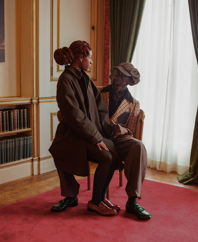
In the rural lands of the Rocky Mountains, Richard Rothman exposes the unsettling truth of American culture and its reliance on the environment

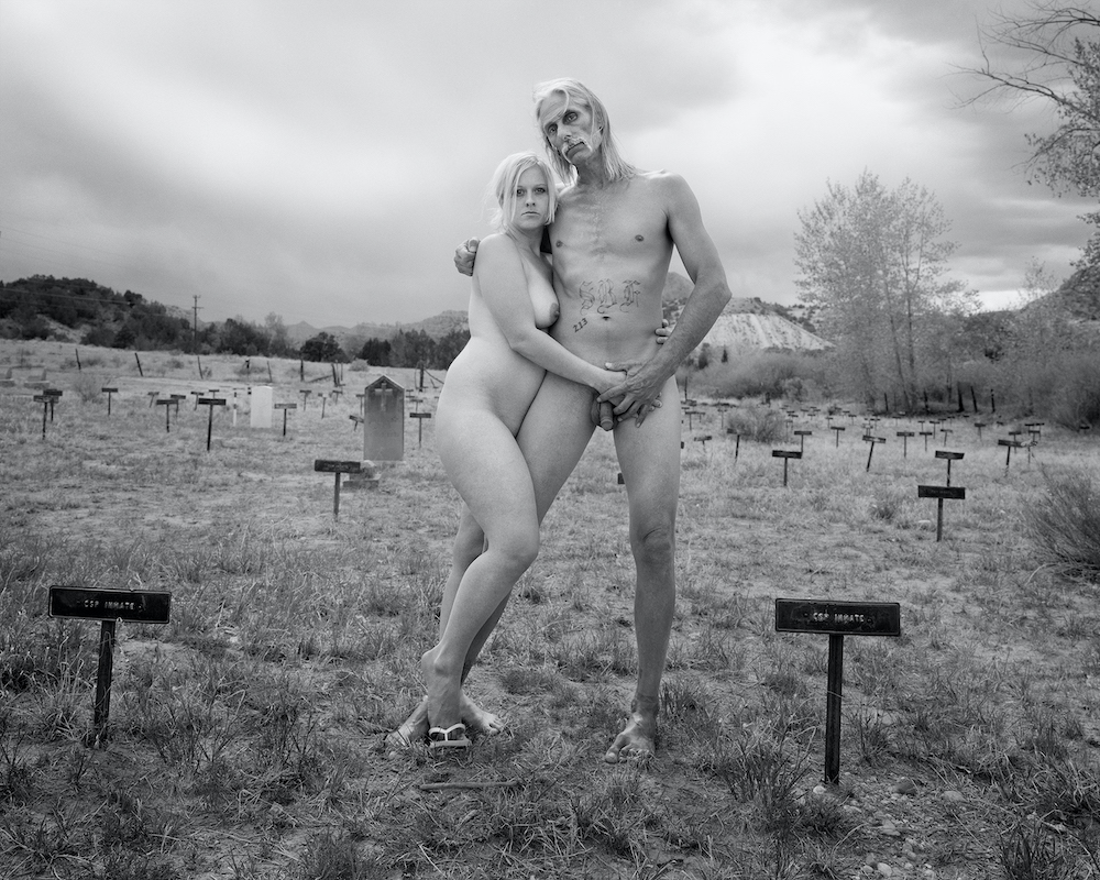
On the introductory page of Richard Rothman’s Town of C, a book published by Stanley/Barker, a naked couple pose starkly in front of the camera. The image, shot in a tonal shade of monochrome, depicts the pair in an embrace, standing amongst a prison cemetery located in the rural lands of Colorado – the part that’s allocated to the state penitentiary for inmate burials. This is unusual for a prison to be located in the middle of a town, but this one in particular was first a territorial prison (meaning medium security) that housed 25 prisoners, which was then formed into its own prison around 1874. The couple, more so on the woman’s side, instigated the idea to pose nude upon meeting with Richard, and this inadvertently set up what the photographer now goes on to describe as a metaphor “tied up with a bow” – that which hints to the biblical, spiritual and the natural.

“I met the woman in this photograph when she was a child,” says Richard, stating how the couple now live particularly close to the cemetery. “The man in the picture is the father of three of her five children, two of whom feature in another picture, in the doorway of a rehab house. He had a long association with LA gangs before moving out to Colorado. Anyway, she persuaded her partner to pose nude with her for me. As soon as I set up for this picture it began to rain, so I was in a hurry and it hadn’t occurred to me that this was going to be an Adam and Eve picture. Months later, on a visit to the Morgan Library, I came upon a postcard of the Dürer etching depicting The Fall of Man, and the expulsion from the garden. It had been an unconscious connection, because I grew up with that story and that particular image, which I was fascinated by, and I realised, much later, that it was a fitting opening to the narrative of the book that unfolds, that it spoke to the current environmental situation, and that it is an enduring, eloquent myth about the universal experience of loss of innocence.”

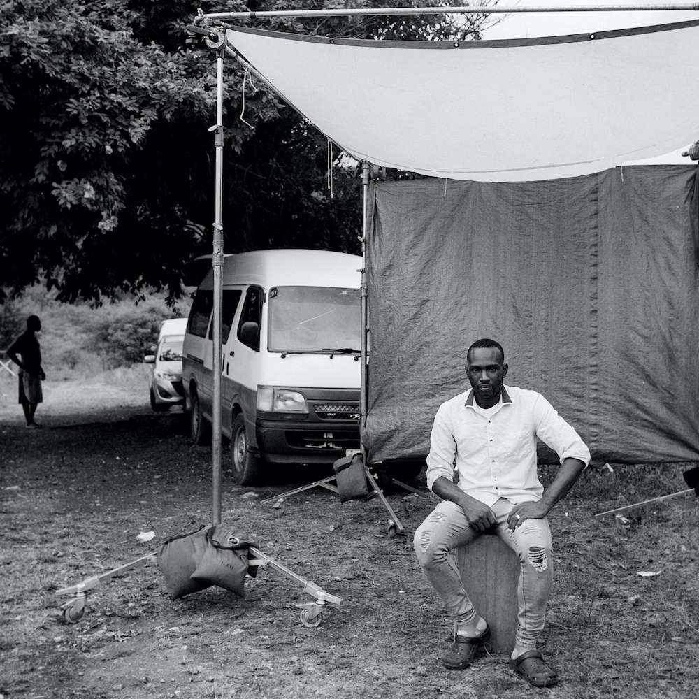
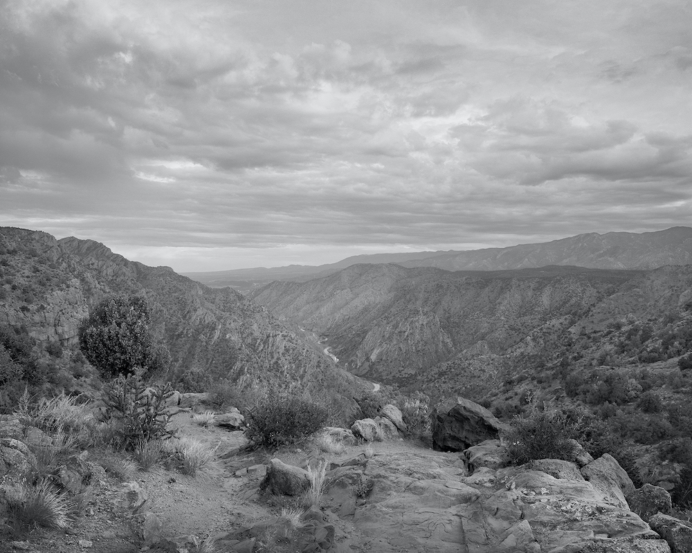
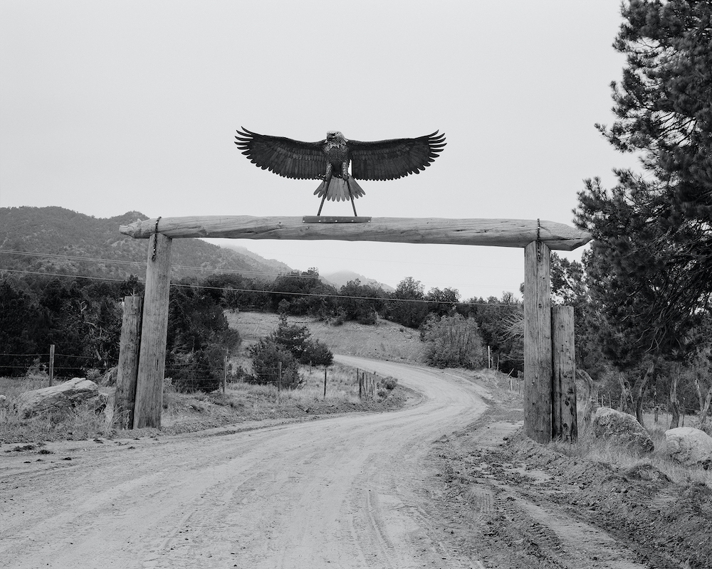
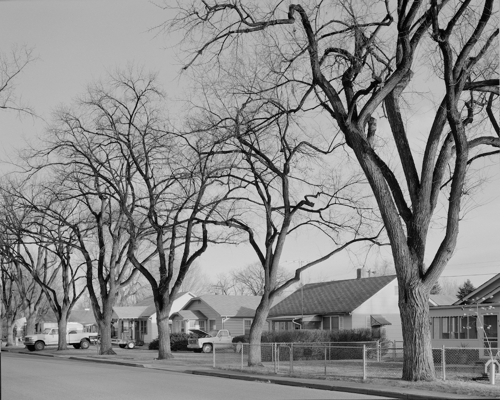
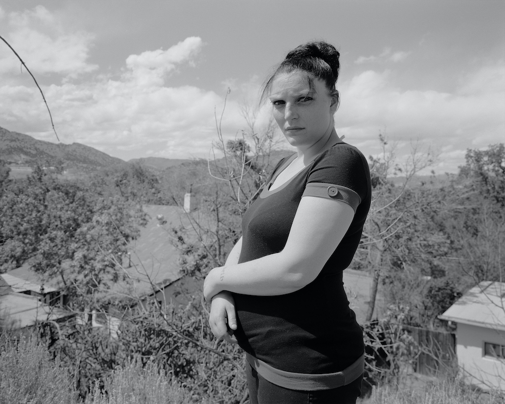
In this part of the world, more specifically the Front Range of the Southern Rocky Mountains, the landscape reigns supreme. The summits tower over the valleys, stretching around 300 miles from Colorado to southern Wyoming. Hikers and mountaineers are drawn to its vast populous of treks, climbs and views, where peaks exceed 4,000 metres and wrap around a variety of rivers. In contrast with this almost inimitable backdrop, there are also vast cities and towns resting on the banks and outer edges of the ranges. This includes the small rural town that Richard photographically paints through the pages of Town of C, one that remains unnamed. “I wanted to tell the biggest story I could, starting with a portrait of a small town, reflecting on the national culture at large and moving out to the mystery – the world beyond our planet – that we’ve all come from,” he adds. And it’s through the very town, its people, its architecture, roads and undeveloped lands, that Richard aims to shed light on the relationship between these two beings: the human and the environment.

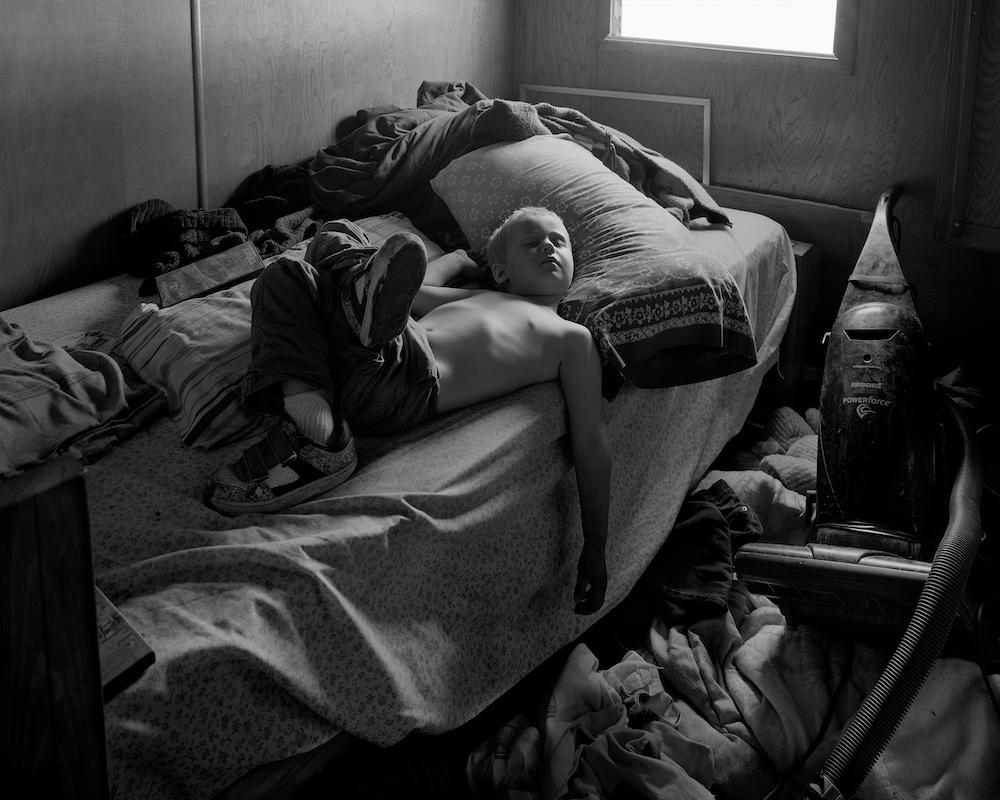
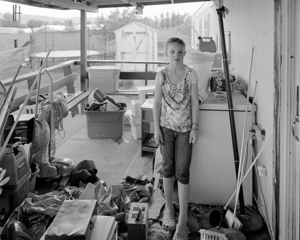
A shy away from the typical American road trip conceived through the work of photography greats like Robert Frank and Walker Evans, Town of C does things a little differently. Instead, Richard looks at the archetypal town and, more specifically, a settlement that he’s visited regularly over the years, revealing the societal and economic complexities of the place through considered compositions and adequate time spent in each location. “Almost everything about the way we live in America, and so much of the world now, is obviously unsustainable and drastically out of tune with the environment we inherited,” he explains. 

“When I began work on the project, climate change wasn’t as widely understood. Today, you have to be wilfully ignorant not to be aware of it. I think there are people who are there because they appreciate its beauty, and I think there are many more for whom life is so challenging they don’t have the luxury to enjoy the beauty around them. So many of us are forced to look down at our shoes and live month-to-month, just taking one step at a time to survive. Americans in general aren’t encouraged to appreciate beautiful land. We don’t teach aesthetics to children in most schools, and it gets in the way of businesses that want to exploit natural resources for profit. Our relationship to nature is deeply troubled and ill considered.”

There are multiple layers hidden throughout Town of C, the most notable being the portrayal of nature’s fragility. Humankind’s reliance on the environment is massive, and in this book, we see this brought to the fore through the energy of the river that runs through Colorado and the Rocky Mountains – the lifeline to all that settle upon the water’s edge. Then, as we meander through the remaining parts of the book, this consuming visual narrative expels themes of the American dream and how, especially in the American small town, these ideologies and dreams of endless natural resources are dwindling. What does the future hold for these lands?

As the book comes to a close, I’m reminded again of the first image of the naked couple and its explicit synergy between place and person. For Richard, this single picture resonates with him for its rich symbolism, as well as its relationship to the Grant Wood painting called American Gothic – “of the stone-faced man and his ill-at-ease-partner, pitchfork in hand, all business and no joy,” he says. “I felt the graveyard picture had a potential iconic quality. The myths of American small town steely resilience and self-sufficiency have collided here with the relentless forces of contemporary socio-economics, and the finite nature of land and resources. The little metal places in the picture serve as gravestones, all of them identified with the initials CSP, which stands for Colorado State Penitentiary. The prison used to make the license plates for Colorado vehicles. The grave markers were made in the same workshop by prisoners for their fellow inmates. They represent people whose families couldn’t afford, or didn’t care enough, to place actual stones on their burial plots, and I couldn’t help but think that said something revealing about their lives, and perhaps why they ended up there in the first place.”

All photography courtesy of Richard Rothman

Town of C is published by Stanley/Barker

E/MOTION. Fashion in Transition

What role does fashion play in society? A new exhibition at Antwerp’s ModeMuseum explores

Cover image by David Sims, The Face, January 1998, © David Sims / Art Partner, model: Bridget Hall, makeup: Linda Cantello

Fashion is a mirror of society, often reflecting the shifts in attitudes, ideas, tastes and preferences that evolve throughout the years; it’s a Zeitgeist. An early example harks back to the hemline, with skirt lengths shortening along with the fight for women’s rights and equality. While in more recent times, the influx of globalisation and the internet – and thus the immediacy of information and access to goods – has also altered our perceptions and ideals of identity, meaning that, on the one hand, fashion choices have become more liberal, conscious and sustainable, while the other is quite the opposite (taking fast fashion into account). Then there’s health crises, a pandemic, economic inequality and social movements like Black Lives Matter and #MeToo signalling to a change in a global society. But what is fashion’s role amongst it all, and where does it sit in the recent world?

Posing this very question is a new exhibition titled E/MOTION. Fashion in Transition. Presented as part of the reopening of ModeMuseum (MoMu) in Antwerp – which opened its doors on 4 September – the exhibition is curated by Elisa De Wyngaert and features works from Helmut Lang, Walter Van Bierendonck, Alexander McQueen, Martin Margiela, Hussein Chalayan, John Galliano, Raf Simons, Versace and more. A time capsule of sorts, E/MOTION. Fashion in Transition, looks at how fashion has “served as a visual signifier of contemporary instabilities, concerns and emotions since the 1990s,” explains Kaat Debo, MoMu’s director and chief curator. Below, I chat to Kaat about the role of fashion and how it can evoke real change.

‘Boxing Gisele’ editorial, Big Magazine, 1999, © Photo: Vincent Peters

What does emotion mean in the context of this exhibition and in the wider sense of fashion?

The choice for the title E/MOTION was motivated by a need for genuine emotion. Over the past 18 months, we’ve all had to work, live and create from home and a large part of our lives took place online. Also, designers have been forced to work digitally because of the pandemic. We wanted to research whether there’s place for genuine emotion in a digital world. We felt the need for real human interaction and the wish to integrate a live aspect in the exhibition, which is difficult within the static context of a (fashion) exhibition. We invited director, performer and countertenor Benjamin Abel Meirhaeghe, in collaboration with the opera house in Antwerp (Opera/Ballet Vlaanderen) and the exhibition designers (Jan Versweyveld & HuismanVanmerode) to create a live performance for the exhibition. A challenging but also very exciting experiment. 

In order to reflect on the future of fashion, as well as on the recent past, we conducted numerous interviews with fashion students and established designers during the pandemic. The designers gave their personal views on a wide range of subjects: what impact does the digital (r)evolution have on their creativity? Are fashion shows important? Can fashion evoke genuine emotions? What is the importance of craftsmanship, local production and sustainability? And what do you hope for the future? Fragments of these interviews formed the basis for this performance, that will be the closing installation in the exhibition. The performance will be brought 20 times during the entire exhibition period (September – January).

Untitled # 359, 2000. © Photo: Cindy Sherman Courtesy the artist and Hauser & Wirth

Fashion has long mirrored certain shifts in society. Can you tell me a bit more about this, and how fashion responds to particular events?

Over the last three decades, we have borne witness to unprecedented globalisation, which has had its impact on the creation, production, dissemination, communication and consumption of fashion. More than ever before, it has pushed fashion into the barriers of its own complex system and made it a stage for international political crises, from the Gulf War in the 1990s to terrorist attacks at the start of the new millennium, as well as for financial crises and recessions, the ecological crisis, and such health crises as the AIDS or the current Covid-19 pandemic. Fashion always reflects the prevailing zeitgeist, from social and economic inequality to global social movements, including Black Lives Matter and #MeToo. How have these evolutions impacted the way we see and perceive emotion, success, beauty, creativity, authorship and collaboration? And how has the role of the fashion designer changed in all this upheaval? Some examples…

Kristen Owen, Helmut Lang backstage series, Spring Summer 1994, Paris, 1993, © Photo: Juergen Teller, All rights reserved

90s recession: Against a backdrop of recession, a deflated job market and pessimism about the future among the younger generation in the 1990s, the Heroin Chic look became popular in fashion imagery. Fragile-looking models with messy make-up and drugged expressions appeared not only in photography, but also in fashion shows. The emergence of the look was linked to the Junk Culture of contemporary movies about addiction, such as Trainspotting (1996). The embrace of heroin and unhealthy body images in fashion drew vitriol. After the turn of the millennium, the Heroin Chic look was replaced by a tanned, toned and – in contrast to its predecessor – ‘healthy’ looking body.

Health crises: Our fear of death and disease during the past three decades has been further fuelled by various epidemics and pandemics, including HIV, swine flu and Covid-19. These health crises also affected the fashion industry. In the early 1990s, Benetton, the Italian fashion brand, ran controversial advertising campaigns referring to the AIDS crisis; while Martin Margiela created t-shirts for charity to encourage open conversations about AIDS; and Walter Van Beirendonck included rubber pieces as protective shields and printed messages about safe sex in his activist collections. During the Covid-19 pandemic, the face mask has emerged as a symbol of the crisis.

Joan Didion, Celine Campaign, Spring-Summer 2015, New York 2014, © Photo: Juergen Teller, All rights reserved

Terrorist attacks: The euphoria of entering the new millennium ended abruptly in September 2001. The repercussions of the terrorist attacks in the USA were complex, violent and disruptive, changing the course of world politics. The attacks occurred on the fourth day of New York Fashion Week, making fashion journalists the first to report them. Though incomparable to the tragic loss of life, the financial impact of 9/11 forced many independent designers to file for bankruptcy or to look for outside investment. Another challenge occurred when, against the sudden trauma of 9/11, some of the Spring-Summer 2002 collections were reinterpreted by the press and buyers as inappropriate and insensitive. Some fashion photographers faced the same issues when a few editorials had to be cut at the last minute. In these, models were depicted falling from buildings or looked like survivors covered in dirt; they suddenly seemed too close to reality.

Military references in fashion were often in direct response to pervasive images in the news about war and terror. In the last two decades, a series of terrorist attacks in European cities led to increased military presence. The surreal experience of encountering soldiers in camouflage uniforms – previously out of context in cities – heightened a sense of unease and fear. Directly or indirectly, these ongoing emotions of anxiety and terror prompted fashion designers to investigate the dichotomies between feeling protected and feeling threatened, between soldiers and female warriors.

Vivienne Westwood campaign image, Spring-Summer 1999, © Photo: Gian Paolo Barbieri

Can you give an example of what’s involved in the exhibition and how this relates to the theme?

One of the exhibition themes is dedicated to the digital evolution and the internet. In this theme, we present a chiffon Versace dress, that was worn by Jennifer Lopez in 2000 during the Grammy Awards. People all around the world Googled her photo. This sudden peak in the search for a specific image was the reason Google Images was invented. The look became a metaphor of the ever more powerful symbiosis between fashion and celebrity culture. Twenty years later, Jennifer Lopez appeared on the Versace runway in this very dress.

What can the audience learn from this exhibition? 

I hope the exhibition will inspire and move our visitors, as well as provoke conversation about fashion culture and its impact on society.

E/MOTION. Fashion in Transition is on show at MoMu from 4 September 2021 – 23 January 2022

Delphine Desane, cover image for Vogue Italia, January 2020, Model: Assa Baradji, © Photo: Laurence Prat. Condé Nast Italia
Exactitudes, 104 Commandos, Rotterdam/Paris, 2008, © Photo: Ellie Uyttenbroek
Y/Project by Glenn Martens, Autumn-Winter 2019-20, Model: Leopold van der Noot d’Aasche, (c) Photo: Noel Quintela
Walter Van Beirendonck, æstheticterrorists® collection, Spring-Summer 2002, © Photo: Ronald Stoops
Untitled # 588, 2016/2018. © Photo: Cindy Sherman Courtesy the artist and Hauser & Wirth
Copyright: MoMu Antwerp, Photo by Stany Dederen
Copyright: MoMu Antwerp, Photo by Matthias De Boeck

Finding Common Ground

Kemka Ajoku’s new series captures migration and settlement of Black people in the UK after the Windrush era

The After Party

A photographer of fashion and portraiture, Kemka Ajoku – who’s born and raised in London – strives to rewrite the stories of Black British culture. Done so through a mix of personal projects and commissions, Kemka has documented all sorts of meaningful tales from the locals of Lagos, busy in the tasks of their everyday jobs, and the beauty of brotherhood in the post-adolescent stage of life. Each picture he takes reverberates with purpose and passion; he’s a storyteller of truth, and someone who employs visual art as a tool for spreading his messages.

Over the last year, which has been a difficult one for many, if not all, Kemka has managed to find a sense of fulfilment. Not only did he graduate at the end of 2020 form a degree in Mechanical Engineering, he also arrived back home and broke away from the educational system for the first time in his life. “I felt free to creatively understand more about who I am,” he tells me, “looking back at my lineage as a guide to learning more about myself, having never given myself the space or time to truly be introspective.”

Gestural Greetings

A period of self-awareness and contemplation, Kemka’s ventures out into the ‘real world’ arose alongside the arrival of the pandemic. Coupled with the increase in racist hate crimes and injustice the globe, he began to question his role as a photographer, “a Black British photographer for that matter.” A sense of responsibility emerged: “a need to document the life of my people both in Nigeria and the diaspora,” he says. “To me, this was more important than taking a pretty photo. And so, a paradigm shift took place within me, a shift which led to me working with more intentionality, giving more meaning to the work with the hopes of lasting the test of time.”

This matured sensibility has manifested into his latest photo series, titled Finding Common Ground. Months in the making, the body of work is currently exhibiting at Wrest Park as part of the England’s New Lenses project with Photoworks, in partnership with English Heritage’s Shout Out Loud programme. In comparison to his previous series – although motivated in their own right – Kemka has never worked with such drive and ethos. “I sat down and really articulated what I wanted to achieve before picking up my camera.” A lengthy bout of research and exploration later, he came to learn more about the migration and settlement of Black people in the UK after the Windrush era, “a story that me, my parents, and their parents are part of.”

Tami’s Portrait

The photos involved are therefore contemplative, powerful and historical. Shot in Wrest Park, Bedfordshire, the location protrudes with British heritage as it’s built atop the style of an 18th Century French Chateau. He cast a selection of his friends to sit for him, each representing a specific demographic within the Black British community. Referred to as “characters”, Kemka explains how each of his models’ personas have been developed from “watching British Blaxploitation films from the 70s and 80s; films such as Black Joy, Babylon Burning an Illusion and Pressure to name a few.” To accentuate this, Kemka worked with stylists Daniel Obaweya, Charles Ndoimu and Lingani Noah who assisted with adorning the models in Black British clothing lines from both young and more established labels. 

Western Union

“The styling for this project was broken into two parts, highlighting two generations of Black British citizens,” adds Kemka, “from the tailored style of the late 40s and early 50s, to the more relaxed and youthful looks of the 70s and 80s. Fashion is an important part of British culture, used in a way to express identity with the community one associates themselves with. Many fashion nuances migrated from foreign land have interwoven with British styling over recent years, and this integration of style was a focal point in styling the models.”

Observing the completed works and you’ll notice how the poses or gestures appear to have been caught in a freeze frame – recording not only that moment in time, but also an experience and learning exuded from the photographer who’s captured them. “The intention with this work is to artistically depict an important era in Black British history (not in a common documentary photography fashion) that will have longevity long after I’m around,” he concludes. “Thinking back to my intentions as a photographer, one thing I revert to is the legacy my work will have for other Black British creatives, looking for a reference upon which to build their creative career upon.”

One View of the Temple
Kozy’s Portrait
Couple in Wrest garden
The Consultation
Wrest River
The Essence of Chi
Lover’s Rock

Credits:

Photographer: Kemka Ajoku

Assistant Photographer: Anu Akande

Talent: Kozy, Ore Ajala, Amidu Kebbie, Chieloka Uzokwe, Tami Bolu, Feranmi Eso

Hair: Shamara Roper

Styling Team: Daniel Obaweya, Charles Ndiomu, Lingani Noah

Special Thanks: Mahtab Hussain, Ingrid Pollard

And special thanks to Photoworks and English Heritage for giving me the opportunity to create this body of work through their ‘England’s New Lenses’ project

Bad Form: Caribbean Literature

In an excerpt from the literary magazine’s seventh issue, guest editor Mireille Cassandra Harper celebrates the Caribbean through stories, essays, reviews and poetry

Illustration by Tomekah George

I am a second-generation Jamaican. Despite my grandmother moving here in the 1960s, my mother remained in Jamaica, a ‘barrel child’ and spent her childhood in the parishes of Clarendon and St. Catherine, raised by her grandparents and later her aunt. She has often entertained me with stories of her childhood, visiting then-untouched beaches, fond memories of picking fresh mangoes, oranges and cashew fruit (often surreptitiously), the goats, chickens and other animals that her grandparents reared on their farm, and the joys of a rural and idyllic childhood. 

I grew up with an intense love and appreciation of my Jamaican heritage, that was always supported and nourished. Our home was filled with the sounds of Morgan Heritage, Richie Spice, Tarrus Riley and other music icons. From Lover’s Rock Sunday sessions and Vibes FM car journeys (those who are familiar will recall the hilarity of the incessant interruptions declaring that the station was ‘the wickedest in the whole world’) to late nights on holiday in southern Italy, where my parents would drive out to arid, empty locations in the middle of nowhere so we could enjoy open-air reggae concerts with the likes of Jah Mason, my mother and I belting out “My Princess Gone” without a care in the world. Storytelling and literature played a big part too. I was regaled by tales of Jamaican folklore, my favourite being the story of River Mumma, a mythical sea siren. A literary lover from a young age, my mother sought out books that put Caribbean literature front and centre. She travelled far and wide to buy me countless titles about the Caribbean, many of which I still own. My personal favourites, Kwame and Netta’s Story, came from Black River Books, an independent publisher that sought to revive the fullness of Caribbean heritage by telling beautiful stories of the lives of Caribbean children, putting them front and centre of stories, rather than on the sidelines. I was taken to meet my heroes, John Agard and Grace Nichols, and cherish the beloved signed copies I went away with to this day.

As I’ve grown older, more complexities around my heritage have come to light. In recent years, I have grappled with difficult conversations with my grandma – if you have ever tried to persuade your grandma, especially a 92-year-old Jamaican grandma, to consider a different way of thinking, you’ll know how challenging that can be. I’ve also attempted to reckon with the fact that my family is split across towns, states and countries – disjointed in more ways than one, and tried to reckon with intricate and at times, painful family histories and hidden secrets that inevitably have come to light as I grow older. At the same time, I have built deeper connections with family members, expanded my knowledge on my family history and heritage, and both listened and taken in the wisdom of my elders. Outside of my familial relationships, I am seeing what it means to be of the Caribbean diaspora, redefined through music, art and of course, literature.

When I came across Bad Form last year, I felt like I had finally found a literary space that encompassed the richness, vibrancy and sheer brilliance of Black, Asian and marginalised writers. Headed up by the phenomenal Amy Baxter (who will likely own her own publishing house one day, mark my words!) and the stellar team – Morgan, Sophie and Emma who are all immensely impressive in their own right – I found Bad Form’s active and dynamic approach to platforming Black, Asian and marginalised writers a breath of fresh air in what can often be a stagnant, elitist and if I am to speak frankly, institutionally racist industry. I knew instantly that I would love nothing more than to work on an issue celebrating Caribbean writers and so the idea for Issue 7 (my lucky number, what are the chances?) was born.

We picked June by chance, but writing now, this publication marks an important time for the Caribbean diaspora. As this issue lands in your hands, Caribbean American citizens are honouring their heritage during Caribbean American Heritage Month and the UK celebrates the 73rd anniversary of the Windrush generation coming to Britain. This feels, in this moment, like a literary ode to what is a month of both remembrance and celebration. A celebration of the Caribbean and all its greatness, this issue boasts 17 stellar writers who each share their stories, essays, reviews and poetry for your literary pleasure. From opinion pieces on Jamaican patois and revelations on queer and non-binary defiance in contemporary Caribbean poetry to literary essays on West Indian revolutionaries and narrative poetry that bring folktales and legends to life, each piece is a gem in its own right.

Like Amy, I’m not one for favourites – each of these contributions is equally brilliant – but some left me reeling after reading. Ashley Roach McFarlane’s spectacular piece on the historical development and exportation of homophobia to Jamaica and Desta Haile’s breathtaking poem, Blue Blood – an ode to her late sister and her childhood years spent in Barbados are two I would recommend you devour instantly.

This issue’s mesmerising cover comes from illustrator, Tomekah George, who creates colourful artworks which sit between collages and paintings. Her abstract design pays homage to the diversity of the Caribbean – across its peoples, cultures and landscapes – coupled with the connectedness of its persons. A huge thanks goes to Tomekah, who approached this with such care and love. 

Thanks also to Duppy Share who have kindly partially sponsored this issue. Many brands co-opt Caribbean culture without consideration for its people. It has been a pleasure to work with an organisation that appreciates the labour, effort and time that the team at Bad Form undertakes for each issue, respects how we choose to present our respective cultures and heritages and recognises the value in this work.

And, of course, thank you, Bad Form readers. Without your support, this issue wouldn’t exist. I hope reading this nourishes your spirit. It has been an honour to work on this, to encounter incredible writers, poets and essayists, and to work with such a brilliant team of brilliant women. May you cherish it as much as I have.

Mireille x

Bad Form is available to purchase here

Stoned in Melanchol

Derry-based photographer Megan Doherty captures youth, freedom and restlessness in a new publication from Sentanta Books

Not only is Derry one of the oldest inhabited places in Ireland, it’s also home to the most intact city walls across Europe – a mile long stretch of brick serving as a protective canopy for the buildings within, running alongside the bank of the River Foyle. The Northern Ireland city is renowned for its architecture, with some of its earliest references dating back to the sixth century; a date so far that it’s hard to place it geographically, culturally and politically. A key moment of its more modern past, however, was the Siege of Derry that took place between 1688-89. Over 105 days, the Protestant citizens of Derry experienced and withstood bombardment, disease and starvation, causing half of the city’s inhabitants to die. Political unrest still continues to this day, but there’s much more to Derry than its history.

Megan Doherty is a photographer born and raised in Derry, a location in which she still resides. She grew up amongst the banalities of small-town life, often restlessly roaming the familiar roads with her friends in seek of something new; adventures, thrill and excitement. Having always been infatuated with the arts – and later ensuing photography in her teens as a means of telling stories – she started documenting her friends as much as possible, narrating the tales of their youth and the activities they’d uphold. This very inquisition is now formed into a new publication titled Stoned in Melanchol, published by Sentanta Books. “The work was borne from a longing for a world beyond the monotony of small-town life,” she tells me. “At the time I was creating the series, I was feeling trapped, unfulfilled, and seeking escape from reality by any means necessary.” 

Turning towards photography for remedial purposes, Megan found utter comfort in her camera for its ability to transcend reality. “I sought solace in mediums that could distract from the sense of emptiness I had been experiencing. I allowed myself to get lost in films that gave me a glimpse into the possibilities outside of what I knew, however it also allowed me to observe just how captivating mundanity could be if viewed through a new perspective.” This inspired Megan to shift her focus inwards, capturing the everyday moments of her friends at parties, walking the city’s streets or moments at home. 

“It was during this very gradual realisation that I turned the camera on my own world. It felt like myself, and those who surrounded me, were all feeling this sense of emptiness to an extent, whether we were aware of it or not. We came together during a daunting period where we were leaving our teenage years and entering young adulthood – the future was uncertain, and we had no concrete plan.”

Post-adolescence is universally tricky, not just for the physical changes but also in terms the expectations laid in front of you. It’s decision making time, a phase to figure out who you want to be, or where you want to direct the rest of your future years. The expectations are massive, and those feeling trapped or unable to make sense of it all can easily end up in a state of languish or displacement. So, in order to combat this, Megan started living vicariously through her photography. “However, what began as staged scenarios, quickly became a documentation of our lives and the relationships we shared. We were navigating this uncertain period together, exploring our identity, celebrating what each of us had to offer, and taking comfort in the bond we were creating. We took solace in the unity of the universe we’d been building for ourselves. We were alone, together. Blurring the line between fantasy and reality.”

In the first instances of making the series, Megan would stage her compositions with care and credulity, in turn producing a compilation of low-lit and heavily contrasted pictures shot entirely in her hometown. With a clear vision in tow, the photographer would arrange the postures and placements of her friends, her “second family”, as she’d pinpoint the particular moment that was previously formed in her mind. The project evolved, however, as many works-in-progress do, and soon she began to capture their time together with spontaneity; instead representing her friends how she perceived them with her very own eyes. 

Meander through the works and you’ll be struck by the consistently rich tones of deep reds, blues and yellows, hazy in their presentation and working in synchronicity with the youthful undercurrent of her subjects. Blue hair, graphic t-shirts, experimental fashion and makeup; bike rides, parties, drinking and smoking; the motifs are both recognisable and transportive, pulling the viewer back into a time of their own younger years. Even with the title, you’re thrown into a pensive state with its playful connotations of euphoria and melancholy. “One thing that sticks with me is photographing the image Stoned in Melanchol , which I then named the series after,” says Megan. “I had set up this house party scene and I wanted my friend Teàrlach as the character in the forefront. I held my camera up to take the photo, and just before I hit the shutter, a tear started rolling down their face. It isn’t visible in the photograph, but knowing it exists makes that image so much more meaningful to me.”

Within the publication, your presumptions of small-town life are completely tossed to the side. Megan has created her own world through her imagery, that being a world that celebrates youth freedom and, naturally, wanting more. In equal measure, the work shows the distinct and individual sprit of the city itself. “In many ways, a lot of issues still exist within this small town, particularly in relation to mental health, and, inevitably, Derry will automatically be associated with its deeply political history by outsiders. That said, while I feel it’s important to acknowledge its history and on-going issues, so much positive change has come about in recent years, and it’s worth noting that there is an amazing creative scene bubbling here that will only gain more recognition with time — one that I’m proud to be a part of. All in all, it’s a unique city, for sure.”

Megan’s Stoned in Melanchol is available to purchase here at Sentanta Books.

Driver Radio: Jamaica

Two twins, Don and Ron Brodie, explore their Jamaican heritage through a four-part docuseries

Don Brodie: Driver Radio Studio

There’s nothing more enchanting than the relationship between two twins; their comparable mannerisms, ability to bounce off one another and communicate with a blank stare or a gentle glance. Don and Ron Brodie, two twins based in New York, find their similarities in more than just their looks and matching quirks: they creatively work together, too. 

Having nurtured interests in film and visual arts from a young age, they both attended Howard University in Washington DC. Ron leaned into the emerging film program and later pursued videography, shifting towards freelance as an independent filmmaker and commercial director. He’s now repped by production company 1stAveMachine and enjoys “every day and every project”, he says. Don, on the other hand, found his niche in photography. After a short hiatus travelling the world, he continued his studies at Parsons The New School for Design before working for distinguished figures such as Nathaniel Goldberg, Steven Klein, Lachlan Bailey and Benjamin Lennox, among others. 

In most recent times, not only have they deciphered their own production and brand, called Fun With Ron or Don (FWRD) – a collaboration formed to work with like-minded creatives and on projects about culture and heritage – they’ve also just completed their first docuseries, Driver Radio: Jamaica. An exploration into their Jamaican heritage, the four-part series chronicles the brothers’ adventures across the island, exploring the culture and people through the lens of taxi drivers. Below, we chat to the brothers to hear more about this three-year-long project and what it’s really like to work with your twin.


What’s your relationship like, have you worked together before? 

Ron: Over the years, we’ve partnered on different projects. Most notably with a small collective I used to manage, called Project Fathom. We would produce music videos and commercial projects collaboratively with three other colleagues. Don was often our ‘photographer of choice,’ and I would commonly produce projects that incorporated both stills and motion. Over the last few years, we’ve partnered to curate galleries, host debates, screenings, parties and even produce strange art installations. We’ve even gone as far as to pitch each other to our respective circles if a need for our crafts would be useful. 

Don: In my experience, being a twin in a related field has always required me to be ready to pitch to different people with the same amount of enthusiasm. I really take pride in knowing what my brother has been up to. It still feels like working with my idol when we get the chance to work on projects together, which can create a lot of passion and energy. I wouldn’t say we have our own language when we are teamed up. However, there is a non-verbal and very verbal communication that happens – whether it’s unexplained laughter, hands-on intense focus in silence, or Jamaican pride. It’s easy to tell beyond our appearance that we are cut from the same cloth. 

R: Agreed, our pairing is an art form unto itself! 


How did the idea for Driver Radio: Jamaica first come about, what sparked it?

D: For me, this project was a personal adventure in creating something culturally authentic, for which I had creative conceptual influence and control. I started this project shortly after my graduation from Parsons, and at that time, I was working at the studio solely as a photographic study. The project did not have a clear direction or timeline, although it did encompass any and everything around a loose concept: taxi drivers! 

Growing up, we saw friends in Jamaica take on driving as a way to join the tourism industry. They were tending to cars (some on blocks), under the hood, tinting the windows or wiring sound systems. We had the experience of seeing their hobbies and interests in cars develop to careers and independent businesses. 

We also learned so much about life in Jamaica through the storytelling and adventurous excursions. After a few family trips where I was taking pictures, Ron joined in and we discussed creating an independent documentary film and how this project could evolve, and its deeper meaning. We wanted to provide a window to an experience we were having while growing up uniquely different from our American peers. 

Don Brodie: Driver Radio Studio

R: As curious kids visiting Jamaica, Don and I took up an interest in a group of guys who by day worked with our aunt at Sangster International Airport in Montego Bay, and by night turned vehicle sound systems, paint, decal style and expressions to hit popular strips and parties. Growing up, we became friends as we frequently visited the island, and they often transported us to and from various family functions. When we were old enough, we’d hit the road with them, and every ride became an adventure. The experiences we had and the places we’d go provided us a broader understanding of Jamaica. As we got older, we became interested in observing other drivers in different communities and discovered the tremendous value in unfiltered culture across the island. 

It’s been about six years now since Don proposed interest in documenting these adventures. Over time, we became interested in speaking with a variety of drivers to discover more about our own heritage. We were a little lost in encapsulating this concept within a two-hour feature; the docuseries result is from my approach as a filmmaker to incrementally sharing these stories. 


What types of adventures did you have while making this series?

D: My biggest adventure was to Gut River and I still remember the excited expression on Ron’s face upon arrival – the same “kid-in-candy” reaction I had the first time I found it. The beautiful oasis was miles deep on a broken, overgrown road that had no signs of paradise. I had to direct our whole crew back as it was such an uncommon location for Jamaicans from the city. I remember the first day I was taken, my driver jumped out to look for a crocodile in the bushes – he was a mad man! That experience was not in the series but it is totally one I will treasure forever.

Don Brodie: Driver Radio Studio

R: Visiting our grandfather’s grave in Mandeville was very moving. We had visited as children, but returning as adults and reflecting on all we have and to appreciate our Jamaican heritage was quite profound. There was a saddened sense that we had never met him in person, but an overwhelming level of accomplishment and pride that only a flash rainstorm could restore.

It was by chance that we got an exclusive with Orville Hall at the Dancehall Hostile. The phone call came late in the afternoon off schedule and after an already late night in Kingston. He only had availability because another film crew did not show up, so we jumped on the opportunity; and as the series demonstrates, it was more than worth it!

We also ran into Beenie Man, of whom many locals say haunts the dancehall because he is at every party. His talent and love of music and culture is energising at any hour!


How do you hope your audience will respond to the work? 

D: The series has made it beyond friends and family; it feels like a good part of Jamaica is hip to it (as perceived from being in the States). People from around the world have reached out and said that it was the first time they had ever seen a story about real country living – it’s not just about the beautiful beaches and party one may seek when traveling to paradise for an escape. For the tourist, it is an opportunity to see the country and not just an island. It starts the conversation of more to explore. It also provides insight into a human condition that is relatable and foreign. 

For the nationalists, I hope it provides a feeling of being seen as more dynamic than pop culture portrays. There are a lot of impressions out there, especially about daily life in Jamaica. Hopefully this provides another or an additional perspective to the beautiful tapestry of our culture. 

R: I hope the series can serve as a conversation starter surrounding what it means to be first-generation, while encouraging others to go back to explore their own heritage. Both Don and I feel as though we are a part of a broader middle culture that is not quite domestic but still not quite a foreigner – which holds a lot in common with any other first-gen person from Trinidad, or Brazil, or Germany or even Korea. Hopefully, Driver Radio could exist all over, and the concepts “FWRD” or moving ahead with no limitations or looking back, can be embraced around the world. 

The full series can be viewed on Independent Lens

An Hour with Jean-Michel

Photographer Richard Corman reflects on his brief acquaintance with Jean-Michel Basquiat, culminating in a set of unpublished photographs shot in a New York studio during the summer of 1984

Although still somewhat of a cult figure at that time, I was definitely aware of the unique canvas of Jean-Michel Basquiat, as his poetry, painting and culturally poignant vision moved so many of us at the time. When I stepped into his studio on 57 Great Jones St., the room was a swirl of people, creative energy and smoke, and Basquiat was submerged and almost invisible in a corner, taking it all in.

I think by nature, Basquiat was extremely vulnerable, and he wore that sensibility on his sleeve. Yet I remember feeling his curiosity, his intensity, his anger and his honesty in his eyes as his body language shifted from frame to frame. I placed him in front of grey paper in order to remove him from the surrounding confusion and to create a simple setting where I would hopefully see a piece of his humanity. I think I was more of a voyeur on that day than a director – I did not want to interrupt the process.

As with most photography, and mine in particular, I leave it up to those viewers who look into the eyes of these portraits to determine their own truth about the man, the artist, the genius. I have tried to create a portfolio that was indicative of that moment in time with an individual who, in many ways, is more relevant today than ever. With the world in such confusion, we need the honest voice of a dreamer like Basquiat.

www.njgstudio.com 

The Vision of Dries Van Noten

An intimate documentary directed by Reiner Holzemer follows a year in the life of the Belgian designer as he reveals the creative process behind four collections

Dries Van Noten selecting fabrics in his studio in Antwerp

Dries Van Noten is one of the most unassuming figures in fashion. In an industry which otherwise moves at an impossible pace, he is a thinking, feeling designer, and for more than 25 years, he has remained independent in the face of fashion’s runaway globalisation. 

Despite his relatively low profile, Van Noten is a veteran designer and celebrated his 100th show in March this year. A master of print, pattern and texture, he emerged from Antwerp’s Royal Academy of Fine Arts in the early ‘80s as part of a group of designers including Walter van Beirendonck and Ann Demeulemeester, often referred to collectively as the Antwerp Six. Since launching his namesake label in 1986, he has become widely respected as a designer who has forged his own path.

In a new documentary directed by Reiner Holzemer – whose past films include portraits of artists and photographers such as David Lynch and Juergen Teller – the Belgian designer gives rare access to his home and work life. Over the course of a year, Dries documents the makings of four collections, from his studio in Antwerp to backstage at his fashion shows in Paris. In doing so, it offers a glimpse into the world of “one of fashion’s most cerebral designers”, as The New York Times has described him.

Dries Van Noten with Jürgen Sailer, head of men’s design in his studio in Antwerp

Holzemer, himself a relative newcomer to the inner workings of the fashion industry, met Van Noten while filming his 2011 documentary on Juergen Teller. Immediately taken with the designer’s intuitive approach, it took the German filmmaker three years to convince a camera-shy Van Noten to be the subject of his next film. While the designer had outright turned down the proposals of other directors, Holzemer was spurred on by the fact that he never said no. Twice a year, they would meet at Van Noten’s shows and each time, Holzemer would ask again.

“I think what encouraged him, or interested him in my work, was that I was not coming from the fashion world,” Holzemer explains. “I wasn’t a fashion filmmaker and he saw some of my films as portraits of artists, and I think he liked that approach.” After this prolonged game of cat and mouse, Van Noten agreed to open up his work and home to Holzemer and a small crew.

Dries Van Noten with Jürgen Sailer, head of men’s design in his studio in Antwerp

Holzemer’s genuine affection for Van Noten comes across in conversation and his respect for designer is more than apparent in his portrayal. Fashion documentaries often capitalise on moments of drama and the frenzy of the eleventh hour, but Holzemer cites examples such as The September Issue and Dior and I as precisely the type of fashion film he wasn’t looking to make. With Dries, he insists he wasn’t interested in playing up to the same stereotypes; the appeal was the person, not the industry. 

An important aspect of the film is its depiction of Van Noten’s life in Antwerp, where he continues to live with his long-term partner, Patrick Vangeluwe, and his dog, Harry. The choice not to live in Paris, where his collections are shown, is a considered one. “There’s less distraction and he can really concentrate on his work,” says Holzemer. “It’s important for him to live his own rhythm, to live in his own world. And that’s why he’s always creating something new and unexpected.”

Dries Van Noten in his garden in Lier, picking flowers for the house

In Dries, Van Noten touches on what he calls the “rat race” of fashion. Speaking of the immense pressure placed on designers today, many of whom are tasked with producing a growing number of mid-season collections, Holzemer says, “In a way he’s an exception and in the same way he’s typical, I think.” Yet, while contemporaries might produce in excess of eight collections a year, Van Noten has refused to compromise the quality of his ideas.

“When he designs something, when it’s too beautiful, he adds something distracting or something ugly to make it more interesting, and that’s an ongoing process all the time,” Holzemer explains of his process. “I found that Dries doesn’t draw. He works like a sculptor, working with the fabrics on a live model, more a less. That was very hard for him to show – how he works – because he was always a little bit afraid of showing something that was not perfect, and might even look a little banal in the eye of the audience.”

As seen through the eyes of Holzemer, the designer’s high-profile admirers, and Van Noten himself, what comes together is a portrait of a man who strives to bring the same artfulness to all areas of his life. “Do you think people like Dries are disappearing in the world today?” Holzemer asks Iris Apfel as the documentary draws to a close. “Not disappearing, darling – they’ve disappeared,” she says. “He’s a treasure and has to be treated as such.”

Dries Van Noten working on a collar for the Men’s Winter 2016 collection

Dries, directed by Reiner Holzemer, is out now on DVD 

Modernist Architecture Redefined

As it opens up the modernist canon to include both contemporary buildings and lesser-known examples from around the world, a new book asks what modernism means today

Shigeru Ban: Curtain Wall House, Tokyo, Japan, 1995 © Hiroyuki Hirai

In 1910, Austrian architect Adolf Loos delivered a radical lecture railing against what he called ‘the plague of ornament’. Later published as an essay titled ‘Ornament and Crime’, Loos’ polemic was first and foremost a violent reaction to the excess and elitism of art nouveau. For Loos, art nouveau’s decadence was an unnecessary burden on both the powers of invention and human labour. Both, he claimed, slow the tempo of cultural progress. Subject as it is to changing taste, the form of an object, he argued, should last as long as the object lasts physically. This was not the first time a moralising stance has been taken on style, but more than century later, it has proved to be one of the most influential.

A new book, Ornament is Crime: Modernist Architecture, plays on Loos’ legacy and celebrates the architectural language of modernism with a visual survey of extraordinary homes dating from 1910 to present day. As it opens up the modernist canon to include both contemporary buildings and lesser-known examples from around the world, it necessarily asks what modernism means today. 

Adolf Loos: Villa Müller, Prague, Czech Republic, 1930. Picture credit: Vaclav Sedy

“Modernism isn’t just a style, it’s actually a radical approach to life and to art,” says co-author Albert Hill. “That clear purpose has resulted in great architecture, and people recognise that this is not architecture by numbers, this is not architecture by corporate committee, this is architecture by vision and values.”

In the 20th century, the tremors of modernism were felt in everything from painting to literature, and to underscore the lasting intensity of these values, authors Matt Gibberd and Albert Hill have interspersed silky black and white photographs with punchy quotes, song lyrics and literary excerpts from figures such as Susan Sontag and Samuel Beckett. “Instead of just being about architecture, the book is about architecture’s place within modern culture,” Hill says.

Tadao Ando: House in Monterrey, Monterrey, Mexico, 2011. Picture credit: Toshiyuki Yano

Although modernism is often historically confined to the 20th century, Ornament is Crime liberates the term by looking at how some of the most respected contemporary architects – including John Pawson, Richard Meier and Tadao Ando – continue to work in the modernist tradition. 

“There are very obvious characteristics that these houses share,” explains Gibberd. “Flat roofs, often horizontal bands of glazing, cubic or cylindrical forms. Modernism came about because of new technologies – the possibilities of curtain-walling, and the fact that concrete allowed you to have these open floor plates, huge expanses of glazing – and those still very much apply.”

Le Corbusier: Villa Savoye, Poissy, France, 1929. Picture credit: Fondation Le Corbusier

Many of these defining characteristics were outlined by Le Corbusier in his five points of architecture. With its free facade, ribbon windows, pilotis, roof terrace and open plan, the Swiss-French architect’s iconic Villa Savoye, built in 1929 in Poissy, on the outskirts of Paris, is an embodiment of these principles and remains a benchmark for modernist design. In the absence of surface decoration, Gibberd suggests that modernist architecture becomes about “shape-making”, and like Loos, Le Corbusier and legions of architects since, Ornament is Crime extols the virtues of pure form.

Ornament is Crime: Modernist Architechture is out now, published by Phaidon

Inside Richard Meier’s White-Walled World

The American architect – part of the New York Five and one of the city’s most iconic modernists – talks to Port about his body of work and branching out from his beloved colour white
Richard Meier by Joss McKinley
“It began quite innocently,” says Richard Meier of the events that propelled him to fame. In 1972 he was a young architect practising in New York, and teaching at Cooper Union with John Hejduk, the educator and theorist who would later become the school’s dean of architecture; Charles Gwathmey, another architect, was working in the same building. Meanwhile Michael Graves and Peter Eisenman were teaching at Princeton. All the men were near the start of their careers – they had built little, and not much building was going on in New York, which was mired in ever-deepening economic and social crisis.
 
“We all knew one another. We taught together; we were friends, and we decided to get together and sort of criticise one another’s work,” Meier recalls. “So we went to a neutral space, the conference room at the Museum of Modern Art, everyone bought one work that they were currently involved with and the others gave their opinion of it. We had a really good, friendly discussion. And afterwards we said, that was really good – we should make a little pamphlet to commemorate the event.”
 
That pamphlet became, in the hands of George Wittenborn – an art books publisher on Madison Avenue – a slim book called Five Architects, and the architects became known as the New York Five. Each architect included two of their houses in the publication, and Arthur Drexler, MoMA’s influential director of architecture, contributed a pugnacious introduction, praising the five for remaining true to the “rational poetry” of pure modernism, as opposed to the “proletarian snobbery” of brutalism and the “elegant but arbitrary” pure structure of Mies and his followers. For a such a slender volume, the effect was electric – even explosive. 
 
“At the time, most architectural discourse, if you can call it that, was around issues of social responsibility… and perhaps the very faint beginnings of postmodernism and reaction against modernist orthodoxy,” says Paul Goldberger, the Pulitzer-winning architecture critic for Vanity Fair, formerly of the New York Times and the New Yorker. “And then, into this mixture, come these young architects who were interested in modernist form and continuing to develop and refine it, and push it forward, and did not feel it was a dead end, but felt it was very much relevant. In the context of the architectural culture of the 1970s, it felt very fresh… very much oriented around pure aesthetics and pure forms and making a shape and making a space as an end in themselves.”
Left to right: presentation model of the Ackerberg House and presentation model of the Rachofsky House in the North Gallery of the New York office.
“I was surprised how much was written about it,” Meier says. “It made people think about architecture in a different way, which was very positive.” But with modernism divided and falling from grace, this clarion call was controversial. The New York Five became known as the “whites”, and were attacked in the pages of the Architectural Review by a rival grouping of proto-postmodernists and neoclassicists, the “greys”. “People certainly read it as a manifesto of some sort, and it provoked other events,” Meier says, although he denies that the aim was polemic. For him, the value was all in those initial meetings: “It was really a wonderful coming together. We knew one another; we had dinner with one another, but this was something different. It was just sitting in a room, talking about the work – not only one’s own work, but also the work of the other four.”
 
Meier was born in Newark, New Jersey, in 1934, and established his office in New York in 1963. “White” was an entirely apt label for his work. He is associated with the colour like no other architect. The Five were always divergent in style, and their architecture went in radically different trajectories: Eisenman into deconstructivism, Hejduk into sui generis idiosyncrasy, Graves into monumental postmodernism. But Meier has remained loyal to white-walled modernism. One monograph of his work opens with an essay by him in praise of the colour: “White is always present but never the same, bright and rolling in the day, silver and effervescent under the full moon of New Year’s Eve. Between the sea of consciousness and the earth’s vast materiality lies this ever-changing line of white.”
 
In interview, however, he’s far more restrained – at times, frustratingly taciturn. “I felt that we were part of a tradition and respected that tradition, and showed the way it could be expanded,” is pretty much all he will be drawn to say about his relationship with his modernist forebears. But his meaning is spelled out in his work. His crowning achievement is the Getty Center in Los Angeles, a hilltop complex of galleries the size of a small town, developed over more than a decade at a cost of $1.3 billion. Few architects get this kind of opportunity; even fewer could make such consummate use of it. He has built other cultural landmarks in the United States as well, including the High Museum of Art in Atlanta; and he is one of continental Europe’s favourite Americans, with major projects such as city halls for The Hague in the Netherlands and Ulm in Germany. Dazzling white is sometimes cut into by pale stone and apertures of sky; grids and purist geometry are kept from sterility with surgical curves and deviations from the orthogonal. 
Photo cards with images from the Richard Meier Archive to commemorate and celebrate Richard Meier’s 80th birthday created by the staff from his New York office.
“What he has done is distilled a kind of elegant purist essence out of modernism,” says Goldberger. “But his works are very much compositions; they’re about balance and weight and lightness and solids and voids, all very beautifully balanced together into compositional wholes that are elegant and serene. That is not what modernist orthodoxy has prioritised so much as what he has prioritised. He has been pursuing his own private version of modernism, consistently, his entire career.”
 
Some of Meier’s earliest projects in the late 1960s and early ’70s, were in New York. After that, for more than a quarter of a century, he was overlooked in his home city. But with the turn of the century, that changed. Between 1999 and 2006, he built a trio of short, elegant towers on Perry Street and Charles Street in Greenwich Village, a decorous little riverfront group that deftly combines variation and restraint. “To have three buildings together, three blocks on the river, is really unique. It makes me proud,” Meier says. “And they’ve really transformed an area, given it a new life.” 
 
They also created demand for Meier’s architecture among condominium developers. In the early years of the 21st century, with his catalogue heavily focused on houses, civic centres and galleries, Meier had more than once expressed a desire to design a skyscraper. Since then, a few Meier spires have appeared in locations around the world, and now one is under way in New York: an apartment tower at 685 First Avenue. The site is a couple of blocks south of the United Nations building on the East River, and Meier expresses his satisfaction that his own tower is much the same height and orientation. “It’s like they’re a pair of buildings,” he says. “That context gives me great pleasure.”
Senior Associate Hans Put working on the design of a new private residence in East Hampton.
However, once it’s finished the uninformed eye might not recognise 685 First Avenue as a Meier: it’s black, clad in a “very taut, very striking” curtain wall of shadowy glass. It is a remarkable rupture with the Meier trademark. What made him break the practice of a lifetime and make a black building? Typically, his reply is a little… well, a little colourless. “ came to me and said ‘I like your work; I like the buildings that you did downtown, but would you do a black building?’ So I thought about it a while, and I said sure. So that’s what we’re doing.”
 
To break up the mass and highlight the blackness and tautness of the curtain wall, there’s a sliver of white about two thirds up the tower: one apartment, different to the others, with clear glass to reveal its pristine interior. An interesting place to live, I say. You’ll be able to point it out from across the river.
 
Another first: Meier laughs, and permits himself a dry joke. “We should tell the sales people that they should charge more for it.”
 
This article is taken from Port issue 20. To subscribe, click here.
 
Photography by Joss McKinley