Sadie Clayton

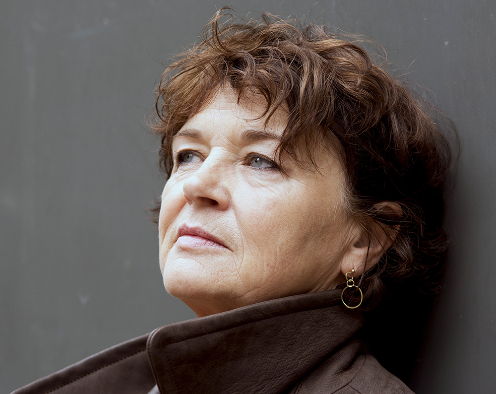
The inimitable fashion designer on innovation, representing a diverse vision of modern Britain and pushing the boundaries of design

In the history of style there are a handful of fashion designers whose work goes far beyond the parameters of attire and moves into the realm of high art; McQueen, Galliano and Gaultier being perhaps the most obvious of the avant-garde vanguard. However, it is worth noting that what those names share in common is the fact that their groundbreaking aesthetic provocations punctuated a very narrow and clearly delineated mainstream – theirs was a time that existed before the information avalanche and tortuous art directed hashtag distractions of the social media landscape. In the current paradigm, punctuating the dizzying multiplicity of cultural streams to genuinely stand apart and be noticed is no easy feat, which is why the British designer Sadie Clayton is a genuinely inspiring 21st century figure.

Born in Yorkshire to mixed race parents, Sadie is earmarked to become the Westwood of her generation. It is testament to her unique aesthetic that she was chosen by the Department of International Trade to represent Britain at this year’s AltaRoma festival in Rome, a distinctive niche in the fashion calendar presided over by the legendary Sylvia Venturini Fendi. It’s a hopeful sign in an era in which right-wing ideologies seem to be on the rise across Europe that the chosen representative of the UK is a plain-speaking, no-nonsense northern woman unafraid of challenging fashion industry clichés.

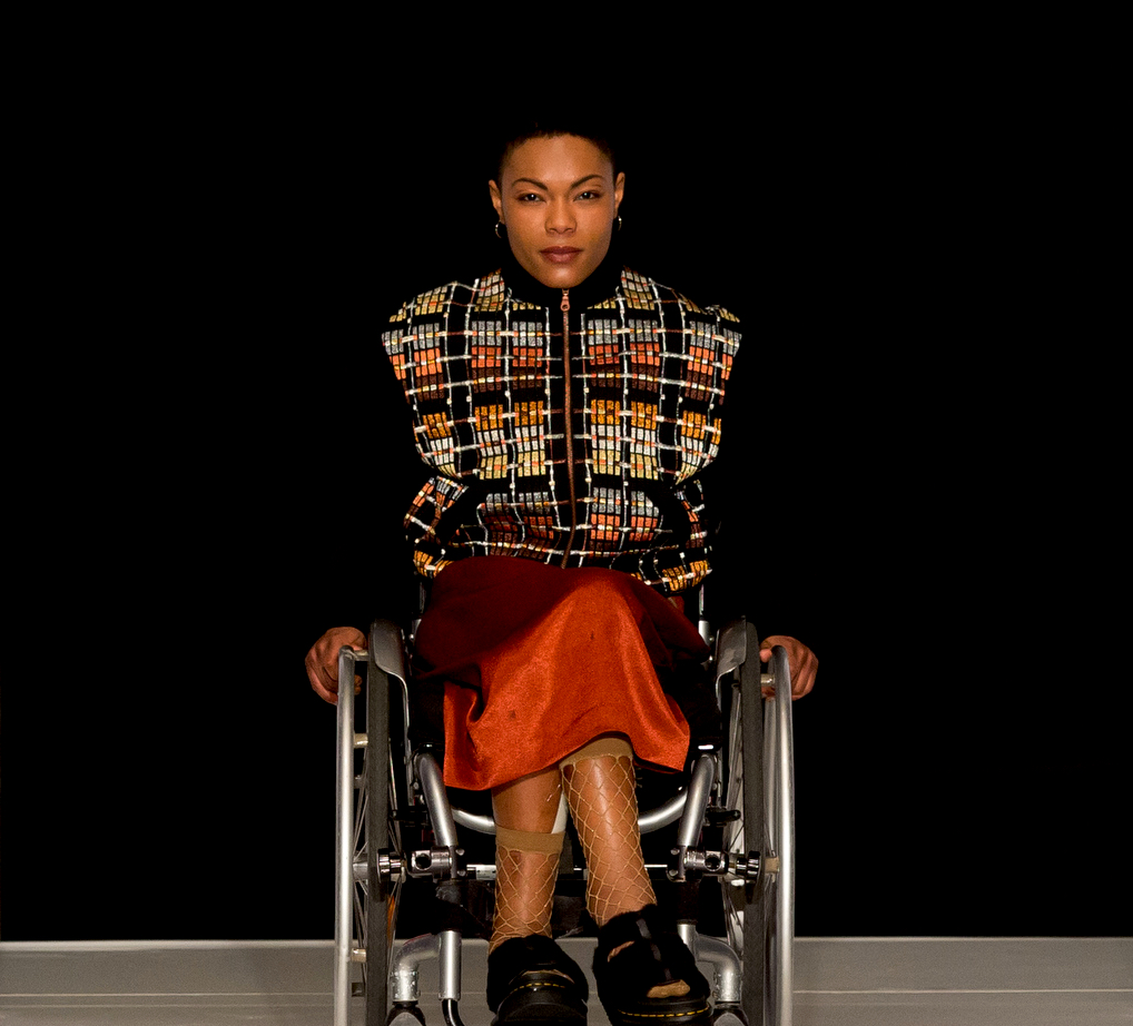
Suffice to say, her show at Villa Wolkonsky, the residence of the British Ambassador in Rome, celebrated profound diversity on the runway. A beautiful, striking black woman rolling down the runway in a wheelchair provided stark opposition to the more common albino-skinned waifs in the fashion firmament. Given her penchant for provocation and punk positivism, it is perhaps unsurprising to learn that fashion is just one spark of Clayton’s fiery creative vision, and that her ambition is nothing short of boundless. We caught up with her after the show at Villa Wolkonsky to discuss her enthusiasm for conceptual innovation and to find out why fashion should be leading the charge for equality.

Was there any particular thing as a child that inspired you to want to create?

I grew up in a society where I was very much in a minority being mixed race. I looked very different to my friends, so had the choice to either follow cultural stereotypes or embrace who I was, have fun with it and take advantage of my cultural fusion. The decision to take the route of individuation began at a young age – I’d buy fabric from Ikea and make a dress by draping fabric on a mannequin, jazzing it up by adding buttons from my very large vintage buttons collection. Back then, as now, everybody wore the same clothes, and followed the same trends, but I wanted to wear avant-garde interesting clothing and create my own trends, so studying fashion and moving to London and creating my own label was a way to actualise this. I am a creative who is inspired by bringing vision to life first and foremost.

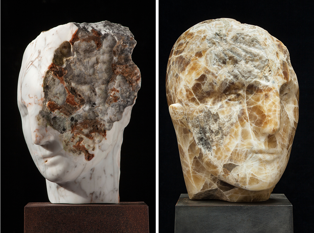
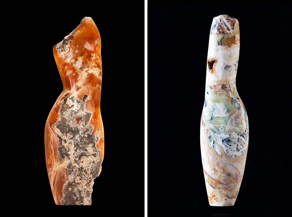
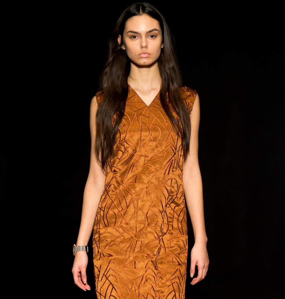
Why did you choose to work in copper and metals?

I always knew that I wanted to work with lots of different materials, not just fabrics, and metal was one of them – I was naturally drawn to the depth and richness of copper, and I love the way that copper can transform into a range of colours, oxidising into blues and greens, and as it ages it mellows. The core essence of my copper work is the creation of a beautiful piece of armour in a sense – something to protect and shield, and how I work the copper comes, for me, to reflect the texture of life. I have a very holistic approach to life, and copper is the element which brings not only health and good luck, but is symbolic of speed and technology and change, all concepts that inspire me.

Who has been your greatest inspiration from the world of art?

That’s hard to answer because I have some many favorite pieces – one of my favorite artists is Ron Arad, I tend to love whatever he produces, whether it be a chair, a hat or a structure in Kings Cross Station. I am also very inspired by sculptural genius of Rachel Whiteread, Barbara Hepworth and Anish Kapoor – artists who challenge the system and fight for change through creating beautiful thought provoking exhibitions and installations.

Talk to us about your teaching – what do you most enjoy about mentoring?

I believe in giving back, whether it is in the field of fashion or beyond, that’s why I teach and also why I participate in events such as those held at Tate Britain where we show hundreds of young people how to sculpt and create for themselves. It is a big way to unlock creativity and stimulate vision. When I speak, I speak openly about the challenges and realities of building a brand, especially in the fashion industry. For too long students have been focused just on the design and creative side but it’s a tough world out there and you need to be prepared and taught how to improve your likelihood to succeed.

What has been the most fulfilling moment for you so far?

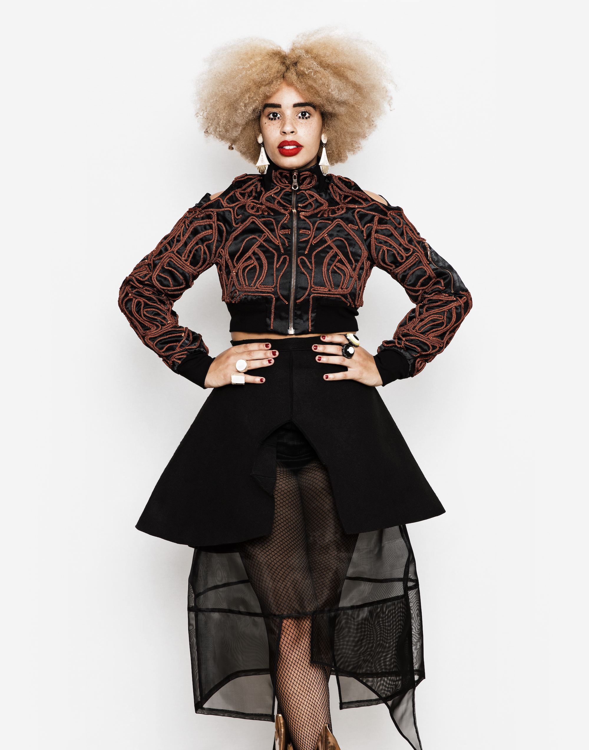
I just presented my AW/18 collection at AltaRoma, which was my first solo catwalk since my commercial launch in-front of the international media, supported by the UKDIT with the intention of drawing attention to diversity in fashion and hopefully the world. It was an amazing moment and privilege at so many levels. It’s very different to the kinds of brands often prevalent at AltaRoma. My brand is strong and feminine, but it’s not all about fashion for me. I don’t want to be defined as one thing, I hate boundaries and want the women who wear my clothes, or people who buy my accessories, or eventually drive my boats, even, to personalise and interpret my work so that they feel energised and complete wearing or living with a big or little piece of Sadie Clayton in their lives.

What are the key principles you stick to when designing?

From a fashion perspective, I would say Thierry Mugler, Claude Montana, Alexander McQueen, JPG and Comme des Garcons, as they epitomise a similar aesthetic purity, and, in their own way, stand for similar aspirational objectives for women. From a personal perspective, it was my mother who was instrumental in creating a woman who was hardworking, professional and tenacious. The key design principles I stick to are a strong silhouette, power and elegance. I love power, I love strength, I love ‘wow’, so if I can capture that in my major pieces then the job is done.

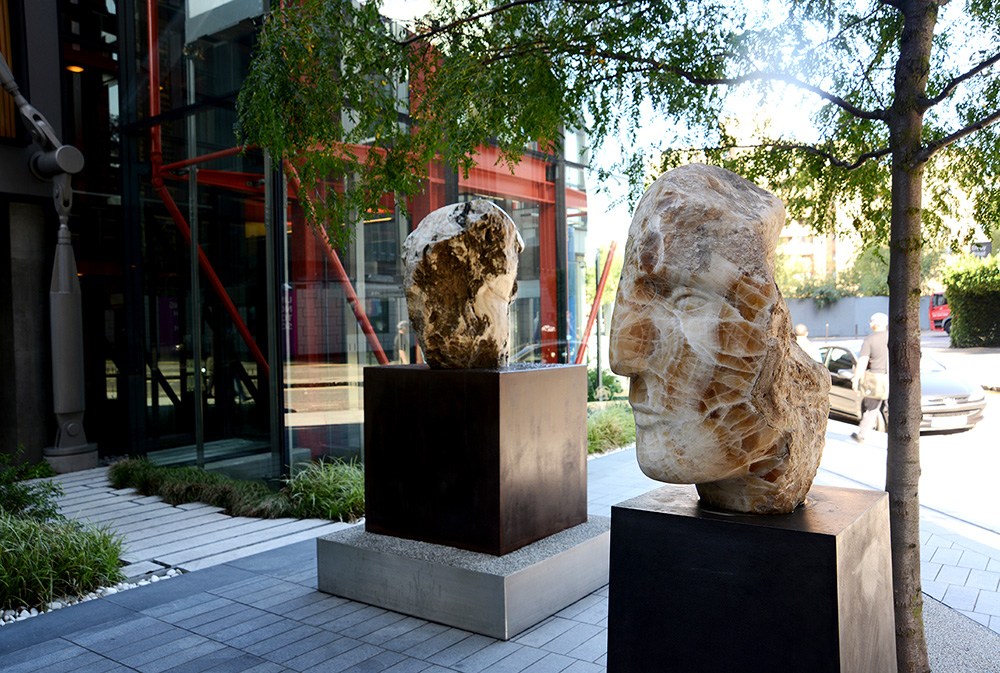
Why do feel you want to expand the brand beyond the horizon of fashion?

I just strongly believe that my vision of the world is not just one with a fashion focus. I would love to design the interiors of hotels, or super yachts or furniture, for example. I am passionate about the role of younger creatives in innovation, and I think my brand shows this in the way I have worked with, and continue to explore technology, whether in holographic form, through AI or 3D. Up until now, that has all been focused on fashion but we can always push the boundaries of design through technology and creativity, and I want to champion this.

What is your personal definition of beauty?

I was asked this recently by the Edinburgh Museum of Art. Beauty, for me, is the act of expression of one’s authentic identity – seeing somebody look a certain way, any particular way, that is really expressing their personality is beautiful. We are in a world now where you can wear what you want, and more and more people are taking advantage of that, whether it be in terms of cross dressing or the trend for gender neutral attire, or being wildly eccentric – it’s all a way of expressing who you are.

Photography Anthony Lycett

sadieclayton.co.uk

Kanaal: Living in Art

Kanaal, the brainchild of Belgian art and interiors behemoth Axel Vervoordt, provides cutting-edge new exhibition and residential spaces at the forefront of design 

Kanaal. Photo © Jan Liégeois

The Kanaal complex, originally an old malting distillery and grain storehouse, lies just on the outskirts of Antwerp. It’s here, over the last two decades, that Axel Vervoordt – the interior designer and art collector who designed the Manhattan penthouses of Robert de Niro and Kanye West – has been gradually acquiring land and derelict agricultural buildings. Today, the recently opened, 55,000sq m site offers custom designed and sympathetically restored exhibition space, featuring permanent installations from luminaries including Anish Kapoor and Marina Abramović, as well as rotating showcase exhibitions for emerging artists. 

The complex also includes luxury apartments available for commercial sale, conceived by long-term Vervoordt collaborator, the architect Tatsuro Miki, and with interiors designed by Vervoordt himself. He envisages a close community here, brought together by a love of art and design – the site already hosts award-winning French bakery Poilâne and a restaurant, with daycare facilities in the pipeline. It’s a project that is truly a family affair, with Axel’s two sons, Boris and Dick, taking responsibility for new art acquisitions and real estate, respectively.  

Anish Kapoor’s At the Edge of the World, installed at Kanaal in 2000 and created before the artist achieved global fame, represents the “red beating heart” of the project, as Vervoordt explains to me at the event’s opening. “I wanted the space, which used to be a building where grains were sorted, to be like a Rothko chapel, a room for universal peace and harmony.” Recently, an opera was performed in the space.  

Axel Vervoordt standing underneath Anish Kapoor’s ‘At the Edge of the World’. Photo © Zoemin

Nearby, the Henro gallery houses Axel Vervoordt’s permanent collection, moved from its previous exhibition space in the heart of Antwerp. In Karnak, an ascetic space with the original solid concrete columns intact, works by Gutai artists are installed alongside Japanese sculptures dating from the Endo period. Literally meaning ‘concrete’, Gutai was a radical artistic movement that emerged in postwar Japan, its proponents aspiring to transcend the abstract painting of the time in favour of pure materiality.

The strength and legacy in the room is palpable: the columns once supported 60 litre silos. “When I first saw it, the columns reminded me of an Egyptian temple,” says Vervoordt. “The power is still amazing – almost religious. Industrial architecture is not made to be beautiful, it is made to serve.”

Karnak © Laziz Hamani courtesy of Axel & May Vervoordt Foundation

The room next door is dedicated to three paintings by Gutai artist Kazuo Shiraga, who descended from a prominent samurai family. The three ‘warrior’ paintings convey a primal violence reminiscent of Shakespearean tragedy, the scarlet spattered canvases hovering, eerily suspended in the slate-grey gloom. When Vervoordt visited the artist at his home in Kobe in 2003, he witnessed an equally elemental mode of preparation.

“He would contemplate the empty canvas, until he became one with the emptiness. His wife would then pour the paint, and he would create the painting in a few gestures, without hesitation. This for me is the origin of life, that which comes out of emptiness. This is the big bang.”

Suiju, Kazuo Shiraga. Photo © Laziz Hamani courtesy of Axel & May Vervoordt Foundation

“Now we go into the light”, Vervoordt jokes, as we exchange the shadowy gallery for comparatively blinding Flemish daylight. Though lighthearted, this is an apposite remark: at Kanaal, the levels of luminescence in each gallery are carefully weighted for optimum atmosphere.

Installation El Anatsui, ‘Proximately’. Photo © Jan Liégeois

The Patio Gallery, a space for temporary exhibitions, is currently showing Ghanaian artist El Anatsui’s ‘Proximately’, and is drenched in natural light. Anatsui’s tactile sculptures, vast quilts of scrap metal that have been washed, hammered flat and sewn together using copper thread, hang on the walls like glittering patchwork quilts. Vervoordt first discovered Anatsui’s work in Toyko, and presented the artist at the Venice Biennale in 2007, draping one of his sculptures over the facade of Palazzo Fortuny like a chainmail tapestry designed with the palette of Gustav Klimt.

Lucia Bru exhibition, Escher Gallery. Photo © Jan Liégeois

The industrial legacy of the Escher Gallery, a former brick warehouse and now another temporary exhibition space, remains clear. Though the machinery and grain silos have been removed, vast cylindrical concavities remain carved in the space. The sculptures of Belgian artist Lucia Bru that inhabit the gallery were not made in accordance with the space, but feel like a part of its industrial heritage. Fragments of crystal and milky porcelain with rounded edges, as though smoothed by waves, lie in glimmering piles. When I note the sculpture’s resemblance to sea glass, Bru emphasises the integrality of water to her work. “The elements of water and earth are part of the same family, they have a relationship, they fight, they reconcile,” she explains. Bru’s larger sculptures, which resemble pale rocky islands, are ceramic, a famously un-pliable, difficult material with which to work. “It has a mind of its own”, she notes. “I don’t like it when I control the material too much. I like it to surprise me.”

Detail of movidas, Lucia Bru. Photo © Jan Liégeois

Not all the structures at Kanaal are original, though it is often difficult to tell what has been newly built. Tatsuro Miki’s design celebrates this assimilation. “It’s important to preserve the existing quality of a place,” Miki says. “The first concept for the additional buildings at Kanaal was to create something as if it was already there. Once things have aged, we want them to be part of the same landscape. We prefer harmony to noise.”

Kanaal represents a continuation of Vervoordt’s design vision that has endured since his earliest restoration projects in the 1960s, to create an environment in which everyday life and art coexist harmoniously: a philosophy of living in art.


Anti-Morality Tales: Famous Artists from Chicago at Milan’s Fondazione Prada

An exhibition at Milan’s Fondazione Prada, curated by Germano Celant, unites a group of radical Chicago artists whose work explored the grotesque, hysterical and at times psychotic nature of life in post-war America

View of the exhibition “Famous Artists from Chicago. 1965-1975” Artworks by Roger Brown, Ed Flood, Art Green, Gladys Nilsson, Jim Nutt, Ed Paschke, Christina Ramberg, Suellen Rocca and Karl Wirsum. Photo Roberto Marossi. Courtesy Fondazione Prada

Artist and curator Don Baum had been teaching at Chicago’s Hyde Park Art Center for close to a decade when he started exhibiting the work of under-represented Chicago artists. It was the early 1960s and Baum’s exhibitions – a mix of group shows, with themes including Animal, Vegetable, and Mineral – were put together on a shoestring, the focus being on the community that surrounded the artists, as well as the work itself.

The Hairy Who (and/or The Monster Roster, Nonplussed Some and Chicago Imagists, as they were also known) was founded as a group – and as an exhibition title – when Baum offered Jim Nutt, Gladys Nilsson, Suellen Rocca, James Falconer, Art Green and Karl Wirsum a show at the Art Center in 1966. Their work was both aesthetically and thematically in opposition to the New York School, and while those artists were delving further into abstraction and although satirical, nonetheless glossy, escapist Pop; the Hairy Who, and their Chicago contemporaries, were engaging with the grotesque, hysterical and at times psychotic nature of life in post-war America.

View of the exhibition “Leon Golub.” Photo Roberto Marossi. Courtesy Fondazione Prada

For the Art Center exhibition, The Hairy Who – and later their 1969 exhibition, Don Baum says ‘Chicago Needs Famous Artists’ at the Museum of Contemporary Art, Chicago – the artists covered the walls with a flower-patterned linoleum, with the express intention of having their audience experience the work in visually complex circumstances. For Fondazione Prada’s newly opened exhibition, Famous Artists from Chicago, the curator – and the Fondazione’s Artistic Director – Germano Celant mirrored the original setting.

On entering the gallery, you are met with a secondary route through to a room that has been built within the gallery walls, in which the group’s work is shown as a collective entity. A mass of wobbly, naked, fuzzy bodies; psychedelic stagings of suburbia; elaborate, flaming dreamscapes; and graphic expressions of delusion and dare; beyond the collective introduction, the exhibition peels off into individual sections, in considerably more ordered, traditional gallery settings. In doing so, each artist is given their moment at centre-stage, but the calm belies what was the strength of The Hairy Who: their focus on collective, noisy social commentary.

In an interview for the accompanying exhibition publication, Germano Celant spoke of how: “They did not passively accept reality like mechanical recorders in the manner of Warhol, but rather explored contemporary society with malice and irony.” He continues, “… they created visual subversions that contemplated the destruction of the body, and the ambiguity of existence leading to inhuman transformations. They focus solely on a moral argument, but attempt[ed] to push forward, awake and aware…”

View of the exhibition “H.C. Westermann.” Photo Roberto Marossi. Courtesy Fondazione Prada

In the surrounding galleries, above and adjacent to Famous Artists from Chicago, Celant curated concurrent exhibitions of the work of Leon Golub and H. C. Westermann, both of whom lived and worked in Chicago after the second world war. Westermann, born in 1922, studied applied arts at the School of the Art Institute, Chicago, after serving in the U. S. army as a Marine. Initially stationed in the South Pacific, and later in Korea, through his work Westermann recorded his traumatic experiences and anti-war politics. Working predominately in wood, in which he carved parts and images of boats, as well as assemblages and hallucinatory narratives, the forms in his work, as they are described in Celant’s essay in the exhibition catalogue: “oscillate between humour and ambiguity”. “On one hand, between a diving airplane and an atomic bomb, a penetrating penis and a figure with arms open in a gesture of surrender; and on the other, between a collapsing building and a book immersed in a void, heralding the end of the world and a return to the life of a savage.”

View of the exhibition “H.C. Westermann.” Photo Roberto Marossi. Courtesy Fondazione Prada

As is the case in Famous, the interior architecture of the Fondazione is utilised here, too. Westermann’s larger, sculptural works – in wood, metal and enamel – form a sort-of army, or front, defending the more revealing narrative works in wood and on paper, which are mostly hidden on entry. His practice embodies both a criticality of the brutality of war and its motivations, and a nostalgia for the fantastical stories of old Hollywood; and Westermann’s titles speak to that. They include, A Piece for the Museum of Shattered Dreams, Swingin’ Red King and the Silver Queen, Coffin for a Crooked Man and Where Angels Fear to Tread; and while his work is known for its craftsmanship, Westermann qualified in an interview with gallery director Martin Freedman and art critic Dennis Adrian in 1966, that: “To me craftsmanship is very secondary, actually”. “As I said, I like quality, but I like quality of ideas first, quality in politics, or quality in business. What the hell’s the difference?”

View of the exhibition “Leon Golub.” Photo Roberto Marossi. Courtesy Fondazione Prada

Golub’s concerns were rooted in his experience of American imperialism, but not limited to the conflicts the U.S had been involved with. He was equally interested in those that had gone unnoticed, developing timelines of concurrent wars and conflicts through his lifetime, and proving the interchangeability of the global paramilitary condition. In his installation works – where he manipulated and altered images of conflict, and presented them on layered photographic transparencies – Golub spliced recognised historical narratives, from the tragedies of the antiquity to the first televised war.

At the close of the second world war, figurative, expressionist practice was conflated with Socialist Realism and, particularly in the U.S, an aesthetic was sought that would assert the concepts of individual freedom and personal enterprise (i.e. The American Dream). This saw the onset of New Abstraction and Pop, and a so-called “depoliticised radical practice”. But Golub, as Celant describes: “Avoid[ed] the whisper in order to denounce loudly the terrible and dark situation in which the world itself.” And with H. C. Westermann, The Hairy Who, and countless other artists working outside of the New York School, he avoided the futile and the frivolous.

Although, “I would dare to claim that despite the apparent pessimism or negativity of the subject matter, in the reportage, retains a residual optimism”, as Golub said in 1996. “It’s in the very freedom to tell. In the freedom to make and exhibit these paintings.”

Famous Artists from Chicago. 1965-1975′ will be shown at the Fondazione Prada, Milan, until 15 January 2018

The Art of the Uncanny: Thomas Demand

Port’s Design Editor, Will Wiles, talks to the celebrated German artist Thomas Demand

Rasen / Lawn, 1998, C-print / Diasec, 122 x 170 cm (c) Thomas Demand, VG Bild-Kunst, Bonn / DACS, London Courtesy Sprüth Magers

The enigmatic photographs by the German artist Thomas Demand appear, at first glance, to be more documentary than art. In fact, drawn closer by the sense of the uncanny, the scenes reveal themselves to be composed of incredibly detailed paper and card models, painstakingly made by the artist. Favouring bureaucratic and banal spaces that are often connected to dark events – subjects include the ransacked offices of the East German secret police, Saddam Hussein’s kitchen and, above, the control room of the nuclear power plant at Fukushima – the images question the nature of experience and memory, and, in Demand’s own words, “our need to make sense of the chaotic environment we are in”.

A few of his pieces are ‘outdoors’ – one of the most memorable being no more than a patch of lawn, rendered in staggering detail, with each blade of grass carefully and convincingly created – but most are of interiors. His work is a sinister enfilade: a succession of quiet, unpeopled rooms. In some, something terrible has clearly happened. In others, it may be about to.  “These spaces more condensed and focused,” says Demand.

It’s an interest that connects to a recurring presence in his work – the ghostly afterimage of the Cold War and the division of Germany. “In the West since the Second World War, most of the places of power were inside a room, whereas the East tended to perform in a public realm, like parades and open-air speeches. This is not a general rule, but it seems notable nevertheless.”

And there has to be a degree of secrecy, or at least privacy and obscurity, to the scenes he chooses. Some scenes “are so iconic that I don’t see much that could be added: all has been shown. I like the less obvious, mundane, the generic and probably accidental attention to the built environment much more. It is closer to one’s own experiences.”

Kontrollraum / Control Room, 2011, C Print, (c) Thomas Demand, VG Bild-Kunst, Bonn / DACS, London Courtesy Sprüth Magers

Reconstructing a scene in meticulous detail, and then taking an image of it, is a process that has obvious affinity to the making and handling of memory. “Memory is a construction,” Demand says. “No one has images in their head. When we talk about the downfall of Saddam Hussein, your brain assembles all the parts necessary for your imagination.  Your brain provides you with that, to enable you to take part in a social practice, communication… That’s when it gets interesting for me. Not the incident, but the way in which we speak about it.”

Do particular scenes ever appeal simply as a model-making challenge? “Certainly,” he says, “but I try to avoid any hint of artistry; it would be challenging in a philosophical sense. Making a piece of lawn will take five months, but anyone could do it if they have the patience. The time spent on something like ‘Lawn’ has a Beckettian, absurdist meaning to it. That’s where it opens up to give an idea a form, which the visual arts should be aiming for.”

Demand seems most at home in a particular kind of bureaucratic environment: the office, the control room, the backrooms of power and decision-making. He admits to a kind of perverse enjoyment that these are spaces of paperwork: “A paradoxical barn door for me”. Here, it might be possible to discern a comment on the passage from an analogue, modern 20th century, in which we still believed that information could be tamed and mastered, into a digital, postmodern 21st century in which information endlessly proliferates. The latter is an era of over-memory, in which machines hoover up every datum of our lives and then never forget it, but also an age under permanent threat from data-loss, and the corruption and blanking of such archives. He gently denies any desire to ‘illustrate’ in that way. “I believe an artist will work alongside the issues which a society identifies in retrospect as significant,” he says. “The artist cannot produce them, but they will show up in a work which is of any relevance.

“However, how many telephone numbers do you remember? Three? Four? You don’t have to memorise them as they are in your smart phone, which you always carry around with you. We immediately blank out all such unessential information to make space for all the really important things, like Kim Kardashian’s Twitter feed. So in the end it’s not the ‘over-memory era’ but the ‘age of the cancerous archive’. We are losing more memory than ever before.”

Kitchen, 2004, C-print / Diasec, 135 x 164 cm (c) Thomas Demand, VG Bild-Kunst, Bonn / DACS, London Courtesy Sprüth Magers

Demand prefers to call the dioramas he creates ‘sculptures’ rather than ‘models’, but their existence is only temporary. Once it has been properly photographed, resulting in that one, perfect shot, the card and paper construction is destroyed – the photograph is the work of art. Though this might feel like a waste, it’s a necessary part of the process, both for the questions Demand wants to ask about memory, and for more prosaic reasons.

“I need the space again, so it has to go,” he explains, though he allows himself some room for sentiment. “I tend to avoid doing it: if you spend months on something, you become friends with it, so I have assistants that take it down. Usually it only takes 20 minutes.”

This is an extended version of an article from issue 21 of Port, out now. To buy or subscribe, click here.

Emily Young’s Mystical Pragmatism

George Upton meets Britain’s greatest living stone carver, to discuss travelling with American draft dodgers and how her art could save the planet

Emily Young, Tempesta (Etruscan goddess of the wind), 90x116x178 cm, 2012, in situ at NEO Bankside. © Emily Young, courtesy of The Fine Art Society

From a cluster of buildings nestled in the Tuscan hillside, comes the sound of cicadas, birdsong and trees rustling in the breeze. There’s a hubbub of voices and the sounds of industry – a rhythmic tapping of stone on metal. It’s timeless and universal, the sounds that rise up through the afternoon heat having accompanied man for thousands of years. That is until the scream of an American air force jet, stationed at a nearby base, punctuates the scene and I find myself back in a room above New Bond Street, London; the idyllic music of the Italian countryside is replaced by the rumbling of the city.

Emily Young has been describing life in the abandoned convent in Italy where she now lives and works, carving the monumental heads and bodies that have earned her the title of ‘Britain’s foremost living sculptor’. It is a fitting location for Young’s work to be produced. With a proximity to the natural world that she finds inspiration in, it is a close approximation in lifestyle to the timeless, universal appeal Young attempts to achieve in her sculpture. “If it’s not eternally true, it’s eternally out of date,” she tells me with a smile.

When we meet in London, however, more pressing matters are on her mind. We are sat in a room on the top floor of The Fine Art Society as Young’s exhibition Call and Response had just opened in tandem with a show of the same name in Venice. The city is in the grip of a heatwave and the windows have been thrown wide to tempt a non-existent breeze – the day before was the hottest July on record.

Emily Young, Head Shot. Courtesy of The Fine Art Society

“Yesterday was a horrible day to be a human in the city, everything will have to change,” says Young. As an artist who has focused on man’s relation to nature for over 30 years, her art has become politicised of late. Her calm, peaceful sculptures have been pressed into active service. Off the coast of Tuscany, 12-tonne heads carved from Carrara marble are being installed on a seafloor ravaged by illegal dragnet fishing. These Weeping Guardians will eventually form a 30km-long deterrent against destructive fishing practices, facilitating the restoration of the marine ecosystem.

Left: Emily Young, Rosea Marble Head, 2015, Rosea Marble, 30x20x26cm. Right: Emily Young, Mont Amiata Warrior, clastic igneous rock, 51x41x47 cm, 2012. © Emily Young, courtesy of The Fine Art Society.

Young’s environmental activism stems from a love of the natural world and humanity that she developed while travelling, well before she took up a hammer and chisel. Growing up in a household of writers and artists, decorated with the sculptures of her grandmother – a pupil of Rodin – it is no surprise that she exhibited a natural flair for art at school. She began a degree in fine art but left the patriarchal environment she found at the Chelsea School of Art in the mid-sixties to travel. Accompanied by a pair of American draft dodgers, Young set out for India overland.

“That trip was an awakening to art outside Europe,” she tells me. “When I travelled overland to India it was almost like going back to the Old Testament and what I found consistent with now was our relationship with our environment.” After beginning stone carving by chance many years later, finding a hammer and chisel in her house and working on a marble off-cut from her kitchen, she returned to this idea. “We would recognise our ancestors from 200,000 years ago. We would have been similar, had similar instincts. What could I make that’s also true for them?”

I ask Young about her creative process: “I found I was drawn to the graveyards, the area at the back of the stone yards for rejected pieces that have these great flaws,” she says. “The blocks people normally work with have six sides. I thought that was really boring because you killed the material, killed its history. I like the rocks the earth shuffles up for you, weathered over hundreds of millions of years.”

Left: Emily Young, Clouded Torso, 2015, Caramel Onyx, 30x25x9cm. Right: Emily Young, Primavera Torso, 2015, Brecchiated Onyx, 72x20x7cm.

Stone carving is nothing new – in fact that is exactly its appeal for Young – but there is something original in her approach to the medium. Throughout history, sculptors have used stone as a way to realise their design – seeing the stone as a three-dimensional blank canvas on which to impose their idea, favouring the smoothest, most consistent block to work with. Young, on the other hand, prefers to let the stone inform her design.

“Working the way I do, these amazing secrets are revealed to you, which I see as taking a very feminine approach,” she says. Rather than a masculine, “imperialistic, colonising of nature”, Young lets the stone dictate its form. The result is half-finished, still raw. Young’s art never never hides its substance, its materiality, and there is an exciting play of polished, formed stone against the raw natural form that has formed over hundreds of millions of years.

To Young the imperfections in a piece of stone are part of its idiosyncratic personality, but this is not to say that Young does not spend hours gently working it into monumental heads or abstracted human forms. I ask her whether she draws from life or if there are any art historical precedents that have influenced her style. She acknowledges that there artworks that will have slipped into her subconscious, but she does not base her figures on real life. “I’m trying to get a look that anybody who has lived anywhere at any time on earth will recognise – two eyes, a nose,” she says. “The ancient Greeks, Michelangelo, they’ve done all that can be done in terms of anatomical verisimilitude. I want to do something that anybody will get and will show the nature and the material, wild and free.” But there is an expression on their faces, a personality? I ask. “The face is quiet, and often their eyes are shut because I want the viewer to have a moment to respond to the stone, to understand quietness in the stone, even though it may have been created in volcanoes and earthquakes,” she adds.

Emily Young, Mont Amiata Warrior, clastic igneous rock in situ at NEO Bankside, 51x41x47 cm, 2012. © Emily Young, courtesy of The Fine Art Society.

For London Design Festival this week, Young has installed a sculpture trail at the NEO Bankside. Six monumental heads join three already installed at the site, facing the Tate Modern. It is part of Young’s programme of bringing nature into the urban environment, of reminding the city’s inhabitants of the organic world that we live and depend on. They shouldn’t be out in nature,” Young explains. “They should be seen, in the streets and public galleries. I want to wild the city.”

More than giving nature a relatable face that we can empathise with, drawing us in to witness the half-finished, marbled, fissured stone, Young’s latest work forms a poignant connection with Weeping Guardians, the monumental submerged heads off the Italian coast. Projections show that if sea levels rise by 10m, much of south London would be submerged and Young’s Southbank heads would join their Italian cousins beneath the sea.

Throughout Young’s work there runs a unifying seam. Her philosophy of wonder at the natural world, an adoration of time, humanity and the churning earth beneath our feet is a kind of mystical pragmatism. On the surface her rationalisation of the title of the exhibition split between The Fine Art Society and a monastery in Venice, Call and Response, seems to echo a New Age mysticism. But when I meet her, there is nothing supernatural in Young’s understanding of the world. Just as she describes her perfectly circular discs of stone, not as abstract forms, but as “moons and suns”, Young’s work is, quite literally, down to earth. Her method and medium may have ancient antecedents and, if compared to the glitz of controversy in the contemporary art world, she could appear naive, but her work resonates poignantly as we begin to reevaluate our relationship with our planet.

Emily Young’s sculpture trail at NEO Bankside on London’s Southbank runs until the 18th October and Call and Response at the Madonna dell’Orto church in Venice runs until 22 November.

Niki de Saint Phalle: a retrospective and a rediscovery

Madeleine Morley uncovers the Guggenheim Bilbao’s retrospective of French artist Niki de Saint Phalle, whose colourful and exuberant work celebrates the diversity of the female form and battled an oppressive patriarchy

The Three Graces, Guggenheim Museo Bilbao, 1995

The estate of the French painter and sculptor Niki de Saint Phalle, led by her granddaughter Bloum Condominas, have wanted to put on a major retrospective of her work for years, especially since her death in 2002. For various reasons, it’s never happened, so any current perception of de Saint Phalle – a prolific, extremely diverse artist – has tended to rely on her famed, exuberant “earth mother” Nanas sculptures. Think of these as her hits – the glossy pop-songs that are remembered while less immediately catchy songs gather dust.

“This exhibition is a re-discovery of her work – the things you might think of her aren’t necessarily true, and the retrospective will show you that” says Camille Morineau, the co-curator of the comprehensive exhibition that is at last happening, at the Guggenheim in Bilbao, Spain. “We need a younger generation talking and writing about Niki,” adds granddaughter Bloum, who has worked closely with curators Camille and Alvaro Rodrigues Fominaya to make this show happen. “We need people to explore her from a young perspective, so people can see how contemporary her work is.”

Niki’s colourfully monumental art deals, in part, with being a woman in the excessively body-conscious world of the 50s and 60s. Powerfully interested in women’s roles, her approach, attitude and strength should make her an artist that is widely discussed today.
Bilbao’s Guggenheim is the perfect place to showcase de Saint Phalle’s work in its entirety, from the Nanas she gave birth to, as well as her other, darker and less familiar projects. The space looks different depending on where you stand, like the artist herself, always confounding expectations. De Saint Phalle was many different women, not just the bohemian mother of the Nanas she is so often remembered by.She was Niki the teenage model, the angry woman, the loving housewife, the abused daughter, the inspiring collaborator, the blushing bride, the grandmother, the femme fatale, the swaggering hero, the avant-garde feminist, the celebrity on Andy Warhol’s arm, the self-taught, radical artist; this show reveals how these various selves infused her art. The exhibition’s structure is chronological, spanning six constantly changing decades. There are around 200 works included, beginning at the very start of her career as a model in the late 40s and early 50s for Vogue and Life magazines. Throughout the Guggenheim’s spiralling rooms, we see how her art was in dialogue with the process and progress of her life.

Having married young, she had a child and lived a typically well-off American lifestyle, before suffering a nervous breakdown in 1953. De Saint Phalle was institutionalised and treated with shock therapy like her equally unclassifiable but determined predecessors Sylvia Plath and Zelda Fitzgerald. They too were frustrated by the world of domesticity and its suffocating effect on any form of individual creative expression. Due to the strain on their mental health, they were all ultimately labelled ‘hysterical women’. Bloum tells me about how de Saint Phalle’s therapist said she should ‘blame herself’ for the sexual abuse she’d experienced from her father as a child: it is this kind of offensive patriarchy that de Saint Phalle battled against, both personally and creatively.

“Think of these as her hits – the glossy pop-songs that are remembered while less immediately catchy songs gather dust”

Madam or Green Nana with Black Bag (Madame ou Nana verte au sac noir), 1968

She embraced art as therapy and then decided on art as a career, before moving to Spain for inspiration. Her early work shows a woman trying to re-arrange the restrictive world around her into a new narrative. Fragments of domesticity like coffee beans, pottery, dolls and toy soldiers became the homespun medium of her collages. These materials of girlhood and motherhood were reconfigured into new shapes and images as she decided to break out of the traditional female role.

For the retrospective, Camille, Alvaro and Bloum have positioned de Saint Phalle very much as one of the first major feminist artist of the 20th century. They use these first, liberating pieces so that we see her later, less obviously volatile garden decorations and Nanas in the context of protest and resistance.

In the 60s, Niki was working on her early, explosive Shooting Paintings. They were dramatic performances, where she shot at pristine white plaster casts, the white of lace, so that they’d burst with colour when paint dripped from the bullet holes; these were more explicitly about her response to a nasty, repressive world. She was the first to use guns in art in this way, and it was as if she was releasing her thoughts and inner turmoil through the destructive act. De Saint Phalle once said: “I was shooting at myself – I was shooting at my own violence and the violence of the time.”

The Toilette (Make Up or Mirror of Life), 1978


“The jubilant sculptures have been described as goddesses, as witches, as grandmothers, as shrines – they’re women who are uncorseted, confident, voluptuous and free”

Skull (Meditation Room), 1990


“I’m not a person who can change society but I can present a vision. That’s all that I can do” – Niki de Saint Phalle

As the work burst from white plaster into colour, it revealed that de Saint Phalle was a subversive: she too burst with force and spontaneity although she appeared to be just a pretty model on the outside. “It’s easy to forget how dangerous this act was in the 60s,” says Camille. “This would have completely shocked people at the time.”

The slashes of colour erupting from her Shooting Paintings anticipate the gaudy colours of the Nanas sculptures. Instead of letting emotion – the wounds of life – drip out of the work as with the early Shooting Paintings, the Nanas boldly display emotion and colour on the outside. “She was missing heroines and role models as a kid,” Bloum explains, “so she decided to make some herself.” The jubilant sculptures have been described as goddesses, as witches, as grandmothers, as shrines – they’re women who are uncorseted, confident, voluptuous and free.

“I’m not a person who can change society but I can present a vision. That’s all that I can do,” de Saint Phalle says in a video projected over her creations on display. Although easily dismissed as relics of the hippie 60s and 70s, the voluminous sculptures still pack a modern punch and hint to potential future possibilities, ones that seem equally relevant for women today. The Nanas seem to have been guardian angels for de Saint Phalle. In the same room where they are displayed at the Guggenheim Bilbao, prints of diary-like drawings and love notes reveal a very self-conscious woman, obsessed with diet pills and sexy stockings. The nearby Nanas are perhaps totems from a world where people aren’t disturbed by these anxieties, and her way of creating images and rituals is an antidote to their corrupting influence.

From left to right: Bathing Beauty, 1967-68, Dancing Nana Anna, 1966, Black Nana Upside Down, 1965-66, Nana with her Leg in the Air, ca. 1966, Guggenheim Museo Bilbao

Niki the person was magnetic but anxious and temperamental; the artist was in control of her life and used art as a restorative guiding spirit. Her 70s Devouring Mothers sculptures and her film, Daddy, are works that turn to her interior life and they jar with the sheer joyfulness of the Nanas. They’re darkly humorous pieces that she used as a way to come to terms with her difficult childhood, which the Nanas were unable to protect her from. At the end of the 70s, de Saint Phalle also married fellow artist Jean Tinguely – a tumultuous though inspirational relationship that fed into her angst as well as her artistic inventiveness. The couple self-fashioned themselves as the Bonnie and Clyde of the art world and the relationship had a striking influence on her work – she influenced him and he influenced her.

Because this exhibition brilliantly captures an entire life in action, we also see de Saint Phalle as a kind of grandmother figure to all children. We see her designs for parks and playgrounds where she extends her vision of joy to public spaces, imagining a world designed not in mundane blocks but as outbursts of whimsy and intrigue. Outside the museum, on the Guggenheim balcony, three of her Nanas dance deliriously in the Bilbao sun, glimmering like the shiny surface of the immense structure. They’ve found a real home.

Frank Gehry, the Guggenheim Bilbao’s architect, and de Saint Phalle were apparently going to collaborate on a building together, but it never went ahead – a world designed by minds like these would be extraordinary. This show positions de Saint Phalle as an artist with stunning vision, one that challenges the ordinary and shows how fantasy can be a very necessary and practical part of reality. She was always growing, her colours getting richer, her shapes more dramatic, and in light of the full body of her work, she keeps growing.


Film still  from Daddy, 1972
Film still from Daddy, 1972

Figure and Rhythm: reassessing Leon Underwood

Pallant House Gallery’s artistic director Simon Martin on why he is dedicating a retrospective to one of the most neglected artists of the 20th century

Leon Underwood Venus in Kensington Gardens, 1921
Venus in Kensington Gardens by Leon Underwood, 1921

More than 40 years have passed since a retrospective has been dedicated to Leon Underwood (1890 – 1975), an unsung hero of British art that helped cultivate some of sculpture’s brightest talents including Henry Moore and Barbara Hepworth. This month, a new show at Chichester’s Pallant House Gallery entitled Figure and Rhythm will bring together Underwood’s often overlooked paintings, wood engravings, etchings and sculptures, as well as accompanying works by Gertrude Hermes and Blair Hughes-Stanton. Here the exhibition’s curator, Simon Martin, tells Port why he believes Underwood deserves far more credit for the role he played in moulding the landscape of modern British sculpture.

Within a year of attending the Slade School of Fine Art to study drawing under Henry Tonks, Leon Underwood had become the assistant teacher for life drawing at the Royal College of Art. He later opened the Brook Green School of Drawing at his home studio; the students under his tutelage included Eileen Agar, Blair Hughes-Stanton, Gertrude Hermes, Vivian Pitchforth, Henry Moore and Raymond Coxon. The men and women who passed through the doors of his school are praised as the most influential of the interwar period and yet he has lacked widespread consideration. As former director of Tate Britain Sir John Rothenstein stated: ‘No artist of his generation… has been so little honoured and indeed so neglected.’

So how is it that Leon Underwood – unlike his widely celebrated pupils – has fallen so much from view? Perhaps it was to do with his versatility. He was a painter, sculptor, draughtsman, printmaker, and illustrator, and due to what R.H. Wilenski described as his ‘restless progress’, Underwood did not have an instantly recognisable ‘style’ that could be easily categorised. When a remarkable series of etchings produced between 1921-22 demonstrated the strength of his draughtsmanship, London’s Chenil Gallery displayed them alongside the then famous Augustus John. Art historian Christopher Neve even described the etchings as ‘unsurpassed of their kind in the period immediately after the war’.

Two Musicians by Leon Underwood, 1925

“No artist of his generation has been so little honoured and indeed so neglected”

Reclining Model in the Studio by Leon Underwood, 1920

The Family by Leon Underwood,1936
The Family by Leon Underwood, 1936

When wood engraving was introduced to the Brook Green School in 1923, Underwood and his pupils began to experiment with tools and techniques to achieve new and unusual effects. This was to be a precursor to his formation of the English Wood Engraving Society in 1925. After moving to New York in 1926, Underwood subsequently became a leading figure in wood-engraved book and magazine illustration. His illustration of Phillips Russell’s book The Red Tiger, 1929, had the greatest impact on his career, and introduced Mexican themes into his work.

While other British artists were deliberating over the question of how to ‘go modern and be British’ Underwood sidestepped the debate entirely by drawing on his first-hand experience of native traditions and ‘primitive’ cultures. He wrote seminal books on the masks, bronzes and wooden figures of West Africa and became fascinated by the relevance of prehistoric art to the 20th century.

The medium of sculpture seemed to fuse the directness and vitality of tribal art with Underwood’s understanding of European traditions, and works such as Recumbent Knight (Catafalque), 1935, heralded his return to sculpture. Later in the decade, his appreciation of ‘the rhythm of materials’ was to inform a series of dramatic sculptures, which reflected his belief in the ‘life-giving force’ of the figure and his goal of artstically expressing a sense of ‘pure plastic rhythm’.

Underwood’s complex ideas and, sometimes, esoteric philosophies, did not always endear him to the mainstream. Whilst his work was always changing, he was devoted to the representation of the human figure and particularly to drawing from life. It’s this theme of ‘figure and rhythm’ which brings together the body of work shown at Pallant House Gallery, through which Underwood’s legacy and his position in the history of modern British art ought to be reassessed.

Figure and Rhythm runs at Pallant House Gallery until 14 June 2015

Words Simon Martin