In the Blink of an Eye

Noor Riyadh’s 2025 programme reflects a city in flux. From Al Faisaliah Tower to metro stations, 59 artists respond to Riyadh’s architecture, movement and rhythm with light as a connective medium

Shinji Ohmaki: Liminal Air Space-Time. Photo Noor Riyadh 2025

Noor Riyadh is a citywide light art festival that reshapes how Riyadh looks and feels after dark. Led by director Nouf AlMoneef, it spans metro stations, public squares and heritage districts, turning familiar sites into installations that respond to the city’s pace and scale. Launched in 2021 under Riyadh Art and the Royal Commission for Riyadh City, it has become what’s considered the world’s largest light art event, presenting more than 550 works by 500 artists and drawing over nine million visitors. Its aim is to commission public artworks from Saudi and international artists and to use light to connect Riyadh’s cultural and urban zones. For 2025, curators Mami Kataoka, Sara Almutlaq and Li Zhenhua work under the theme In the Blink of an Eye, a reference to the city’s rapid development.

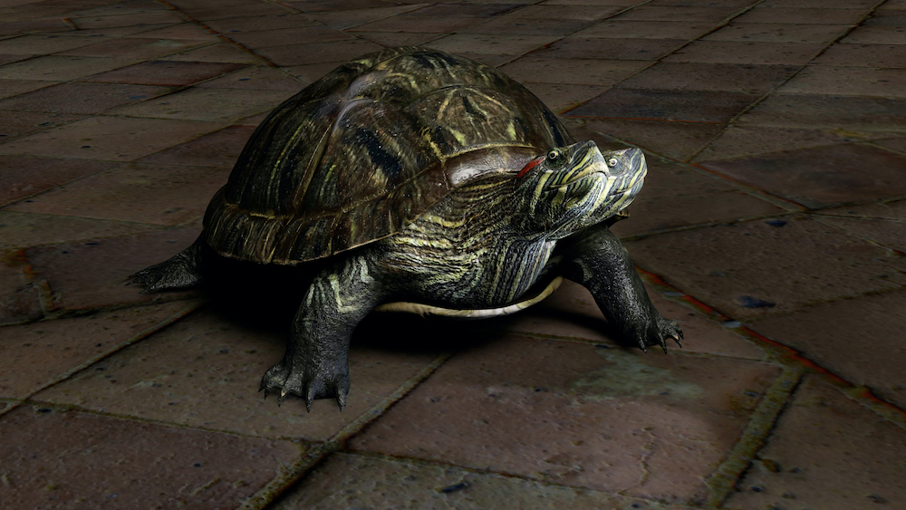
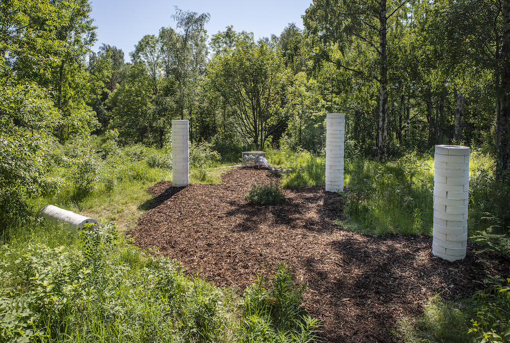
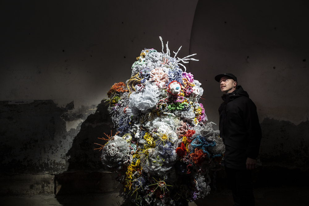
This year’s edition – which closes on 6 December – features 60 artworks by 59 artists from 24 countries, including 35 new commissions. László Zsolt Bordos’ Astrum turns Al Faisaliah Tower into a real-time planetary compass, its 7km laser beams mapping celestial movement. At KAFD Metro Station, Vali Chincișan’s The Vision Grid converts the facade into a shifting lattice of colour and sound. Christophe Berthonneau’s Synthesis, made with Bordos, merges drone choreography and architectural mapping so a building appears to lift and reassemble itself. fuse*’s Luna Somnium builds a large-scale metal framework animated with lunar data. James Clar’s When the Sky Reaches the Ground (a moment frozen) suspends a sculptural ‘lightning bolt’ made of neon and scaffolding. Saudi artists include Fatma Abdulhadi, whose fabric-based Keep your eyes on the light: Into Another Garden explores shadow and reflection, and Ahmad Angawi, whose Algorithms of Light: The Falcon draws on Najdi Sadu patterns and falcon iconography. Alex Schweder’s Clockwise Invitations is an inflatable environment that expands and shifts with its visitors.

Since its early editions, Noor Riyadh has grown into part of the city’s cultural infrastructure. Below, AlMoneef discusses the festival’s evolution, the logic behind its six hubs, the criteria shaping artist selection, and the moments she hopes visitors notice.

Fuse: Luna Somnium. Photo Noor Riyadh 2025

Port: You’ve been director of Noor Riyadh since its early editions. What does this iteration feel like to you personally, and what is it trying to do differently?

Nouf AlMoneef: Every edition carries its own identity, but In the Blink of an Eye feels especially close to the current spirit of Riyadh. Since the festival launched in 2021, I have watched the city transform at remarkable speed. This year reflects that momentum in a very direct way. It brings light into spaces that express both our heritage and our modern urban rhythm, while placing even greater emphasis on accessibility and public experience. What feels different is the immediacy. The festival responds to a city that is constantly shifting. Light becomes a way to pause, notice change, and reflect on how quickly our surroundings evolve.

How would you describe this year’s theme, In the Blink of an Eye, and how did it shape your approach to the programme?

The theme captures the pace of Riyadh’s transformation. It speaks to how rapidly life is moving, how innovation shapes our environment, and how perception can change in a single moment. Light naturally conveys speed, energy, and transition, which made it the ideal medium for this edition. The curatorial team, led by Mami Kataoka, with Sara Almutlaq and Li Zhenhua, explored these ideas through artworks that shift, react, or transform as audiences move through them. The theme shaped the programme by encouraging artists to experiment with perception, memory, and the movement of the city around us.

Encor Studio: Sliced. Photo Noor Riyadh 2025

The festival spans historic and emerging zones across the city. Can you tell us about these locations and how you decide which works go where?

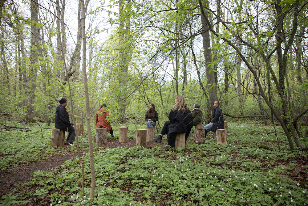
Noor Riyadh 2025 unfolds across six hubs and locations: Qasr Al Hokm District (Hub), King Abdulaziz Historical Center (Hub), stc Metro Station (Hub), KAFD Metro Station, Al Faisaliah Tower, and Riyadh Art Hub at JAX District. Each carries its own narrative and atmosphere. In the historic areas, artworks interact with architecture that holds the city’s memory. We look for installations that respond to heritage through material, scale, or rhythm. In the metro stations and contemporary hubs, the focus is on movement and modernity. These environments naturally lend themselves to works that explore data, sound, flow, and digital expression. Placement is always intentional. We consider the artist’s vision, the spatial character of each hub, and how the overall journey will feel as visitors move between traditional and modern spaces.

This edition presents 59 artists with more than 35 new commissions. What criteria guided the curation?

The selection balanced several key considerations. Alignment with the theme: every work needed to respond authentically to the idea of rapid transformation and shifting perception. Diversity of international and Saudi voices: artists represent 24 nationalities, including a strong Saudi presence that reflects the country’s evolving creative landscape. Innovation in light-based practice: we invited artists who experiment with technology, kinetic movement, or immersive forms of storytelling. Sensitivity to site: each commission had to fit its location, whether a historic street or a fast-moving transit hub. Public experience: the festival remains open and free, so works are designed to be intuitive, welcoming, and engaging for all ages.

Shinji Ohmaki: Liminal Air Space-Time

If you had to highlight two or three works that capture the heart of the festival, which would they be, and what moments do you hope audiences notice

Several works express the essence of this edition. The commemorative installation for Safeya Binzagr is a tribute that honors a pioneer of Saudi modern art. It connects the past to the present and invites visitors to reflect on the legacy that shaped today’s creative momentum. Ayoung Kim’s installation at Riyadh Art Hub at JAX District: her work explores shifting temporalities and cultural cosmologies through light and movement, inviting audiences to reflect on different ways of perceiving time. New commissions from artists such as James Clar or Muhannad Shono explore perception and identity in ways that resonate with the theme and the atmosphere of the city. What I hope people notice are the subtle details. The way light shifts against a facade, how a work responds when you walk past it, or how an installation transforms a daily commute into an unexpected moment of reflection.

Noor Riyadh is often described as a point where art and technology meet. How do you see advances in light-based technology reshaping public art?

Technology broadens the possibilities of public art. Tools such as AR, AI and advanced projection systems allow artists to work with movement, interaction and environmental data in new ways. These tools also enhance emotional connection. They can turn a metro station into an immersive landscape or translate the rhythm of the city into light and sound. What matters most is not the technology itself, but how it deepens the experience. When used thoughtfully, it helps audiences feel more connected to their surroundings and to the stories we want to share through the festival.

Encor Studio: Sliced. Photo Noor Riyadh 2025

How has Riyadh’s art scene evolved in recent years, and what role has Noor Riyadh played?

Riyadh’s cultural ecosystem has expanded significantly. New institutions, public art programmes and creative platforms have helped build a vibrant artistic landscape. Noor Riyadh has supported this growth by presenting large-scale light artworks in public spaces and by inviting both Saudi and international artists to engage with the city. Since its launch, the festival has presented more than 550 artworks by over 500 artists, attracting more than 9.6 million visitors and spectators. The community engagement programme – including workshops, school visits, talks and guided tours – has also been important in creating new art enthusiasts and building long-term cultural curiosity.

Looking ahead, how do you hope Noor Riyadh will evolve? What ambitions or challenges feel most urgent for its future?

I hope the festival continues to grow in a way that reflects the evolving character of Riyadh. The ambition is to expand the breadth of light-based creativity, support more Saudi talent, and keep strengthening the connection between the public and the city’s artistic identity. As Riyadh develops, one of the key challenges is to ensure that public art remains accessible and meaningful. We want Noor Riyadh to stay rooted in inclusivity and to offer experiences that resonate with residents and visitors alike.

Ultimately, the goal is for the festival to evolve in step with the city, providing new perspectives on Riyadh’s changing landscape and inviting people to experience its transformation through light.

Noor Riyadh runs until 6 December, find out more here

Fuse*: Luna Somnium. Photo Noor Riyadh 2025
Zhang Zengzeng: The Light To Home. Photo Noor Riyadh

Sculpting Air

Inspired by côte&ciel designer Emilie Arnault’s sculptural approach, architect and spatial artist Alberto Simoni of asprostudio.eu has created an installation that frames the FW25 collection as weightless, architectural forms

Emilie Arnault, head of design at côte&ciel, names Antoine de Saint Exupéry, the French pilot and author of The Little Prince as the inspiration behind Stratus, the brand’s new collection. “I pictured a puzzle made of sky, clouds, aircraft and parachutes through the eyes of a child.” Some bags fold like origami; others appear deconstructed, stripped to their bare bones. There’s an ethereal sense of weightlessness about them – a balance between volume and form, as if each piece had been caught in mid-air, billowing before flight.

Since its founding in 2008, Arnault has been at côte&ciel from the very beginning, guiding the design of its collections. Over the years, the brand has also embraced the philosophy of “bags to wear, not to carry”, as explained by Arnault. Their bags interact with the wearer, adapting to the body like a garment. “The more abstract the body looks, the deeper you feel the connection, as if the bag was a part of the outfit,” says Arnault. Previous examples include the cocoon-like Isar backpack, the circular Moselle and the hooded Nile.

To introduce the Fall/Winter 2025 collection, côte&ciel unveiled Soft Sculptures during the Paris Fashion Week, an installation with Milan-based architect Alberto Simoni of asprostudio.eu. Over 30 foam sculptures were constructed and presented as columns of yielding material supported by wooden frameworks: without the foam, the structures would sway. “The core idea was to bring attention to the design itself,” says Simoni. “côte&ciel bags incorporate many details that emerge naturally from the construction process – details that are deduced rather than deliberately selected or positioned. While the bags appear rigid and structured, they are actually built on a soft framework.” The squishy foam blocks, sculpted to house the negative space of the bags, create an illusion of solidity, mirroring the way that the côte&ciel bags are formed.

“Emilie explained that she approaches bag design from a sculptural perspective, building the volume from two-dimensional textiles and refining it through prototyping. This was a key insight for the project,” Simoni says. Polyurethane, an everyday material, took on a key role. “Inspired by Emilie’s process, I imagined a sculptural approach – tracing the extraction of the bags from a solid block of material and displaying the negative space left behind. The negative space, shaped around the body, defines the bag’s actual volume when it is worn on the body.” Seeing her designs presented as sculptures was a moment of affirmation for Arnault. “When Alberto dared to showcase the bags as if they were sculptures, it worked so well that for a second, my impostor syndrome vanished,” she says. “That’s what happens when you meet someone who sees the world as you do – pure, selfless satisfaction.” Simoni hopes the installation offers the same sense of openness. “The sculptures are intentionally imperfect, the images are intentionally off-centre, things aren’t ‘designed’ specifically for a space. We wanted to create something without too many preconceived barriers or limitations; exactly how Emilie designs her bags.”

This article is taken from Anima Issue 3, to purchase a copy or subscribe head here

Art direction and Sculptures design Alberto Simoni asprostudio.eu

Photography Gabriele Rosati

Video Francesco Saverio Costanzo

Production asprostudio.eu

Brand creative Joe Goodwin

Production assistant Camilla Longhi

Project design assistant Rebecca Biagini

Set design assistant Mari Gianna

Digital operator Gill Lemon

Light assistant Luca Chiapatti

Retouch Mia Gianini

Gestural

Artwork Ruth van Beek, styling Lune Kuipers

Sarah Levy
Louis Vuitton
Zegna
Hermes
Sarah Levy
Celine
Givenchy
Celine
Emporio Armani
Margaret Howell

Artwork Ruth van Beek

Styling Lune Kuipers

This article is taken from Port Issue 35. To continue reading, buy the issue or subscribe here

Five artworks exploring India’s changing landscape

The Imaginary Institution of India: Art 1975-1998, an exhibition organised by the Barbican in collaboration with the Kiran Nadar Museum of Art, explores pivotal moments in India’s socio-political history through nearly 150 artworks. Below, assistant curator Amber Li highlights five standout pieces from the show, each revealing powerful narratives of identity, resistance and change during late-20th century India

Gieve Patel, Off Lamington Road, 1982-86 Collection Kiran Nadar Museum of Art, New Delhi © Gieve Patel Courtesy Galerie Mirchandani + Steinruecke and Kiran Nadar Museum of Art

Gieve Patel – Off Lamington Road, 1982–86

This epic painting captures a crowd moving through a busy alley, located off an important road in Mumbai where Gieve Patel worked as a doctor. 

Across the painting, men and women stand or squat in small groups to talk. On the right, musicians accompany young people dancing, some dressed in colourful clothes. Celebration is side-by-side with destitution: two bandaged, leprous children beg for alms, and a woman lies naked and bleeding in the foreground. Patel’s work often depicts people on the fringes of society. The painterliness with which these figures are portrayed verges on abstraction, conveying the transience of the crowd.

Madhvi Parekh, Village Opera-2, 1975 © Madhvi Parekh Courtesy DAG

Madhvi Parekh – Village Opera-2, 1975

Madhvi Parekh’s oil paintings provide, for her, a way back to the idyll of village life. They depict remembered landscapes from both her childhood village of Sanjaya, Gujarat, and her subsequent travels. She painted Village Opera-2 after attending an artist’s camp organised by artist G. R. Santosh in Kashmir in 1975. The copper pots she saw there inspired the black anthropomorphic figures at the centre of this work. Working first with oil paint, Parekh then used oil pastels to add small, vibrant creatures which resemble birds, fish, snakes and amphibians. The scene floats in a colourful net of dots and lines, patterns drawn from the folk crafts of Rangoli and embroidery that she had practised as a child. 

Arpita Singh, My Mother, 1993 © Arpita Singh, Courtesy Talwar Gallery

Arpita Singh – My Mother, 1993

Arpita Singh’s monumental painting, My Mother, records the chaos of communal violence exploding across India in the early 1990s. The artist’s mother looms dignified and stoic in the foreground, while militiamen in bottle-green uniforms enact scenes of devastation behind. Shrouded bodies line the streets and victims lie stripped on the ground.

Singh had started work on a portrait of her mother when riots erupted in Bombay (Mumbai). Unable to keep these two elements from spilling into one another, the painting represents collapsing boundaries between home and nation, private and public, and the real and the imagined.

Vivan Sundaram, House, 1994, from the series Shelter, 1994-99 Photo by Gireesh G.V. Photo courtesy The Estate of Vivan Sundaram

Vivan Sundaram – House, 1994

Vivan Sundaram was concerned throughout his career with the urgency of using art to confront political realities. After the demolition of the Babri Masjid, a 16th century mosque, by right-wing Hindu militants in 1992 and the ensuing Hindu-Muslim communal violence in the early 1990s, Sundaram, like some other artists at this time, turned towards making installations. The walls are made from handmade paper, derived from a handmade fibre called Khadi which Mahatma Gandhi promoted as an indigenous fabric which symbolised anti-colonialism. Although the walls are thin and fragile, they are also a call to resistance against violence and a commitment to peace. 

Nalini Malani, Remembering Toba Tek Singh, 1998 Installation view, World Wide Video Festival, Amsterdam, 1998 © Nalini Malani

Nalini Malani – Remembering Toba Tek Singh, 1998

Nalini Malani made this work in response to nuclear tests carried out by the Indian government in Pokhran, in the Rajasthan desert in 1998. In this installation, a woman from Pakistan and a woman from India fail to fold a sari together while footage plays of the aftermath of the nuclear bombings of Hiroshima and Nagasaki. The video installation builds on Toba Tek Singh, a short story by Pakistani author and playwright Saadat Hasan Manto about forced displacement during Partition, which you hear Malani reading from in the film.

The work conveys the artist’s searing anger at India’s nuclear tests, and at the absurdity and senselessness of ‘one set of people killing the other only because there is some land that you want, or there is some religion that is considered to be more superior than the other’.

The Imaginary Institution of India: Art 1975-1998 opens at Barbican Art Gallery on Saturday 5 October 2024. Entry to the exhibition will be free on 26-27 October as part of the Barbican’s Open Gallery weekend

Crafting Identity

In an increasingly interconnected world, design has become a meaningful tool for self-expression

Subin Seol. All Photography Sebastian Bruno

Throughout history, design has unfurled as a vehicle for self-expression. Consider the ground-breaking designs of Eileen Gray, a pioneer of modernism in the early 20th century. Her E-1027 seaside villa – replete with shape-shifting furniture – was not merely a marvel of architecture but a defiance against gender norms, and a means of carving out space in a male-dominated industry. Or Emory Douglas, a graphic artist and Minister of Culture for the Black Panther Party, whose revolutionary designs represented Black American oppression and helped define protest art at the height of the Civil Rights era. Otl Aicher – a designer most revered for his identity for the 1972 Summer Olympics in Germany – opposed the politics of Nazi-era Germany and believed that designers were responsible for building a better order. This led to the co-founding of education centre Ulmer Volkshochschule in 1946, accompanied by a graphic poster with the title ‘Wiederaufbau’, which translates to ‘the rebuilding’. Aicher played a pivotal role in reconstructing post-war Germany.

In the present day, where ideas dance freely amidst a mosaic of cultures, the importance of preserving and expressing one’s individuality cannot be overstated. Design has proven to be an instrument for making sense of oneself and communicating it to the masses. It’s more than aesthetics; it’s a canvas where individuals can paint their innermost narratives through materials, processes and technology. This concept pulses vigorously through the veins of many contemporary practitioners today, like Subin Seol, a London and Seoul-based designer who skilfully weaves her Korean heritage into her oeuvre. “Design is an intrinsic reflection of one’s identity and self,” she says. “I’m not just crafting objects; I’m translating my personal journey, challenges and joys into a tangible form.”

Subin’s formative years were bathed in Korean history, stories and craftsmanship, forging the bedrock upon which she built her creative perspective – a juxtaposition between Korean tradition and a modern feel. Her Korean Art Deco collection, shown at Seoul Design Festival in 2020, stands as a magnum opus for its fusion of bold, geometric Art Deco style with traditional Korean art, the latter designed after natural forms. Meanwhile, her Remembrance project, unveiled this year, comprises a dining chair and coffee table derived from reclaimed timber handrails sourced from a brutalist landmark, the now-demolished Fawley Power Station, located in Hampshire. An “ode to architectural heritage”, the project invites viewers to honour its memory through the physical elements.

Even with the prevalence of British architectural features, her Korean heritage still reverberates within the Remembrance project – attained through the use of natural, repurposed materials and delicate composition. “Whether it’s the patterns, shapes or even the subtle gestures in my designs, my Korean heritage invariably shines through,” she says. “Every design choice, from material selection to the crafting technique, tells a story of where I’ve been, what I’ve learned and how I perceive the world. The transformation of ideas into three-dimensional objects serves as a testament to my evolving identity.”

Bisila Noha

This exploration of self resonates within the ethos of Bisila Noha, a London-based ceramic artist, researcher and writer of Spanish-Equatoguinean heritage. With clay as her muse, Noha was drawn to pottery for its affinity with tactility. “I love the fact that it is a direct conversation with the material,” she says. “The way my fingers are dealing with the clay and shaping it is very relaxing and meditative.” As time went on, a deeper fascination for the material’s history grew – specifically the way in which clay has been part of civilisation for thousands of years, and used to make bricks or vessels for storing food and water. “It is such an integral part of our survival.”

At the start of her creative journey, Noha felt inclined to use her practice as a way of proving her Spanish-ness, employing traditional Spanish objects – like Mediterranean water containers crafted in hues of warmth and vitality – as an influence. Around three years ago, her parents brought back clay from Baney, a small town in Equatorial Guinea where her father is from. “Through the process of making with this clay, I’ve connected to my African side,” she explains. “It’s been an interesting but also very deep and transformational process.” When she returned to Baney in April,  from the moment she arrived there was an irrefutable sense of homecoming – “for so many years I had been dealing with and touching the land.” So in a sense, Baney clay acted as a catalyst for her to open up about her heritage, resulting in her most personal project to date, Baney Clay: An Unearthed Identity, a collection made with mixtures of stoneware or porcelain and Baney clay. It also sparked her creative ethos to reclaim the history of women of colour in pottery, and to challenge Western views on art and craft.

Rio Kobayashi, a London-based designer of Japanese-Austrian heritage, also finds solace in the practice of his craft. Raised in Japan by an artisan family, he imbibed the spirit of craftsmanship almost inherently. His parents are hippies – his dad a potter and mum a conservationist with pink hair – and they lived in an eccentric house with a large workshop and a mass of land. “Many people treated me as a special person,” says Kobayashi of his experiences growing up mixed-race in the countryside. Not only does he have a German accent in English, sometimes it’s Italian or Austrian Tyrolean; he’s also fluent in Japanese and German. “My existence was already confusing for many people.” This melting pot of cultures went on to inform his outlook on design – that is, an aim to create anthropomorphic furniture pieces lavished in patterns, maximalist silhouettes and a reverence for creating unexpected outcomes. “I like the idea of mixing everything up, making it all ambiguous and confusing to people.”

Rio Kobayashi

This is evident across Kobayashi’s entire portfolio, from a reconstructed three-legged table assembled in a “bat-like” hanging manner, to Shima Uma, a mixed-material dresser designed for Dolce & Gabbana that’s inspired by the ambiguity of a zebra’s black-and-white stripes. More recently, Kobayashi released a collaborative project Manus Manum Lavat, which translates to “One hand washes the other”. Made in conjunction with a group of friends who each work across textiles, graphics and art, he set out to recreate a living room of his life, filled with a medley of playful furniture pieces that you wouldn’t find anywhere else. A table with a tuna fish painted on the top; or hand-shaped soaps appearing like they’re reaching out to wash the palm of the other; the collection pivots away from a lone journey of self-discovery and instead shows us what happens when a group of like-minded individuals (and friends) come to ride on the same path. Three posters were commissioned for the exhibition, which provoked a welcomed response for Kobayashi; “My grandma didn’t understand the posters,” he says. “I was trying to get people to feel even more confused.”

Kobayashi is an apt example of how craft can allow designers to press their own imprint onto a tangible object. In a similar vein, UK-based wood artist, curator and public speaker Darren Appiagyei uses locally sourced wood from Shooters Hill, London, to create sculptures seeped in Ghanaian tradition. “As I grew older, I developed my identity and understood what it is to be from Ghana,” he says. From pottery and weaving to beadwork, masks and wood carving, Ghanaian art is strikingly textured and raw. Appiagyei applies these attributes to his own work, but instead of striving for a flawless finish, he seeks out imperfections from the wood, slowly carving out cracks and texture between the posts of a lathe. “I try to keep the authenticity of the wood and its origin key to my design.”

Darren Appiagyei

With each curve and contour, Appiagyei maps out the formation of wood and essentially opens up a dialogue between the history of the natural world as well as his own. A series of Pyrographic Vessels put this process to use through pyrography, a mark burning technique which, when applied, subtly exposes the grains and enhances the tones of the wood. “I never want to disturb the natural aspects or features that make the wood interesting,” he says. For him, it’s important to appreciate the material, be explorative and enjoy the journey. “It’s a very therapeutic process for me. I call it a labour of love.”

From remedial hand-play to the crossing of cultures, the stories of these designers underscore the profound role that design can play in understanding identity and heritage. As we continue to navigate the complexities of an interconnected world, their work demonstrates the enduring power of craftsmanship and the ability for design to transcend borders and time. It’s clear that design is a homage to the diverse cultures that make up our global community.


This article is taken from Port issue 33. To continue reading, buy the issue or subscribe here

Frank Bowling and Sculpture

In a new exhibition at The Stephen Lawrence Gallery, rare and previously unseen sculptural works from the iconic artist are brought to the fore

Frank Bowling, Angharad’s Gift Patagonia, 1991, Welded steel, 92 x 94 x 34 cm and Sasha’s Green Bag, 1988, Acrylic, acrylic gel, polyurethane foam and found objects on canvas with marouflage, 180.6 x 294.2 cm. © Frank Bowling, All Rights Reserved, DACS 2022. Courtesy the artist. Photographed by Anna Arca.

There is unlikely a more prominent or influential name in the world of art than Frank Bowling, a painter and sculptor born in Guyana and based in London. Renowned for his use of colour and experimentation, the former RCA grad – who studied alongside the likes of David Hockney and R. B. Kitaj – spent the next 60 years fine-tuning his medium, working his way to masterdom while developing a style that merges new materials and methodologies. From iconic Map Paintings to an artwork (named Tony’s Anvil (1975)) featuring pouring paint dripping down the canvas, perhaps his paintings are what Frank is best-known for. Little does the world know about his sculptural pieces, which is precisely what a new exhibition at The Stephen Lawrence Gallery opening on 15 July aims to address. In a conversation with curator Sam Cornish, we chat about Frank’s enduring influence, his pivotal works, and the reasons why his sculptures have remained in the shadow – until now. 

“Painting has to release certain sculptural aspects, but it also has to retain aspects of the sculptural to hold its own on the wall, in order for it to be a thing.” – Frank Bowling

Frank Bowling, Hrund, 1988, Welded steel, 84 x 122 x 40 cm. © Frank Bowling, All Rights Reserved, DACS 2022. Courtesy the artist. Photographed by Anna Arca

This is the first exhibition to focus on Frank’s sculptures. Why have these works been overlooked in the past?

Interest in Bowling’s art has risen vertiginously in the last decade or so. Inevitably there are lots of areas which haven’t been explored, especially given the peculiar complexities and contradictions of his art and attitudes. At the moment interest has been concentrated in his earlier work, his Expressionist pictures, his conflicted Pop paintings and, most significantly his Map Paintings; all areas open to sociological or political analysis. This is all well and good, and in line with the mood of the time, but I think there are lots of aspects of Bowling’s work that these approaches struggle with. Bowling’s making of sculpture has been fairly isolated, so naturally have taken a back seat. His paintings’ interactions with sculpture, or the idea of the sculptural, has been remarked upon before, but my project argues it has a much more central generative role within the trajectory of his work.

Frank Bowling, Lapwing Eye (Made in Japan), 2000, acrylic and mixed media on canvas, 64.5 x 46 cm. © Frank Bowling, All Rights Reserved, DACS 2022. Courtesy the artist. Photographed by Anna Arca

Can you give some details into Frank’s relationship with sculpture? What defines his style and processes, and how did you want to represent this in the show?

We are showing seven steel sculptures by Bowling, which is probably about half he has ever made, and almost all that survived. Six were made between 1988 and 1991 and the seventh completed this year, for the exhibition. I relate his work in steel to Anthony Caro, to Cubism, to classical African Art and the art of the abstract artists of the early twentieth century of Russia and Eastern Europe. This mix of influences are handled playfully. Bowling makes a virtue of being an amateur, or at least occasional, sculptor: they do not have any tricks, but they do have a direct and in a sense surprising physicality. 

Frank Bowling, Bulbul, 1988, Detail, Welded steel. © Frank Bowling, All Rights Reserved, DACS 2022. Courtesy the artist. Photographed by Anna Arca

What comparison can be made between his sculptures and paintings?

There are many connections and overlaps. One is persistent interest in geometry, one of Bowling’s key concerns from the very beginning of his career. Bowling has commented that he turned to sculpture because he thought Colour Field Painting ‘lacked structure’. Geometry, whether used to determine the overall proportions of his paintings, or more physically present as a kind of substructure, has been crucial for Bowling to help him give his paintings a sense of order. There are a number of instances in the exhibition where similar geometric structures can be seen in painting and sculpture. 

Frank Bowling, Mummybelli, 2019, Acrylic, acrylic gel and found objects on collaged canvas with marouflage, 171.3 x 206.8 cm. © Frank Bowling, All Rights Reserved, DACS 2022. Courtesy the artist. Photographed by Anna Arca

How did you curate the show, what works did you seek to include? Can you pick out some highlights?

The 1988-91 sculptures chose themselves, although I was very pleased that Bowling had What Else Can You Put In A Judd Box completed, so it could be included. And we were very grateful to include a sculpture from a private collection. I could have kept the selection limited to paintings contemporary with the 1988-1991 sculptures, but I decided to include works from across the career, from 1960 until 2019. This gives a broader sense of the different ways his paintings have interacted with sculpture, which also creates an inherently more interesting, and I hope, exciting, display. 

Sentinel, one of Bowling’s Poured Paintings of the mid-70s is a highlight for me. But I also love Brooklyn III, which at first seems monochrome. The way Brooklyn III sits next to the very busy, object strewn and colourful surface of Mummybelli is something I am especially pleased with. The similarities outweigh the differences, which would be difficult to anticipate from photographs. I think the harmony is to do with light and the way a sense of underlying movement is contained by the overall rectangle. Of the sculptures, Angharad’s Gift Patagonia and The Man Who Mistook His Wife for a Hat are my favourites: I’ve looked at both many times before, but they feel very different in this exhibition. The rigour of Angharad’s Gift Patagonia is clearer in the gallery space, while there are a few elements of The Man Who Mistook His Wife for a Hat I hadn’t noticed before. I could go on, because all the works bring something special to the display.

Frank Bowling, King Crabbé, 1988, Welded steel, 68 x 50 x 30 cm. © Frank Bowling, All Rights Reserved, DACS 2022. Courtesy the artist. Photographed by Anna Arca

Any notes about the structure and pace of the exhibition itself? How do you hope the audience will experience it?

The exhibition space is divided roughly in half, with an upper and lower level, separated by a ramp and some partition walls, although with enough space left to easily look from one to the other. The paintings are hung visually, in dialogue with each other and the sculptures, rather than in chronological or thematic order. I wanted to mix large and small works, partly because of the spaces of the Stephen Lawrence Gallery, and partly because some recent displays of Bowling’s art have perhaps overemphasised literal monumentality. The movement from the very small incidents of colour and texture to very large panoramas is hugely important to Bowling’s paintings, so in a way it makes sense that his larger works can sit alongside his smaller. Obviously I had some hunches before I started about how the works would interact but I was pleasantly surprised at how many inter-connections there were, congruences of shape or structure, or materiality, even in a few instances, of colour. I would hope the viewers would pick-up on at least some of these and also notice things I haven’t.

Frank Bowling, Sasha’s Green Bag, 1988, Acrylic, acrylic gel, polyurethane foam and found objects on canvas with marouflage, 180.6 x 294.2 cm. © Frank Bowling, All Rights Reserved, DACS 2022. Courtesy the artist. Photographed by Anna Arca. Frank Bowling, King Crabbé, 1988, Welded steel, 68 x 50 x 30 cm. © Frank Bowling, All Rights Reserved, DACS 2022. Courtesy the artist. Photographed by Anna Arca. 

What’s the main goal with the show, what can the audience learn? 

I hope it’s more pleasurable than didactic. But I guess I want to impress upon people the complexity and range of Bowling’s interaction with sculpture. There has been a lot written about Bowling and landscape. I think that his more fundamental concern is with evoking human presence, and I would be pleased if that were communicated at some level.

Frank Bowling and Sculpture is at The Stephen Lawrence Gallery, University of Greenwich, London from 15 July – 3 Sept 2022. To coincide with the opening of the exhibition a new standalone monograph Frank Bowling: Sculpture has been published by Ridinghouse.

Frank Bowling, The Man Who Mistook His Wife for a Hat, 1988, Welded steel, 75 x 72 x 65 cm. © Frank Bowling, All Rights Reserved, DACS 2022. Courtesy the artist. Photographed by Anna Arca.

Frank Bowling, What else can you put in a Judd box, 2022, Welded steel, 72 x 69.8 x 57.9 cm. © Frank Bowling, All Rights Reserved, DACS 2022. Courtesy the artist. Photographed by Anna Arca.

A Symbol of Love

Strength and resilience rise to the fore through the first major UK exhibition of artist Robert Indiana, currently on show at Yorkshire Sculpture Park 

Robert Indiana, LOVE (Red Blue Green), 1966–1998, installation view at Yorkshire Sculpture Park, 2022. Photo: © Jonty Wilde, courtesy of Yorkshire Sculpture Park. Artwork: © 2022 Morgan Art Foundation Ltd./ Artists Rights Society (ARS), New York/DACS, London

Arriving at Yorkshire Sculpture Park on a cloudless morning in March, it was strange to think that just days ago one of the worst storms in years had wreaked havoc here. The 500-acre park had lost three of its ancient trees; the grounds were left muddy and the branches bare. But, in a moment of respite, there was a refreshing sense of hope and resilience in the air, as well as the welcomed scent of spring exuded through the dozens daffodils sprouting from the earth.

Celebrating its 45th anniversary this year, the park has been at the epicentre of contemporary sculpture for the past four decades. There are currently more than 80 works from major sculptors peppered amongst its grounds including Phyllida Barlow, Ai Weiwei, Joan Miró, Damien Hirst and Barbara Hepworth, with site-specific works from Andy Goldsworthy, David Nash and James Turrell. It’s a treasure trove for art lovers, nature enthusiasts and dog walkers alike; there’s something for everyone whether it’s a leisurely stroll, a picnic, a gawk at the 18th-century Bretton Hall estate, or to revel in the work of some of the world’s best-known sculptors. 

Robert Indiana, Exploding Numbers, 1964-66, installation view at Yorkshire Sculpture Park, 2022. Photo: © Jonty Wilde, courtesy of Yorkshire Sculpture Park. Artwork: © 2022 Morgan Art Foundation Ltd./ Artists Rights Society (ARS), New York/DACS, London

There’s much to explore, not least in the park’s ongoing exhibition programme located in six indoor galleries and the outdoors. For 2022, the YSP opens the doors to the first major UK exhibition of American artist Robert Indiana, spanning 60 years of his magnanimous sculpting career with many works previously unseen. Additionally, there’s a selection of drawings by sculptor and land artist David Nash presented in The Weston Gallery and Bothy Gallery, while Yukihiro Akama’s miniature wooden houses are shown in the YSP Centre. A common denominator throughout it all is a profound feeling of love and strength, addressed through the key topics of the major exhibitions – that being politics and sustainability. This is oozed through the works entirely but most prominently at the entrance of the site, Indiana’s iconic Love (Red Blue Green) (1966-1998), stands proudly as if it were watching over us all, reminding us of one of the most universally felt emotions.

Clare Lilley, who’s recently been appointed the new director of YSP, spoke of the “incredible coincidence” of making this exhibition at this point in time. The moment she saw Love being installed at the park, for instance, she sobbed. The invasion of Ukraine had just been announced and – holding back her tears greatly – she remarks how “love is symbolic for the current world”. Love couldn’t be more symbolic or more pertinent, despite the fact that it was crafted decades ago. 

Robert Indiana, LOVE WALL, 1966-2006, installation view at Yorkshire Sculpture Park, 2022. Photo: © Jonty Wilde, courtesy of Yorkshire Sculpture Park. Artwork: © 2022 Morgan Art Foundation Ltd./ Artists Rights Society (ARS), New York/DACS, London

The tone was set for the remainder of the day as Clare took us on a guided tour of the park, first beginning with Indiana’s outdoor structures allude to his fascination with the graphic, numerical form. “Numbers fill my life,” he stated, penned in the release. “They fill my life even more than love. We are immersed in numbers from the moment we’re born.” Heading indoors, we gazed at the surprisingly mixed-media works; brass pieces constructed to look like wood, earlier collage forms, or phallic columns addressing the impact of the AIDS crisis to name a few. Tracing six decades through 56 sculptures, we saw the artist’s practice in full swing as he depicted his own version of the American Dream – a darker one at that. Forging a connection between politics, society and art, Indiana’s momentous career has poked hard at the world for its discrimination of LGBTQIA+ communities and racism. It’s a hopeful reminder of love and unity. 

The day continued as we strolled through the luscious grounds, inhaling the fresh air and either avoiding or ingesting the Marmite pieces from Hirst in the nearby distance. David Nash was our next stop – a painterly depiction of our relationship with nature perceived through an evolving study of trees – before heading to witness James Turril’s Deer Shelter Skyspace, a moment of calm as we peaked through the cut out roof of an 18th-century Grade II Listed building (an old deer shelter). Swapping the foot for a sturdy Land-rover, the final steps of the day were observed through the window as the helpful guide navigated us through the on-site sculptures and artworks. A personal favourite being the biodegradable pavilion created by Studio Morison, where timber, thatch and compacted earth has been constructed to allow visitors in for a moment of peace and quiet. Eventually, the piece will fall in on itself and decompose. It’s a stark comment on the fragility of nature, echoed by the fallen trees and bent branches from the storm.

YSP is undeniably a tranquil setting, and the final moments of the day were with concluded with calm, wind-hit faces and an unanimous feeling of contentment. Consumed by nature-rich parklands and the evocative artworks on display, I couldn’t think of a more apt location for discussing themes of love, resilience and our relationship with the planet – a greater reflection of what’s happening in the world right now.


Robert Indiana: Sculpture 1958-2018 is on show at YSP’s Underground Gallery and Open Air between 12 March 2022-8 January 2023

Robert Indiana, American Dream # 5 (The Golden Five), 1980, installation view at Yorkshire Sculpture Park, 2022. Photo: © Jonty Wilde, courtesy of Yorkshire Sculpture Park. Artwork: © 2022 Morgan Art Foundation Ltd./ Artists Rights Society (ARS), New York/DACS, London

Robert Indiana, AMOR (Red Yellow), 1998-2006, installation view at Yorkshire Sculpture Park, 2022. Photo: © Jonty Wilde, courtesy of Yorkshire Sculpture Park. Artwork: © 2022 Morgan Art Foundation Ltd./ Artists Rights Society (ARS), New York/DACS, London

Robert Indiana, Ash, 1985, cast 2017, installation view at Yorkshire Sculpture Park, 2022. Photo: © Jonty Wilde, courtesy of Yorkshire Sculpture Park. Artwork: © 2022 Morgan Art Foundation Ltd./ Artists Rights Society (ARS), New York/DACS, London

Robert Indiana, Love Is God, 1964, installation view at Yorkshire Sculpture Park, 2022. Photo: © Jonty Wilde, courtesy of Yorkshire Sculpture Park. Artwork: © 2022 Morgan Art Foundation Ltd./ Artists Rights Society (ARS), New York/DACS, London

Robert Indiana, Monarchy, 1969, installation view at Yorkshire Sculpture Park, 2022. Photo: © Jonty Wilde, courtesy of Yorkshire Sculpture Park. Artwork: © 2022 Morgan Art Foundation Ltd./ Artists Rights Society (ARS), New York/DACS, London

Acid Coral Template

Tuomas A. Laitinen addresses important questions of ecology and climate change through a series of glass-made structures and installations

A Proposal for an Octopus, series, 2019. Photo: Jussi Tiainen

The octopus has earned a spot as perhaps one of the most visited subject matters in art. From 19th century Japanese erotica through to modern painting classics, the eight-armed sea creature has drawn many artistic practitioners in with its alluring symbology and anthropomorphic influences. Mysterious, intelligent, adaptable and fluid; the tentacled and unpredictable animal represents both wisdom and strategy. For instance, in the recent documentary My Octopus Teacher, we saw the ocean protagonist cover herself with shells to hide from impeding prey, outsmarting the sharks in an instant as she continued to poke her many legs into its gills. So it’s no wonder the octopus has caught the attention of artists and designers over the years, with Tuomas A. Laitinen being the most recent – an artist who works across video, sound, glass, algorithms, plus chemical and microbial processes.

In his most recent body of work Tuomas merges the line between art and science, weaponising materiality and craft to take a crystallised view at the world of ecology – that which is done so through octopus-shaped glass structures and compositions. The work, named Acid coral template, has been presented at the inaugural Helsinki Biennial this year, and he’s also recently been commissioned by Daata to create an AR artwork for the launch of the platform’s AR app – a continuation of what was first commissioned by Daata in 2020. “I had been researching protein crystallography for a few years and started to think about how I could translate this data in my work,” he tells me. “In that video work, I used the protein models to create these very baroque body augmentations for the animated characters in the video.” Simultaneously, at the time of making, Tuomas was working on coral growth simulations and eventually these two worlds collided. “The protein model for this particular coral is based on the Yersinia Pestis (plague) bacterium. So there is a weird fictional metamorphosis woven into the fabric of the work. A bacterium becomes a speculative coral. It’s not really about representing the data as such but making an interpretation, a translation, or a transmutation of it and consequently placing it into new environments through AR.”

PsiZone, 2021. Installation view, Helsinki Biennial

Tuomas grew up in a small Finnish town, a place known the centre point for glass production in Finland and in the 20th century. He started working on his installations as a teenager using junkyard materials and scraps, “so that was my fist touch to art, even though there were no such categories in my mind then,” he says. After a stint in music, Tuomas decided to attend art school and pursued his studies at Finnish Academy of Fine Arts, which is where his love of sound, moving image, 3D animation, light and installation first bloomed; his debut glassworks were created around 10 years ago and “were basically custom lenses for a camera”, while his first augmented reality piece was borne in 2016. Now living in Helsinki, he often works with various artists and researchers to question the role of ecology and production, often employing a profound mix of translucent materials such as glass and chemicals, as well las microbial processes and algorithms. 

For the last five years, Tuomas has turned his focus onto the eight-legged creature and its home: the coral reef. “I’ve been making glass sculptures for octopuses as an attempt to find ways to think with these extraordinary lifeforms and, on a larger scale, ocean ecosystems. The octopus started to feel like a relevant conductor for opening up various ecological questions, providing a tentacular and modular model for organising ideas and artworks: ‘nine minds’ in one body. There is always a core brain there, but the structure allows a certain decentralisation to happen.” In a wider context, Tuomas strives to question ecology but also to touch upon the various mythologies that are attached to it, “and ideas coming from processes of knowledge production.” He adds: “And in some way, an element of cli-fi and sci-fi is present in the entanglements of my work – especially climate fiction, where the weather or the ecosystem is often seen as a protagonist. The current path in my work started in 2010 when I discovered some key texts from feminist new materialist theorists. That moment presented a major shift in perspective, and it is still affecting a lot of my work.”

Haemocyanin, 2019. Still from the video

And now, when thinking about the relationship between ecology and sustainability, it’s universally thought of as a delicate and necessary relationship. Conserving the earth’s waters, soil and ecosystem is vital in order to remain harmonious with the environment and the incoming – or better yet the present – affects of climate change. Tuomas’ work not only proves the impact of art when it comes to raising awareness of climate change, but that it’s a an aesthetic reminder of how fragile the natural world can be, where with just a shudder, slap or bash it can break it into tiny fragments. 

“For me, the idea of ecology is something that emerges from being sensitive to processes of mutual coexistence,” he explains. “When I think of ecology, I often come back to the notion of overlapping symbiotic processes and questions of biodiversity. At the level of making art, it means that individual works (like this coral reef) emerge out of an extensive world building or thought process rather than clearly defined project boundaries. A certain bundle of actions and reactions allows a specific outcome or a life form to appear, and I think that this is a sort of a parable of an ecological process. Feminist theorist Deboleena Roy talks about this notion of ‘feeling around for the organism’ in her book Molecular Feminism, and it’s been one of the important reminders on how to look for kinship with other-than-human lifeforms. And then, on another scale, as a citizen concerned with environmental issues, I am trying to find ways to support youth climate actions, but on an artistic level, it’s all about these subtle differences and tentative approaches.

It seems to me that understanding different scales and the resulting perspective shifts are quite crucial tools in relation to thinking about ecological transformations.”

A Proposal for an Octopus, series, 2019. Photo: Jussi Tiainen

Protean Sap, 2020. Stills from the video

The Same Sea

Port takes a trip to the Finnish island of Vallisaari for the Helsinki Biennial 2021

©Matti Pyykko, Helsinki Biennial

A group of 330 islands conjugate around the coastline of Helsinki, establishing an untrammelled and easy getaway from the humdrum of city life. It’s normal for locals to boat around here, whether that’s in lieu of the sauna, work or heading home from the mainland. Life in the Finnish capital feels serene, and the calm streets of the more urban environments – free from any queues – only solidifies this as a place where happiness, nature and the environment matter above anything else. 

While leaving the port of Helsinki on a refreshingly crisp day – the locals explained it was unusually cold for the time of year – that’s when I first caught sight of the many tiny islands, most of which are decorated with a wooden hut or left untamed and completely wild. Some are homes, others are summer houses or places to soak up the heat of the sauna. Then there’s the rocks, poking out of the water with abnormally smooth edges; they sink into the sea bed with little effort, windswept and altered by the tectonic shifts of the surface below. It took a mere 20 minutes to arrive at our destination of Vallisaari, an enchanting island and home of the Helsinki Biennial – an event presented by Helsinki Art Museum (HAM), directed by Maija Tanninen-Mattila, and curated by Pirkko Siitari and Taru Tappola.

Making its debut on the island with 41 artists from Finland and across the globe, the biennial’s new location is a land that’s diverse and rich in its formation. Few people could have entered Vallisaari a handful of years ago, due to it being used as a military base for the Russian Army – the remnants of which are still astonishingly present today. With a title of The Same Sea, the works involved in the biennial’s festivities reflect on the island’s history, as well as the interconnectedness and dependence that the world has on its oceans. With the climate at the fore, this is highlighted immediately as you board the island, where visitors are stunned by the confrontational work of Finnish artist Jaakko Niemelä’s Quay 6 (2021) a large, red structure that cups the shore line as it explicitly denotes the impending threat of rising sea levels. Below, I round up a few key highlights from the event, consisting of sculpture, sound and installation that each reflect on our climate emergency. 

Jaakko Niemelä: Quay 6, 2021 ©Maija Toivanen/HAM/Helsinki Biennial 2021

Jaakko Niemelä: Quay 6 (2021)

Designed as the island’s greeting, Jaakko’s installation has been construed of scaffolding, painted wood structures, water pipe and pumps. Commenting on the drastic effects of climate change and how the rising sea levels will greatly affect our lands and civilisation, the alarming piece directs its focus onto the melting of Greenland’s northern ice sheet; if it were to disappear in entirely, then sea levels will rise to six metres – the height of the structure.

Teemu Lehmusruusu: House of Polypores, 2021 ©Maija Toivanen/HAM/Helsinki Biennial 2021

Teemu Lehmusruusu: House of Polypores (2021)

A hybrid of natural processes, research and sound, the Helsinki-based artist’s installation is given anthropomorphic qualities as it listens to decaying trees before converting the noise into music. The work is likened to an instrument made of soil, and visitors are invited to touch and place their ears onto the large tubular structures to listen to its deep and vibrating hum. There are four structures in total, each of which is crafted from mushrooms, electronics and decaying wood. 

Margaret & Christine Wertheim and the Institute For Figuring: Helsinki Satellite Reef, 2021 ©Maija Toivanen/HAM/Helsinki Biennial 2021

Margaret & Christine Wetheim: Crochet Coral Reef, The Helsinki Satellite Reef (2021)

The world’s coral reefs are depleting, suffering greatly from pollution and heat exhaustion as a result of climate change. This handmade crochet piece, crafted by two LA-based sisters, is a passionate response to the matter; it reflects on the long process of building the sculptures as well as the lack of time that animals (and the reefs) have on our planet. The project has travelled to New York, London, Riga and Abu Dhabi in engaging with more than 10,000 participants; the sisters will also work with local Finnish communities to crochet a reef in Helsinki.

Janet Cardiff & George Bures Miller: FOREST (for a thousand years…), 2012 ©Maija Toivanen/HAM/Helsinki Biennial 2021

Janet Cardiff & George Bures Miller: Forest (for a thousand years…) (2021) 

In a calming corner of the island’s woodland, an immersive sound installation encourages its visitors to perch on tree stumps as they listen to various sounds: aircrafts flying above, birds, explosions and choir song. The Canadian artists’ work comments on the sounds that a forest will hear in a lifetime and, in this case, the different points in history for Vallisaar. Its listeners are exposed to yelling, screaming and gun fire, but equally they are connected to the trees around them, personifying nature as a delicate and fragile entity. 

Lutfi Janania

The Honduran-born botanical artist creates objects and sculptures coined from the natural world

The Central American country of Honduras is rich in flora. So immense that it runs miles, canopied amongst mangroves, cloud forests and long lines of coast stretching across the Caribbean Sea, to the north, south and Pacific Ocean. It’s marked by high and rainy mountainous slopes of the country’s highlands, dense in oak-pine forests and delicious woodlands that spreads for valleys upon valleys. Yet despite its vast occupancy of luscious lands and lively fauna that inhabit it, Honduras has also undergone some dramatic environmentalist issues. This includes the loss of soil fertility and soil erosion, plus the depletion of forests where trees have been harvested for lumber, firewood and land. Its fragility is only increasing, but it’s also these very pines, leafs and flowers that serve as a delectable backdrop and inspiration for one particular artist working today, Lutfi Janania.

Lutfi is a Honduran botanical artist who was raised amongst the rainforest and mountains of San Pedro Sula. After emigrating to New York City, the artist was in search of a new utopia – one comparatively different to the green facades of his upbringing. And, in doing so, he started working in the fashion industry whereby he learned about construction, colour and texture; the key elements to his work now. A few design roles later, and he finally ventured out on his own as a stylist, working on editorials and employing the use of flowers within the backdrops and more subtle accents of the shoots. This is the moment when he realised he’d found his utopia, or better yet his “passion for creating fantasy through experiences that could be harnessed through botanical design,” he tells me. Naturally, this led to the launch of his own design studio, Rosalila, during which he works with botanicals to build objects, sculptures and installations.

Corallia. Shot by: Maksim Axelrod

“I live for the idea of creating a fantasy, transforming a dream into reality,” he continues, noting how this was fully harnessed once he’d moved to the USA. “I imagine it as materialising an enchanting and otherworldly environment and the creatures that live in it.” Through freshly cut tropical plants used in installations through to various assortments of trimmings and flowers, Rosalia is indeed a “fun, flirty, exotic yet very elegant” outlet for his goals and view of the world. “Think of that sensation when taking in the lively rays of sun in the tropical beaches of Honduras while holding a delicious spicy margarita in your hand.”

Lutfi’s reasons for venturing into the field of botanicals stems wholly from his past. His familial home, for instance, is located on a nature preserve, built by his grandfather amongst the wild forest. Describing the environment as being “literally Jurassic in size”, Lutfi had the entire ecosystem at his fingertips. “The trees tower over my house and provide habitat for a variety of tropical birds and giant variegated monsteras, and other plants which climb and drape all over their entirety. Coming of age in such company really shaped my understanding of colour texture and light.”

The typical compositions of a forest tend to be centralised, as the plants reach for the light in their journey to photosynthesise. Lutfi’s work, however, completely defies the laws of gravity, and of the rainforest for that matter. He relies steadily on light, weight, balance and, of course, gravity, to stretch and spread his pieces to achieve questionable angles. Reaching branches are paired with dried florals, “which seem to simultaneously bloom and weep”, while curved woods and obscure silhouettes are formed through the skill of finding stability within his striking sculpture pieces. It’s an art form in itself.

Looking inwards, and beyond the outer layer of wildness and beauty, you’ll notice how Lutfi’s structures are more than just a display of expansive nature. He picks his materials depending on the stories that they speak, especially those that tell tales of their homelands. “And because of my upbringing in the bioreserve of Honduras, my relationship and experiences with the natural world have led my inspiration to be often rooted in nature,” he explains, weaponising both permanent and sustainable objects in order to reach the studio’s environmentally conscious goals. “At Rosalila, we have a conscious practice; we don’t believe in a wasteful way of designing. We repurpose our materials, pushing their limits and boundaries.” 

Leafy Sea Dragon. Shot by: Leon Hernandez

The Leafy Sea Dragon sculpture embodies this entirely, as its’ construed of hand-preserved botanicals, manzanita wood branches and crystals. “The piece explores negative space, grandeur and fantasy with an emotional connection,” adds Lutfi, who collaborated with a family-owned fabricator in Queens to create the Italian rainforest marble base, and a Brooklyn-based metalworker in Brooklyn to weld the brand stand, before adding in the botanical work crafted by the studio. It’s an immeasurable piece with strands and spikes alluding to the ever-growing quality of nature; punches of pinks are tossed amongst the desolate, earthy tones of the environment, causing a fiery juxtaposition of fertility and sterility that plausibly takes a stand against the dwindling lands of the rainforest.

All of Lutfi’s pieces encompass a myriad of materials, be it marble, quartz, brass, manzanilla wood, curly vines and hand-preserved botanicals. And through the marriage of the man-made and natural, his pieces are greatly provocative. “My desire is to convey emotions, feelings and sensations and the dualities in them,” he shares on a final note about the work’s impact. “When compiled together, these vignettes with crooked leaves generate sorrow, curiosity, anticipation and longing. In stirring such emotions, the environment begins to take shape and the life within the work becomes evident. The dried, dehydrated material is not just preserved, it’s persevering and actively creating. What appears to be dead is very much alive.”

Portrait in front of sculpture. Shot by: Ricardo Rivera
The Mirror. Housed by: @Ashya.co. Shot by: @equatorproductions
Corallia. Shot by: Maksim Axelrod