Reading Between The Lines

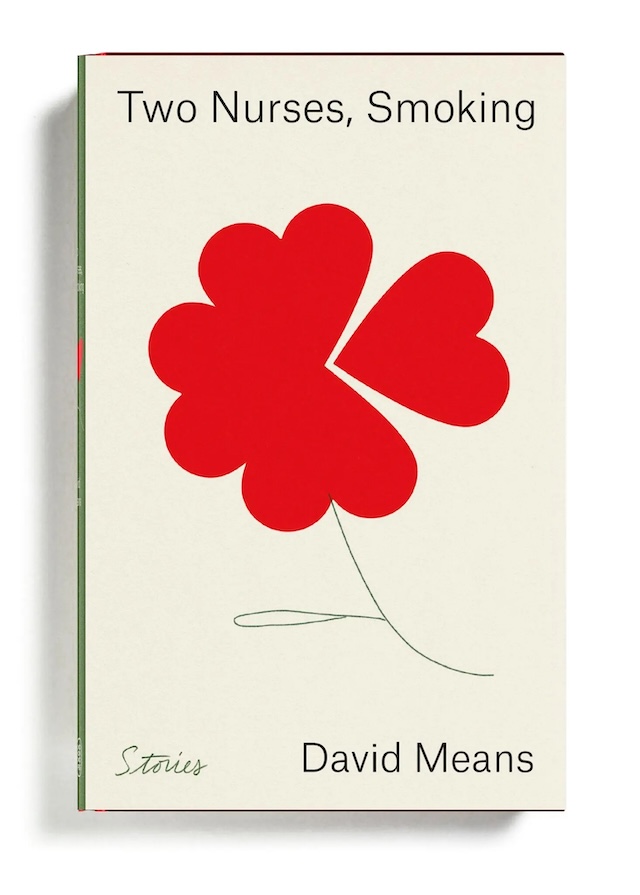
Digital platforms are changing how we discover, judge and read books, but what does that mean for the art of cover design? Below, Ayla Angelos speaks to Na Kim, Alex Merto, Coralie Bickford-Smith and Rush Jackson who each share their insights

Alex Merto: Among Flowers by Jamaica Kincaid

You step into a bookshop – perhaps Daunt Books or Libreria, if you’re in London. Your hand glides across a row of spines, fingertips catching on raised titles, debossed illustrations, the gloss of a foil-stamped name. A single book catches your eye. The cover is bold, enigmatic, resisting instant interpretation. You pick it up immediately and take it to the till.

Online, it’s different. Probably on Amazon, you scroll too fast and everything blurs into a sea of thumbnails, covers designed for algorithms. At the moment, book design is being pulled in two opposing directions; one towards clickable, hyper-optimised visuals, the other back to the tactile, crafted forms. Somewhere in that tension, the book cover is shifting.

Before book covers were designed to sell, they were built to protect. Early books were bound in leather, embossed with gold leaf, sometimes clasped shut like vaults. They were objects of rarity, more sacred than commercial. That changed with the rise of mass printing. Dust jackets emerged in the 19th century, first as disposable wrappers and then as a canvas for design. By the mid-20th century, the modern book cover had found its form with bold, abstract graphics designed to grab attention.

Na Kim: Alphabetical Diaries by Sheila Heti

Penguin’s classic tri-band paperbacks are perhaps the most well-known example of effective book cover design. Introduced in 1935 by founder Allen Lane, the covers became an early exercise in branding. Designed by Edward Young, who also drew the penguin logo, they featured a standardised layout with three horizontal bands, colour-coded by genre – orange for general fiction, green for crime, blue for biography and so on – allowing readers to instantly recognise the type of book they were picking up.

Meanwhile, designers like Alvin Lustig revolutionised book covers in the 1940s and 50s, bringing modernist abstraction to the form. His influence continues today in figures like Irma Boom, dubbed the ‘Queen of Books’, who treats each project as an object rather than just a container for text.

Today, book cover design is at a crossroads. AI-generated imagery and algorithm-driven marketplaces have reshaped how covers are created, producing efficient but often generic designs. And yet, there has been a resurgence of craft – a digital resistance of sorts, keeping the art of book design alive.

Na Kim: The Sun Walks Down by Fiona McFarlane

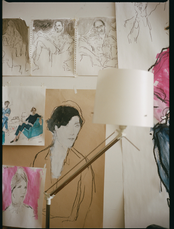
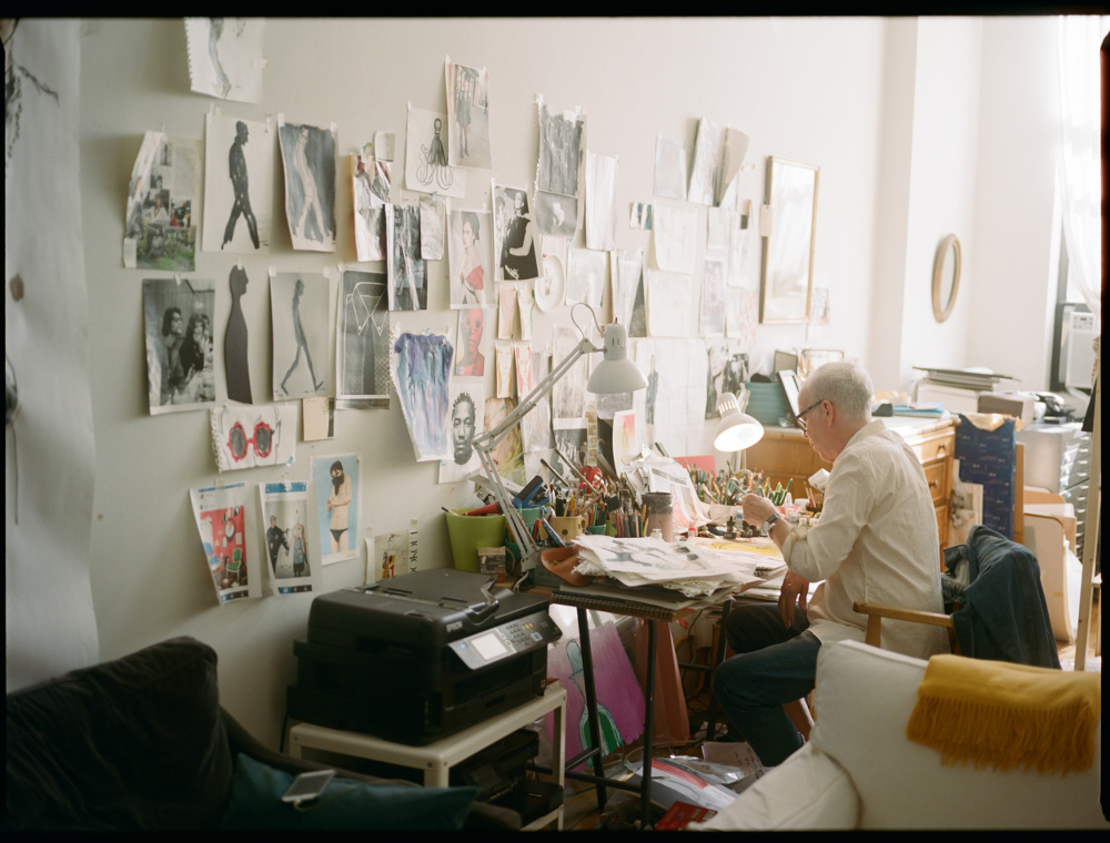
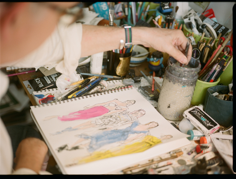
Na Kim, creative director at Farrar, Straus and Giroux and art director of The Paris Review, is part of this movement. A painter as well as a designer, she draws inspiration from the physical world: “I don’t find too much inspiration behind the screen,” she says. Instead, she seeks out sensory details – like certain moods, the colour of the sky on a particular evening, or a texture of an object – and uses them to shape her creative instincts. “Cataloguing these things helps me in my process and pursuit of making something feel true or real. You have to practice noticing things, and finding beauty in the world.”

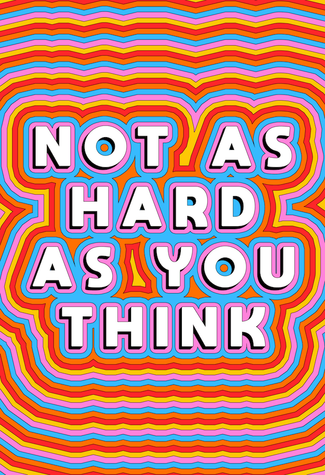
Kim always reads the book before designing, and lets the author’s writing guide her – the structure, pacing, mood and message. She begins by establishing the book’s tone, absorbing the rhythms and atmosphere before translating them visually. For Yiyun Li’s The Book of Goose, a novel she describes as “cutting, deft, vivid yet simultaneously lyrical and lush”, Kim sought to capture that duality with graphic elements and a pastoral image. Designing Sheila Heti’s Pure Colour felt like “a meditation, or entering a flow state”, which translated into a simple and large green splodge centred on the page. Justin Torres’ Blackouts evoked “layered thick air and discovering new things from room-to-room”, inspiring a cover that mirrors that sensation – dark, smoggy and unsettling.

But as much as Kim’s process is rooted in intuition and deep engagement with the text, she’s also aware of how digital culture has reshaped book design, and therefore our relationship with consumption. “It’s become the filter for everything. Even if somebody buys a hardcover book, their first contact with it is probably digital. The speed in which the digital world is evolving also requires us to constantly consider how to capture the attention of a potential reader.” She cites a study by the American Psychological Association that found the adult attention span has dropped from two and a half minutes in 2004 to just 8.25 seconds in 2024. “It’s a hard gap to accommodate. It requires constant repositioning and reinventing the way we make books.”

This shift has made designers more conscious of marketing-driven aesthetics and the pressure to conform. “Maybe taking risks isn’t affordable anymore,” Kim reflects, acknowledging how algorithmic trends can stifle originality. “But I bet if designers were given more trust, the covers would feel less homogeneous.”

Alex Merto: On Photography by Susan Sontag
Alex Merto: Blind Spot by Teju Cole

Alex Merto takes a similar stance and argues that book covers should stand in contrast to the fast-paced digital world, offering a sense of permanence and legacy. “I’m inspired by my daughter and the idea of leaving behind work I’m proud of,” he says. “I love designing books because they have such a long life – maybe one day she’ll see one of my covers on a shelf and feel that connection.”

Known for his graphically bold covers for publishers like Picador, Penguin Random House, and Farrar, Straus & Giroux, Merto’s work often relies on striking typography and unexpected colour choices to distill a book’s essence. Notable projects include Blind Spot by Teju Cole, in which he took a more minimal approach: “Teju’s writing style is so visual already that I wanted the cover to have a quiet depth, something that invites you to look closer.” Merto also enjoys reimagining classic works, like reissues of Elias Canetti, Susan Sontag and Jamaica Kincaid. “There’s a built-in audience, so we can experiment more with image-driven ideas, bolder colours or unusual layouts without worrying that a new author won’t stand out,” he says. “It’s about drawing in fresh readers while still honouring the existing fan base. That balance of respect and reinvention keeps it interesting.”

Alex Merto: Two Nurses, Smoking by David Means

When asked about AI’s role in book design, Merto explains he’s cautious, viewing it as a potential disruptor rather than an aid to creative originality. “I’m definitely worried about AI. Part of me hopes people will push back against it,” he says. While he acknowledges its usefulness in summarising text, he doesn’t believe it can replace the human process of reading, interpreting and responding to a story. “If everyone types in the same prompts, we’ll end up with a flood of covers that look alike,” he warns. For Merto, originality in book design stems from human insight, which is something that AI, no matter how advanced, cannot replicate. “AI isn’t the source – we are.”

Rush Jackson: Keep the Kid Alive by Arielle Bobb-Willis (Aperture, 2024)

Rush Jackson shares this sentiment, recognising AI’s ability to streamline workflows but insisting it cannot replicate human creativity. “I’m not too worried about AI gaining the skills to autonomously design a book by itself,” he explains. An artist, designer and educator, and founder of Jackson Studio, Jackson is drawn to projects with a socially reparative quality. He’s also influenced by Black design history and pre-colonial African design systems, which he values as highly as the Bauhaus movement. “I find the history of African rhythmic practices, writing systems and performance as important to design history as anything that’s come out of European modernism.”

His approach is intuitive rather than formulaic, allowing space for unexpected moments. “For me, the process of arriving at a cover design is always different, every time,” he explains. This openness has shaped striking works such as Notes Towards Becoming a Spill for artist Shikeith and Keep the Kid Alive for photographer Arielle Bobb-Willis, both published by Aperture. He also designed In the Black Fantastic, edited by Ekow Eshun, which saw Jackson develop a bold, type-driven cover that honoured the book’s subject matter. “Ekow was extremely open and trusting throughout the process,” he notes. “I love how the typography carries the rhythm of the book.”

Despite the growing presence of AI, Jackson has observed an increasing emphasis on materiality in book design, from cover textures and production techniques to unconventional formats. “I think a great book, and a great cover, has the potential to feel like an art object,” he says. “I think the best covers arise as unexpected moments, and should surprise you.”

Rush Jackson: In the Black Fantastic by Ekow Eshun (Thames & Hudson and MIT Press)

Coralie Bickford-Smith, a designer known for her work on the Penguin Clothbound Classics Series – in which she created custom patterns stamped on linen cases, colourful endpapers and ribbon markers – also emphasises the importance of tactility in book cover design. Much of her inspiration comes from art history, nature and classic design, particularly the work of William Morris and William Blake. “Their ability to blend text and imagery to tell a deeper story has always fascinated me,” she says.

For her, materiality is just as vital as imagery in shaping the reader’s experience. Her Fitzgerald collection, for instance, channels the glamour of the Jazz Age into mechanical patterns and metallic foiling, as seen in the cover for The Great Gatsby. “The design reflects the novel’s themes of destruction and disillusionment, capturing the moment when Gatsby’s dreams fall apart.” A more recent project, White Holes by Carlo Rovelli, pushed her conceptual approach further. “With this cover, I took a step back, zooming out to offer a fresh perspective on space,” she says. “It mirrors the way Rovelli’s writing guides readers through complex ideas – conveying depth and exploration.”

Coralie Bickford-Smith: Heart of Darkness by Joseph Conrad

Though technology continues to shape visual trends, Bickford-Smith – like Kim, Merto and Jackson – treats books as objects of beauty rather than mere vessels for stories. “Minimalism and bold colour choices have gained prominence due to the way books appear online as thumbnails,” she says. “But I believe the physical experience of a book – its cloth binding, foil stamping – remains irreplaceable.” She is also mindful of AI’s expanding role in design. “AI can be a powerful tool, but it shouldn’t come at the expense of human creativity and rights. The key will be ethical guidelines that protect original work.”

Even as AI continues to reshape industries, book design, for the time being, feels like a space where human creativity, intuition and lived experience will always have the upper hand. And perhaps the most exciting shift is the resistance to homogenisation, where designers are creating covers that feel excitingly fresh, raw and real, all while balancing clarity with craftsmanship. As Merto notes, the best book covers should be “something eye-catching and enticing”, setting the tone and leaving space for discovery. Bickford-Smith emphasises the harmony of typography, imagery and layout to create an “inviting, balanced design”, while Jackson sees the cover as “a thoughtful and intelligent response” to its content. Ultimately, the most successful designs spark both delight and recognition, feeling inevitable but at the same time unexpected – making us, as Kim puts it, wish we had thought of them ourselves.

This article is taken from Port issue 36. To continue reading, buy the issue or subscribe head here

We Are We Are Not

Danielle Pender is a writer and editor, and the founder of Riposte magazine. Her work has appeared in publications including The Guardian and The New York Times. In this reflective essay for Port, she explores the complexities of returning home – how distance reshapes family bonds, and the quiet negotiations that come with reunion


For the last fifteen years I have ridden the East Coast Main Line from London to Newcastle, tracing the same miles over and over, yet arriving somewhere slightly different each time. Newcastle is home in the way that childhood places always are – embedded in muscle memory, a place you don’t have to think about to know. London is where I live now, but when I picture my family, the roots of it, I think of my mother, my brother and me. 

For years it was just the three of us, tightly bound inside a small house, navigating whatever came our way. We were in each other’s pockets in that specific way small families in small houses are – you know everything about each other, whether you want to or not. Routines, rhythms, moods, silences. What time someone would come through the front door, what it meant when they didn’t. The smell of someone’s shampoo lingering in the hallway. A shifting weather system of closeness and irritation and deep, unspoken understanding.

Now, my brother and I have our own families. We have expanded, our lives have changed, and in doing so, we have also dispersed. As the train slowly pulls over the River Tyne into the station, I think of a Heraclitus quote that Siri Hustvedt included in Mothers, Fathers and Others: “In the same river we both step and do not step, we are and are not”. A line that feels made for those who leave home and return – not as prodigals, not as tourists, but as something harder to define. Insiders who have grown alien to their own past. My mother, my brother and I were once a fixed unit inside that small house; now we orbit one another, connected but no longer in sync. We are and are not.

With people moving further from where they were born, modern family life is often reduced to a handful of sanctioned gatherings – birthdays, Christmas, the odd anniversary or weekend away. But what happens in between? What happens when you are no longer part of each other’s daily lives, when the casual, unexamined intimacy disappears? We meet as guests in each other’s presence, performing the shape of family but feeling its lack. The questions we might ask a stranger – What do you do? Who do you love? What keeps you up at night? – are the very ones we avoid with each other, afraid of exposing how much we no longer know.

For the past year, I have been writing a novel about a homecoming, which has drawn me to literature that explores this experience from different angles, offering both comfort and insight. In Long Island, Colm Tóibín’s Eilis Lacey returns to Ireland and finds herself caught between past and present – who she was before she left, who she is supposed to be now. This is often the way for families coming back together; each visit becomes a delicate negotiation, a process of reacquaintance in real time. 

When Eilis buys her mother new white goods for the kitchen, a gesture driven by generosity and a desire to mark herself as different, as a grown woman of means, her mother insists she doesn’t need them, leaving them as obstacles in the hallway rather than having them installed. The protest isn’t really about the appliances. It’s about control, about the unbearable proof that Eilis has formed a life outside of this house, that she is no longer someone whose choices pass through a parental filter.

Annie Ernaux writes about this change and distance with such precision – the way that home, once so familiar, can start to feel like a foreign country. In A Man’s Place, translated by Tanya Leslie, she writes about the gulf between herself and her working-class father, which widens as her education and career take her into another world. She describes the sorrow of seeing home through new eyes, of feeling both love and alienation at once. 

That tension haunts so many reunions. Gwendoline Riley captures it in First Love and My Phantoms, where adult children return to parents who are both familiar and unknowable, baffling and inevitable. There’s something particularly painful about these encounters, when love starts to feel like performance, when obligation replaces ease. The gap between people who should know each other best, but somehow, don’t.

What is it like for those who stay, watching someone return – someone who looks the same but feels subtly, irrevocably changed? The returnee carries an unspoken tension, a quiet air of judgment, whether deliberate or not. Their departure was a choice, one that, however unintentionally, suggests a rejection – of this place, this way of life. Whether their world is ‘better’ or simply different, the contrast lingers, unspoken yet inescapable.

In Gwendoline Riley’s My Phantoms, the mother is a particularly heartbreaking figure, repeatedly colliding with a daughter who has come back to Manchester to care for her, but whose presence is more duty than desire. Their dynamic is fraught; her daughter observes her life with barely concealed disdain, seeing tragedy where her mother perhaps sees only routine or comfort. The book forces the reader into an uncomfortable complicity, recognising the sharp edge of judgment in the daughter’s perspective and perhaps, uncomfortably, in their own.

But estrangement is not inevitable. In Close to Home, Michael Magee’s protagonist Sean returns to Belfast after studying at university in Liverpool, finding his brother and old friends caught in a different rhythm – one shaped by economic precarity and cycles of drink and drugs. The distance between them is undeniable, but love does not demand sameness. Magee writes these relationships with a deep, unflinching tenderness, recognising that while family bonds may stretch, they do not always break. 

In the novel’s final moments, Sean stands with his older brother, Anthony – a man hardened by experience, shaped by a trauma that could have driven them apart. Instead, Magee offers a scene so quietly devastating, so full of unspoken understanding, that it brings me to tears every time I read it:

“I tried to get away from him, but he was stronger than me and he wasn’t letting go. Get off, I said, and he giggled and kissed me on the ear and on the side of the head, my face, my neck and anywhere he could reach with his arm around me. And while he did this he told me he loved me. I love you to death, he said, and he kissed me and kissed me.”

The places and people we come from remain woven into us, no matter how far we go. Family holds a version of us that is fundamental and inescapable – the ones who knew us before we knew ourselves. We may no longer share the details of our daily lives, but that early imprint lingers, shaping us in ways we can’t always see. Whether that is a comfort or a source of pain depends on the circumstances. As Didier Eribon writes in Returning to Reims, “Whatever you have uprooted yourself from still endures as an integral part of who you are.”

For my mother, my brother and me, it is something I cherish. We witnessed everything that shaped us, and in that shared history, there is an unspoken understanding of how the past made us who we are today, no matter what other factors have influenced our identity. I will always be deeply grateful for that. I find solace in the sayings we still repeat, the in-jokes that need no explanation, the memories that resurface without warning – and the way we all look the same when we laugh.

I think about this as I walk across London Bridge one evening after work, caught by a deep and unexpected longing – not for Newcastle itself, but for the version of us that once lived there. My mother, my brother and me in her bedroom, playing charades, doing handstands onto her bed, laughing ourselves breathless. The physical closeness of it. The certainty that we belonged to each other. That incarnation of us is gone, but something remains, changed but intact. Like the body maintaining homeostasis, making constant adjustments to keep itself, itself.

To leave home is to fracture a wholeness you can never fully restore. But maybe restoration isn’t the point. Family is not static. It is movement – towards, away and back again. 

We are and are not, but still, some of us return.


Illustration by Alec Doherty

This article is taken from Port issue 36. To continue reading, buy the issue or subscribe head here


Margaret Howell

From a well-used Ercol chair to her daily wake-up call with a Braun alarm clock, the British designer talks to Port about the ten things that inspire her

Illustrations by Pablo Delcan

1. Ercol Chair, designed by Lucian Ercolani, 1956

Lucian Ercolani set up the Ercol factory in 1920 in Britain’s traditional furniture-making district near High Wycombe. He designed a number of chairs in the 1950s that are still in production. “This was the first chair I owned. It’s very special to me. My mother gave it to me when I was a student. When I started making shirts in my flat, Doris my machinist used it while she was sewing buttons on. It still has the marks made by the ties she used to secure the cushion that she made for it.”

2. Anglepoise 1227 Desk Lamp, designed by George Carwardine, 1931

“I have always lived with an Anglepoise. My parents had one, and I have still got it, with the original square base.”

3. LC4 Chaise Longue, designed by Le Corbusier, Charlotte Perriand, and Pierre Jeanneret for Le Corbusier, 1928

“I would love to have met Charlotte Perriand. I know I’d have liked her. There is a famous photograph of her in the mountains and snow, with her back to the camera, her arms high in the air, wearing only a pair of trousers and a necklace. It’s the kind of feeling I get when I am at my house in Suffolk and enter the North Sea. It’s where I have my chaise lounge. I sit on it last thing at night.”

4. Leonardo Table, manufactured by Zanotta, designed by Achille Castiglioni, 1969

“After I left Goldsmiths, it became clear that I wasn’t going to be a painter, and I started to make shirts at home. I sold them in Joseph Ettedgui’s shop, who was a designer and retailer. He was very instrumental and generous, and he allowed me to put my label on the shirts. I had the Zanotta table at home and used it for pattern cutting. It was so useful because you could raise and lower it as needed. Now we have lots of them in the design studio.”

5. E-1027 House at Roquebrune-Cap-Martin, designed by Eileen Gray for her own use, completed in 1929

“I loved the house when I went to see it. The guide showed our group a side table Eileen Gray had designed and asked us why we thought the surface was made of cork. I knew immediately that it was so it wouldn’t make a loud noise when she put a glass down on it. Her designs are so practical.”

6. S33 Tubular Steel Cantilever Chair, designed by Mart Stam, 1926

After a protracted lawsuit over copyright to decide if it was Stam or Marcel Breuer who originated the Cantilever Chair, the court decided in Stam’s favour. “I have this at home. It sits in the corner, but it often goes out on photoshoots for models to sit on.”

7. Church of Santa Maria Assunta, Riola di Vergato, near Bologna, designed by Alvar Aalto, 1965

Construction began in 1975, the year of Aalto’s death. The campanile was completed in 1993. “I went to see this church, designed by Alvar Aalto, with my daughter. It was a kind of pilgrimage. The church is wonderful; instead of a spire, it has a tower made of concrete blocks. Inside, all of the light comes through the roof; it’s so bright and lovely. At the end of our visit, the heavens opened and it teemed with rain, with water gushing down over the church. We were lucky; somebody took pity on us and drove us back to the station to catch our train.”

8. Braun AB1 Alarm Clock, designed by Dietrich Lubs and Dieter Rams, 1987

“It wakes me up every morning.”

9. Polyprop Chair, manufactured by Hille, designed by Robin Day, 1963

Britain’s universal low-cost chair, with an estimated 50 million sold. “Mine is a tan colour with chrome legs. Because it’s light, I take it into the garden.”

10. Alveston Stainless Steel Cutlery, designed by Robert Welch, 196. Made in Sheffield by Harrison Fisher and Co, distributed by Old Hall Tableware
“If things are made well, and the materials are good, they work for you. I like holding this cutlery, even when I am washing up.”

Illustrations by Pablo Delcan, founder of Prompt Brush, the first non-AI Generative Art Model

This article is taken from Port Issue 35. To continue reading, buy the issue or subscribe here

Greco Disco

Port and Oliver Peoples meet with artist and designer Luke Edward Hall to discuss interior design, historical influences and the magic of Italy

The illustrated figures by Luke Edward Hall have the facial features of a classical portrait bust, although their luxuriantly coiffed hair, stark jawlines and Greek noses are all sparingly rendered with only a few strokes. They possess a composed sense of purpose, not unlike the artist’s own, but whether poised with martinis at a bar or gazing at a sea view, their eyes communicate a melancholic impassivity, evocative less of sadness than of listless longing. Steeped in an unnamed nostalgia, theirs is an idealistic beauty that appears to have been at first entirely enervated and then brought back to life through bright colours and delicate floral arrangements.

Shirt, tie and boilersuit Gucci

At the age of 30, Hall has created a brand out of this mix of the frivolous and sophisticated. He suffuses the style with references, most obviously to antiquity, and uses classical imagery as a shorthand for all things worldly and refined. The root is his interest in mythology but, as the name of his newly published book Greco Disco suggests, he is alluding to a more modern interpretation, in which Graeco-Roman tradition becomes a set of stylised motifs. Whether as a pattern or print, Hall applies them with playful, contemporary twists. “I think design can be very serious, very boring, and I’m trying to inject a bit of fun. It’s not about going crazy. I’m still quite careful with it.”

Shirt Drake’s, jacket Lanvin, trousers Basic Rights

The cartoonish simplicity of Hall’s drawings also recalls Jean Cocteau, and the occupants of some of his more isolated scenes are imbued with the same emotional ambiguities that appear in the work of Patrick Procktor or John Craxton. Others languish in a sensuality more closely connected to Duncan Grant. The man himself is regularly decked out in pastel pink trousers, busy seater vests and trademark optics, making the collaboration with Oliver Peoples a natural fit.   

Shirt, jacket and trousers E.Tautz

Though Hall is quite clearly informed by the past, his sketches have an unpretentious, off-the-cuff immediacy that he developed while producing designs for his Menswear degree at Central Saint Martins. It was there that a burgeoning aesthetic found its physical form in the medium of the sketch, which lies at the heart of the many high profile design collaborations he is best known for. Among these are slippers for Stubbs and Wootton, cushions for The Rug Company, stationery for the RA, tableware for Richard Ginori, ceramics for Liberty and a furniture line for Habitat. In a studio filled with magazines and mood boards, there is rarely a day where Hall can’t be found leant over paper with a pencil in hand. “Most things I do, whether it’s an interior or art or ceramics, will start with sketches. There’s always something to be sketched out.”

Shirt and trousers Basic Rights, shoes Luke’s own

Hall’s student days foreshadow the diverse nature of his practice now, and he originally moved to London from his hometown of Basingstoke with the hopes of studying Graphic Design. He had been a voraciously artistic child who drew in his spare time and, looking back now, he sees threads that have survived. “It was very cut and paste and collagey and a lot of my work now is like that still. It has a slightly DIY aesthetic.” In the end he opted for Fashion Communications after his Foundation year, a decision perhaps foretold by a fashion and art fanzine he set up at the age of 16. He would eventually switch to Menswear but spent his final few years tracking down antiques to resell online. The business, which he oversaw with a friend and his boyfriend, the interior designer Duncan Campbell, was more a way to stay occupied than a serious side hustle. “I’ve always loved doing a lot of stuff at once. It was never going to make us lots of money, but it was a fun little project.”

Interning at a clothing company immediately after graduating in 2012, Hall grew disenchanted with fashion at the same time as he was approached by an architect and interior designer who had found him through his website. What followed was a two-year apprenticeship, during which Hall learnt not only the practicalities of running a business, but a whole new set of historical references. He now cites David Hicks, Madeleine Castaing, John Fowler and Dorothy Drapers as inspirations for his interiors. At the same time he started making ceramics and continued selling artworks online, this time his own prints and illustrations. As soon as he began receiving a reliable stream of commissions, he struck out on his own as he’d always planned.

Much of what Hall attempts to evoke in his drawings is a time and place, one that relates to his experiences but takes on an otherworldly aura in memory. “I like the idea of being taken away to someplace magical. Italy has been a huge inspiration… the people, the food, the culture and history.” More than a mood, Hall is establishing a certain lifestyle. It harks back to many of Hall’s heroes, from Cocteau to the Bloomsbury Group and, above all, to the diarist and designer Cecil Beaton. The artistic London milieu that the latter inhabited during the interwar period included socialite Stephan Tennant and designer Oliver Messel. It provides a romantic vision of a life in which work and relaxation cease to be separated. “They were working in such different fields. Sometimes, when I get stressed about doing too many things, I look back at those people.”

In as much as we can imagine Beaton in the 21st century, Hall’s presence on Instagram may provide some clue. With 85k followers at the time of writing, his ability to embody and live out his aesthetic has been an easy hit on a platform that rewards aspirational content. Not merely a portfolio of Hall’s work, the page also offers followers a glimpse of his private interiors, holiday snaps and even Hall and Campbell sharing an intimate candlelit dinner. “I like Instagram’s that aren’t very curated, that are not perfect. Those are the ones that feel most real.” He is keen to stress, however, that it is an edited view: “I show our houses because my job is making interiors, but I don’t write a weekly blog about my feelings. You’re also not going to Instagram from a hungover Sunday in bed. I mainly just try not to take it too seriously. It’s a great tool and I like using it, but it’s not the biggest part of what I’m about.”

Shirt and tie Drake’s, jumper Gucci, jacket E.Tautz, trousers Basic Rights

Sighting the inside of Hall’s North London flat, where he lives with Campbell, attracts followers for its colourful schemes and surfaces liberally scattered with objects. It’s a curiosity that Hall understands. “What I find fascinating with interiors is how people express themselves through what they live with.” So what can his interiors tell us about him? “People ask what I would save from a fire, and I’m not really that attached to big pieces of furniture. I’m more attached to little things that have stories, like a figurine I picked up at 18 when I first went to Rome. It’s that connection to things I’ve done, people I’ve met, places I’ve been.” The objects that Hall collects have a modest charm, and there is something folksy about his preference for novelty ceramics shaped like vegetables and rare art books. What moves him most though, is colour. “I find it very transportative. Our hall at home is painted in egg yolk yellow and when I come home I’m instantly taken somewhere happy.”

His approach to colour is spiritedly experimental, and one past mistake he admits to is the choice of “really intense barbie pink” for the couple’s living room. “It turned out so headachey, it was like being in a highlighter pen.” Hall switched it for a softer version, noting, “Sometimes you mess up but you can always repaint. It’s not the end of the world.” Hall leaves no room ever truly finished, an approach that challenges conventional wisdom about the purpose of interior design. Each project remains open ended and Hall’s latest struggle has been getting a newly acquired country house, on the Gloucestershire-Oxfordshire border, ready to live in from scratch. “When you’re mixing together colours and furniture from different periods it is quite tricky to do in a short period because ideally you need time to reflect on it, bring different pieces in and try stuff out.” Plans for a dark brown guest bedroom have so far been stalled for fear of complaints.

Shirt Drake’s, jacket Lanvin

The challenge has parallels with Hall’s latest professional project, an entirely renovated hotel in Paris’s 10th arrondissement that is set to open in the spring. As well as doing the interiors, he is art directing the branding, uniforms and stationery. The project satisfies his lifelong urge to build a complete world from the ground up, but is testing his eye for detail. “It’s a lot of sitting down and looking at fabric samples and light fittings. The challenge is to create an atmosphere through furniture, wallpaper and objects.”

To focus on the project and promote his new book, Hall, who also writes a weekly column for the FT’s House & Home, is momentarily slowing his uptake of new commissions. Asked if he considers himself an entrepreneur, he admits to loving a spreadsheet but adds, “when I was younger I got a bit caught up worrying about what to be seen as and now I don’t mind. I just do what I do and I enjoy all the aspects of it.” As open to new opportunities as ever, he is keeping his plans for the future intentionally vague – “I’ve been on a winding path to get here and I think I’m just going to continue on that.”

Stylist Rose Forde
Assistant stylist Sophie Tann
Photographer Issac Marley Morgan 
Grooming Hiroshi Matsushita 
 
Film Production Company – Black Sheep Studios
Film Producer – Rory Reames
Film Director – Harry Bowley
DOP – Lorena Pagès 
Camera Asst – Carmen Pellón
Sound Recordist – Nick Olorenshaw 
 
Luke Edward Hall wears Oliver Peoples Coleridge opticals and sunglasses throughout 

Dimitris Anastasiou: A=-A

The Greek painter and artist on his new graphic novel, an illusory and hypnogogic tale of a protagonist named Alpha

For one day, a man’s entire reality is about to be toppled. It all begins as he glares into the bathroom mirror, brow lines creased with exhaustion as he looks back at himself. He runs his hands through his hair and pieces start to fall into the sink. He reaches for a hat at the back of the door, and the scene ends. The following page starts in double vision, where the letter “A” is penned on a piece of marked paper. A man – who looks similar to before – appears to be dragged off into a surgical operation; injections, cameras, masks, a room full of doctors. The scene ends. The next eight-panelled page details a patient, slowly falling asleep on the left, while the doctors wait in anticipation on the right. The scene ends in darkness. 

There are many more encounters of this kind, as the man wanders the streets of his hometown, journeying into unfathomable places. And these are all but a few of the vague and pensive moments found within Dimitris Anastasiou’s graphic novel, A=-A. A Greek painter and artist based in “sunny (but gloomy nonetheless)” Athens, it was around nine years ago in 2021 when he sparked a sudden urge to draw something – but not just anything, it was a picture of a man flying over the city of Athens. “That drawing felt like a part of a bigger narration and it made me wonder: ‘Who is this man? Why is he flying?’ It was obviously a dream scene – flying was a frequent dream of mine,” he says, before deciding to build on the narrative bit by bit and “weaving the oneiric word of A=-A.”

Dimitris’ A=-A can be likened to a state of consciousness, for it depicts the events that can only be conjured up in the nonsensical landscape of a dream. Hair falling out, flying, losing teeth or undergoing surgery; these are familiar themes in the extraordinary abyss of dreams, and themes that many can relate to. Since he was young, Dimitris has kept a dream journal, and he’s always enjoyed listening to others’ tell their nightly stories. “I could say that A=-A is based on real dreams, at least at its best part,” he continues. “I have always been fascinated by the dream world, this realm of uncertainty, of unwilling symbolism and of spontaneous visual poetry.”

In choosing the graphic novel as his preferred media to tell his hypnotic tales, Dimitris effortlessly combs his detailed drawings in with the disjointed structuring of his dreams. It’s an idyllic pairing no less, considering the ways in which dreams run in sequences. But it was never his intention to form an entire short story like this. Rather, he set out to create a few pages only, avoiding any script or series of events. Consequently this spawned a uniquely hand-made and evolutionary tale of a protagonist named Alpha – “someone who could be anyone”, or someone who’s perhaps devised from a dream. The character’s presence and intentions aren’t quite clear from the beginning, and you’re instantly hit with wondering whether or not this is the same person appearing over and over again in the pages. Who is Alpha, and what is his story?

There are a few things that do become known, however, and that is how Alpha is the first letter of the alphabet and also of Dimitris’ surname. He also started drawing Alpha six years ago with a pencil and paper, while “following the steps of my main character,” he says. “But was I trying to follow alpha as he was diving deeper and deeper into his oneiric world, I had to use different drawing styles and techniques.” That’s why, in the second chapter, you’re greeted with a comparatively different aesthetic: he’s using ink on paper, acrylics and coloured panicles. Then in a flippantly stark contrast to the monochromatic wanderings that came before, the next section details the more comic-like errands of his character, the “more grotesque, more expressionistic”. 

Things change once again in the third chapter, the final chapter, which is composed entirely of colour. In this part, Dimitris has painted each frame separately with oil on canvas, before photographing the images and arranging the sequences on the computer. It’s the more realistic part of the mind-bending narrative and one that tilts the axis of the novel into a more regular world (or so it seems). “Alpha believes that he has awoken and that everything is back to normal. But very soon, he realises that his world is as normal as a goat standing on a bed.”

Many questions will hatch when observing Dimitris’ beautiful, although highly speculative graphic novel. There’s a character, like you and I, who’s striving to find some certainty in life, “even a tiny piece of solid ground on which to firmly stand,” adds Dimitris. “He needs some kind of an existential axiom to use as a basis of his life. Instead of that, he finds himself being constantly out of balance, doubting even the most elementary constants. To me, this is the core of western thinking. Skepticism is what makes the western philosophy both strong and weak. It is a sign of health but at the same time a sign of sickness. I think this is what makes our situation fascinating.”

Dimitris has drawn up an engrossing network of thought and doubt, where beautiful markings probe into the role of humankind and the free-running mind of its people. But if you’re looking for answers in A=-A, then you’re not getting any. Dimitris wants you – and Alpha – to continue being curious. “‘But is doubt helpful?’ one might ask. ‘Do people not need certainties in order to live?’ I suppose so, nobody likes a doctor who doubts his own diagnosis. But maybe philosophical questions are not made to be answered, at least not once and for all. And maybe works of art are not supposed to give answers, but to pose meaningful questions.”

 A=-A by Dimitris Anastasiou, published 29 July by Jonathan Cape, a part of Vintage Books

Go with the Flow

Yigit Tuna talks to digital artist Tyler Spangler about his Instagram-age illustrations

Tyler Spangler is a digital artist who plays with colorful illustrations, merges them into animation, photography and mantras of his own imagination. He defines himself as an obsessive person who loves to research, retreat, create, and analyse everything. When you have a look at his Instagram feed for just a minute, you’ll see instantly what he means.

I consider each of your illustration or gif as a motto and I’m curious about which one comes first: ideas with words or design with visuals?

They both happen at different times. Sometimes the idea first and sometimes the visuals first. If I have a really good quote in my head I will know how it should look visually to create the most impact.

Is it possible for you to separate your work from your life?

No. My work is like a visual journal that I share with the world. The fact that is it so personal means it has become popular. People love vulnerability. 

When did you know what you wanted to do?  

I was sitting in my commercial art class in high school and a representative from an art school came and did a presentation. I never realised that someone designs every single product you see in the world. I understood it but I never really thought about it. At that point I realised I could make stuff way cooler than what existed in the world.

What do you expect of yourself as an artist?

To be honest and continue creating work that I enjoy.

All of your work makes the observer feel alive, I guess that’s because of your use of bright colours, lots of tones and how you mix them with old-fashioned photography. What do you think is the most important component of your work?

It’s all been a progression. I have always used super bright colours. In the beginning I was just creating incoherent collages with bright colours that looked pretty but didn’t really have much meaning behind them. Over time I have learned to refine my art while maintaining the energy. I think the most important component is just the energy and emotion.

Do you believe the power of an ongoing stream of consciousness or do you have precise patterns to follow when creating something new?

I have a colour palette that I used, but I completely adhere to just opening a blank page and to start moving stuff around to see what happens. I’d say 80% of my work is improvisation.

Dropping out of art school may be one of your biggest decisions. Did this decision affect your life or career?

Definitely. Dropping out has allowed me to pursue what I want to do as opposed to working for someone else and pursuing what they want to do. Dropping out also forced me to experiment a lot more with my art and how I want my career to progress. I feel if I finished art school and got a safe job at an agency, my art would stagnate, and I wouldn’t have the same motivation to stay fresh.

What is the essence or art, or being artist? 

I think it mostly boils down to honesty. If you are honest with yourself and portray that in your work it will come across as authentic. There is nothing worse than a watered-down version of someone else’s honesty.

How does social media impact your working habits and creativity?

I love social media. It forces me to stay productive and vulnerable. I love the instant feedback.

As your art has become increasingly renown, do you ever feel being under certain amount of pressure to perform? 

Yes. As my follower count rises I sometimes have the urge to create pieces that are more popular but I am always hesitant to fall into that trap. My typography is by far my most popular, but I still love making collages, patterns, and illustrations. I don’t want to pigeonhole myself into one thing.

Which one is more useful for you: self-confidence or self-doubt? 

They have to work together or you will fail. If you are all confidence you won’t learn or grow because you think you know everything already. If you are all self-doubt you will be too scared to experiment and won’t grow either.

What’s next?

Continuing to learn and experiment with new things.

tylerspangler.com

Watching Them Sleep

Author Rick Moody on the subject of young love, whose tenderest moments, though fleeting, give birth to some of our most profound and long-lasting emotions

At 17 I thought I knew all there was to know about love. In part I believed this because I was reading Byron, Shelley and Keats in a literature class in my senior year of high school, and in part because I had a large crate of LPs in my dorm room, and this crate was filled with love songs. I liked love songs about romantic destitution best. In fact, as a 17-year-old, I seemed to favour repelling love in my daily life so that I could feel the destitution of love, which would occasion playing the love songs that best celebrated this acute loss. I thought love was an indescribable violet, I thought it was a certain stretch of empty highway, I thought it was in the craggy outcropping of desolate snowy peaks that you can see in the valleys, I thought it was a hanging plateau of fog, or an elk glimpsed on a bit of empty prairie, or the call of the hawk swooping down on a trembling rodent. I was happy both to declare love and to declare its futility.

We had an obligatory religion class at my high school, and a large part of this class, to the chagrin of my contemporaries, was given over to wrestling with a knotty theologian called Paul Tillich. The 17-year-old dreamer version of Rick Moody applied himself to the class, and could readily spout Tillich’s phrase loving action when asked to describe the meaning of faith. I could tell you, because we’d had an exam on the subject, that this meant that love was not a static condition, but that in the throes of love one was outwardly directed, or ultimately concerned, as Tillich says; one was giving and expecting nothing in return, one was open and selfless, one was the wind off the inscrutable ocean, clearing away the detritus of selfishness, blowing where it listeth.

What little apocalypse was required to make this loving action a thing that one felt and lived rather than something one spouted in exams? Well, there was this girl – who I’ll call Brenda – who was a couple of years younger, meaning that at the time of this story we were almost exactly the age of Romeo and Juliet. Neither of us were allowed to vote, and neither of us could legally drink, and we went to a school where if a boy visited a girl in her room she was supposed to leave the door open, and have three out of their four feet on the floor. Brenda was from Colorado, and she had a really warm and loving family. She was put together like a level-headed person is put together. We didn’t have much in common but we were in love.

One day, Brenda and I were over in this school building called Memorial Hall, an assembly hall, which was empty. Brenda and I were just strolling around, and through some impulse we ended up sitting on the carpet, whereupon, in some glorious fit she, leaning against me, simply fell asleep. Brenda was blonde, oh reader of these lines, and she was tall, had a decidedly joyful smile, a great, earthy sense of humour, and a perfect laugh, and she fell asleep in my arms. Rather than wake her, I just held her, and let her sleep. It was not comfortable for me, not for long. But I had cause to think about all of this – who she was, how she was, how I was with her – and while she slept all the ups and downs, the star-crossed and difficult portions of our entanglement, were in arrest, and all was silence and awaiting.

It came to me, in the half hour that ensued, at least as I recreate it, that I had never known how she felt, not really, not from the inside, but as she slept I felt the beginning of some sentiment that didn’t require romantic destitution, didn’t require loss, but was rather a measure of the labour and service put in to being with someone, and the selflessness that comes from trying to figure out what’s best for the girl in your lap, rather than always thinking about what’s best for you, abuser of all the natural resources in your family and your group of friends. I held her, and watched, and waited, and there was no bounty of tears, there was no brush fire of the heart, there was just the outwardly directed feeling, which in turn, as the Sun in the window moved several inches in its across-the-carpet-ing transit, pointed toward the feeling of being ultimately concerned.

We did, it must be said, break up not long after that. Or we broke up and got back together and broke up again. And then I graduated. And moved several states away. Neither of us ever drank a draught of poison, or set themselves on fire at the ocean’s edge. Protestations of need of the epistolary sort would have been silly. We went on with our lives. But in my case I went on a bit wiser about what’s important. A still moment of being and giving and letting go could, it seemed, reveal where the deepest feelings are hiding out, waiting to be diagrammed over the decades to come. The deepest feelings are to be found in what you give. Brenda taught me in the simplest way possible, by falling asleep.

I’m now in my mid-50s and very happily married, and have a newborn son, as one should probably not have at my age, and a daughter who is almost eight years old, and I frequently have the opportunity to watch them sleep. In fact, nothing makes me happier than watching children sleep. Is it the love, the agape, that C S Lewis ascribes to the divine (him or her or itself ), the love that parents feel for children? Maybe. I know that something really pure takes place in these moments, the child breathing and dreaming in some vulnerable way that is beautiful and trusting. It doesn’t seem to matter much how old the children are. It’s a different model, this adult loving action, from the 17-year- old rental economy kind of love, the love-the-one-you’re-with desperation of the teenage years, and I’m glad for it, I’m glad it’s different, no matter how long it took to get here.

Keats said it best: “Silly youth doth think to make itself/Divine by loving, and so goes on/ Yawning and doting a whole summer long.”

Illustration Tim McDonagh

This is an extract from issue 21 of Port, out now. To buy or subscribe, click here.

Richard Haines: Larger Than Life

Artist and illustrator Richard Haines discusses art’s importance in Trump’s America, how Dries Van Noten has inspired him and why you should create for yourself

Richard Haines is living life his way. After the end of a career in fashion design, a divorce and a coming-out, Haines found himself starting anew as an illustrator living in Brooklyn’s then yet-to-be trendy Bushwick neighbourhood.

After posting sketches of the intriguing people he saw around him on his blog ‘What I Saw Today’, he caught the attention of some of fashion’s key players and the rest is history. But it doesn’t quite end there. As a man rediscovered, Haines has once again rewritten his story, by establishing himself as an artist in his own right. Here, we talk to him during his new exhibition in New York.

photo-sep-26-1-20-59-am-1

The rise of editorial photography in the ’70s meant that you instead pursued a career as a designer instead of as an illustrator, do you look back on this time as a detour of-sorts, or as an experience that has bolstered your artistic ability?

I’d say it was a detour and something that bolstered my knowledge. I think because I worked as a designer for so many years I have a complete understanding of clothing and the process that goes into making them. When I draw I know exactly where the pocket goes or where the lapel falls because I spent so many years working with pattern makers, being in fittings, and drawing ‘flats’—technical garment drawings.

I think that experience just informs the work I do. Because of that background, I’m super aware of the manufacturing process, which I think has also helped in my collaborations with companies such as Prada, Dries Van Noten, and Orlebar Brown.

Your new exhibition ‘Larger Than Life’ centres around the Bushwick drag scene. What is your connection to the area, and why has the process of documenting the area and its people been so captivating for you?

I moved to Bushwick about eight years ago (after 30 years in Manhattan) as a kind of refuge from the economic crisis and a divorce. It was also the start of my life as an artist, and I feel like I landed in the perfect place. There’s a rule of thumb in NYC that where there is space and cheap rent there will be artists… and ideas—and that’s Bushwick.

There are people here who are being brave — pushing boundaries of art, beauty, gender and sex. Bushwick is fearless, I love witnessing it!

What does this exhibit say about where you are in your life right now?

Exhibits are great ways to evaluate progress, and I ask myself ‘Where am I this time versus last?’ I’m just starting to get some distance and perspective. I was so happy with the first show, it consisted only of drawings on paper. This time round I felt like I needed to ‘push it’, so I began painting on canvas and also installed two large drawings. Painting is a real challenge. There were so many time when I said to myself, ‘Why the fuck did I take this on? Everyone likes the drawings, why fuck up the momentum?’, but I’m so happy I did.

There are surprises in the show and ultimately that’s what a show is for — to push, risk and then present. I feel like all art is a diary of sorts, at least it is for me. It’s a journal of my thoughts on gender, beauty, sexuality, fashion and more.

photo-sep-26-1-20-56-am-2

You are well known for the immediacy of your charcoal and watercolour responses, but your new work focusses on your use of acrylic. What has drawn you to the medium?

I haven’t used watercolours in a long time – they remind me of being a kid, when all I could get were the ones that come as little compressed cakes. The colour was never vibrant enough and dried so quickly. Watercolours are also hard to work with…once they’re on the paper, that’s it!

I’ve been using acrylic paints for most of this ‘new’ career as an artist. You can push them around the page, layer them and there’s still room to rework. The colours are also much more vibrant. So it’s a win-win for me!

What do you look for in a subject when you’re out exploring the streets of New York?

I’m reading about the Flaneur — the observer, the urban walker and how it relates to what I do. I’m much more interested in a person who carries himself a certain way, who puts themselves together in an interesting or unusual manner. People think I’m attracted to ‘fashion’ but that’s not the case. It’s more about attitude, swagger, grace and self-possession.

photo-sep-26-1-20-56-am-1

What’s the most unusual or memorable situation in which you’ve met an inspirational subject?

There are so many! I love to go to clubs, after-hour clubs, bars, etc, and kind of disappear and observe. I’ve met amazing people that way, but conversely I also see incredible people on Instagram, or meet friends through networks — there are people everywhere who are compelling and pushing the envelope.

How do you feel illustration affects the senses of viewers who are now so used to seeing photographic representations in the media?

I always think illustration is a ‘palate cleanser’ to photography. And I think that explains the recent resurgence of interest. There’s so much photography, so many images now; drawing lets the eye relax and engage in a different way. It brings the viewer into the piece differently.

I find people crave the human touch – the smudges and drops of paint that are human and say ‘I was here’. When I draw, I edit as I go along, removing and eliminating parts of the drawing. It’s a way of bringing the viewer into the piece and lets them interact in a different way. Photography has its own magic, but this to me is unique to drawing.

What role do you think art plays in our culture today?

In the context of what just happened in this country with the election of Trump, art has a new purpose and urgency. I’ve felt a shift in what I’m posting on Instagram — images and words that are healing and uniting. They’re healing not just for me but hopefully for the viewer too.

I think art is crucial in telling storytelling, uniting, provoking and expressing. I have a 19-year-old daughter who’s studying photography and I told her the best thing she can do now is make art — good thoughtful art to heal and unite. Art that says ‘Yes’ and art that says ‘NO!’

You started your blog ‘What I Saw Today’ back in 2008, and it has since caught the eye of some of fashion’s most influential personalities. How has social media been instrumental to your later success?

Social media basically changed my life. When I started my blog I was an unemployed fashion designer who couldn’t get a job – there were no jobs to be had. The idea of posting my own drawings in an unedited way — sharing my vision with like-minded people – was, and still is, incredibly powerful. I’m grateful for the technology that made this possible, and for the amazing people I’ve come in contact with because of it.

rhaines

How has your style evolved through your life, and how have you refined it?

When I first moved to NYC many years ago, my style wasn’t great. I have drawn my entire life but by the time I moved here it was just very tight and not interesting. Then, over time, it improved because I just didn’t care what people thought of it. I drew only for myself and it got much more emotional and free.

It was a great lesson in learning to not seek approval from others, and to be real and authentic. I think that’s what people respond to: realness.

Which designers are striking a chord with you right now?

I have always had an enormous amount of respect for Dries Van Noten. There is so much integrity and beauty in his clothes and of course it was thrilling collaborating with him. I feel the same way about Prada; Mrs. Prada designs to her own instinct, and takes an idea and executes it beautifully. I also think Comme des Garçons is wonderful for many reasons — I love CDG’s vision of execution and distribution as well as Rei Kawakubo’s ideas.

Because my focus is menswear those names come to mind first, but Raf Simons shows are great, as are those by AMI and Officine Generale. They all have different points of view but are all 100 per cent behind their design and know who they are designing for.

What does the near-future hold for you?

The older I get, the more I realise that we have very little control over much. That said, of course I plan on continuing to draw, explore painting and have more gallery shows that give more context to my work. I also want to see my daughter graduate from college, spend more time in Paris and get exciting commissioned work.

In early 2017, I am spending a week at the Courtauld Institute of Art in London, talking about art and drawing. I’m super excited about that, and look forward to the experience of interacting on that level in London. Oh, and I of course hope that I can get through the next four years of a Trump administration without losing my mind…

‘Larger than Life’ runs until 22 Dec at Daniel Cooney Fine Art, New York

Photography Jerry Buttles

Milroy’s of Soho: four essential whiskies

The staff of London’s oldest whisky shop, Milroy’s of Soho, recommend four of their favourite drams from around the world

WHISKY WEEK: Walking down Greek Street in Soho it’s easy to pass by an integral part of London’s drinking history without even looking twice. Milroy’s of Soho, widely considered to be the city’s oldest whisky shop, was founded in 1964 by John ‘Jack’ Milroy as The Soho Wine Market. Its owner at the time, John ‘Jack’ Milroy, soon decided to start stocking premium spirits and, at one point, even counted a former Prime Minister as a regular customer. But far from becoming a dusty relic or a tourist trap, Milroy’s has aged gracefully in the 51 years since it opened its door, establishing itself as a regular haunt for serious whisky drinkers and collectors alike.

In 2014, Milroy’s’ current owner, Martyn ‘Simo’ Simpson, converted the building’s basement into The Vault – a cosy speakeasy bar that lays claim to the largest selection of whisky in the capital, and boasts a secret entrance hidden discretely behind a bookcase.

Sourced from all over the globe by its team of connoisseurs, Milroy’s whisky cabinet appears to have all ends of the spectrum covered – from Scotch single malts to rare ryes and lesser known Japanese whiskies.

To celebrate Whisky Week on PORT, we head down to The Vault and ask the Milroy’s team to select four of their favourite whiskies from around the globe.

Balblair 2003, Highland Single Malt (Scotland)

BALBLAIR 2003, HIGHLAND SINGLE MALT (SCOTLAND)

“The Balblair 03 is not your standard bottle, nor is it the niche whisky geek kind… it’s very much in the middle. Matured in ex-bourbon casks, Balblair has a bit more of a vanilla flavour, which comes from a compound in American oak called vanillin that is in the actual makeup of the oak itself. It would go well with something like Victoria Sponge or light tropical fruit…

“Balblair as a brand likes release whiskies in vintages and there is a difference in the whisky each year. They’re blending for single malt and will make maybe 50 to 100 carts as a batch, so they’re blending for quality rather than quantity. So, a Balblair 2004 vintage release will be similar to this 2003 next year, but they do allow a little bit of variation.”

Glendronach 1995 Single Cask 19 Year Old, Speyside Single Malt (Scotland
Glendronach 1995 Single Cask 19 Year Old, Speyside Single Malt (Scotland)

GLENDRONACH 1995 SINGLE CASK 19 YEAR OLD, SPEYSIDE SINGLE MALT (SCOTLAND)

“The vast majority of Glendronach’s whisky is usually matured in ex-sherry barrels, which is also what Macallan and Glenfarclas do. Most distilleries these days use ex-bourbon casks, but 5 to 10 per cent use sherry casks, which gives you a much richer aroma. The Balblair is 46 per cent ABV and the Glendronach is 55.4 per cent ABV, so this is a much punchier whisky.

“Glendronach is renowned for top, top sherry cask whiskies. Sherry seeps into the cask’s oak during the day when it’s warmer, then at night it contracts and leaves particles in the oak, which affects the flavour of the whisky.

“Sherry casks are a great thing to go to if you are wanting to move up a stage, mostly because they’re a bit sweeter. You don’t get big peaty notes or big burnt notes, so they’re a lot easier to drink.”

Whistle Pig 10 Year Old, Straight Rye
Whistle Pig 10 Year Old, Straight Rye (Vermont)

WHISTLE PIG 10 YEAR OLD, STRAIGHT RYE (VERMONT)

“Rye whiskey is one of our favourite whiskies right now. If you like Scotch go for a rye, you get more of a kick, like an Islay whisky. It’s a good gateway whiskey. Those who like Scotch and are trying to get into bourbon should go through rye first. The spices take away the dryness associated with Scotch whiskey.

“Bourbon is made up of at least 51 per cent corn – the rest can be more corn, malted barley, wheat, rye or whatever else. However, rye is the other way round and has to be at least 51 per cent rye… the rest can be more rye, malted barley, wheat, etc. Overall, rye tends to have a much spicier, orangey flavour.

“People assume that bourbon has to be made in Bourbon County in Kentucky, but it doesn’t. Bourbon has to be made in the USA, that’s the only rule. We have seen the interest for American whiskey really grow, with lots of Scotch drinkers starting to move across. There’s been a serious change in market and some people say that it’s because of TV series such as Mad Men.

“Jim Murray, the whisky reviewer, claimed in his annual essay that he thinks American whiskey is now better than Scottish whisky, which is quite a controversial thing to say. But, he may be onto something in the sense that in, terms of value, bourbon is probably better than Scotch. Also cocktails are very popular now and bourbon is much more versatile than Scotch in that respect.”

Nikka whisky Single Malt Miyagikyo (Japan)

NIKKA WHISKY SINGLE MALT MIYAGIKYO (JAPAN)

“Japanese whisky is basically Scotch that isn’t made in Scotland. It’s produced using exactly same process, especially in single malts with malted barley and copper pot stills. Japanese distillers tend to use American oak barrels or sherry casks. The key difference is that Japanese distillers can choose to use Japanese oak for casks, which creates a coconut-like flavour. The problem with this is that it leaks a lot… it’s quite porous. Japanese oak produces lovely flavours, but it’s impractical, so it’s only brewed in small quantities.

Nikka Whisky Distilling Co. was founded by a Japanese man called Masataka Taketsuru, who studied chemistry in Glasgow and worked at a number of distilleries including Ben Nevis. He married a Scottish girl, moved back to Japan, took his craft with him and started Nikka.”

“Miyagikyo is a lighter, more floral whisky than Yoichi, for example, which is another Nikka whisky that’s made in a more peaty style.”

Milroy’s of Soho, 3 Greek Street, London, W1D 4NX.

Illustration Jennicka Sapigao
Additional words Ben Browne and Ray Murphy