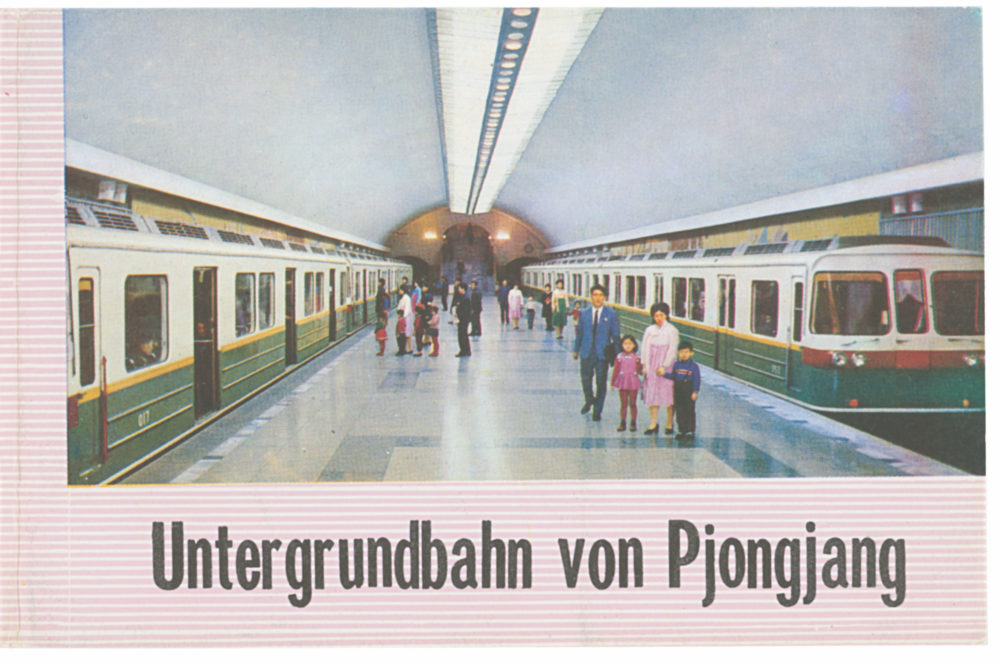
Nicholas Bonner reflects on his first visit to Pyongyang and his collection of vibrant North Korean visual ephemera
Pyongyang was, and remains, a more beautiful capital than Beijing. It is a planned city that sprung up following the devastation of the Korean War (1950–53) – locals say that only three buildings were left standing. The Taedong River and its tributary the Potong River run through the city and, together with various parks, give Pyongyang an admirably high proportion of green space. Early Soviet-style utilitarian apartment blocks and more modern prestige streets were interspersed with peculiar and original public buildings: theatres, gymnasia, cinemas and libraries, all with quirky but wonderful interiors. I had more questions than answers, and it only dawned on me on return to Beijing just how unusual it had all been.
This curiosity-driven jaunt was the first of hundreds of visits, a decades-long enduring fascination with North Korea and its people; its art, products, oddities, mysteries and banalities. These combine to create a whole that remains murky beyond the parts that ‘they’ want you to see, but, with enough persistence and stubbornness, reveals itself incrementally. I have seen the contradictions and controversies, the surprise of normality, the well-off and the desperate, and the emergence of familiar elements from out of the seemingly alien. I still regularly get blindsided by unexpected occurrences; from surprising revelations from old friends, and the excitement of visiting a newly available part of the country, to the swing between sub-zero winters and sweltering summers. It isn’t a place to tire of easily.
As a countryside ranger taking school groups on walks through the green fields and moors of England, I saw that kids stuffed their pockets with stones or flowers, and a similar magpie-style of collection started with me as soon as I began visiting North Korea. I was charmed and simply taken by the graphic design elements of the products there. Many were not technically or legally ‘available’ to me, a foreigner. So I would buy Korean sweets and keep the wrappers and the hoarding eventually became several large boxes stuffed with what others might, justifiably, call junk. When I was approached to publish a collection of North Korean graphics, this rubbish (which I did at least keep in labelled envelopes) suddenly transubstantiated into a carefully curated collection of expertly selected design ephemera.
At the relaunch of the iconic Oksen chair, Christian Andresen, head of design for Fritz Hansen, remembers one of the greatest Danish designers and architectsArne Jacobsen was at the time, and probably is still, only one of a handful of Danish architects and designers who ventured beyond Denmark. A total designer – he was interested in everything, from objects and furniture to landscape and urban planning – he brought Danish design to an international audience.
Jacobsen was educated at the Danish School of Architecture at a time when the old masters of architecture – those who had grasped an industrial way of thinking about design during the 20s and 30s, and had pioneered Bauhaus-inspired Danish architecture – were teaching there. It was a breeding ground for some of the best designers to have come out of Denmark and yet, of his contemporaries, such as Jørn Utzon who designed the Sydney Opera House, Jacobsen was probably the most talented.
Both an academic designer and an architect, Jacobsen both made projects with contractors and clients on a professional level, and had a love for experimenting with shape. It was this approach that would transpire with Fritz Hansen. Hansen’s forward-looking son, Christian, and Jacobsen both had a passion for new technology and an interest in how designers like Charles and Ray Eames were making furniture in the US with plywood.
The Oksen chair
The ambition of Jacobsen was to do a one piece chair and in developing the technology to produce this – a mould that can press a two-dimensional shape into a three-dimensional shape – the core of our business was founded. We are slow making products compared to our competitors, but we want to challenge, and that always puts a lot of love and frustration into project. The way that Jacobsen and Hansen worked together has become part of our culture.
The Oksen chair took Jacobsen six years, and a lot of hard work at the company, to produce. He would die in 1971 and it was the last big project he worked on. I thought it was about time that we showed it off.
The Berlin-based Dutch designer draws on her studio’s 15 years of research in a solo show that unpacks our relationship with colour and how it has changed
In her solo exhibition at the Design Museum in London, Berlin-based Dutch designer Hella Jongerius calls widespread preconceptions of colour into question. Chief among these is the idea that, as per paint charts and standardised colour systems, our experience of individual colours is static and unchanging. As Breathing Colour invites us to take a closer look at the way colour behaves, the designer makes a case against the processes of industrialisation that limit how we perceive colour.
A phenomenon called metamerism lies at the heart of Jongerius’ research. In colorimetry, metamerism refers to the way two colours can look the same under one light source and different under another. To this effect, the exhibition is divided into separate spaces that simulate natural light at specific times of the day – morning, noon and night – and their effect on colour. Each installation includes a series of three-dimensional objects as well as textiles in order to show that materials and shapes also play a role in our perception.
Below are five takeaways from Jongerius’ in-depth interview with the Design Museum.
Colour is subjective
“Colour is very subjective. It is different for every person, every surface, shape and under changing lighting conditions. This makes colour mysterious and ever-changing.”
Industrial colour systems don’t reflect the full spectrum
“I miss the changeability, the options, that will allow us to read and re-read an industrially produced colour, like we do with works of art. Perfectly arranged, immaculate industrial colour systems don’t offer us the full potential of colour.”
Colour changes throughout the day
“Morning tones are pastel coloured, soft but fresh, with less yellow and no black. Then comes the sharp light right from above at noon, bringing very brisk contrasts and structure. Colours look greener and more reddish.”
Reflections colour everything
“If you take notice, you see just how much is coloured by reflections: whole walls and spaces are toned by it. A grey day is therefore even greyer because there is not enough intense light to cause these reflections.”
Materials impact colour
“The surface and colour of an object defines how we interact with it, how we use it at first and over time. A sense of touch and feeling things strongly influence the relationship between object and user.”
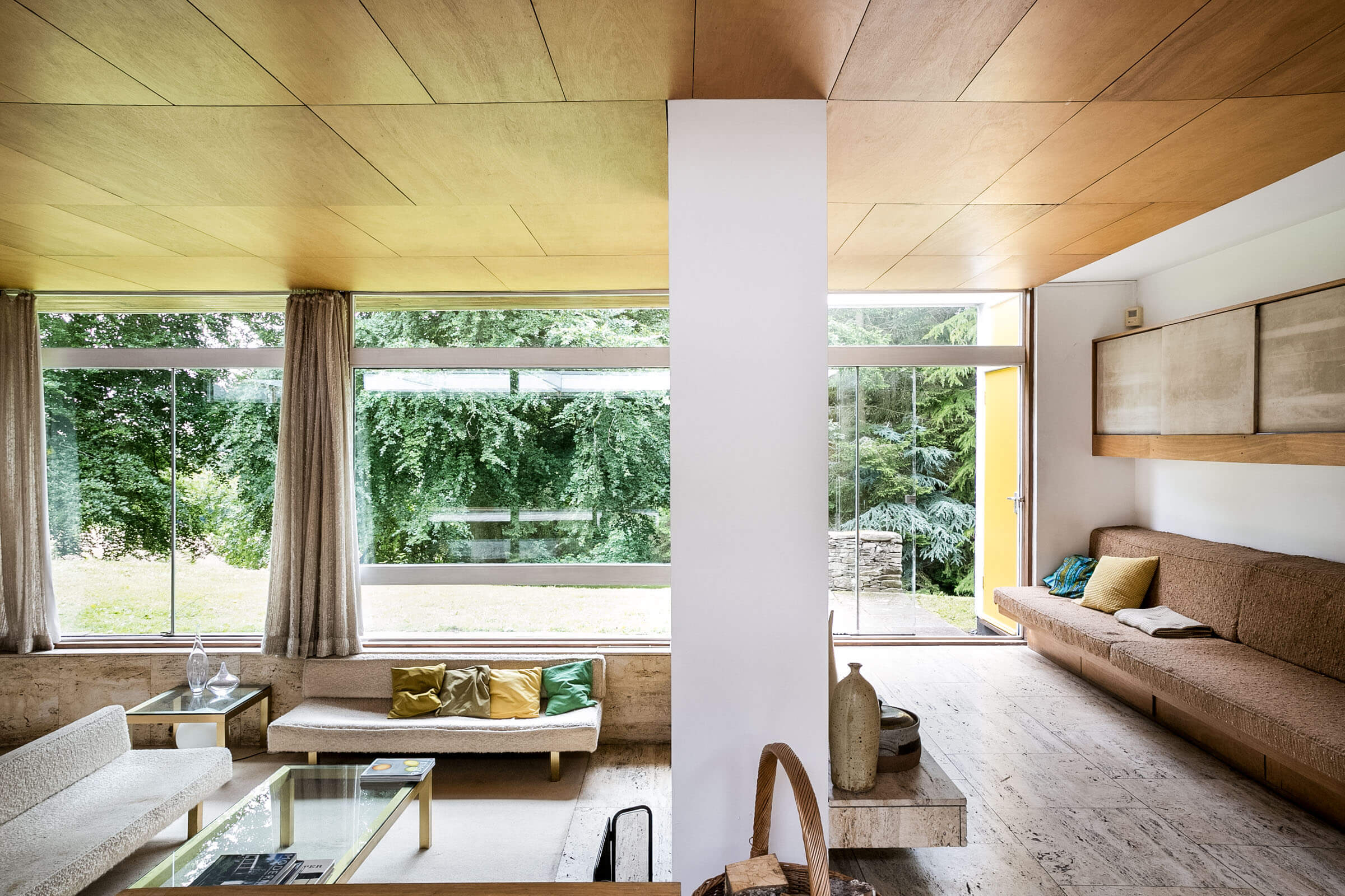
Shelley Klein reflects on growing up in an extraordinary home in the Scottish Borders commissioned by her father, the influential textile designer Bernat Klein
In 1957, the celebrated architect Peter Womersley was commissioned by Bernat Klein – an influential textile designer whose fabrics were used by the likes of Christian Dior, Balenciaga and Yves Saint Laurent – to design a four-bedroom house in the Scottish Borders. Today, the house stands as a fine example of modernist architecture built in Britain during the mid-century period.
As recognition of its design and rare status, Klein House, which has recently been put up for sale, has a Category A listing – the highest grade of listing given by Historic Environment Scotland, and one not often awarded to post-war buildings. Here, Klein’s daughter Shelley gives personal insight into the history of the house and shares her memories growing up there.
“I was born here in 1963 and I’ve lived in lots of places, but this house has always been home. My father, Bernat Klein, was a textile designer and commissioned the house from Peter Womersley in 1956.
“One day he was out driving with my mother and he came across Peter’s first commission, Farnley Hey, completely by accident. He was so drawn to the building that he knocked on the door and asked if the same architect could build a house for him!
“Peter became a really close family friend and moved to the Scottish Borders shortly after he completed the house in 1957. He became the legal guardian for my siblings and I and he spent a lot of time with us here.
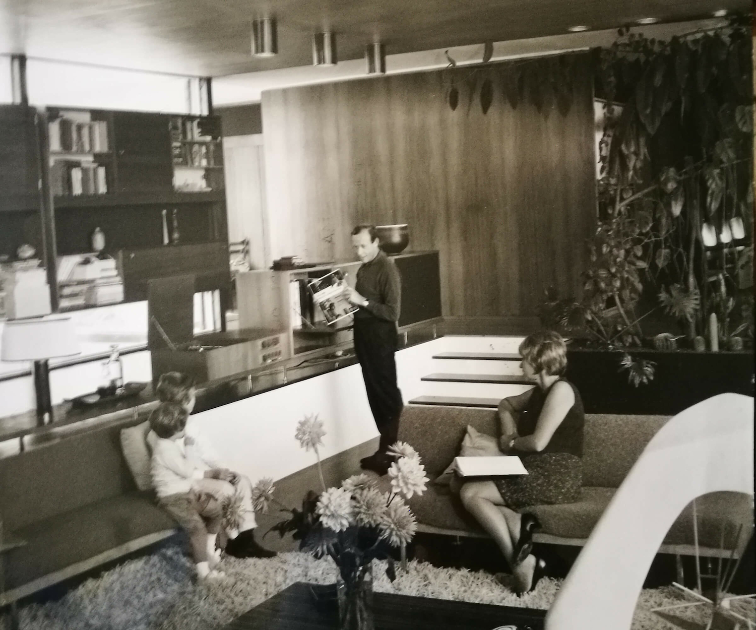
Bernat Klein and Margaret Klein in the living room with Shelley and Gillian, c.1960
“He was a very private man but he loved parties and being one of the gang. Professionally, I don’t think he was the easiest person to get on with as he had very strong opinions about what he saw. However, my father trusted his vision completely and felt that Peter shouldn’t be interrupted in realising the design.
“Over the years my father adapted a few things but most of it is exactly as Peter designed it. All of the soft furnishings are designs that my father made for the house – the fabrics for the sofas and curtains are an extraordinary type of slub yarn with a mix of wool and mohair. They have a wonderful three-dimensional quality to them.
Klein House
“My mother Margaret loved what dad did with the house, but it was really his passion. They used to have fantastic parties here and it was always being used for fashion shows. Fashion editors would fly up to Edinburgh and come to the house to watch models walking up and down the living room – my sister and I would hide in the bedroom and try on all the wigs, it was great fun.
“As a child you’re not really aware of what a building is, it’s just a home – but I feel differently now. I came back to look after my father for a few years before he died and it’s given me time to appreciate the house for the architecture as well as all of the memories it gave us.”
This interview is an excerpt from The Modern House, read more here
From political posters to portable devices, discover how the egalitarian spirit of design in California has changed the way we live, learn, work and communicate
An ongoing exhibition at London’s Design Museum explores how Californian design has given us the tools for unprecedented personal freedom by transforming the way we see, speak, make, travel and share. California: Designing Freedom traces the roots of modern technology and the legacy of Silicon Valley – including its cultish corporatism – back to counterculture movements and the hippie modernisms of the 1960s.
In this sweeping celebration of California as a nucleus of pioneering design and technology, curators Justin McQuirk and Brendan McGetrick make connections between the free speech movement and social media, LSD and virtual reality, self-reliant communes and online communities, as well as many other equivalents, in order to argue that design drives the egalitarian spirit of California’s techno-utopia.
The exhibition is ultimately about understanding the age of the individual. The freedom to say, to see, make, go where, and join what you want are its five organising themes. Taking the 1960s as its starting point, some 300 items, from political posters to portable devices, come together in the first show to position the Golden State as a self-made design capital of the 21st century, highlighting how Californian products now shape our daily lives.
It is an ambitious and at times overwhelming survey, with early Apple prototypes sharing the space with a replica of the Captain America chopper from the 1969 film Easy Rider. Highlights include artist and activist Gilbert Baker’s original 1978 design for the Rainbow Flag, Ridley Scott’s first commercial for Apple in 1984, and back issues of The Whole Earth Catalog (a pre-internet publication providing access to tools, information and ideas). There is even a vitrine of LSD blotting paper. “It’s the only drug where you’re consuming a piece of graphic design,” co-curator Justin McQuirk joked.
A question left unanswered by California: Designing Freedom is whether the spirit within which something is made is more important than its application. When drawing parallels between California’s history of counterculture and the shared values of Silicon Valley, the downsides of technology, the internet and individualism at large are not addressed head-on. New phenomenons like self-surveillance are mentioned, but their potential for abuse is never fully implicated. In other words, the cost at which some of our newfound freedom comes is left unaccounted for. But perhaps that’s a story for another exhibition.
California: Designing Freedom is on show at the Design Museum in London until 17 October
An intimate documentary directed by Reiner Holzemer follows a year in the life of the Belgian designer as he reveals the creative process behind four collections
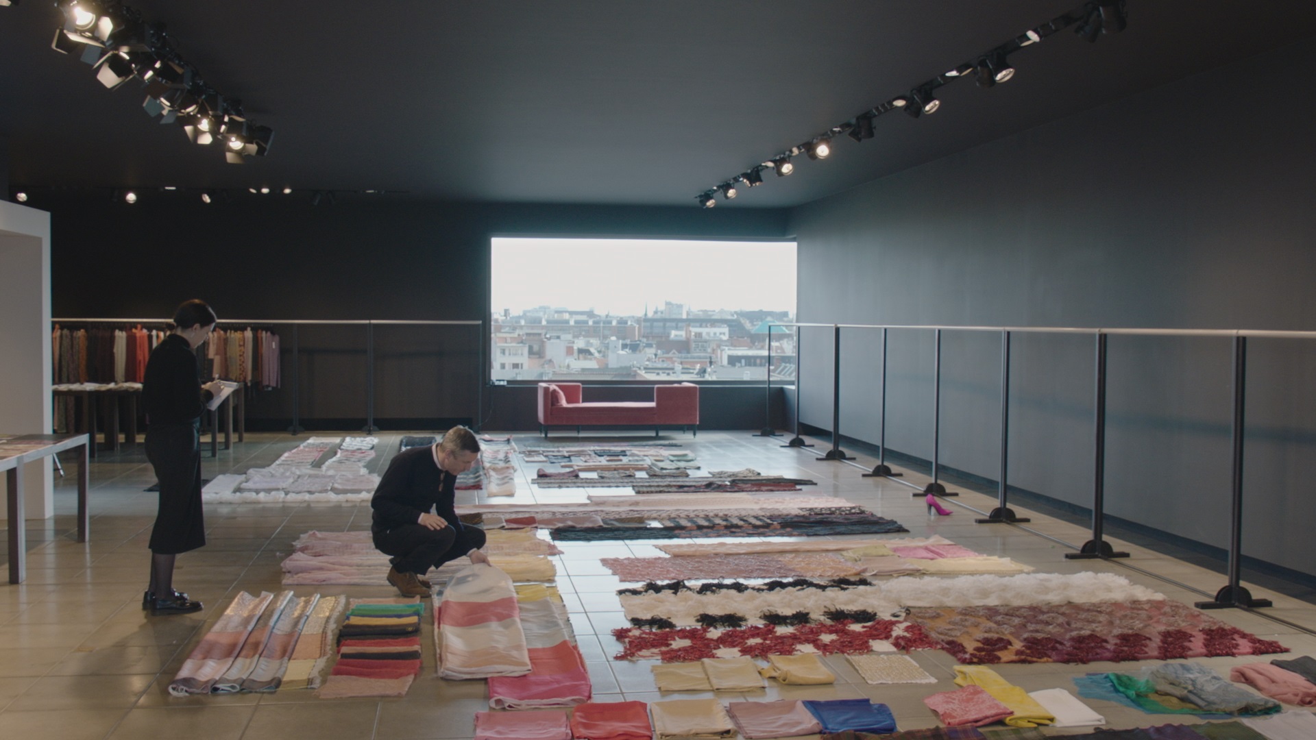
Dries Van Noten selecting fabrics in his studio in Antwerp
Dries Van Noten is one of the most unassuming figures in fashion. In an industry which otherwise moves at an impossible pace, he is a thinking, feeling designer, and for more than 25 years, he has remained independent in the face of fashion’s runaway globalisation.
Despite his relatively low profile, Van Noten is a veteran designer and celebrated his 100th show in March this year. A master of print, pattern and texture, he emerged from Antwerp’s Royal Academy of Fine Arts in the early ‘80s as part of a group of designers including Walter van Beirendonck and Ann Demeulemeester, often referred to collectively as the Antwerp Six. Since launching his namesake label in 1986, he has become widely respected as a designer who has forged his own path.
In a new documentary directed by Reiner Holzemer – whose past films include portraits of artists and photographers such as David Lynch and Juergen Teller – the Belgian designer gives rare access to his home and work life. Over the course of a year, Dries documents the makings of four collections, from his studio in Antwerp to backstage at his fashion shows in Paris. In doing so, it offers a glimpse into the world of “one of fashion’s most cerebral designers”, as The New York Times has described him.
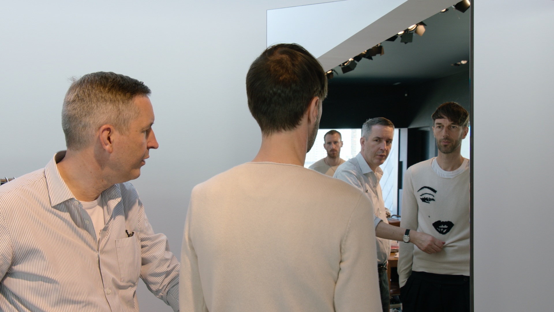
Dries Van Noten with Jürgen Sailer, head of men’s design in his studio in Antwerp
Holzemer, himself a relative newcomer to the inner workings of the fashion industry, met Van Noten while filming his 2011 documentary on Juergen Teller. Immediately taken with the designer’s intuitive approach, it took the German filmmaker three years to convince a camera-shy Van Noten to be the subject of his next film. While the designer had outright turned down the proposals of other directors, Holzemer was spurred on by the fact that he never said no. Twice a year, they would meet at Van Noten’s shows and each time, Holzemer would ask again.
“I think what encouraged him, or interested him in my work, was that I was not coming from the fashion world,” Holzemer explains. “I wasn’t a fashion filmmaker and he saw some of my films as portraits of artists, and I think he liked that approach.” After this prolonged game of cat and mouse, Van Noten agreed to open up his work and home to Holzemer and a small crew.
Dries Van Noten with Jürgen Sailer, head of men’s design in his studio in Antwerp
Holzemer’s genuine affection for Van Noten comes across in conversation and his respect for designer is more than apparent in his portrayal. Fashion documentaries often capitalise on moments of drama and the frenzy of the eleventh hour, but Holzemer cites examples such as The September Issue and Dior and I as precisely the type of fashion film he wasn’t looking to make. With Dries, he insists he wasn’t interested in playing up to the same stereotypes; the appeal was the person, not the industry.
An important aspect of the film is its depiction of Van Noten’s life in Antwerp, where he continues to live with his long-term partner, Patrick Vangeluwe, and his dog, Harry. The choice not to live in Paris, where his collections are shown, is a considered one. “There’s less distraction and he can really concentrate on his work,” says Holzemer. “It’s important for him to live his own rhythm, to live in his own world. And that’s why he’s always creating something new and unexpected.”
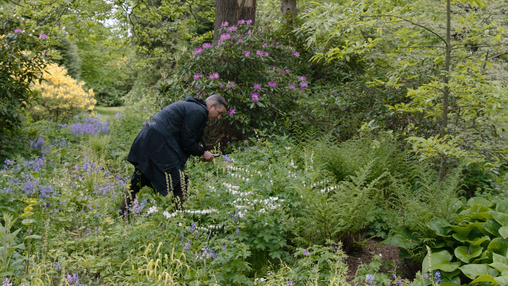
Dries Van Noten in his garden in Lier, picking flowers for the house
In Dries, Van Noten touches on what he calls the “rat race” of fashion. Speaking of the immense pressure placed on designers today, many of whom are tasked with producing a growing number of mid-season collections, Holzemer says, “In a way he’s an exception and in the same way he’s typical, I think.” Yet, while contemporaries might produce in excess of eight collections a year, Van Noten has refused to compromise the quality of his ideas.
“When he designs something, when it’s too beautiful, he adds something distracting or something ugly to make it more interesting, and that’s an ongoing process all the time,” Holzemer explains of his process. “I found that Dries doesn’t draw. He works like a sculptor, working with the fabrics on a live model, more a less. That was very hard for him to show – how he works – because he was always a little bit afraid of showing something that was not perfect, and might even look a little banal in the eye of the audience.”
As seen through the eyes of Holzemer, the designer’s high-profile admirers, and Van Noten himself, what comes together is a portrait of a man who strives to bring the same artfulness to all areas of his life. “Do you think people like Dries are disappearing in the world today?” Holzemer asks Iris Apfel as the documentary draws to a close. “Not disappearing, darling – they’ve disappeared,” she says. “He’s a treasure and has to be treated as such.”
Dries Van Noten working on a collar for the Men’s Winter 2016 collection
Dries, directed by Reiner Holzemer, is out now on DVD
As it opens up the modernist canon to include both contemporary buildings and lesser-known examples from around the world, a new book asks what modernism means today
In 1910, Austrian architect Adolf Loos delivered a radical lecture railing against what he called ‘the plague of ornament’. Later published as an essay titled ‘Ornament and Crime’, Loos’ polemic was first and foremost a violent reaction to the excess and elitism of art nouveau. For Loos, art nouveau’s decadence was an unnecessary burden on both the powers of invention and human labour. Both, he claimed, slow the tempo of cultural progress. Subject as it is to changing taste, the form of an object, he argued, should last as long as the object lasts physically. This was not the first time a moralising stance has been taken on style, but more than century later, it has proved to be one of the most influential.
A new book, Ornament is Crime: Modernist Architecture, plays on Loos’ legacy and celebrates the architectural language of modernism with a visual survey of extraordinary homes dating from 1910 to present day. As it opens up the modernist canon to include both contemporary buildings and lesser-known examples from around the world, it necessarily asks what modernism means today.
Adolf Loos: Villa Müller, Prague, Czech Republic, 1930. Picture credit: Vaclav Sedy
“Modernism isn’t just a style, it’s actually a radical approach to life and to art,” says co-author Albert Hill. “That clear purpose has resulted in great architecture, and people recognise that this is not architecture by numbers, this is not architecture by corporate committee, this is architecture by vision and values.”
In the 20th century, the tremors of modernism were felt in everything from painting to literature, and to underscore the lasting intensity of these values, authors Matt Gibberd and Albert Hill have interspersed silky black and white photographs with punchy quotes, song lyrics and literary excerpts from figures such as Susan Sontag and Samuel Beckett. “Instead of just being about architecture, the book is about architecture’s place within modern culture,” Hill says.
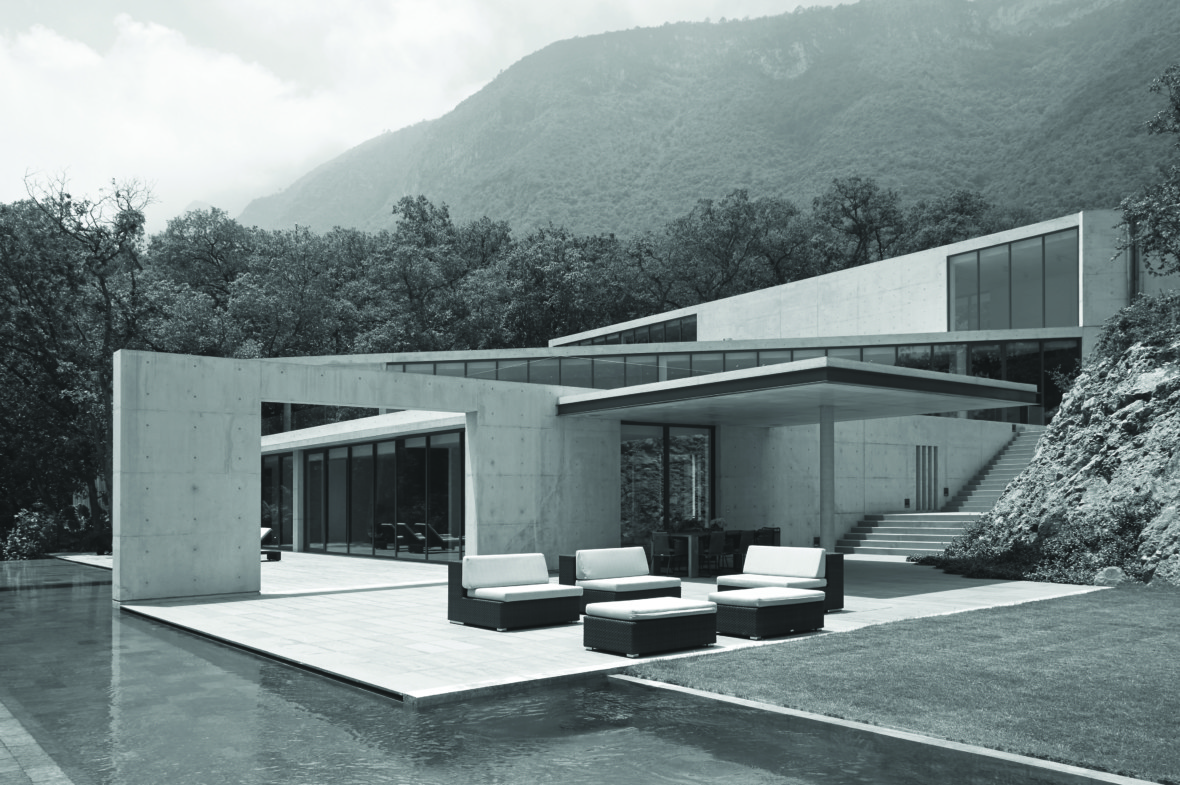
Tadao Ando: House in Monterrey, Monterrey, Mexico, 2011. Picture credit: Toshiyuki Yano
Although modernism is often historically confined to the 20th century, Ornament is Crime liberates the term by looking at how some of the most respected contemporary architects – including John Pawson, Richard Meier and Tadao Ando – continue to work in the modernist tradition.
“There are very obvious characteristics that these houses share,” explains Gibberd. “Flat roofs, often horizontal bands of glazing, cubic or cylindrical forms. Modernism came about because of new technologies – the possibilities of curtain-walling, and the fact that concrete allowed you to have these open floor plates, huge expanses of glazing – and those still very much apply.”
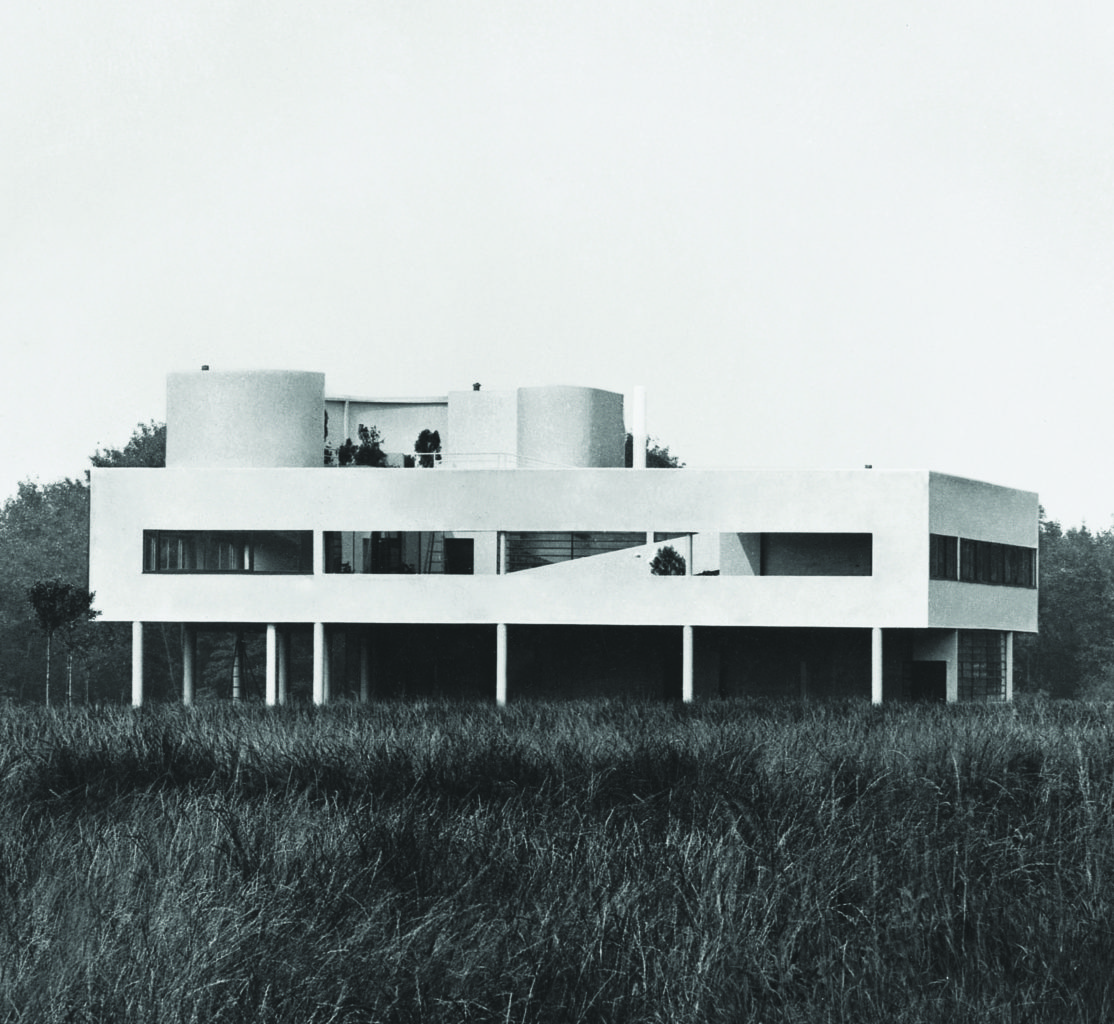
Le Corbusier: Villa Savoye, Poissy, France, 1929. Picture credit: Fondation Le Corbusier
Many of these defining characteristics were outlined by Le Corbusier in his five points of architecture. With its free facade, ribbon windows, pilotis, roof terrace and open plan, the Swiss-French architect’s iconic Villa Savoye, built in 1929 in Poissy, on the outskirts of Paris, is an embodiment of these principles and remains a benchmark for modernist design. In the absence of surface decoration, Gibberd suggests that modernist architecture becomes about “shape-making”, and like Loos, Le Corbusier and legions of architects since, Ornament is Crime extols the virtues of pure form.
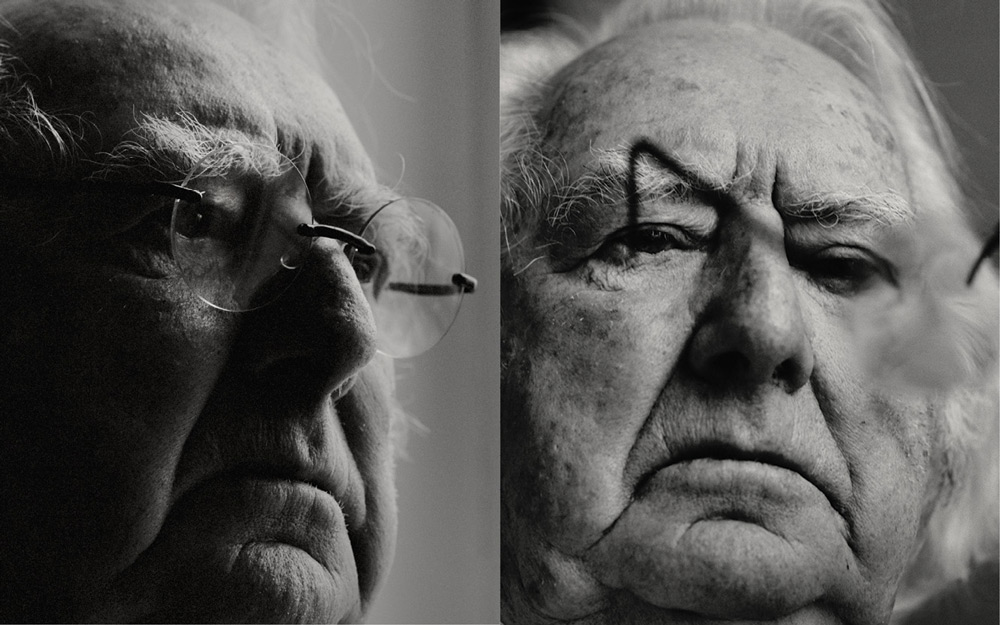
The American architect – part of the New York Five and one of the city’s most iconic modernists – talks to Port about his body of work and branching out from his beloved colour white
Richard Meier by Joss McKinley
“It began quite innocently,” says RichardMeier of the events that propelled him to fame. In 1972 he was a young architect practising in New York, and teaching at Cooper Union with John Hejduk, the educator and theorist who would later become the school’s dean of architecture; Charles Gwathmey, another architect, was working in the same building. Meanwhile Michael Graves and Peter Eisenman were teaching at Princeton. All the men were near the start of their careers – they had built little, and not much building was going on in New York, which was mired in ever-deepening economic and social crisis.
“We all knew one another. We taught together; we were friends, and we decided to get together and sort of criticise one another’s work,” Meier recalls. “So we went to a neutral space, the conference room at the Museum of Modern Art, everyone bought one work that they were currently involved with and the others gave their opinion of it. We had a really good, friendly discussion. And afterwards we said, that was really good – we should make a little pamphlet to commemorate the event.”
That pamphlet became, in the hands of George Wittenborn – an art books publisher on Madison Avenue – a slim book called Five Architects, and the architects became known as the New York Five. Each architect included two of their houses in the publication, and Arthur Drexler, MoMA’s influential director of architecture, contributed a pugnacious introduction, praising the five for remaining true to the “rational poetry” of pure modernism, as opposed to the “proletarian snobbery” of brutalism and the “elegant but arbitrary” pure structure of Mies and his followers. For a such a slender volume, the effect was electric – even explosive.
“At the time, most architectural discourse, if you can call it that, was around issues of social responsibility… and perhaps the very faint beginnings of postmodernism and reaction against modernist orthodoxy,” says Paul Goldberger, the Pulitzer-winning architecture critic for Vanity Fair, formerly of the New York Times and the New Yorker. “And then, into this mixture, come these young architects who were interested in modernist form and continuing to develop and refine it, and push it forward, and did not feel it was a dead end, but felt it was very much relevant. In the context of the architectural culture of the 1970s, it felt very fresh… very much oriented around pure aesthetics and pure forms and making a shape and making a space as an end in themselves.”
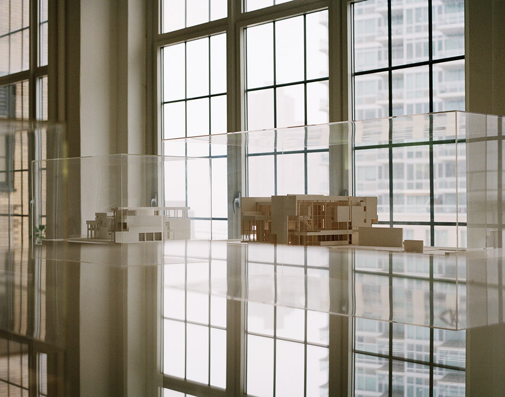
Left to right: presentation model of the Ackerberg House and presentation model of the Rachofsky House in the North Gallery of the New York office.
“I was surprised how much was written about it,” Meier says. “It made people think about architecture in a different way, which was very positive.” But with modernism divided and falling from grace, this clarion call was controversial. The New York Five became known as the “whites”, and were attacked in the pages of the Architectural Review by a rival grouping of proto-postmodernists and neoclassicists, the “greys”. “People certainly read it as a manifesto of some sort, and it provoked other events,” Meier says, although he denies that the aim was polemic. For him, the value was all in those initial meetings: “It was really a wonderful coming together. We knew one another; we had dinner with one another, but this was something different. It was just sitting in a room, talking about the work – not only one’s own work, but also the work of the other four.”
Meier was born in Newark, New Jersey, in 1934, and established his office in New York in 1963. “White” was an entirely apt label for his work. He is associated with the colour like no other architect. The Five were always divergent in style, and their architecture went in radically different trajectories: Eisenman into deconstructivism, Hejduk into sui generis idiosyncrasy, Graves into monumental postmodernism. But Meier has remained loyal to white-walled modernism. One monograph of his work opens with an essay by him in praise of the colour: “White is always present but never the same, bright and rolling in the day, silver and effervescent under the full moon of New Year’s Eve. Between the sea of consciousness and the earth’s vast materiality lies this ever-changing line of white.”
In interview, however, he’s far more restrained – at times, frustratingly taciturn. “I felt that we were part of a tradition and respected that tradition, and showed the way it could be expanded,” is pretty much all he will be drawn to say about his relationship with his modernist forebears. But his meaning is spelled out in his work. His crowning achievement is the Getty Center in Los Angeles, a hilltop complex of galleries the size of a small town, developed over more than a decade at a cost of $1.3 billion. Few architects get this kind of opportunity; even fewer could make such consummate use of it. He has built other cultural landmarks in the United States as well, including the High Museum of Art in Atlanta; and he is one of continental Europe’s favourite Americans, with major projects such as city halls for The Hague in the Netherlands and Ulm in Germany. Dazzling white is sometimes cut into by pale stone and apertures of sky; grids and purist geometry are kept from sterility with surgical curves and deviations from the orthogonal.
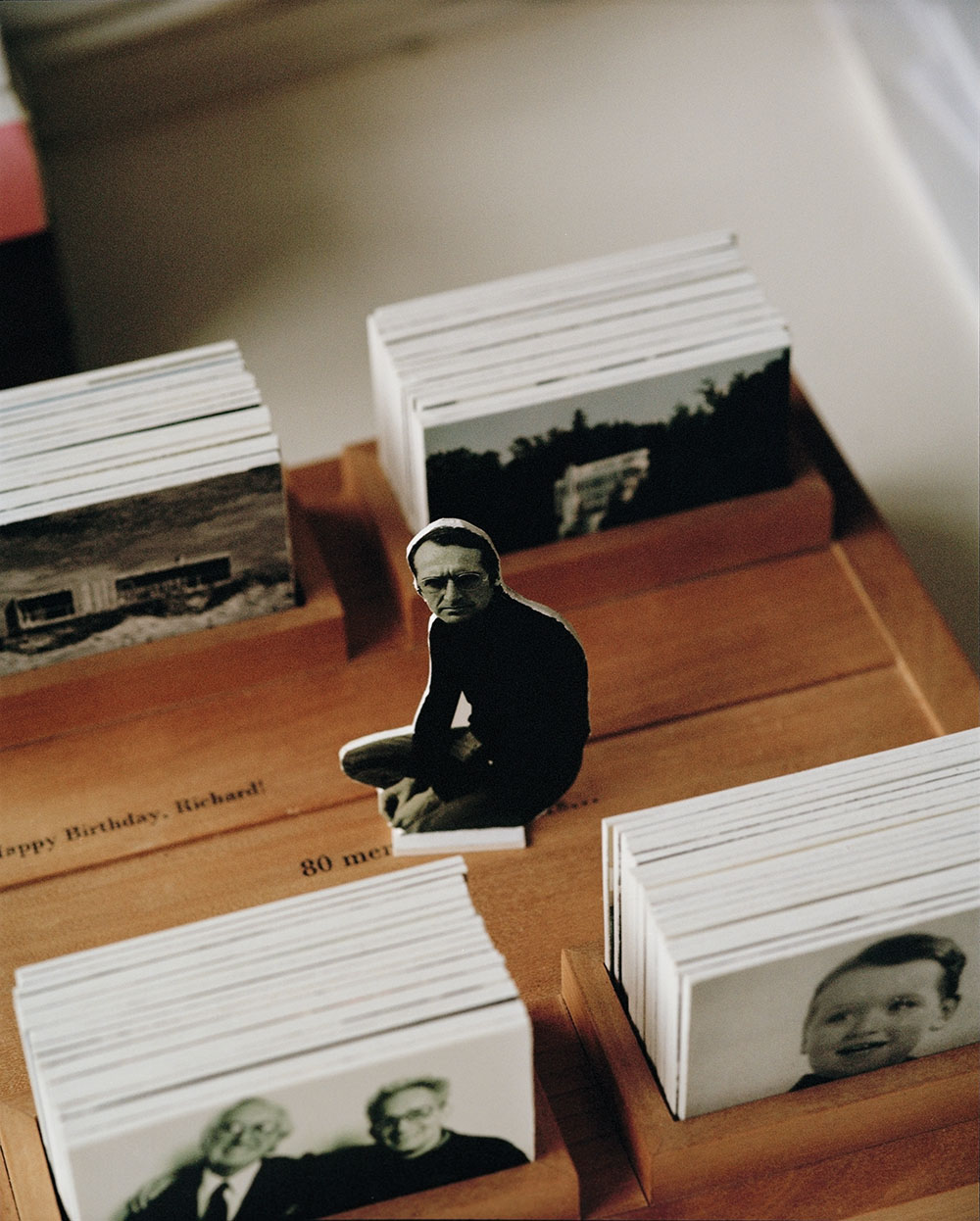
Photo cards with images from the Richard Meier Archive to commemorate and celebrate Richard Meier’s 80th birthday created by the staff from his New York office.
“What he has done is distilled a kind of elegant purist essence out of modernism,” says Goldberger. “But his works are very much compositions; they’re about balance and weight and lightness and solids and voids, all very beautifully balanced together into compositional wholes that are elegant and serene. That is not what modernist orthodoxy has prioritised so much as what he has prioritised. He has been pursuing his own private version of modernism, consistently, his entire career.”
Some of Meier’s earliest projects in the late 1960s and early ’70s, were in New York. After that, for more than a quarter of a century, he was overlooked in his home city. But with the turn of the century, that changed. Between 1999 and 2006, he built a trio of short, elegant towers on Perry Street and Charles Street in Greenwich Village, a decorous little riverfront group that deftly combines variation and restraint. “To have three buildings together, three blocks on the river, is really unique. It makes me proud,” Meier says. “And they’ve really transformed an area, given it a new life.”
They also created demand for Meier’s architecture among condominium developers. In the early years of the 21st century, with his catalogue heavily focused on houses, civic centres and galleries, Meier had more than once expressed a desire to design a skyscraper. Since then, a few Meier spires have appeared in locations around the world, and now one is under way in New York: an apartment tower at 685 First Avenue. The site is a couple of blocks south of the United Nations building on the East River, and Meier expresses his satisfaction that his own tower is much the same height and orientation. “It’s like they’re a pair of buildings,” he says. “That context gives me great pleasure.”
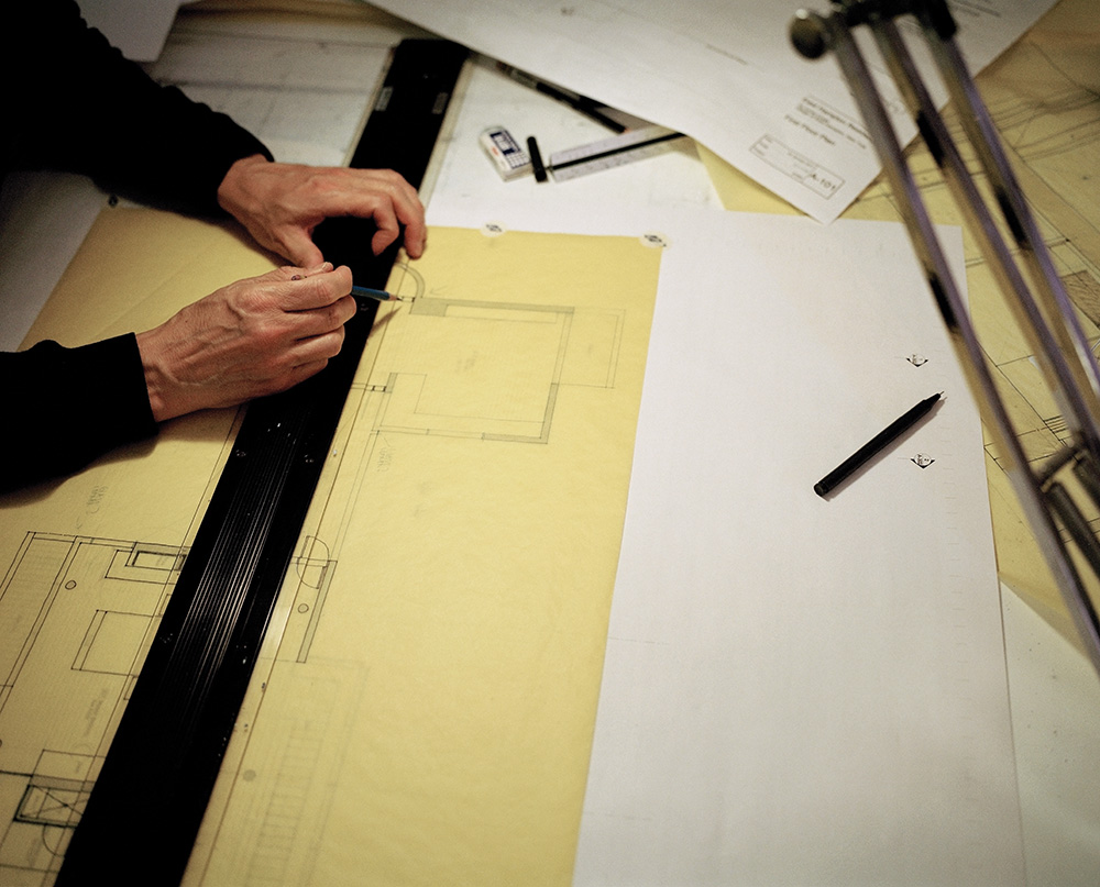
Senior Associate Hans Put working on the design of a new private residence in East Hampton.
However, once it’s finished the uninformed eye might not recognise 685 First Avenue as a Meier: it’s black, clad in a “very taut, very striking” curtain wall of shadowy glass. It is a remarkable rupture with the Meier trademark. What made him break the practice of a lifetime and make a black building? Typically, his reply is a little… well, a little colourless. “ came to me and said ‘I like your work; I like the buildings that you did downtown, but would you do a black building?’ So I thought about it a while, and I said sure. So that’s what we’re doing.”
To break up the mass and highlight the blackness and tautness of the curtain wall, there’s a sliver of white about two thirds up the tower: one apartment, different to the others, with clear glass to reveal its pristine interior. An interesting place to live, I say. You’ll be able to point it out from across the river.
Another first: Meier laughs, and permits himself a dry joke. “We should tell the sales people that they should charge more for it.”
From his south London home, the celebrated chef, restaurateur and food writer speaks to The Modern House about what modern living means to him
I lived in Shoreditch for 20-odd years, as well as Notting Hill, and I wasn’t considering south London before I bought this place. My friend Richard, who’s a search agent, showed it to me on The Modern House website, and I zipped straight over on my scooter to take a look. I said yes straight away. I didn’t even come for a second viewing because I knew I was going to redo it.
Space was the main consideration, but I’ve found that Bermondsey is a really interesting area. It’s also easy to get to any of my restaurants… I nip over London Bridge to get to the Oyster & Chop House. I’m close to lots of bridges here! I visit at least two of my restaurants every day. I’m not really in the kitchen any more; I’ve got lots of other things to look at, mostly overseeing the creative side.
This place is my home, and I also do some work from here: writing and experimenting. I might start doing some cookery demonstrations, like I do in my Kitchen Library at the Tramshed.
I worked with Tekne on the refurbishment. Originally they’re shop fitters, but they’ve fallen into doing hotels and restaurants. They did my Bankside restaurant, Hixter, and the one in Soho. I recently put them in touch with my friend Robin Hutson, who owns The Pig Hotels, so they’ve done the last two projects for him. When Robin buys old buildings for the hotels he clears them out, and he’s given me a few salvaged things for the flat – a shower and some old Crapper loos.
I designed the space, and then Tekne worked as the contractors and architects. I gave them the ideas, and they put it all on paper. We gutted the whole thing, taking it right back to the bare bricks. We played around with materials: the wine racks are made out of scaffold planks picked up from building sites around here – some we paid for and others we were given for nothing. The same with the bookcase. Because they’re old, they’ve got a bit of character.
The kitchen counter is made from liquid metal. You can pour it over MDF to create curves at the edges, and you don’t get joins. Underneath are pieces of cast concrete from Retrouvius; I think they were originally columns in a mid-century office block. I wanted simple, natural oak units, something that would wear in naturally. Cooker hoods are normally so boring, so we went to a foundry and made a semi-industrial-looking unit that’s wrapped over the top of a normal extractor. We went back to the natural brick on the wall behind, which would have been the end wall of the original factory.
The spoon on the wall is a Michael Craig-Martin – it’s the cover of one of my books, The Collection. The ‘Vacancies’ neon piece is a Peter Saville art piece that he made. The fridge came from an antiques shop in Paris. It was made in the 1800s – originally they would have put a block of ice in the middle compartment to keep the whole thing cold. The refrigeration guy that I use for my restaurants converted it and made the top bit to match the bottom. It’s got different sections: dairy, wine, glasses, negroni cabinet!
I buy a lot of stuff from junk shops and reclamation yards. The kitchen lights are from Trainspotters in Gloucestershire, and I’ve collected midcentury Stilnovo lights over the years.
I bought the cocktail cabinet years ago at the Paul Smith shop. It had a horrible Chinese painting on the front, so I got my artist friend Mat Collishaw to make a replacement. The taxidermy mice in bell jars are by Polly Morgan, and the Bridget Riley is one of the first pieces I ever bought. There’s a shop across the road – a sort of Lithuanian shop – and they were selling what I thought was a mandolin, but I couldn’t work out why it was so big; it turns out it dates from 1903 and was used for slicing white cabbage.
The guitar comes from an event in Lyme Regis called Guitars on the Beach. A friend of mine said: ‘If I get a Fender guitar sponsored, can you ask Tracey Emin to draw on it?’, and she did. I thought it was going to be a silent auction, but it ended up being a raffle at a pound a ticket. So I bought a thousand tickets for £1,000 to narrow the chances down! It’s signed by Paul McCartney as well. I go back to Lyme Regis maybe three weekends a month. I’m part of the local community, I suppose. I get involved in local charity work and I do a food festival, which brings quite a few people to the area.
I made the garden room because the little terrace is quite small. In the summer you can open the doors up and feel like you’re inside and outside. I put the bi-fold doors in, and then got lots of crazy plants from Covent Garden. It’s a nice place to have tea in the morning. I found the old plantation chair on eBay. The artwork is by my mate Henry Hudson, who works in plasticine. That’s an Australian Moreton Bay Bug [on the ceiling]: it’s a sort of prehistoric crab. Then this is an old python skin I found rolled up in a box in a junk shop. I guess there’s a touch of the macabre, but really I just thought this room was crazy enough that you could put anything in it.
I’ve got a fishing and shooting cupboard here. The wallpaper is by one of the guys who works in the gallery, Tom Maryniak; he’s done a few different types of wallpaper in the loos at my Bankside restaurant. And then the wallpaper in the main bathroom is by Jake and Dinos Chapman.
The photographs above the bed are by Susannah Horowitz – she was one of the winners of the Hix Award. Every time we do the award I end up buying something. And this one isn’t from the Hix Award: it’s just two fucking flamingos with a little bird watching… I forget what its name is! The rooflight was already here; it was quite a weird space before, with a pool table and not much else.”
This feature is an excerpt from The Modern House, read more here
Joe Hollier, co-creator of the first phone designed to be used as little as possible, speaks about resisting digital distractions and the benefits of ‘going light’
As far as advertising slogans go, ‘designed to be used as little as possible’ is a far cry from ‘Just Do It’ or ‘I Want My MTV’, and is maybe one of the most unlikely examples in marketing history. Coined by Joe Hollier and Kaiwai Tang, co-creators of the Light Phone, its strength lies in the fact that the majority of us spend a worrying amount of time on our smartphones, and we’re all too aware of it.
Some even call it an addiction. In fact, recent research claims that US consumers spend an average of five hours per day on their phones. The Light Phone’s USP then, is that it was made to be as simple and rudimentary as possible. Small, sleek and no bigger than a credit card, it is designed to be used as a second phone; a way to log off from the internet while still being contactable.
Hollier and Tang came together on an app design programme run by Google. For Hollier, a graphic designer, artist and skateboarder, the programme ended up highlighting the greed and cynicism of the tech industry.
“I realised quite quickly that, on one hand, apps all claim to make our lives better,” he explains. “But on the other hand, what all the founders and investors were talking about was retention: how many hours a day do your users actually use the app. Because the more addicted they become, the more ads you can sell them, the more data you can collect, and the more money you can make. So I saw this disconnect. How can you be claiming to make my life better when you’re really just taking up all of my time?”
By the time the Light Phone was being tested, they found that first-time users often experience something that they now call ‘going light.’ “When someone ‘goes light’ there’s an initial anxiety, maybe tapping their pockets, maybe feeling like they’re missing something, maybe they’re at a café and can’t resort to looking down at their phones and they start making awkward eye contact with people,” Hollier continues. It sounds like satire, though it’s undoubtedly close to the truth. “But there’s always this moment when you stop caring, you forget about Instagram and you’re able to relax and experience the present.”
Given the Light Phone’s minimal design and limited features, the question remains: why buy a Light Phone when a simple Nokia could do the same job?
“The design and the form are very important,” Hollier says. “The object of the Light Phone, image-wise, is designed to make the experience as special as possible. It’s hopefully something that you’ll be proud to pull out of your pocket. And then there’s the fact that you can keep the same number.”
Admittedly, there’s no getting away from the irony of using technology to combat technology addiction, but this isn’t the first time disruptors have subverted it in this way. With mindfulness apps and smart jewellery start-ups, the Light Phone seems to be part of a growing independent tech sector that promotes personal well-being.
“One big thing about the Light Phone is the conversations it allows you to have about technology,” explains Hollier. “Even if someone doesn’t buy the phone, maybe it’s inspired them to question their personal phone use. Our goal was only ever to show how most technology is sponsored by big companies who don’t care about us, who just want our time and money. So the real question that the Light Phone poses is: why? And where do we go from here?”


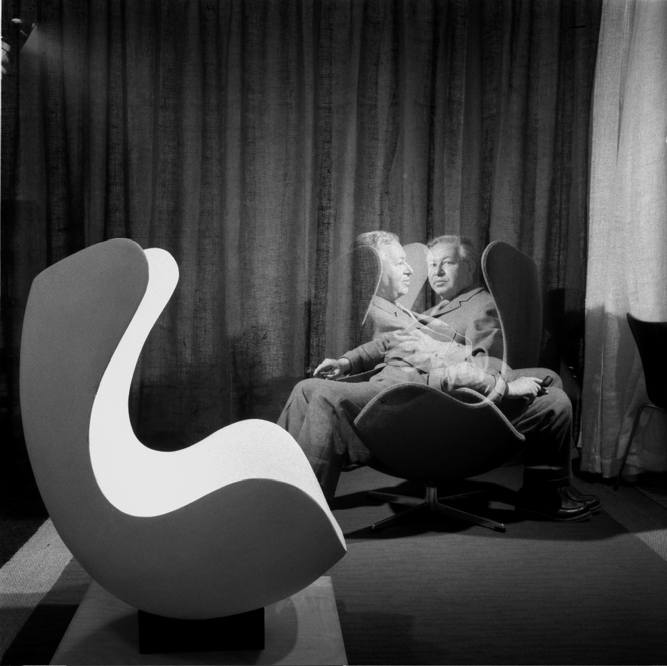 Arne Jacobsen was at the time, and probably is still, only one of a handful of Danish architects and designers who ventured beyond Denmark. A total designer – he was interested in everything, from objects and furniture to landscape and urban planning – he brought Danish design to an international audience.


 From his south London home, the celebrated chef, restaurateur and food writer speaks to