The Imaginary Institution of India: Art 1975-1998, an exhibition organised by the Barbican in collaboration with the Kiran Nadar Museum of Art, explores pivotal moments in India’s socio-political history through nearly 150 artworks. Below, assistant curator Amber Li highlights five standout pieces from the show, each revealing powerful narratives of identity, resistance and change during late-20th century India

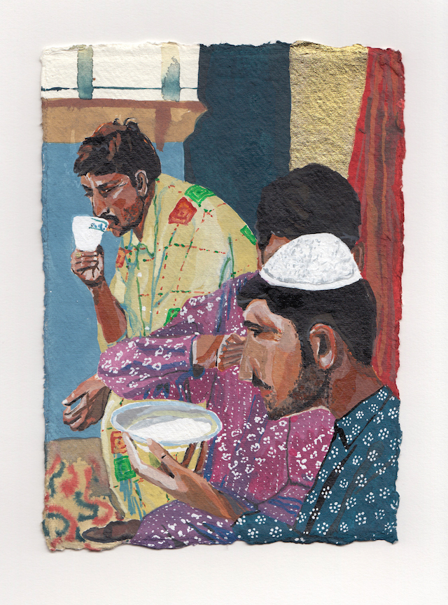
Gieve Patel – Off Lamington Road, 1982–86
This epic painting captures a crowd moving through a busy alley, located off an important road in Mumbai where Gieve Patel worked as a doctor.
Across the painting, men and women stand or squat in small groups to talk. On the right, musicians accompany young people dancing, some dressed in colourful clothes. Celebration is side-by-side with destitution: two bandaged, leprous children beg for alms, and a woman lies naked and bleeding in the foreground. Patel’s work often depicts people on the fringes of society. The painterliness with which these figures are portrayed verges on abstraction, conveying the transience of the crowd.

Madhvi Parekh – Village Opera-2, 1975
Madhvi Parekh’s oil paintings provide, for her, a way back to the idyll of village life. They depict remembered landscapes from both her childhood village of Sanjaya, Gujarat, and her subsequent travels. She painted Village Opera-2 after attending an artist’s camp organised by artist G. R. Santosh in Kashmir in 1975. The copper pots she saw there inspired the black anthropomorphic figures at the centre of this work. Working first with oil paint, Parekh then used oil pastels to add small, vibrant creatures which resemble birds, fish, snakes and amphibians. The scene floats in a colourful net of dots and lines, patterns drawn from the folk crafts of Rangoli and embroidery that she had practised as a child.

Arpita Singh – My Mother, 1993
Arpita Singh’s monumental painting, My Mother, records the chaos of communal violence exploding across India in the early 1990s. The artist’s mother looms dignified and stoic in the foreground, while militiamen in bottle-green uniforms enact scenes of devastation behind. Shrouded bodies line the streets and victims lie stripped on the ground.
Singh had started work on a portrait of her mother when riots erupted in Bombay (Mumbai). Unable to keep these two elements from spilling into one another, the painting represents collapsing boundaries between home and nation, private and public, and the real and the imagined.

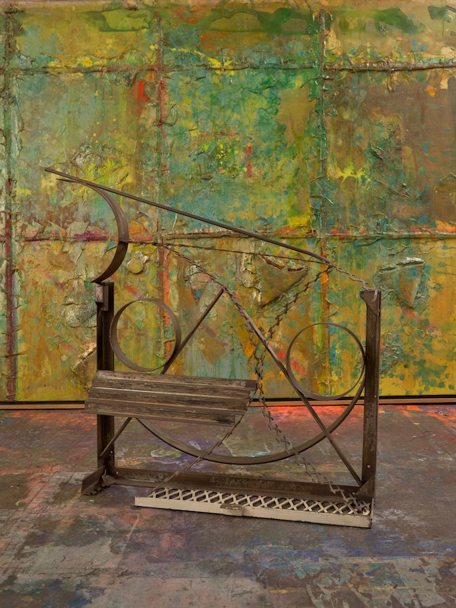
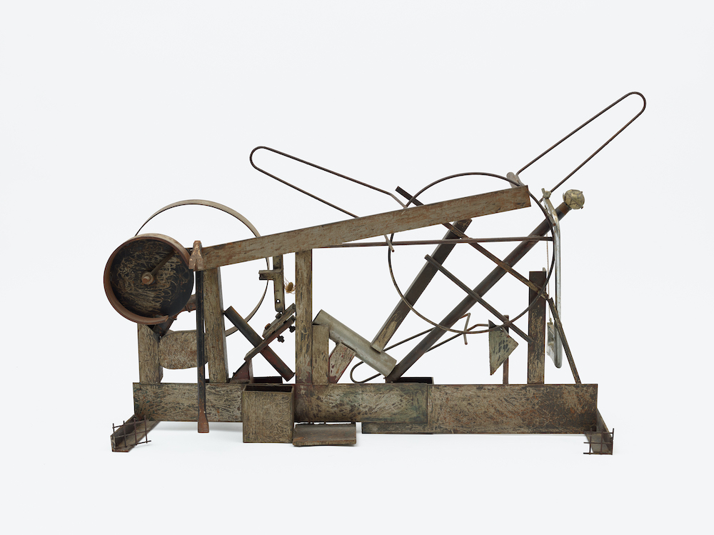
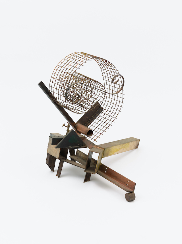
Vivan Sundaram – House, 1994
Vivan Sundaram was concerned throughout his career with the urgency of using art to confront political realities. After the demolition of the Babri Masjid, a 16th century mosque, by right-wing Hindu militants in 1992 and the ensuing Hindu-Muslim communal violence in the early 1990s, Sundaram, like some other artists at this time, turned towards making installations. The walls are made from handmade paper, derived from a handmade fibre called Khadi which Mahatma Gandhi promoted as an indigenous fabric which symbolised anti-colonialism. Although the walls are thin and fragile, they are also a call to resistance against violence and a commitment to peace.

Nalini Malani – Remembering Toba Tek Singh, 1998
Nalini Malani made this work in response to nuclear tests carried out by the Indian government in Pokhran, in the Rajasthan desert in 1998. In this installation, a woman from Pakistan and a woman from India fail to fold a sari together while footage plays of the aftermath of the nuclear bombings of Hiroshima and Nagasaki. The video installation builds on Toba Tek Singh, a short story by Pakistani author and playwright Saadat Hasan Manto about forced displacement during Partition, which you hear Malani reading from in the film.
The work conveys the artist’s searing anger at India’s nuclear tests, and at the absurdity and senselessness of ‘one set of people killing the other only because there is some land that you want, or there is some religion that is considered to be more superior than the other’.
The Imaginary Institution of India: Art 1975-1998 opens at Barbican Art Gallery on Saturday 5 October 2024. Entry to the exhibition will be free on 26-27 October as part of the Barbican’s Open Gallery weekend