Preserving Syria’s graphic design heritage, the Syrian Design Archive showcases the nation’s visual identity through decades of typography and print
تجربتي الشعرية، عبدالوهاب البياتي دار الكتب، بيروت ١٩٦٨ تصميم الغلاف؛ عبد القادر أرناؤوط ١٩٧٤ My Experience in Poetry writing by Abdel, Wahab Al-Bayyat. Design: Abdulkader Arnaout
In 2020, Kinda Ghannoum grew frustrated with the lack of documentation in Syria’s design history which, along with much of the Arab world, has often lacked formal archiving due to political instability, limited resources and the marginalisation of design as an academic discipline. Recognising this gap, Ghannoum partnered with Hala Al Afsaa and Sally Alassafen to establish the Syrian Design Archive, which quickly grew into a platform for preserving the country’s visual identity, documenting everything from street posters and book covers to Arabic typography.
Among the collection are stamps dating back to 1919 and posters and book covers from the 1960s, including Abdulkader Arnaout’s cover designs for Colette Al-Khoury’s One Night to Youssef Abdelke’s 1998 poster for Des Films Pour La Palestine. These works – which are open source and available to researchers and students alike – highlight aesthetic trends throughout the ages, but also moments of unrest, revolution and creativity in the face of adversity. In a region where cultural heritage is under threat, the preservation of these materials feels urgent. The Syrian Design Archive acts as a safeguard, ensuring that these visual narratives aren’t lost to time. As Ghannoum says, “To us, the best art pushes you to see the world through someone else’s eyes.”
ليلة واحدة، كوليت الخوري منشورات زهير البعلبكي، بيروت ١٩٦١ تصميم عبدالقادر أرناؤوط One Night 1987, Colette Al-Khoury, Design: Abdulkader Arnaoutملصق لمهرجان الافلام الفلسطينية ١٩٩٨ تصميم يوسف عبدلكي Poster for “DES FILMS POUR LA PALESTINE” 1998, Design: Youssef Abdelke – يوسف عبدلكيالموقف الأدبي العدد الأول، أيار ١٩٧١ رئيس التحرير: صدقي اسماعيل المجلة من ارشيف مي قحوش Literary position, First Issue, May 1971, Editor-in-Chief: Sedky Ismail, The magazine is from the archives of May Qahoushالمسرح القومي يقدم البورجوازي النبيل لموليير تصميم: عبد القادر أرناؤوط The National Theatre presents the noble bourgeois of Molière Design: Abdulkader Arnaoutمعك على هامش رواياتي ١٩٨٧ كوليت خوري تصميم: عبدالقادر أرناؤوط Maak (With you) 1987 Colette Al-Khoury Design: Abdulkader Arnaoutمهرجان الأغنية العربية الأول – دمشق ١٩٧٧ تصميم: عبد القادر أرناؤوط 1st Arab Song Festival, Damascus 1977 Design: Abdulkader Arnaoutالكلمة الأنثى، كوليت الخوري ١٩٧١ منشورات زهير البعلبكي تصميم: عبدالقادر أرناؤوط The Feminine Word, Colette Al-Khoury 1971. Design: Abdulkader Arnaoutاغلفة متعددة كتاب “كيان” لكوليت سهيل ١٩٦٨ تصميم عبدالقادر أرناؤوط Series of Kayan book covers designs for Colette Suheil Design: Abdulkader Arnaoutالفخ، مسرحية لروبرت توماس مسرح القباني ١٩٦٢ تصميم: عبد القادر أرناؤوط The Trap, a play by Robert Thomas Kabbani Theatre 1962 Design: Abdulkader Arnaout
This article is taken from Port Issue 35. To continue reading, buy the issue or subscribe here
Celebrating Richard Hollis’s design work for London’s Whitechapel Gallery
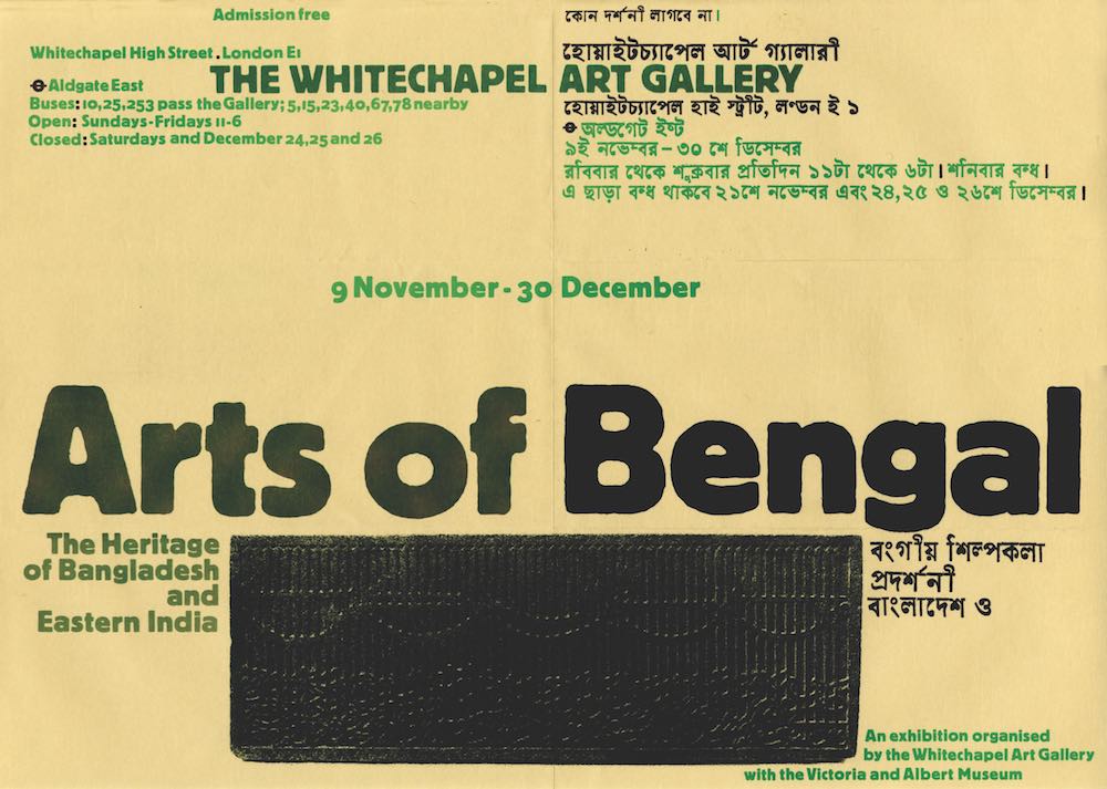
Arts of Bengal: 9 November – 30 December 1979. Many of the posters Hollis designed were in A3 format and designed to be folded into an A4 envelope. Here, for the 1979 Arts of Bengal Exhibition, he utilises the central crease to create a textual echo. One half is in English and other Bengali, the title and gallery name then bring the opposing sides into a seamless whole.
“BILL POSTERS WILL BE PROSECUTED” read the brass plaque next to Magdalen Bridge in Oxford, below which a sloppy marker pen had scrawled “BILL POSTERS IS AN INNOCENT MAN”. Poor, poor Bill, we all regularly agreed. This joke can be seen around the world, and of course the ubiquitous and prolific Mr Bill Posters has never been prosecuted, because the sign actually refers to the advertising posters (or “bills” as they were once known) that cover the back alleys, undercrofts and vacant shopfronts in the overlooked parts of towns and cities. Usually advertising barely legal club nights, obscure cover bands and dying circus acts, they have a reputation for being junk. However, posters can have life and character that is lacking in other types of advertising – even in some art work.
Take a look at a wall that has been layered with posters over many years, and it’s likely you will see a dreamlike delirium of fonts, shapes and images. There will be manic repetition of the same advert and some will be peeling off in places allowing a glance back through the strata of past events. Such a vast repository of discordant information may have once influenced the surrealist’s penchant for free association, montage and collage, but now it seems more like a precursor to the gluts of fast and confusing content on the internet. Posters also allow people to see art without needing to pay for a gallery ticket, while simultaneously enabling art ownership for those who wouldn’t normally have the means to do so; in the 1890’s, Toulouse-Lautrec’s posters were so coveted that instructions were published on how to peel them down without damage. All of these unique traits make posters a fitting medium for artists wanting to democratise their art and set it on a journey beyond the realms of claustrophobic gallery spaces. Indeed, Bill Posters might be innocent after all.
Any art of note should work with and against the parameters of its medium, and, more so than other graphic designers, Richard Hollis’s work for the Whitechapel Gallery (between 1969 and 1985) takes full advantage of the characteristics inherent to the humble poster. His work is a three-dimensional spatial experience, rather than a flat, two-dimensional affair.
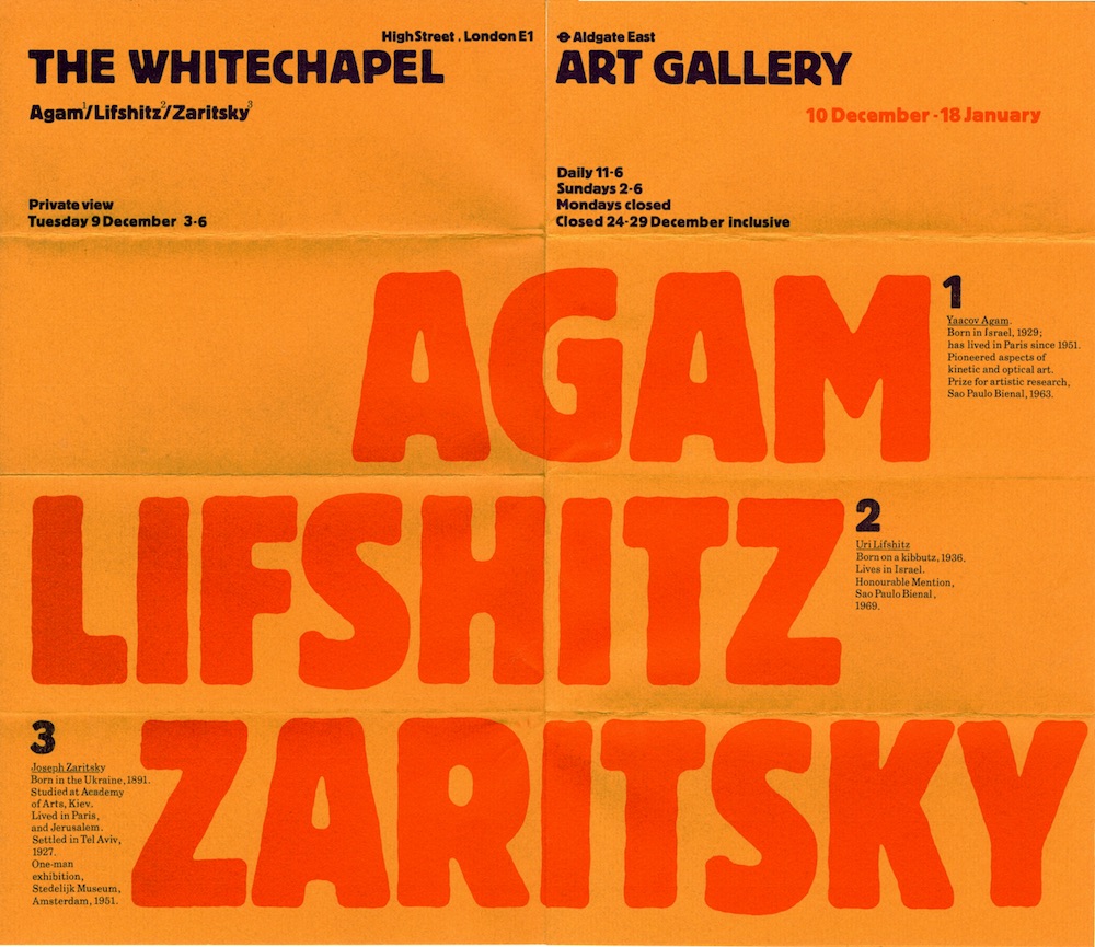
Three Israeli Artists: Agam, Lefshitz, Zaritsky: December – January 1969
This poster is a masterclass in how Hollis disposed type in such a way that it was not interrupted by fold lines. Again, much like a film, as the poster is unfolded a new part of the message slowly appears until the sheet is fully opened out – from chaos to order. You are in the poster, rather than looking at it.
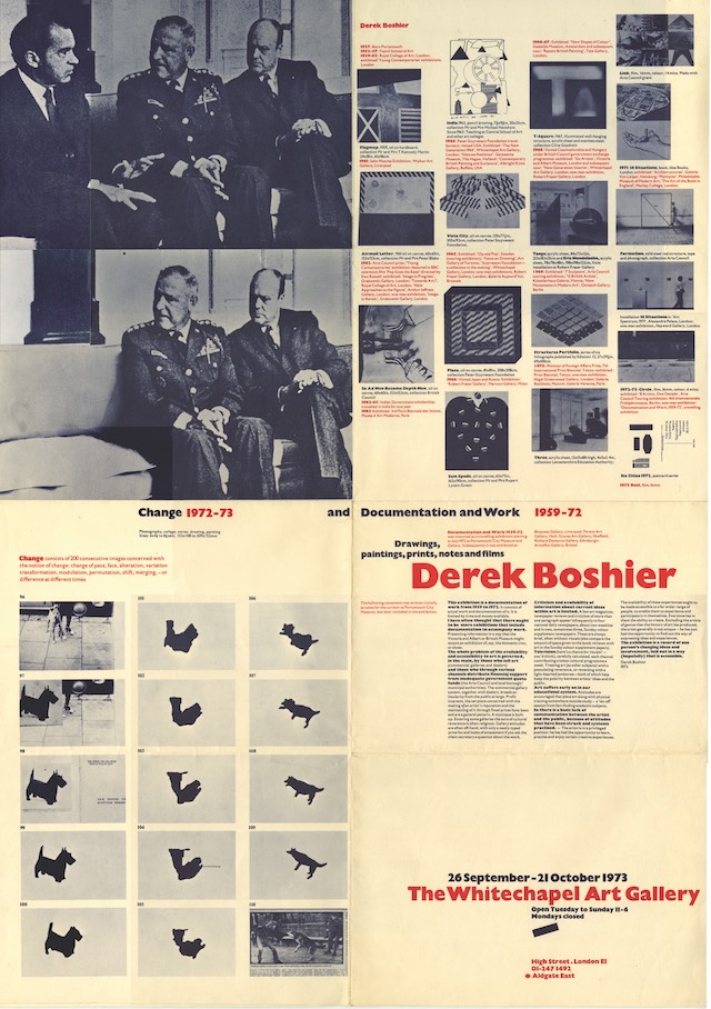
Derek Boshier: 26 September – 21 October 1973
The Derek Boshier poster (1973) is a cabinet of curiosities in image and text – the viewer is active in bringing all the constellations of meaning together in endless variations. Posters are always about catching the roving eye in motion and there is a similar sense of movement in the image sequences and the doctored photo of Ronald Reagan. It’s a whole art exhibition in miniature: Maybe a visit to the gallery isn’t always necessary.
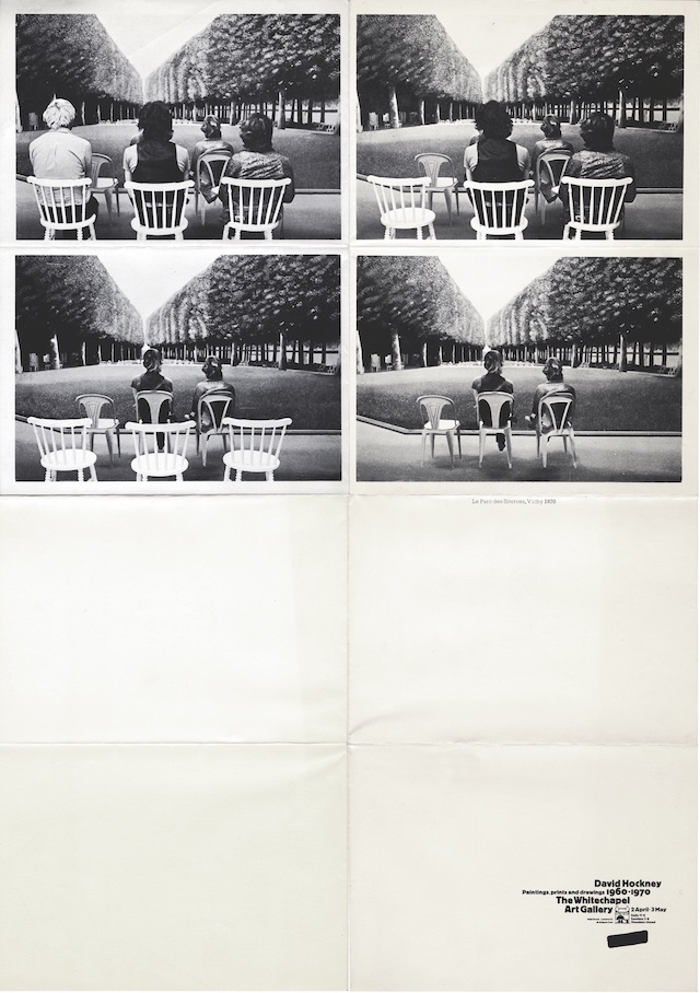
David Hockney: 2 April – 3 May 1970
There is a sense of filmic sequence in this David Hockney poster. Posters are usually saturated with images yet, in this instance, the lower portion is left blank as if it is waiting for someone to add their own drawings and images to complete the movie.