Artist and illustrator Rory Kurtz discusses movie posters, the magic of memory and his approach to creating new artwork for the 50th anniversary of The Graduate, starring Dustin Hoffman
The art of reduction is, in any medium, a difficult task. To reduce something to its most basic form is to break down or strip away those important, albeit less essential, parts of a larger whole. American artist and illustrator Rory Kurtz is all too familiar with this chancy, unpredictable venture. On a regular basis, he distils films into a singular image. Yet remarkably, his works stand not as shells of their referents, but as powerful icons of films in concentrate.
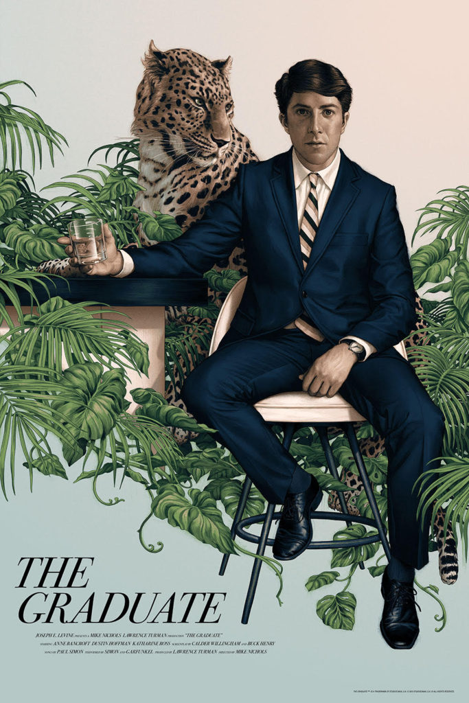
To look through Kurtz’s portfolio is to immerse oneself in an enthralling, mysterious film directory that leaves you with a feeling of wanting more. Included are posters for Stanley Kubrick’s A Clockwork Orange, Nicolas Winding Refn’s Drive and, more recently, Edgar Wright’s Baby Driver. In very different ways, the images cross over into the realm of the fantastical. One poster, however, reflects its film’s more nuanced storyline: a limited release poster for Mike Nichols’ 1967 film, The Graduate, licensed by Austin-based company Mondo. As The Graduate approaches its 50th anniversary, we speak to Kurtz about this serio-comic classic and his approach to the recent commission.
As an artist and illustrator, what was the appeal of ‘The Graduate’ for you?
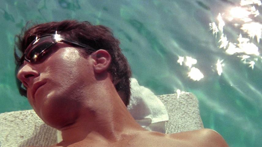
“The Graduate, as its shot by Mike Nichols in that style of film making in the ’60s, is a bit more of a subtle type of film. It was not known for great artistic flourishes. So it was going to be a real challenge for me to find a way to give a visual representation of that. But that appealed to me – the challenge of bringing such a subtle story into a piece of art that has to be visually impactful at a glance. Everyone is so familiar with the shot of Anne Bancroft, leg-on-the-bed, you’re looking beneath her knee to see Dustin Hoffman framed in the doorway of a bedroom. That’s sort of the multi-iconic image of The Graduate in both terms of its poster art and film box covers in general. I felt like I had to bring something new to it.”
What did you want to communicate for this film poster?
“I wanted to communicate fear. The Benjamin Braddock character is in an obvious place of indecision in the film. When you’re young you get the sense that the decisions you make are developments, or the answer to parents who are always trying to change your mind. The results never last long. The decisions you make as a young person have a lighter effect. When you think about the decisions of adulthood – what am I going to do with my life, what am I going to do with my career, who am I going to involve myself with sexually or romantically? – these are all big decisions, and I think that there’s definitely a moment of fear that comes from that. Universally, we all understand adulthood and those rites of passage.”
A lot of your work combines reality and fantasy. How would you describe your style?
“I call it ‘magical reality’, for lack of a better term. I like to keep the work very grounded in reality and recognisable, and I find that that makes it really easy to connect with. But I also like to introduce elements of fantasy into it, which might be something as simple as the movement of lighting. We experience reality in a linear, straight-forward sense. And yet a memory of reality is very fantastical. We tend to interject magic into our lives. In a sense I like to bring the same thing to illustration – taking very real moments, then imbuing them with a lot of the strange magic and mood that we bring to important memories in our lives.”
Port channels the iconic film through The Best Mid-Century Furnishings For Retro Glamour