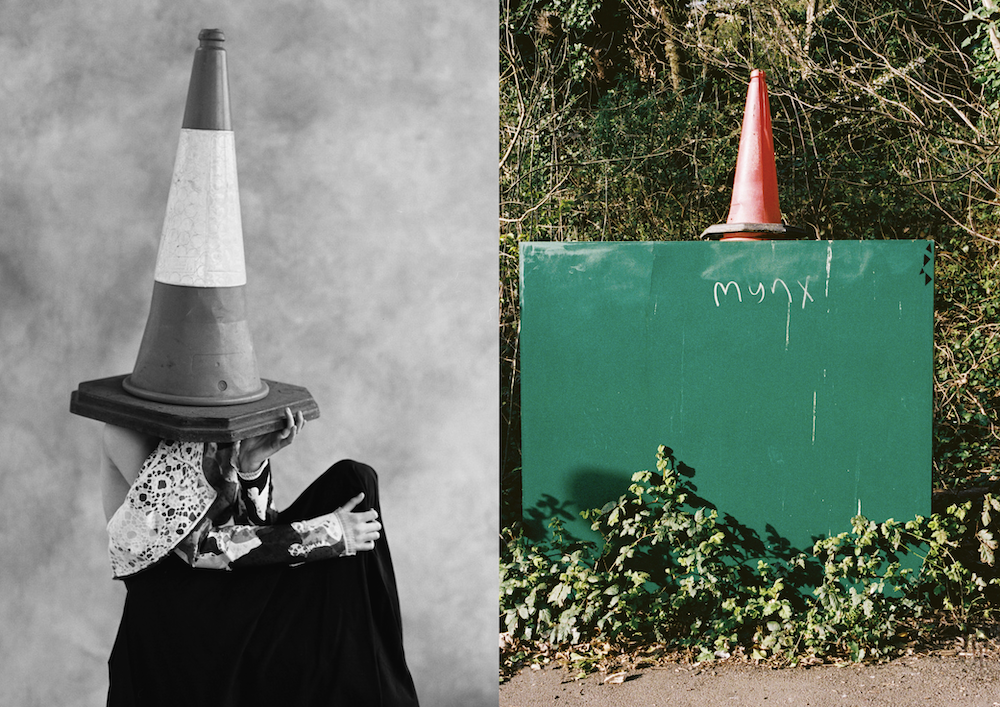
Photography Fumi Homma


Photography assistants Amar Gill and Daiki Tamija
Production Lalaland Retouch Touch Digital
This article is taken from Port Issue 35. To continue reading, buy the issue or subscribe here
Subscribe to Port Magazine annually and receive each issue to your door.
Get PORT in printSubscribe to Port Magazine annually and receive each issue to your door.
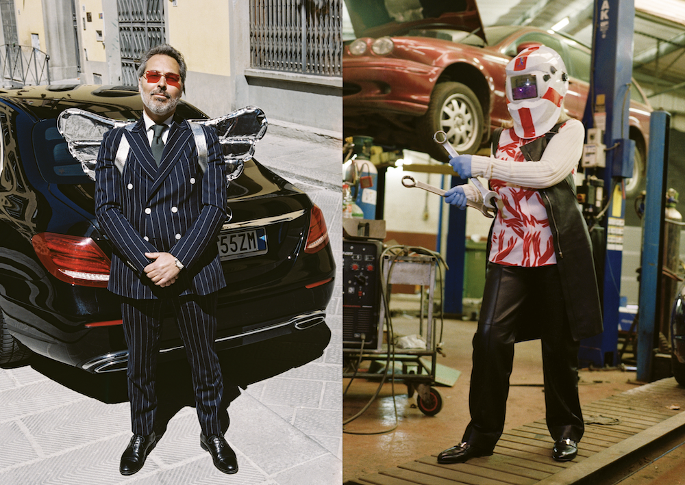
Get PORT in printPhotography Fumi Homma
Photography assistants Amar Gill and Daiki Tamija
Production Lalaland Retouch Touch Digital
This article is taken from Port Issue 35. To continue reading, buy the issue or subscribe here
Since launching in 2022, Young Space has cultivated an environment where artists collaborate and thrive. Below, we ask some of its residents to highlight their favourite objects in the space, and the role these items play in their everyday lives

Young’s founding principle – that a good space can facilitate great, surprising creative work – isn’t necessarily new. Its approach, though, might be. Launching in July 2022, the UK indie label Young (formerly known as Young Turks and founded by Caius Pawson) built Young Space as an incubator for creatives, sitting in a former millinery works in east London’s De Beauvoir Town, hemmed in by housing on either side.
When stepping into the late 19th-century structure, which was redesigned by British architect John Pawson, visitors will likely see singer Sampha recording in one of its five studios, or Grace Wales Bonner designing her latest collection in a workspace. But for the most part, it’s “for artists and people who support artists”, as stated on its website, spanning freelance and company-based residents across fashion, music, visual art, furniture, food and publishing.
Practically, freelancers occupy a core and yet precarious position in the creative world, acting as iconoclastic sources for new creative thinking some of the time, or at other times as the glue or the oil in a creative engine. The problem with that duality is that they’re scattered, often isolated, but inextricable from exciting creative work – a freelancer commissioned this story, another freelancer photographed it. Yet another freelancer will have combed through these words before you read them.
It’s not in Young’s mission to set out a goal for itself or its residents – one gets the sense that’s exactly what they’re trying to avoid. If we were to apply one to what’s been built so far, though, it might be to bring freelancers together under one roof with as few prescriptions as to what they do there as possible. On the day I visit, there’s an A&R meeting for the label, a visiting dog, a delicious communal lunch and a reading in the evening. You can do pretty much anything here, Beth Davies, Young Space’s strategist and development consultant, tells me, “as long as you put the tables back”. To dig into some of what happens there, we asked residents to contribute objects as well as explanations around them.

Young is a space built on the energy of creative fluidity, as well as a safe space for all to freely connect and grow creatively; a space for all to feel comfortable from the moment they step in the building. That ethos runs through all parts of the space, including the studios – mine is a sacred room of free flow and spirituality. The palo santo stick is an important part of my studio, as it provides calm and a cleanse of any bad energy that may try to interfere with the core foundation and comfort of being. The scent complements the aura of Young and emits positive vibrations and peace.

Prompts for fantasy, amplifying elements of things we consume every day. They feel familiar but they are something else now. They could transform you if only you could touch them, which is happily encouraged.

We believe that a sense of calm is imperative for the creative process. At Young Space, we begin each of our writing workshops with a meditation. Light a candle, get comfortable and ignite the flow state.

In relation to this space, the microphone is one of the most crucial objects. It’s as important to me as it is to others. It’s where sounds are transmitted to give life to a space called Young.

I love all things fantasy. As adults, we don’t often get to truly remove ourselves from reality and indulge in the freedom of make believe. Dungeons and Dragons allows you to do just that: play. It’s fun to bring this game to the space and play with people you’d normally interact with in a professional context. You see different sides of people.

‘Filter Sweep’ references feedback loops and resonance, mirroring the cross-pollination at Young Space. This piece is the first of a new series of works, and is created using Italian marble and granites from India and Brazil.

Chess is an unfiltered conversation between two people’s minds, it can tell you a lot about a person and about how they think. It’s a fun way for two minds to come together and challenge each other, not unlike that of Young Space. Every day, we meet new people and are challenged by others’ thoughts and ideas. This brings out the best in people – food for thought nourishes the mind.

At its core, the blanket draws from the specific visual memory of a graphic interaction between architectural space and light. Through its function, it transfers feelings of home to Young Space.

Wearing jewellery in the kitchen is somewhat forbidden but holds so much identity for myself and Nancy. Whilst cooking at Young Space, we wear our jewellery as a statement of our individualism. The dining room at Young Space is a minimal communal area and, though we take our jewellery off to cook and mix with our hands, we show it off whilst serving lunch, as an extension of our personalities.
The space is a minimalist haven, a place where conversation, community and calm take precedence over anything else. Sometimes I just want to spray paint over all the walls and let the chaos in. I see the lamps as pieces of physical graffiti.

Dolly’s name kept appearing at Young Space, literally in large type on the leg of her signature baggy shorts. You’d see it worn by radio show guests, by our friends at WORMS publishing and in the kitchen. When we were talking about designers who we should collaborate with, she was first on the list.

Caius Pawson, co-founder and board of trustees chair, Murmur – ClientEarth book
This book was co-written by James Thornton, a poet, Zen Buddhist and tough-as-nails climate lawyer. James founded ClientEarth, and both the organisation and the book have been a point of reference and an inspiration for Murmur.
Photography Dan Tobin Smith
This article is taken from Port Issue 35. To continue reading, buy the issue or subscribe here
We find out in a new book from the London-based photographer and creative
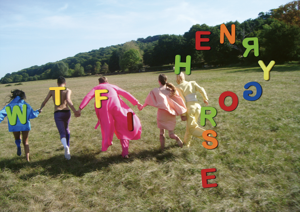
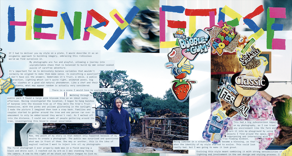
For those who haven’t yet had the pleasure of getting lost in one of Henry Gorse’s images, then let me tell you this: Gorse’s work is an intentional maze that cannot be pigeonholed. While his work can indeed be pegged as photography – capturing people, places and fashion through his signature surrealist lens – it also doesn’t really have a label, and stretches far beyond the frame pinpointed by his camera. Pouring his wild imagination into colourful, magical scenes filled with objects, models and street-casted individuals, all laced with his cheeky wit and irreverence, Gorse embodies the role of photographer, art director and rule-breaker, out to defy the limits of one medium. So when I pose the inevitable question, ‘Who the fuck is Henry Gorse’? he aptly replies in third person. “Henry is a mix of absurdity with a splash of humour and a wink at the ridiculousness of it all. Henry has a lot of ideas!”
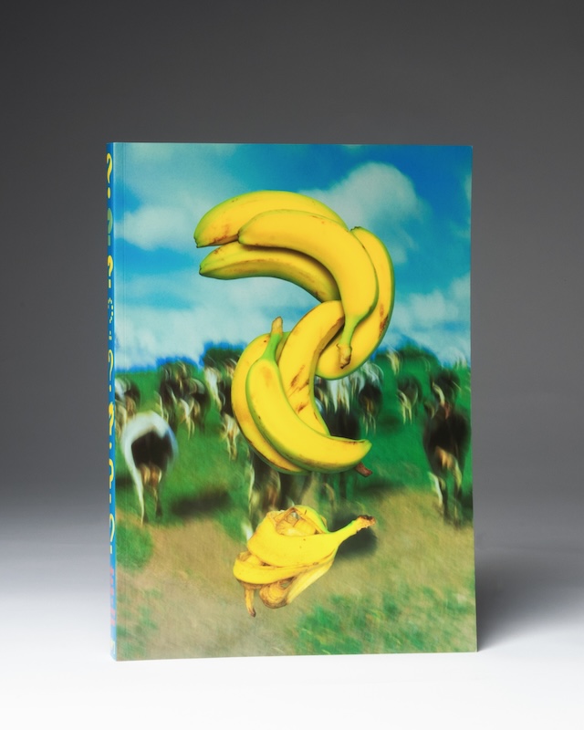
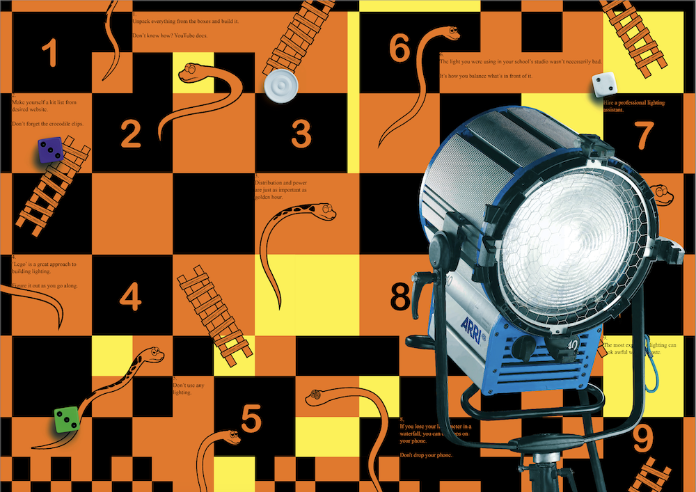
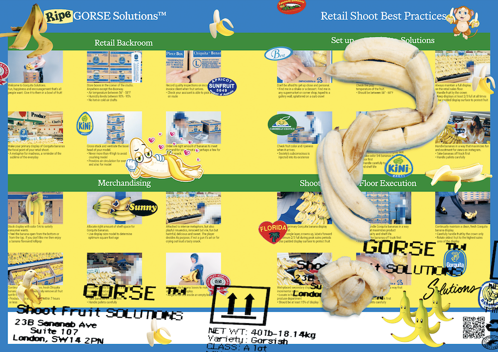
In this nearly 400-page book, titled Who the Fuck is Henry Gorse?!, Gorse collaborated with designers Alfie Allen and Max Marshall, editor James Ross and writer Eugenie Shinkle to bring the project to fruition and to ultimately answer this imperative question. Inside, you can expect to find a mashup of visuals, DIY motifs, punk and chaotic iconography from the 90s and early 2000s and, of course, snapshots of Gorse’s career over the past decade. He’s worked with brands such as Selfridges and Fendi, and has released projects documenting communities and youth culture – Grange Farm is a personal favourite. Importantly, there’s no white space left in this publication. Between Gorse’s trashy and ever-so stylish photography, every gap is filled with something suitably chaotic: playful typography made from paint and ripped colourful paper, zigzag graphics, flower cut-outs, banana skins, AI experimentations and the checkerboard from Snakes and Ladders. Only in this game, the rules have been swapped with a step-by-step guide on how to set up the perfect lighting job.
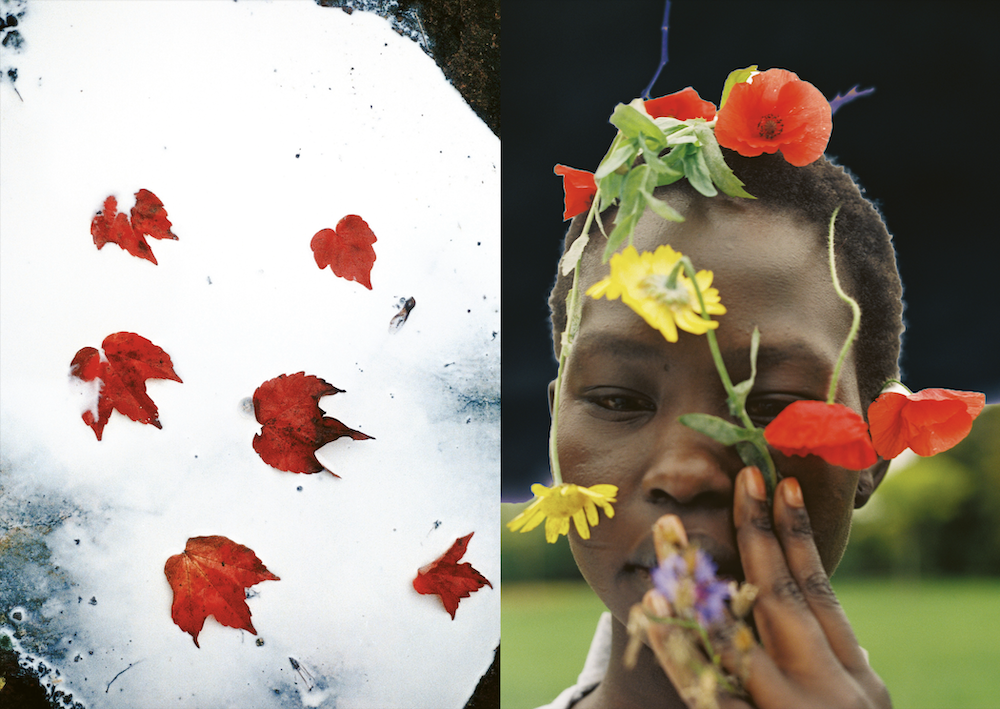
Going beyond a portfolio, the publication merges elements from a photo book, fashion magazine and an experimental creative project, demonstrating Gorse’s long-standing fusion between the mediums and his addictively dizzying style. “My photographs are fun and playful, allowing a journey into devil-may-care escapades that are balanced to build my own colour-soaked photographic adventures,” he says. “We can scroll on our phones for hours. I would like to think that within that endless scrolling, I can make photographs that make you stop.”
When a creative reaches a certain point in their career, a natural progression or sensible ‘thing’ to do is to compile it into an archive of some sorts. And that’s technically what this book is all about. “I came to the conclusion that my work needed its own space,” says Gorse. “I felt like I’ve been capturing the same kind of images since I began, so it made sense to see everything together in one context. This was never about editing it down or focusing on one aspect to gain commercial recognition; the entire journey is an exploration of the self. I had to create my own book to let it exist as it’s meant to be seen – a way to invite people into a unique world.”
During the process, the team worked intuitively and built the concept up “subconsciously” until it took shape – the same way Gorse creates his imagery. The team began with prints scattered on their living room floors, before progressing to a shared office space between Alfie and Max, and eventually a new studio space which is where the publication was completed. As for the graphics, Gorse scribbled down notes and kept folders filled with references that he resonated with, while his collaboration with Allen was particularly synergistic. “I knew Alfie was ideal for this project because he understands my work very well – he even commissioned my first covers in 2011,” says Gorse. Not to mention the fact that Allen’s maximalist approach to design pairs exceptionally well with the carnivalesque nature of Gorse’s work. The book is a wonderful collision of three rebellious minds, structured into chapters divided by question marks, garish graphics, still-life images, a mix of portfolio pieces and new material made exclusively for the book.
But while I try my best to describe this creative powerhouse’s vision – and I do hope that I’ve done it justice – perhaps the more sensicle method is to hear from Gorse himself. Below, Gorse has picked out a selection of spreads from the book and given us the low-down on the project, his process, some significant memories and stories behind the work, and how the team put this magnificent feat together.
The Aura Reading
“I went to get a 25-page aura photo reading near Liverpool Street, and to my surprise, it highlighted almost all of my strengths and weaknesses. Sankar even mentioned that I had psychic potential. The photograph was taken using an aura camera connected to a laptop, with my hand placed on a metal sensor to collect the data. I convinced him to let me do my aura photo with a banana on my head – after assuring him I was completely serious about the experience.”

Public Interactions
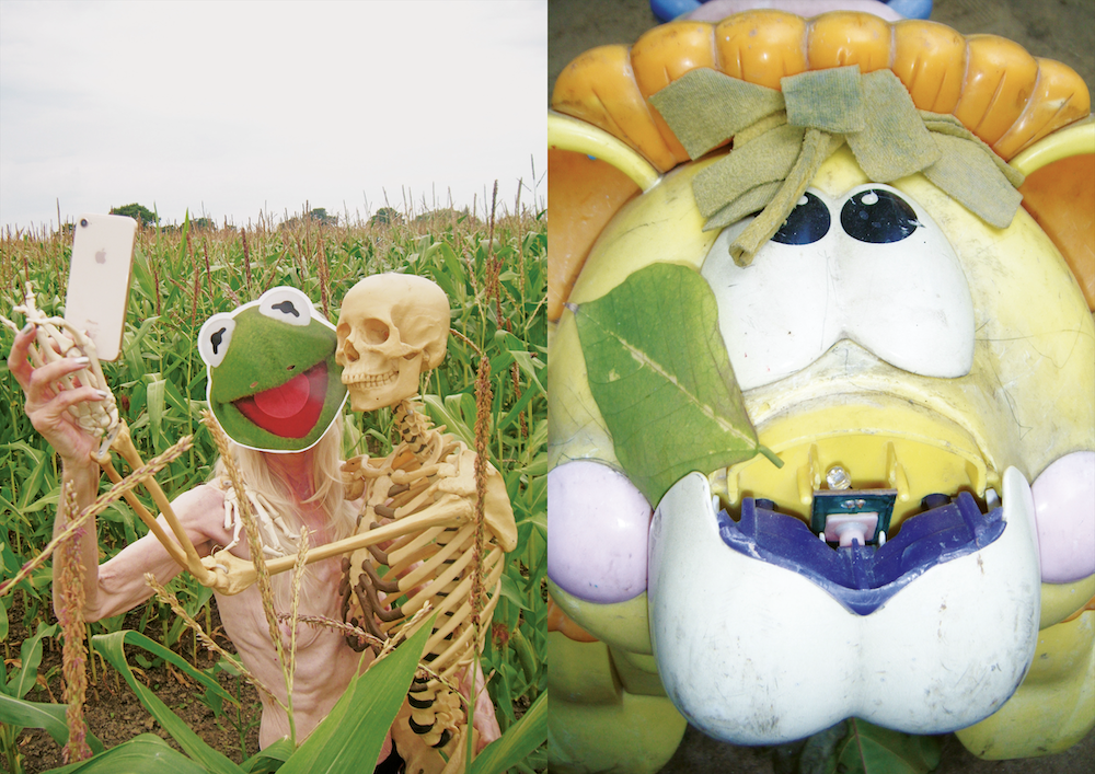
“A big part of my work over the years has been about spontaneously engaging with the public. These encounters are often coincidental, yet they lead to uplifting moments shaped by the individual’s identity or our unique interaction. Sometimes, I bring props in my kit bag or use what’s available on-site; these props often align serendipitously with the situation, creating a feeling that it was meant to be.”


Damaged Negatives
“In my old flat, some of my negatives were damaged due to a leaky floor. After inspecting most of the film, I found nearly all of it was too damaged – except for two 35mm negatives that had merged into a single photograph. One image was of my brother eating Christmas dinner, and the other was of the London Eye, which happened to replace his head, surrounded by vibrant, euphoric film bleeds. We all loved the result, so it became the book’s back cover – a rare, one-time moment that came together naturally and would be difficult to recreate or even imagine.”
AI Experiments
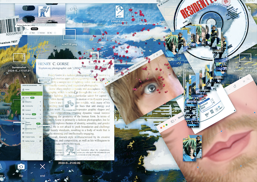
“When we started working on the book nearly two years ago, AI was just beginning to become more refined and find its place in mainstream media. I loved the immediacy of its response to creative ideas and began creating AI images, treating them much like I would my own photographs. We decided that including an AI chapter would be not only fun but also a way to mark this moment in time – a glimpse into the future following a 380-page photographic journey.”
Farmyard Beginnings
“In my teens, while working on a local dairy farm close to my parent’s house, I began to develop what would become my signature style. I was taught to be adaptable and use what was around me to fix problems. One of the best examples of this was pulling down an existing cow shed with forks and chains attached to a tractor, to then build a new one all by ourselves. If machinery broke down, we would search for other parts on old tractors scattered around the farm. If a wall was knocked down, we would build it back up ourselves with what we had. Basically, we thought on our feet in the moment. This had a big subconscious impact on my photography, as I can treat any environment like the farm and turn it into my playground by using objects I find around the space, repurposing and interacting with a free-flowing mindset. Being limited in a situation actually became a blessing, as that’s when the identity of my style started to evolve. This could look really bad, but I was going to make it look great.”
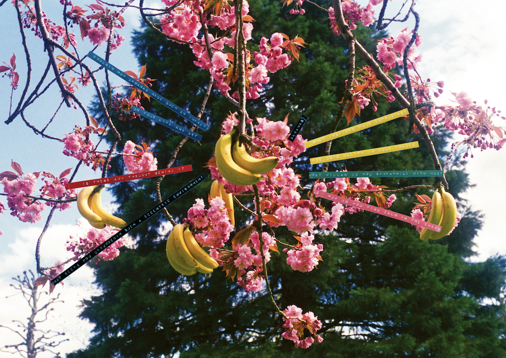
Bananas in Blossom
“There is a scene I would love to explain to you. Walking through a public park I found a large pink blossom tree on an ideal sunny afternoon. Having investigated the location, I began to hang bunches of bananas into the blossom tree as if they were the tree’s fruit themselves, with the pinks and yellows glistening in the sunlight. I made the picture I imagined then took a step back. Families and couples started to gather around the tree and one person ran over in amazement to only be embarrassed they weren’t real. As I walked off into the distance, I could see crowds of people gathering around the tree, investigating this bizarre visual occurrence. Now, the point of my story is that moment only happened because of my desire to create a photograph. The public was surprised and questioned what was in front of them. One way or another, this is the idea of magical realism I want to inject into all my photographs.”
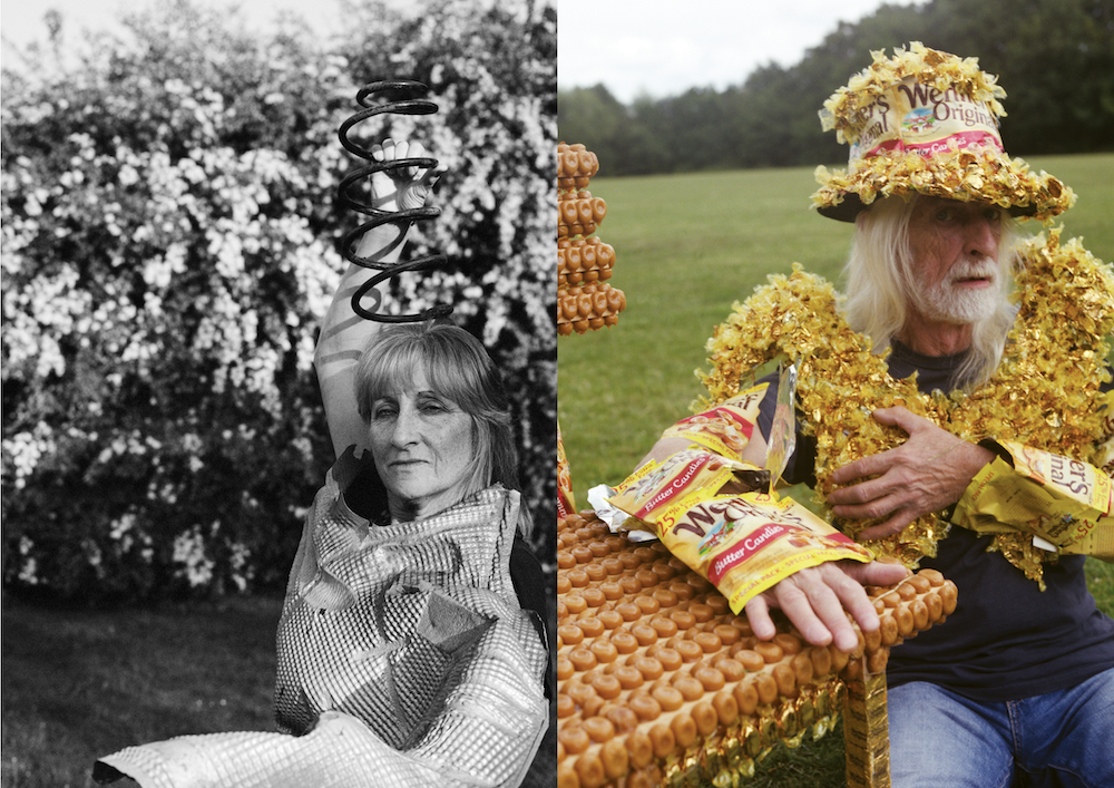
Worthers Chair
“I created a chair for the project 19 chairs, they asked 19 different artists to reinvent a simple wooden chair for an older person in support of the charity Age UK. I thought my chair could be the Worthers original massage chair. Great memories are attached to the caramel butterscotch from whenever my family would visit my grandparents, the Candys would be the first thing offered with a cup of tea. The chair then was photographed with our Mr Worthers Terry who I even made a chest piece for, instead of existing as a chair the final object was in the exhibition as a print.”
Who the Fuck is Henry Gorse?! is available on his website here.
At his new studio on a former military airfield, James Capper designs kinetic sculptures powered by hydraulics

James Capper recently moved his studio from Bermondsey to what used to be RAF Wroughton, a military airfield in Wiltshire that is now an outpost of the Science Museum. Capper is in the old fire station, which may not be at the gigantic scale of Wroughton’s original hangars, built to handle the 100-foot wingspan of Lancaster bombers, three at a time, but it is certainly big enough to reflect the industrial scale of his work. And it makes manoeuvring a forklift truck easier.
Over the last 15 years, Capper has built a series of what the critic Richard Cork once described as “self-propelled sculptures,” beginning with a piece called Tread Toe in 2010. It’s a work fabricated from steel I-beams painted bright yellow. At each end there is a pair of legs connected by a runner. Positioned between them is a motorised hydraulic arm welded to a third steel runner. Cork watched as Capper clambered up into the sculpture, manoeuvred himself into the control cabin, and started the engine. He pulled a lever, and the hydraulics punched the central arm down into the earth with enough force to lift the whole piece off the ground, propelling it a few feet forward. He repeated the manoeuvre, and Tread Toe lurched a bit further forward. Each jump left a distinct trace on the ground, which is why Capper assigns it to what he calls his ‘Earth Marking Division’.

Tread Toe is a piece that works on multiple levels. Its assemblage of steel I-beams uses the vocabulary of Antony Caro’s sculpture in his period of classical abstraction. It can also be understood as a performance piece. And then there are the ephemeral traces it leaves behind as it moves. His Rotary Paintings series reverses the emphasis to make permanent marks on paper. Like Tread Toe, these paintings are the product of a specially designed and fabricated hydraulic mechanism. They are the result of a performance that starts when Capper switches on the machine and distributes industrial marine paint in standard RAL colours in concentric rings.
He has been working with the Hydra Painter – a hydraulic painting machine – on these artworks since 2015. Some of them were the subject of an exhibition that, unlike marks in the mud left by Tread Toe, could be comfortably accommodated in the pristine setting of the Albion Jeune Gallery in London.
There is another aspect to Capper’s work, hinted at by his use of the word ‘division’, that refuses to be constrained by the confines of any gallery. He has designed and built several other earth-marking machines that use a variety of steel blades and claws. There is also what he calls an ‘offshore division,’ of which the most substantial expression so far is the Mudskipper, a 14.5-ton, nine-metre-long boat that has been retrofitted to allow it to walk.

In the summer of 2021, Capper sailed it up the Thames from Battersea Power Station towards the Royal Docks and demonstrated the ability of its twin hydraulic jacks, each equipped with a circular tread pad foot, to lift the boat out of the water and make its way up the mud banks. “Have you seen Fitzcarraldo?” he asks me, referring to Werner Herzog’s epic film from 1982 that has Klaus Kinski playing the part of a rubber prospector hauling an ocean steamship through the Peruvian jungle. Capper spent 18 months on the project which, at times, was almost as demanding.
The rest of the offshore division’s products are even more ambitious, though they are still at the research and development stage. They include turning a bulk carrier into a sunken power plant. Then there is the aviation division, which speculates about heavy lift helicopters, and the ski-mounted Aero Cab which he tested on the ski slopes at Verbier. “I am less of a formal sculptor and more of a speculative engineer,” Capper says. He has spent enough time working with cars to understand exactly what is happening to an engine, but he is also the product of the art school system, having studied at Chelsea College of Arts and the Royal College of Art.
Structuring his work into divisions reflects his wider ambitions; his work is about more than the individual objects. It made me think of the architect Jan Kaplický, whose early practice with Future Systems speculated about houses transported by helicopters, inflatable structures, and robotic manufacturing. Capper knows and admires his work, but he refers more to Robert Gilmour LeTourneau, who was a prolific inventor of huge earth-moving equipment. With wheels 12 feet high designed for off-road use, they looked more like fantastical mechanical creatures than commercial products. But he was able to turn his ideas into a large industrial corporation.
Capper’s projects depend on hydraulics-based systems which is, by most measures, an old technology, whereby mechanical movement is produced by pumping liquid through hydraulic cylinders to move pistons. But Capper is also fascinated by evolving technologies. He is working on an autonomous tree planter, using seed drills built into a six-legged, electrically powered hydraulic machine, charged off a solar array that would use artificial intelligence to place saplings.

Capper works in a way that uses the practices of an industrial designer. He makes forensic drawings of complex mechanisms, each designed with a specific purpose. They have a functional as well as an aesthetic aspect and are the starting point for Capper’s iterative design process. Capper loses patience with suggestions that he is simply welding together pieces of recycled agricultural equipment. They will become a set of manufacturing instructions for Capper and his collaborators to produce prototypes and subassemblies. These are carefully planned and considered objects. The visual resonances go beyond machinery; Capper’s work with claws and beaks and flippers has zoomorphic characteristics. The idea of a boat walking out of the water is a kind of reflection on evolution.
Capper calls the divisions “Idea Fields,” and uses them as a conceptual framework to realise some projects without losing track of his wider ambitions. “Some fields move faster than others. If you divide them, you can cross-pollinate between fields, and use prototypes as sub-assemblies for larger pieces. What divisions do is keep the idea on the horizon.”
Photography Oskar Proctor
This article is taken from Port Issue 35. To continue reading, buy the issue or subscribe here
Switzerland’s latest craze places watchmakers in the literal limelight

From dials to dial markings and even entire watch cases, luminescence is getting glowing reviews in the darkest corners of Switzerland. And it’s thanks to some nigh-on alchemical experimentation that the mechanics ticking inside seem pedestrian.
Bell & Ross’s BR-X5 Green Lum kicked off last year with its photoluminescent polymer-composite case – now mastered in blue for 2024. Still to be commercialised, IWC used Lewis Hamilton’s appearance at the Monaco Grand Prix to unveil a pilot’s chronograph whose ceramic case was fully luminous; while Richemont Group label-mate Panerai put on a light show at Geneva’s Watches & Wonders showcase with its lumed-up Elux Lab-ID, co-opting naval technology first used for WWII signalling lights.
“Even though luminous components seem to be the flavour of the week, I don’t think it’s fair to say that this is anything new in watchmaking en masse,” notes James Thompson, chief of materials at Scandi indie brand Arcanaut who, under his pseudonym Black Badger, was one of the original lume experimenters. “The cool thing about the bigger brands getting to grips with this stuff is how deep their pockets are when it comes to research and development.”
“Luminescence was originally used during WWI to improve legibility,” says Albert Zeller, CEO of RC Tritec. His father, along with Japanese company Nemoto & Co, developed phosphorescent strontium-aluminate-based ‘Luminova’, followed by the industry-standard ‘SuperLuminova’ in the 1980s, getting around the health issues that came with radium- and tritium-painted dial markings used previously.
Unlike fluorescent materials, phosphorescent materials continue to glow when the source of energy fades. Electrons are ‘excited’ from their usual orbit around an atom, trapped in this state, then slowly decay back to their former state by releasing energy, which we perceive as a glow.
Whatever’s in the water, what’s worth celebrating the most is lume’s emergence as an overlooked watchmaking skill in its own right: up there with dials, polishing and gearwork. As Thompson says, “shining a light on things that glow is, after all, always a good idea.”

Rather than lume paint, which has historically glowed through the Florentine military brand’s stencilled-out ‘sandwich’ dials since the 1930s, a button on Panerai’s new Submersible Elux LAB-ID lights up several miniature LEDs beneath the indices, bezel and even the minutes hand on demand. No battery, but rather four spring barrels wound by the timekeeping movement’s usual automatic rotor. Unbraked, a geartrain spins six copper coils within a microgenerator, harnessing Faraday’s law of electromotive induction to deploy a dynamo-driven electric current. Unsurprisingly, it’s the result of eight full years of R&D. And surely something Guido Panerai himself would be proud of. Especially since this dynamo principle draws directly from his early, on-deck landing-pad lighting technology for the Italian Navy, from which Elux takes its name.
10:10 Issue 11 is included with Port Issue 35. To continue reading, order your copy or subscribe here
Canali marks 90 years of tailoring with a heritage-inspired capsule collection

Canali was founded in 1934 by brothers Giovanni and Giacomo Canali, each bringing their expertise to the table – Giovanni as a fabric magnate and Giacomo as a master tailor. By the 1950s, the brand’s ownership transitioned to the second generation of the Canali family, cementing its reputation as a cornerstone of Italian menswear. In the 1970s, Canali became the first Italian tailoring brand to introduce mechanised cutting machines, marrying tradition with innovation. By the 1980s, its reach was global, with half of its sales coming from international markets.
Now with 90 years under its belt, Canali is in its third generation and has continued as a pioneer of Italian luxury for men, bringing tailor-made craft, artisanal techniques and comfort to the modern wearer. The design and manufacturing group has five production locations in Italy and more than 1,500 employees over the world. What’s more is there are 190 boutiques and the brand can be found in 1000 retail stores in more than 100 countries worldwide. “Good manners and kindness are two words that occupy a special place in Canali’s history. They have always reflected an essential trait of our family, an unostentatious way of showing interest and passion for what we do and the story we tell,” writes Stefano Canali, president & CEO of Canali, on the brand’s website.

To say that Canali has a rich heritage would be an understatement. The brand’s distinct aesthetic is immediately recognisable: sharp tailoring and luxurious fabrics are easily spotted amongst the masses. Not to mention the soft-shouldered jackets, perfectly balanced proportions and classy blend of formal and contemporary garments that it has become well-known and loved for. Canali’s collections often feature neutral palettes and patterns like pintrips and checks, excluding a quiet confidence that speaks to the brand’s Italian heritage and focus on the future.

In celebration of nearly a century in the business, Canali has launched its anniversary capsule collection featuring two of its most cherished garments: the overcoat – i.e. the piece that’s at the core of the company – and the suit. The brand has also updated its logo to feature a swan, which is better known as a ‘waterproof animal’ due to the fact its feathers remain dry while going for a swim. The swan is fittingly pictured holding a waterproof overcoat in its beak, which represents the themes of “grace, loyalty, spiritual growth and transformation”, as stated in the brands press release about the launch. The team have placed the swan logo on the custom labels inside the garments, as a nod to “inner beauty”, which guides the ethos of Canali.

Among the overcoats and suits are knit cardigans, cashmere zip-up hoodies and drawstring trousers. All of which encompass the signature silhouette of Canali, where soft lines meet artisanal tailoring. Internal shoulder straps and detachable linings also bring an element of functionality to an otherwise sharp and formal aesthetic, while the footwear in the collection feature snazzy removable fringes and leather accessories with textile inserts. The colour scheme features a typical medley of greys alongside Brianza green, which is a quintessential shade from Canali’s history – and also nods back to the timeless style of the 1930s. The Prince of Wales check is also reworked into the Canali aesthetic, while a chevron pinstripe gives a tactility and texture to the garments.

The materials have long played a key character in the tale of Canali and the garments it produces. For this collection, worsted wools and lighter versions of archive materials have been applied to each piece, from the suits to the waterproof membrane of the overcoats, as well as the bags and footwear. Meanwhile, the hoodies are all composed of cashmere or cashmere-silk blends. The pièce de résistance, however, is a subtle but poignant detail inside each garment: a Cimosa (selvedge) inscribed with “Canali 90th,” like a penned signature – a subtle reminder of Canali’s enduring legacy.


From a well-used Ercol chair to her daily wake-up call with a Braun alarm clock, the British designer talks to Port about the ten things that inspire her

Lucian Ercolani set up the Ercol factory in 1920 in Britain’s traditional furniture-making district near High Wycombe. He designed a number of chairs in the 1950s that are still in production. “This was the first chair I owned. It’s very special to me. My mother gave it to me when I was a student. When I started making shirts in my flat, Doris my machinist used it while she was sewing buttons on. It still has the marks made by the ties she used to secure the cushion that she made for it.”

“I have always lived with an Anglepoise. My parents had one, and I have still got it, with the original square base.”

“I would love to have met Charlotte Perriand. I know I’d have liked her. There is a famous photograph of her in the mountains and snow, with her back to the camera, her arms high in the air, wearing only a pair of trousers and a necklace. It’s the kind of feeling I get when I am at my house in Suffolk and enter the North Sea. It’s where I have my chaise lounge. I sit on it last thing at night.”

“After I left Goldsmiths, it became clear that I wasn’t going to be a painter, and I started to make shirts at home. I sold them in Joseph Ettedgui’s shop, who was a designer and retailer. He was very instrumental and generous, and he allowed me to put my label on the shirts. I had the Zanotta table at home and used it for pattern cutting. It was so useful because you could raise and lower it as needed. Now we have lots of them in the design studio.”

“I loved the house when I went to see it. The guide showed our group a side table Eileen Gray had designed and asked us why we thought the surface was made of cork. I knew immediately that it was so it wouldn’t make a loud noise when she put a glass down on it. Her designs are so practical.”

After a protracted lawsuit over copyright to decide if it was Stam or Marcel Breuer who originated the Cantilever Chair, the court decided in Stam’s favour. “I have this at home. It sits in the corner, but it often goes out on photoshoots for models to sit on.”

Construction began in 1975, the year of Aalto’s death. The campanile was completed in 1993. “I went to see this church, designed by Alvar Aalto, with my daughter. It was a kind of pilgrimage. The church is wonderful; instead of a spire, it has a tower made of concrete blocks. Inside, all of the light comes through the roof; it’s so bright and lovely. At the end of our visit, the heavens opened and it teemed with rain, with water gushing down over the church. We were lucky; somebody took pity on us and drove us back to the station to catch our train.”

“It wakes me up every morning.”

Britain’s universal low-cost chair, with an estimated 50 million sold. “Mine is a tan colour with chrome legs. Because it’s light, I take it into the garden.”

10. Alveston Stainless Steel Cutlery, designed by Robert Welch, 196. Made in Sheffield by Harrison Fisher and Co, distributed by Old Hall Tableware
“If things are made well, and the materials are good, they work for you. I like holding this cutlery, even when I am washing up.”
Illustrations by Pablo Delcan, founder of Prompt Brush, the first non-AI Generative Art Model
This article is taken from Port Issue 35. To continue reading, buy the issue or subscribe here
Since 1962, Flos has pioneered the field of lighting through collaborations with some of the world’s most celebrated designers. In its new visual story, named Icons, Flos honours 12 of its most emblematic lamps, crafted by design masters like Gino Sarfatti, Achille & Pier Giacomo Castiglioni, Jasper Morrison and Tobia Scarpa. The project was conceived by Flos’ chief creative officer Barbara Corti, with art direction and design from Omar Sosa of Apartamento Studios, and photography by Daniel Riera. Below, in an exclusive extract, Deyan Sudjic reflects on Flos’ legacy and examines design’s evolving role in contemporary spaces
Not many things that were first made in 1962 and are still in production today can be regarded as being ‘contemporary’. To be contemporary isn’t the same as being ‘modern’, which is now a category of design that has taken on the flavour of a particular historical moment closely associated with the foundation of New York’s Museum of ‘Modern’ Art in 1929. Nor is it about being ‘timeless’, a characteristic which achieves longevity through the adoption of an impersonal variety of neutrality.
Flos manufactures designs conceived a lifetime ago that still feel as relevant and as contemporary as the IC lamp designed by Michael Anastassiades that the company put into production as recently as 2014. What connects them is that they are not afraid to show a sense of personality. Flos looks for new voices from another generation to ensure that it remains closely associated with the idea of the contemporary, rather than turning the brand into a museum of the recent past.
![]()
![]()
![]()
In the same year that Flos launched Arco, Taccia and Toio, three of Achille and Pier Giacomo Castiglioni’s most memorable lamps as the heart of its first lighting collection, Italy’s most ubiquitous car was the curvaceous Fiat Cinquecento. And Brionvega introduced the Doney Europe’s first all-transistor black and white portable tv. All of them are brilliantly inventive reflections of Italy’s creative industrial culture and have a lot to say about the history of design in general and of 1962 in particular. But of them all, only the three Castiglioni designed lights remain in production today. The car was the work of the gifted engineer Dante Giacosa and an economical means of transport for the masses. But now seems very much a product of another time. The tv still looks modern, though its technology has been redundant for decades. The three lights possess another quality; they still seem contemporary and so remain relevant. The dizzying pace of technological and social change that has overtaken the industrial world has meant that not many objects now last longer than a few years and that makes those few that do survive all the more significant. Pier Giacomo Castiglioni died in 1968, but his brother Achille would go on to work with Flos for many years.
It was the minimalist Dan Flavin who began making art from standard fluorescent lighting tubes eight feet long in “any commercially available colour” as he put it, in the 1960s who drew a distinction between what he called ‘image’ and ‘object’. For Flavin the image of his work was the effect of the light when it was on. The object is the apparatus that produced it. The lights made by Flos come close to Flavin’s understanding of the possibilities of the form in a context outside the gallery and the museum.
Flos’s products reflect a wide range of design languages. There is the sophisticated, knowing wit of Achille and Pier Giacomo Castiglioni who used ready-made components, including a fishing rod, a hand-saw, a transformer and a car headlamp to create the Toio floor lamp in much the same spirit that Marcel Duchamp repurposed a urinal. But there is also the formal purity of Tobia Scarpa’s Biagio designed in 1968 and the laconic sensibility of Jasper Morrison’s Glo-Ball from the 1990s.
Flos was born in 1962, the outcome of a series of earlier experiments with Cocoon, a manufacturing technique which depended on spraying a plastic material over a substructure that had recently become available in Italy. The Cocoon technology made possible the Castiglioni brothers’ lamps named for obvious reasons as Taraxacum and Gatto; respectively the Italian words for ‘dandelion’ and ‘cat’, as well as Viscontea. Flos’s founders, Dino Gavina and Cesare Cassina, two of the key figures in post-war Italian design, did not limit the company to making light fittings from a material as synthetic as plastic. Taccia still relies on the traditional skills of Venetian craftsmen to blow the glass diffusor that sits on top of a fluted cast aluminium base designed to dissipate heat from the original incandescent light source. The swooping chromed structure of Arco is anchored in a block of polished white Carrara marble.
In 1967, Flos launched Snoopy, the Achille and Pier Giacomo Castiglioni’s tribute in marble and enamelled steel to Charles M. Schultz’s cartoon strip anthropomorphic beagle.
![]()
![]()
![]()
Flos went on to take over the production of some of the Castiglioni brothers’ earlier work, notably the Luminator, designed in 1955. In 1972 Flos acquired Arteluce’s catalogue, a company established by Gino Sarfatti, a brilliant engineer and entrepreneur. Sarfatti himself designed more than 600 pieces for Arteluce. Most of them were never intended for large volume production, but some of his highly refined work is still available from Flos. Unlike the whimsical names that Castiglioni gave his work, Sarfatti had the rationalist discipline of an engineer. His lamps have numbers, not names. The 2097 now made by Flos belongs to the 2000 sequence, designated for chandeliers. The 1000 series was reserved for floor lamps, and the 3000 for ceiling lights.
To be contemporary is to be ready to adapt to changing circumstances.
In the last decade, the pace of change in lighting technology has accelerated with the eclipse of traditional incandescent light sources mandated by European Union legislation.
Flos has found ways to equip designs from the 1960s with new light sources. Light Emitting Diodes are more efficient, and emit less heat, but the fact that they can be accommodated in the forms devised for other technologies reflects the continuing relevance of those designs.
In their essence, they remain contemporary. And even more important, Flos has gone on to find new designers who have their own version of the quality of the contemporary, to work with, to make lights that bring our worlds to life.
The Paper Bag Archive
Tim Sumner has been collecting paper bags for some time now, and as more and more people find out about the collection, more and more have been offering him bags. With the collection approaching 2,000, he’s starting to say no to quite a few. “It makes me sound likeI’m really picky, but sometimes it’s just space. You know, I don’t have a massive warehouse to put them in. It’s just a bit of racking and some boxes.”
Is it important that they’re bags? “I suppose it is important in a sense, but I don’t think it’s the be-all and end-all. It’s the history of it and the aesthetics.” There’s also the fact that they’d normally get thrown away. “They’re sort of designed for that day. They’re supposed to just be gone… you’re a nutter if you keep them. I kind of just love the fact that people collect all sorts of things now.” Part of the thinking behind the archive is just to share things that’d otherwise end up forgotten. He tells me “It’s good to collect,” but “it’s a shame for them to rot under someone’s stairs.”
I learn from Tim that the word ephemera comes from Ancient Greek for lasting only a day – making the bags, in some way, “the ultimate ephemera”. He notes that for how long they’re meant to last, a lot of effort used to go into them. Talking about places that still hand out paper bags, it seems the approach is to “make your own stamp, buy a load of bags and stamp it on… rather than doing a four-colour screen print or something.” As a collection, some things jump out that might have got lost over time. He says it “sort of tracks social history, things like coronations. You can see how the flavours of design have changed, and illustration.”
After our call, he emails me a picture of a recent find – a plain Selfridges bag, with ‘Selfridges’ written in Cooper Black. It’s part of an upcoming zine on department store bags. I’ve tried to look for that iteration of their logo online but turned up nothing. It’s lost on the internet, but it’s in this archive.
Hans Ulrich Obrist, artistic director of the Serpentine Galleries since 2006, is arguably the art world’s busiest curator. This year, however, his most intriguing show is at The Design Museum – a retrospective on Enzo Mari, a designer, artist and teacher who continues to resist categorisation. Here Deyan Sudjic and Hans Ulrich discuss Mari, his work, and the particular challenges of a show as ambitious as this

How did you come to have the idea of working on an exhibition with Enzo Mari?
In a way, it began when I met him. The late 90s were a really interesting moment at the Iuav , the Venice architecture school. They invited Olafur Eliasson, Stefano Boeri who later became the editor of Domus and me to do a series of seminars. Basically we said, you know, let’s not divide architecture and art in the Vasari way. Lives of the Artists, Lives of the Architects – we combined our seminars, which was kind of a thing, but it actually worked. It was before I moved to London, I was a curator at the Musée d’Arte Moderne in Paris at the time. Every second week I took the night train to Venice on a Thursday. I would arrive in the morning, teach on Friday, and then go for the weekend to Milan to work with Stefano on Domus. Then there would always be these dinners at Stefano’s home in via Donizetti. They were extraordinary, Vico Magistretti would be there, Nanda Vigo would be there, very often on the same evening. Achille Castiglioni was still alive, Ettore Sottsass would come. There would be Stefano’s mother Cini Boeri and Enzo Mari.
Even before that, a key thing in my encountering Mari was a show called Do It, that I did with Christian Boltanski and Bertrand Lavier. It began 30 years ago and it’s still going on. We thought that it would be nice to do an exhibition based on instructions and how-to-do-it manuals. I was in the art world, so I knew the history, from Duchamp to Moholy-Nagy, conceptual art, and Fluxus. But it’s only through Do It’s endless tour that I started to learn about what role instruction art plays in Asia, in Tropicalía and Brazilian art history, and what role it plays in African art history. People started to say, “You should also look into other disciplines.” Initially I was only looking at art, and then I started to research architecture, design and music.
And design is a set of instructions.
Exactly, and I came across Mari. Even before I met him in the 90s, we invited him for Do It. Autoprogettazione was always, I think, very, very popular.
I was kind of amazed by Mari. There was a book of his which I came across. [The Function of Aesthetic Research, published in 1970] It’s an incredible masterpiece, which he designed himself. It was his first retrospective when he was around 40. He made the graphic design. I think it’s genius, and so I’ll always carry it with me.
He was fascinating because he brought all these disciplines together. Industrial design, design, science, visual art. He was part of Arte Programmata . I started to have deeper conversations with him. I would go and visit him and make recordings of our conversations. I realised that the complexity of his world was almost irreducible. Each time we met, we could cover another ground. For example, we did one session just on book design. He had an amazing practice. He not only designed his own books, but also did books for Antonio Negri .
We did another interview about Arte Programmata with Nanda Vigo. It was quite a short period when Mari really was a visual artist. Then we did another one on environmental questions.
I was always saying to Stefano Boeri, you know, I dream one day that we can do a big show about Mari. Each of those conversations would be a chapter. One could do an extraordinary, big show about Mari, that had never happened before.
Boeri said we needed to do this show one day, but we didn’t really know exactly where. It wasn’t completely right to do it in an art museum. The Musée d’Arte Moderne in Paris, where I was at the time, wouldn’t feel completely right. Even if he had a period as a visual artist, he needed to be contextualised as a designer. So it was a project which didn’t have a home for years. Then Boeri was appointed as the president of the Triennale [in 2018]. Literally the hour he got appointed, he rang me, and he said, “we have the venue”.
Mari was always positive about this? Because he did need quite careful handling. He could become quite abrasive in the wrong circumstances, but he was always positive about the idea?
You and I met through the jury for the Kiesler Prize that went to Cedric Price. In that respect Mari is quite similar. Both Cedric Price and Mari had a quite strong antagonism to their field. I mean to their main field – I would say Mari’s main field is design – and he had an extreme antagonism, particularly to the commercial side of it. In a similar way to Cedric Price, who had a very big resistance to architecture.

But paradoxically he would also work for Hermès. And make objects for Danesi?
Exactly. And he would also design shows for Cartier. He did do that. But he did have a resistance… I don’t think it was so much the idea of working with brands he was against, because he did it himself. But he was really against the idea that things would be done and wouldn’t last. When we went to see design shows, he would always say “this will not last”. But also, I had the feeling that because of my not coming from the design world, it was kind of easier, maybe.
You weren’t part of a tribe.
In a way. Maybe I was more neutral.
And did he have any involvement in the way that the exhibition shaped itself?
He had a very strong involvement. I went to see him with Boeri multiple times. There was actually an exhibition in Turin in 2008, part of the Torino World Design Capital, which I went to visit. That was, of course, before we could start on the exhibition, we just went from curiosity to see the show. It’s the last show he designed during his lifetime. He was very, very involved in that. He supervised the exhibition design and grouped the whole oeuvre of thousands of works according to different themes and groupings. He also developed a plinth for the display.
When I started on the exhibition, he was already quite frail. It was the last two or three years of his life. He couldn’t attend the opening of the show. It was a complete tragedy. He died the day after the opening, and Lea Vergine the day after him.
That last show of his was a departure point. I have always found it interesting to see how one can restage exhibitions and exhibition designs. From there he was comfortable for us to let it evolve. Lea Virgine was very involved. We had many conversations with her. Both Mari and Virgine loved my suggestion that we should invite artists and a few of his designer friends – Nanda Vigo was the foremost, to do homages. He loved this idea. He was very interdisciplinary. It went from Dozie Kanu, who is a young artist, to Virgil Abloh, who was obsessed by Mari, and they all did tributes to him.
Do you think people understand what he really was? Perhaps that is a ridiculous question. He was so many things, he was the kind of designer that you can take what you want from.
I think that’s the idea of the show, that everyone can find their own thing in it. There seems to be an ever-increasing interest in Mari by younger generations. And I was wondering, what’s the reason? We started to do design shows at the Serpentine where we give carte blanche to a designer; Konstantin Grcic, FormaFantasma and then Martino Gamper. All roads always led to Mari. When I asked them, “Who are the designers who inspire you?” they all said Mari. Martino Gamper even included Mari in his show at the Serpentine.
I think it’s also Mari’s environmentalist approach and his idea of never doing anything which is not needed that interests an even younger generation, like FormaFantasma.
I was looking again at an interview with Mari. He told me, “I suggest you look outside the window, if you like what you see, there’s no reason for new projects. If, on the other hand, there are things that fill you with horror to the point of making you want to kill those responsible, then there are good reasons for your project.” That has to be a very Mari sentence. So transformation comes from need in a way.
A couple of times during the Salone , I would ring him up, and say, “Do you want to go and see some shows?” And he obviously wouldn’t really do that usually, but then he found it amusing. I remember once he stopped and began to scream: “This is not going to last!” A crowd of people started to gather, it was a whole scene.
I don’t know the notion in design… in fashion it’s fast fashion. Maybe a word is needed to describe it in design. FormaFantasma, in their exhibition at the Serpentine, analysed that an IKEA chair would have to last several generations in order for the resources to be justified, And I think that’s how they explained to me why Mari is so relevant for them. But then every generation will find something else in him, no?

What is the story about his donation – to the Triennale – of his archive, with the proviso that it’s not shown again for 30 years?
That was also quite an extraordinary moment. It was the last time we recorded him – about a year before the opening. Stefano Boeri and I went to see him. At the moment when it all seemed to be falling into place, the retrospective would be happening, all of a sudden, in his last interview (which we then published in La Repubblica because he asked us to make it public) he announced, in a very determined way, that though he does want to give the work to Milan, he does not want the work to be shown again for 30 years.
What was in his head when he said, after 30 years?
I just think it’s this act of resistance.
Was he just trying to be difficult?
An act of resistance, but also, no, he did say in this interview that he just feels that the state of design today is such that he feels it needs a pause.
He wants to wait for better times?
Yes, wait for better times. And then I explained to him that maybe actually for people to see his work might make the situation better. It was a whole thing, you know.
Making an exhibition about design, is that entirely a different activity from making an exhibition about art?
It’s different. I clearly come from the art world. I’m a curator who learned to do exhibitions in the art context. But then I always felt that it’s important to kind of connect. And that’s also why the interest in Mari, to connect art to design, to architecture, to science, to music, and to have a very interdisciplinary kind of curation. I think exhibitions are a great way of bringing all these fields together. I found it interesting to bring designers and architects into my shows in the 90s. When we did Cities on the Move, Toyo Ito, and Isozaki and Sejima would send maquettes, and then they came to see our show, and they realised, “wow, actually, artists are doing experiences, so for your next iteration, we’re going to send you something else.”
But then, of course, at a certain moment, after having done for many years this idea of bringing designers and architects into the art world, I started to be invited into the design and architecture world, every now and then. It doesn’t happen that often, but it happens every now and then.
Maybe you can shoot this down, but I’ve always had in my mind this idea that design needs more help when it is being exhibited.
It needs more scenography, possibly, and that is somehow seen as being inappropriate in an art context. Every so often I read Remy Zaugg’s book The Art Museum of My Dreams… and I find him excoriating everything I’ve ever tried in an architecture exhibition.
I’m aware I haven’t answered your question. I was sort of circling around it because it’s a really interesting and complex question. I think with architecture – which is the reason why we’re doing pavilions here at the Serpentine – that the best way to solve the conundrum is basically just build it. In the sense that I think maquettes of architecture are really difficult for an audience who isn’t so familiar with architecture. That doesn’t mean only to do pavilions, it can also be very interesting with architecture that architects come up with a display feature or an experience inside, like Norman Foster’s brilliant Pompidou show (2023). But then with designers, to come back to your question, it’s not that one shows maquettes, they are the actual work. So it’s a less big conundrum.
I worked in the Barragán house [in Mexico City] I curated a show there. And then I also did one in the Lina Bo Bardi house [in Sao Paolo]. That’s another connection to design and architecture – I curate these shows in these houses, and then it’s almost like one lives in these houses for the time one curates the show. Inhabiting and keeping it in your life.
I will never forget we were in the Barragán house, with Cerith Wyn Evans and with Philippe Parreno and Roni Horn, and various other artists were there. All of a sudden, the record player worked again, because he had a record player in every room. And Cerith started to put records on, and then we were looking at some videos with Barragán’s voice. The house suddenly came alive.
With Mari, it’s different, of course, because the exhibition is not in his house. Sadly, that’s my biggest regret.
That is something which society is missing out on. These important apartments and offices, which are like Gesamtkunstwerk, where visionary artists or designers work for their entire life. They should be kept so people can visit them in the future. With Mari, sadly, it couldn’t be preserved. But in any case, we are obviously not in the house. I do believe that it makes a huge difference in an exhibition to have videos in which he talks. In a one-to-one situation people can sit in front of the monitor, put the headphones on, and almost meet him. We met him, but the majority of the people who see the show will never have met him.
I hope that the Mari show can give people different entry points and experiences, more than just the objects.

I loved his office and his filing system, two piles marked ‘Importante’ and ‘Meno Importante’.
That’s why I think his office should have been preserved, that would be magical. The idea was always that we wanted people to visit the Triennale and then, in small groups, the office. That was my kind of premise, you know, so that the exhibition would be in both places. I then was having a sleepless night, and Stefano called me and said, “This is not possible.” And that kind of – undermined is a bit of a strong word – it sort of weakened the curatorial premise of the show in Milan, because I had this idea of having these two places, you know. And then I came up the next morning with this idea that we could ring the great Mimmo Jodice. Who is now, I mean, he’s very old. and one of the greatest photographers of his generation, he’s based in Napoli. And who also knew Mari since the 60s. We would get Mimmo Jodice to absolutely, mimetically photographically document the now no-longer-existing studio. So at least we would have that for posterity as a sort of photography thing. The photos then became part of the show.
There’s a different time scale, strangely, for furniture and for technology. Furniture can still be relevant 100 years after it was designed.
Mari has that total timelessness. It’s also not a design show only, because there are all these other dimensions to his work. So in the exhibition, at certain moments you are in an art show, because you have his Arte Programmata period, then you’re at certain moments in an industrial design show. Then you’re in a furniture show, and then at a certain moment, you know, you’re in a… you have his whole educational thing, you know, these are the lessons.
Is curating changing? You might be described as the successor of Harald Szeemann, and one could say, of the creative use of what curating can be, are we now moving into a more collective period?
I have always thought of curating as a collective process. I worked with Kasper König, who was my mentor. But I did interview Szeemann. I studied his work and I met him as a teenager growing up in Switzerland in the 1980s. So it was certainly important just to be aware at such an early age that the idea of curator, and the kind of role they can play in society, existed as a profession. He was important in that way, but from the beginning I never followed the model of signature exhibitions. For me it’s always a collaboration, it’s always a collaborative practice, a hugely collaborative practice. It’s a collaborative practice with the designer, with all the artists who are involved, with Francesca Giacomelli, who is the scholar, and a great expert on Mari. It’s a collaborative practice with Stefano Boeri, because this has clearly been developed with him, you know, from the beginning. It’s a collaborative practice in many different ways. I would say all my shows have been the collaborative kind of endeavours. I never really curated a show on my own, or very rarely.

This article is taken from Port issue 34. To continue reading, buy the issue or subscribe here