Tobia Scarpa, born in 1935, is one of Italy’s most distinguished architects and designers. The son of Carlo Scarpa and husband to the late Afra Scarpa, he is celebrated for his poetic approach to buildings. He talks to Deyan Sudjic about the Seki-Han, an early design for Flos that followed the Fantasma lamp, which marked the beginning of his relationship with the company. Seki-Han is once again in production, reflecting the continuing relevance of Tobia Scarpa’s work
Photography Robert Rieger
Tobia Scarpa did not make his first visit to Japan until some years after the Seki-Han light was launched in 1963, but both he and his father were already fascinated by Japanese culture. In the late 1960s Tobia was commissioned to design an exhibition of Italian furniture staged in Tokyo, and travelled to oversee that installation in person. Italy at the time was developing its own version of modernity, filtering a range of influences and at the same time making the transition from skilled artisan workshops to industrial production.
Scarpa, both the father and the son, were born and educated in Venice. They are products of that unique city with its special craft traditions and a very specific historical context shaped by France and Austria – two of the powers that once controlled it. Tobia explains the significance that Japanese culture has had for him: “We need to take a step back to the first half of the last century, during which my father developed his knowledge and artistic sensibility. From the point of view of cultural influences, it was a very complex period. an evolved central structure was emerging, similar to that of France, whose quality of thought Italy aspired to, while the country was simultaneously looking with curiosity at Austrian culture and falling in love with Japanese culture. There still wasn’t sufficient energy or knowledge to bring order, but cultural forms were taking shape that were the sum of many origins, and Italy, all things considered, had a greater capacity to bring all these origins together.
“My father studied the Japanese world in depth, and there were always many publications on the subject at home. I love books, which is perhaps why I was already curious and familiar with this culture even before visiting the country.” In fact, it was the fees from Tobia’s exhibition commission that allowed him to fund his father’s first trip to Japan, “to visit all those places he had so longed for and deeply loved, known until then only through books.”
Carlo Scarpa was an architect and a designer who built comparatively little, but made a remarkably powerful impact with every project. The showroom that he designed for Olivetti in St Mark’s Square in Venice, the Brion family tomb and his work on the historic Castelvecchio Museum in Verona in particular have left an indelible mark on the architecture of his time. It is a tribute to both father and son that Tobia and his late-wife, Afra, established themselves with a body of work that is clearly their own and yet reflects his father’s poetic sensibility. “I learned everything from my father. He didn’t teach me anything, but he took me with him everywhere, and let me ‘steal’ everything from him.”
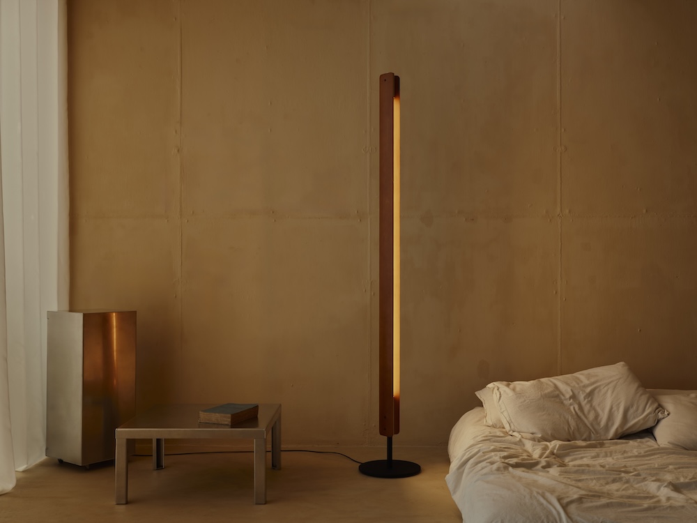
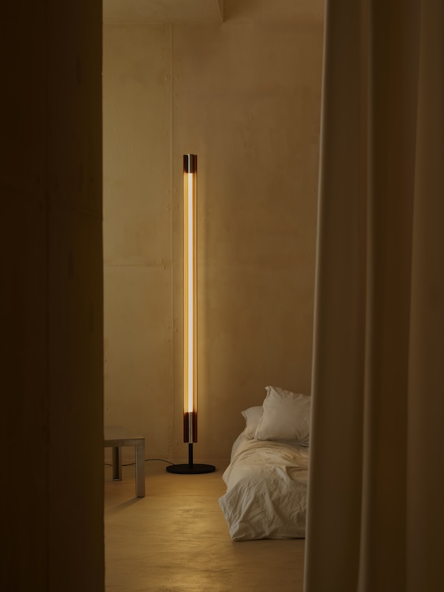
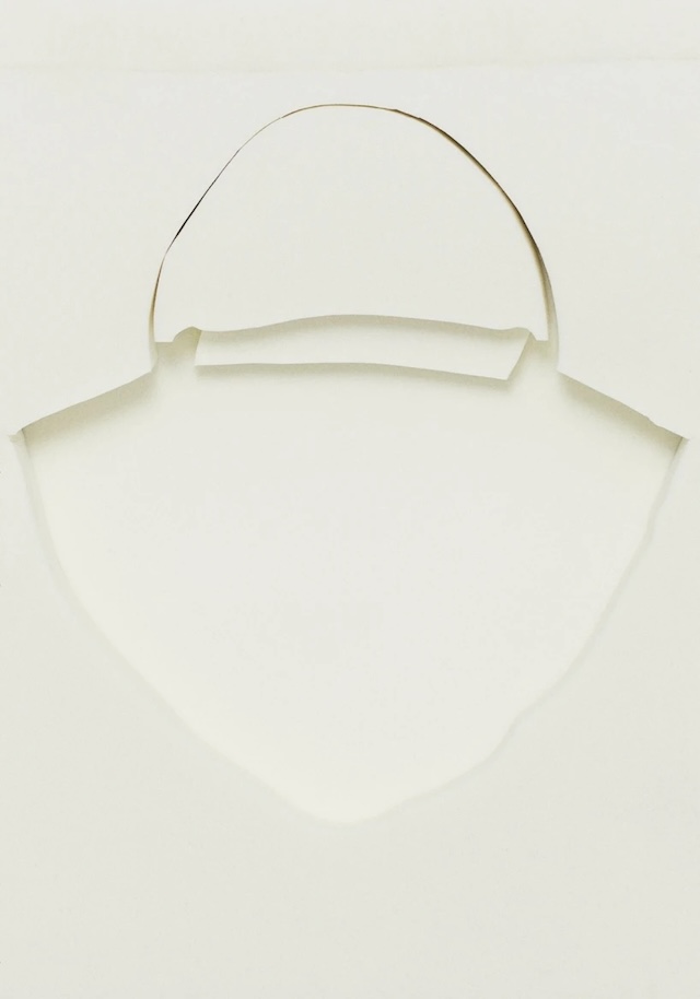
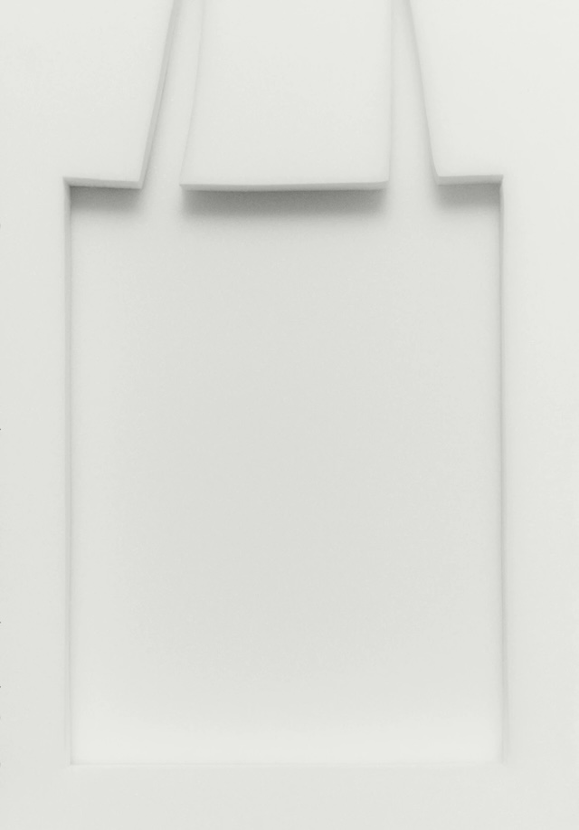
Seki-Han’s literal meaning in Japanese is ‘red rice’, a dish associated with celebration, and the phrase has taken on that added meaning. The light was launched in 1963, the year that Sergio Gandini took on the management of Flos, founded a year earlier in Brescia by Dino Gavina and Cesare Cassina, two of the key figures in post-war Italian design. “Everything was just beginning then and anything was possible,” says Tobia. “Everything could be invented and built. As a designer, I was able to use a pencil to generate ideas. I proposed things that didn’t exist at the time, and they weren’t always understood by those I proposed them to. We were able to do tests and simulations quickly, and so, through experimentation, products were born and Flos was born, and it grew through the evolution of dialogue with designers.”
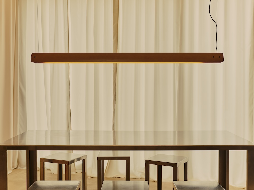
Seki-Han is developed in two versions – a floor lamp and a pendant – designed for use either standing or suspended. “We wanted the extreme simplicity of the design to make it suitable for all situations where a formally essential floor lamp of minimal bulk is needed. The possibility of suspending it horizontally made it suitable for lighting worktables in spaces intended for offices.” Tobia and Afra met as architecture students and set up a studio together that worked on projects that ranged in scale from furniture to the Benetton factories. “Afra and I were always involved in all the projects. The studio was very small, and it still is today.”
Piero Gandini, who took the decision to put Seki-Han back into production, first worked with Scarpa in 1991 when Flos was run by Gandini’s father. Tobia says, “I was working on the Pierrot desk lamp, as Piero himself reminded me during one of his visits to my studio to talk about the Seki-Han lamp. When he first joined the company, he asked his father if he could develop a project independently with the help of a technician. He selected a lamp that I had recently designed. Gandini’s account of it suggests that every time we reviewed the project, I urged him strongly to find better technical solutions, but I can say that, not remembering the events very well, he may have exaggerated a little.” The rate of technological change is much faster for lighting than it is furniture, and the new Seki-Han features modern electronics and an LED light source.
“The impetus to put it back into production came from Piero, who had a childhood memory of this object in a room in his family home. One day he took the lamp, loaded it into his car and rushed to my studio with a proposal to reissue it for the market, updating its technological apparatus. It was the chance to breathe new energy into a dormant – or abandoned – project that over time retains the value of the thinking that generated it. It brings me great joy to see the new vitality of this product and I observe with curiosity the result that emerges from it.”
Designer Max Lamb and Potato Head turn the detritus of luxury tourism in Bali into furniture and objects of function and beauty
Photography Adrian Morris
When Indonesian property developer Ronald Akili opened his first restaurant in Jakarta in 2009, he called it Potato Head. It was his way of differentiating it from the run-of-the-mill stylish eating in the city. For the initiated, the essential innocence of a Hasbro plastic toy from the 1950s would serve as a paradoxical signal of sophistication. Potato Head turned out to be the beginning of a hospitality brand that spread from Jakarta to become a resort in Seminyak on the island of Bali, and more recently a bar and restaurant complex in Singapore. Given Rem Koolhaas’ fondness for iconoclastic paradox, the founder of the Rotterdam-based architectural studio OMA was not an entirely surprising choice when Akili commissioned him to design the Potato Head hotel, which opened in Bali in 2020.
The Potato Head brand is based on a string of strikingly utopian promises. In the missionary prose of 21st-century marketing, it is based on “a zero-waste ecosystem where good times are reimagined as a catalyst for change – cultivating culture, restoring the Earth and nurturing community. Here, every element has purpose. Food and wellbeing nourish. Music connects. Art inspires. Circular design enables a regenerative way of life.”
Photography Adrian MorrisPhotography Adrian Morris
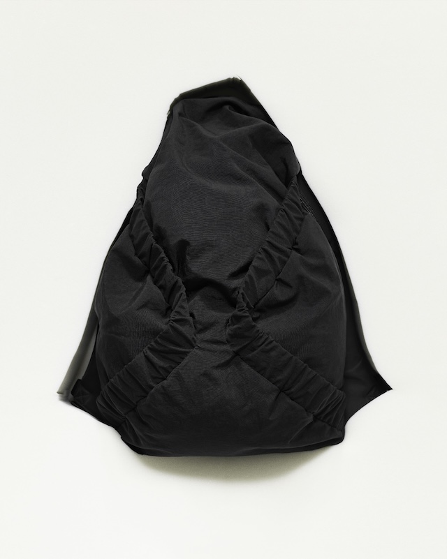
We have become so inured to relentless greenwashing that it is hard not to be sceptical. But Potato Head is certainly in it for the long term. Since 2018 it has been working with Max Lamb, the London-based maker and designer, trying to find ways to reduce the negative impact of luxury tourism on the environment and on traditional communities. While OMA were working on the hotel, Lamb made the first of several visits to explore ways in which Potato Head could create a range of products and furniture to equip the building when it was ready. “At first I thought that I would design items, and source remote production. But when I went to see the site, I understood that there is a large craft capability on Bali. Building relationships with what is available was the way to go.” The island’s network of craft workshops might not be able to make a blow-moulded plastic chair or pay for aluminium extruding tools, but they do have the ability to work with a wide range of materials to produce distinctive products. Lamb produced an intriguing range of designs, but once all the bedrooms of the hotel had been furnished, it was clear that it could not be the end of the story. “Everything was high-level quality, and quite desirable. People stole things, which suggested that it was suitable for a homeware collection.”
The Wasted collection is a much larger project than the original range for the guest bedrooms. It was designed to harvest all the various waste streams from the hotel’s activities, and to use the detritus as a raw material that Balinese craftsmen can turn into homeware products designed by Lamb, for sale at the hotel and beyond.
Photography Putu Eka Permata
Every year Potato Head, along with all the other luxury hotels in Bali, produces an apparently unstoppable flow of waste, from uneaten food to broken bottles, from single use plastic to cutlery and crockery. Both Akili and Lamb were acutely aware of the need to make something of this. “Bali is tourism-focused, the generation of waste is an island-wide issue,” says Lamb. “Potato Head is trying to capture waste. It has a sustainability director, and has worked with an outside agency that analysed all the waste streams: going through the statistics, seeing what was accumulating, and to understand what we could do with all of it.” Wasted products are based on eight distinct material families. One uses high-density polyethylene plastics; others are based on cooking oil residues, salvaged ceramics, broken glass, worn-out bed linen, composite waste materials such as polystyrene, and even oyster shells. “Most of the glassblowers source waste from construction sites and broken windows. Potato Head sends them their broken drinks bottles,” says Lamb.
“Bali is not really industrial, it is characterised by small village-based craftsmen; there are weavers, as well as a cluster of glass makers and blowers. They are all families, all multigenerational. It is large volume, but quite artisanal.”
Photography Adrian MorrisPhotography Adrian Morris
Lamb saw his role as devising a range of products using the available materials that would make the most of the capabilities of Bali’s artisans. “My own experience as a maker with my own workshop was helpful. I wasn’t just a designer doing a design on paper, it was a collaboration with each individual maker, so that I could give them what they needed to be able to make pieces. On paper it’s easy to model but making in volume for retail can be very difficult. Each object is singular, they are all quite simple. It’s not high design, it’s not elaborate: it’s functional and humble. The detailing is intentionally minimal, it has been a process of collaboration respecting what they can make well, what they can make consistently. I am singular in my focus on materials. So, every piece is all made in a single workshop.”
The first Wasted collection includes marbled plastic chairs, hand-shaped ceramics and lounge seating. At the time of writing, Potato Head is now waiting to see the results of its launch in the summer of 2025. It’s also working with seven other hotels and restaurants on Bali to process their waste. For Lamb the key to the project is to be agile. “To achieve an equilibrium we must be nimble in our designs and production, we have to follow the waste stream. It is a finite and moving target. If product demand exceeds waste stream, we can’t just buy virgin materials.”
This article is taken from Port issue 37. To continue reading, buy the issue or subscribe here
Photography Anselm EbuluePhotography Adrian MorrisPhotography Putu Eka PermataPhotography Adrian MorrisPhotography Putu Eka PermataPhotography Putu Eka PermataPhotography Putu Eka Permata
Port Horizons is a new travel series, with each edition focusing on a single location to explore how its architecture, makers and communities shape its cultural identity. For the first edition, we explore how Spanish moss, historic squares and a university called SCAD transformed America’s most beguiling Southern city
When you arrive in Savannah, Georgia, the first thing that slows your step is the Spanish moss, laced like silver tinsel through the branches of ancient oaks. It hangs low enough to brush your shoulder as you pass – and, as the locals warn, it often gets stuck in your hair. By late summer it sways in the humid air, softening the geometry of America’s first planned city. Savannah was laid out in 1733 by British general James Oglethorpe, its grid of 22 squares punctuating the streets with fountains, statues and benches, each framed by a patchwork of Colonial, Federal, Gothic Revival and Victorian buildings. Cast-iron balconies curl with vines, verandas sag in the heat, façades wear their history in layers of paint and weather.
Yet perhaps most noticeable are the large-scale Savannah College of Art and Design signs peppered throughout town. Painted on old brick warehouses, lit in neon above façades and stencilled onto doorways are four letters: SCAD. The Savannah College of Art and Design is everywhere, stitched into the city’s fabric like a watermark.
Founded in 1978, the university was the brainchild of Paula Wallace, president of SCAD, who envisioned a new type of art school – one that bridged creativity and professional practice. At a time when most creative colleges left careers to chance, SCAD was deliberately structured as an “art and design university where students are educated as creative professionals from day one – much like a medical school or law school, so that they might be propelled towards lifelong careers”, says Wallace. From its first cohort of 71 students, the school has grown into a global institution of more than 18,500 across Savannah, Atlanta, Lacoste in Provence and an online campus, offering over 100 degree programmes spanning film, fashion, photography, design, architecture, game development and more. Its “unofficial” motto, says Wallace, became “No starving artists”. Today that ethos manifests in infrastructure like SCADpro – an in-house design studio developing briefs for NASA, Gucci and Google – and resources ranging from a casting office to industry-standard production facilities. “Our philosophy is simple,” adds Wallace. “Reimagine with reverence.”
Wallace grew up in Atlanta, the daughter of May and Paul Poetter, a curriculum designer and a Bureau of Labor Statistics employee. By the age of 12 she was giving piano lessons to neighbourhood children, discovering early both her independence and her love for teaching. While working later as an elementary school teacher in Atlanta Public Schools, she became frustrated by what came next for her pupils: “I recognised a chasmic gap in higher education, which was too heavy on abstraction, too light on application,” she recalls. In the 1970s, art schools didn’t speak about careers. “You were left to fend for yourself. Whatever happened after university, that was a black box,” she says. “Not at SCAD. Every course would be designed to meet a professional need, a client’s need.”
Her parents backed the vision, selling their belongings and retirement savings to purchase SCAD’s first building, a derelict 19th-century armoury on Bull Street that became the university’s first classroom. Wallace describes Savannah at the time as “on her deathbed”, with historic structures crumbling, downtown hollowed out and young people leaving. SCAD has since restored more than 70 historic buildings, from depots and schools to warehouses and churches, giving them new life as classrooms, studios and galleries. Walk down Broughton Street, Savannah’s main commercial artery, and the logo can be seen on buildings such as SCAD Trustees Theater and Jen Library – located a few blocks down from Paris Market: an airy, Parisian-inspired concept store that has become a destination for design-minded visitors. Forsyth Park, over 30 acres of lawn and shaded pathways in the Victorian District, hosts Saturday markets, art festivals, and is an ideal place for student projects to spill out under its oaks. The Starland District, once semi-abandoned, now hums with converted dairies, galleries and cafes, many of them run by graduates.
That initial building – Poetter Hall – became the benchmark of it all, and today it houses SCADstory – an immersive, Disney-esque biography of the institution. “So many SCAD buildings have lived many lives,” Wallace says. “Former churches, schoolhouses, private residences, Savannah’s first hospital, first power station and others all transformed by the university through adaptive rehabilitation and upcycled into new purpose.” Vice president of SCAD Savannah, Darrell Naylor-Johnson, frames it as inseparable from the city’s rebirth: “What were once uninspired or abandoned spaces have been turned into vibrant, living models of design and artistry.”
The SCAD Museum of Art, housed in the 1856 Central of Georgia Railway depot, is a contemporary art museum and teaching space. Its 65,000-square-foot expansion added galleries, conservation labs, event space and a 250-seat theatre. Winter exhibitions include shows by contemporary international artists Rana Begum, Tomokazu Matsuyama, Davina Semo and Michi Meko
The SCAD Museum of Art epitomises this approach. Sitting on the city’s west side, just a short walk from the riverfront’s Plant Riverside District, the museum is housed in the 1856 Central of Georgia Railway Company depot – once worked by enslaved African Americans. In 2011, it was rescued from ruin and reimagined with alumnus and professor Christian Sottile. More than 70,000 original Savannah grey bricks were paired with an 86-foot glass tower, a soaring modern addition nicknamed the ‘Lantern’. SCAD’s choice to preserve and showcase the bricks is a way of acknowledging the past while embedding it into a space of dialogue and creativity. “This National Historic Landmark is the only surviving antebellum railroad complex in the US,” explains chief curator Daniel S Palmer. “The building’s precious salvaged Savannah grey brick and original heart pine timbers give the museum a vital sense of place and root us to the historic site, yet the brilliant adaptive reuse renovation allows for a state-of-the-art display and experience of art.”
Davina Semo’s exhibition A Gathering of Bells at the SCAD Museum of Art
Inside, as many as 20 exhibitions a year bring international artists into conversation with SCAD alumni. In recent months, shows have ranged from a solo show of Rana Begum called Reflection to Davina Semo’s A Gathering of Bells, alumna Summer Wheat’s Fruits of Labor and a group exhibition exploring myths and legends. The museum has just unveiled the world’s first exhibition of garments and other belongings from the late André Leon Talley’s personal collection – a project Talley himself had asked Wallace to oversee.
SCAD’s restoration work extends beyond the museum. The Beach Institute, founded in 1867 as the first school for African Americans in Savannah, was rehabilitated and donated by SCAD to the King-Tisdell Cottage Foundation, a landmark that “thrives as a vital centre for African American arts, culture and history”, says Naylor-Johnson. He adds, “As a Black Southerner, my return to the South – and to Savannah specifically – was influenced by SCAD’s presence. Savannah is a city with a layered and often difficult history, but SCAD has helped reframe that history by restoring neglected spaces, fostering inclusivity, and creating opportunities for global dialogue through art and design. SCAD’s presence demonstrates that the South can be both a guardian of its heritage and a leader in innovation. In doing so, the university has helped position Savannah as a cultural and creative capital, while also challenging historical narratives that excluded voices like mine.”
Spanning over 300,000 square feet, SCAD’s Savannah Film Studios includes the largest university backlot in the U.S., complete with an LED volume and Hollywood-scale sets – giving students a true-to-life film production experience
Savannah’s identity today is inseparable from the university’s cultural footprint. Each autumn, the SCAD Savannah Film Festival draws around 75,000 visitors, regularly attended by Barry Jenkins, Olivia Wilde and Jeremy Irons. Jenkins hired dozens of SCAD students for The Underground Railroad, while Todd Haynes shifted production of May December to Savannah after attending the festival. The city is also home to the Savannah Film Studios, the largest university film studio complex in the country. Spanning 300,000 square feet, it includes an LED volume, a Hollywood-style backlot, and a 17,000-square-foot production design facility. “SCAD has it all. In the School of Film and Acting we have an unwavering commitment to transform every class and student project into a ‘just like Hollywood’ or ‘just like Broadway’ experience,” says Andra Reeve-Rabb, dean of the School of Film and Acting. “At SCAD, students don’t just learn film, they live it.”
The fashion programme is no less visible. Alumnus Christopher John Rogers, winner of the CFDA/Vogue Fashion Fund and an LVMH Prize finalist, cut his teeth here; other graduates have gone on to LVMH and Nike. Former Style.com editor Dirk Standen, now SCAD’s dean for the School of Fashion, puts it bluntly: “We bring Paris and London and New York here.” The university recently launched a tailoring course in partnership with Savile Row stalwart Huntsman, embedding professional expertise directly into the curriculum. John Rogers remains closely engaged with SCAD students, while Flora Medina was hired by i-D’s Steff Yotka straight from campus. “It’s literally hand in hand – not only in terms of placing our students or partnering on conferences, but in embedding professional expertise into our curriculum,” says Standen.
Perhaps the clearest sign of SCAD’s embedded nature within Savannah is the number of graduates who stay and build their futures in the city. Leather goods brand Satchel, founded by Elizabeth Seeger, has become a fixture on Liberty Street. “At SCAD we were encouraged to use any and all resources at our fingertips and to think outside of the box to solve problems. Isn’t that entrepreneurship in a nutshell?” she says.
In the Starland District – now one of Savannah’s trendiest neighbourhoods – alumni have opened cafes, studios and galleries, helping anchor a creative community. Provisions, a hybrid cafe and pantry founded by graduate Nikki Krecicki, has become a downtown hub. Origin Coffee Roasters, launched by another alum, keeps students and locals alike fuelled. Laney Contemporary, run by a SCAD graduate, has established itself as one of the city’s most forward-thinking galleries. Elsewhere, Asher + Rye merges Scandinavian-inspired interiors with a lifestyle store, while jewellery designer Gillian Trask has built a namesake studio for her sculptural silver pieces.
SCAD also runs Gryphon, a tea room housed in a 1926 pharmacy, where students and alumni – like Aahana Tank, who’s studying themed entertainment design and has worked on two SCADpro projects with Universal – serve grits, quiche and sweet tea beneath stained-glass windows. Next door, shopSCAD acts as a storefront and showcase, selling student and alumni-designed works to visitors from around the world.
For Seeger, the appeal of staying is about more than a business opportunity. “I love that Savannah values quality of life,” she adds. “The city is beautiful, the people are lovely and it’s a laidback lifestyle.”
Tybee Island, about 18 miles east of downtown Savannah, is home to ~3,400 year-round residents, hosts nesting logger- head sea turtles and features one of the oldest operational lighthouses in the U.S
The work of SCAD graduates – whether running cafes, designing jewellery or staging exhibitions – wins awards, pays wages, fills hotel rooms and keeps studios in business. Meanwhile, blockbuster festivals and fashion events translate into production hires, tourist nights and local retail spend. A Tripp Umbach study found SCAD generated $1.3 billion in economic impact for Georgia in the 2023 fiscal year – roughly $1 billion of that attributable to the Savannah area. “Our capital projects employ local construction companies and workers, while our day-to-day operations rely heavily on area vendors, service providers and small businesses,” says Naylor-Johnson. Joe Marinelli, president and CEO of Visit Savannah, agrees: “Without what President Wallace and SCAD have done, it’s hard to imagine the community looking better.”
SCAD shows no sign of slowing down. In the past year alone it has launched new degrees in themed entertainment, cinematography and eyewear design. A Bachelor of Design in applied AI – the first of its kind – is beginning this term, empowering students to “shape intelligent systems with empathy, ethics and artistry”, says Wallace. “We launch new degrees that anticipate market demand – immersive reality, sneaker design, the business of beauty and fragrance.”
SCAD Beach is a 16,000-square- foot sand-filled courtyard built upon the former railway depot footprint. It includes sable palms, ambient lighting, cabanas and a lifeguard stand that doubles as an AV booth
Yet for all the scale, her vision remains intimate. She recalls a graduate who returned from India with his wife. “He described Savannah and SCAD as places ‘you want to fold up and put in your pocket, take with you wherever you go’. Our city and university reside in people’s hearts that way, carried with SCAD friends and alumni throughout their lives and careers.”
Nearly five decades after its founding, SCAD has grown into something larger than itself. Its home in Savannah remains unapologetically Southern – “The residents that live in Savannah are some of the most hospitable and welcoming that you’ll find anywhere in the country,” says Marinelli – but now, it’s layered with a new identity. A city of students, makers and dreamers, where the preservation of the past feeds directly into the future.
Noor Riyadh’s 2025 programme reflects a city in flux. From Al Faisaliah Tower to metro stations, 59 artists respond to Riyadh’s architecture, movement and rhythm with light as a connective medium
Shinji Ohmaki: Liminal Air Space-Time. Photo Noor Riyadh 2025
Noor Riyadh is a citywide light art festival that reshapes how Riyadh looks and feels after dark. Led by director Nouf AlMoneef, it spans metro stations, public squares and heritage districts, turning familiar sites into installations that respond to the city’s pace and scale. Launched in 2021 under Riyadh Art and the Royal Commission for Riyadh City, it has become what’s considered the world’s largest light art event, presenting more than 550 works by 500 artists and drawing over nine million visitors. Its aim is to commission public artworks from Saudi and international artists and to use light to connect Riyadh’s cultural and urban zones. For 2025, curators Mami Kataoka, Sara Almutlaq and Li Zhenhua work under the theme In the Blink of an Eye, a reference to the city’s rapid development.
This year’s edition – which closes on 6 December – features 60 artworks by 59 artists from 24 countries, including 35 new commissions. László Zsolt Bordos’ Astrum turns Al Faisaliah Tower into a real-time planetary compass, its 7km laser beams mapping celestial movement. At KAFD Metro Station, Vali Chincișan’s The Vision Grid converts the facade into a shifting lattice of colour and sound. Christophe Berthonneau’s Synthesis, made with Bordos, merges drone choreography and architectural mapping so a building appears to lift and reassemble itself. fuse*’s Luna Somnium builds a large-scale metal framework animated with lunar data. James Clar’s When the Sky Reaches the Ground (a moment frozen) suspends a sculptural ‘lightning bolt’ made of neon and scaffolding. Saudi artists include Fatma Abdulhadi, whose fabric-based Keep your eyes on the light: Into Another Garden explores shadow and reflection, and Ahmad Angawi, whose Algorithms of Light: The Falcon draws on Najdi Sadu patterns and falcon iconography. Alex Schweder’s Clockwise Invitations is an inflatable environment that expands and shifts with its visitors.
Since its early editions, Noor Riyadh has grown into part of the city’s cultural infrastructure. Below, AlMoneef discusses the festival’s evolution, the logic behind its six hubs, the criteria shaping artist selection, and the moments she hopes visitors notice.
Fuse: Luna Somnium. Photo Noor Riyadh 2025
Port: You’ve been director of Noor Riyadh since its early editions. What does this iteration feel like to you personally, and what is it trying to do differently?
Nouf AlMoneef: Every edition carries its own identity, but In the Blink of an Eye feels especially close to the current spirit of Riyadh. Since the festival launched in 2021, I have watched the city transform at remarkable speed. This year reflects that momentum in a very direct way. It brings light into spaces that express both our heritage and our modern urban rhythm, while placing even greater emphasis on accessibility and public experience. What feels different is the immediacy. The festival responds to a city that is constantly shifting. Light becomes a way to pause, notice change, and reflect on how quickly our surroundings evolve.
How would you describe this year’s theme, In the Blink of an Eye, and how did it shape your approach to the programme?
The theme captures the pace of Riyadh’s transformation. It speaks to how rapidly life is moving, how innovation shapes our environment, and how perception can change in a single moment. Light naturally conveys speed, energy, and transition, which made it the ideal medium for this edition. The curatorial team, led by Mami Kataoka, with Sara Almutlaq and Li Zhenhua, explored these ideas through artworks that shift, react, or transform as audiences move through them. The theme shaped the programme by encouraging artists to experiment with perception, memory, and the movement of the city around us.
Encor Studio: Sliced. Photo Noor Riyadh 2025
The festival spans historic and emerging zones across the city. Can you tell us about these locations and how you decide which works go where?
Noor Riyadh 2025 unfolds across six hubs and locations: Qasr Al Hokm District (Hub), King Abdulaziz Historical Center (Hub), stc Metro Station (Hub), KAFD Metro Station, Al Faisaliah Tower, and Riyadh Art Hub at JAX District. Each carries its own narrative and atmosphere. In the historic areas, artworks interact with architecture that holds the city’s memory. We look for installations that respond to heritage through material, scale, or rhythm. In the metro stations and contemporary hubs, the focus is on movement and modernity. These environments naturally lend themselves to works that explore data, sound, flow, and digital expression. Placement is always intentional. We consider the artist’s vision, the spatial character of each hub, and how the overall journey will feel as visitors move between traditional and modern spaces.
This edition presents 59 artists with more than 35 new commissions. What criteria guided the curation?
The selection balanced several key considerations. Alignment with the theme: every work needed to respond authentically to the idea of rapid transformation and shifting perception. Diversity of international and Saudi voices: artists represent 24 nationalities, including a strong Saudi presence that reflects the country’s evolving creative landscape. Innovation in light-based practice: we invited artists who experiment with technology, kinetic movement, or immersive forms of storytelling. Sensitivity to site: each commission had to fit its location, whether a historic street or a fast-moving transit hub. Public experience: the festival remains open and free, so works are designed to be intuitive, welcoming, and engaging for all ages.
Shinji Ohmaki: Liminal Air Space-TimeShinji Ohmaki: Liminal Air Space-Time
If you had to highlight two or three works that capture the heart of the festival, which would they be, and what moments do you hope audiences notice
Several works express the essence of this edition. The commemorative installation for Safeya Binzagr is a tribute that honors a pioneer of Saudi modern art. It connects the past to the present and invites visitors to reflect on the legacy that shaped today’s creative momentum. Ayoung Kim’s installation at Riyadh Art Hub at JAX District: her work explores shifting temporalities and cultural cosmologies through light and movement, inviting audiences to reflect on different ways of perceiving time. New commissions from artists such as James Clar or Muhannad Shono explore perception and identity in ways that resonate with the theme and the atmosphere of the city. What I hope people notice are the subtle details. The way light shifts against a facade, how a work responds when you walk past it, or how an installation transforms a daily commute into an unexpected moment of reflection.
Noor Riyadh is often described as a point where art and technology meet. How do you see advances in light-based technology reshaping public art?
Technology broadens the possibilities of public art. Tools such as AR, AI and advanced projection systems allow artists to work with movement, interaction and environmental data in new ways. These tools also enhance emotional connection. They can turn a metro station into an immersive landscape or translate the rhythm of the city into light and sound. What matters most is not the technology itself, but how it deepens the experience. When used thoughtfully, it helps audiences feel more connected to their surroundings and to the stories we want to share through the festival.
Encor Studio: Sliced. Photo Noor Riyadh 2025
How has Riyadh’s art scene evolved in recent years, and what role has Noor Riyadh played?
Riyadh’s cultural ecosystem has expanded significantly. New institutions, public art programmes and creative platforms have helped build a vibrant artistic landscape. Noor Riyadh has supported this growth by presenting large-scale light artworks in public spaces and by inviting both Saudi and international artists to engage with the city. Since its launch, the festival has presented more than 550 artworks by over 500 artists, attracting more than 9.6 million visitors and spectators. The community engagement programme – including workshops, school visits, talks and guided tours – has also been important in creating new art enthusiasts and building long-term cultural curiosity.
Looking ahead, how do you hope Noor Riyadh will evolve? What ambitions or challenges feel most urgent for its future?
I hope the festival continues to grow in a way that reflects the evolving character of Riyadh. The ambition is to expand the breadth of light-based creativity, support more Saudi talent, and keep strengthening the connection between the public and the city’s artistic identity. As Riyadh develops, one of the key challenges is to ensure that public art remains accessible and meaningful. We want Noor Riyadh to stay rooted in inclusivity and to offer experiences that resonate with residents and visitors alike.
Ultimately, the goal is for the festival to evolve in step with the city, providing new perspectives on Riyadh’s changing landscape and inviting people to experience its transformation through light.
Noor Riyadh runs until 6 December, find out more here
Fuse*: Luna Somnium. Photo Noor Riyadh 2025Zhang Zengzeng: The Light To Home. Photo Noor Riyadh
In 1966, Robert Rauschenberg and Billy Klüver founded Experiments in Art and Technology. Pairing artists with engineers, EAT produced fog-filled pavilions, laser performances and early uses of fibre optics. Its story reveals how collaboration reshaped art forever
Image of Frosty Myers with tower. From Frosty Myer’s ‘Light Frame’ sculpture, engineering by Pichel Industries
Today the intersection between art and science or technology feels so normal it barely raises an eyeball. We are used to immersive digital installations, LED screens, kinetic robotic sculptures, augmented reality, VR, AI and everything in between. Once upon a time, however, the idea of these kinds of interactions between art and other mediums was unheard of. That was until Experiments in Art and Technology – known as EAT – exploded in the 1960s. It is arguably ground zero of the art we know today. Its legacy cannot be underestimated, and its story is a fascinating and intuitive one.
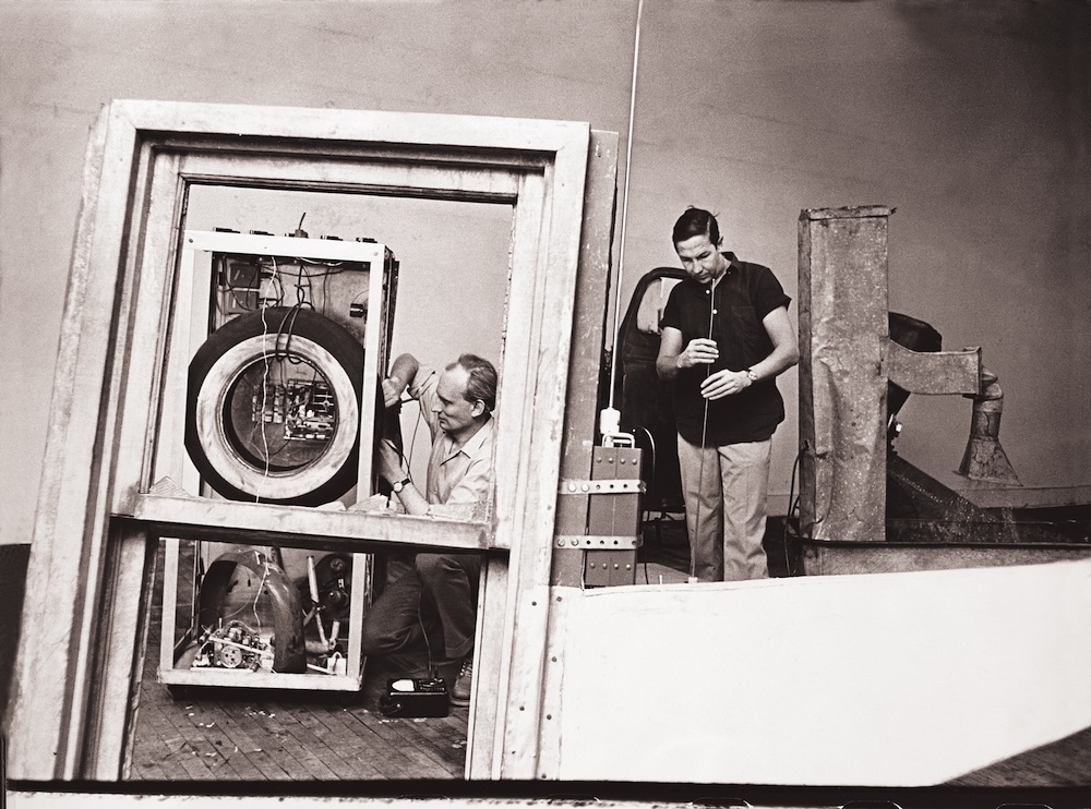
The instigator for this fascinating crossover was Billy Klüver, who was born in Monaco and brought up in Sweden, where he studied Electrical Engineering in Stockholm. It was at the university film club that he first crossed over into the art world, making friends with artist Öyvind Fahlström and curator Pontus Hultén, who would later become director of the iconic Stockholm museum, Moderna Museet. He worked in Paris for a couple of years, where he was introduced to kinetic artist Jean Tinguely – known for his moving, wiggling sculptures. Klüver went to California in 1954 to complete a PhD at the University of California, Berkeley. When he graduated three years later he went to work in the communication and research department of what was then cutting-edge tech – Bell Telephone Laboratories in New Jersey. When Tinguely came to New York City in 1959, he needed help designing a timing mechanism for a 27 by 23ft sculpture he was creating at MoMA. He wanted the artwork to dismantle itself with the press of a button.
EAT: ‘Pepsi-Cola Pavilion in fog’ for the Expo ’70, 1970. View from the back
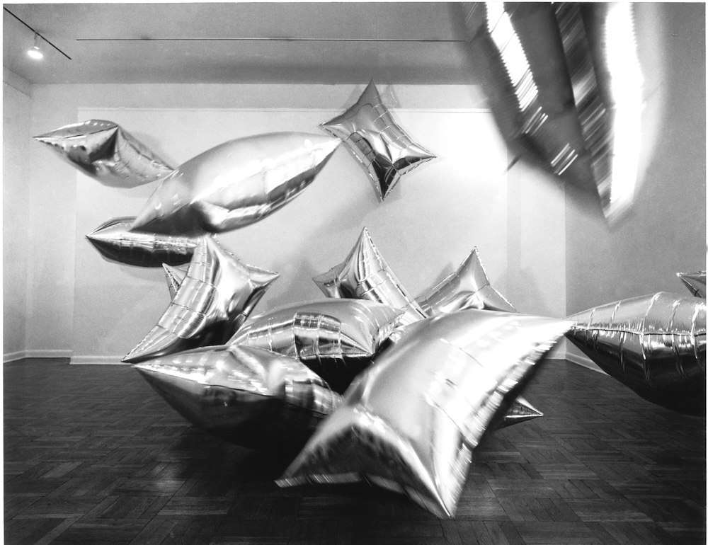
Klüver became the go-to guy when artists wanted to experiment. Things really kicked off when he began to work with Robert Rauschenberg in 1960. The American artist had already started to develop his signature take on pop culture painting, incorporating elements of magazines into otherwise abstract works. He was also simultaneously experimenting with sculpture and wanted to embed wireless radios into a group of works – far before portable electronics were widespread. Klüver integrated battery-powered lights into Jasper Johns’ paintings, and he sourced the metallic material for Andy Warhol’s ‘Silver Clouds’ in 1966. Klüver was an inventor and visionary, unafraid to make what would seem impossible possible. He worked with Yvonne Rainer in 1964 and created a portable microphone to project her breathing mid-performance. The idea of body-object interaction changed performance art completely. Klüver was boundaryless in his desire to enable an artist’s vision. In many ways, the EAT collaborations helped cement the focus on concept over aesthetics.
1966 was also the year that Rauschenberg and Klüver founded EAT. Its aim was to create a space of collaboration between art and technology, and its first event was 9 Evenings: Theater & Engineering which featured 10 performance artworks and took place at the 69th Regiment Armory in New York City. The pieces paired 30 engineers from Bell Labs with artists working in dance, sound and theatre. The artists who took part are now viewed as some of the most important of the 20th century. There were sound pieces by John Cage, David Tudor and Rauschenberg; dance works by Yvonne Rainer, Lucinda Childs and Deborah Hay. The pieces included fibre-optic cameras, closed-circuit television, portable radio transmitters and sonar devices. The event had a phenomenal response from the New York City art world. Part of what was so exciting was the idea of repositioning where the conception of the art world was – in some “unknown place somewhere between engineers and themselves”, as Simone Forti stated in Artforum the following year. Buoyed from the events, Rauschenberg and Klüver invited artists to turn up to be introduced to engineers. 300 artists came and there were 75 requests for collaboration. EAT was born.
Robert Rauschenberg: ‘Oracle.’ Engineers: Billy Klüver, Harold Hodges, 1962-1965Installation view of Andy Warhol’s ‘Silver Clouds’ at Castelli Gallery, 1966. The Andy Warhol Foundation. Engineers: Billy Klüver, Harold Hodges
Over the next two decades, EAT grew to include thousands of members. Hundreds of collaborations were created between artists and engineers. The pairing process used edge-notched cards, a little like the computer cards of the era, that would be organised by the engineer’s name with clipped holes for their speciality. A request would be punched in using knitting needles, apt engineers would come out, and the names were shared with an artist. It was a bit like a creative matchmaking service. The project entered the canon. In 1968 they worked with MoMA on an open call competition that was so large it had to be exhibited across multiple institutions – the Brooklyn Museum showed Some More Beginnings and a number of EAT artworks were included in MoMA’s highly influential show, The Machine as Seen at the End of the Mechanical Age.
Julie Martin worked with EAT initially because she was assisting artist Robert Whitman. “I was working for Bob Whitman as a stagehand. Once 9 Evenings started everybody got involved. I remember working with Pontus Hultén on a catalogue and finding photos or editing. After nine evenings, Klüver and Fred Waldhauer asked me to join as editor of the newsletter. Artists, and not that great spellers…” she recalls. “As things developed, I just kept working there.”
Some More Beginnings: Experiments in Art and Technology at Brooklyn Museum, November 25, 1968-January 5, 1969. ‘Fakir in 3/4 Time’ by Lucy Young and engineer Niels Young
There was something utopian about EAT. It was driven by the idea that creative endeavours were vital to shift the path of machine-led progress. “That artists and engineers could get together and build something for the future – using a new technology to improve people’s lives. Less aesthetics and more active in society and utility.” In that era, there was hope and positivity around the possibilities of technology. There was a hope that working with artists would also influence engineers. “The idea was that the engineer working with the artist would somehow see his or her role differently, and might see other ways that they could use their skills in society,” Martin explains. “Fred Waldhauer is a perfect example. He was working with David Tudor. His mother was becoming deaf. He said he listened to the radio in the car and got the idea of a hearing aid that could be programmed to help people who are losing their hearing. He left Bell Labs and started a company to make the hearing aid. It became the model for things that came later. That’s an example of somebody who really went out into society.”
The pinnacle of EAT would be the Pepsi Pavilion for the Japan World Exposition in Osaka in 1970. It was created by a number of artists, including Robert Breer, Frosty Myers, Robert Whitman and David Tudor. It consisted of a Buckminster Fuller-inspired geodesic dome whose interior was covered in mirrors – a “Bucky solar dome”, as Julie Martin, who worked on the project describes it. “The artists hated it. First, they decided to cover it,” she recalls. The idea was to surround it with fog – but the process didn’t exist yet. At that point the American technique of using carbon dioxide would attract every mosquito in the fair. “When we got to Japan, the group worked with Fujiko Nakaya, who was an artist. She knew Bob Rauschenberg from his trip there. She was working with a kind of desktop fog.” She agreed to create the fog – without having an actual idea of how to do it. She connected with engineer Tom Mee, and the project gave birth to her practice – an ethereal, floating sea of mist made from small droplets of water.
In this mist, Breer developed six-foot-tall moving sculptures. These white, abstract, domed objects moved very slowly around. Myers made a night piece out of four towers projecting columns of light into a linear form around the pavilion. Inside the dome, David Tudor created a laser work that made patterns on the floor and showered people with light. “The dome was actually a 90-foot-diameter dome made out of reflected plastic. Our architect, John Pearce, figured out how to pull a vacuum between the dome and the cage so it was held up by negative pressure. You could see real images around the floor, upside down in space. People could go in and see themselves in space.” Martin recalls. The intention was to have performances programmed through the pavilion but Pepsi pulled out – confused about what they were funding. The project remains one of the most memorable and haunting works of the era. A truly immersive experience.
EAT never kept track of the outcome of the hundreds of introductions and pairings it made over two decades before it gradually disbanded. Its legacy, however, can be seen in many art practices today. What makes EAT so fascinating is how the project broke boundaries. It was the first time where time became a truly present element in art. Object, experience, performance, architecture all blurred. The idea of collaboration, rather than the single ‘artist-genius’, was truly present here. The idea that working together, artists and engineers could reach beyond their fields. That art was not just representation or decoration but something with serious, social purpose. That art could change the world.
Sensing the Future: Experiments in Art and Technology (E.A.T.) is on view at LUMA Arles until January 11, 2026, find out more here
This article is taken from Port issue 37. To continue reading, buy the issue or subscribe here
Billy Klüver talking to the fireman during the performance of Jean Tinguely’s ‘Homage to New York’ at MoMA, 1960. Photo: David GahrYvonne Rainer performing ‘At My Body’s House’ in 1964. Photo: Peter Moore. Engineers: Billy Klüver, Harold HodgesThe armoury floor with David Tudor performing. Photo Peter Moore. David Tudor: ‘Bandoneon !’ Performance Engineer: Fred Waldhauer. October 14 & 18, 1966. TV Images: Lowell Cross. Cart controllers: David Behrman, Anthony Gnazzo, Larry Heilos, Per Biorn
The final film in PORT and Sage’s The Art of Duality series follows designer and gallerist Max Radford in his South London home and gallery. Between sketching, research and curating what he calls “radical design”, Radford’s day moves between fast-paced projects and slower, reflective moments – with the Oracle™ Dual Boiler coffee machine threading through both
Max Radford is an interior designer, gallerist and curator of emerging British furniture talent. His eponymous gallery showcases both contemporary innovators and iconic design pieces, reflecting his philosophy that objects should hold value through presence and engagement rather than transaction alone. Radford’s journey spans fine art studies, early experience with an antique dealer and years of cultivating a nuanced eye for materiality and form. He has collaborated with brands such as Ercol, Aram Gallery and LS Gomma, and archives his work and insights via his interiors Substack.
A typical day for Radford involves balancing his dual roles at his gallery and studio. “My weeks are very varied, having two different businesses as a gallerist and also as an interior designer, you have to balance those things,” he says. At home, he switches between focused creative work – like drawing, research and sketching – and domestic tasks, moving between desk, dining table and a small cubby by the kitchen. His home doubles as both sanctuary and studio, a space that allows calm reflection alongside bursts of high-focus activity, whether planning exhibitions, conceptualising furniture layouts or organising objects for the gallery. He spends time reading, scanning magazines, listening to records and lighting incense, crafting moments of quiet within a busy schedule.
Coffee is what drives these different modes. “I always have to start the day with a coffee. Nice and easy flat white on auto mode in the morning,” he says. In the afternoon, he opts for a “nice, slow” pour-over Americano. The Sage Oracle™ Dual Boiler mirrors this flexibility with its auto and manual modes, enabling Radford to switch between automated efficiency for morning routines and manual precision for when he has time to explore his craft. By using the new Auto Dial-in system, which monitors each extraction and adjusts the grind size automatically, Radford is able to achieve the perfect brew every time. “The duality of the machine is something that is certainly great for our lives. We’re easily able to just make a coffee in the morning, pressing a button, or you can fiddle around and learn how to make coffee on the weekends,” Radford adds.
Looking ahead, Radford plans to expand the gallery internationally while continuing to platform London’s emerging design talent. His home and daily practices remain a laboratory for ideas, where coffee and creativity live in harmony. “The pieces of furniture that we work with within the gallery are regarded as something called collectible design, but we like to call it radical design,” he notes.
This is the closing film in the PORT x Sage The Art of Duality series. Relive the earlier stories with Rejina Pyo and Jordan Bourke here, and Thomas Straker here.
Production Studio Union
Exec producer Dan Pickard
Director & DoP Theo Tennant
Lighting & camera assistant Matt Bramston
Hair & makeup / groomer Margherita Lascala
Port producer Jack Stacey
Port editor Ayla Angelos
Production assistant Annabelle Brown
Barista / drinks stylist Luke Lane
Edit Ned Donohoe
Edit David Tse
Colourist Lucrezia Pollice
Dub Tom Guest
EMEA PR & Partnerships manager Kira Schacht
Breville Group General manager, global communications Lucy Martyn
Concept agency John Doe
Since its founding in 1985, SCP has nurtured generations of talent, from Jasper Morrison to Andu Masebo. As it marks 40 years with an exhibition tracing its legacy, its influence on contemporary design remains undeniable
Chair by Jasper Morrison for SCP 1986
While London is still a city in which many of the world’s most successful designers live and work, if they want to make furniture on an industrial scale, they have to travel. The influential manufacturers for the upmarket home are mostly Italian or Danish, with some of the best-known names, such as Cassina or Hay, being American-owned. Vitra is Swiss, though its biggest factory is in Germany.
There are a few exceptions: foremost, Sheridan Coakley, who started making furniture in 1985 when he set up SCP with a showroom in Shoreditch. As a brand name, it showed a certain degree of self-awareness. Coakley had begun his career with a shop located off London’s Portobello Road selling vintage tubular steel chairs made before World War II by Practical Equipment Ltd, known by its initials as PEL.
Topside stool by Andu Masebo, designed for the SCP Boxed Collection
But Coakley has never been about nostalgia; he wanted to sell new designs, and to make things on his own account. He had seen Café Costes in Paris the previous year, the bar that made Philippe Starck into a design world celebrity, and he opened his own showroom with an exhibition of Starck’s playful furniture designs. Forty years later, SCP is one of the few British brands that is still making innovative design. It is celebrating with an exhibition in its Shoreditch base titled An Imperfect Archive, that includes prototypes and pieces by a remarkable collection of designers, architects and artists, from Jasper Morrison to Rachel Whiteread. At the same time, Coakley has commissioned a range of new work that SCP launched in Milan in April.
Coakley’s imperfect archive, one which was built up almost absent-mindedly, serves to illuminate 40 years of contemporary culture in Britain, a period during which SCP has served as a crossover point between design, art, music and politics.
Now that the 1980s have receded far enough into history’s rear-view mirror to take on a certain period charm, it’s easy to forget that 1985 was a lot less fun than it might look from today’s distance. Margaret Thatcher was halfway through her 11 years as prime minister. The British had gone through a war in the Falklands, 3.4 million unemployed, a confrontation with the miners, riots in Brixton and Katharine Hamnett’s trip to Downing Street wearing a T shirt emblazoned with the message “58% don’t want Pershing”.
Hoop Daybed by Tom Dixon for SCP 1998
Factories were closing, manufacturing was moving to Asia. Students trained as ‘industrial’ designers had no industry to work for, creating a phenomenon documented in a prescient exhibition at the Crafts Council titled Industry of One: Designer Makers in Britain 1981-2001. Jasper Morrison, Ron Arad, Tom Dixon and others tried to unlock the potential of mass production by initiating the manufacturing process themselves, using found objects and technology as best as they could to produce what were essentially one-offs.
Against this background, SCP was almost on its own in being prepared to manufacture the work of a talented generation of young designers. Coakley was the only person in Britain interested in turning Morrison’s ideas into commercial products, or those of Matthew Hilton, or Konstantin Grcic. Thirty years later he was one of the first manufacturers to work with the Canadian designer Philippe Malouin.
In the early 1980s Jasper Morrison was still a student at the Royal College of Art, and started coming to SCP to see what interesting new things Coakley had in stock. The graphic designer Peter Saville had just moved to London from Manchester and was ready to barter a logo design for the pieces he needed to furnish his flat.
Side Tables by Jasper Morrison for SCP 1986
Coakley had the ambition to look beyond the sometimes parochial nature of the London design scene. He took SCP to Milan’s Salone del Mobile. In the 1990s, he made possible a pioneering project (Please Touch) involving artists, including Rachel Whiteread and Michael Craig-Martin, in design.
The endless years of the Conservative government finally came to an end when Tony Blair came to power. Peter Mandelson had already been photographed for Vogue by Tony Snowdon seated in his leather Balzac club chair that Matthew Hilton designed for SCP. When Mandelson became a government minister his department bought another one for his office. Contemporary design became a signifier for Britain and SCP was an essential part of its vocabulary.
In 2003, SCP acquired upholstery works in Suffolk. It was the start of the company’s commitment to manufacturing, and also to phasing out the use of foam, which is both unsustainable, and (because of UK regulations) treated with potentially harmful chemicals. In recent years SCP has made all its own designs foam-free.
Stool by Andu Masebo The Boxed Collection SCP
SCP has been shaped by Coakley’s particular sensibility. He has always been ready to work with a wide variety of voices: Nigel Coates’ anthropomorphism; the reduced-to-the-essentials work of Jasper Morrison, Terence Woodgate and James Irvine. He has worked on textiles with Donna Wilson, and with Reiko Kaneko to make ceramics and fine bone china in Staffordshire. He is open to new ideas wherever they come from. SCP works with graduates of Design Academy Eindhoven, as well as Brooklyn start-ups, such as Piet Hein Eek and Rich Brilliant Willing, Fort Standard and Pearson Lloyd.
Coakley has continually set out to find new things, or new ways of doing old things, that interest him. It is perfectly true that we have worked through many conceivable approaches to designing a chair. But that does not mean that we should stop trying, any more than we will stop designing new shirts. Furniture, seen through the lens of 40 years of SCP, is a reflection of the wider sensibility. An interior in 2025 is not the same as an interior in 1985. SCP, and Coakley, have done more than most people to shape both.
This article is taken from Port issue 36. To continue reading, buy the issue or subscribe head here
Inspired by côte&ciel designer Emilie Arnault’s sculptural approach, architect and spatial artist Alberto Simoni of asprostudio.eu has created an installation that frames the FW25 collection as weightless, architectural forms
Emilie Arnault, head of design at côte&ciel, names Antoine de Saint Exupéry, the French pilot and author of The Little Prince as the inspiration behind Stratus, the brand’s new collection. “I pictured a puzzle made of sky, clouds, aircraft and parachutes through the eyes of a child.” Some bags fold like origami; others appear deconstructed, stripped to their bare bones. There’s an ethereal sense of weightlessness about them – a balance between volume and form, as if each piece had been caught in mid-air, billowing before flight.
Since its founding in 2008, Arnault has been at côte&ciel from the very beginning, guiding the design of its collections. Over the years, the brand has also embraced the philosophy of “bags to wear, not to carry”, as explained by Arnault. Their bags interact with the wearer, adapting to the body like a garment. “The more abstract the body looks, the deeper you feel the connection, as if the bag was a part of the outfit,” says Arnault. Previous examples include the cocoon-like Isar backpack, the circular Moselle and the hooded Nile.
To introduce the Fall/Winter 2025 collection, côte&ciel unveiled Soft Sculptures during the Paris Fashion Week, an installation with Milan-based architect Alberto Simoni of asprostudio.eu. Over 30 foam sculptures were constructed and presented as columns of yielding material supported by wooden frameworks: without the foam, the structures would sway. “The core idea was to bring attention to the design itself,” says Simoni. “côte&ciel bags incorporate many details that emerge naturally from the construction process – details that are deduced rather than deliberately selected or positioned. While the bags appear rigid and structured, they are actually built on a soft framework.” The squishy foam blocks, sculpted to house the negative space of the bags, create an illusion of solidity, mirroring the way that the côte&ciel bags are formed.
“Emilie explained that she approaches bag design from a sculptural perspective, building the volume from two-dimensional textiles and refining it through prototyping. This was a key insight for the project,” Simoni says. Polyurethane, an everyday material, took on a key role. “Inspired by Emilie’s process, I imagined a sculptural approach – tracing the extraction of the bags from a solid block of material and displaying the negative space left behind. The negative space, shaped around the body, defines the bag’s actual volume when it is worn on the body.” Seeing her designs presented as sculptures was a moment of affirmation for Arnault. “When Alberto dared to showcase the bags as if they were sculptures, it worked so well that for a second, my impostor syndrome vanished,” she says. “That’s what happens when you meet someone who sees the world as you do – pure, selfless satisfaction.” Simoni hopes the installation offers the same sense of openness. “The sculptures are intentionally imperfect, the images are intentionally off-centre, things aren’t ‘designed’ specifically for a space. We wanted to create something without too many preconceived barriers or limitations; exactly how Emilie designs her bags.”
This article is taken from Anima Issue 3, to purchase a copy or subscribe head here
Digital platforms are changing how we discover, judge and read books, but what does that mean for the art of cover design? Below, Ayla Angelos speaks to Na Kim, Alex Merto, Coralie Bickford-Smith and Rush Jackson who each share their insights
Alex Merto: Among Flowers by Jamaica Kincaid
You step into a bookshop – perhaps Daunt Books or Libreria, if you’re in London. Your hand glides across a row of spines, fingertips catching on raised titles, debossed illustrations, the gloss of a foil-stamped name. A single book catches your eye. The cover is bold, enigmatic, resisting instant interpretation. You pick it up immediately and take it to the till.
Online, it’s different. Probably on Amazon, you scroll too fast and everything blurs into a sea of thumbnails, covers designed for algorithms. At the moment, book design is being pulled in two opposing directions; one towards clickable, hyper-optimised visuals, the other back to the tactile, crafted forms. Somewhere in that tension, the book cover is shifting.
Before book covers were designed to sell, they were built to protect. Early books were bound in leather, embossed with gold leaf, sometimes clasped shut like vaults. They were objects of rarity, more sacred than commercial. That changed with the rise of mass printing. Dust jackets emerged in the 19th century, first as disposable wrappers and then as a canvas for design. By the mid-20th century, the modern book cover had found its form with bold, abstract graphics designed to grab attention.
Na Kim: Alphabetical Diaries by Sheila Heti
Penguin’s classic tri-band paperbacks are perhaps the most well-known example of effective book cover design. Introduced in 1935 by founder Allen Lane, the covers became an early exercise in branding. Designed by Edward Young, who also drew the penguin logo, they featured a standardised layout with three horizontal bands, colour-coded by genre – orange for general fiction, green for crime, blue for biography and so on – allowing readers to instantly recognise the type of book they were picking up.
Meanwhile, designers like Alvin Lustig revolutionised book covers in the 1940s and 50s, bringing modernist abstraction to the form. His influence continues today in figures like Irma Boom, dubbed the ‘Queen of Books’, who treats each project as an object rather than just a container for text.
Today, book cover design is at a crossroads. AI-generated imagery and algorithm-driven marketplaces have reshaped how covers are created, producing efficient but often generic designs. And yet, there has been a resurgence of craft – a digital resistance of sorts, keeping the art of book design alive.
Na Kim: The Sun Walks Down by Fiona McFarlane
Na Kim, creative director at Farrar, Straus and Giroux and art director of The Paris Review, is part of this movement. A painter as well as a designer, she draws inspiration from the physical world: “I don’t find too much inspiration behind the screen,” she says. Instead, she seeks out sensory details – like certain moods, the colour of the sky on a particular evening, or a texture of an object – and uses them to shape her creative instincts. “Cataloguing these things helps me in my process and pursuit of making something feel true or real. You have to practice noticing things, and finding beauty in the world.”
Kim always reads the book before designing, and lets the author’s writing guide her – the structure, pacing, mood and message. She begins by establishing the book’s tone, absorbing the rhythms and atmosphere before translating them visually. For Yiyun Li’s The Book of Goose, a novel she describes as “cutting, deft, vivid yet simultaneously lyrical and lush”, Kim sought to capture that duality with graphic elements and a pastoral image. Designing Sheila Heti’s Pure Colour felt like “a meditation, or entering a flow state”, which translated into a simple and large green splodge centred on the page. Justin Torres’ Blackouts evoked “layered thick air and discovering new things from room-to-room”, inspiring a cover that mirrors that sensation – dark, smoggy and unsettling.
But as much as Kim’s process is rooted in intuition and deep engagement with the text, she’s also aware of how digital culture has reshaped book design, and therefore our relationship with consumption. “It’s become the filter for everything. Even if somebody buys a hardcover book, their first contact with it is probably digital. The speed in which the digital world is evolving also requires us to constantly consider how to capture the attention of a potential reader.” She cites a study by the American Psychological Association that found the adult attention span has dropped from two and a half minutes in 2004 to just 8.25 seconds in 2024. “It’s a hard gap to accommodate. It requires constant repositioning and reinventing the way we make books.”
This shift has made designers more conscious of marketing-driven aesthetics and the pressure to conform. “Maybe taking risks isn’t affordable anymore,” Kim reflects, acknowledging how algorithmic trends can stifle originality. “But I bet if designers were given more trust, the covers would feel less homogeneous.”
Alex Merto: On Photography by Susan SontagAlex Merto: Blind Spot by Teju Cole
Alex Merto takes a similar stance and argues that book covers should stand in contrast to the fast-paced digital world, offering a sense of permanence and legacy. “I’m inspired by my daughter and the idea of leaving behind work I’m proud of,” he says. “I love designing books because they have such a long life – maybe one day she’ll see one of my covers on a shelf and feel that connection.”
Known for his graphically bold covers for publishers like Picador, Penguin Random House, and Farrar, Straus & Giroux, Merto’s work often relies on striking typography and unexpected colour choices to distill a book’s essence. Notable projects include Blind Spot by Teju Cole, in which he took a more minimal approach: “Teju’s writing style is so visual already that I wanted the cover to have a quiet depth, something that invites you to look closer.” Merto also enjoys reimagining classic works, like reissues of Elias Canetti, Susan Sontag and Jamaica Kincaid. “There’s a built-in audience, so we can experiment more with image-driven ideas, bolder colours or unusual layouts without worrying that a new author won’t stand out,” he says. “It’s about drawing in fresh readers while still honouring the existing fan base. That balance of respect and reinvention keeps it interesting.”
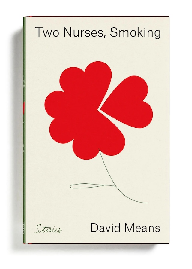
Alex Merto: Two Nurses, Smoking by David Means
When asked about AI’s role in book design, Merto explains he’s cautious, viewing it as a potential disruptor rather than an aid to creative originality. “I’m definitely worried about AI. Part of me hopes people will push back against it,” he says. While he acknowledges its usefulness in summarising text, he doesn’t believe it can replace the human process of reading, interpreting and responding to a story. “If everyone types in the same prompts, we’ll end up with a flood of covers that look alike,” he warns. For Merto, originality in book design stems from human insight, which is something that AI, no matter how advanced, cannot replicate. “AI isn’t the source – we are.”
Rush Jackson: Keep the Kid Alive by Arielle Bobb-Willis (Aperture, 2024)
Rush Jackson shares this sentiment, recognising AI’s ability to streamline workflows but insisting it cannot replicate human creativity. “I’m not too worried about AI gaining the skills to autonomously design a book by itself,” he explains. An artist, designer and educator, and founder of Jackson Studio, Jackson is drawn to projects with a socially reparative quality. He’s also influenced by Black design history and pre-colonial African design systems, which he values as highly as the Bauhaus movement. “I find the history of African rhythmic practices, writing systems and performance as important to design history as anything that’s come out of European modernism.”
His approach is intuitive rather than formulaic, allowing space for unexpected moments. “For me, the process of arriving at a cover design is always different, every time,” he explains. This openness has shaped striking works such as Notes Towards Becoming a Spill for artist Shikeith and Keep the Kid Alive for photographer Arielle Bobb-Willis, both published by Aperture. He also designed In the Black Fantastic, edited by Ekow Eshun, which saw Jackson develop a bold, type-driven cover that honoured the book’s subject matter. “Ekow was extremely open and trusting throughout the process,” he notes. “I love how the typography carries the rhythm of the book.”
Despite the growing presence of AI, Jackson has observed an increasing emphasis on materiality in book design, from cover textures and production techniques to unconventional formats. “I think a great book, and a great cover, has the potential to feel like an art object,” he says. “I think the best covers arise as unexpected moments, and should surprise you.”
Rush Jackson: In the Black Fantastic by Ekow Eshun (Thames & Hudson and MIT Press)
Coralie Bickford-Smith, a designer known for her work on the Penguin Clothbound Classics Series – in which she created custom patterns stamped on linen cases, colourful endpapers and ribbon markers – also emphasises the importance of tactility in book cover design. Much of her inspiration comes from art history, nature and classic design, particularly the work of William Morris and William Blake. “Their ability to blend text and imagery to tell a deeper story has always fascinated me,” she says.
For her, materiality is just as vital as imagery in shaping the reader’s experience. Her Fitzgerald collection, for instance, channels the glamour of the Jazz Age into mechanical patterns and metallic foiling, as seen in the cover for The Great Gatsby. “The design reflects the novel’s themes of destruction and disillusionment, capturing the moment when Gatsby’s dreams fall apart.” A more recent project, White Holes by Carlo Rovelli, pushed her conceptual approach further. “With this cover, I took a step back, zooming out to offer a fresh perspective on space,” she says. “It mirrors the way Rovelli’s writing guides readers through complex ideas – conveying depth and exploration.”
Coralie Bickford-Smith: Heart of Darkness by Joseph Conrad
Though technology continues to shape visual trends, Bickford-Smith – like Kim, Merto and Jackson – treats books as objects of beauty rather than mere vessels for stories. “Minimalism and bold colour choices have gained prominence due to the way books appear online as thumbnails,” she says. “But I believe the physical experience of a book – its cloth binding, foil stamping – remains irreplaceable.” She is also mindful of AI’s expanding role in design. “AI can be a powerful tool, but it shouldn’t come at the expense of human creativity and rights. The key will be ethical guidelines that protect original work.”
Even as AI continues to reshape industries, book design, for the time being, feels like a space where human creativity, intuition and lived experience will always have the upper hand. And perhaps the most exciting shift is the resistance to homogenisation, where designers are creating covers that feel excitingly fresh, raw and real, all while balancing clarity with craftsmanship. As Merto notes, the best book covers should be “something eye-catching and enticing”, setting the tone and leaving space for discovery. Bickford-Smith emphasises the harmony of typography, imagery and layout to create an “inviting, balanced design”, while Jackson sees the cover as “a thoughtful and intelligent response” to its content. Ultimately, the most successful designs spark both delight and recognition, feeling inevitable but at the same time unexpected – making us, as Kim puts it, wish we had thought of them ourselves.
This article is taken from Port issue 36. To continue reading, buy the issue or subscribe head here
For Mies van der Rohe, the house was an exercise in restraint. His unrealised 1931 Row House, built full-scale for the first time in the Tokyo National Art Center’s Living-Modernity exhibition, embodies that ethos. The exhibition explores how architects – from Mies to Lina Bo Bardi and Le Corbusier – designed new ways of living
Lina Bo Bardi’s own house Casa de Vidro, Sao Paolo, Brazil
Mies van der Rohe was an uncompromising teacher. Over and over again he set his students at the Bauhaus the same problem: to design a single-storey one-bedroom house facing a walled garden. His teaching style was described as laconic. Supposedly he would sit silently smoking a Havana cigar for minutes on end, and then ask his students to try and design the house again. Occasionally he would reach for a pencil, lean over a drawing and suggest a better place to put a door, realign a wall or reconfigure the layout of a kitchen. Howard Dearstyne, one of the handful of Americans who studied at the Bauhaus, defended Mies’ approach. “The very simplicity of these houses is their chief difficulty. It is much easier to do a complicated affair than something clear and simple,” Dearstyne argued. It’s a point well made. The individual house is closer to a poem, in which every word has to count. There is much more room to be vague about design decisions in museums, the preferred building type for most architects.
A full-size realisation of one of Mies’ own designs for a courtyard house, the so-called Row House (dated to 1931) is the centrepiece of Living Modernity: Experiments in the exceptional and the everyday, an exhibition curated by Waro Kishi and Ken Tadashi Oshima and taking place this summer at the National Art Center in Tokyo. The exhibition takes the single-family house as its starting point, and uses it to trace the way that architects have experimented with new ways of living. Kishi describes the exhibition as a historical response to the Museum of Modern Art’s International Style exhibition held in 1932. “Our idea was to show that modernism developed in different ways around the world”.
Villa Tugendhat in Brno in the Czech Republic, originally completed in 1930, and recently restored
To judge by the 14 homes designed between 1923 and 1978 on which the curators chose to concentrate, spanning the long half-century that coincided with the high point of modernism, architects did a lot of experimenting on themselves. This was a period that came to be associated, at least in Europe, with social housing: blocks of communal apartment buildings set in parkland, built by municipal authorities. The exhibition does hint at that, with its coverage of the mass-produced low-cost Frankfurt Kitchen, the mother of all fitted kitchens, designed by the pioneering Austrian architect Grete Schütte-Lihotzky. But most of the emphasis is on the individual home.
Eight of the 14 homes are houses designed by architects for their own use, and a ninth – a villa on Lake Geneva – was built by Le Corbusier for his parents. The exhibition benefits from its context. Four of the houses are in Japan, and reflect a subtler selection than a Western curator would likely have chosen. There is nothing by Kenzō Tange or Arata Isozaki. Instead there is Koji Fujii’s Chochikukyo house in Kyoto from 1928, a delicate fusion of Japanese tradition with traces of western modernity. Nobuko Tsuchiura was one of the first women to train as an architect in Japan. She and her husband Kameki, also an architect, both worked for Frank Lloyd Wright while he was building the Imperial Hotel in Tokyo, and then spent two years with him in America before setting up their own studio. Their villa in Tokyo, a four-storey-high timber structure from 1935, shows the spatial lessons that they learned from Wright.
Japan’s post-war reconstruction is represented by Kenji Hirose’s steel framed SH1 house from 1953, the first in a series of 60 private houses that he built in the course of his career. Completing the exhibition’s insightful account of the development of modern architecture in Japan is the Sky House that Kiyonori and Norie Kikutake, founders of the Metabolist movement, built for themselves in Tokyo in 1958.
Barcelona Pavilion from 1929, rebuilt on the same site in 1986
The non-Japanese houses are more predictable, though it is interesting to see Le Corbusier represented by the very modest villa that he built for his parents on Lake Geneva, rather than one of his more palatial houses. Pierre Chareau and Bernard Bijvoet’s Maison de Verre in Paris, the ancestor of Richard Rogers’ variety of High Tech architecture, is on most lists of houses that changed the course of 20th-century architecture. It is also one of two houses in the exhibition that were designed for doctors. The other is Louis Kahn’s Fisher House from 1967 in Hatboro, Pennsylvania.
Eero Saarinen’s house for Irwin Miller reflects the interest that this exhibition has in the furniture and fittings that architects designed for their houses. Mies designed the Brno chair for the Villa Tugendhat. Saarinen asked his friends Ray and Charles Eames to design the aluminium group seating for the house that he built for Miller in Columbus, Indiana. The most recent design in the exhibition is Frank Gehry’s radical makeover of a suburban bungalow in Santa Monica from 1978. The most beautiful is Lina Bo Bardi’s Casa de Vidro. She left her native Italy to live and work in Brazil where she managed to put modernism to work for social purposes.
But perhaps the most intriguing exhibit, the one that makes a trip to Japan essential for architecture enthusiasts, is the chance to experience full-size realisation of a house designed by Mies in 1931 but never built. “There are many unbuilt houses that we could have constructed,” says Kishi. “But we chose the courtyard house because it is still a very efficient building type, and is a real option for a contemporary megalopolis like Tokyo.” Unlike the opulent villa that he designed for the Tugendhat family in Brno at almost the same time, which is also on show, Mies’ so-called Row House reduced domestic life to its essentials. Brno has quarters for servants, a greenhouse, and a motorised window wall that can open the living room up to the garden in summer. The Row House has a very reduced square plan, and was designed to be built in continuous terraces along a street. It has a single sleeping space, a dining area, a living area and a galley kitchen, all planned around an internal courtyard that creates a serene inner world.
Installation view from Living Modernity: Experiments in the Exceptional and Everyday at The National Art Center, Tokyo
Constructing the house demanded a certain amount of creative imagination from Kishi and Naoyuki Nagata, the architect that he worked with. “There were only a few sketches in MoMA’s archive in New York, and they didn’t give us much to go on in choosing materials, or in the scale. So, we opted for a completely white abstract mock-up. We worked as if we were members of staff in Mies’ office, trying to understand his design and imagining his hidden intention. It was a great experience for any architect. We were bridging a gap in time of 90 years to work with the master.”
The courtyard is a theme that Mies kept returning to in the 1930s, in between the construction of his three domestically scaled masterpieces; the Tugendhat villa from 1929, the Barcelona pavilion opened in the same year, and the Farnsworth House designed and built between 1945 and 1951 in Illinois. He set the theme as a student exercise; he explored it in unbuilt projects for his own clients, and in the Berlin building exhibition of 1931, The Dwelling of Our Time, when he commissioned Marcel Breuer, Walter Gropius, Lilly Reich and others to design and build show houses that reflected their view of what the contemporary house should be like. The houses were built full-size in a huge exhibition hall, and represented a remarkable act of faith in the future, given that it opened just two years before Hitler’s seizure of power, and the desperate economic conditions of the time. It was a period when Mies believed that radical architecture had a lot to offer society. As he wrote in his justification for his selection, “The dwelling of our time does not yet exist, but changed living conditions demand its realisation. The precondition for this realisation is the clear definition of actual dwelling needs; this will be the main purpose of the exhibition, a further task will be to demonstrate the means required for the satisfaction of the dwelling needs, only that way can we combat the present discrepancy between real dwelling needs and wrongly directed expectations, between genuine demand, and inadequate supply. To overcome that is a burning economic necessity and a precondition for cultural reconstruction.”
Mies’ own contribution was another single-storey house built around a courtyard, albeit on a larger scale than the row house in the Tokyo exhibition.
Phillip Johnson, the curator of the International Style exhibition at MoMA, and himself an architect, wrote of Mies’ Berlin house, “The walls are mainly glass with one solid wall facing the street. In spite of the use of glass and the fact that there are no interior doors except the ones that lead to the kitchen, privacy is not lacking. Ornament is absent in the Mies house, nor is any needed. The richness of the beautiful woods, the sheets of plate glass and the gleaming chrome steel posts suffice. The beauty of the house lies in the handling of the walls as planes and not as supporting elements, Mies places these planes so that space seems to open up in every direction giving the feeling of openness that perhaps more than anything else is the prime characteristic of modern architecture.” He could have been describing the Row House that we can see brought to life in Tokyo.
The Farnsworth House, Plano Illinois, completed in 1951. The clarity and material quality of Mies van der Rohe’s architecture has been a life-long inspiration for John Pawson’s workThe realisation of a full-size model of one of Mies van der Rohe’s courtyard houses, designed in 1931, on show in Tokyo in 2025The realisation of a full-size model of one of Mies van der Rohe’s courtyard houses, designed in 1931, on show in Tokyo in 2025