Acid Coral Template

Tuomas A. Laitinen addresses important questions of ecology and climate change through a series of glass-made structures and installations

A Proposal for an Octopus, series, 2019. Photo: Jussi Tiainen

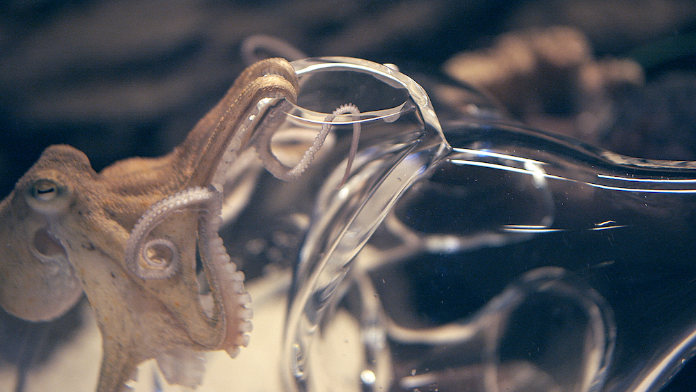
The octopus has earned a spot as perhaps one of the most visited subject matters in art. From 19th century Japanese erotica through to modern painting classics, the eight-armed sea creature has drawn many artistic practitioners in with its alluring symbology and anthropomorphic influences. Mysterious, intelligent, adaptable and fluid; the tentacled and unpredictable animal represents both wisdom and strategy. For instance, in the recent documentary My Octopus Teacher, we saw the ocean protagonist cover herself with shells to hide from impeding prey, outsmarting the sharks in an instant as she continued to poke her many legs into its gills. So it’s no wonder the octopus has caught the attention of artists and designers over the years, with Tuomas A. Laitinen being the most recent – an artist who works across video, sound, glass, algorithms, plus chemical and microbial processes.

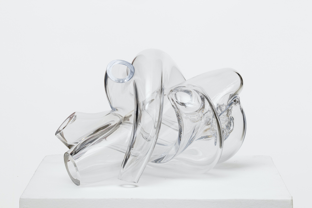
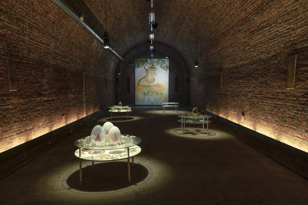
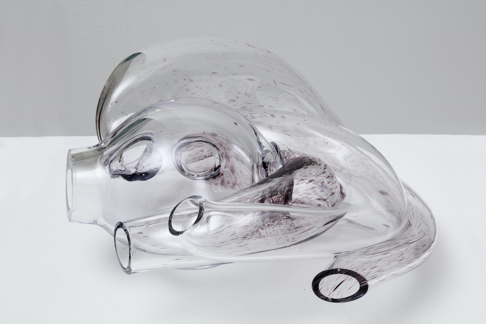
In his most recent body of work Tuomas merges the line between art and science, weaponising materiality and craft to take a crystallised view at the world of ecology – that which is done so through octopus-shaped glass structures and compositions. The work, named Acid coral template, has been presented at the inaugural Helsinki Biennial this year, and he’s also recently been commissioned by Daata to create an AR artwork for the launch of the platform’s AR app – a continuation of what was first commissioned by Daata in 2020. “I had been researching protein crystallography for a few years and started to think about how I could translate this data in my work,” he tells me. “In that video work, I used the protein models to create these very baroque body augmentations for the animated characters in the video.” Simultaneously, at the time of making, Tuomas was working on coral growth simulations and eventually these two worlds collided. “The protein model for this particular coral is based on the Yersinia Pestis (plague) bacterium. So there is a weird fictional metamorphosis woven into the fabric of the work. A bacterium becomes a speculative coral. It’s not really about representing the data as such but making an interpretation, a translation, or a transmutation of it and consequently placing it into new environments through AR.”

PsiZone, 2021. Installation view, Helsinki Biennial

Tuomas grew up in a small Finnish town, a place known the centre point for glass production in Finland and in the 20th century. He started working on his installations as a teenager using junkyard materials and scraps, “so that was my fist touch to art, even though there were no such categories in my mind then,” he says. After a stint in music, Tuomas decided to attend art school and pursued his studies at Finnish Academy of Fine Arts, which is where his love of sound, moving image, 3D animation, light and installation first bloomed; his debut glassworks were created around 10 years ago and “were basically custom lenses for a camera”, while his first augmented reality piece was borne in 2016. Now living in Helsinki, he often works with various artists and researchers to question the role of ecology and production, often employing a profound mix of translucent materials such as glass and chemicals, as well las microbial processes and algorithms. 

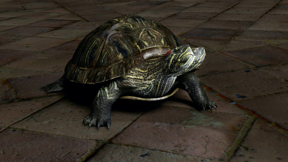
For the last five years, Tuomas has turned his focus onto the eight-legged creature and its home: the coral reef. “I’ve been making glass sculptures for octopuses as an attempt to find ways to think with these extraordinary lifeforms and, on a larger scale, ocean ecosystems. The octopus started to feel like a relevant conductor for opening up various ecological questions, providing a tentacular and modular model for organising ideas and artworks: ‘nine minds’ in one body. There is always a core brain there, but the structure allows a certain decentralisation to happen.” In a wider context, Tuomas strives to question ecology but also to touch upon the various mythologies that are attached to it, “and ideas coming from processes of knowledge production.” He adds: “And in some way, an element of cli-fi and sci-fi is present in the entanglements of my work – especially climate fiction, where the weather or the ecosystem is often seen as a protagonist. The current path in my work started in 2010 when I discovered some key texts from feminist new materialist theorists. That moment presented a major shift in perspective, and it is still affecting a lot of my work.”

Haemocyanin, 2019. Still from the video

And now, when thinking about the relationship between ecology and sustainability, it’s universally thought of as a delicate and necessary relationship. Conserving the earth’s waters, soil and ecosystem is vital in order to remain harmonious with the environment and the incoming – or better yet the present – affects of climate change. Tuomas’ work not only proves the impact of art when it comes to raising awareness of climate change, but that it’s a an aesthetic reminder of how fragile the natural world can be, where with just a shudder, slap or bash it can break it into tiny fragments. 

“For me, the idea of ecology is something that emerges from being sensitive to processes of mutual coexistence,” he explains. “When I think of ecology, I often come back to the notion of overlapping symbiotic processes and questions of biodiversity. At the level of making art, it means that individual works (like this coral reef) emerge out of an extensive world building or thought process rather than clearly defined project boundaries. A certain bundle of actions and reactions allows a specific outcome or a life form to appear, and I think that this is a sort of a parable of an ecological process. Feminist theorist Deboleena Roy talks about this notion of ‘feeling around for the organism’ in her book Molecular Feminism, and it’s been one of the important reminders on how to look for kinship with other-than-human lifeforms. And then, on another scale, as a citizen concerned with environmental issues, I am trying to find ways to support youth climate actions, but on an artistic level, it’s all about these subtle differences and tentative approaches.

It seems to me that understanding different scales and the resulting perspective shifts are quite crucial tools in relation to thinking about ecological transformations.”

A Proposal for an Octopus, series, 2019. Photo: Jussi Tiainen

Protean Sap, 2020. Stills from the video

Field Day 2021

On the last weekend of August, London’s Victoria Park welcomed the return of Field Day in a quintessentially electronic homecoming

The day began as we bounced our way onto the overground, only to be met by a swarm of festival goers; the influx of glittery faces, patterned shirts, make-shift drinks and bumbags gave them away instantly. We walked from Whitechapel, many others did the same, and the weather was typically British – muggy and grey. But despite the somewhat bleak skies that casted over the city, there was a real sense of anticipation sweeping the air. Field Day, London’s annual outdoor music festival that originated in 2007, had returned. And with it came a sell-out event and line-up comprising a mix of electronic genres and six arenas, not to mention a thrillingly moody headline performance from production duo BICEP at the main stage – the first performance since 2018.

After a year of cancellations, the elation for the UK’s return to festivals was unmissable. As we edged closer to the gates, the bassy hum of the stage openers exaggerated this: IMOGEN, Jaguar, Flip the Lid, Sofia Kourtesis, Grainger and Yung Singh were all kicking off what would be a blissful homecoming to the original playground of Victoria Park. Other bookings included O’Flynn, Hot Chip Megamix, Artwork, Mall Grab, Rosie Low, Floating Points, TSHA and Poté to name a few, and it’s safe to say that those in attendance were more than enthusiastic. 

“It’s been different,” said the festival’s director, Luke Huxham, as I sat down with him to ask about the expected and enduring hurdles. “It’s been challenging trying to navigate through the rescheduling and reacting to the government messaging. But, I think festivals in general are challenging, so it’s just been another challenge we’ve had to deal with. However, things are back and they’re back for good. It’s exciting.”

With the previous event held in south London’s Brockwell Park, Luke explained that it was a thrilling return to the festival’s birthplace in east London. “This is where we’re going to stay for a while,” he said. Coupled with a quick reaction to the news of the pandemic, the team were able to roll over the line-up from 2019, which inadvertently worked in their favour. “In a way, the delay has been a good thing because BICEP’s profile is now much bigger than it was or would have been for last year’s event,” said Luke. “So we’ve got one of the hottest headlines at the peak of their career.”

Photo credit: Ro Murphy / Hotchip

Poté, a Paris-based artist who also goes by the name Sylvern Mathurin, took to The North Stage in the early evening for his DJ set. A little different to his live performances, the set was still brimming with energy. The return to festivals, he said, had been rejuvenating: “It gave me a lot of time to re-think what I want to stand for and how I want to portray myself in the future.” Having just finished working on an album, he explained how his experiences over the pandemic have been self-defining; he’s thought a lot about who he is. “For the first time, I’ve got into therapy and started diving into who I am. Especially with all that was going around – Black Lives Matter and Me Too – it made me question who I am and what I stand for. I never had that existential moment before.” 

This was Poté’s second UK festival of the year so far, with Lost Village being the first a couple of days prior. For him, like many of the artists performing that day, the come-back was exhilarating. “As soon as you go up on the stage and get that roar of energy, there’s nothing else to do but give it back, releasing it and dancing.”

TSHA

TSHA is a London-based DJ producer who was one of the early performers at the Victoria Park East stage. Catching her after the set, there’s no denying that she set the mood for what was to come later on. “It’s difficult to play early but it’s always nice,” she said. “Not everyone gets here at this time or people aren’t drunk enough yet, or ready enough. But it’s been a good vibe – I think everyone’s been pretty on it with a lot of the festivals, which is wicked.”

Field Day was TSHA’s second festival of the weekend, so it’s been a busy return for the DJ. “It’s been really energising but at the same time exhausting,” TSHA added. She’s just dropped an EP and has been utilising the past year or so to write. But as things opened up again, her focus then shifted to performing. “You’re there meeting people and finally seeing friends you haven’t seen in a long time, finally being able to be together and dance together, catching other performers I haven’t seen in a long time; it’s a hole that’s been missing and it’s been filled now.”

Photo Credit: Karolina Wielocha / Mall Grab
Photo Credit: Ro Murphy / Bicep
Floating Points
Jaguar
Photo credit: Karolina Wielocha
DJ Seinfeld and George FitzGerald

Behind the Best Record Covers of the 70s

The album artwork that cemented design collective Hipgnosis as the visual arbiters of the progressive rock scene 

When Pink Floyd asked friends and graphic designers Storm Thorgerson and Audrey Powell to create the cover art for their second studio album, A Saucerful of Secrets, they set in motion a design legacy that produced some of the most memorable record covers of the 60s, 70s and 80s. Hipgnosis – a play on the words ‘hip’ and ‘gnostic’ – combined the cool and occult, and was a word first coined by Syd Barret, who shared a flat with Thorgerson and Powell in Cambridge at the time. Barrett scrawled the word onto their front door one day and the name was born.  

In the years that followed, Hipgnosis built a reputation off the back of their characteristically enigmatic album covers. Using photography to blend elements of surrealism, sex and postmodern elbow-nudging, their quirky sense of humour and willingness to break boundaries was both a sign of the times and a revolution in itself. Here, we look at some of the best examples of their work from the 70s.

Syd Barrett, The Madcap Laughs, 1970 – Photography: S. Thorgerson © 2017 Hipgnosis Ltd

Syd Barrett – The Madcap Laughs

In preparation for this album shoot Syd Barrett painted the floor of his bedroom in orange and purple. When photographer Mick Rock arrived to shoot Syd, he found a naked woman in the kitchen known only as “Iggy the Eskimo”. Fittingly, she features on the back of the sleeve. 

10cc, Deceptive Bends 1977 – Photography: A. Powell/S. Thorgerson/P. Christopherson – Graphics: G. Hardie – Retouching: R. Manning © 2017 Hipgnosis Ltd

10cc – Deceptive Bends

In the days before photoshop Hipgnosis were pioneers of the cut-and-paste method, creating surreal collages by sticking conflicting images on top of each other. The artwork for Deceptive Bends features three separate images: the diver and the woman (shot in a studio), the jetty (shot on location by the River Thames), and the sky (taken from a photo library). 

Peter Gabriel, Peter Gabriel (2) 1978 – Photography: A. Powell/P. Christopherson – Graphics: Hipgnosis/C. Elgie © 2017 Peter Gabriel Ltd

Peter Gabriel – Scratch

The unofficial title of Peter Gabriel’s second self-titled album, Scratch was inspired, undeniably, by the artwork of Hipgnosis. The ‘tearing’ effect from Gabriel’s fingertips is actually white paper, torn and adjusted onto the original image .

10cc, How Dare You! 1976 – Cover design: Hipgnosis/G. Hardie – Photography: A. Powell © 2017 Hipgnosis Ltd

10cc – How Dare You!

The concept for 10cc’s How Dare You! was entirely based upon the strength of the music. The use of phones refer to the song ‘Don’t Hang Up’, which opens with a woman picking up the phone, while the people on the front and back refer directly to certain characters that pop up throughout the album.

Pink Floyd, The Dark Side of the Moon 1973 – Graphics: G. Hardie © Pink Floyd Music Ltd

Pink Floyd – The Dark Side Of The Moon

Perhaps the best known of Hipgnosis’ work, the artwork for Pink Floyd’s seminal The Dark Side Of The Moon is a graphic representation of both the band’s light-infused live shows and the heartbeat that begins the album. The spectrum of light reflected from the prism on the cover to the the back, provides a suitably cryptic image to fit the mysterious title of the album.

Vinyl. Album. Cover. Art. is out now, published by Thames & Hudson