- While exhibiting Being Dreaming at KK Outlet, one half of the NYC-based creative agency Hugo & Marie talks us through his favourite album artwork
A few weeks ago, as their KK Outlet exhibition Being Dreaming kicked off with a dinner and an almighty party, New York-based creative duo Hugo & Marie took their artist rooster to London. One part sleek branding agency and one part gallery agents, Mario Hugo and wife Jennifer Sims has filled the Hoxton Square gallery with well over 100 pieces of works, colliding “art with science.” The two world views are often seen as opposites but, as we know, opposites also attract. In Being Dreaming this is visible through a wide array of techniques and sub topics: Through painting, drawing, weaving and video work, each of the 12 artists tackle anatomy, botany, ecology, geometry, energy and mythology. Having operated out of Brooklyn, NYC, since early 2008, Mario & Hugo today represent a worldwide force of creative talent including Hisham Akira Bharoocha, Deanne Cheuk, Tom Darracott, Merijn Hos, Hvass & Hannibal, Jules Julien, Micah Lidberg, Santtu Mustonen, MVM, Mike Perry and Kustaa Saksi – all of who are represented on the walls of KK Outlet this month. The duo also worked with PORT Magazine issue 7 on creating section dividers.
One half of Hugo & Marie, the charismatic husband, Mario Hugo, has since an early age been obsessed with music. But, as a designer and illustrator, Hugo also approach the music from a visual point of view; he’s enjoys the album with both ears and eyes, as it were. This fascination has led Hugo and the agency to work on quite a few record sleeves over the years. When you think about it, the album cover art, single sleeves, posters and overall visual communication for a band with an album out and tour about to start, is of course immensely important. That’s probably why they go to Marie & Hugo to sort it out. So far, they’ve worked with Rihanna, Soft Rocks, Land of Light and Shocks, to mention but a few. In light of this, we asked Mario Hugo to select his five favourite record sleeves, and tell us what he likes about them…
 Words David Hellqvist
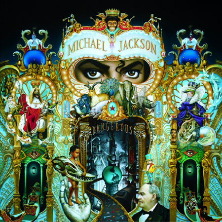
 Michael Jackson, Dangerous: “I talk a lot about vinyl – I love vinyl. I direct, illustrate, and design vinyl throughout the year. But I’m a child of the 80s – I was raised on dusty cassette tapes, and my first genuine fascination with an album cover also happened to be the first CD I ever owned – Dangerous. I was about nine when the album came out and I remember hours studying every cryptic little detail – and this level of detail was incomprehensible to me at that time. Mark Ryden’s painting reads like a flemish miniaturist’s pop hell – at once weird, enigmatic, masonic, tacky, and absolutely beautiful.”


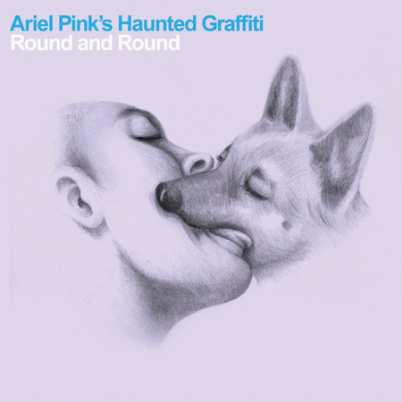
 Ariel’s Pink Haunted Graffiti, Round and Round: “Seriously, what could give you more pause than this display of incredible, unabashed intimacy. Saimon Chow created a series of artworks featuring humans kissing animals and insects, and this canine kiss was appropriated for a fantastic Ariel Pink track. I’ve always coveted sleeves as artworks in and of themselves – there is some je nais se quoi about the format’s limitations – decades and decades of twelve square inches to tell stories as rich as many, many minutes of music. I have no idea what this cover has to do with the song, but it absolutely reeks of Ariel Pink.”
 Pulp, His ‘n’ Hers: “In addition to being one of my favourite albums of all time, Pulp’s His ‘n’ Hers was designed by The Designer’s Republic and illustrated by Philip Castle. I’m not really sure a pedigree of creative talent gets more impressive than this.”


 Speidel Presents, Let your Feelings Show: “I’d be remiss if I didn’t pick a random from my Mom’s collection. Nothing quite touches gorgeous 70s vinyl. How many different phenomena can we possibly capture on a single record sleeve? Space, rainbows, waterfalls, endless love, and the biggest nameplate bracelet of all time in one concise, stunning, voluminously airbrushed package. Unicorns are conspicuous in their absence. One of my favourite details is the back, with separate bracelets for each track.”
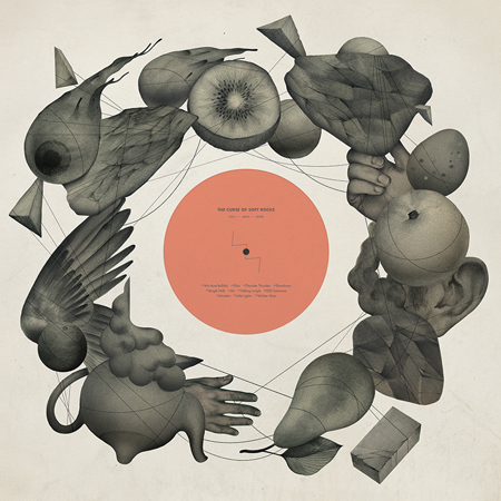
 Soft Rocks, The Cure of Soft Rocks: “I mentioned earlier that I create a lot of album packaging throughout the year. I’ve worked with acts and musicians of varying sizes, but I feel most rewarded by direction and design for ESP Institute. They’ve got a general apathy for commercialism, and they let me explore the themes they way I’d like to explore them, and if I think the juxtaposition of Soft and Rocks is best communicated by a fruit bowl of kiwis, dismembered hands, ears, wings, eyeballs, and an occasional rock in a tense, tangled gravity – well, it floats.”
Being Dreaming, KK Outlet, 42 Hoxton Square, N1 6PB, until April 27, 2013
Subscribe to Port Magazine annually and receive each issue to your door.
Get PORT in print


