Emma Spedding talks to the East London cartographer about how tailoring and map-making aren’t dissimilar, and how they’re rejuvenating traditional cartography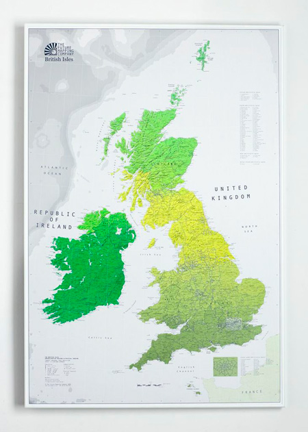
Chances are you’ll find a map hiding in a junior School corridor, rather than displayed as a piece of graphic art. Gone are serpents in splendid seas; we live in an age of laminated posters and home-printed Google Maps. Marcus Kirby, founder of The Future Mapping Company, is on a mission to put design back on the map. For him, a map is the perfect platform to play with colour and do the unexpected.
Marcus hardly had the conventional ‘training’ you’d expect for a man leading a map renaissance. Starting his career in the fashion industry, it was on Savile Row, where he worked for five years, that he learnt how to bring a struggling craft into the 21st century.“It was stuffy” he recalls. “A lot of people wouldn’t want to put a foot on Savile Row let alone get a suit on it.”
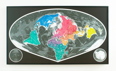
He was working in colour forecasting when he realised that a map could be reinvented with a fresh lick of paint: when he created the company nine years ago, no one else had created a functional map with a stylistic edge. Forget baby pink islands, or pastel shaded continents, on a Future Map you’ll find a coral Russia or an apple green Brazil. Traditionalists challenge this kaleidoscope of colour, but their response, ‘why not?’ “People are used to the soft pastel shades of Empire,’ Marcus explains. “We let people know that now colours are purely arbitrary. I’ll point to an old map where Brazil is yellow and South Sudan is yellow, but there was no political link.”
Marcus explores this world of colour using a lithographic printing process, using bespoke inks, including metallic and phosphorescent shades. Whereas digital printing uses cyan, magenta, yellow and black inks, Marcus explains: ‘By allowing you not to use CMYK, you can use the part of the ink you want. It’s like looking through a Pantone colour chart and going ‘that’s the one I want’. You get a vibrancy you just can’t get from a digital print.”
A standard wall map will divide countries with a patchwork of colours. As a designer Marcus craved fluidity, so created wall maps where colours seep across borders. “Having your neighbour in a completely different colour to you states massive differences. We grade the colours through the countries and continents. You’re are only a shade away from your neighbour.”
The Future Mapping Company wants to challenge how you see the world. When asked how they balance accuracy with design, Marcus points out that there is no correct way of representing the world as a flat image. He – like most who attended junior school before the 90s – was educated with a Mercator projection, which focuses on the shape of countries but distorts the land area (it was originally devised as a nautical navigational tool during the Renaissance when traversing the seas unearthed ‘undiscovered’ lands). Future Maps represent countries in their correct proportion, sacrificing shape for surface area.
Marcus explains: “With the Mercator projection areas are grossly distorted. Greenland is 515 percent too big, Russia is 300 percent too big and Canada is 210 percent too big. My Geography teacher showed me that map, and told me that was the world.” The equal-area projection works as a piece of graphic art because it pushes the image of the world in a different direction. Marcus comments: “This is an alternative look that makes you stop and question and think. There is no correct vision, but we want to let people know there are different ways of flattening a sphere.”
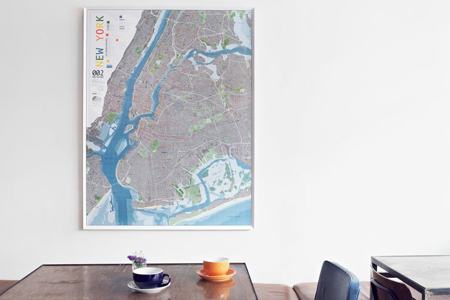
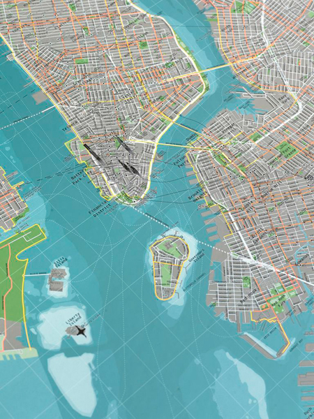
The company has also plotted city maps for London and New York, which are more than simple A-Z prints, as road networks are secondary to cycle routes and historical sites spring to life with 3D illustrations. One street map takes up to nine months to create from the data collection to finalising the design. It’s scientific work for an artisan, but Marcus doesn’t feel burdened to create. “A lot of designers have a desire to transcend and design something different each day, but I’ve learnt a small idea can go a long way.”
As our interview came to a close Marcus revealed his own history with the map. As a child whenever he finished a walk in the Lake District, his father he would buy him an OS map. He would then carefully record their route in fluorescent marker; “I would spend the journey home pouring over the landmarks and undulations that I had seen.” And that’s why a map works as a piece of art; it’s personal. Standing in front of one, you can pin point your last holiday destination and hunt your own street. “Maps make unpretentious wall art; the have a purpose”.
www.futuremaps.co.uk


