Betty Wood heads to the Bedfordshire studio of the ceramicist to find out how his clay canvases are an experiment in abstract expression
Barry Stedman’s ceramics are more than just clay pots or vases.
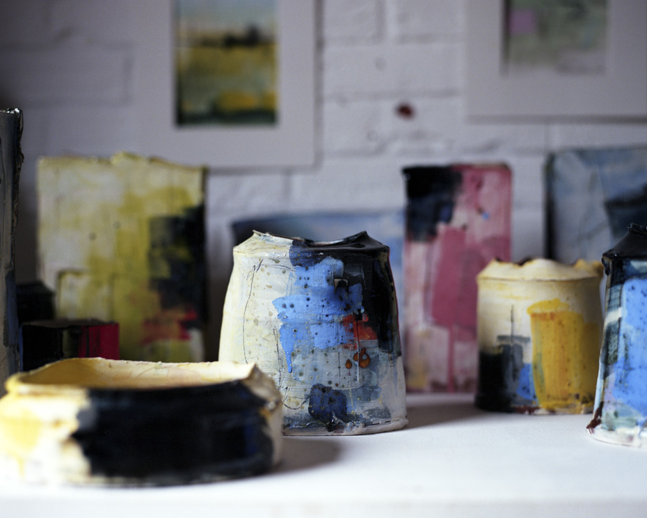
Their imperfect, ragged lips and pinched waists work in tandem with their striking colour palettes and glazes to create beautiful ceramic objects that delight the eye and the touch. I discovered them in Mayfair earlier this year, and have coveted them ever since for their oxidised stains, peculiarity and refusal to conform to standards of perfection in their maker’s pursuit of proportion and detail.
“For me, these are design objects as well as art pieces” Stedman says, turning one of the unfired vessels in his hands. But unlike design objects, where function often dictates form and is the fundamental marker for success, Stedman’s ceramics operate as canvases for expression.
Taking his first night class 15 years earlier, he says “Straight away I realised I wanted to combine the two things – ceramics and drawing. I tended to do figurative stuff, and was looking to find a more abstract way of working. Making vessels and paintings really worked for me”.
It’s a far cry from his previous job, running a business selling fruit and veg, though he says he was “hopeless as a business person”. As a ceramicist however, he’s faring much better with his work the subject of several recent exhibitions around the South of England. His pieces are also sold in London through The Craft Potter’s Association and The New Craftsman. “My style of work doesn’t appeal to everyone” he says modestly, “but if you’re into abstract expressionism them maybe you’ll like it. If you’re into traditional pottery, it’s not so much your thing…”
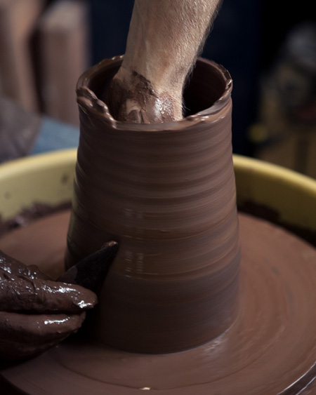
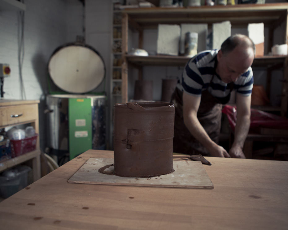
Solid and three-dimensional, Stedman’s wheel-thrown vessels provide a tactile surface to paint onto. “My influences are really the St Ives artists” he tells me, “particularly Patrick Heron, as well as Ivon Hitchens and Gerhard Richter”. In fact, his studio bookshelves burgeon with books on painters, including a recent volume from The Tate’s exhibition, Matisse: The Cut Outs. Though his vessels are not paintings themselves, they’re treated to a painterly approach: “they’re great to make marks on” he adds – later, he shows me how he uses found objects such as sticks and off-cuts of wood to make marks into the soft clay – “and you can take a lump of brown clay into a form, paint it and change it completely. It becomes something different.” Pointing to a shelf of unfired clay vessels he’s made that morning and is waiting to put into the kiln, he says, “I think sometimes they look their best then”.[/one_half]
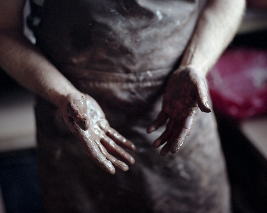
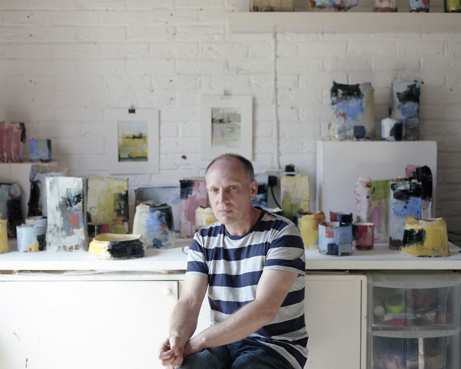
Red earthenware clay is Stedman’s material of choice because of its inherent pigmentation and tactile characteristics. “I like how it breaks on the edges; it gives you a slight break of colour inside, and it gives you a colour to start with”.
Comparing it to a toned background, ie the solid colour first applied to a blank, white canvas, he explains, “It’s like starting with a base you paint on top of. I put a white or cream slip on as the next stage, then I paint it with another layer of pale colours, sometimes black”. Working from light to dark, as with watercolour, oil or acrylic, he builds his colour palette to the desired level.His most recent body of work is much brighter in colour, featuring lucid blues and yellows reminiscent of the seaside. It’s a youthful spectrum, and a departure from his previous collection, which used contrasting creams and blacks, whites and navy-blues. “I don’t like making the same things over and over” he explains. Much like a painter, “I tend to think, now I’ve done that, let’s move on, do something different”.
Continuity is of course provided by form. “I don’t like things to be a perfect shape. That goes along with my drawing in a way; I enjoy broken lines, interrupted marks, I rarely make round forms – ellipses, or squashed – and I find it more interesting when they’re off kilt.”
Photography James Rawlings


