How Geneva Got Its Groove Back

Switzerland’s venerable haute horloger, Vacheron Constantin, is winning over millennials and gen-zedders with just the right balance of new-age fun and vintage feel: Say hello to FiftySix

Chief among the FiftySix’s distinguishing features is its ‘sector’ type dial, applied with alternating 3D Arabic and baton indices.

Out of the blue, storied Swiss names who previously erred on the side of tradition have started launching sporty, entry-level collections squarely aimed at younger customers. There’s the Ryan Reynolds approved Piaget Polo S, Jaeger-LeCoultre’s reboot of its rakish Polaris diver and, leading the charge, Vacheron Constantin, and its brand new FiftySix.

Vacheron is not a brand known for having its finger on the pulse of the young and cool. This is a name that prides itself, not only on its exacting craft, but the fact that it’s a craft that has continued for 263 years – the longest continuously run watchmaker in history. Its collections have names such as Patrimony and Traditionnelle. Napoleon Bonaparte owned one. The most modern it usually gets is the Overseas, and that was launched in the 1990s, inspired by something from the 1970s.

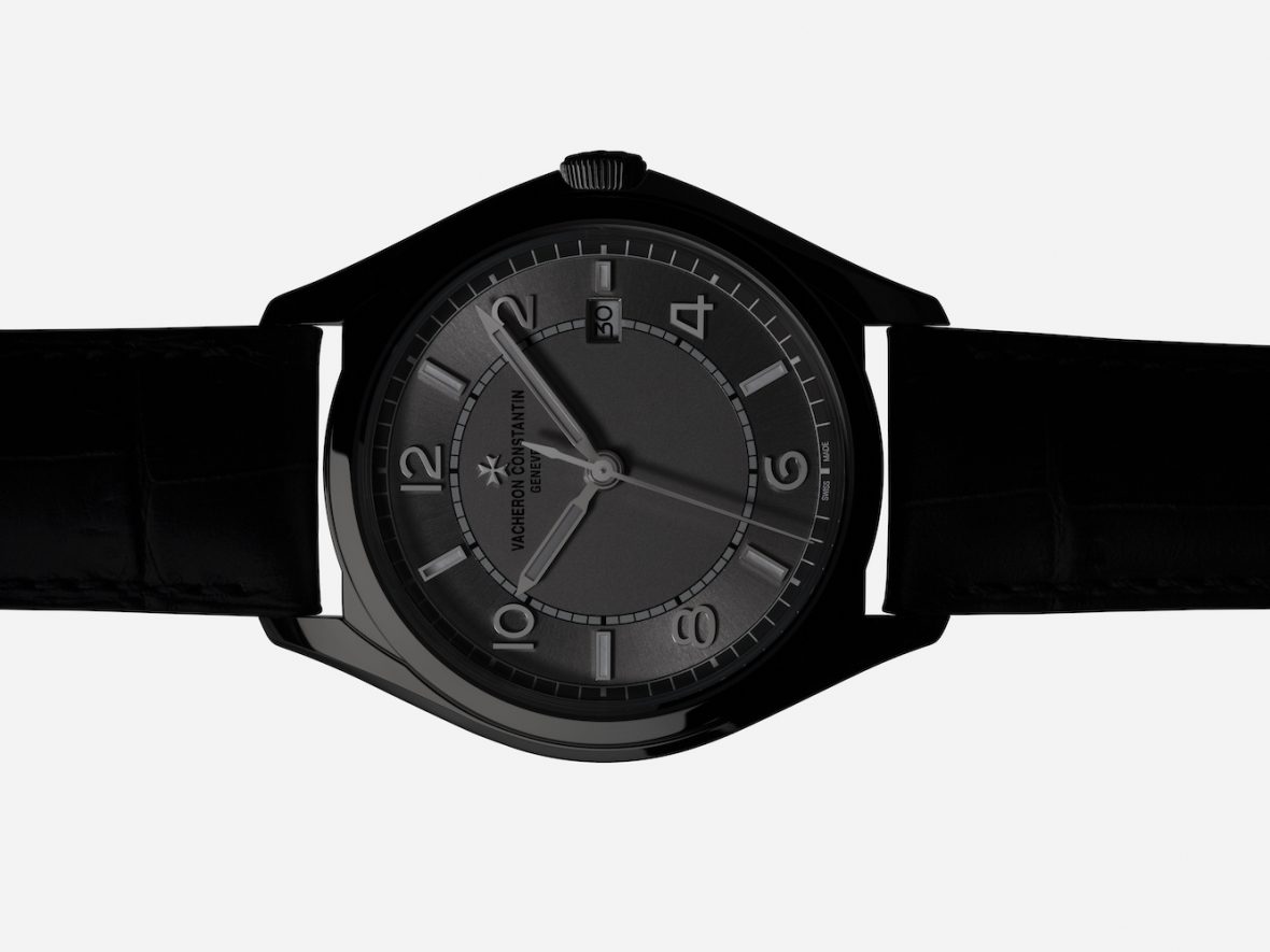
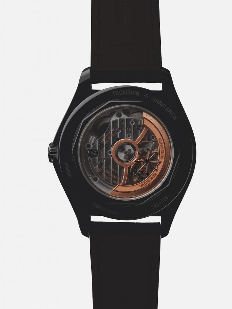
Then, this year, along comes FiftySix. Still, admittedly, inspired by a watch from (you’ve guessed it) 1956, it launched as a slice of vintage styling, in either steel or rose gold, that is relatively reasonably priced. At 10,500 pounds the steel automatic model lowers the brand’s entry level by a few thousand, while retaining all the hand-finished mechanical loveliness you’d expect from VC, ticking through a sapphire caseback beneath a solid-gold winding rotor.

The underlying tenet of FiftySix is its bridge between the present and past – 1956, specifically. As well dial design, this marriage is at its most visceral in profile; in particular its prominent ‘box’ type crystal rising well above the bezel – historically made from Plexiglas or mineral glass, now in scratch-resistant sapphire.

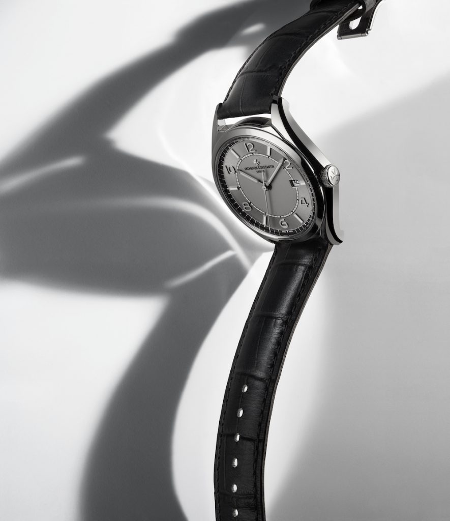
“We wanted the FiftySix collection to incorporate a retro-contemporary style – to be an elegant watch, which can be worn in any circumstance,” explains Christian Selmoni, style and heritage director for Vacheron Constantin. “The fact that the whole collection has a diameter of 40mm – even the styles with the moonphase, day-date or power-reserve complications – makes it quite easy for both men and women to wear.”

Alongside the sculpted Maltese Cross features of FiftySix’s case design, one of the collection’s distinguishing characteristics lies in its sector-type dial. While the circumferential chapter ring, punctuated by alternating Arabic numerals and baton-type hour markers, channels its 1950s inspiration, the presence of two subtle surface tones adds a beguiling play of light across the whole ensemble, lending depth and brilliance.

And this isn’t an ancient brand, wildly looking around for the latest demographic to attract; stats prove that millennials are coming back to mechanically driven watches.

A recent survey from Deloitte found that this sector wants to invest in high-end Swiss watch brands. The research showed that, in the UK alone, if given 4,000 pounds as a cash gift to spend on a watch, 70 per cent would spend it on one mechanical watch, as opposed to spending 400 pounds a year on a smartwatch, for the next 10 years. China and Italy also showed a majority thinking the same way; only the US favoured the smart sector over the mechanical.

Being Vacheron Constantin, the movements ticking inside every FiftySix are as good as it gets, their exquisite hand-finishing admirable through the cases’ crystal caseback: ‘Côtes de Genève’ stripes across every bridge, circular graining and snailing.

And there’s a very good reason for this. While Generation Z – those born from the mid-1990s to the early 2000s – have grown up with the Internet, millennials still remember wearing watches. “This shift in the balance of buying power cannot be ignored,” says Sky Sit, founder of new online platform, Skolorr, which champions independent luxury watchmakers with the younger generation specifically in mind. “I witnessed firsthand the emergence of the affluent millennials’ new buying behaviour, and felt the shift in my bones, even back in 2013 and ’14,” she adds, referring to her past as communications director of rebellious sports brand, Linde Werdelin.

“Yes, the kids are certainly spending money in more of an interesting way with Skolorr-type indie brands. But this demographic is also the key to remaining relevant for the bigger luxury players over the next 10 to 15 years.”

And it is exactly this customer Vacheron has in mind with FiftySix – which has all the components that matter: The look is reassuringly vintage, the styling is simple and, at 40mm, it isn’t flashy. Vacheron also has appeal because it isn’t one of the more obvious names. Research by Luxury Society found that millennials are eschewing brands such as Rolex because they come with a certain set of expectations about the person wearing them. They prefer brands that feel personal to them over those that are signifiers of wealth or luxury. Vacheron Constantin couldn’t be more ‘in the know’.

The 22-carat yellow- gold winding rotor spins on ceramic ball bearings with every wrist movement, requiring no lubrication or maintenance.

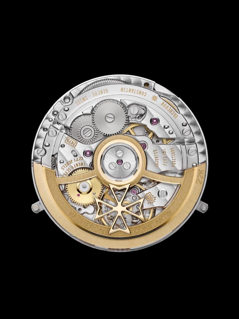
That said, Vacheron is still using the FiftySix collection to showcase its watchmaking prowess. Alongside a complete calendar there is now a whirring, whirlwind tourbillon variant: an addition that might seem at odds with the quiet composure of the collection, but is a canny move when you consider the inevitable thirst for more connoisseur-like features when those nascent watch enthusiasts move up to the corner office and collector status.

While the millennial generation might not be the saviours of the Swiss industry – an industry never likely to need saving by anyone – in appealing to them, long-overdue invigoration has certainly been brought to the landscape. Unlikely launches from the likes of Vacheron Constantin that feel as fresh as FiftySix surely benefit everyone.

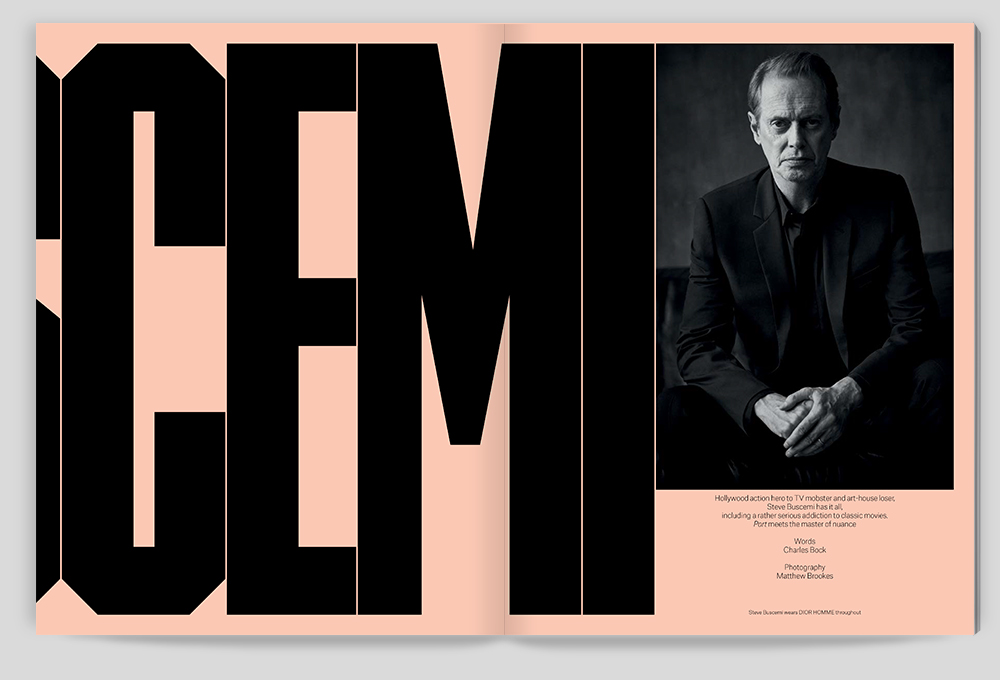
Photography Robin Broadbent

vacheron-constantin.com

Reduction, Reduction: Robin Broadbent

Celebrated still life photographer Robin Broadbent speaks to Port about his latest exhibition in London

Grids, 2012

Still life photography is a frequently overlooked discipline. It’s practitioners – patient, meticulous, technically skilled – may be direct descendants from their masterful 17th and 18th forebears in paint, but today, in an age of quick pack shots and a preference for lifestyle imagery, their skills are woefully underused commercially, and relatively critically unconsidered.

Robin Broadbent, the New York-based British photographer, is one of the most prominent exponents of the discipline and, having complimented his product-led work with a personal exploration of form, proves that still life can be one of the most exciting and creative areas of photography. Alongside campaigns for Prada, Balenciaga and Rolex, as well as work for Numéro, Vogue, the New York Times Magazine, and this publication, he has produced several books and mounted many well-received exhibitions of his work. The latest, Reduction, Reduction, runs at the newly opened Wren Gallery in east London until the end of June.

A labyrinth of large-scale abstracted studies, the show refers directly to Broadbent’s commercial work – which plays with a sense of scale and abstraction – further reducing the modern material world to a seductively simple form. Static yet lively, the compositions are precisely constructed – a process Broadbent considers to be almost surgical, “it’s all about the hands and the little details”. It’s fitting for an artist who first pursued a career in medicine, and there is likewise something clinical to many of his works, not least because the viewer can often make out actual pills or syringes. One contains the recognisable silhouette of a fine-toothed comb, an oddly eloquent allusion to the photographer’s characteristically exacting standards.

Here, Broadbent spoke to Port about the exhibition, his unique, abstract, painterly approach, and his artistic influences.

Black, 2016

How did the exhibition come about?

Last year I published a book – The Photographic Work of Robin Broadbent – which was seen by Jennifer Turner, who runs the gallery. Wren has two floors and I was excited that this could reflect the two sections of my book – one of lighter photographs on white/gray backgrounds and one of darker photographs printed on black. The main floor is filled with daylight but downstairs is a dark, windowless environment in which the images have been be spotlit.

The gallery liked that I am an ‘old school’ photographer who works on 10×8 large format and wanted the prints on show to be traditional silver gelatin and c-type for the color. I find producing large prints more interesting given that the images are mainly abstractions, so the size adds a certain ambiguity over whether it is photography or not.

Five, 2005

Could you explain a little your approach to the work? What is the unifying themes with the exhibition?

My work has very much had the same approach since I began. It is a study and exploration of objects, often turning into a series. I keep things very simple and reduce down to the minimum, with a balance of interest and tension with the negative and positive spaces. Nothing has really changed through my thirty years of taking pictures. I get excited by shape and form and how they interact or repeat – either in a random or organised way. The backgrounds have always been clean and simple with different neutral tonalities. So it is always about the object form that is being photographed with no distracting backgrounds. Although the backgrounds play a large role as negative spaces.

When I produced the book, I edited it with the designer Doug Lloyd, so a lot of the images had already been picked and had relationships to each other when we started working on the show. Like turning a page in a book, there had to be a relationship between the images as they hung. I worked very closely with Jennifer and we chose images that were pure abstractions with very little to distract or reveal other than line or color.

Cyan, 2001

The works are drawn from over two decades. How did you curate the selection?

Most of the book was more recent than twenty years ago, but I felt some of the earlier work helped add balance to the show and my vision has stayed similar so that work remains relevant. Jennifer was keen to make the show as abstract and linear as possible so that looking around the room you experience an interaction of darks and shapes and line. A lot of monochromatic black and white images, and then a sudden burst of colour and then back to the black and white.

Factor, 2012

How do you understand the nature of abstract photography generally at the moment? What influences do you specifically draw from?

As soon as something is recognisable within a photograph, it tends to be a photograph of something, which in itself limits the way it is seen. I want to take photographs that can be hung on the wall and enjoyed for their forms and shapes, without questioning where they come from. Each time you see something different in the image.

I wonder sometimes whether I’m really a photographer who paints or a painter who photographs. No one would question a painter doing abstract imagery but as it’s a photograph, people start questioning. It shouldn’t be relevant but the questions still come.

I started studying science with the intention of going to medical school and I wonder if this is my way of being an artist without paint. Fortunately I was lucky enough to work with an American photographer, Robert Golden, who opened my eyes to the true complexity, and to a love of art.

The first artists I liked and related to were Kandinsky, Malevich and other Russian constructivist artists. And I soon moved on to the New York abstract expressionists such as Franz Kline and Robert Motherwell. As far as photographers, I always found the Bauhaus group very exciting, particularly Rodchenko and Moholy-Nagy. Also Albert Renger-Patzsch, an early German photographer and even Edward Weston and his pepper photographs. They seem to look at objects and buildings from different perspectives and viewpoints. There’s no traditional respect, it was more about how you can make the best image within the frame, even if it meant twisting or turning the camera and even pointing it in a completely different direction.

Reduction, Reduction runs at the Wren Gallery, 39 Featherstone Street, London until 30th June

robinbroadbent.com


Port Issue 21

The latest issue of Port is out now, featuring our interview with the inimitable Steve Buscemi, a focus on the Royal Gold medal winning architect Neave Brown, and much more…

“He kicks ass, man. His range is incredible”, so remarked Jeff Bridges to Port recently. And it’s true: Steve Buscemi does kick ass. But he also knows how to walk the line between multiple different guises. He’s an industry grandee, with cult status; an arthouse movie darling, and a blockbuster powerhouse. When Port met one of the most nuanced actors of his generation in a quiet bar in Brooklyn, we received a masterclass in maintaining a successful yet steady life.

Hollywood action hero, TV mobster and art-house loser Steve Buscemi sits down with award-winning author Charles Bock to discuss playing Nikita Khrushchev in the upcoming The Death of Stalin, his addiction to watching classic movies on TCM, the vanity of the movie business, and his newfound passion for yoga.

Over in the Style section, our Miami Noir editorial – styled by Dan May and shot by Greg Lotus – features a sharp selection of menswear from Emporio Armani, while a series styled by Will Johns features a range of Hermès accessories elegantly interspersed with scenes from a Sussex village. Elsewhere, we offer our take on the hottest men’s outerwear of the season, and mingle casual menswear with dramatic botanical images.

In the features section, sailor Alex Thomson reflects on his experience of the Vendée Globe, a grueling, round-the-world solo yacht race, and the most demanding of its kind on the planet. Will Wiles reflects on the career of one of the last surviving proponents of brutalist architecture, Neave Brown, who was recently awarded the highly coveted Royal Gold Medal; and photographer Elliott Verdier travels to the remote central Asian republic of Kyrgyzstan to capture an ex-Soviet state struggling to find a national identity in a globalised world.

Acclaimed novelist and playwright Hanif Kureishi explores the connection between drugs and countercultural movements, while Alain de Botton muses on that million dollar-question: what is the relationship between capital and contentment, and what can banks tell us about the psychology of money? Conflict photographer Giles Duley unravels the ethics of photography in documenting a violent world, while Steven Johnson considers the ramifications of communication with life beyond Earth.

Highlights from the Porter include 108 Garage chef Chris Denney’s celebration of the versatile Japanese seaweed kombu; a focus on the life and work of Soviet Constructivist Vavara Stepanova; and a conversation between Mozambican author Mia Couto and his protégé, Brazilian author and translator Julián Fuks.

To buy a single issue or to subscribe, click here


Robin Broadbent: Up Close

The still life photographer and long-time Port collaborator discusses the impossible attention to detail demanded by his exacting work

“All my plans sort of crumbled around me, and I didn’t know what to do,” says Robin Broadbent of the time he didn’t get the A Levels he needed for medical school. “But I had a camera, and did the odd bit of black-and-white photography, and so decided to go to art school.” Many years later, as he speaks to me from New York where he now lives and works, his career has taken a radically different path. Still, he ponders on the similarities: “I think taking still-life pictures is a bit like being a surgeon, it’s all about the hands and the little details, which are things that seem to be in my blood.”  

As a photographer, Broadbent produces still life pictures for a variety of magazines and commercial brands, his style being one that uses shadows, lines and limited colour palates in a way that turns static objects into images that appear both beautiful and alien at the same time. “Everyone’s eyes work in the same way,” he explains. “When you look at an image you don’t question things, you just enjoy it.” 

His latest book, The Photographic Work of Robin Broadbent, is a run down of the past five years of his editorial work; a personal, artistic statement to offset the commercial work that makes up the second half of his output. 

With so many of the pictures, the objects that he uses seem so ordinary that it’s hard to imagine where the inspiration for using them might have come from. The brief for one such picture, an image of scattered buckwheat with elongated shadows taken for Numéro magazine, was to capture something “based on natural ingredients like seeds and nuts.” Of the process, he notes: “My first reaction was wanting to make little things really big, and so I shot them with really low light. There was a lot of consideration based on how shadows worked within the pages, and how the lines work.”   

Here, the impossible attention to detail demanded by his work is apparent. “I spend a lot of time trying to balance things compositionally, along with thinking about how the eye enjoys an image. There’s a lot of tweaking and fiddling,” he continues. 

With their close-ups and contrasts, Broadbent’s images can often seem like optical illusions or graphic designs. Other times they look more like abstract paintings than photographs but this unique style, as he tells me, is the result of a career’s worth of practice. “I’ve been pretty strong in my pursuit of what I want to see, and what I enjoy doing and what makes me excited in an image and, having found that, it makes it very easy to enjoy taking pictures.”

The Photographic Work of Robin Broadbent is available in the UK from 22 May