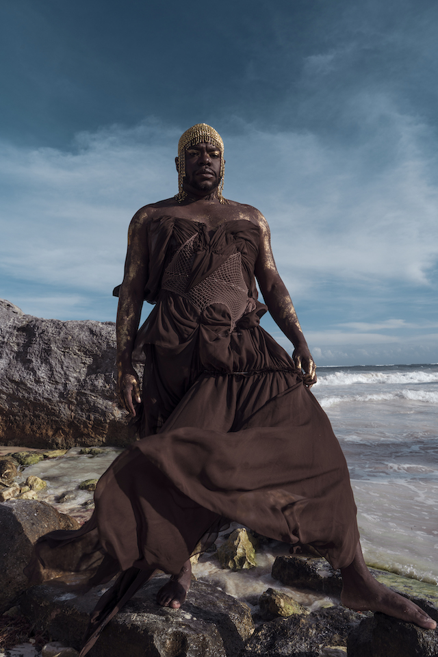
Jaamil Olawale Kosoko shares a poem from their new book blending poetry and memoir, conversation and performance theory
Jaamil Olawale Kosoko. Photo by Freddie Koh
Black Joy Is the Protest!
Listen to me. I am telling you a true thing. This is the only kingdom. The kingdom of touching; the touches of the disappearing, things. —Aracelis Girmay, “Elegy”
BLACK JOY is a protest that must be protected. It requires
constant spiritual conjuring and attention, attention of embodied survival.
I feel my BLACK JOY most in the depths
of loving and creating and healing. This beauty, I have come
to understand, is a kind of undeniable truth-telling to myself
or anyone else who might want to listen. BLACK JOY
as a birthright, a duty I must fulfill within myself to fully be within myself
…my raptures …my poetics. A testament,
of self love as resistance, as resilience.
Listen,
I’m speaking about a world of feeling, a spiritual excellence
that can only arrive in sensual attunements between the self
and the earth and the universe—when feelings become a presence so intense
that everything that has ever been past or future must take rest.
The first NYC solo show in 15 years at GRIMM, the photographer challenges our perspectives of reality with nine years’ worth of boundary pushing imagery
Dirk Braeckman: S.N.-U.N.-21, 2021. Ultrachrome inkjet print mounted on aluminium in stainless steel frame Framed: 90 x 60 x 3 cm | 35 3/8 x 23 5/8 x 1 1/8 in Edition of 5 plus 1 artist’s proof (#1/5) (c) Dirk Braeckman. Courtesy Zeno X Gallery, Antwerp, Galerie Thomas Fischer, Berlin and GRIMM, Amsterdam and New York
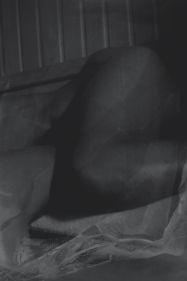
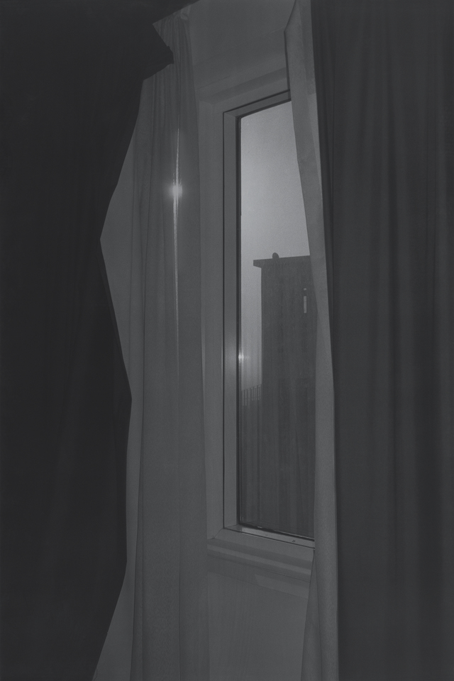
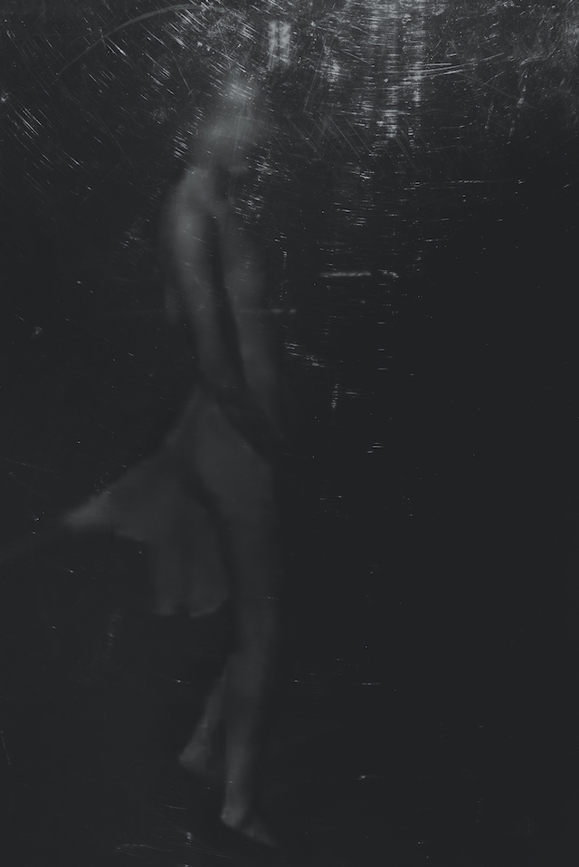
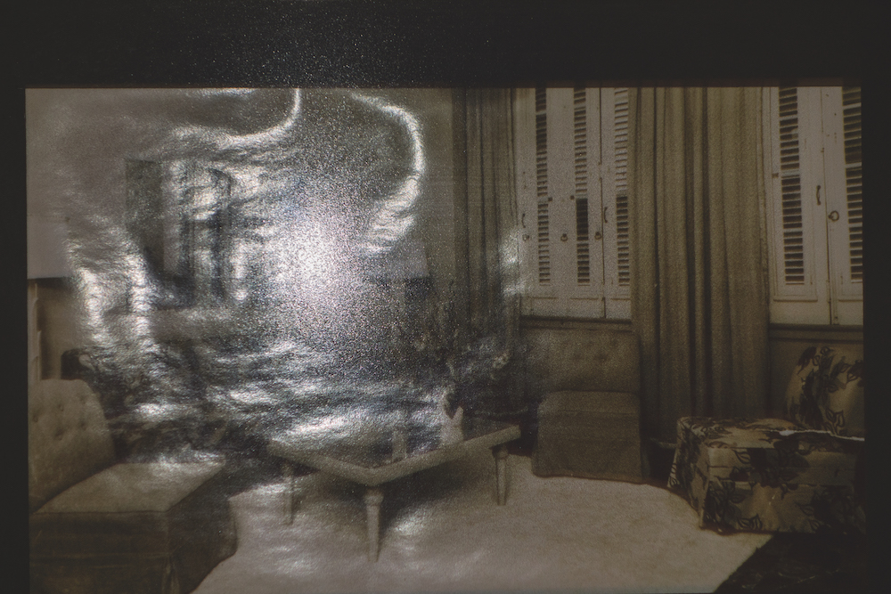
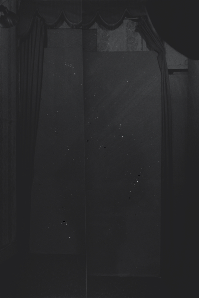
The opening image of Dirk Braeckman’s first solo show of 15 years is quintessentially Dirk Braeckman. This photo greets you with a stark uneasiness; a body-like composition appears to be cradling itself amongst some crispy sheets and materials, the colours printed in a signature tone of ashy monochrome. Sombre, dark and melancholy, the name – S.N-U.N.-12, 2021 – is just as allusive as its subject matter, where you’re not quite sure of its offering, let alone its narrative and context. But one thing we do know is that the piece is an ultra chrome inkjet print, mounted on aluminium and hung in a stainless steel frame; a technique widely employed throughout the photographer’s boundary pushing practice.
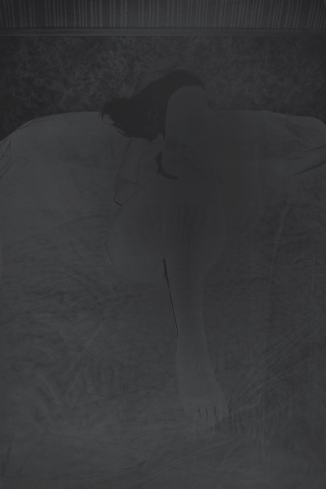
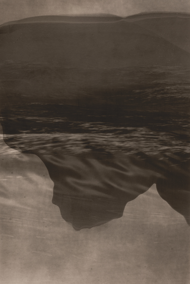
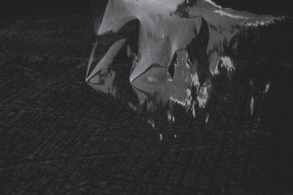
Minutes later and you’ll float quietly past the image titled U.M.-V.P.-16, an almost opaque depiction of a subject laying on a a bed – their face obscured from the camera’s gaze and the lines of the body only just visible to the audience. Similar to when a bright flash goes directly into your eye and your pupil rapidly adjusts to its surroundings, this gelatine silver print is hauntingly mysterious. What follows next is a series of landscape explorations, the sea crashing against the sepia-tinted cliffs and the dynamic ripples of the ocean reflecting the small amount of light available to the lens. You might not have come across anything so considered and technical before, where layers of life and perspective have been thoughtfully composed into a dystopian depiction of the world.
Dirk Braeckman: U.M.-V.P.-16, 2016. Gelatin silver print mounted on aluminium, aluminium support & frame Framed: 180 x 120 x 3 cm | 70 7/8 x 47 1/4 x 1 1/8 in Unique in a series of 3 (#1/3) (c) Dirk Braeckman. Courtesy Zeno X Gallery, Antwerp, Galerie Thomas Fischer, Berlin and GRIMM, Amsterdam and New York
Based in Belgium, Dirk has spent the last 40 years as a photographer. Over this time, he’s continued to build on his impressive portfolio replete with recognisable and undeniably expressionistic artworks, that of which have garnered him a credible name in the field. Instead of offering up his stories and motives on a platter for the hungry viewer to quickly ingest, Dirk contrastingly leaves a sense of mystery throughout all that he creates. He’s a suckler for the darkroom, too; he works like a painter as he experiments with the creative process, altering negatives through various tools and double exposure techniques. The result of which is almost unrecognisable, from altered seascapes, darkened bedrooms, wallpapers and nudes awash in a tone of grey. What is reality, when conceived through the eye of this knowingly stirring photographer?
Toying with the unknown, Dirk’s photography is very much the case of ‘show don’t tell’. It’s an illusion ready to be found out – like the moment of uncovering a magician’s trick. Whether we find this book of secrets, though, is something we can only hope for. But for now, revelling in the beauty of the imagery at hand is more than enough.
Dirk Braeckman: U.C.-T.C.I #2 -21, 2021 Ultrachrome inkjet print mounted on aluminium in stainless (series of five works) 180 x 120 x 3 cm | 70 7/8 x 47 1/4 x 1 1/8 in (each) Edition of 3 (#1/3) (c) Dirk Braeckman. Courtesy Zeno X Gallery, Antwerp, Galerie Thomas Fischer, Berlin and GRIMM, Amsterdam and New York
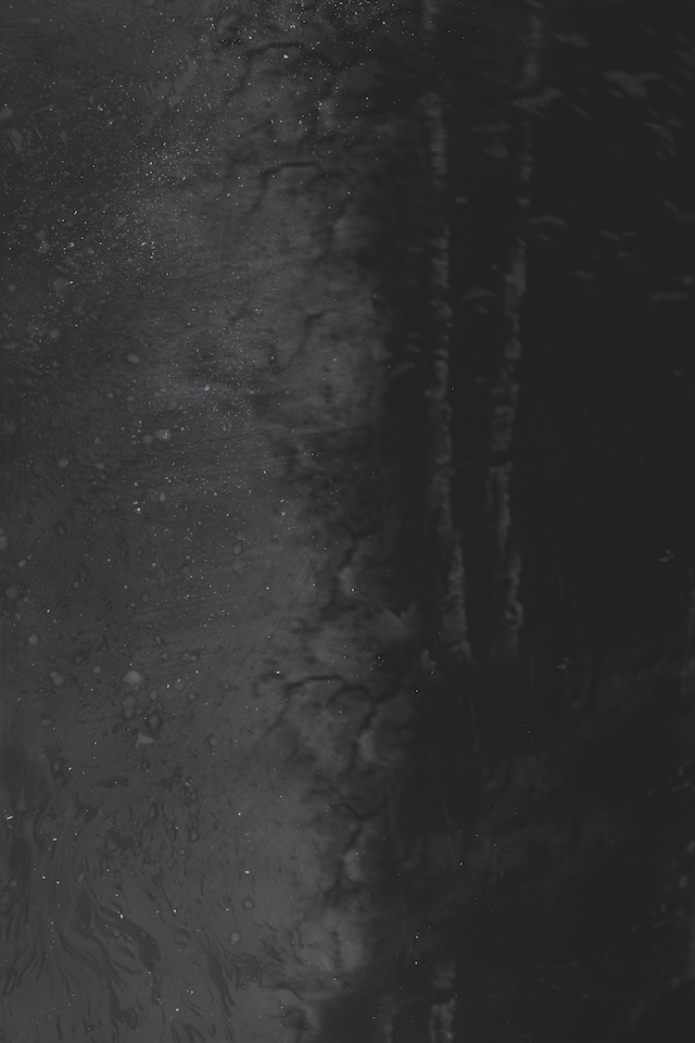
The exhibition features a wide-spanning collection of his works from 2012 to 2021 that not only give the audience a firm understanding of the breadth of his practice, but also his commitment to his artistic language. There’s a synchronicity between each piece, where fluid movements of nature meet with the candid postures of his subjects. What I find particularly interesting, too, is the omnipresent feeling of light. In many of his photos, there’s a glimmer of light presented in the frame. This is either portrayed as a more obvious ray of the moon or the more allusive, like the moment someone tries to photograph an artwork in front of them, only to have been met with the light bouncing off the frame. Other times, the light is more finely sprinkled than it is all-encompassing, but it’s always there – keeping you in check with the reality.
Towards the final moments of the exhibition, you’re then met with a piece named T.S.-O.S.-18. There’s a familiarity about this one – the darker palettes, handing drapes and wallpaper. Yet what’s different this time around is that there’s no subject to be seen, no-one cradling their own body in the dimly it room. The absence of a person leaves you wondering whether what you’ve just been looking at was ever there at all; that art and photography a subjective, illusive thing.
LUSTER./ is currently on show at GRIMM New York until 26 February 2022.
Dirk Braeckman: B.J.-D.U.-12, 2012. Gelatin silver print mounted on aluminium, aluminium support & frame Framed: 180 x 120 x 3 cm | 70 7/8 x 47 1/4 x 1 1/8 in Edition of 3 plus 1 artist’s proof (#2/3) (c) Dirk Braeckman. Courtesy Zeno X Gallery, Antwerp, Galerie Thomas Fischer, Berlin and GRIMM, Amsterdam and New York Dirk Braeckman: B.S.-S.B.-18 #3, 2018. Gelatin silver print reversibly mounted on aluminium 180 x 120 x 3 cm | 70 7/8 x 47 1/4 x 1 1/8 in (c) Dirk Braeckman. Courtesy Zeno X Gallery, Antwerp, Galerie Thomas Fischer, Berlin and GRIMM, Amsterdam and New York Dirk Braeckman: R.N.-W.S.-21, 2021. Ultrachrome inkjet print on matte paper 180 x 120 cm | 70 7/8 x 47 1/4 in Edition of 3 plus 1 artist’s proof (c) Dirk Braeckman. Courtesy Zeno X Gallery, Antwerp, Galerie Thomas Fischer, Berlin and GRIMM, Amsterdam and New York Dirk Braeckman: F.W.-S.V.-21, 2021. Ultrachrome inkjet print mounted on aluminium in stainless steel frame Framed: 180 x 120 x 3 cm | 70 7/8 x 47 1/4 x 1 1/8 in Edition of 3 plus 1 artist’s proof (#1/3) (c) Dirk Braeckman. Courtesy Zeno X Gallery, Antwerp, Galerie Thomas Fischer, Berlin and GRIMM, Amsterdam and New York Dirk Braeckman: L.U.-A.L.-21, 2021. Ultrachrome inkjet print mounted on aluminium in stainless steel frame Framed: 180 x 120 x 3 cm | 70 7/8 x 47 1/4 x 1 1/8 in Edition of 3 plus 1 artist’s proof (#1/3) (c) Dirk Braeckman. Courtesy Zeno X Gallery, Antwerp, Galerie Thomas Fischer, Berlin and GRIMM, Amsterdam and New York Dirk Braeckman. 27.1 / 21.7 / 045 / 2014, 2014 Ultrachrome inkjet print mounted on aluminium support & frame Framed: 120 x 180 x 3 cm | 47 1/4 x 70 7/8 x 1 1/8 in Edition of 3 plus 1 artist’s proof (#2/3) c) Dirk Braeckman. Courtesy Zeno X Gallery, Antwerp, Galerie Thomas Fischer, Berlin and GRIMM, Amsterdam and New York Dirk Braeckman: R.N.-W.S. #2-21, 2021. Ultrachrome inkjet print mounted on aluminium in stainless steel frame Framed: 180 x 120 x 3 cm | 70 7/8 x 47 1/4 x 1 1/8 in Edition of 3 (#1/3) (c) Dirk Braeckman. Courtesy Zeno X Gallery, Antwerp, Galerie Thomas Fischer, Berlin and GRIMM, Amsterdam and New York Dirk Braeckman: S.G.-B.S.-21, 2021. Ultrachrome inkjet print mounted on aluminium in stainless steel frame Framed: 180 x 120 x 3 cm | 70 7/8 x 47 1/4 x 1 1/8 in Edition of 3 plus 1 artist’s proof (#1/3) (c) Dirk Braeckman. Courtesy Zeno X Gallery, Antwerp, Galerie Thomas Fischer, Berlin and GRIMM, Amsterdam and New York Dirk Braeckman: T.S.-O.S.-18 (1_1), 2018 Gelatin silver print reversibly mounted on aluminum 180 x 120 cm | 70 7/8 x 47 1/4 in Unique in a series of 3 (#1/3) (c) Dirk Braeckman. Courtesy Zeno X Gallery, Antwerp, Galerie Thomas Fischer, Berlin and GRIMM, Amsterdam and New York
The esteemed photographer talks us through his new roster of exhibitions and book, True Colors (or, Affirmations in a Crisis)
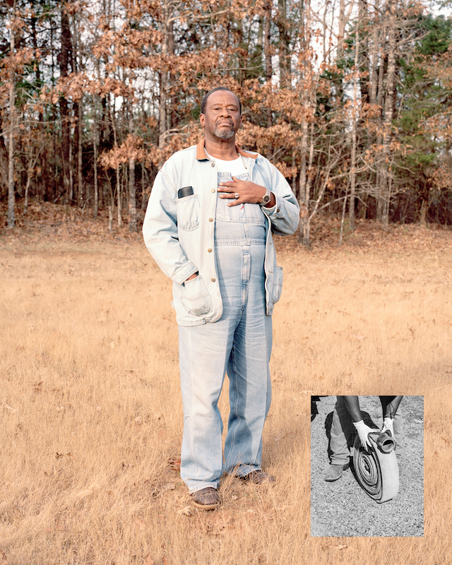
American Father, 2018
For Zora J Murff – a photographer, artist and educator based in Arkansas – to be published by Aperture is not too dissimilar from a chimera. An illusory dream of kinds, Zora could “hardly believe it” as he won the Next Step Award and was affirmed a new book from the publisher, entitled True Colors (or, Affirmations in a Crisis). Coupled with an exhibition at London’s Webber Gallery plus a presentation of his new series American Mother at Paris Photo, Zora is sharing perhaps his most direct and critical commentary of work to date – that being a compilation of photographs, archival imagery from the past 12 years. In these works, the artist speaks of power, privilege, race and white supremacy, plus the impact it’s had on Black people in America. Zora tells me more below.
Fronting (Affirmation #4), 2020
It would be great to begin by hearing about your first steps into photography. What sparked your interests in the medium?
I started taking photographs in my early 20s. At the time, I was a social worker providing services to kids in the juvenile criminal justice system. I found the work rewarding in many ways, but something always seemed missing. Being an employee of the criminal justice system was conflicting. Even though I served kids and families who found themselves in difficult circumstances, I was present as a punitive measure. It was an environment where most of our practices and processes were dissonant from rehabilitation, and even though I could understand what changes could change that reality, I wasn’t in a position to speak on or enact them.
I often felt stuck and decided to go back to school to study art. I started my first serious body of work, Corrections. Creating that work was my first education in researching a violent system and speaking on that violence through the practice and interpretation of image-making. Furthermore, I was fortunate to have a couple of professors, Margaret Stratton and Jeff Rich, who were present for my ideas and taught me how to articulate what I was trying to express both visually and in language. I quickly learned that I had been searching for a profession where I could work with people and help them in similar ways.
At No Point in Between
What’s your ethos and what messages are you hoping to share?
My ethos as an artist is to have the courage to be vulnerable and to speak my truth. In my earlier works, I kept a distance between myself, the subject, and the viewer. I am present with my thoughts and camera, but I am speaking on those things through nuance and perhaps imperceptibly. I credit this to studying in historically/predominantly white institutions where Blackness had not been allowed, was not accepted and therefore not understood. Because of our society’s belief and wholesale practice in racialisation, I find myself in adversarial situations for being Black. These confrontations happen daily, sometimes self-initiated but mostly by force. My work deals directly with existential questions and presents various aspects of our social reality. Those answers I have found don’t differ from my early experiences with my first professors: being an artist is an endeavour in self-determination. I carry this sentiment with me into everything I do.
At No Point in Between
You’ve opened two exhibitions and recently published a new book with Aperture — tell me about this new body of work. How does it compare to your past projects?
True Colors (or, Affirmations in a Crisis) is me going for broke. When I first learned that I had won the Next Step Award and would be publishing with Aperture, I could hardly believe it. I had a conversation about it with the good homie Kris Graves, and his advice was, “Now is the time to be direct.” This book is me, parts of my life narrated by me and a choir of folx who have all supported me in getting to this exact moment. It’s not so much a body of work, but my collective commentary on the last 12 years as a means of being critical of “the come up.” Iam talking about what it means to participate in systems whose agents have continually seen and used me as a diversity token.
At No Point in Between
How do your hope your audience will respond to the work?
My goal with this process was to create something that pulled out all of the stops because it’s not every day artists get to publish at this level. My goal with this process was to spread this opportunity as widely as possible, so my people could eat.
I don’t have goals for audience response or plans for what this work can accomplish in general. As the title states, the book is me putting out affirmations for myself as I experience a crisis of consciousness. People who have lived similarly to me will find themselves in these pages. The only thing I could ever ask is that viewers bring themselves to the artwork with an open heart and critical mind (both outward and inward).
What’s next for you?
I’m going to take some time to celebrate and enjoy in this work with the people I love. Everything else is just white noise.
Gas Money (Affirmation #1), 2019 Reservoir At No Point in Between Self Portrait as a Dreamed Man (After Bayard), 2020 Untitled (False walls #1), 2020
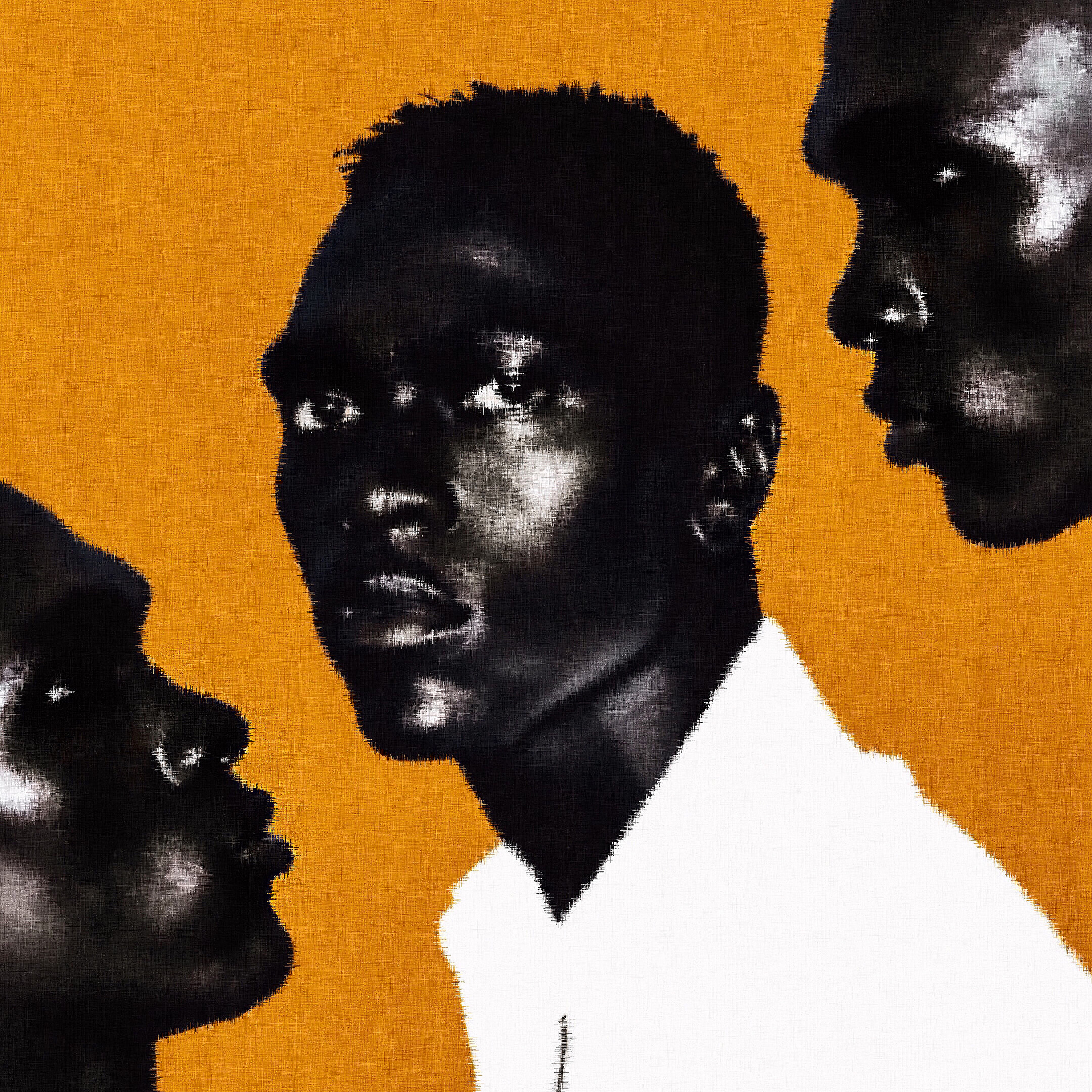
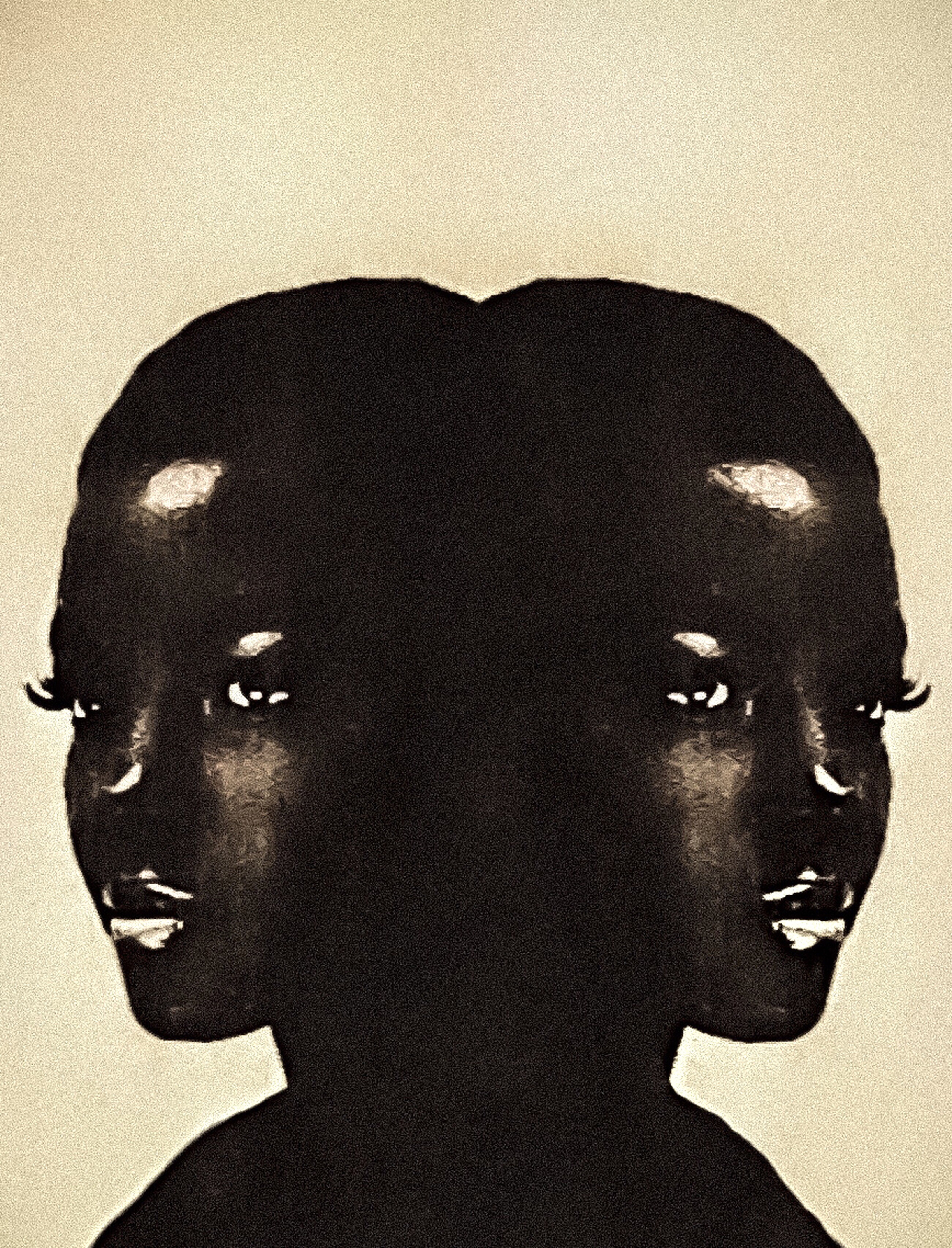
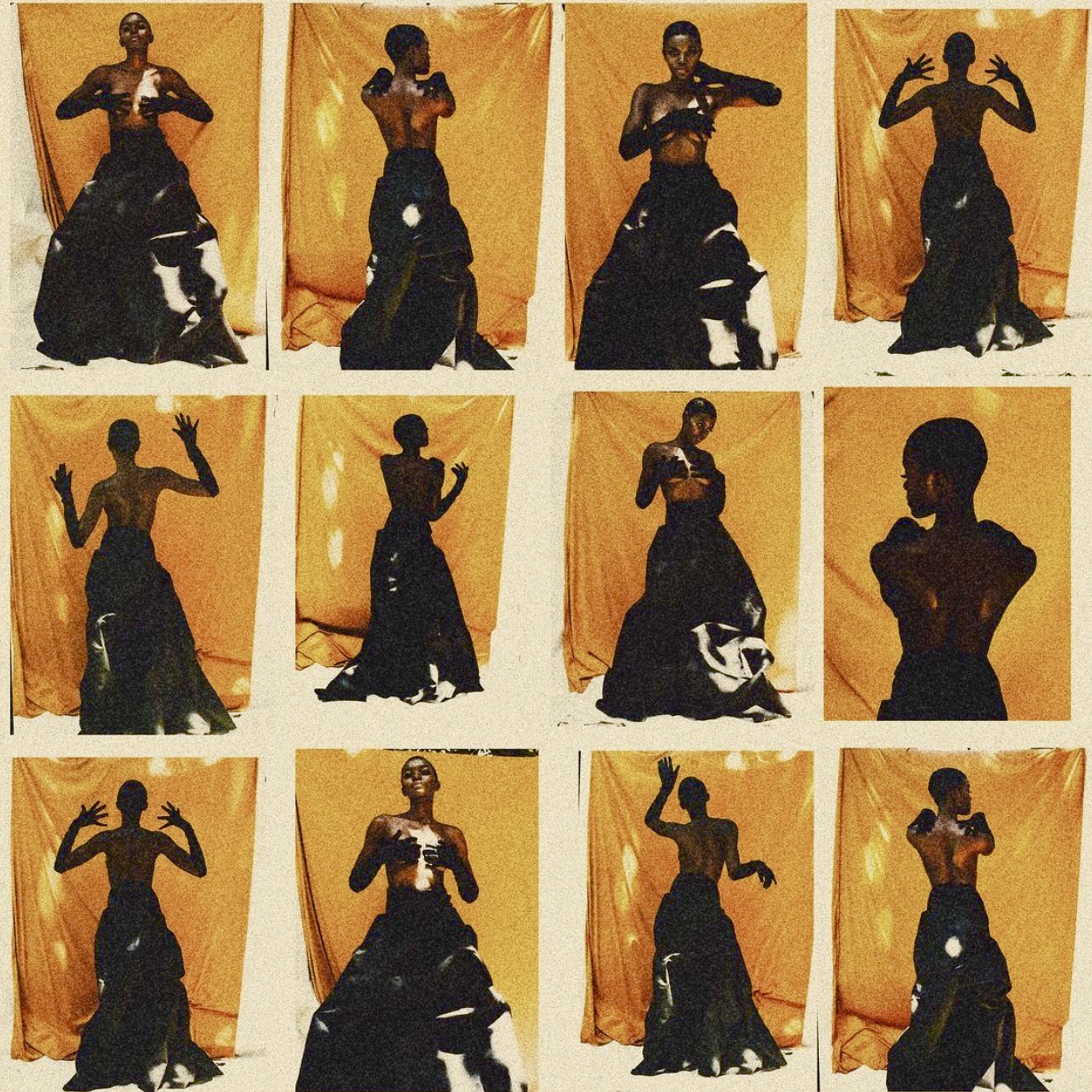
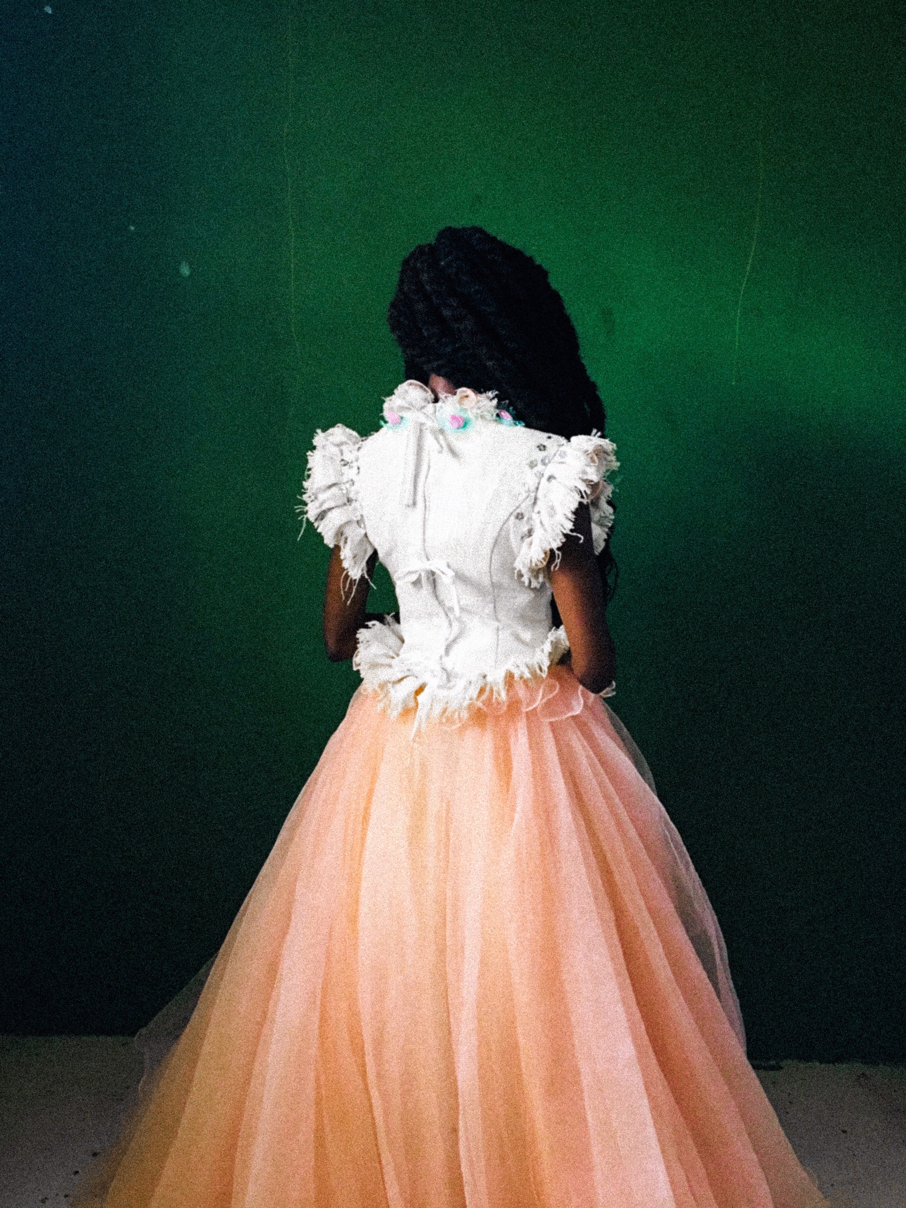
The Nairobi-based multidisciplinary artist creates worlds of inexplicable beauty
Presence and absence – Joel 2021
There’s something rather exponential about the work of Shitanda, a multidisciplinary artist from Nairobi, Kenya. Open to interpretation and riddled with passion for craft, each image resonates with power, storytelling and a careful consideration of tactility. You’re not quite sure how or where these images are made, or what they’re suggesting in their complex form and visuals. But that’s exactly what Shitanda strives to achieve in his work; an allusive feeling that sings to a distance memory, time and place.
From grainy textures to experimental shadow play, Shitanda’s painterly pieces are produced with a vintage-like quality. He lenses subjects adorned in fashion and places them amongst a coloured backdrop or setting, each littered with intrigue and an artistic language that’s “unexplainably beautiful”. Here, I chat to Shitanda to find out more about his evocative practice.
Mind and body -Juma 2021
What drew you towards photography over other creative media?
Well I can’t really say I chose photography over other media. It’s been a journey of constantly exploring different channels that allow me to visually translate my thoughts and mental experiences. At first, I was particularly drawn to photography because it allowed me to visually experience and relive moments that I was physically present or absent from. I’ve always been fascinated by the thought that I can’t rewind time, but photographs allow me to do so mentally. It’s thrilling to experience that soft nostalgia.
Overtime, photography gave me the chance to present my world to people and, in turn, I also get to experience the minds of those I photograph. A moment when we’re blind to any constraints that reality creates. It’s absolutely beautiful to watch someone reach out to cross that unseen line that separates their fantasies from reality. The honesty, the rawness, the vulnerability, the freedom to touch your dreams and the shared goal of creating something beautiful by our own terms is simply breathtaking.
Mind and body – Phoebe 2020
You’ve developed this immensely cinematic and nostalgic quality throughout your work. What’s influenced you to work this way?
The images are a visual representation of what I think my perception of life would look like if it was an object. Unclear, rough, uncertain, textured but sometimes difficult to feel, yet still so unexplainably beautiful. It’s like a silent noise that evokes a sense of nostalgia for a time and place I’m yet to experience.
How do you go about creating one of your photographs – what tools or methods do you use?
I don’t really have a particular way of making my pieces. I allow my mind to wander and settle where it feels most at home. Every image will carry its own emotion. Sometimes I’ll take photographs and think ‘I need to destroy these’, sometimes I’ll keep them for months without doing anything to them. And other times, I’ll take some and think ‘this story is complete’. I see them as paintings or poems, not to be rushed or overly controlled.
La femme noire – Phoebe 2020
Can you talk me through a favourite piece?
The face of anxiety is an unwritten love letter to the minds that were never meant to be understood. Those that present their own kind of beauty that can’t be explained in words.
Is there a particular message you’re trying to convey?
The poem Risk by Anaïs Nin: ‘And then the day came when the risk to remain tight in a bud was more painful than the risk it took to blossom.’
What’s next for you?
A design space that’s yet to be named, home to the dreamers and an experience for the minds that wander.
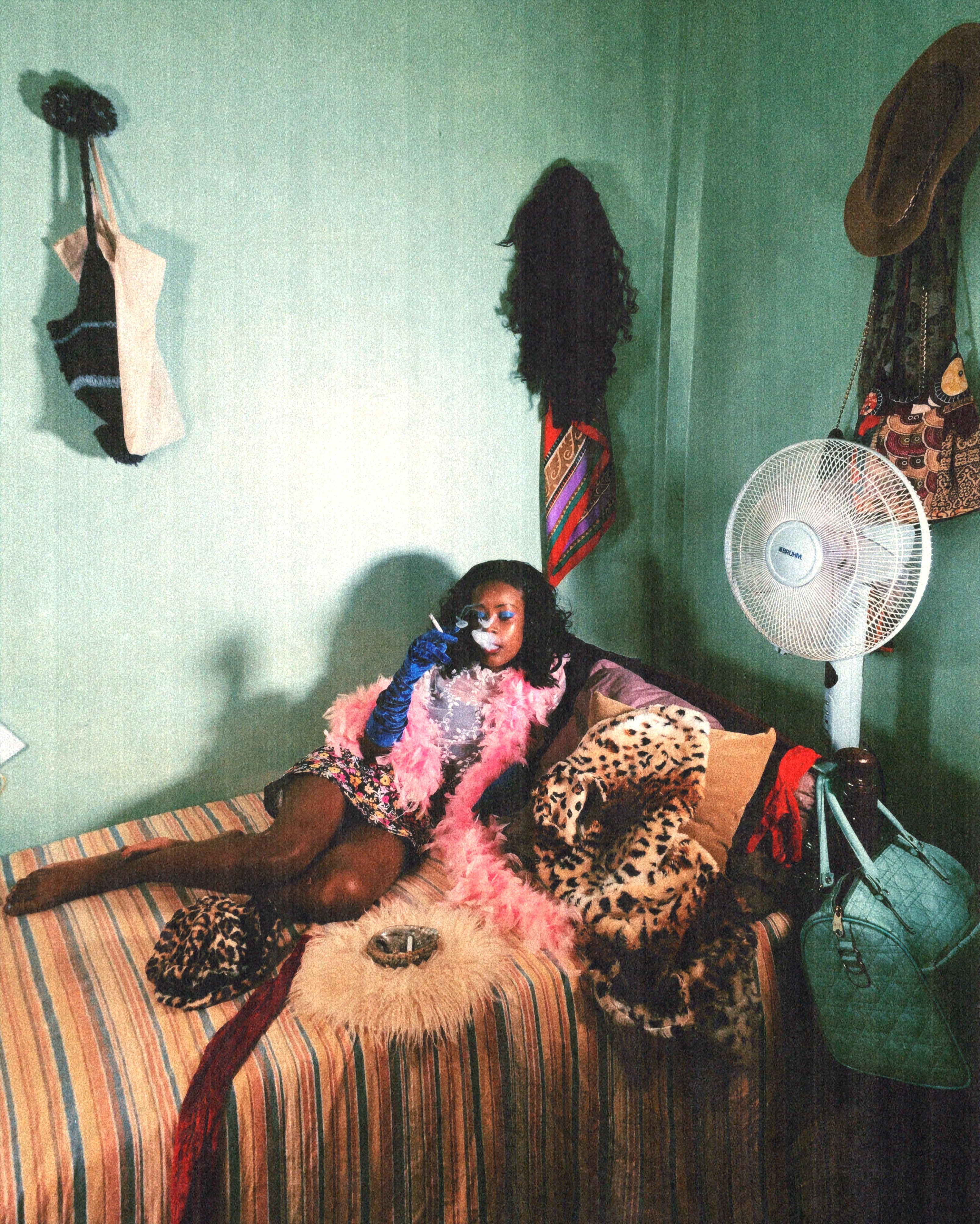
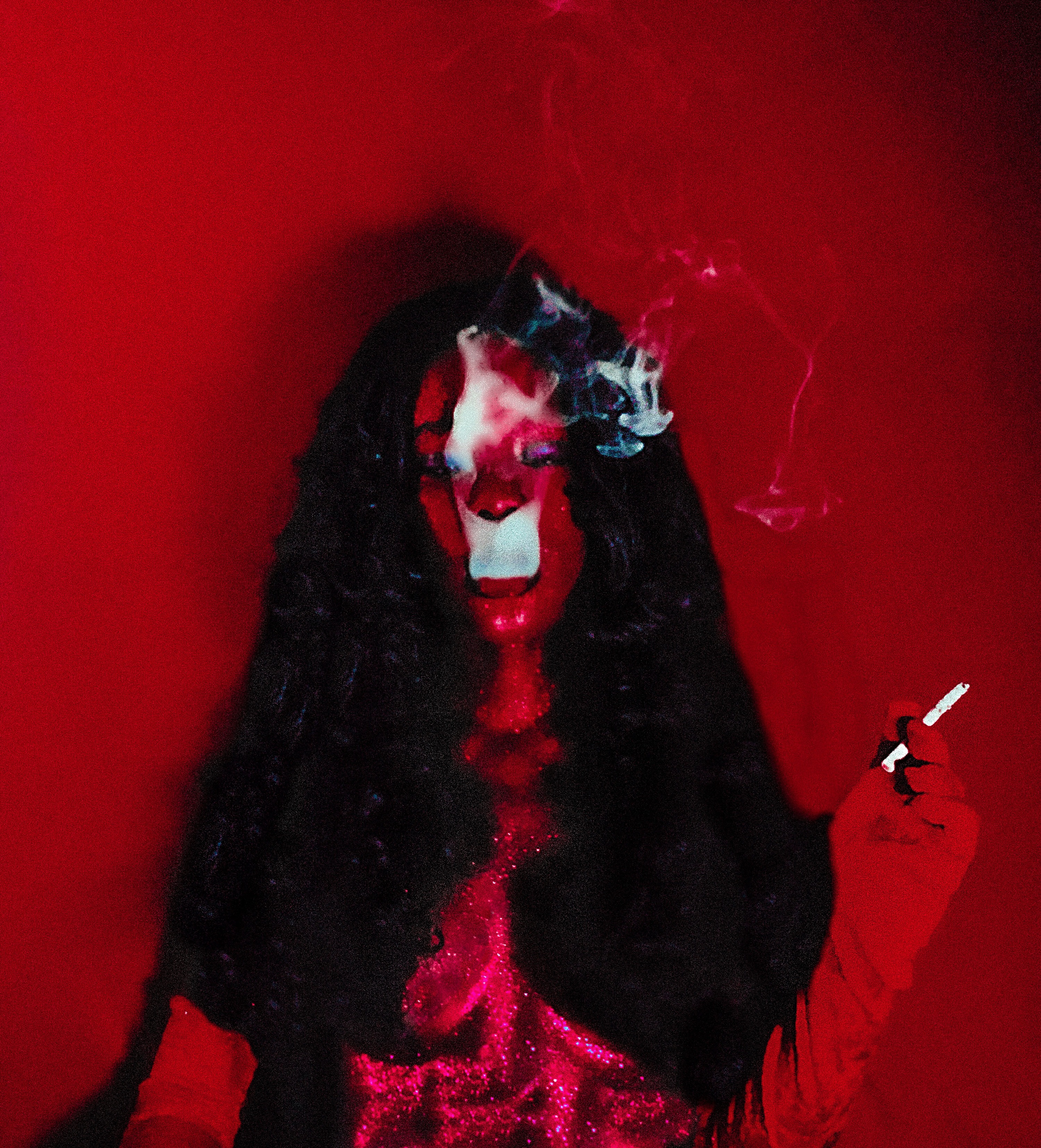
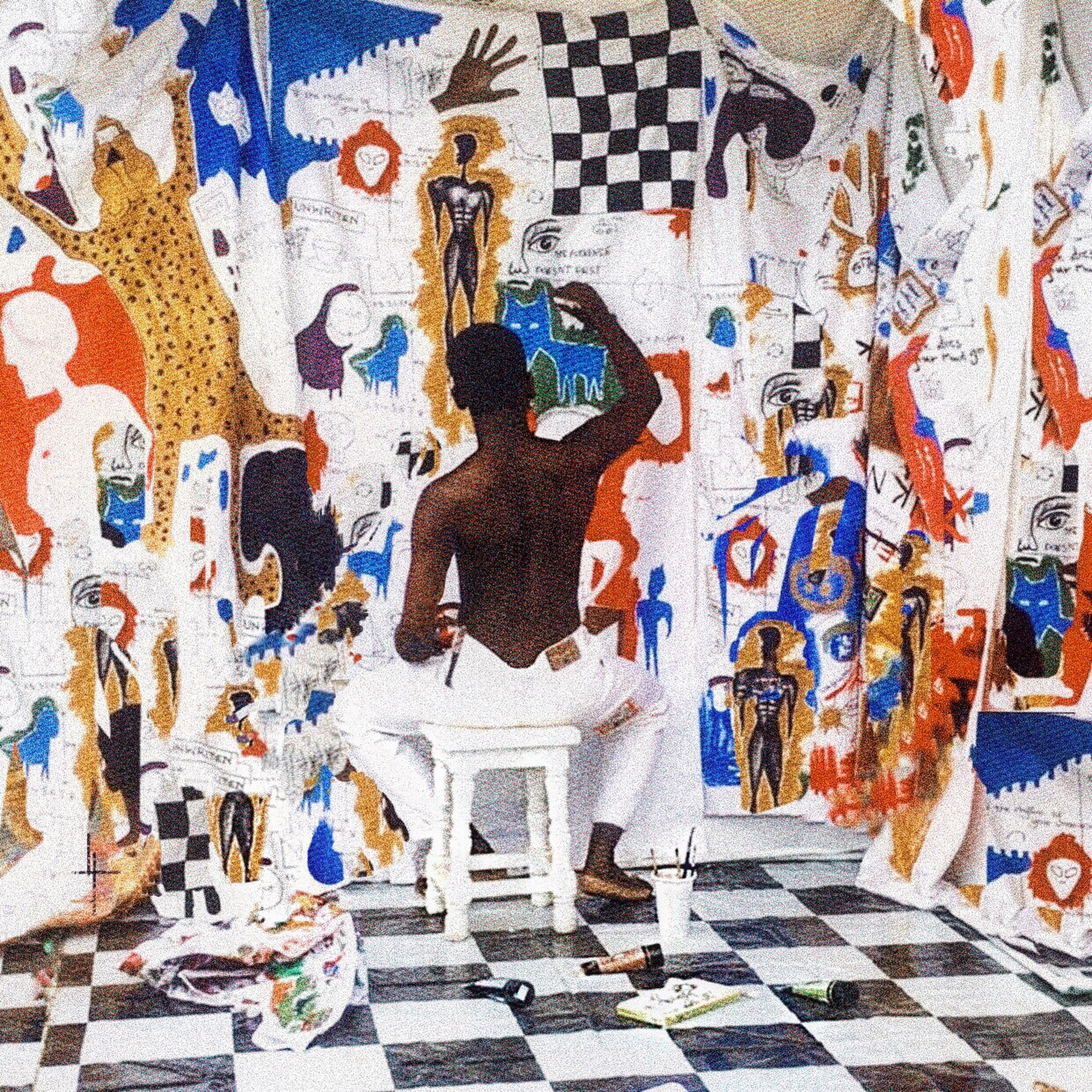
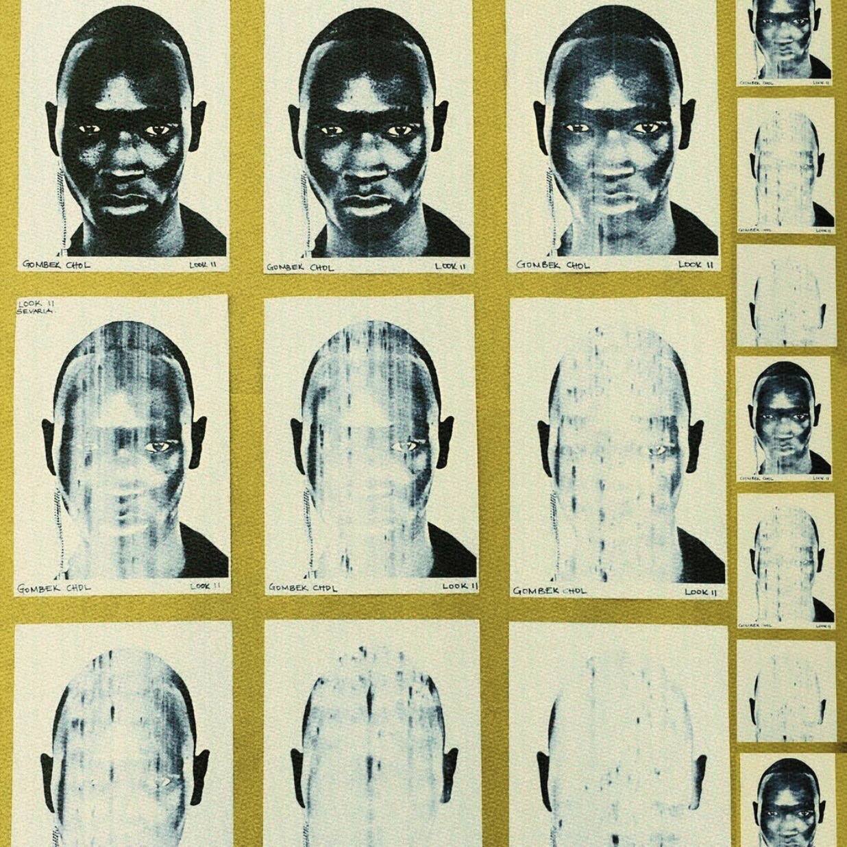
Presence and absence (la femme noire) – Viaana 2019Rest and the repossession of self – memories of non existent times, Didi 2021Rest and the repossession of self (Didi unwinds)The blank pageThe singer and the red rosePresence and absence – Gombek 2021
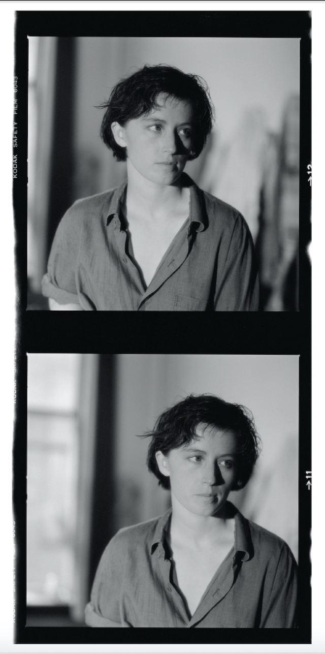
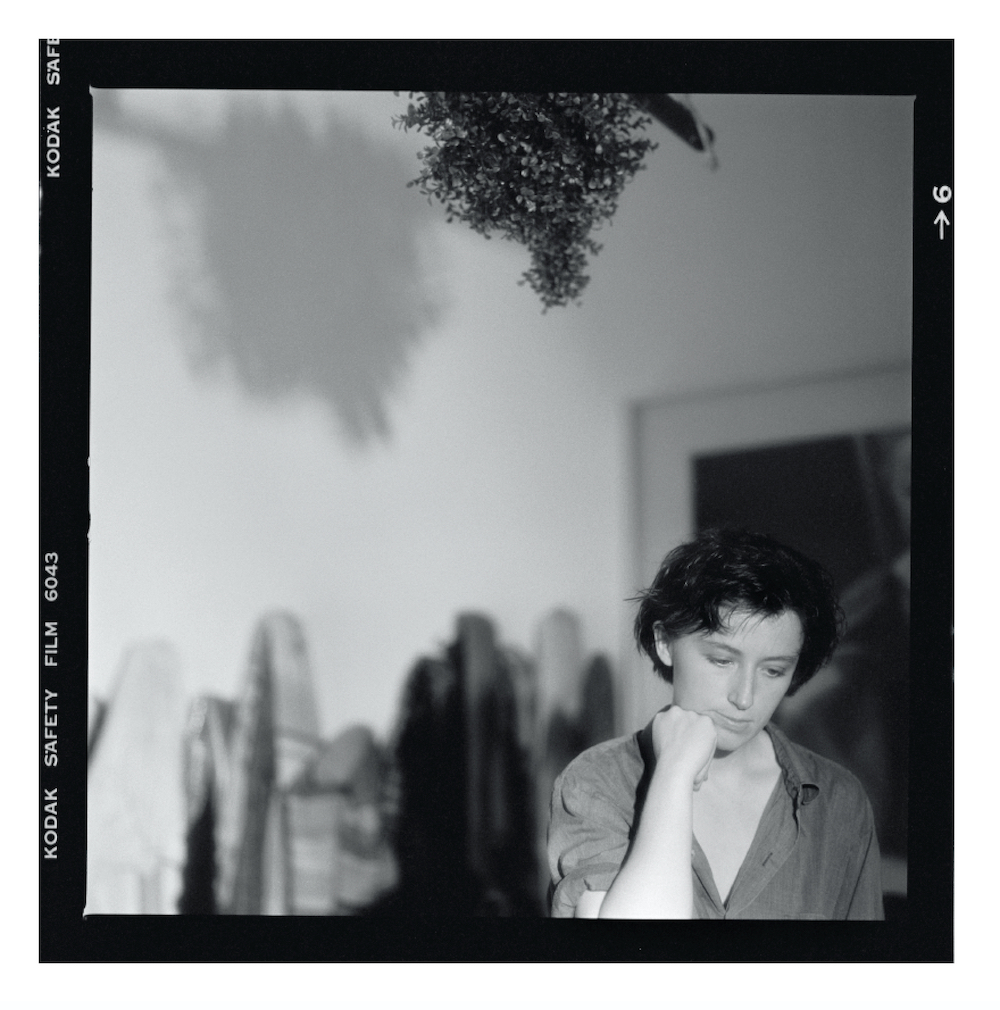
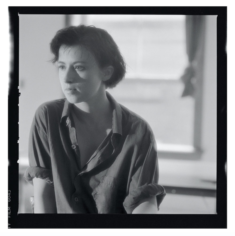
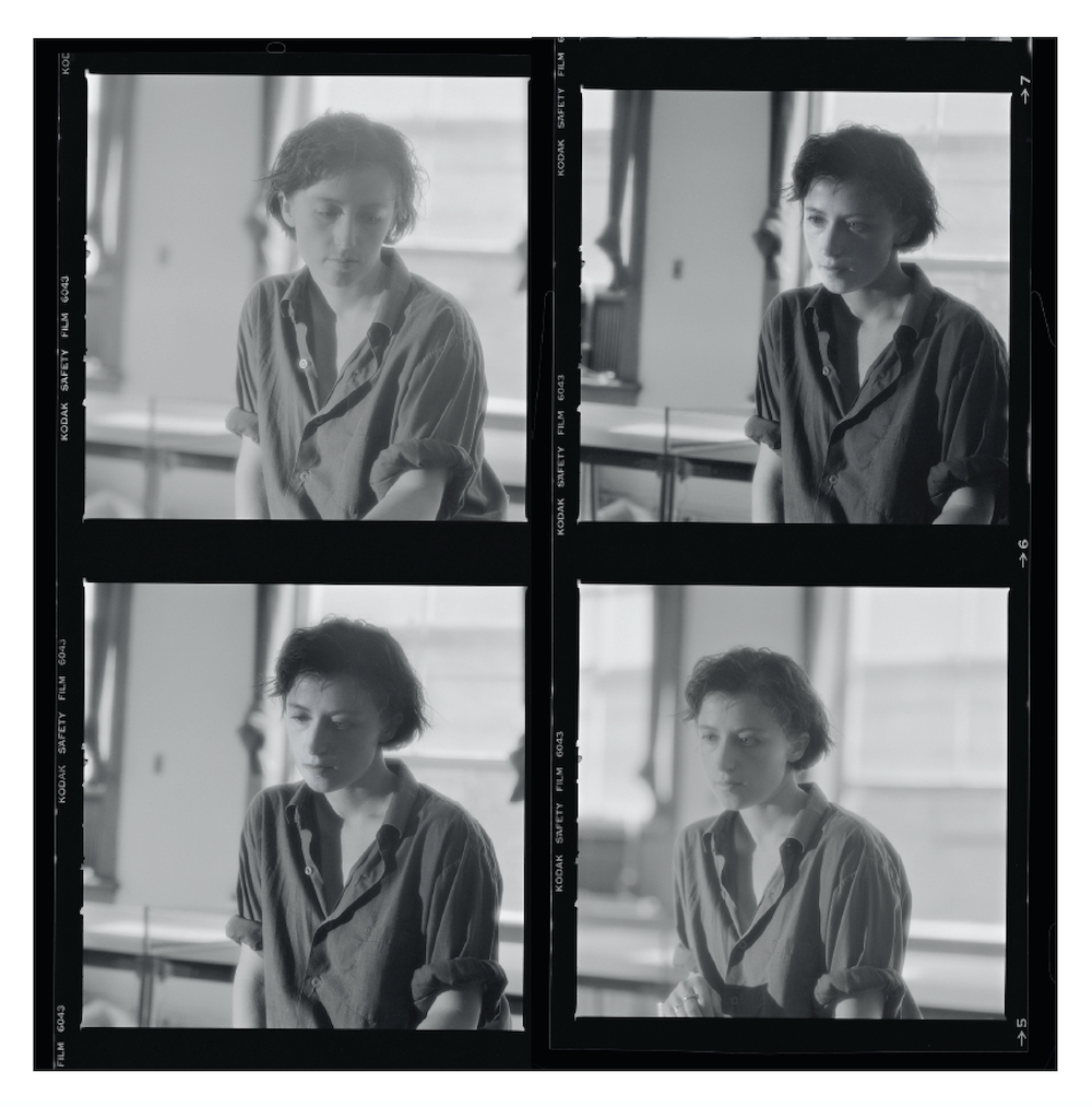
In some ways, we’re all familiar with the face of Cindy Sherman, an American photographer known for her self-portraiture adorned with wigs, prosthetics and elaborate makeup. For the last four decades, Sherman has turned an inquisitive eye onto the concept of identity, deconstructing its codes into varying pastiche of art, gender and self.
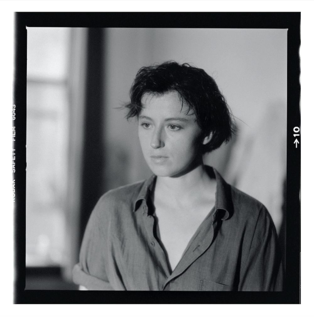
In a conversation with John Waters for MoMa in 2012, she said, “I wish I could treat every day as Halloween, and get dressed up and go out into the world as some eccentric character.” So it’s somewhat fitting, then, that Jeannette Montgomery Barron would end up photographing Sherman on Halloween in 1985, an annual event that sees America congregate in partying mass and embellished in fancy dress. Jeannette was invited to Sherman’s studio in the city, and it was in this very moment that she sat herself in front of the camera as her own subject – revealing a face without all the typical costumes and fictional characterisations.
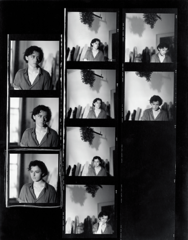
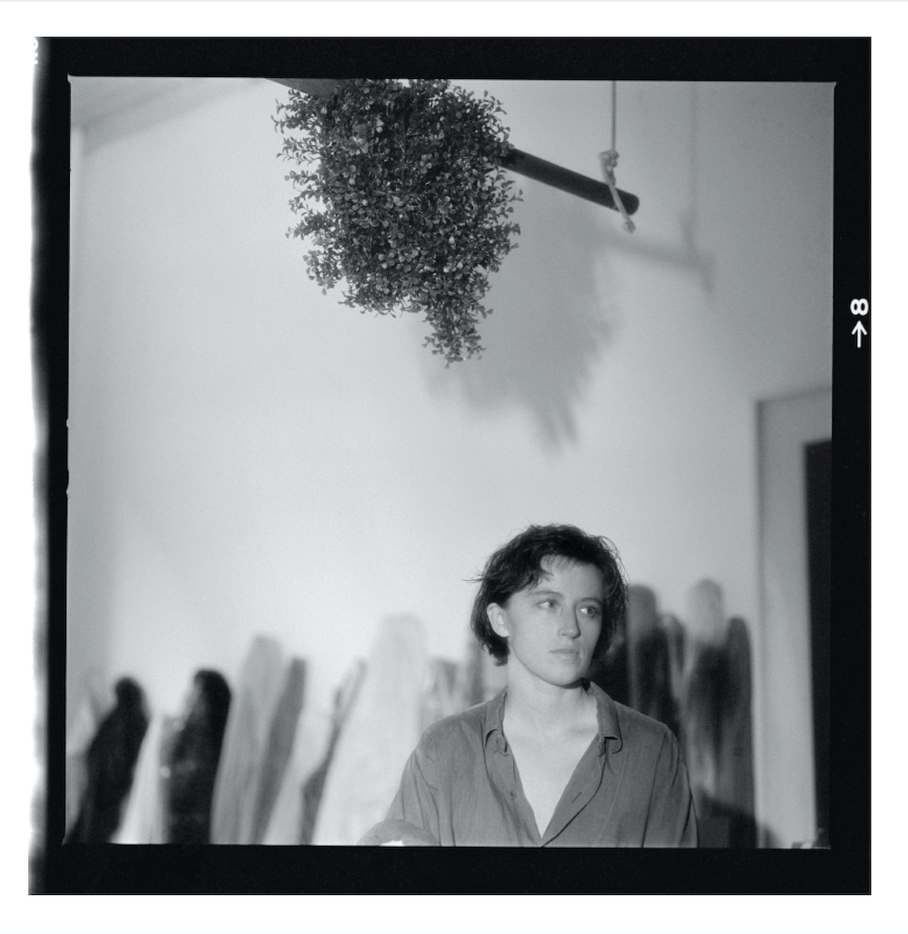
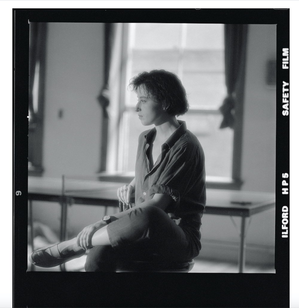
This was nearly 30 years ago, and the pictures have now been brought into light with a new book, Contact, published by NJG Studio. A compilation of 40 images and four contact sheets, the visual tome presents a different side of Sherman, as seen through the eye of Barron who’s known for capturing portraits of many notable names from New York City during the 80s. Below, I chat to Barron to learn more about this meeting.
Having lensed many renowned personalities over the years, what was it that captivated you to photograph Cindy Sherman?
When these portraits were taken in 1985, I had already photographed many people in the art world. Cindy was an artist whose work fascinated me. I just really wanted to photograph her.
How did the shoot come about; was she happy to be photographed?
I called her up on the phone and asked if I could photograph her – that’s the way it worked back then. If someone wasn’t home, I’d leave a message on their answering machine and they would hopefully call me back.
She seemed happy to be photographed. I really hope she was.
Was there a specific reason for photographing on Halloween in 1985? Does this date have much significance?
I’m pretty certain the date, 31 October, was chosen randomly. And I never really thought about the significance of the date until recently.
What was the art landscape like in New York at this time?
Well, you know, we all tend to romanticise the past. But I remember Soho still being a bit rough and wonderful back then. One vivid memory was walking around a corner onto West Broadway and always smelling fresh pepper; there were warehouses still down there.
I’d always stop by and say hello to Mary Boone when I was downtown, and also pop across the street to Leo Castelli’s gallery. I had two good friends who moved to a loft in Tribeca in the early 1980’s. If you can imagine, there was not one grocery store down there back then; it was kind of like the wild west.
What can you tell me about Sherman’s real-life character and persona? And how did this compare with your expectations?
Cindy was very quiet and reserved as I recall. I’m not sure I expected her to be any other way, even though her work may have led one to expect differently.
What was the process like; was it much of a collaboration between the two of you – between a photographer and subject?How exactly did you want to portray her in the photographs?
My process was always much the same: I would arrive exactly on time with my Hasselblad 500 C/M and usually Tri-x 400 film (although for these portraits I used Ilford film, which was unusual). I had two Lowel Tota Lights with stands I always brought along. And I always used a tripod for my Hasselblad.
I would usually find a spot where I want to photograph the subject and move around a bit, getting closer, going further away. Then sometimes I would change location and go somewhere else in the studio or apartment.
I wanted to portray Cindy as Cindy without all of the costumes on. I imagine that’s what she wanted too, since she answered the door in her normal clothes.
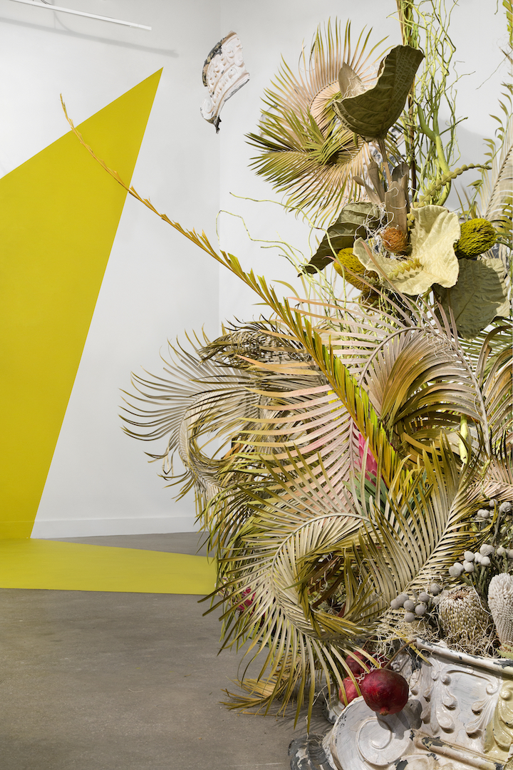
The Honduran-born botanical artist creates objects and sculptures coined from the natural world
The Central American country of Honduras is rich in flora. So immense that it runs miles, canopied amongst mangroves, cloud forests and long lines of coast stretching across the Caribbean Sea, to the north, south and Pacific Ocean. It’s marked by high and rainy mountainous slopes of the country’s highlands, dense in oak-pine forests and delicious woodlands that spreads for valleys upon valleys. Yet despite its vast occupancy of luscious lands and lively fauna that inhabit it, Honduras has also undergone some dramatic environmentalist issues. This includes the loss of soil fertility and soil erosion, plus the depletion of forests where trees have been harvested for lumber, firewood and land. Its fragility is only increasing, but it’s also these very pines, leafs and flowers that serve as a delectable backdrop and inspiration for one particular artist working today, Lutfi Janania.
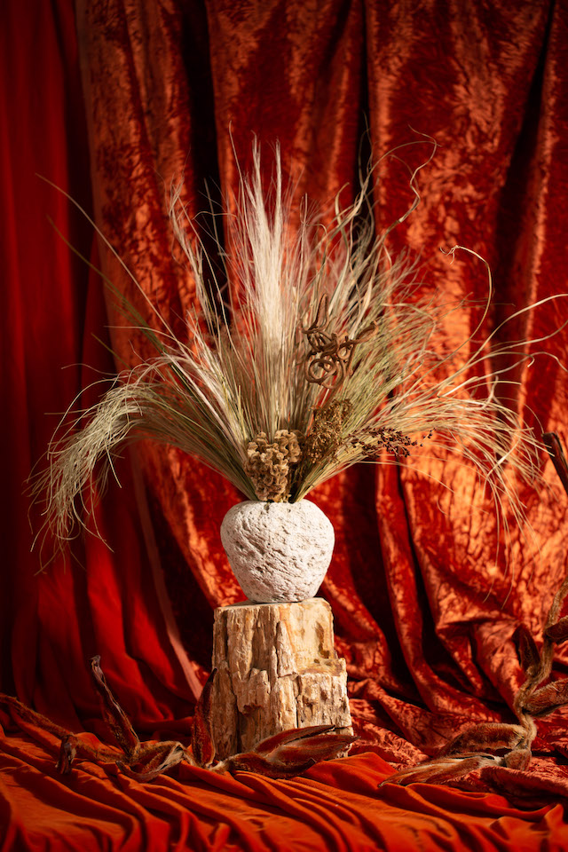
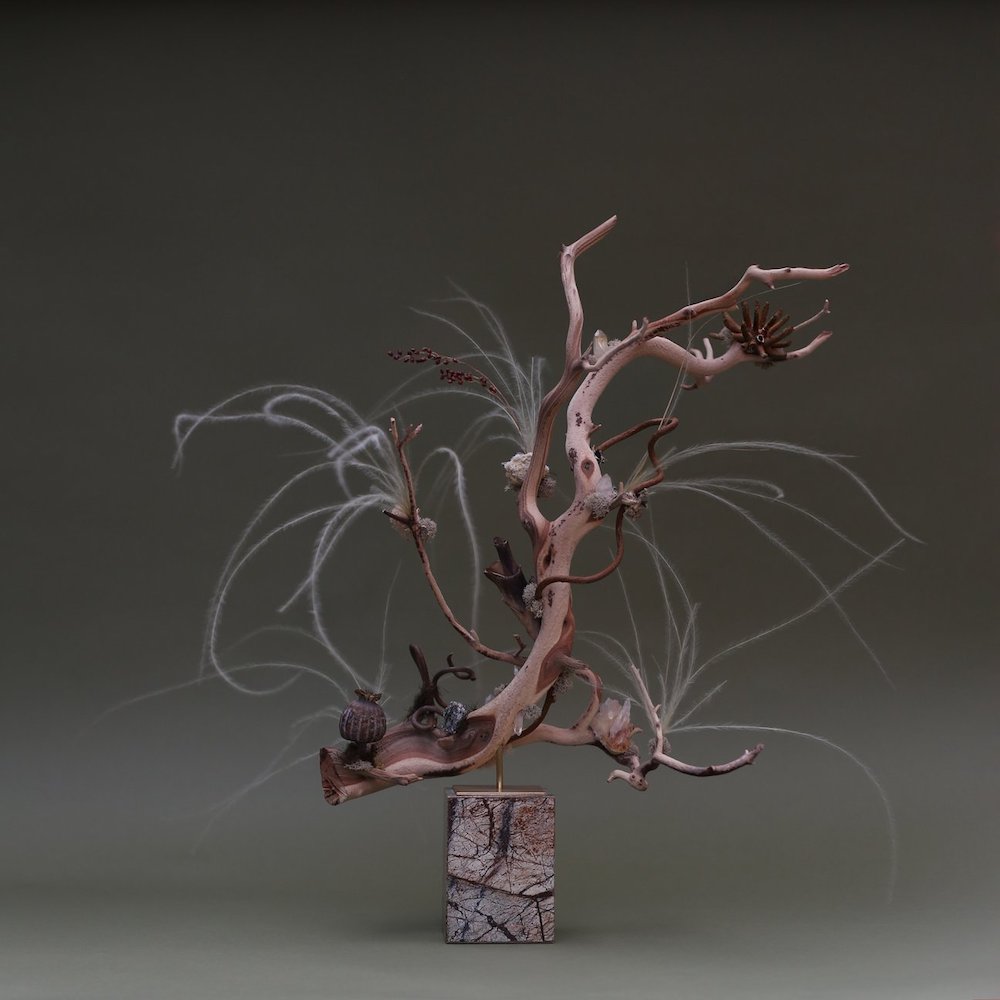
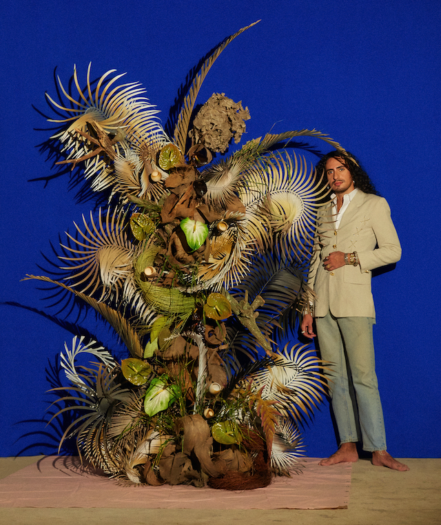
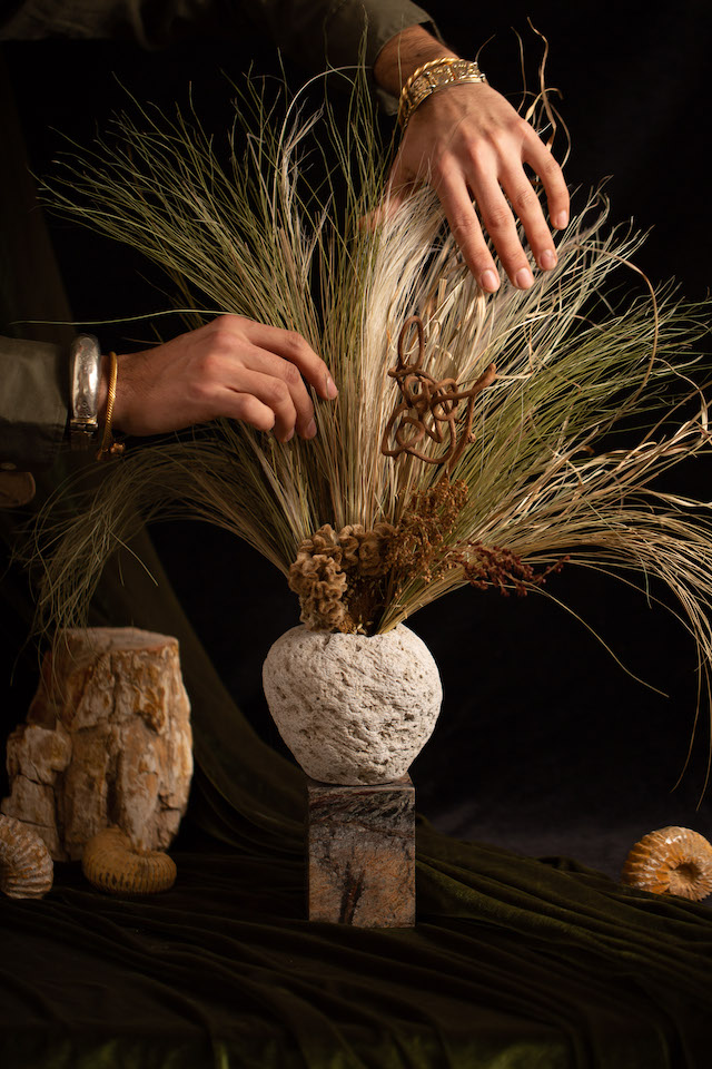
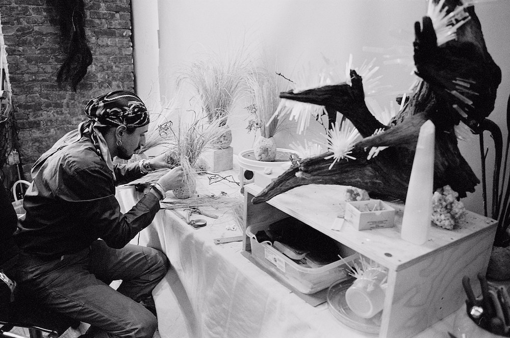
Lutfi is a Honduran botanical artist who was raised amongst the rainforest and mountains of San Pedro Sula. After emigrating to New York City, the artist was in search of a new utopia – one comparatively different to the green facades of his upbringing. And, in doing so, he started working in the fashion industry whereby he learned about construction, colour and texture; the key elements to his work now. A few design roles later, and he finally ventured out on his own as a stylist, working on editorials and employing the use of flowers within the backdrops and more subtle accents of the shoots. This is the moment when he realised he’d found his utopia, or better yet his “passion for creating fantasy through experiences that could be harnessed through botanical design,” he tells me. Naturally, this led to the launch of his own design studio, Rosalila, during which he works with botanicals to build objects, sculptures and installations.
Corallia. Shot by: Maksim Axelrod
“I live for the idea of creating a fantasy, transforming a dream into reality,” he continues, noting how this was fully harnessed once he’d moved to the USA. “I imagine it as materialising an enchanting and otherworldly environment and the creatures that live in it.” Through freshly cut tropical plants used in installations through to various assortments of trimmings and flowers, Rosalia is indeed a “fun, flirty, exotic yet very elegant” outlet for his goals and view of the world. “Think of that sensation when taking in the lively rays of sun in the tropical beaches of Honduras while holding a delicious spicy margarita in your hand.”
Lutfi’s reasons for venturing into the field of botanicals stems wholly from his past. His familial home, for instance, is located on a nature preserve, built by his grandfather amongst the wild forest. Describing the environment as being “literally Jurassic in size”, Lutfi had the entire ecosystem at his fingertips. “The trees tower over my house and provide habitat for a variety of tropical birds and giant variegated monsteras, and other plants which climb and drape all over their entirety. Coming of age in such company really shaped my understanding of colour texture and light.”
The typical compositions of a forest tend to be centralised, as the plants reach for the light in their journey to photosynthesise. Lutfi’s work, however, completely defies the laws of gravity, and of the rainforest for that matter. He relies steadily on light, weight, balance and, of course, gravity, to stretch and spread his pieces to achieve questionable angles. Reaching branches are paired with dried florals, “which seem to simultaneously bloom and weep”, while curved woods and obscure silhouettes are formed through the skill of finding stability within his striking sculpture pieces. It’s an art form in itself.
Looking inwards, and beyond the outer layer of wildness and beauty, you’ll notice how Lutfi’s structures are more than just a display of expansive nature. He picks his materials depending on the stories that they speak, especially those that tell tales of their homelands. “And because of my upbringing in the bioreserve of Honduras, my relationship and experiences with the natural world have led my inspiration to be often rooted in nature,” he explains, weaponising both permanent and sustainable objects in order to reach the studio’s environmentally conscious goals. “At Rosalila, we have a conscious practice; we don’t believe in a wasteful way of designing. We repurpose our materials, pushing their limits and boundaries.”
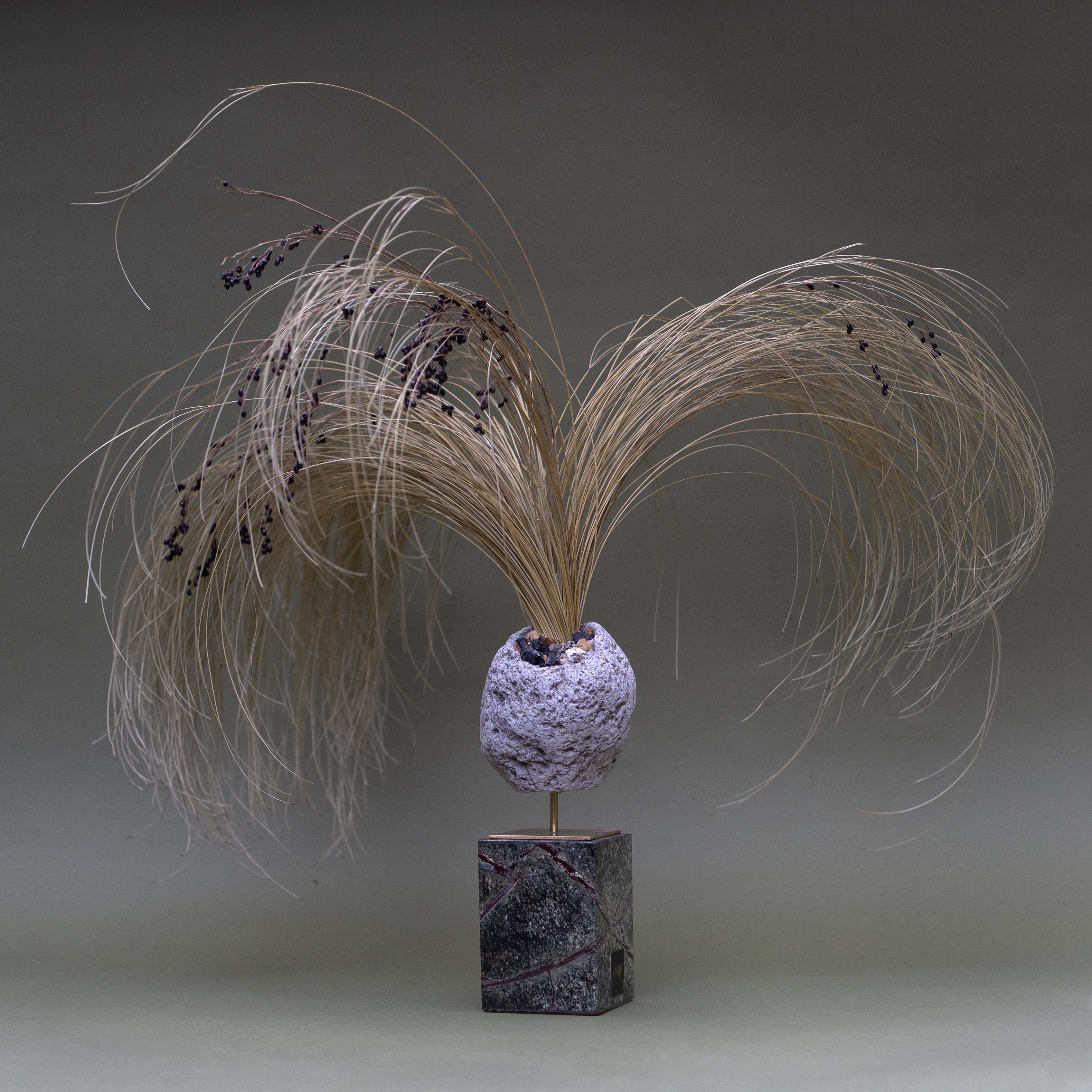
Leafy Sea Dragon. Shot by: Leon Hernandez
The Leafy Sea Dragon sculpture embodies this entirely, as its’ construed of hand-preserved botanicals, manzanita wood branches and crystals. “The piece explores negative space, grandeur and fantasy with an emotional connection,” adds Lutfi, who collaborated with a family-owned fabricator in Queens to create the Italian rainforest marble base, and a Brooklyn-based metalworker in Brooklyn to weld the brand stand, before adding in the botanical work crafted by the studio. It’s an immeasurable piece with strands and spikes alluding to the ever-growing quality of nature; punches of pinks are tossed amongst the desolate, earthy tones of the environment, causing a fiery juxtaposition of fertility and sterility that plausibly takes a stand against the dwindling lands of the rainforest.
All of Lutfi’s pieces encompass a myriad of materials, be it marble, quartz, brass, manzanilla wood, curly vines and hand-preserved botanicals. And through the marriage of the man-made and natural, his pieces are greatly provocative. “My desire is to convey emotions, feelings and sensations and the dualities in them,” he shares on a final note about the work’s impact. “When compiled together, these vignettes with crooked leaves generate sorrow, curiosity, anticipation and longing. In stirring such emotions, the environment begins to take shape and the life within the work becomes evident. The dried, dehydrated material is not just preserved, it’s persevering and actively creating. What appears to be dead is very much alive.”
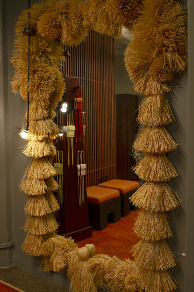
Portrait in front of sculpture. Shot by: Ricardo RiveraThe Mirror. Housed by: @Ashya.co. Shot by: @equatorproductionsCorallia. Shot by: Maksim Axelrod
Allegra Oxborough’s 10-episode web-series affixes a gaze onto the challenges of parenthood over the pandemic
So much as modern societal expectations are concerned, reaching your mid-30s usually means it’s time to start having children. Allegra Oxborough, an artist and filmmaker based in Brooklyn, is currently at this benchmark, where most of her friends are becoming parents. “I know that some people continue to make art after they have children,” she tells me, “but there are so many more time constraints and financial responsibilities – I’ve always been scared of what that would mean for me as a woman, creative freelancer and artist.”
Having grown up predominantly in the mid-west, Allegra has now been rooted in New York City for the last eight years, building on an artistic practice that navigates through research, documentary and narrative. She’s created numerous shorts, experimental films and music videos, all of which are crafted in docu-narrative style – a marriage of documentary and fiction, coupled with a respectful dive into the world of someone else through means of a lens and storyboard. So when Allegra arrived at the age of 30-something, she started to question her options as an artist, woman and person veering onto later-adulthood; someone who might soon be a mother, or might not.
Let’s just say that many of life’s questions were beginning to brew. “I figured I’d need to get health insurance or an office job, and that I would have to somehow cultivate extreme confidence in my practice and in myself if I wanted to keep making art, or else feel very selfish. I also feared that I might just stop caring about making art if I had a kid. At the same time, I don’t want to regret not becoming a parent.”
These inquisitions formed the basis of her latest release, a 10-episode series titled The Endless Sleepover that affixes a necessary gaze onto the struggles and challenges of parenthood.After previously writing the story of a long-distance breakup (aptly titled Distance), with a real-life long-distanced couple cast as the characters, the idea for a second project was sparked after the couple announced they were expecting their first child. “I started to write something we could make together,” she recalls. “I wanted to know how they, and other people, made decisions around art and kids, and interviewed many other artists and parents.” With a solid plan in mind, she was ready to shoot. However, like many events and projects, the series was put on hold due to the pandemic, but Allegra was able to recalibrate and remotely produce a self-shot web-series instead. And that’s where The Endless Sleepover was borne – a purposefully lo-fi and story-centred series addressing themes such as unaffordable IVF, Black maternal mortality and abortion.
Once the production was in swing, Allegra reached out to (mostly) cinematographers and filmmakers, making sure they were comfortable with setting up their own shot and footage. This was aided by the fact that several of the collaborators are close friends of hers, while others had been introduced in her creative communities. All in all, she interviewed around 20 potential collaborators before landing on the final 10. “Each episode is the result of an extremely close collaboration, coming out of several interviews, and lots of re-working ideas to accommodate needs,” she explains. “I am beyond grateful for the level of vulnerability and honesty each collaborator shared.”
Allegra also knew that the collaborator’s footage would vary, which only generated yet another challenge. To combat this, she decided to opt for a grainy, low-fi aesthetic – the type that sings with nostalgia – to give a heavy-handed treatment and thus a sense of coherency to the contributions. This, plus the fact that Allegra is “very influenced by radical children’s programming from the 70s and 80s” gives the immensely personal stories in The Endless Sleepover a touch of beauty and flavour, packed nicely into a time capsule of parenthood over what’s been a ubiquitously difficult time.
There are many powerful and winding stories to be heard in The Endless Sleepover because, over the course of making it, her contributors had undergone a few changes themselves – be it break-ups, moving house and cites, having children or becoming pregnant, leading communities in activism or prepping for exhibitions. One of Allegra’s particular highlights is within Episode 6, where she’d just wrapped the pre-production for most of the episodes and she’d gotten in touch with Chiara, whom she’d met in an online storytelling workshop offered through the collective Herban Cura last autumn. “I knew she was involved in film, and I reached out to see if she had any interest in the project. Though we hadn’t ever spoken one-on-one before that, it was quickly obvious how deeply and personally she related to the exploration of artisthood and parenthood. She was brave and unguarded, and trusted me with her story; I think it turned out beautifully.”
It’s unclear as to whether or not Allegra would have been able to share such intimate stories if it weren’t for her outlook on creativity. She respects the process, and wholeheartedly wants to voice the lives and narratives of her collaborators – like the feeling of shame or conflict that comes with making art, for example, or not having enough time, taking up too much space or feeling worthless. These are all emotions that Allegra has felt personally, and The Endless Sleepover is a synergetic offshoot of this as it twists and highlights the often hazy, narrow, white and heteronormative depiction of parenthood. “I think it takes a lot of effort to persist,” she adds. “Often the persistence requires creative non-conformity, piecing together an alternative life model – a path that doesn’t lead to a 401k salary, health benefits, and a dual-income nuclear family home.”
“Adding kids into this alternative model – in a country where there is no universal childcare or healthcare, or paid family leave mandates – this just amplifies the precariousness. And deciding to not have kids also feels incredibly fraught. Having kids, at any and all costs, is expected and celebrated. But those who do not have kids are asked to explain themselves.”
“If people watch the Endless Sleepover and find themselves relating to the stories they hear I hope it will make them feel less alone, and more likely to speak about their own experience. Maybe it will start conversations that lead to people feeling more supported, connected and confident.”
The full web-series can be viewed here, and the final episode will go live on 4 July 2021.
In an excerpt from her newly published book – Ethical Portraits – Hatty Nestor talks to Heather Dewey-Hagborg about her artwork that resists surveillance and gender binaries
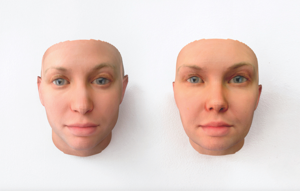
Heather Dewey-Hagborg, Radical Love, 2016; Genetic materials, custom software, 3D prints, documentation; each portrait 8 x 6 x 6 inches. Courtesy of the artist and Fridman Gallery
While researching facial recognition techniques and uses of DNA, I emailed Heather Dewey-Hagborg, an artist whose work exposes the dangers of data collection and identity. By mimicking the processes undertaken by law enforcement – primarily, producing portraits based upon DNA samples collected from strangers – she creates images that stand in resistance to surveillance. For Stranger Visions (2012-2013), she collected cigarette butts and chewing gum to create composite portraits of strangers. Dewey-Hagborg began communicating with Chelsea Manning in 2015, when she was incarcerated in Fort Leavenworth, with the intention of creating – much like Alicia Neal’s portrait – an alternative public representation of her. Given the circumstances, using forensic methods of representation seemed appropriate: Manning’s gender status had been denied by the prison system, she had been misrepresented visually and physically, and through her incarceration she had, in her own way, been rendered a missing person.
After communicating via mail, Manning sent Dewey-Hagborg hair clippings and two swabs which she placed in a plastic fruit punch bag from the Joint Regional Correctional Facility at Fort Leavenworth. Together, they decided to create two portraits: one to reflect Manning’s female gender, and one gender neutral image intended to demonstrate the reductionism of forensic recognition. Their collaboration materialised as a form of activism, and Dewey-Hagborg was delighted to generate visibility for Manning while subverting algorithmic systems of facial recognition and portraiture. What emerged were two portraits collectively titled Radical Love (2015). They function as a homage to Manning, while also dismantling genetic data as absolute, restating that it is our liberty and right to represent ourselves how we see fit. Probably Chelsea, a series of 30 different portraits of Manning created from DNA analysis in 2017 and exhibited at Fridman Gallery, New York, is an extension of Radical Love.
Dewey-Hagborg’s portraits seek to uncover the dominant narratives surrounding who is considered eligible and worthy of representation, and who is deemed the author of their own image, while shaking off outdated notions of genetic essentialism. They also demonstrate how solidarity with the incarcerated can begin with a single strand of hair.
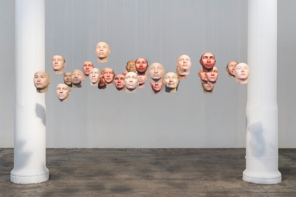
Heather Dewey-Hagborg and Chelsea E. Manning, Probably Chelsea, 2017; Genetic materials, custom software, 3D prints; 30 portraits, each portrait 8 x 6 x 8 inches, overall dimensions variable. Courtesy of the artists and Fridman Gallery
Phone interview conducted between Hatty Nestor and Heather Dewey-Hagborg, January 2018 between New Mexico and Berlin.
Hatty Nestor: The constraints placed upon Chelsea Manning while she was in prison meant that she had little control over her identity or the distribution of her portrait. As an artist, what was your role in generating visibility for her through portraiture?
Heather Dewey-Hagborg: Years before I met Chelsea, I started developing this process of creating portraits of people from abandoned DNA. I would extract DNA from found genetic artefacts like cigarette butts and hair, then, using software that I wrote, I would turn that genetic information into algorithmically generated 3D portraits, which I would also 3D print in full colour, and exhibit alongside the material and the data.
In 2015 I was contacted by Paper Magazine, who were interviewing Chelsea through the prison mail system, and were interested in having an image to accompany the interview. At the time she couldn’t be visited or photographed, and they had discussed the idea of me creating a DNA portrait. Chelsea was excited about the concept and had read about my work before, and her only concern was that she didn’t want to appear too masculine. When they contacted me, I realised that this was a great opportunity to both pay homage to Chelsea Manning, whose heroism I admire, and also to use the technology for good, by giving her the public face that had been taken from her. And, simultaneously, in a kind of double gesture, to deconstruct this technology itself, to call attention to some of its shortcomings and reductions.
What was the process of removing Chelsea’s DNA from prison?
I hadn’t met Chelsea in person. She collected some hair clippings when she was getting her haircut. She also took two Q-tips and swabbed the inside of her mouth, and mailed these from prison to her lawyer. Then the lawyer sent me a Fed-Ex envelope with the materials. At the time I was working at a lab at the Art Institute of Chicago.
With the early portraits I made, I wanted to show the reductionism around gender and sex in particular. After the first portraits commissioned by Paper Magazine in 2015, the prints were exhibited at the World Economic Forum in 2016, after which Chelsea and I stayed in touch, and worked together on a short graphic short story called ‘Suppressed Images 2016’ that we published as part of her clemency campaign. In the comic we forecast the idea of Obama commuting her sentence, and Chelsea being freed and being able to come and see an exhibition of portraits of herself for the first time. We published the comic on the morning of 17 January, and then that afternoon Obama commuted her sentence. It was an unbelievable and emotional experience.
After that we began developing ideas, drawing on Chelsea’s writing, and the discussions we’d had in our letters about reductionism and biometric portraiture. Our ideas addressed ancestry and the social construction of race, what else can be done with this kind of technology, and how to use it proactively. This led to the idea of showing even more variations of her portrait, to demonstrate just how subjective the interpretation of DNA data is, and how diverse she could look based on the same information.
Hatty Nestor
The first portraits were a pair called Radical Love. After this, you made Probably Chelsea: 30 portraits of Chelsea, which are all aesthetically different, exhibited in ‘Becoming Resemblance’ at the Fridman Gallery, New York. Looking at them initially you wouldn’t necessarily say they’re reconstructions of the same subject. They show how identity isn’t necessarily fixed to a single outer appearance or prescribed gender.
The portraits are about exploding outmoded ideas of biologically inscribed identity, refuting stereotyped representations of phenotypical characteristics, and using a scientific and data-driven process to show how many different readings there are of the same data.
How were the portraits received? Do you think you raised the questions that you wanted it to, about gender and the prison-industrial complex?
Radical Love premiered at the World Economic Forum in January of 2016, if I remember correctly. That, especially from an activist angle, was a practical place to begin. The later work, Probably Chelsea, in a way is a kind of celebration. It’s a celebration of Chelsea’s release. It’s a celebration of the genetic commonality that we all share. In a sense it’s much lighter and more playful and fun. It’s more of an art installation, and also an opportunity for Chelsea to enter into being an artist, and being seen as an artist. In answer to the question, the reception has been positive.
The new piece with the 30 portraits is just beginning to travel, so let’s see what kind of impact it has. It’s a little too early to say since we’ve only shown it once for the opening in New York. Now it’ll go to Berlin, and Frankfurt, and all over the place after that. So let’s see what kind of impact that has.
It seems crucial to consider how Radical Love aids Chelsea’s visibility and representation now that she has more control over it. There was a fantastic release of images of her in Vogue in August 2017, for example, where she is wearing a black sweater and standing against a wall. Your early portraits act as an archive of what wasn’t possible, and I wonder how their purpose has changed.
Radical Love, the two portraits, served as a kind of document of their time. The 30-portrait piece, Probably Chelsea, was always something different. It was meant to be shown after she was released, and was expected to be an exploration of different kinds of ideas around identity and challenging identity inscription. It was always intended for her to see upon being free.
Port’s Design Editor, Will Wiles, talks to the celebrated German artist Thomas Demand
Rasen / Lawn, 1998, C-print / Diasec, 122 x 170 cm (c) Thomas Demand, VG Bild-Kunst, Bonn / DACS, London Courtesy Sprüth Magers
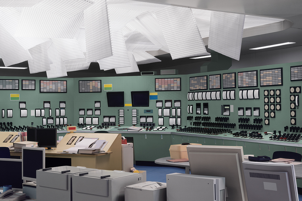
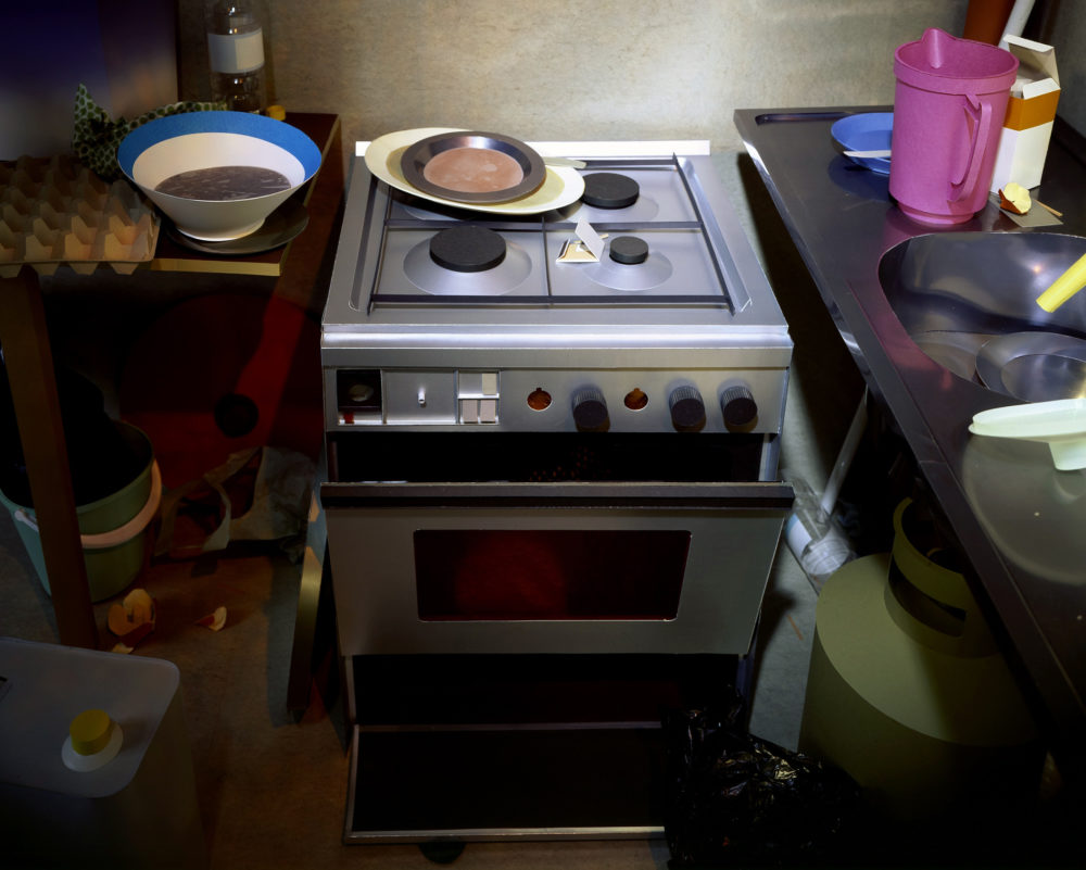
The enigmatic photographs by the German artist Thomas Demand appear, at first glance, to be more documentary than art. In fact, drawn closer by the sense of the uncanny, the scenes reveal themselves to be composed of incredibly detailed paper and card models, painstakingly made by the artist. Favouring bureaucratic and banal spaces that are often connected to dark events – subjects include the ransacked offices of the East German secret police, Saddam Hussein’s kitchen and, above, the control room of the nuclear power plant at Fukushima – the images question the nature of experience and memory, and, in Demand’s own words, “our need to make sense of the chaotic environment we are in”.
A few of his pieces are ‘outdoors’ – one of the most memorable being no more than a patch of lawn, rendered in staggering detail, with each blade of grass carefully and convincingly created – but most are of interiors. His work is a sinister enfilade: a succession of quiet, unpeopled rooms. In some, something terrible has clearly happened. In others, it may be about to. “These spaces more condensed and focused,” says Demand.
It’s an interest that connects to a recurring presence in his work – the ghostly afterimage of the Cold War and the division of Germany. “In the West since the Second World War, most of the places of power were inside a room, whereas the East tended to perform in a public realm, like parades and open-air speeches. This is not a general rule, but it seems notable nevertheless.”
And there has to be a degree of secrecy, or at least privacy and obscurity, to the scenes he chooses. Some scenes “are so iconic that I don’t see much that could be added: all has been shown. I like the less obvious, mundane, the generic and probably accidental attention to the built environment much more. It is closer to one’s own experiences.”
Kontrollraum / Control Room, 2011, C Print, (c) Thomas Demand, VG Bild-Kunst, Bonn / DACS, London Courtesy Sprüth Magers
Reconstructing a scene in meticulous detail, and then taking an image of it, is a process that has obvious affinity to the making and handling of memory. “Memory is a construction,” Demand says. “No one has images in their head. When we talk about the downfall of Saddam Hussein, your brain assembles all the parts necessary for your imagination. Your brain provides you with that, to enable you to take part in a social practice, communication… That’s when it gets interesting for me. Not the incident, but the way in which we speak about it.”
Do particular scenes ever appeal simply as a model-making challenge? “Certainly,” he says, “but I try to avoid any hint of artistry; it would be challenging in a philosophical sense. Making a piece of lawn will take five months, but anyone could do it if they have the patience. The time spent on something like ‘Lawn’ has a Beckettian, absurdist meaning to it. That’s where it opens up to give an idea a form, which the visual arts should be aiming for.”
Demand seems most at home in a particular kind of bureaucratic environment: the office, the control room, the backrooms of power and decision-making. He admits to a kind of perverse enjoyment that these are spaces of paperwork: “A paradoxical barn door for me”. Here, it might be possible to discern a comment on the passage from an analogue, modern 20th century, in which we still believed that information could be tamed and mastered, into a digital, postmodern 21st century in which information endlessly proliferates. The latter is an era of over-memory, in which machines hoover up every datum of our lives and then never forget it, but also an age under permanent threat from data-loss, and the corruption and blanking of such archives. He gently denies any desire to ‘illustrate’ in that way. “I believe an artist will work alongside the issues which a society identifies in retrospect as significant,” he says. “The artist cannot produce them, but they will show up in a work which is of any relevance.
“However, how many telephone numbers do you remember? Three? Four? You don’t have to memorise them as they are in your smart phone, which you always carry around with you. We immediately blank out all such unessential information to make space for all the really important things, like Kim Kardashian’s Twitter feed. So in the end it’s not the ‘over-memory era’ but the ‘age of the cancerous archive’. We are losing more memory than ever before.”
Kitchen, 2004, C-print / Diasec, 135 x 164 cm (c) Thomas Demand, VG Bild-Kunst, Bonn / DACS, London Courtesy Sprüth Magers
Demand prefers to call the dioramas he creates ‘sculptures’ rather than ‘models’, but their existence is only temporary. Once it has been properly photographed, resulting in that one, perfect shot, the card and paper construction is destroyed – the photograph is the work of art. Though this might feel like a waste, it’s a necessary part of the process, both for the questions Demand wants to ask about memory, and for more prosaic reasons.
“I need the space again, so it has to go,” he explains, though he allows himself some room for sentiment. “I tend to avoid doing it: if you spend months on something, you become friends with it, so I have assistants that take it down. Usually it only takes 20 minutes.”
This is an extended version of an article from issue 21 of Port, out now. To buy or subscribe, click here.
The German artist offers a new perspective on the Near East with a romantic series of photographs taken during his extended travels
The overwhelming effect of Elger Esser’s photographs is one of stillness. Nature and the landscape tradition are the backbone of the Düsseldorf-based artist’s work and just beneath the surface of his large-format photographs is a sense of the sublime. For more than ten years, Esser has travelled between Lebanon, Egypt and Israel and, in his first solo exhibition in the UK, he presents painterly photographs of shorelines, traditional feluccas and dahabiya sailing boats, all scaled up to monumental effect.
‘Morgenland’ is an old German term for the Middle East, meaning ‘morning land’, and the hazy, white-hot light that saturates Esser’s images explains the artist’s chosen title. Captured using an 8 x 10 camera, these luminous and unpeopled landscapes see glassy waters, still horizons and ancient ruins presented as heroic images.
Esser’s intuitive eye for beauty is immediate but a subtle political edge still runs through the Morgenland series. The photographs quietly resist the pitfalls of cultural colonialism by subverting media depictions of the Near East as a zone of endless conflict. Instead, they offer something more sensitive, more neutral.
As Edward Said wrote in his 1978 landmark, Orientalism: “The more one is able to leave one’s cultural home, the more easily is one able to judge it, and the whole world as well, with the spiritual detachment and generosity necessary for true vision. The more easily, too, does one assess oneself and alien cultures with the same combination of intimacy and distance.”
Elger Esser: Morgenland is on show at Parasol Unit in London until 12 May