Oslo Pilot: Rethinking Art in Norway

Madeleine Morley travels to Oslo and discovers the new two-year programme that’s reconsidering the role of public art in Norway’s capital city

Munch Museum. Photo of unknown visitor (date unknown). Photo: Knudsens fotoaterlier © Dextra Photo, Norsk Teknisk Museum

Opening out from Oslo’s centre, a myriad streets take you to public spaces, as is the case in most cities. Yet, unlike most other cities, there’s a new, cohesive plan for these areas: they will act as multiple stages for a new public art project boldly entitled Oslo Pilot.

Recently initiated by the City of Oslo’s Agency for Cultural Affairs, the two-year programme intends to reconsider the role of public art through a series of events, talks, installations and art projects, laying the research groundwork for a biennale that the Oslo Pilot curators, Eva Gonzalez-Sancho and Per Gunnar Eeg-Tverbakk, are organising in 2018.

The project developed out of a desire to do things differently; the art biennial format has become increasingly standardised, or so Oslo Pilot argues, so the initiative seeks to produce something born from the contemporary rhythms of the local community, from the pace, purpose and people of the city itself. They suggest that the art industry – its makers, writers, buyers, sellers and enthusiasts – routinely travel from city-to-city for biennale after biennale and, apart from taking a taxi from the airport to the exhibitions, there is often little chance to interact with the show’s surroundings Guests move from white lecture room to anonymous gallery space in a vacuum; Oslo Pilot seeks to rethink this separatist status quo. By commissioning work that’s intimately connected to public space, the artworks, lectures and words that Oslo Pilot curates will inevitably define where the city and its people are today.

The National Gallery in Oslo, 1920

When you fly into Oslo city airport in the heart of winter, and possibly throughout the year, you descend through a landscape so white that you can’t distinguish what’s ice and what’s cloud. If it weren’t for the thick tufts of forest that erupt from blankets of snow, you wouldn’t be able to tell where the mountains start, the sea ends or the sky begins.

It takes exactly 22 minutes to get from Oslo city airport, which is embedded in classic Norwegian landscape, to Oslo city centre. And the transition from country to city is a sudden one. You cut through a dark tunnel carved through the mountainside, shuttling from a world of pine trees heavy with snow to a scenery of fantastic glass towers that spring up next to the train tracks. These stark buildings make no secret of Norway’s relatively newfound wealth: the glitzy surfaces speak of oil – as does the plush tinkling of a grand piano player and the blazing, rose-gold fire pits that fill the station’s central hall.

The Munch Museum in 1963. Courtesy Teigens Fotoatelier

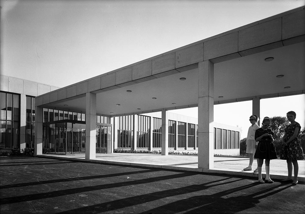
Step outside of the station and you’ll immediately see Norway’s Opera House designed by Tarald Lundevall, where silhouettes trudge slowly and obediently up a slope that will take them to the roof. You saw the ancient mountains from the plane; now in the capital, newer steel, glass and concrete mountains loom with science-fiction vividness.

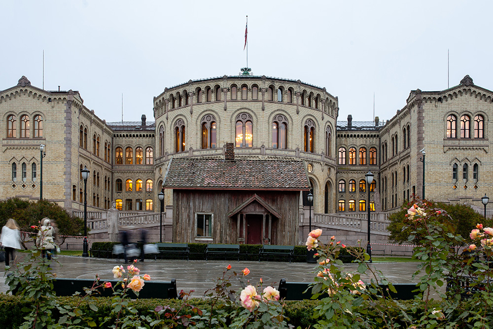
One public space, or stage, just minutes from the Opera House has been recently filled by Oslo Pilot, the first of many projects that will sprawl in squares and along the side-streets over the next two years. Beside the elaborate House of Commons built in the 17th Century is this first commission: Marianne Heske’s House of Commons, built in 17th Century but moved to this icy public spot in front of parliament in 2015. The red-slat house could be mistaken for one of the structures you can see from the plane window – its relocation is a grand attempt to subtly remind the city of its own humble past and roots.

Deichman Main Library (1959). Photo: Leif Ørnelund © Oslo Museum

The first Oslo Pilot presentation and exhibition of 2016, launched January 21, 2016, articulates how a now modernistic sensibility is impacting the fabric of the city and its public spaces.

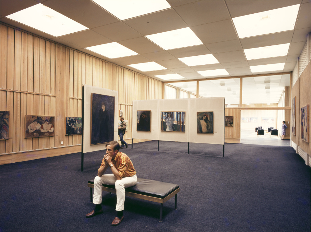
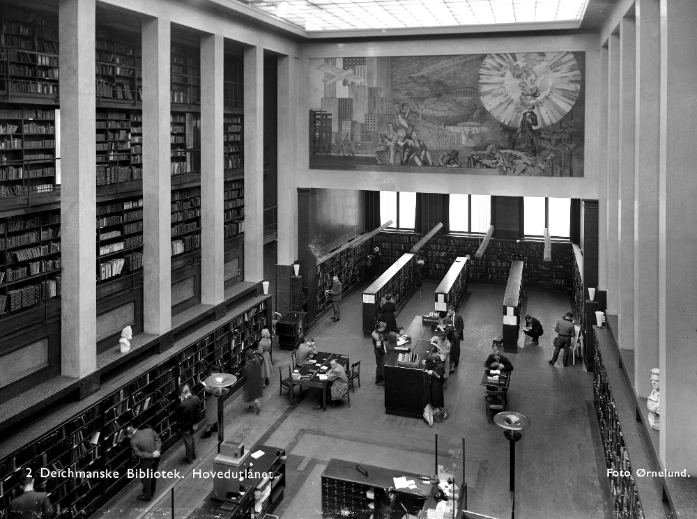
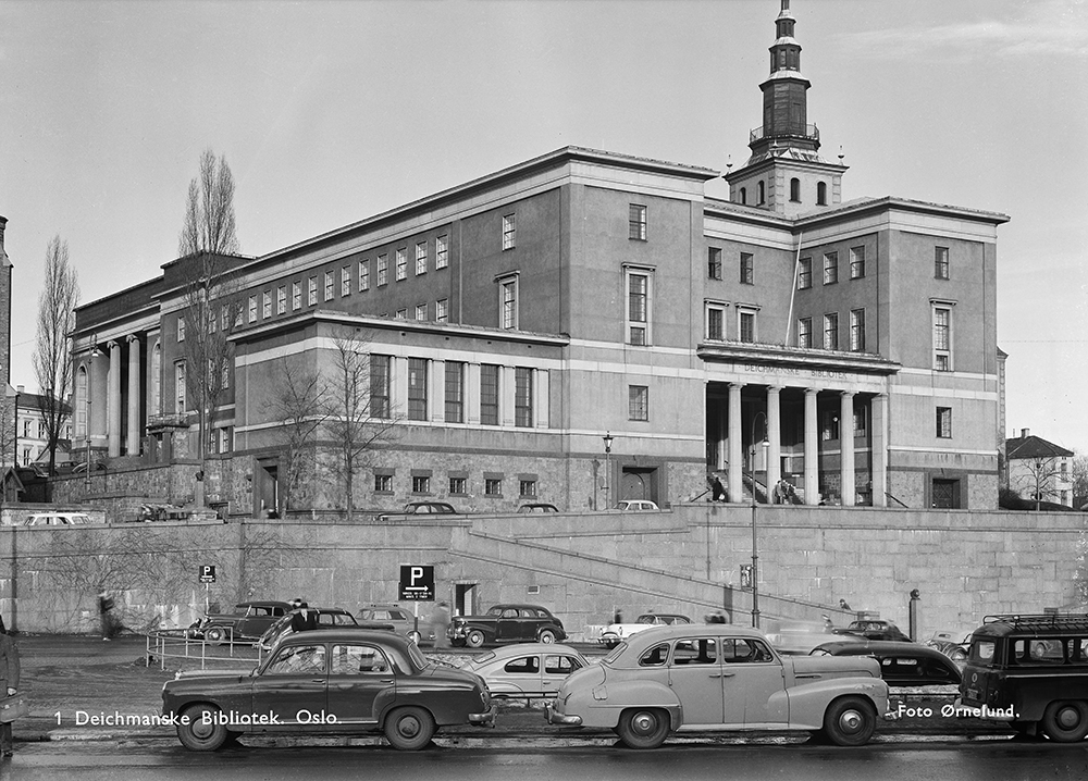
‘The City of Dislocation’, an extensive research project, examines why cultural institutions are being moved out of their current locations – historical buildings scattered throughout the city of Oslo – and alludes to the loss that neighbourhoods will experience as a result of these organisations merging and relocating to newly built facilities. Using pictures, newspaper clippings and a map of Oslo plastered around the Oslo Pilot Project Room, the project demonstrates how The National Museum, the Munch Museum, the Museum of Contemporary Art, the Museum of Decorative Arts and the public library are being moved from their current neo-classical homes to large, dominant buildings presently under construction.

One such site is the Fjord City project that will sit beside the dramatic Opera House on the waterfront; although movement and change is vital to the energy of a city, what concerns City of Dislocation curators Joanne Borthne, Vilhelm Christensen, Martin Braathen, and Even Smith Wergelad, is that there are no plans for what will happen to the old buildings when they’re left empty.

Deichmanske bibliotek, 1959. Photo Leif Ørnelund © Oslo Museum

“My worry is that they’ll become hotels or luxury apartments and no longer retain their status as public space,” says Wergelad, an architectural historian. If these buildings get claimed for other, more commercial purposes, the stories contained in their architecture will be rewritten and potentially forgotten by the public too.

Built in the late 1800s and early 1900s after Norway gained independence, the small yet proud public buildings were a celebration of freedom, though as a poor country, the structures were small. Now, their modest size has become an embarrassment to many and developers are eager to create confident, international glass towers that reflect Norway’s current economic reality and position as European powerhouse.

Wergelad takes me on a walking tour to a few of the institutes that are going to be relocated. The Contemporary Art Museum is currently situated in a former bank built in 1900 – an art-nouveau creation with thick, textured blank bricks that harmonise with the towering, ancient mountains. Ten minutes up the road, there’s the National Art Museum, which houses Norway’s oldest collection in some dignity. It’s a building that was built for the art it houses, each archway and elaborate detail encasing the paintings hung on the wall. And while it makes sense that contemporary art should be moved out of a formidable old bank and into a sweeping, more accessible modern building, this neoclassical structure seems tied to the artworks that it shelters. That’s why the abandonment of the current National Art Museum is the most controversial.

On the way to the site, Wergelad and I bump into the head of the Architectural Association of Norway, who has been campaigning against the relocation of the national art collection, for years. “It’s good that The City of Dislocation and Oslo Pilot is bringing this to attention,” he says, “but it’s probably too late now.”

Marianne Heske, House of Commons, 2015-16. Photographer Niklas Lello

The role of public art is often about reflection and contextualisation. A public piece of art can be an enlightening visual manifestation that embodies a pervasive feeling or thought and brings a community together, or it can bring to light an ideal or tradition that has been forgotten. The City of Dislocation and The House of Commons articulate current feelings and bring the forgotten to wider attention. How much of an effect these pieces and others being commissioned by Oslo Pilot will have on the rampant changes of the city is still uncertain. Will they be just charming pin pricks dotted around the streets, appreciated and admired but ultimately unheard whispers, or will their resounding relevance shine through?

Oslo Pilot has a tireless programme of public art initiatives, research programmes, talks, commissions and events planned for the city, all of which investigate the function of art in public space. In Summer 2016, Siri Anker Aurdal will present her sculptures in Vigeland Park, and in August Norwegian artist duo Trollkrem will be organising a festival in the Ekeberg Park woods.

‘Moneyed newness’ threatens to separate the city of Oslo from its history but the real question is whether public art can repair these broken and fractured ties or will it become a minor, decorative part of the tourist trade.

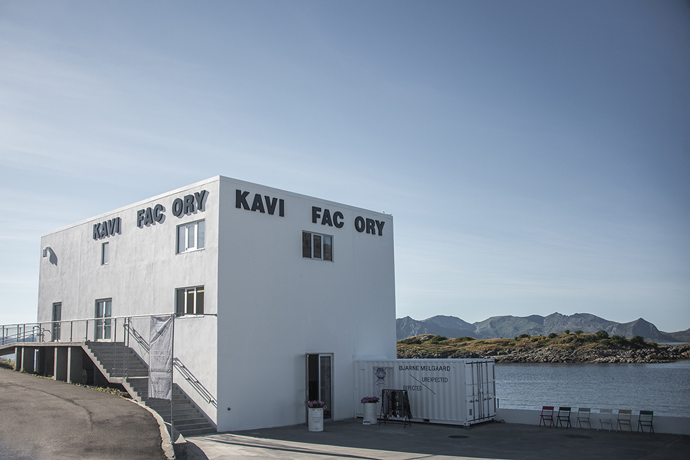
Oslo Pilot is a two-year project investigating the role of art in and for the public realm

The Art of the Mind: Mark Wallinger


Ahead of Mark Wallinger’s new London exhibition, PORT visits the Turner-prize winning artist’s studio to discuss psychoanalysis, his return to painting and coming to terms with your own mortality

It’s been two years since his last exhibition and I’m sat, drinking coffee, with Mark Wallinger in his North London studio. White canvases smeared with symmetrical patterns are stacked against tall, white-washed walls, reaching almost to the ceiling struts and skylights. Pots of paint stand on tables and there’s a wide, fittingly Freudian couch. As we talk, Wallinger smokes an e-cigarette drawing from it periodically; as I listen back to my recording later, he sounds a little like Darth Vader.

Looking at the finished, half-packaged work waiting to be shipped down to Hauser and Wirth’s Saville Row galleries, I ask Wallinger if these moments before the show opens make him nervous. As a one of the most important living British artists – a Turner Prize winner, a representative of Great Britain at the Venice Biennale and the first artist commissioned for London’s Fourth Plinth in Trafalgar Square – his answer surprises me. “Thinking about this show, I was struck by the word ‘apprehensive’ or ‘apprehend’,” he says. “To see, to notice, to understand, to fear… some of those feelings.”

markwallinger014

If his new work is making him uneasy, it’s because the series of 65 monumental hand-painted canvases – the focus of the show – are deeply personal and a significant departure from his typically bold, public work.

His artistic projects to date have seen him dress up in a bear costume while walking around a deserted Berlin gallery at night, erect a lifesize sculpture of Jesus Christ crowned with thorns and recreate an anti-war protest from Parliament Square in the Tate Britain. Wallinger has always been stylistically fluid; he never repeats himself.

“You only go round once, don’t you,” he says. “I think it’s part of the job description of an artist to push things, but maybe it’s just a low boredom threshold.” Now, however, Wallinger is shifting the thematic character of his work from a poised meditation on identity, formed through nationality, religion and race, to a more personal idea of identity – a “voyage of self-discovery”, as he puts it.

Composites2

ID, opening on 26th February 2016 at Hauser & Wirth London, is structured around Sigmund Freud’s conception of the mind – the instinctive drive of the id, the critical, moralising superego and the rationalising ego that mediates between the two. It’s the culmination of a year’s work away from the art world and the bustle of the city, having moved his studio from Soho to Archway 12 months ago. “I’m in analysis at the moment, but in another sense it’s Darwinian that I move into this tall space,” he says. “The self-portraits I had been working on can evolve to an abstract-expressionist scale.”

Wallinger shows me these self-portraits, and I see capital ‘I’s in various forms of abstraction, sometimes bold with clear lines, sometimes bordering on illegible. Following these works, Wallinger says he moved to canvases that were his span wide by double his height and, dispensing with brushes, stood, nose to the canvas, spreading the paint with both hands. The resulting works that stand before me are gigantic Rorschach paintings that invite the viewer to engage, to see what they see in them, while at the same time being a cathartic, instinctive and elaborate self-portrait of the artist.

Composites

I wonder why there is a such a dramatic shift to the personal in this exhibition, reflected in the autobiographical significance of Orrery, a videoed circumnavigation of the roundabout that he learnt to drive on, and Shadow Walker, a film of his shadow as he walks down Shaftesbury Avenue.

“I suppose it’s to do with life events and getting older, having been on the planet for longer than I’m going to be in the future.” Could this be a coming to terms with his own mortality? Wallinger pauses for long time, staring at the ceiling: “I suppose there’s a degree of that, a bit of urgency… but there’s joy, I hope, in the paintings.”

Despite this focus on himself, Wallinger has retained his typical irreverent wit. Ego, for example, is a solipsistic parody The Creation of Adam from Michelangelo’s Sistine Chapel ceiling, where Wallinger has simply shot his left and right hand with an iPhone. It is wonderfully playful – humorously and self-deprecatingly comparing his almost effortless photography with the painstaking, highly-skilled act of painting, while still speaking seriously about our inability to prove that anything but one’s own mind exists.

Composites3

Wallinger’s latest work is refreshing, not just because it shows a successful middle-aged artist continuing to develop his style – here turning his measured, thoughtful gaze on himself – but it is an antidote to the ever-accelerating interconnectivity we experience day-to-day. It is the luxury of being an artist to be able to stop, unplug and think. As Wallinger says: “a lot of the time trying to make art is trying to shut out as much of the world and as many decisions as possible, to get to some sort of purity.” Somehow, Wallinger’s ID manages to do just that.

ID will be showing across both Hauser and Wirth spaces on Saville Row from 26th February to 7th May

Photography Jasper Fry

William Eggleston: The Democratic Forest

Max Lakin reflects on the legacy of photographer William Eggleston, whose influence is still felt across pop culture today

When New York’s Museum of Modern Art mounted an exhibition of William Eggleston’s photography in 1976, many people found themselves confused. Here were images of a lot of things, most of the sort that anyone might encounter a dozen times a day, but none, so far as anyone could tell, of art.

The images weren’t oblique or especially erudite or masked in folds of subterfuge — the expected indicators of art photography. Most egregiously, they were in colour. The New York Times called it “the most hated exhibition of the year.” One critic, among more florid descriptors, thought it “totally boring and perfectly banal.” He was, of course, completely correct.

An Eggleston photograph operates in the liminal spaces of living, the lulls in which much of the quiet stuff happens. As such, the first thing you notice is how familiar it is. Even if you’ve never been to Mississippi, or Memphis, or Kentucky, you can swear you’ve driven past that side of road, sat among that burger joint’s lacquered red tables, seen the back of that Cadillac. There’s an immediacy of understanding to an Eggleston photograph, which can make it easy to dismiss. But then something else happens. The familiar begins to look strange. There’s something almost imperceptibly skewed, as if in a Lynchian daydream.

© Eggleston Artistic Trust © The Democratic Forest by William Eggleston, published by Steidl

Sometimes it’s the image’s content itself that jars: a boy perusing a firearms catalog, a handgun left casually on the nightstand among the morning’s spent cigarettes. But more often, these are images of fields, highways, gas stations, hardware stores—disquieting in their lusty, near-lurid chromaticism—lived-in places made alien terrain.

First published in 1989 by Doubleday (Jackie Onassis ordered 20,000 copies on the spot) The Democratic Forest was a slim, supposedly palatable exploration of this terrain. It was 150 intensely saturated images that received little recognition. Fifteen years on, audiences have mostly caught up with Eggleston, or at least figured out they should have been listening the first time.

Enter a reassessment of Democratic Forest, released by German publisherSteidl late last year, it now constitutes 10 volumes of more than 1,000 photographs drawn from a body of 12,000 pictures made by Eggleston in the 80s. 12,000 is the working scope, but one gets the feeling a real limit does not exist.

They form an almost biographical narrative, creating, as French literary theorist Roland Barthes wrote, “a history of looking.” It begins in Eggleston’s own Mississippi Delta and radiates out — a locus of American imagination formed by points like Pittsburgh and Boston, a Civil War battlefield in Tennessee and a book depository in Dallas.

Eggleston is often compared to William Faulkner in his evocation of the American South, but perhaps he’s closer to Dante, wending through the forest of a shared recent history, a Virgil for the McDonald’s set.

© Eggleston Artistic Trust © The Democratic Forest by William Eggleston, published by Steidl

The wilful documentation of our daily movements is more or less expected now; we’re all photographers of our own minutiae, emboldened by an expanded vernacular of what counts as photography, helped along by Instagram. But Eggleston’s images prefigure the social media idiom, elevating the workaday into something noble, without special access.

In the book’s afterword, Eggleston alludes to the crystallising of his process:

“I was in Oxford, Mississippi, for a few days and I was driving out to Holly Springs on a back road, stopping here and there. It was the time of year when the landscape wasn’t yet green. I left the car and walked into the dead leaves off the road. It was one of those occasions when there was no picture there. It seemed like nothing, but of course there was something for someone out there. I started forcing myself to take pictures of the earth, where it had been eroded 30 or 40 feet from the road. There were a few weeds. I began to realise that soon I was taking some pretty good pictures, so I went further into the woods and up a little hill, and got well into an entire roll of film.

“Later, when I was having dinner with some friends, writers from around Oxford, or maybe at the bar of the Holiday Inn, someone said, ‘What have you been photographing here today, Eggleston?’

‘Well, I’ve been photographing democratically,’ I replied.

‘But what have you been taking pictures of?’

‘I’ve been outdoors, nowhere, in nothing.’

‘What do you mean?’

‘Well, just woods and dirt, a little asphalt here and there.’”

It’s in this expansive nothingness that Eggleston moves, trafficking in vast swaths of the country that everyone sees but few notice. “He takes very ordinary situations and can create very powerful pictures out of almost nothing,” explained the photographer Martin Parr in a BBC documentary. “And therefore he is not relying particularly on the ultimate decorative thing like a nice sunset—or the incredible nostalgia that you will often see in contemporary practice. I would say he is kind of beyond that if you would like, he is almost photographing on the gap of everything else.”

The Democratic Forest and other works by Eggleston are available from Steidl

My grandfather’s studio: Joan Miró

As a recreation of Joan Miró’s Mallorcan studio opens in London, PORT speaks to the Spanish artist’s grandson about the surrealist painter’s life and why the workspace is crucial to understanding his oeuvre

Joan Miró, Son Abrines, 1978. Photo Jean Marie del Moral

Joan Miró, the Catalan surrealist, was a workaholic. Up until he died in 1983 at the age of 90, Miró was constantly experimenting with form, colour and medium, leaving behind a dizzying collection of paintings, prints, drawings and sculptures. Throughout this process of eclectic creativity, of invention and reinvention, the studio was crucial in providing a safe, stable place for him to create. The studio’s role is celebrated in a new exhibition that opened in in London’s West End this week, which sees the artist’s Mallorcan workspace recreated and opened to the public.

Miró came to Mallorca in 1956 and would stay there 27 years until his death. He had long dreamed of a purpose-built studio and in Mallorca this was realised in a design by his friend and architect Josep Lluís Sert, who sent his plans through letters from America where he was exiled from the Franco regime. Far away from the curators and journalists that had plagued him in Paris and in his birth-town of Barcelona, Miró found a tranquility in the mediterranean and a brilliant light that would be reflected in his ever-evolving work.

Ahead of the exhibition’s opening, Miró’s grandson, Joan Punyet Miró – an artist and art historian dedicated to preserving Miró’s legacy – spoke to PORT from Mallorca about the studio and its importance in Miró’s work.

Son Abrines studio. Photo Jean Marie del Moral

Why is it important to remember and recreate artist’s studios like your grandfather’s?

I think these sort of places have to be more emphasised and studied by experts in the modern art world. They are just so unique and so special that for me, it was worth taking a plane from London to Mallorca just to see the Miró studio here.

Do you feel like the artist’s studio doesn’t get enough attention from the art world?

Yes, for example with the Henry Moore studio in Yorkshire, the Francis Bacon studio in Dublin or Jackson Pollock in East Hampton. I think that sometimes people need to know more about the existence of these studios… The experience of walking into the artist’s studio is so meaningful, it really goes a long way to understanding the process of creation.

Joan Miró, Femmes V, 1969, Oil and charcoal on canvas, 60 x 81 cm. Courtesy Mayoral

Why do you think Miró settled in Mallorca?

The light, the atmosphere, the mediterranean culture and also the peacefulness. Sometimes, especially when you are Miró, you just want to be on your own, to work peacefully in your studio, and to have directors from museums, directors from art galleries, and journalists from different magazines coming to your door to see how your work is doing. He wanted to be away from the city, to be able to be alone in Mallorca and dedicate himself to creation.

Son Abrines studio. Photo Jean Marie del Moral

What can we learn about Miró as an artist by visiting his studio that we can’t from simply looking at his work?

His commitment. He was committed to painting, sculpture and drawing, from moment zero to the last minute of his life. He was always saying how he’s ‘not afraid of death or failure, but repetition and mediocrity’. He was a risk taker; he was a daredevil, always experimenting with new techniques and supports.

He would work a lot and in the afternoons, after lunch, he was reading poetry, listening to music and sketching, sketching, sketching – as a boxer does, preparing his fist for combat in the morning. When you go to the exhibition in London you understand why a man that died when he was 90 years old never gave up.

Left: Joan Miró, Son Abrines, 1978, Photo Jean Marie del Moral. Right: Joan Miró, Woman in front of the moon, 1978, Oil on canvas, 27 x 22 cm (10.6 x 8.7 in.) Courtesy of Mayoral

What did you learn about your grandfather that may not be well known to the public?

The link I have with my grandfather is something that marked me profoundly because I was able to spend many days with him, at his house and in his studio. What I learned through all these moments I spent with him was his engagement, his commitment and his generosity.

I also discovered his idea of being and artist with a capital A. Being an artist doesn’t mean that you are a Wall Street trader, or a lawyer in the USA. Being an artist means that you are someone that really wants to change the world, for the better. At the moment, what you see with the attacks in Paris and how the world has turned in a very pessimistic direction, I think that artists like Miró keep you hopeful for the future.

Miró’s Studio runs until 12 February at 6 Duke Street, St James’s, London SW1Y 6BN

Chance Encounters: Loewe in Miami

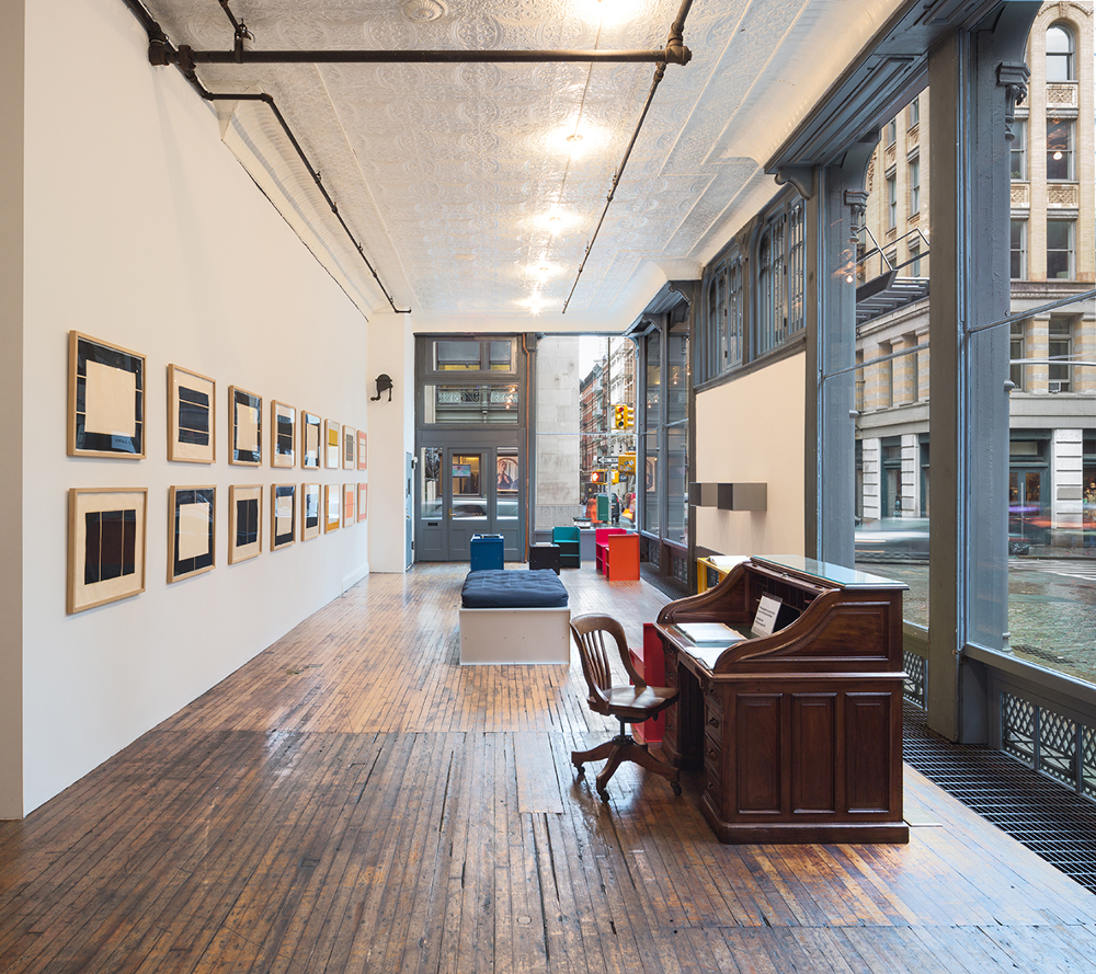
The 170-year-old Spanish fashion house installs an 18th-century granary and an exhibition of British art at its US flagship store, to coincide with Art Basel Miami

Loewe’s creative director Jonathan Anderson has had a busy 2015. Not content with running his own brand, JW Anderson, for which he won both the womenswear and the menswear designer of the year at the British Fashion Awards, the English designer has now branched into curation, putting together a show that will run during Art Basel Miami.

The exhibition, entitled Chance Encounters, which opens on Wed 2 Dec 2015 at Loewe’s flagship store in Miami’s design district, is based around an 18th-century granary (or hórreo) imported from a small town on the Spanish-Portuguese border. The degraded, unadorned form of this monolithic structure centres an exhibition of four British artists. Contemporary works, by the painter Rose Wylie and installation artist Anthea Hamilton, are contrasted against an extensive collection of works by celebrated potter Lucie Rie and photographs by Paul Nash, one of the icons of early British 20th century art.

When curating Chance Encounters, Anderson wanted to create an environment that “brought history and craft into a modern context”. The show reflects the earthy tones and simple forms of Loewe’s latest collection, functioning as a “snapshot of a single moment, bringing together things that have recently lodged in my mind and shaped my thinking”, as Anderson says in the press release.

Chance Encounters runs until 17 January at Loewe, Miami Design District 110 NE 39th Street, Suite #102 Miami Florida 33137

Bed Time Stories with the Kray Twins

On the eve of a major new Joe Machine exhibition, curator Laurence Johns considers why he may be Britain’s most relevant living artist

Left: The Krays – Right: Member of a Rival Firm with a Razor Slash

I first came across the work of British artist Joe Machine at a Billy Childish exhibition in 2009. Since then I have sold many of his paintings, but the one thing that I have often failed to convey in any description is that ‘certain something’ that I, and those that collect Joe’s work, see in his art.

I used to assume it was some intangible thing, something about the duality of the human condition; the thin line between love, anger and the human need for contact that is present in all his work. Vibrant greens amongst a snowy landscape, the regal purples of a Russian fairy tale or the ruby red of a slashed face. Joe’s work is traditional, brutal, crude, uncomfortable and violent, yet is also refined, lonely and vulnerable. It has a sense of timelessness about it, but contains an element central to its message that still I cannot put a word on.

While hanging his current show, The Krays: Bed Time Stories at East London’s Lollipop Gallery, it become clear to me what that ‘something’ is. It’s Englishness. Not English in the ‘stiff upper lip, ‘cucumber sandwich and cream teas’ kind of way, but still very English.

The Twins with Violet

What Joe captures in his work is the outsider – the underbelly, the parts of England that we don’t like to address, but that we all know are there. The artist presents an England of bare-knuckle fighting, of dogfights by the docks, of criminals glorified to the status of mythical kings, of eccentricity and of confrontation. Joe’s England is a violent and rugged land with an understanding of structure, and it’s this knowing look at England’s ‘underclass’ that makes Joe’s work so vital.

Above: Ronnie Kray Cutting a Man in a Pub. Below: Valence Road.
Above: Ronnie Kray Cutting a Man in a Pub – Below: Valence Road

The Krays: Bed Time Stories shows the dark heart of England and holds up a mirror to its bestial, violent and proud subconscious. What’s reflected is an internal landscape forged between the clash of fists and metal, of desperate men and sensual women, of right and wrong, and of sex and aggression. Joe’s Britain is a landscape where fear, anger, love, hate, violence and sex stagger together through its backstreets looking for meaning. Like William Blake, Joe is not interested in the England that England thinks it is; Joe is interested in England’s dark satanic mills.

The Krays: Bed Time Stores runs from November 13 to December 13 at The Lollipop Gallery, 58 Commercial Street, London, E1 6LT. For more information click here

Donald Judd: 101 Spring Street

Presented within his own studio, a new Donald Judd exhibition in Manhattan provides an insight into the life and work of a multidisciplinary artist

101 Spring Street – Image © Judd Foundation

Donald Judd was an artist and designer famous for his minimalism; his use of straight lines and block colours has inspired a generation of both fashion and furniture designers. In other areas of his life, however, Judd was not so fond of established boundaries.

A politically active figure in the 1960s US art scene, Judd fought to save his studio space in 101 Spring Street, SoHo, New York, from being flattened by a planned highway connecting East and West Manhattan. He won his case, and went on to successfully lobby for a change in New York zoning laws, allowing artists to convert disused industrial buildings into live-work spaces.

101 Spring Street became one such studio. It housed a mixture of debates, performances, and creative activities, all curated and encouraged by Judd during his lifetime. Over the studio’s five spacious floors, Judd often exhibited his own art collection, which included over 1000 works of art and design he collected on his many trips around the world.

The studio has since undergone a complete restoration courtesy of the Judd Foundation, run by Donald Judd’s son and daughter, Flavin and Rainer. And as part of Donald Judd: Prints, an intimate new exhibition backed by Swedish fashion brand COS, Judd’s work is shown in the studio space he designed, neatly reflecting his views on the relationships between art, architecture, and design. Having found a fitting home in 101 Spring Street, the works provide an insightful look into the life of multidisciplinary artist and creative political force.

Here, PORT talks to the Head of Menswear Design at COS, Martin Andersson, about the exhibition and the lasting influence of Judd’s work.

Donald Judd: Prints, Bed 32 with Untitled, 1992-1993, set of ten woodcuts, 58.8 x 79 cm (23 x 30 ¾in), Schellmann 270, Ground Floor, 101 Spring Street, NY Image © Judd Foundation Photo credit: Sol Hashemi / Judd Foundation Archive Licensed by VAGA
Donald Judd: Prints, Bed 32 with Untitled, 1992-1993, set of ten woodcuts, 58.8 x 79 cm (23 x 30 ¾in), Schellmann 270, Ground Floor, 101 Spring Street, NY
Image © Judd Foundation
Photo credit: Sol Hashemi / Judd Foundation Archive
Licensed by VAGA

101 Spring Street seems like an apt place to exhibit Judd’s work. What do you think this setting add to the viewer’s experience?

As it is set within Donald Judd’s one-of-a-kind loft spaces, this installation offers an intimacy and immediacy which is unmatched in museum settings.

A part of the installation that I personally love is the integrated Judd-designed furniture that guests can use. This really creates a gathering space where visitors can experience Judd’s collection, home and the incredible prints.

How do you think Judd’s influence is still felt today and in what ways?

Judd’s work feels very timeless and we certainly find his work extremely relevant. Everything from his large sculptures located around the world, to the prints and furniture that you can see at 101 Spring Street, has an air of modernity to it.

Donald Judd: Prints, Seat/Table/Shelf/Seat 59 with Untitled, 1990, set of seven woodcuts, 60 x 80cm (23 ½ x 31 ½ in), Schellmann 199, Ground Floor, 101 Spring Street, NY Image © Judd Foundation Photo credit: Sol Hashemi / Judd Foundation Archive Licensed by VAGA
Donald Judd: Prints, Seat/Table/Shelf/Seat 59 with Untitled, 1990, set of seven woodcuts, 60 x 80cm (23 ½ x 31 ½ in), Schellmann 199, Ground Floor, 101 Spring Street, NY
Image © Judd Foundation
Photo credit: Sol Hashemi / Judd Foundation Archive Licensed by VAGA

Donald Judd’s work often plays with colour and proportion in surprising ways, while retaining its sense of minimalism. How does this relate to COS’ design values?

The core areas we look to in design are timelessness, modernity and functionality.

An area where we feel especially close to Judd’s work is the way in which we use proportion in an unexpected way. We look to reinvent timeless wardrobe pieces, like the white shirt or classic blazer, and the way in which we achieve this is by playing with the proportions of the styles or details. The colour and symmetry of Judd’s prints is also something we come back to season after season.

Prints: Donald Judd runs at 101 Spring Street until December 19 2015

Tools of the trade: Liam Everett

US artist Liam Everett takes PORT through the process behind his latest work, a book inspired by his father-in-law’s collection of broken hammers and rusted chisels

Bruno Tollon taught History of Art at the University of Toulouse for 50 years and was known as an avid collector of tools. Rusting in the haphazardly stacked boxes in the professor’s garage in France are broken hammers, roofing chisels and keys for doors that no longer exist. Some have been repurposed by Tollon, serving as paperweights or containers for paper clips, and some have been mended, but many lie dormant. It is an impressive collection, with some tools dating back over 300 years. But for abstract painter Liam Everett – Tollon’s son-in-law, who had set-up a studio in the garage – their significance was not immediately apparent.

0135

“I had known about this collection for almost 15 years,” Everett tells me on the phone from his current home in rural California. “I began pulling them together, creating a catalogue of probably about 13 different tools, not with any other intention than other than to familiarise myself with them. It’s very much the way I work in painting, beginning to work without an idea.”

Everett’s paintings are typically large-scale works, the product of alternately accretive and reductive processes that, in their gestural mark-making, evoke the movements of the artist. But for UTILE/INUTILE, published by RITE EDITIONS, Everett decided to work in a more intimate medium.

“I usually try and avoid narrative, I’d rather that rises up from the work itself,” explains Everett when asked why he felt the book was the best format for the work. “But Bruno started visiting my studio space every morning. He would pick up one of the tools on my desk and tell me the story , the memory that they evoked. Whether I liked it or not the project began to have a narrative.”

0137

While in France, Everett delved further into Tollon’s collection and found a block of watercolour paper and ink that was over half a century old. After cracking open the jars of ink with vice grips and heating up the solidified ink (a process that Everett compared to painting), he soaked the tools in a mixture of alcohol, ink and salt to stabilise the metal and speed up the oxidisation process so they would deposit rust. Then he simply laid them on the paper and left them in the direct Mediterranean sun.

“After about two or three hours I would shift them on the paper and spray the same ink solution from above. At this point they just looked like cyanotypes,” he tells me. “You’re just getting the outline of the form like a primitive photocopy, but I repeated the process 20 to 25 times. I wanted the outlines of the tools to dissolve into a kind of static… I didn’t want the thing to be so literal.”

Although the images that result – half-realised, half-translucent forms in vibrant purples and blues and greens – are both compelling and beautiful, it was, for Everett, the act of producing the work that held the most importance, rather than the finished product. “For me the process wasn’t so much to make an image, but rather to handle the tools,” he explains. “To have a kind of influence with these objects, these things that were made only to have one purpose.”

0138

By reminding us that tools like this that have been made redundant by new technology and lost techniques, Everett continues the themes of his large scale painting – of work done and of physical activity – into the book format. But UTILE/INUTILE goes further than this. The impressions of the tool, first on Tollon’s memory and then later on the watercolour paper, speak universally, while quietly evoking life’s aggregate of time and experience.

riteeditions.com

Harry Diamond: Man in the Mac

David Hellqvist examines the subtle wardrobe of Harry Diamond – the enigmatic street photographer who captured London’s art scene in the 60s and 70s

Harry Diamond by Lucian Freud, 1951 – Courtesy of Bridgeman Images

Today, ‘street style’ photographers follow celebrities around and post their images on blogs immediately. It’s a hollow business, often devoid of any genuine interest in the person. But back in the 1960s and 70s, it was photographers like Harry Diamond who documented London’s creative elite. Diamond wasn’t skulking outside the houses of painters Francis Bacon and Lucian Freud – he was part of the scene. He shot the artists who, in turn, asked the photographer to sit for them.

During two portrait sittings – one in 1951 and the other in 1970 – in Paddington, northwest London, Freud captured Diamond’s slender and nervous-looking figure. But, looking back, what stands out is Diamond’s subtle wardrobe. Even though they’re almost 20 years apart, both of his portraits speak of a sparse glamour; plain staples in beige, brown and white shades dominate his outfits. Around Soho, London, Diamond was dubbed ‘the man in the mac’ due to his choice of coat. His stylishness probably wasn’t conscious, but well-made quality basics were hard to come by, and the subtle colour choices helped the otherwise anonymous clothes stand out. Diamond and his contemporaries sported an art school style, characterised by unbuttoned formalwear. They lived and worked at a time when the term ‘casualwear’ was established and defined. This was before the introduction of sportswear as everyday clothing, and long after the formal Victorian dress code – a suit, tie, shirt and hat – had died out.

Today, Bacon and Freud are not only recognised masters of art but also widely acknowledged style icons. This AW15 season, brands such as Dunhill, Lou Dalton, Fendi and Paul Smith all look to their bohemian and boozy Soho lifestyles for inspiration. But, whereas Bacon and Freud have been religiously examined, men like Harry Diamond were able to dress and live outside the limelight, making for a more interesting style study. It’s no wonder luxurious high-end brands have come back to this time and place to find inspiration. But sometimes, as Harry Diamond proves, it pays to look beyond the most obvious figureheads.

This article was taken from PORT issue 17. To buy a copy of PORT or to subscribe, click here

Art in the Arctic Circle: KaviarFactory

Simon Parkin travels to the Arctic Circle to explore one of the most remote contemporary art galleries in the world

The KaviarFactory building with the logo (missing the letters A, R and T) designed by German artist, Michael Sailstrorfer

The Lofoten archipelago, a series of islands that curve away from the mainland of Norway, is nothing short of spectacular. It is a harsh and simple landscape, but, despite being situated deep inside the Arctic Circle, the mountains that rise out of the sea and the fishing villages that take shelter in them are warmed by the Gulf Stream.

Hopping from village to village in a place that is as much sea as it is land, you do not expect to stumble upon a contemporary art gallery, especially one housed in a converted caviar factory and exhibiting the work of one of Norway’s greatest living artists.

An exhibition at the KaviarFactory showing works from Norwegian artist Bjarne Melgaard
An exhibition at the KaviarFactory showing works from Norwegian arist Bjarne Melgaard

Henningsvær is a fishing village in the Lofoten archipelago that juts into the Norwegian Sea and is home to a population of less than 500. From the vantage point of the bridge, the only way to access the island, it looks like the last pieces of land before the sea drops off the edge of the world. But it is here that Venke and Rolf Hoff established their gallery, KaviarFactory. Or rather their ‘Kunsthalle‘, as Rolf corrects me, which means a not-for-profit exhibition space.

“This property, an abandoned caviar factory, was up for sale,” said Rolf, when I asked him how he and Venke came to own what must be one of the most remote art galleries in the world. “Someone wanted to knock it down and build flats so my wife bought it, but we had no idea what to do with it.”

When Dolk and Pøbel – two of Norway’s best known street artists – came to the Lofoten, the Hoffs offered them the old factory as a base. After a family chat around the kitchen table in Oslo, the Hoffs decided to offer the street artists the building to exhibit their work, even though the old factory had not changed since it was shut down in the 1990s. “We had removed all of the old machinery and there was no water or electricity, but it was a success,” Rolf tells me. “That was when we decided to start KaviarFactory.”

DSC_3461

Before the network of bridges between the archipelago’s islands were built and the region became known as the ‘Nordic Venice’, locals relied heavily on boats for transportation. The factory was built on the sea wall for loading and unloading crates of caviar, and there were apertures in the ceiling to move produce between floors. Unusually, Rolf tells me, he and Venke decided to change as little as possible when restoring the building and tried to preserve the functionality of the building. “Every window and door is exactly where it used to be,” Rolf adds.

The result is a pared-back space with white washed walls and concrete floors, but the openings in the ceiling – now covered with glass – and the wide windows on the second floor allow natural light to circulate throughout the building. From the top floors, there are incredible views across the water to the steep mountains beyond. “The art inside goes very well with the nature outside, so long as the art is strong,” Rolf tells me.

_DSC7628

Strong is an apt description of Bjarne Melgaard, the artist currently on exhibition at KaviarFactory. Melgaard is a provocateur who, in his installations and expressive paintings, is never far from controversy and divides many, including those who have patronised KaviarFactory. Despite having been called ‘unethical and demoralising’ in some visitors’ reviews, Melgaard has earned his position as one of Norway’s greatest artists and was recently exhibited in Oslo alongside Edvard Munch.

That the Hoffs can mount an exhibition of Melgaard (the only one to show the artist’s work from over the past 20 years) is a testament to the decades that the couple have spent collecting, making contacts in the art world and investing in young talent long before KaviarFactory opened its doors.

“I have always been a collector. Before art it was stamps and coins,” Rolf says. “At first we had no money so I had to find the young and upcoming artists, which is exciting. You have to judge the art yourself and form your own opinion.”

It seems as if Rolf’s taste has paid off. When he happened upon Melgaard’s work in Oslo in 1996, he was so impressed that he walked out with three of his paintings; Rolf was the second person in Norway to have bought his work.

_DSC7665

Having enjoyed a large amount of success so far, there is an exciting future for KaviarFactory. Continuing the programme of one carefully curated, high-quality exhibition each year, 2016 will see a group show of 25 female artists that includes Cindy Sherman and Roni Horn.

And after that? “In 2017 it will be a one-person show with a superstar,” says Rolf, giving nothing away. “It will be a sensation.”

KaviarFactory


Main photography Marc de Bertier


Homepage image of KaviarFactory – Photo © John Stenersen