The Scottish print supremo injected colour and elegance into his LC:M presentation
London is known for print and colour, it’s the aesthetic our young and avant-garde creatives – at least a good few of them – have been broadcasting to the world for a good few years. But ages ago, before it became norm, it was a look we all associated with Jonathan Saunders. Not to say he invented it – because he didn’t – but the Scottish designer sure enough made colourful and optical prints his forte while most other London designers were yet to send in their UCAS applications to Central Saint Martins.
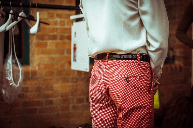
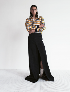
For SS14, Saunders mixed his usually loud colour palette with a few sombre beige and grey tones. Still, spots of blue, green and lime yellow were injected for effect – some of it as floral prints on cropped jackets. The pixelated prints, pop coloured satins and bright ombres on laser cut wool blazers and belted trench coats defined the collection, which was shown as a presentation rather than catwalk show, as per usual. All in all Saunders continued his refined and assured look, quietly dominating the London scene without making a fuss about it…
Photography Morgan O’Donovan
