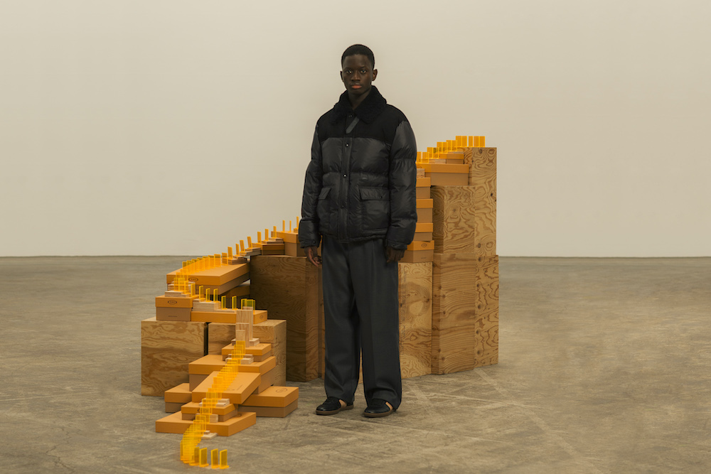
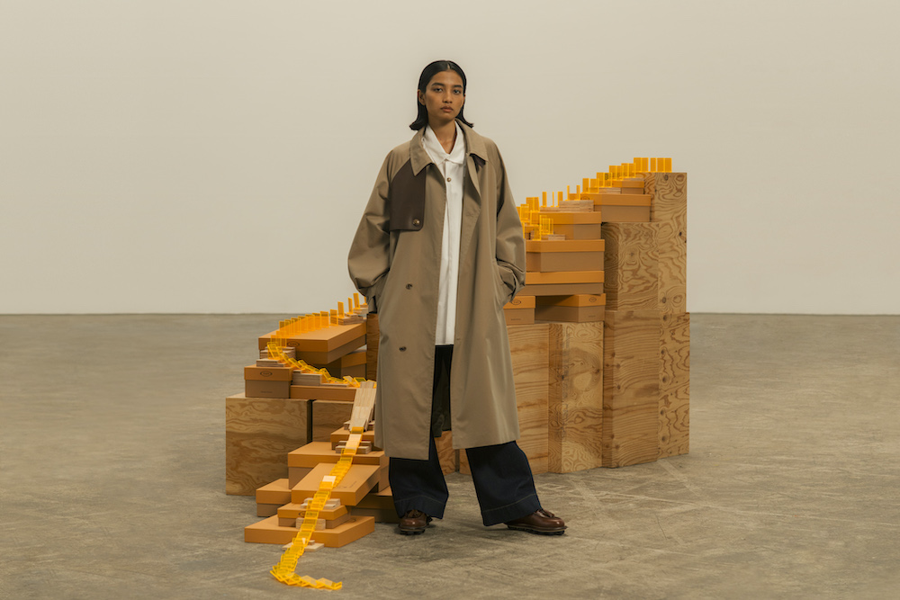
TOD’S collaborate with Hender Scheme on a crafty collection
Sandra Bem was a US psychologist whose pioneering work in the late 20th century proposed that traditional gender roles are restrictive for both men and women, and can have negative consequences for individuals as well as society as a whole. It is her ‘gender schema theory’ – research that interrogated social beliefs that gender roles are “opposite, bipolar, and mutually exclusive” – that Hender Scheme derives its name from. Founded in 2010 by Ryo Kashiwazaki, who first studied philosophy before turning to leather, the Tokyo-based label is built around balance and craft, focusing on footwear and accessories.
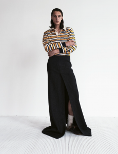
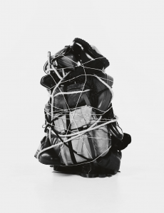
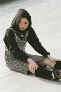
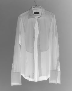
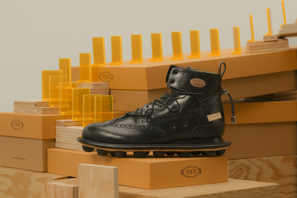
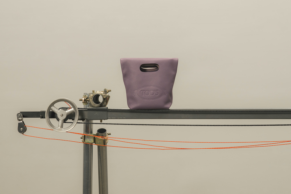
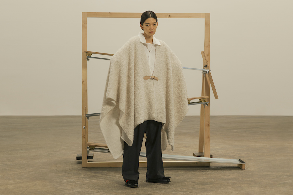
For the fourth instalment of the TOD’S Factory project, in which designers are given access to TOD’S craftsmen and savoir faire in the Marche region of Italy, Ryo has created a playful capsule for both men and women together with creative director Walter Chiapponi. Using creative free association, Ryo flipped the luxury houses’ logo to spell DOT’S, leading him to zero in on the dots of the brand’s iconic gommino sole. Experimenting with scale, these dots became large pebbles on the bottom of tasseled loafers that combine different leathers and textures in organic modulations of natural colours. The collection also has a crafty contemporary take on TOD’S classic Oboe bag, as well as ample trenches, knit shawls, tracksuits, shirts and trousers.
To celebrate the capsule being presented at Milan Fashion Week this month, Port spoke to Ryo about balance, craft and non-verbal communication.
What was the push and pull, balance of collaboration, between yourself and Walter Chiapponi? It sounds like it was an equal and open exchange of prototypes, samples and products between the two brands.
We had contact with TOD’S several years ago, since then I have been communicating casually. We started more concrete conversations around the Fall of 2019. We met Mr. Della Valle when he came to Japan and we were invited to the TOD’S factory in the region of Le Marche, Italy, and the head office in Milan. We interacted with TOD’S Creative Director Walter Chiapponi, with craftsmen and people at the head office, and the collaboration started.
One of the images I have of Italy is that there is unique taste in colour scheme, and TOD’S is no exception, it is good at matching colours. In this capsule collection, I think that the colour diversity is higher than in the usual Hender Scheme collections, partly because I challenged that colour scheme. It’s a real design balance.
Why is ‘flip’ your creative slogan? How is it a useful prompt when approaching design?
Since both of us are brands that mainly focus on shoes and leather, I decided to combine the specialties of both by looking at the commonalities and differences. At that time, the keyword “TOD’S ⇄ DOT’S” came to my mind.
Based on “FLIP”, the keyword for making things in Hender Scheme, the idea is to flip the TOD’S logo and interpret DOT’S as pebbles on the sole of TOD’S. Using this idea as a starting point, I expanded this collection.
Everything looks relaxed, many pieces have a generous silhouette – did anything inspire this finish?
Overall, I really like the balance that the products have – it’s a unique one that combines Hender Scheme and TOD’S, but enough to recognise both brands’ presences.
I think this can be created by accumulating fine details, materials, colour schemes, etc., so from either point of view, it seems that either brand can be recognised. That is the balance that I aimed at from the beginning.
Could you expand on the thinking behind the materials that were chosen for the collection, I know leather is one of your (and TOD’S) fortes
With the intention to work on RTW as Hender Scheme, I considered leather as a material for clothing and added details cultivated in my shoe making experience, such as stitch work and hole decorations of medallions. And I think we came up with a collection that goes well with shoes, combining contemporary and modern ideas and designs with something very classic. I designed the products with the intention to create a strong identity.
Why is it important items have a manual imprint of the craftsmen/women who created the garment?
Craftsmanship is an important element in Hender Scheme’s manufacturing, and collaboration with brands that also celebrate craftsmanship is very inspiring. By visiting and observing the factory, I was able to create things by imagining the people and environment that work there, even when making things remotely. Since manufacturing started when COVID-19 became widespread, it was difficult to actually go back and forth and face-to-face communication was not easy. We tried to communicate through the objects between us and I was able to overcome the difficulty.
It was a very valuable experience to be able to share and understand each other at once by communicating through things such as mockups, prototypes, and patterns rather than through language. Also, there were many surprises when I received the samples and products, such as the high level of techniques and the excellence of the materials.
Do you have piece from the collection you’re particularly fond of?
This is a difficult question … Every item is indispensable because it is a collection with all items.
However, the most iconic item in this collection is the tassel loafers on the maxi pebble sole. This product embodies the concept of the collection as a completely new sole. The upper part has also modernised classic loafers with a manufacturing update with the Hender Scheme’s way of creation, described with keywords such as “NEW CRAFT” and “contemporary”. I think it became a very nice shoe.