The founder of magCulture on the front-cover arms race
Just as the business model of magazine publishing has been transformed in recent years, so has the creative model. Nowhere has this been felt more keenly than the front cover.
One of the final stages of failure in mainstream publishing was the ever more desperate sales pitch of the front cover design.
Produced to grab attention from the height and distance of the newsagent’s shelf, front covers were conceived to algorithmically tight parameters: a celebrity face (tick!); full eye contact (tick!); logo at top of the page; a set of cover lines written to appeal to as many people as possible, while not putting anyone else off (tick; tick; tick!). Research demonstrated the ever-decreasing number of seconds available to grab the interest of the potential reader.
An arms race developed in an escalating battle for this attention. Cover headlines became larger, fluorescent inks were introduced, then multiplied; pull-out supplements were added and gifts glued to the front. Sales fluctuated issue by issue as each magazine fought its competitors for attention. Readers jumped from magazine to magazine as the last drops of loyalty evaporated.
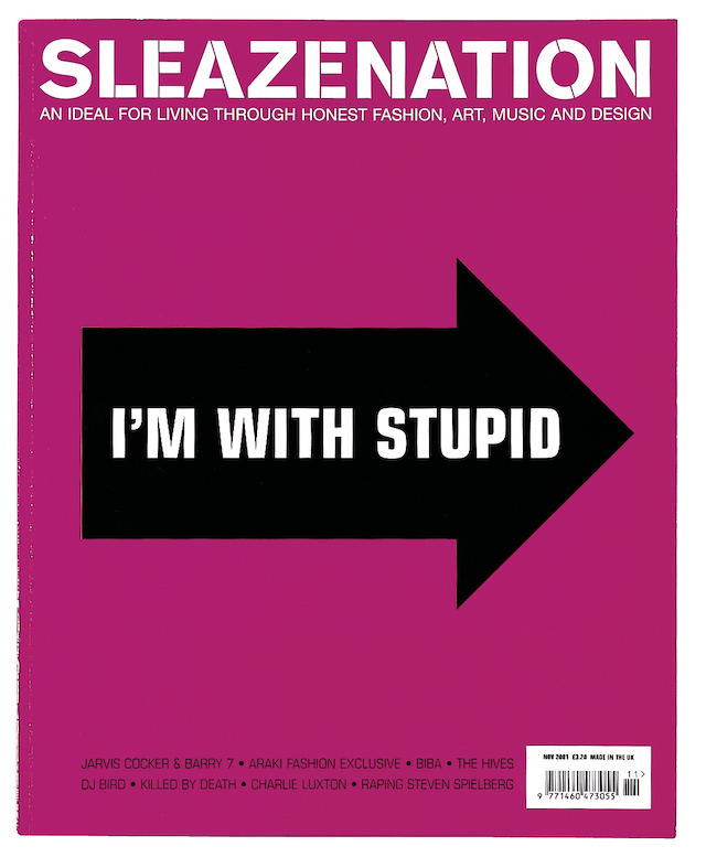
Scott King’s fluorescent pink “I’m With Stupid” cover for Sleazenation critiqued this direction back in 2001, the very concept relying on the issue being shelved alongside the competitors it sought to abuse.
However, that cover also suggested a way forward: the return to a singular poster-like design as the battle for attention gradually swung from the newsagent to the screen.
Since the 2010s, magazines have announced new issues via their social media accounts, and Instagram in particular has proved a key channel. The front cover is ideally suited to the platform, and, in taking advantage of it, the format has morphed completely.

This phenomenon can be traced to the 2010 design of Bloomberg Businessweek. Editor Josh Tyrangiel and art director Richard Turley used their weekly front covers to shout about a single feature story, and for several years they produced a series of brilliant poster-like covers that were powerful in real life and arguably even more effective as thumbnails on Twitter and Instagram.
The weekly arrival of the new front cover of Businessweek became a key element of my social feed; a favourite was this vivid red global warning cover that cleverly adapts Bill Clinton’s 1992 election phrase, “It’s the economy, stupid.”
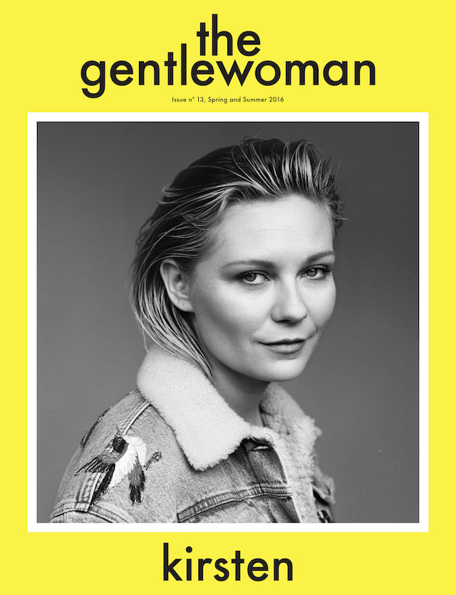
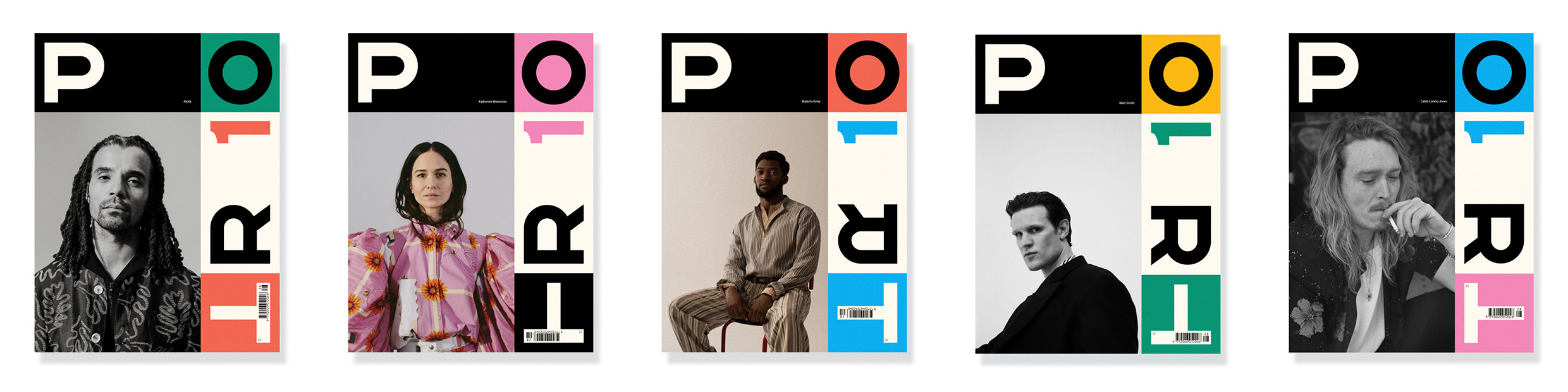
The Gentlewoman reveal their biannual cover star using a format with just four elements: a background colour, the magazine’s name, a star portrait, and her name.
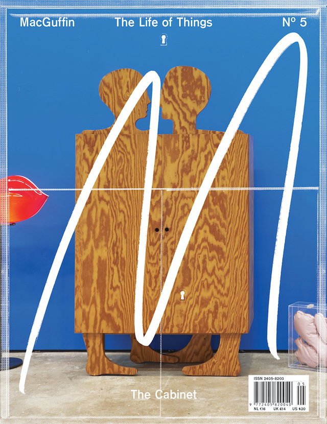
The design of MacGuffin’s covers are canvases across which a large paintbrush stroke “M” is scrawled over a collage of parts hinting at the theme. That “M” provides the recognition factor.
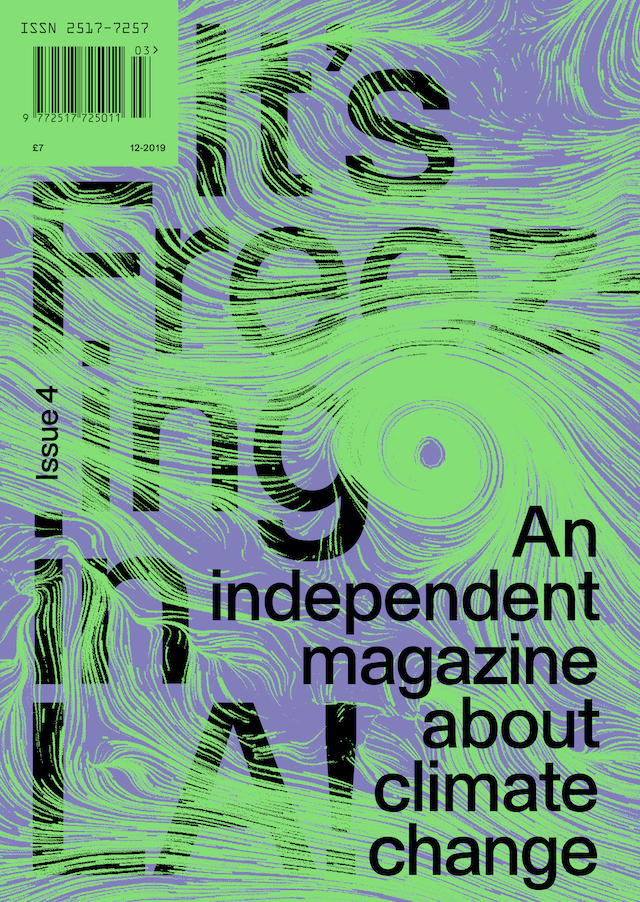
It’s Freezing in LA! has developed a similar formula, adding the additional social-friendly element of a large text announcing “An independent magazine about climate change”. Such scale is not required for the newsagent, but is needed on Instagram.
The New York Times Magazine goes further. As well as single-issue covers that look great as thumbnails, they produce a weekly promotional video for social distribution. Creative director Gail Bichler and editor Jake Silverstein talk through the development of the front cover, sharing dropped ideas and talking the viewer through to the final version.
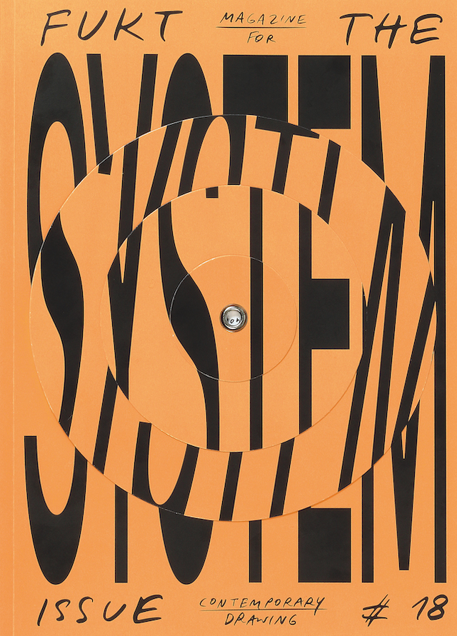
While not everybody can afford such a production, a small-run biannual like Berlin-based drawing magazine FUKT can compete by creating covers that are mobile in print, such as the example here. Their System issue had a pivoting title on the cover: beautiful in real life, perfect when animated for Instagram.
This article is taken from Port issue 28. To continue reading, buy the issue or subscribe here


