- By appointment to the Queen, wallpaper designers Cole & Son have an excellent pedigree – Betty Wood finds out what goes into the making one of their iconic collections
Words Betty Wood
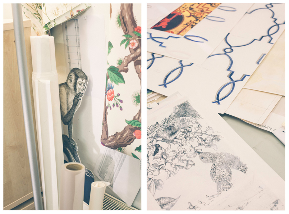
Photography Jasper FryAbove: sketches and illustrations from the new collectionInterior design has had a tumultuous relationship with wallpaper in recent decades. The rising popularity of paint in the late 80s, coupled with wallpaper’s reputation as fussy, outdated and notoriously difficult to hang, gradually led to it falling out of favour until the relatively recent revival of ‘the feature wall’.
Whilst the days of matching floral pattern wallpaper, carpets, curtains and furniture died a death in the 90s, patterned wallpaper has hung on in there, overtaking fabric as the versatile and affordable way to add style and identity to a room. Wallpaper is once again en vogue. And a company who have weathered this circus of popularity better than most is Cole & Son, who, later this month at Deco Off in Paris, launch their latest collection: Folie.

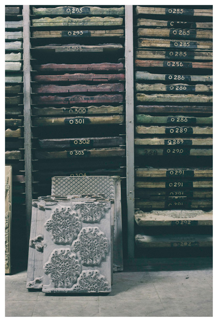
That’s what I’m here to see this morning, and as we sit down in the Cole & Son design studio to talk with Creative Director Shauna Dennison, designs from the collection hang from the walls around us, an intriguing and geometric cocoon of colour. Immediately, we begin dissecting the motifs on display. “We’d just finished designing our Royal Palaces collection, and that involved seeing Hampton Court and Kensington Palace, but what really struck us were the gardens. It wasn’t what we were focussing on for that collection, but it started a thought process going”, explains Shauna. That though process culminated with Folie, a series of wallpapers based on the gardens of eighteenth and nineteenth century French gardens, featuring imagery of statues, follies, menageries of exotic animals and architecture.Above left: A roll of each design is kept in the company’s archive, organised by date of production. Initials signify the wallpaper’s designerOf course, the 19th century is when the Cole & Son story begins. Founded in 1875 in Islington by John Perry, Cole & Son spent the latter part of the 19th century printing for the likes of Jeffrey & Co and Shand Kydd, building a reputation for high quality block printing of stripes and jaspes and reviving flocking. When it was bought out by A P Cole in 1941, it not only took on the moniker Cole & Son, it inherited the largest archive of historical printing block designs in the country, stretching back more than two centuries across thousands of designs and hundreds of collections.
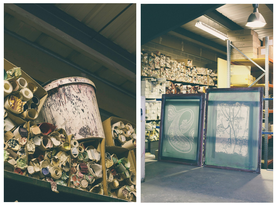
Above right: Layer screens for a Cole & Son wallpaper design in the warehouse- Presently, it takes the best part of a year to develop a collection, two of which are released each year in spring, then autumn. As creative director, Shauna oversees the process from beginning to end – from the initial design phase through the colouration and production period, to the printing of pattern books, press and marketing – working with a team of two designers in the studio. “We spend a lot of time talking – communication is really important” she stresses, grounding the holistic nature of the design process. “Even if an idea’s not applicable immediately, it’s important to keep your ear close to the ground [to store it away for later] and try and pick up on trends before they’ve even become trends, if you like”. Those ideas include “films that we’ve seen, books that we’ve read, exhibitions we’ve been to – it all comes into the mix.”
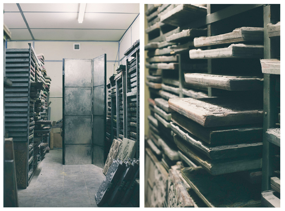
Right: Pattern books like these stretch back to the pre-war period

- “I work on Post-It Notes,” she reveals. “It sounds a bit odd, but I quickly sketch out an idea. The other designers tear things out of magazines and sketch. Over a couple of weeks, we’ll narrow the ideas down through a process of elimination… You work on things, you discard them”. From this initial pool, eight or nine designs make it to the logistical phase, where the finished design is layered off into individual screens to be used in printing.
It’s at this point the manufacturers come on board. Until last year, Cole & Son owned their own factory (part of the site we’re sat in). “We use four manufacturers based mainly in the UK, according to which printing process we want to use”. Despite their move from in-house production, Cole & Son still offer traditional printing techniques, like block and surface printing – the staples of their archive – maintaining a link to their heritage.
Right: Gothic Lily print designed by A.W.Pugin for the interior of the Houses of Parliament. Cole & Son’s archive stretches back to the Victorian period, and includes designs by some of the most influential designers of the last 200 years
To do so is a no-brainer in Dennison’s mind: “Part of our business has a huge heritage aspect to it and it’s a service we still offer to our customers. But of course, we’re now in the 21st century, we’re not a museum – we have to move with the times whilst keeping a toe in the past, so to speak”. To their list of processes and finishes (including flocking, which they were in part responsible for reviving in the late 19th century), they’ve added digital printing.Turning our attention back to the collection at hand, and given the success of previous collections like the Contemporary range (which continues to be a top-seller today), what’s key to a design’s longevity? “Avoid colours that make too definite a statement about a design period” Shauna says without hesitation.
Above: Because the printing blocks are carved from pear wood, they decay at room temperature. The archive of blocks, more than 1,700 strong, are refrigeratedColour is obviously an essential part of the design process. I ask Shauna how they can possibly colour-forecast so far in advance (they’re currently working on September 2015’s collection). “Obviously, our time frame is much longer than the fashion industry as people don’t decorate as often as they change their clothes (sadly). But colour isn’t thought about in isolation – we don’t say, purple’s really on trend right now, let’s do a purple floral print. It’s much more organic. It comes with the design, strong design.”
Shauna goes on: “People always ask, ‘oh what’s on trend at the moment’, but colours have a trend, and they move in an out of fashion. For us, the way things are rendered and printed are what moves in and out of fashion.”
- Traditionally known for the dark, regal tones of their Victorian papers, such as A.W. Pugin’s ‘Gothic Lily’ (which hangs in the Houses of Parliament), Shauna made a point of “updating the colour palette a bit” when she started, drawing on the archives (“a moveable feast: acidic yellows, olive greens, fantastic!”). Duck egg blue, and a soft, ballet slipper pink have become two modern colours that appear regularly in collections.
And the success of a colourway, it seems, often hinges on the styling of the paper. “The best selling colourways and designs are the ones we photograph – with wallpaper you need to see the potential of how you could live with it”. Which begs the question, how are people, designers and consumers, using Cole & Son wallpapers right now? “In the last 12 months, we’ve started to reintroduce the border as a styling tool. They were a big thing in the 80s, a mean little strip you’d put around the top of the wall. We’re doing it differently now: we use a wide width – we call them friezes, and they are horizontal papers designed to be hung below a dado rail at ground level upwards, or to go halfway around the room at waist or shoulder height.” The re-emergence of the border is indicative of a return to layering: “look back at the grand architecture of the last few centuries… everywhere you look, there’s layers of decorative detail and texture. We wanted to explore that and put some fun back into decorating, beyond having one feature wall on the chimney breast”. And Folie is a collection that’s definitely found the fun, contrary to its formal origins.
The Folie collection launches at Deco Off, Paris, from 23-27 January
Subscribe to Port Magazine annually and receive each issue to your door.
Get PORT in print


