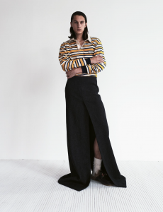
Luca Campri ventured backstage at the German designer’s Milan show for an injection of bright pinks and all-over monochrome suit prints
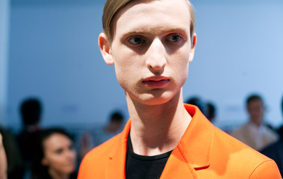
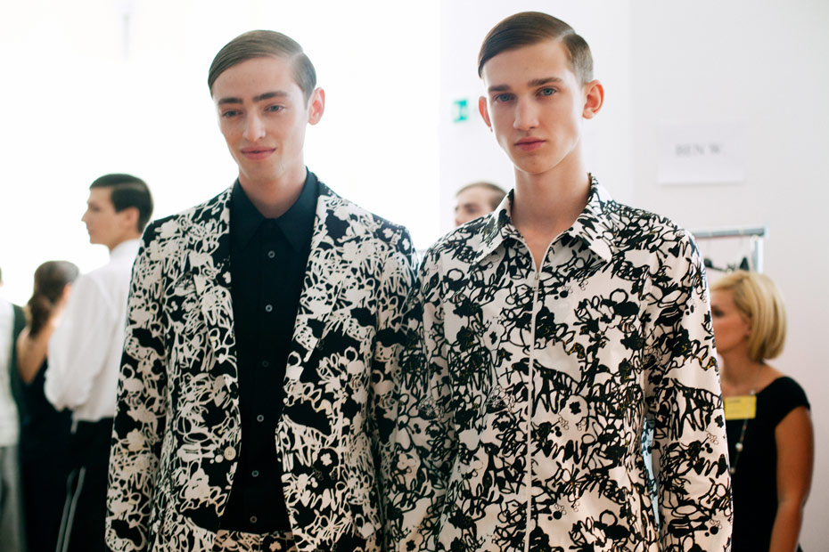
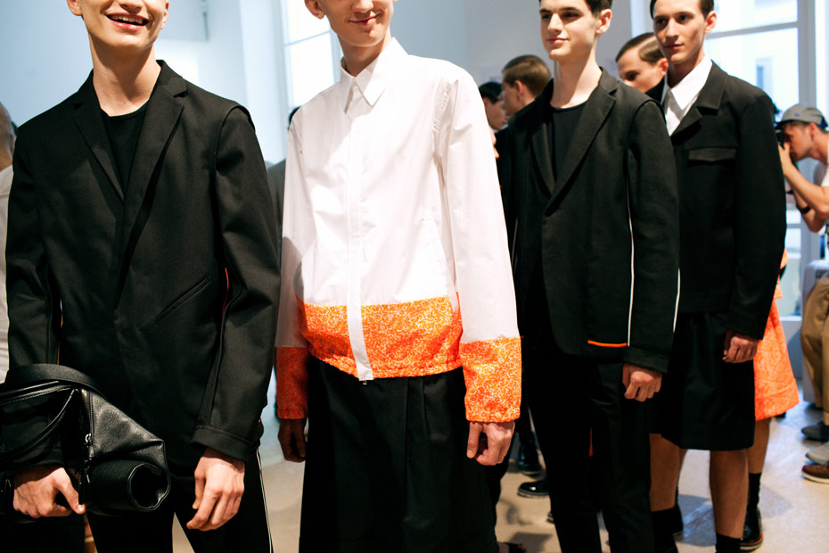
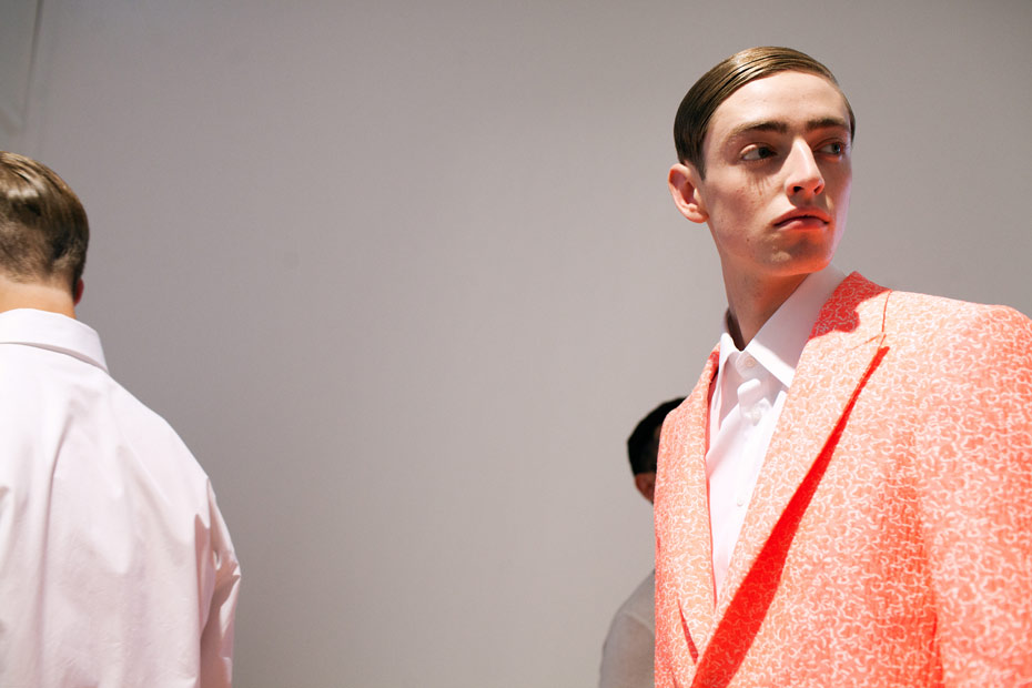
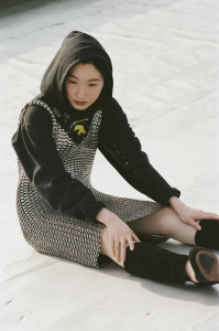
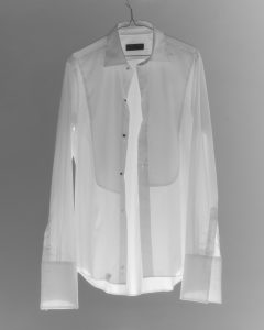
The queen of minimalism returned to Milan with a focused and coherent collection. Jil Sander, who came back to her eponymous label when Raf Simons left for Dior, is known for simple cuts and lack of detailing. SS14 continued that theme but what the collection lacked in intricate detailing it made up for with its colour palette: bright pink tones contrasted the usual monochrome offerings.
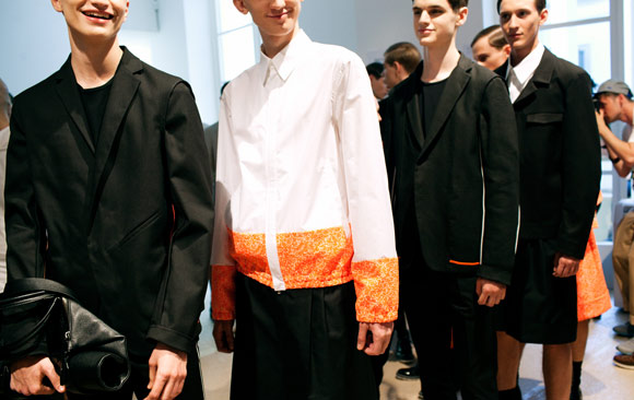
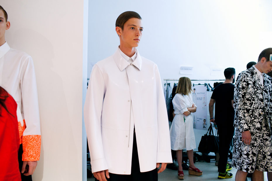
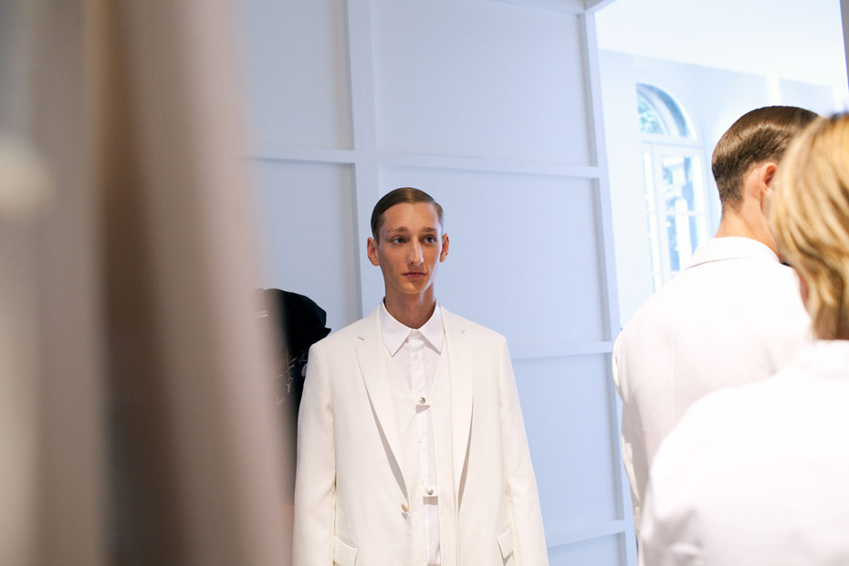
Jil Sander’s strongest design feat is making the old ‘less is more’ saying actually work – and she’s been successfully doing it since the 90s. Of course her style has evolved over the years: today Jil Sander is as much about sportswear (note the new windbreaker style) as the plain suits that made her a sartorial star twenty odd years ago. Except for the colour injection, there were a plethora of prints available. Some of them knitted into cardigans, others printed all over suits. But, true to the brand DNA, it was left to a plain and simple grey suit to close the show. You can take the designer out minimalism but never the minimalism out of the designer…
Photography Luca Campri