We profile three designers who’ve piqued our interest at LDF later this week by using kaleidoscopic patterns, tactile industrial materials repurposed and straight-up simplicity. Photography by Robin Sinha
Patternity
As you wander city streets and dutifully avoid the orange and white striped traffic cones, perhaps shoo an irritating striped wasp from your shoulder or tut as a brazen motorist straddles sacred double yellow lines, you might well fail to notice the impact of pattern on your life. You might have overlooked that patterns are present in nature, in art, in literature and music, in behaviour and in science, in language and in thought. Anna Murray, co-founder of PATTERNITY – pattern archivists, consultants, educators and designers – suggests that these patterns might well hold more significance than one would think: “We’re only just beginning to understand it psychologically and scientifically but it is this amazing thing that people are really drawn to, maybe it can answer some of those higher questions.”
PATTERNITY is founded on that sense that pattern has potential – the idea that the patterns we create ourselves or that are (as yet) unexplainably omnipresent in nature could be harnessed and used to communicate, educate, entertain and unite. The name Patternity itself is a compound of ‘pattern’ and ‘eternity’ – testament to Anna’s and co-founder Grace Whitteringham’s faith that pattern has limitless potential as a social tool. “We believe that if people better understood and were more aware of pattern it could positively shape future behaviour. It’s why we wanted to set up this company – we wanted to have a driving social mission underneath.”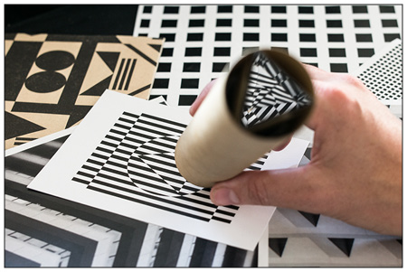
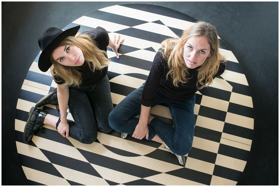
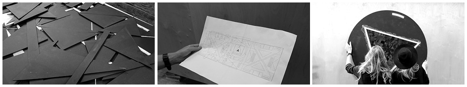
So how to raise awareness of pattern? Tasked by collaborators Air BnB with examining the concept of the home, PATTERNITY have commissioned a giant Kaleidoscope to be installed in Trafalgar Square as part of the London Design Festival. ‘We’re using all the fundamental shapes. The shapes that make up the world around us, that make up peoples’ homes. Circles, lines, triangles and squares – they essentially make up all matter – there’s a commonality factor there; we all share these patterns.’ Visitors to the exhibit will have the chance to operate the Kaleidoscope and will have their photo taken at the centre of the pattern it creates around them – a chance to be the unique element in a shared pattern. “We really want to be really inclusive, to make this accessible, to make something tactile as well – that was really important to us. It’s very much part of our philosophy. Pattern is for everyone.”
Tom Parfitt
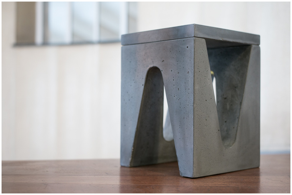
Tom Parfitt was selected earlier this year as one of the finalists of Heal’s Discovers, an annual competition open to young designers from Bucks, Kingston and London Metropolitan University. His innovative design, the Maya Side Table will be launched with the opening of London Design Festival and sold exclusively in Heal’s stores.
The side table, which was inspired by ancient Mayan architecture, in particular the corbeled Mayan arch, is made from 90 percent recycled concrete though original drawings envisioned a marble construct. “If you made it out of marble there would be a lot of wastage whereas with using concrete you can pour it into the mould, it’s a more honest process which I think translates better into the final design.”
It’s an unconventional material for a designer to choose, especially a former cabinet-maker, but Tom explains that he was attracted to its “inherent beauty” and obvious structural strength when used in architecture. “I wanted to create a mini bit of architecture in an interior setting. Something that would have a powerful visual impact.” In practical terms, the natural durability of concrete also means that the product can be used outside, adding another notch to its appeal.
The table is left to cure over three days in its mould after which its removed and either painted or left as the natural concrete finish. “The first time they made it they couldn’t get it out of the mould so the guy who was making it added a lubricant, which ended up making it look more weathered, which I really liked and really wanted, I didn’t want it to look too sterile.”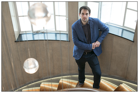
It’s important to Tom that people acknowledge the way in which the table has been made and for that reason each table comes with a signed tag telling you “which batch you’ve bought and what number it was in the batch.” At the end of the table’s life it can be broken down and recycled again.
“London is a real melting pot of design because it welcomed people from other countries and we give them equal footing with British designers. I guess we just need to be careful that we don’t limit the opportunities for British designers and we continue to nurture our own designers as well as bringing in design talent from other countries. In the coming years, I think we’ll probably see more British designers going abroad as well just because the British brand has so much to offer the rest of the world and people look to us for quality. It’s definitely something I would like to do but I need to establish myself here first. I think that as you get older as a you start to really develop your own style, I’m still developing that but at the moment I’m not too worried about one design leading into another aesthetically – quite the opposite really. I want to try different things all the time.”
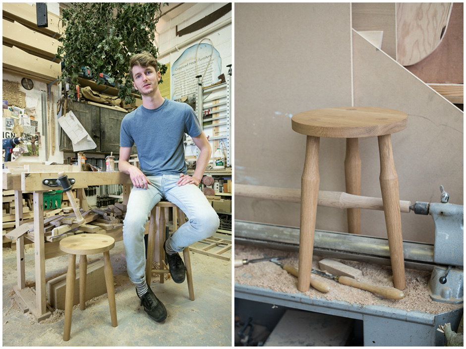
Liam Treanor
Combining practicality with creativity is not a challenge faced by every artist. Canvasses hang, sculptures stand, musical notes endure and then fade with little concern for any purpose but their own intrinsic beauty. To personify them would be to attribute them vanity. Forcing ones art into functionality, therefore, is a challenge faced by designers rather than painters. Liam Treanor is mindful of how his furniture overcomes that challenge ‘It’s about maintaining a sense of balance. A strong sense of logic, an understanding of how things work. Why they work.’
Additional Patternity images courtesy of Anna Murray and Grace Whitteringham
Alongside that logic, Liam’s furniture combines myriad influences; there’s a significant nod to modernist architecture – specifically the monumentalism of Alvar Aalto and Santiago Caltrava, an (almost) imperceptible sense of Wassily Kandinsky’s abstraction and comforting, respectful references to tradition. “You can learn a lot from what other people have done, designers and artists, from the last five years to the last 200 years,”says Treanor whose minimal designs are rendered in either ash – synonymous with the wan and cool aesthetic of contemporary Scandinavian furniture – or oak – “Britain’s favourite timber” and a material still heralded for its fortitude and tradition.
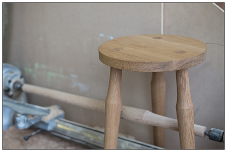
The Santiago collection – named after Caltrava – to be showcased at LDF was inspired by the architect’s Bilbao Airport, a building whose clean lines and bold shapes, remarkable in their simplicity, combine to contrive both a sense of awe and a sense of calm. To say that the Santiago collection echoes those sentiments is no overstatement. The gently tapering legs – a trademark feature of the collection – both invite and enclose, whilst the horizontal lines of the Lina desk accelerate in all directions, creating a broad and clean surface upon which to compose long and elegant letters, or, indeed, to draw detailed architectural plans. “I like the perspective of the taper. Things should taper away from you, it creates a visual harmony. The way the legs taper out and back it gives the idea of it being tilted away from you, it’s almost comforting because it’s so soft on the eye. It’s inviting to use.”
Perhaps it is the ultimate testament to Liam’s work that I am at once aware of his influences, appreciative of his craftsmanship and most inspired to get on and use his beautiful products.
Liam launches his Santiago during at designjunction, 18-21 September. Click for more information


