Madeleine Morley visits the Berlin studio of revered typographer Erik Spiekermann for a master class in letterpress printing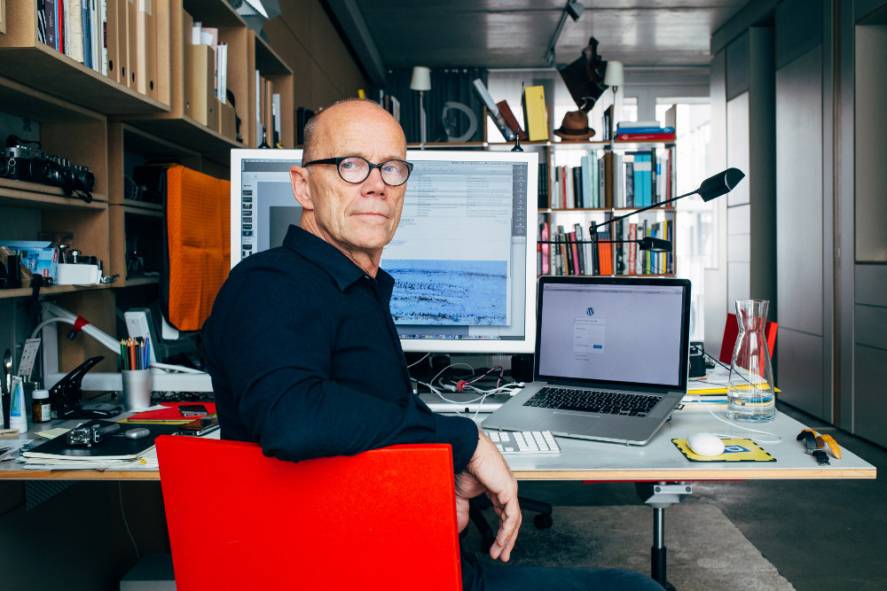
Last week, I spent the day with Erik Spiekermann, who invited a small group into his Berlin-based print workshop, p98a, for an introduction to the letterpress. Organised by London branding agency Construct, the session brought together designers, writers and project managers who, like me, spend most of the working day in front of the computer, fixed to their screens or typing away on light, plastic keyboards.
Today, however, we were due to be fixated on another rectangular surface: the bed of a letterpress, crafting words from wood not pixels. The workshop was an opportunity for us to break from the daily monotony, experience the heaviness and precision of typography before it all went digital, and return to a time when rotating a sentence diagonally wasn’t as easy as using the ‘spin’ tool, but required a hand cut wooden wedge instead.
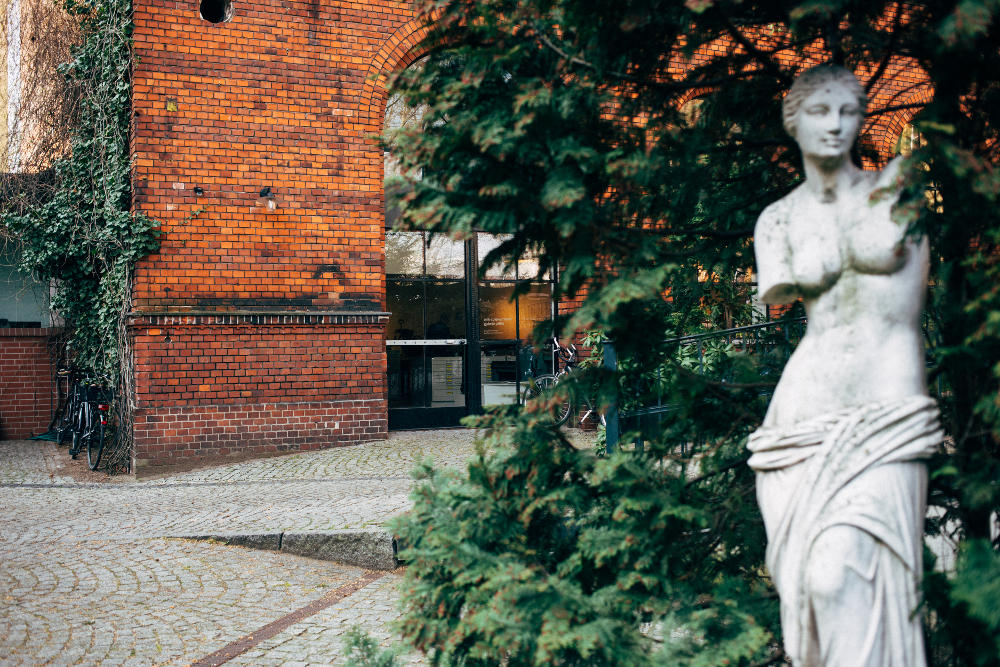
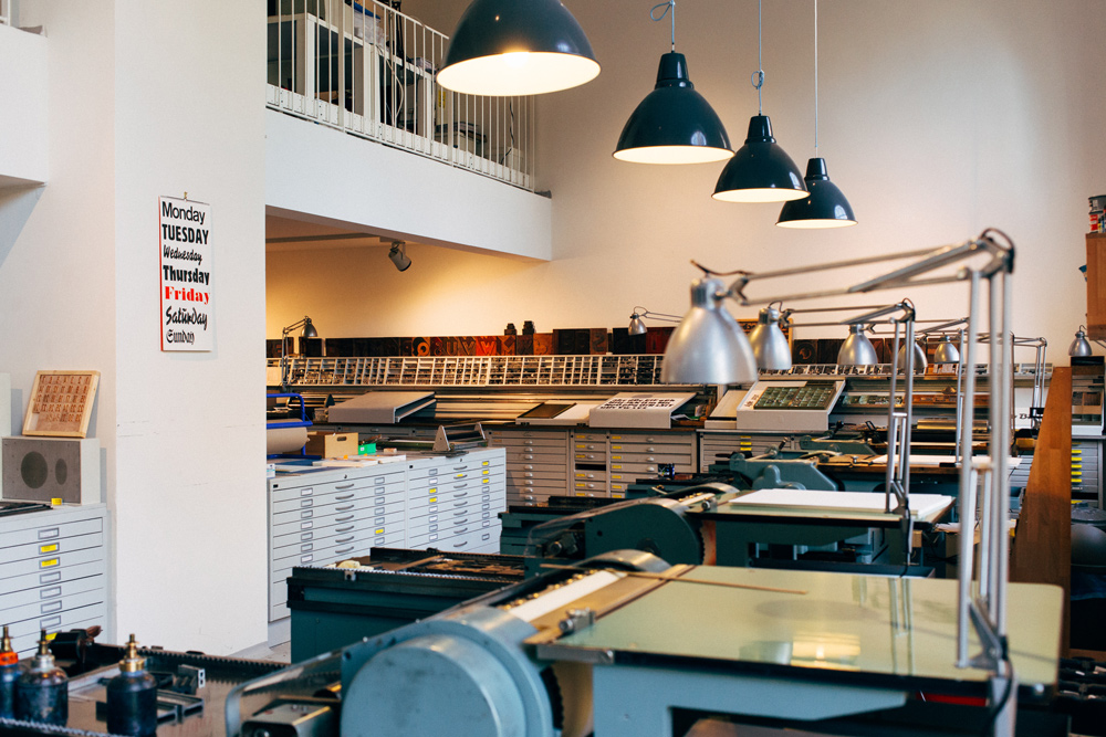
Along a silent yet immense street in Berlin, I found Spiekermann’s workshop nestled in a small green courtyard emerging from the greying road. In the 60s Spiekermann studied nearby, funding himself by running a letterpress in the basement of his house. His studio is now located just a few streets away on a strip of Potsdamer Straße – an empty stretch containing nothing else apart from a hat maker, who designs for the likes of Alexander McQueen, and a few rustic German eateries that sell p98a favourites like spätzel and small beers that arrive in ceramic mugs.
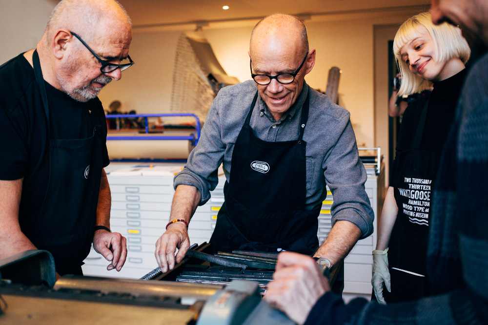
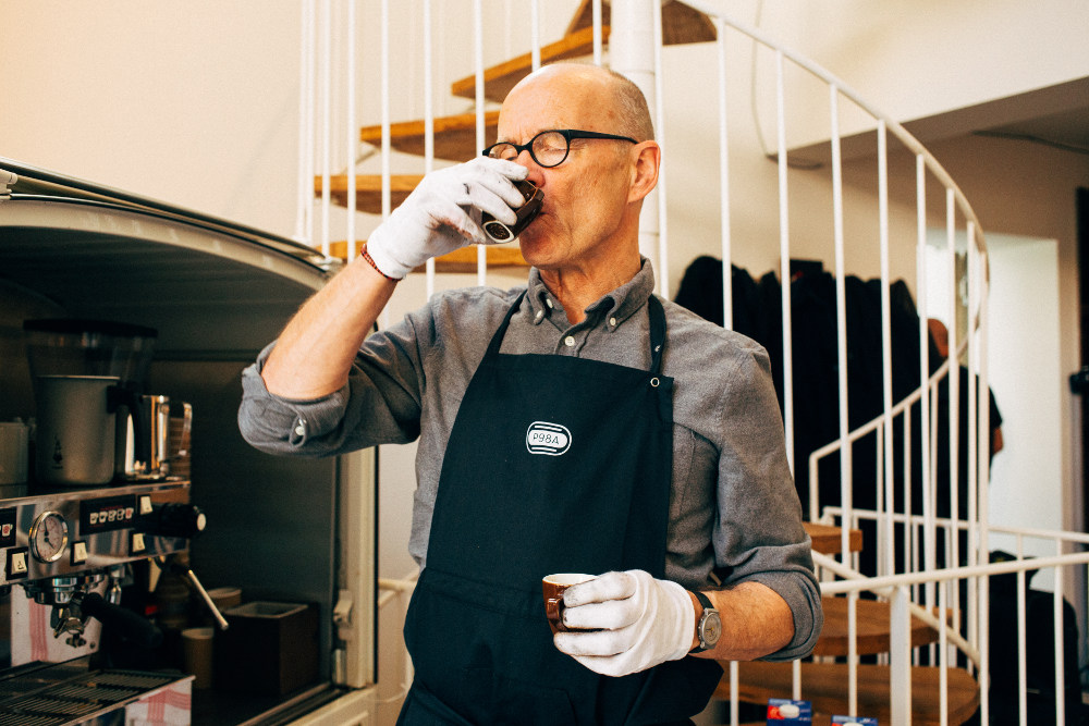
Spiekermann greets us at the door, brimming with energy and good humour, wearing a craftsman’s apron and signature circular spectacles. He is a constant source of jokes, anecdotes and ideas, and moves around the solid machinery quickly like a dancer, bouncing from one idea to the next.
“This is hard work,” he says whenever he sees me struggling to keep up. “You’re not used to standing up all day, but when you’re here, you’re on your feet the whole time – this is manual labour.”
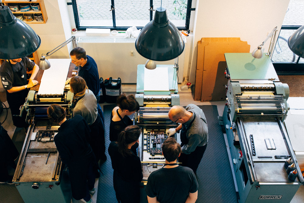
As he explains how the equipment works, his team weave in and out of him like parts of a mechanic clock – they obviously know the dance well. Alexander Nagel, a photosetting expert, hammers letter types into place on the press to keep them from moving around. Meanwhile, fellow p98a director Jan Gassel rolls black paint onto each letter with quick, forward strokes; Spiekermann’s assistant, Ferdinand Ulrich, reaches up to the highest drawers of font sets that no one else can quite stretch to.
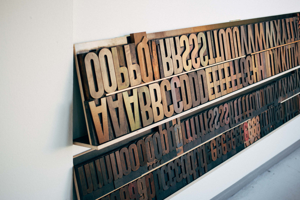
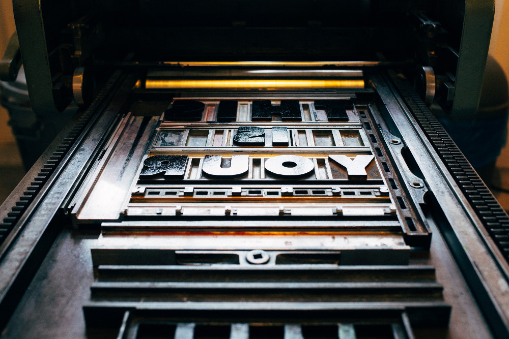
The group divides into teams and I work with Tom Wittlin and Dan Jones from Poole creative agency Folk. We’re drawn to a strong typeface called Block, from one of the many drawers and decide on it for our poster. The typeface is bulging, with rounded, assertive sides and ragged edges; it feels solid, like all the machinery around us. Recently, p98a has been experimenting with 3D printing and laser cutting to produce their types. Spiekermann’s new wood type HWT Art, which he designed for the Hamilton Wood Type Museum, Wisconsin, US, is a slicker, more direct and less bumpy version of Block.
It’s like a modular puzzle where every piece is rectangular and grey
Axel helps me load a tray of the Block type for our print, putting in tiny slits of metal to make the space between each letter, using tweezers to insert and remove the pieces. We have to measure in cicero (a unit of measurement equivalent to 4.5 mm) and then find corresponding blocks to fit into the gaps – it’s like a modular puzzle where every piece is rectangular and grey.
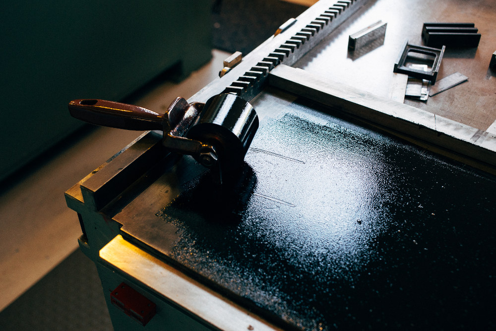
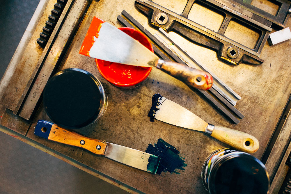
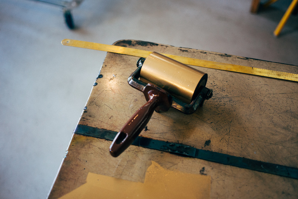
After a sheet has gone through the press, I roll paint on the type again, making sure the colour is thick and evenly distributed . The ‘H’ of our print keeps coming out faded, so we have to raise the type slightly by cutting out a piece of paper and placing it underneath. Once everything is set, we start the process of producing a stack of posters. “You can make around 200 of these an hour… if you’re fast,” Spiekermann says with a wink.
The process of printing is repetitive, slow, and surgical, but also very peaceful and contemplative – like knitting or carpentry. We insert pieces of paper into the letterpress, rotate the handle, stack the print on a drying rack, re-ink the font, then start again. By this point, we begin to develop a consistent and robot-like rhythm, but we’re a clunky, less graceful team in comparison to Spiekermann’s guild of typographers.
I ask Nagel why he prefers this method of design: “It has more… sinne,” he replies, using a German word that is difficult to translate. The term means ‘touch’ or ‘sense’. It refers to the haptic, but also means ‘significance’. This is something people say a lot about the printed page and its physical tangibility, but it’s something you don’t quite appreciate until you’re actually building one of these templates from metal, wood and paint.
From 10am and 6pm, my team and I have only just about finished printing one sentence and it’s in no way perfect or balanced. Hands are bruised, blackened with oil and grease and black paint, and my own are even cut slightly by the paper. My shoulders ache and my eyes are tired, not from being hunched over a laptop all day, but from stretching across the letterpress and putting my eyes up close to the smallest letters and punctuation marks.
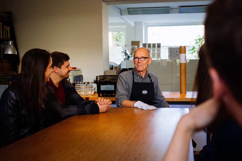
We clean the machine with blackened rags, determined to get one more colour on our design. I prime the press with gold paint and then we put a print that we’ve already made through the press again, moved slightly to the right, so that the gold prints on top of the black. Once it’s done, I hold it up to show Spiekermann, who has been our teacher for the day. “A drop shadow!” he energetically shouts across the room. “Yes! Experiment, try different things – that is what this place is about!”
The word ‘text’ shares its root word with ‘textile’ – a nod towards the shapely, woven and handcrafted nature of words. A day spent at p98a reminds you of the physicality of text, how materials shape an idea. As the workshop comes to a close, I find myself appreciating the complexity of creating a single word in a time when words can be typed and formatted so quickly.
These days, rewriting a sentence is as simple as hitting the backspace, and colour can be altered with a simple click. At p98a, words aren’t something you simply churn out, and a single world is pleasurable when it fits just right – both in terms of its meaning and its alignment on the page. Returning home to my glaring laptop screen, the quickness of the computer allows me to experiment with sentence structure and rhythm, but the day at the workshop has reminded me to always choose my words carefully.


